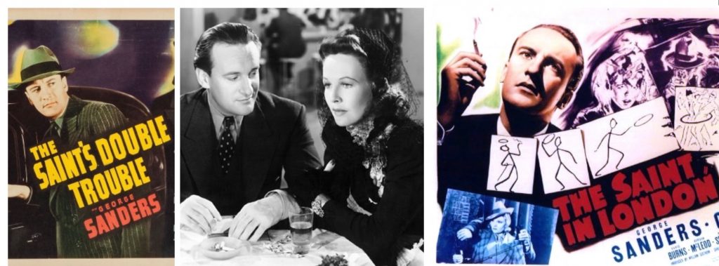
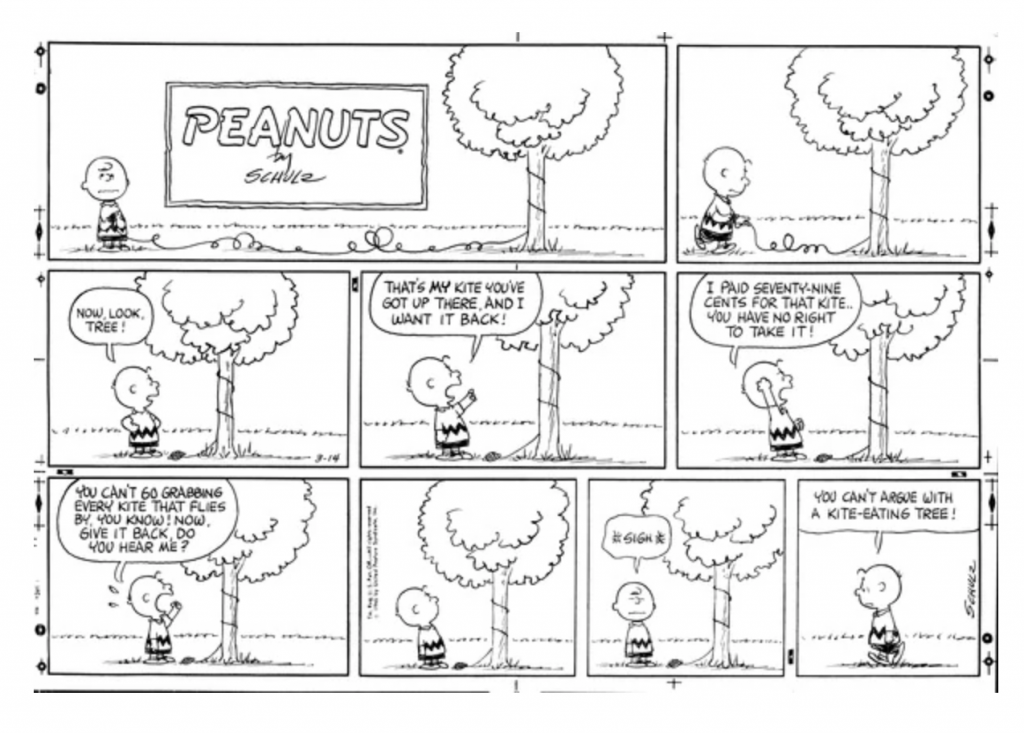
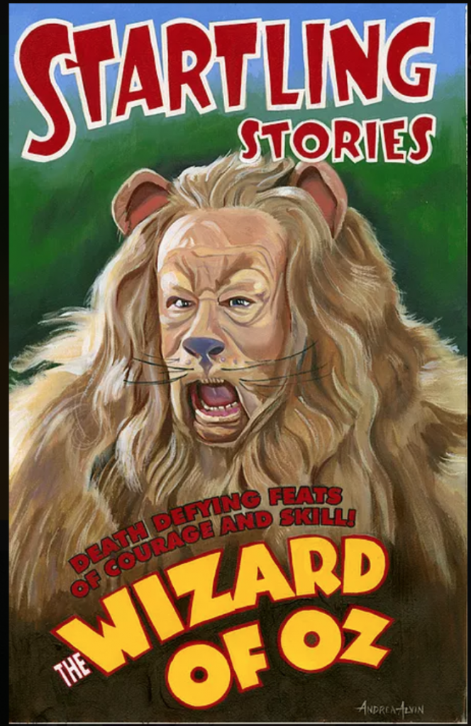
The Jungle Book was my gateway drug into the addictive world of Disney feature films. I had always been a movie geek, from the first time I can remember watching a movie. As a Gen X baby, I was generally unsupervised in my viewing, often to my detriment, but I was also a very stubborn child, so if one of the actors I loved was featured in a film, I’d watch it no matter what the subject matter. Starting at the tender age of 5 or 6, I accrued a number of early and persistent favorites. Watching Paul Newman and Robert Redford in Butch Cassidy and the Sundance Kid taught me, even at 6, that I very much liked boys. Gene Kelly and his physical style of dance taught me that too, I I fell for him when I watched Cover Girl, but not nearly as hard as I did for Eve Arden. She taught me being a wise cracking dame was an option. Sidney Poitier was just grace personified, and super cool in my introduction to him in To Sir With Love. Roman Holiday brought Audrey Hepburn and Gregory Peck into my life, but then I watched Wait Until Dark to see Audrey again, and it scared the bejeezus out of me. One of the weirder crushes of my 6 year old self was on George Sanders. He played Simon Templar in 4 or 5 The Saint movies I watched over a period of only a few days. I mean..the accent! His suits! His savoir faire!
I watched Wile E Coyote and Road Runner and Bugs shorts from infancy, but how many animated features did I watch as a young child? Probably none. Honestly I don’t remember any before I saw The Jungle Book at age 8. I had recently been accidentally introduced to the horror genre when my oldest sister Pam was babysitting me and had friends over to watch The Night of the Living Dead. I’m pretty sure that’s the same weekend I saw the a French adaptation of Murders in the Rue Morgue. I have vivid memories of this black and white scene of a detective finding a woman stuffed up a chimney. I. WAS. SEVEN. Needless to say, I was primed for some more positive, joyful cinematic fare. It came in the form of the newest movie I found that featured George Sanders. Jungle Book not only had him, it had JAZZ!
Along with being a little kid that loved movies, I was also obsessed with jazz. I don’t remember how or when I saw the trailer for The Jungle Book, but it really sold the jazz element of the movie.
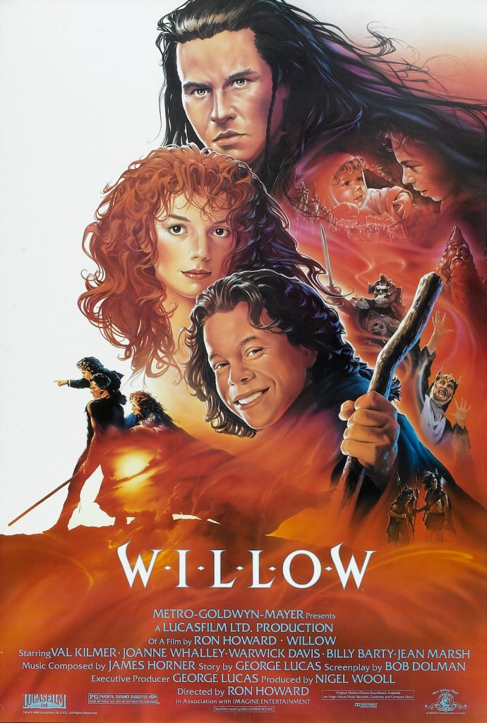
The original trailer for The Jungle Book from 1967.
Since my first record was by Louie Armstrong, and my second was an Ella Fitzgerald album, I was all in when it came to that musical genre. So here was a movie that not only had George Sanders, one of my favorite actors, who I’d seen at this point playing villains in Rebecca and The Ghost and Mrs. Muir, but it had The King of Swing, Louie Prima! Interestingly, Disney’s original choice to play King Louie was Louis Armstrong. Wiser heads prevailed, (since a Black performer playing the King of the Monkeys would have rightly been seen as..uhh..problematic?) and Prima does a wonderful job.
Basically, The Jungle Book gave me a bit of a respite from what I thought were permanent night terrors and dreams of zombies twirling intestines. I wanted more, and that led me to watching all the Disney movies I could find. I must have seen The Jungle Book on a military base, because I saw it in English. The first time I saw Cinderella and The Aristocats, they were in French. All I know is The Jungle Book opened up a whole new world of film for me, one where there were no spilled guts, and happy endings were a given.
There’s something about The Jungle Book though that has always stuck with me in a way none of the other Disney movies could. I know they say you always remember your first, but it’s more than that. The Jungle Book is about friendship and sharing joy in music and caring for each other.
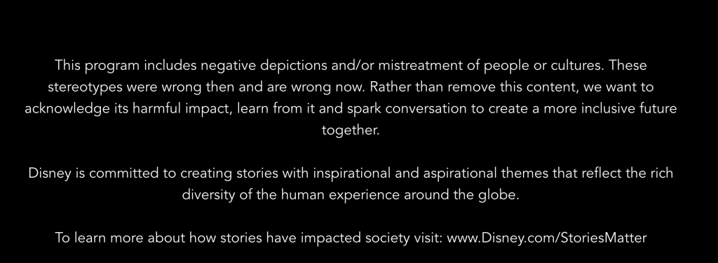
As an adult, I’m aware one can definitely rip the movie apart for its connection to Rudyard Kipling, the book’s original author. He was the colonialist and racist who wrote the poem “The White Man’s Burden” in 1899, in which he encouraged the American annexation of the Philippine Islands. Interestingly though, Kipling began writing The Jungle Book while living in the US. Though it takes place in the jungles of India, it was in part inspired by the wilderness of Vermont, and had as one of its themes the personal growth through adventures in the wild. That aspect of the story led to a friendship between Kipling and Theodore Roosevelt, then a civil-service commissioner in Washington. Abigail Disney has decried the film’s racist overtones. Developed in the mid-60s during desegregation in America, Disney’s The Jungle Book was sending a message about sticking to your own kind. When I rewatched it on Disney+ a few days ago, it carried a pre-screening warning:
The advisory shown before The Jungle Book
You can find more information about the advisory council and their work towards inclusion HERE.
All that being said, there’s a reason it was the 4th highest grossing film in 1967. Released in December of 1967, the reviews at the time were almost universally effusive. Charles Champlin of the LA Times said, “It is a labor of patient love (nearly four years in the making) as remarkable in its visible man-hours as a wall-sized tapestry and mosaic. It is beautiful to see.” Howard Thompson of The New York Times said, “A perfectly dandy cartoon feature, “The Jungle Book,” scooted into local theaters yesterday just ahead of the big day, and it’s ideal for the children. Based loosely on Rudyard Kipling’s “Mowgli” stories, this glowing little picture should be grand fun for all ages, for in spirit, flavor and superb personification of animals, the old Disney specialty, the new film suggests that bygone Disney masterpiece, “Dumbo.” Life magazine said, “The story men, forgetting all they may have picked up about mythology’s relationship to mankind’s collective unconscious, have given the artists first class low-comedy gag sequences to work on and there are some simple bouncy songs to further enliven the proceedings.” In Time magazine, one reviewer explained its appeal this way: “The reasons for its success lie in Disney’s own unfettered animal spirits, his ability to be childlike without being childish. In his Jungle safari, he obviously aimed for the below-twelve market by stuffing his scenario with pratfalls and puffing it with the kind of primitive tunes that can be whistled through the gap left by a missing front tooth.”
The financial success of The Jungle Book was probably bolstered by a nostalgic remembrance of studio founder Walt Disney, who had died only 6 weeks after a lung cancer diagnosis in December of 1966. Still, it is beloved and appreciated to this day, and had a huge influence on the animators of the New Golden Age of Disney. It is Scar, Afar, and Roger Rabbit animator Andreas Deja’s favorite Disney movie, and Pocahontas director and animator Eric Goldberg, character designer for Aladdin’s Genie, calls the work on the film “possibly the best character animation a studio has ever done”.
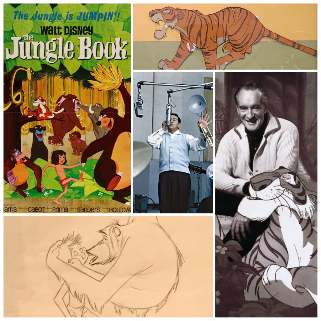
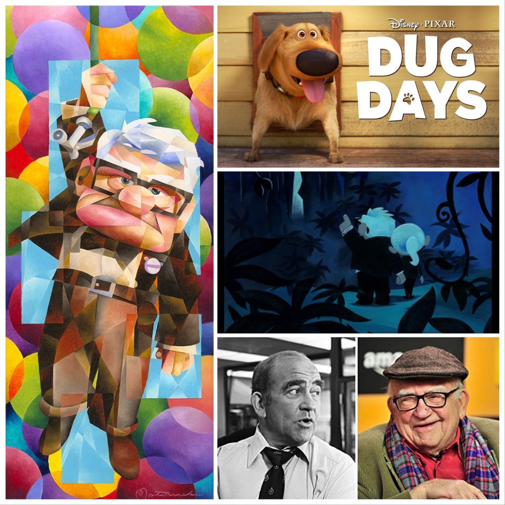
Watching The Jungle Book in the last few days to find screen caps for our new production cels and concept art, I am once again drawn to George Sanders. Shere Khan is by no means my favorite character in the movie. That honor is shared by Bagheera and King Louie. Even in animation, Sanders is magnetic, stealing his scenes just as he did in every live action film he was ever in. In his Oscar-winning role as critic Addison DeWitt in All About Eve, he has Marilyn Monroe on his arm, and your eyes still follow Sanders. Speaking as one of his legion of fans, we are indebted to fellow thespian Greer Garson, who had been a secretary working at the same advertising agency as Sanders. She’s the one who suggested he could have a successful acting career. If you love George Sanders as much as I do, you’ll enjoy knowing he also tried his hand at singing and songwriting. Here he is singing a song from his 1958 album The George Sanders Touch: Songs for the Lovely Lady:
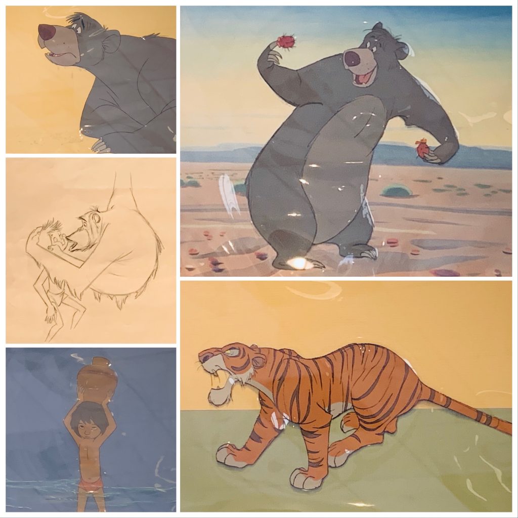
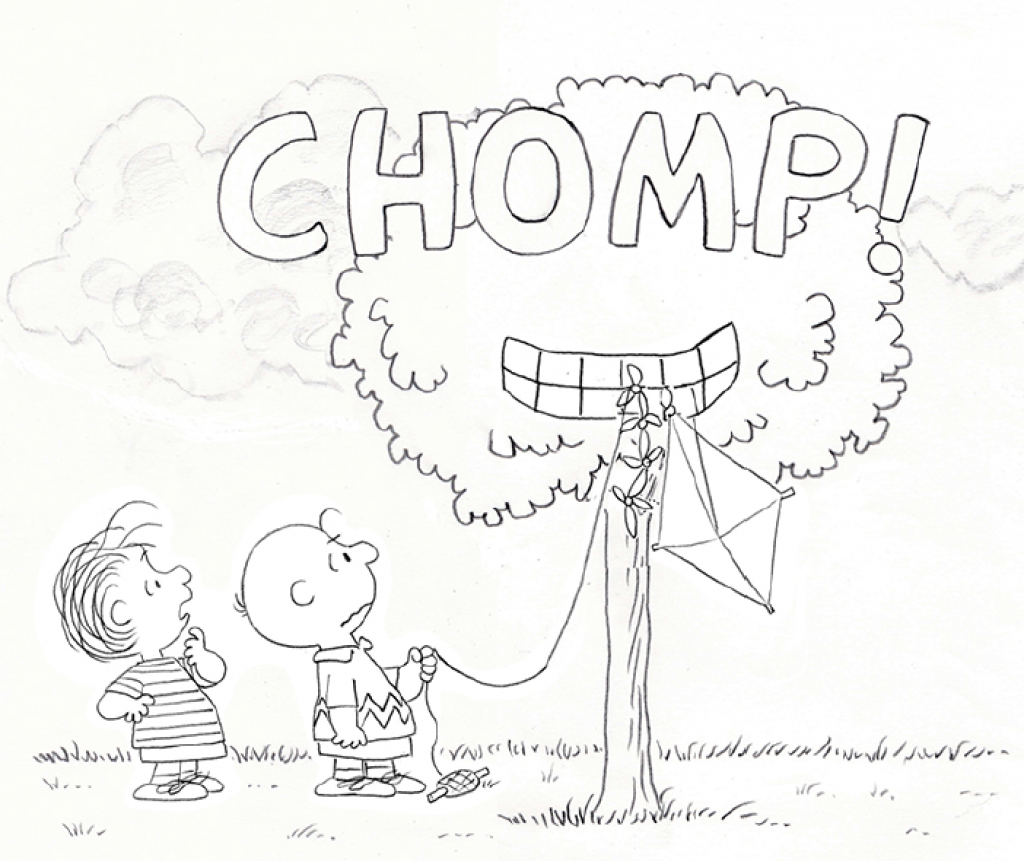
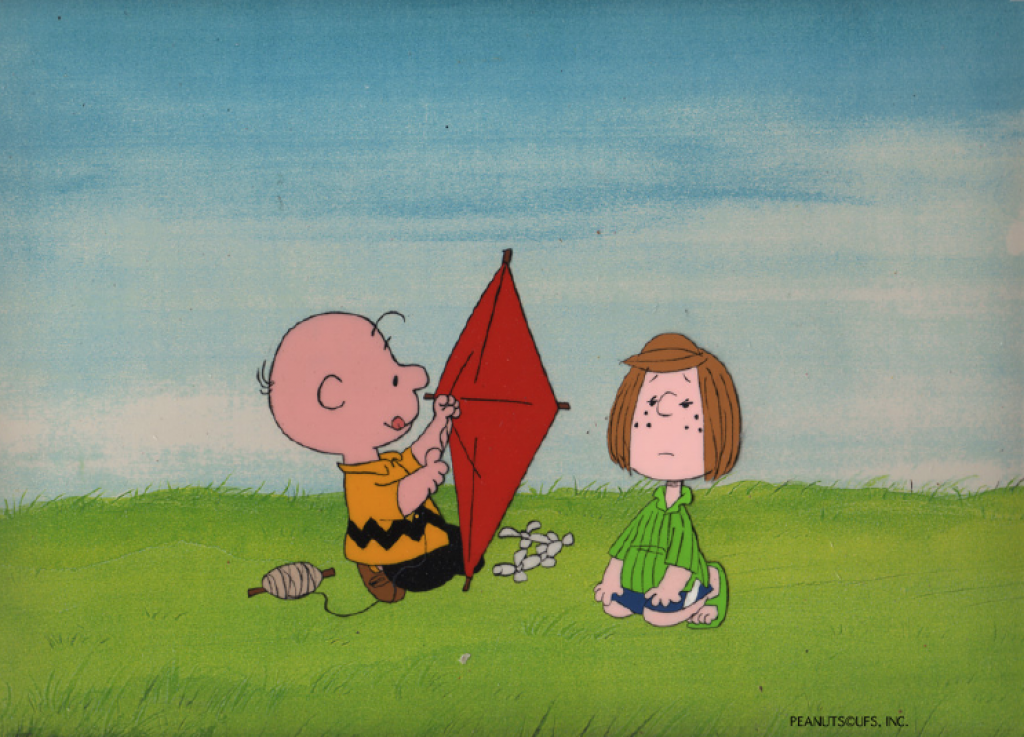
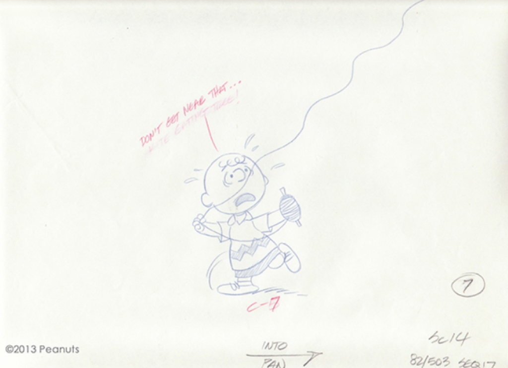
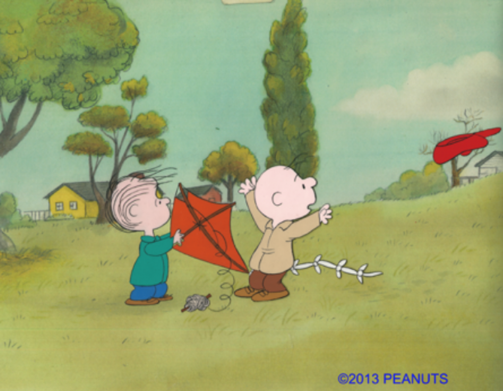
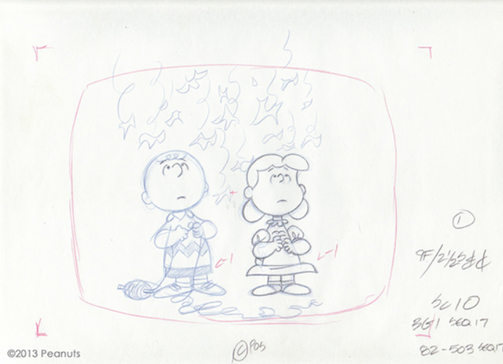
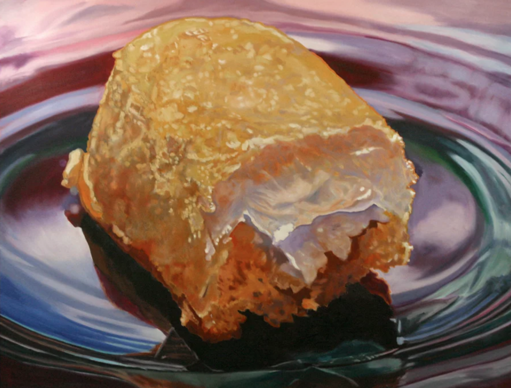
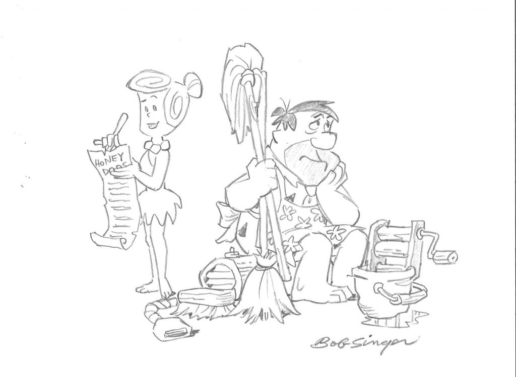
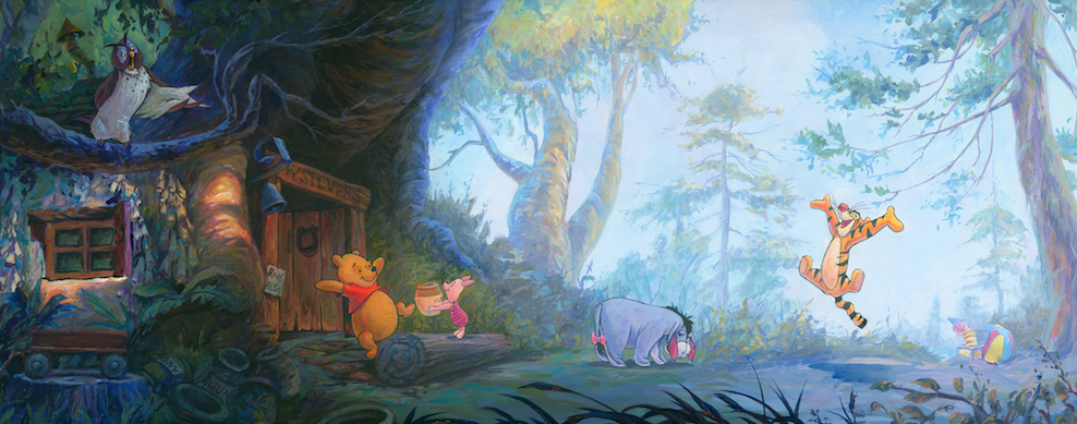
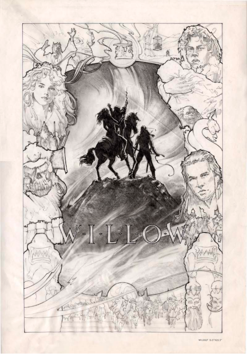
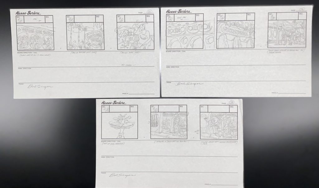
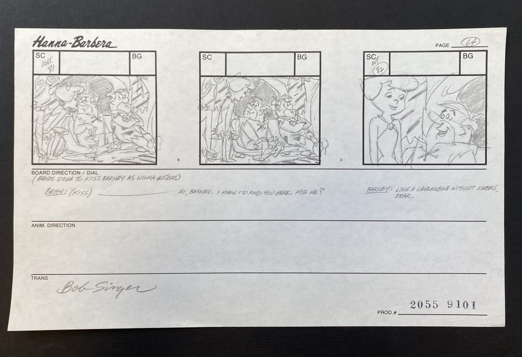
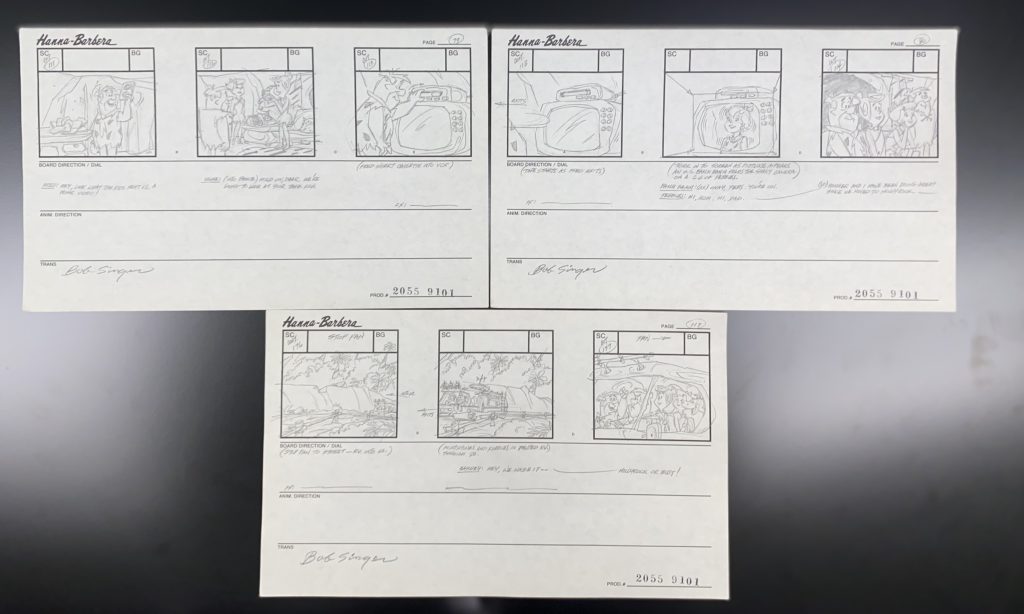
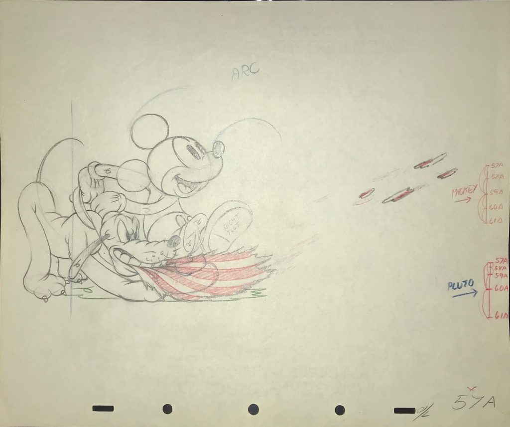
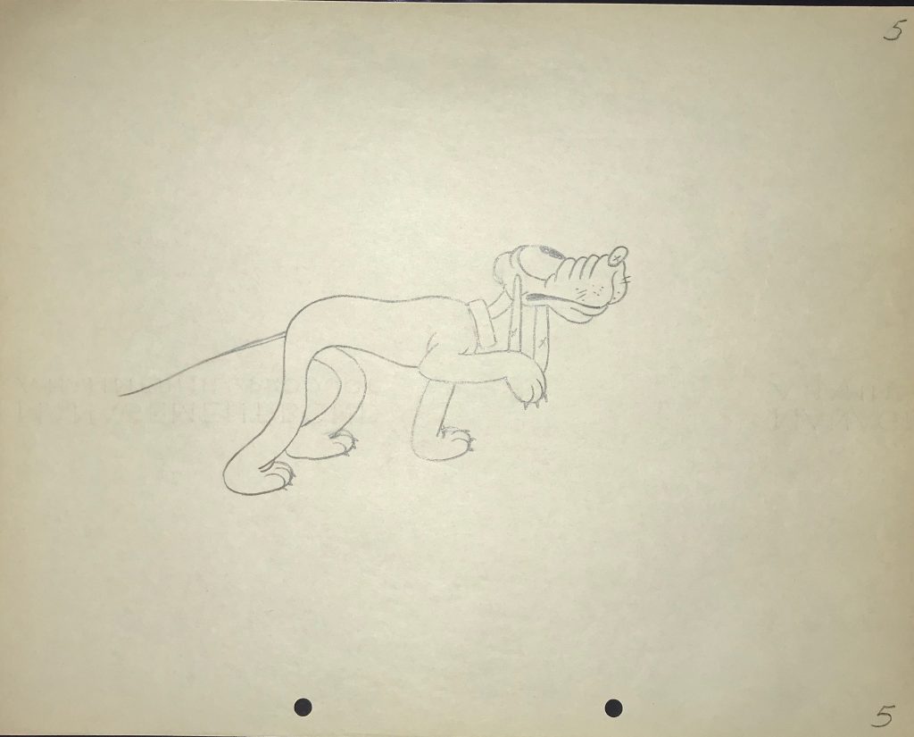
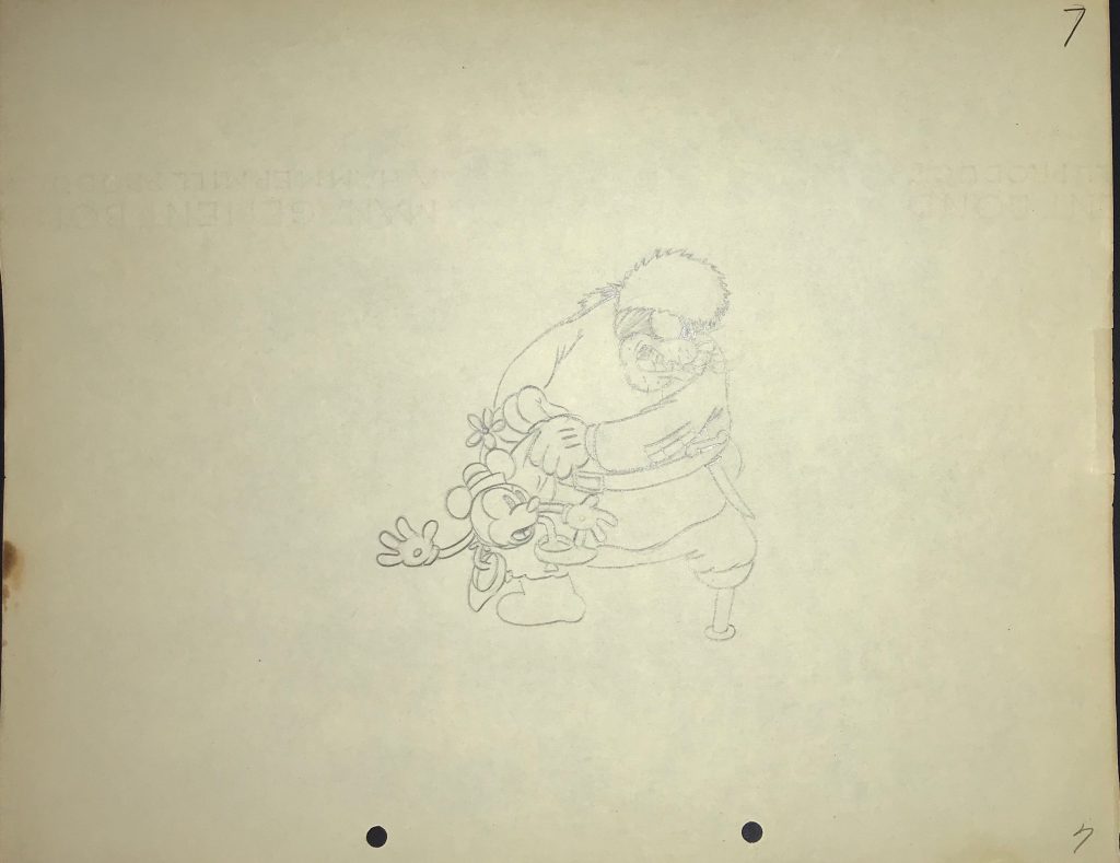
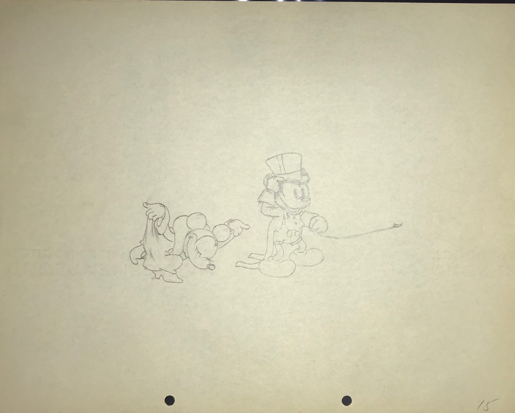
I was so excited to get some Jungle Book original production cels that hadn’t been restored and were in good condition! Most production cels from the film were sold as Disneyland mat setups, that is, they were sold at the art corner at Disney back when the movie was released, and so they are all stuck to their backgrounds. It’s inherent to the era. I think no one should restore Jungle Book production cels unless they are so damaged they can’t be enjoyed as they are. This is rarely the case for Disneyland mat setups, so I do wish dealers would just leave them alone. Isn’t it better to have the entirety of the art intact as photographed in the making of the movie? Anyway, here are the Jungle Book production cels we just got in, which, along with the realization that Jungle Book turns 55 this year (!!) inspired this blog:
10 THING YOU MIGHT NOT KNOW ABOUT DISNEY’S THE JUNGLE BOOK
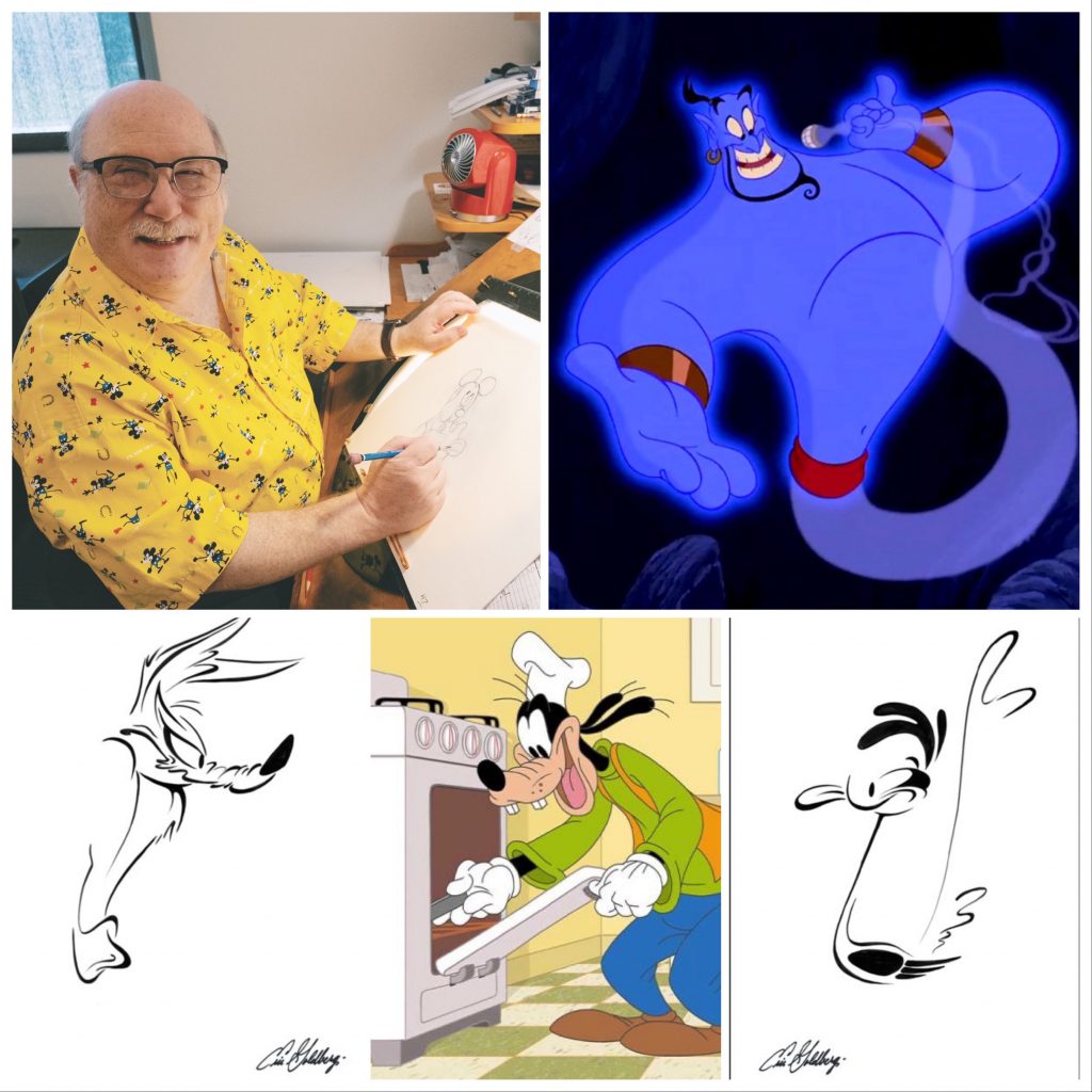
1 – With Shere Khan, George Sanders became the first Academy Award-winning actor to voice a Disney character. He had become friends with Walt after starring in 1962’s In Search of the Castaways, and got the role after Walt saw him in early concept drawings of the character.
2 – The Jungle Book was Verna Felton’s last movie. She died a little less than 2 days before Walt. Playing the elephant matriarch Winifred, Colonel Hathi’s wife, she bookended her experience with Disney studios with elephants, since her first vocal role was the elephant matriarch in Dumbo.
3 – The music for the film’s opening overture was written for the 1964 World’s Fair.
4 – The Jungle Book was rated G by the Motion Picture Association of America. It was the last Disney animated film to include the 1945 MPAA logo, and the last animated Disney film to be released during the Hays Office Code before its elimination in 1968.
5 – The Beatles were supposed to voice the vultures and sing the song That’s What Friends Are For”, but John Lennon refused. Lennon was quoted as saying: “There’s no way The Beatles are gonna sing for Mickey f*cking Mouse. You can tell Walt Disney to f*ck off. Tell him to get Elvis off his fat arse, he’s into making crap f*cking movies.” Tell us how you really feel, John!
6 – Gregory Peck, the president of the Academy at the time, lobbied heavily for The Jungle Book to be nominated for Best Picture, as well as the inclusion of animated features for consideration in Best Picture nominations. It didn’t happen, and he resigned over it. (Go Gregory!)
7 – Legendary story artist Bill Peet was originally the one who suggested The Jungle Book to Walt as an animated feature. Peet actually created the character of King Louie, who wasn’t in the original stories. His version of the story followed the dark tone of Kipling’s book. Walt insisted on script changes, and Peet refused. Dramatic and intense arguing ensued, leading to Peet quitting Disney altogether in January 1964.
8 – The Bare Necessities, the only song in the movie not written by The Sherman Brothers, was nominated for an Oscar, but lost to “Talk to the Animals” from Doctor Doolittle, “sung” (or spoken, really) by Rex Harrison. Rex Harrison never did voice acting, but Friz Freleng tried to hire him to voice Pink Panther. He demured, and Rich Little was hired to do an impression of him for two cartoons, 1965’s Sink Pink and Pink Ice.
9 – Louis Armstrong was the first choice to voice King Louie. Phil Harris, the voice of Baloo, improvised most of his lines. All the scatting by both Harris and Louis Prima was entirely improvised during recording sessions.
10 – The wolf cubs in The Jungle Book are all based on the puppies from 101 Dalmatians.
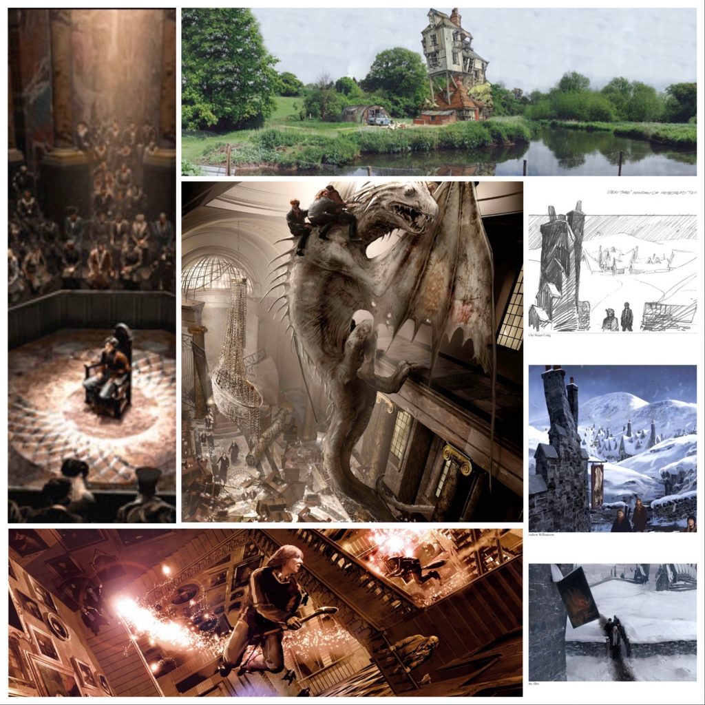
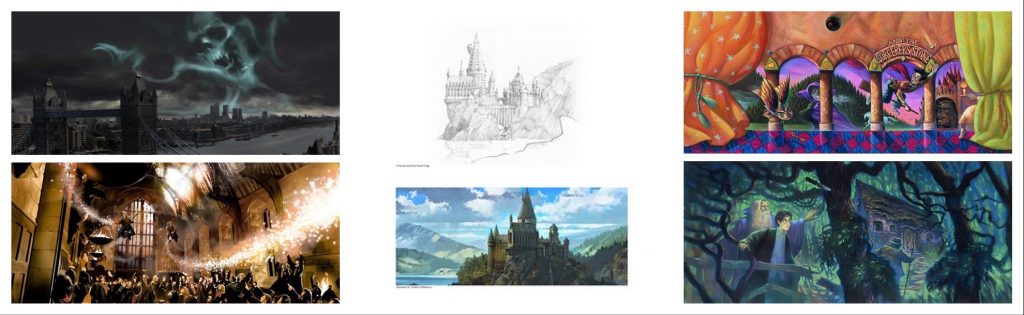
In the just-released HBO Max releasing Harry Potter 20th Anniversary: A Return to Hogwarts, Harry Potter film franchise production designer Stuart Craig is mentioned and called up fondly by a number of cast members. For good reason! Apart from the cast, Stuart Craig, who worked on the entire series, is one of the players that kept the continuity and look of the films consistent from beginning to end. A 3-time Oscar winner for Gandhi, Dangerous Liaisons, and The English Patient, Craig has been in the film business since he started in 1967 on Casino Royale as an assistant, bringing tea, running errands, and studiously avoiding Peter Sellers. Needless to say, I’ve loved having Stuart Craig Harry Potter art in the gallery.
He was hired from the very beginning of the Harry Potter series, designing the look of Hogwarts and the extended world of the boy who lived, interpreting and bringing to life the spaces and environments as written by JK Rowling.
Now here we are, 20 years after the first film’s release, and Warner Brothers celebrated by releasing a new documentary featuring all the major players from the film (though sadly missing Alan Rickman, Richard Griffiths, and Richard Harris, and Helen McCrory, among other cast and crew no longer with us). Neither Stuart nor any other below-the-line artist was interviewed, but that doesn’t diminish the importance of their contributions to these magical movies.
One of the subjects around the reunion that created controversy was whether it would include Rowling herself. In recent years she has, to put it mildly, put repeatedly her foot in her mouth on social media by clearly being trans-exclusionary. You can read all about it HERE. Ultimately, they used about 2 minutes (out of 2 hours) of footage from 2019. This brings us to why my post is titled “last available Harry Potter art”.
Since the books were released, I’ve been a champion of Harry Potter art. I’ve even been a panelist on several Harry Potter fandom panels at San Diego Comic-Con! (Here’s one video of us talking HP from 10 years ago, and yes, that IS a pre-Glee, shaggy-haired Darren Criss sitting next to me!)
I have definitely sold more Mary GrandPre and Harry Potter concept art than anyone else. I even got to release two exclusive limited editions. Regardless of how much of a fan of the art, the books, and the movies I might be, when Rowling started her row with the world about what is and isn’t male and female, and why, I had to reconsider my stock, and think about whether I wanted to put another penny into her pockets. The answer was no. At the time, I was well-stocked with official limited edition art from Harry Potter, both the books and the movies. Though until now I’ve done it below the radar, I slowly sold off what was available through ArtInsights, and vowed to myself I would stop selling the art when all the Harry Potter art in my current inventory was gone.
Should one of the artists I know who worked on the films and has original art comes to me, I’ll still be willing and able to promote and find great homes for their art, but the days of supporting the limited edition market are over, but for the last remaining pieces I have, which are all pieces I’d put aside by Stuart Craig, many of which are Artists Proofs.
So: If you’re interested in the movies, and love the characters and the movies as much as I do, check out all the Stuart Craig Harry Potter art HERE.
A large part of why I fell in love with the Harry Potter movies was the look and feel of them, and that’s entirely to the credit of Stuart Craig.
I interviewed Stuart in 2011, before the release of the last Harry Potter movie. I spoke to him about how he got started, artist’s block, his inspirations, and advice for aspiring production designers, among other things. You can listen to it on the video below, or scroll down to read the transcript.
Stuart Craig interview transcript
Leslie Combemale:
So, how did you get started? What led you to becoming a production designer? Did you love movies as a child?
Stuart Craig:
It wasn’t movies, specifically. When I was in school in my hometown, there was a tradition of doing musical operettas, Gilbert and Sullivan particularly. I wasn’t a great academic student and I was always, you know, hanging around the art room. My mother discovered quite late on in her life that she had a talent for painting. She was 65. Anyway, there was a Gilbert Sullivan thing, and I was painting scenery, painting the stone wall of the Tower of London, and somebody behind me admired it, and, I was totally surprised, really, that I created any interest at all from anybody else, and that was a little trigger. Later on in my school life, I did some amateur theater work painting scenery for two complimentary tickets a week. There were two theaters in my hometown, and I work in both of them. At the same time, I pursued my art, went to the local art school, then went to a London art school, and did work in London theater. My day work was as a student at London art school. As art school students do here, at the end of my course, I looked for a kind of postgraduate course, and the Royal College here in London had a course in film design. I thought, ‘well, I can maximize my chances of getting in here just using my theater experience.’ So that was it. I was being pragmatic, really, in going to film school thought that is the way to develop the experience I have possibly, even a way to have a slightly better paid career, so that’s what I did, and it was film forevermore after that, really. When I left the Royal College, I got a job on the first Casino Royale film, the one with everybody in it. Peter Sellers, David Niven, Woody Allen, I don’t know if you’ve ever heard of it.
LC:
I think I’ve seen almost everything you’ve ever done, with the exception of Saturn City that I have not seen.
SC:
As a quick introductory course to film technique, it was pretty good. I have to say it couldn’t be better, in fact.
LC:
You were doing art direction for that?
SC:
No, I was very, very junior. I made the blueprints and made the tea. There’s very much a tradition of that in the movie industry, that you start in one of these junior positions, and serve an apprenticeship, and then you kind of work your way up.
LC:
Making tea for Peter Sellers, that’s kind of entertaining though.
SC:
I didn’t dare go anywhere near Peter Sellers. I was making the tea for the art directors and the guys in the art department.
LC:
So then from there, you got involved in terms of working with Richard Attenborough?
SC:
Yeah. Well, I served in quite a lot of apprenticeships, for about 12 years. From that tea boy to draftsman to art director was about a 12 year process. I worked for RIchard Attenborough actually on Gandhi in that period, but it was one of those false starts that he had. I mean, he tried to make that movie for 20 years. We set up an art department, and did some work. I was working for another designer called Michael Stringer at that stage. It fell through, it didn’t happen, so I went on, did other things, and then eventually, 12 years later got to design the first film of my own. I think either the second or third film I did was Ghandi, which was huge for one so green and comparetively new as a designer, That was a big challenge.
LC:
When you got the job of doing Gandhi, did you feel like you had built up enough knowledge and experience that you felt like you were ready for it? Or did it feel just enormous at the time?
SC:
Over my 12 year apprenticeship, I did begin, towards the end, to think ‘I can do this’, so was ready for it in that sense. I was also smart enough to choose two very, very good art directors to go with me, both of whom were older than I, and had more experience than I had. Looking back on it it was a pretty smart move.
LC:
What’s your take on the way you use color? Because for instance, in The Elephant Man, I see a lot of shadow and light, and almost using your gray tones as color. But then you also do definitely use color almost as a character in your movies.
SC:
I think that’s true. I think there’s a tradition here in England, maybe here more than in America, or certainly more than in California, of kind of limiting the palette. Maybe it’s because we live in a gray, rainy place. You know, our sensibility is just different. But with Stephanie McMillan, the decorator, I consult all the time on matters of color. We do have this technique of limiting the palette, very, very severely, so that the subtlest of color changes register quite strongly. I also do love, obviously, to have built sets with potential for dark shadows, and consider initially each set as something abstract, and as a piece of sculpture, literally, pieces of abstract sculpture, with a lot of thought given to how it might be lit. Now obviously, it’s a communal activity, and I need to talk to the director of photography about that. So I have tried, as well as consulting with the director right off, then the cinematographer as soon as they are available, becomes an essential part of the plan.
LC:
You start out with a limited palette and then you add color based on what calls for it and where it makes sense?
SC:
Well, certainly in Hogwarts, almost every color is muted, or has a lot of gray. So we work in sort of gray greens, gray ochre, and it’s limited in that way. Occasionally, you might go for sharp color, or go for reflective color. In the Harry Potter films, we’ve used a lot of gold leaf, or actually brass leaf, because gold is fairly expensive. We’ve used brass leaf but it gives it a kick, and it has a quality that gold spray paint could never have.
LC:
So even if you pull out all the color, you’re still going to get a slap of color by using the brass?
SC:
Yes. But it’s more for its reflective qualities than for yellow gold color. Well, I guess it’s a combination of both.
LC:
So it’s playing with light as well as color.
SC:
Yes, exactly.
LC:
When you’re doing all of these projects, you’ve got the the producer and the director, and then in the case of Harry Potter, you’ve got the author, how does the involvement work? Who gets called in first? And how do you figure out the process and the collaboration with all those people together?
SC:
There was a promise made by David Heyman, the producer, to JK Rowling, that we would be faithful to the spirit of the books, but she understood that we could never include everything. There had to be huge omissions. And I think she was very brave in allowing the films to be their own separate entity. She quite accepted from the beginning that books and movies could be separate, and so we consulted her initially. She literally gave me a map of Hogwarts, a map of the world. She did the drawing over the first meeting in a hotel lobby, and that became a massive aid or a starting point from her. We consulted her throughout the series when there were questions. As to the director/producer relationship, the designer would always address the director first, and have an initial conversation to understand his priorities, and then I would prepare a sketch or model in the art department, and go back to him and show it, and then at that stage, maybe introduce the producers to the idea, so that they were up to speed on what was happening. But it’s really that dialogue between the director and the designer, which is essential and you follow that path wherever it leads.
LC:
This is after the script has been written, and you’re reading over the script. Do you go back, whether it’s Harry Potter or some of the other movies you’ve worked on that are based on books as well, or novels, do you read the novels over and over so that you get a sense of some of the elements in the novels, or do you try to stick strictly to the script that’s written in the screenplay?
SC:
I think the background information is important as well. Quite early on the Harry Potter books were issued as spoken books on CDs, so that helped. I would read the novel, and then listen to it in the car on the way to the studio several times.
LC:
Stephen Fry’s version of Harry Potter?
SC:
Yes! It’s essential, and not just that and reading the novels, but then there’s a researcher, Celia Barnett, who worked with us on all the films, and I find that process important too. She was researching things like medieval clock mechanisms, because in the Prisoner of Azkaban this clock is important. She would research medieval architecture, and the tapestries in the common room. Celia found the tapestry for the Gryffindor common room, those bright red tapestries, from a museum in Cluny, in Paris.
LC:
In terms of the Harry Potter movies, has there been something where you’ve done everything and it’s been filmed, and then you look at it and you realize it just doesn’t quite have what you’re after, and you have to go back and change something?
SC:
One big thing. In the beginning, the Sorcerer’s Stone or the Philosopher’s Stone, we were obliged to use existing locations quite a lot, because we didn’t have the time or the money to build the entire world. When we then cut to a big exterior of Hogwarts, those are real places, like Gloucester Cathedral, Durham Cathedral, and Christ Church College at Oxford, all had to be incorporated into the complex which was Hogwarts School. This gave, I must say, a not a very satisfying silhouette, and I was at pains in subsequent movies. Fortunately, the script made different demands anyway, and required different geography. You know, if we had had all seven books from the beginning, then certainly those early decisions would not have been made or those early choices of location, because they didn’t fit with the action in later books. But anyway, we didn’t have that. So we used bits of cathedrals, and bits of Christ Church college. Then, when obliged to make those changes in subsequent movies, I did use take that opportunity to improve the silhouette of Hogwarts, just to make it more magical. It was confused. Although it was always huge and complicated, it did progressively get more elegant. Nobody seemed to mind, they seem to expect that it was just part of a magical world.
LC:
I would imagine, though, not having all of the books at once was a source of excitement for you, since you have worked on all of them.
SC:
Absolutely
LC:
What would you say in the last book were a couple of the elements that you were really excited about getting an opportunity to express visually?
SC:
Absolutely. I mean, the ministry suddenly appeared, and that was a huge challenge. Every book produced something new. In the last book, the seventh book, which we split, as you know, into two two movies, the challenge of the first part is that we don’t go to Hogwarts at all. The entire film takes place with the kids on the run from Voldemort. The ministry has turned bad, and they’re hunted, and on the run, so it’s a series of locations, physical locations, and sometimes built sets. There’s a frozen forest with a frozen pool, and the sort of gryffindor at the bottom of the frozen lake. That’s a set on a soundstage here in London, which has to be integrated with a bit of real forest that proceeds it. So, that was a challenge there. Something we were quite unfamiliar with really was traveling to distant locations for landscapes. Specifically. In part two, the great challenge is the destruction of Hogwarts. And you don’t just knock holes in what you’ve got, you really have to consider that as a new set. And again, this all important idea of strong profiles making strong images.
LC:
and all that fire, and the light coming through, and all these big sections of the castle that are knocked down.
SC:
The sun rising behind the smoke, all those considerations. But as I say, the big big challenge was these massive remains of destroyed walls, the entrance hall, the front of the Great Hall, part of the roof of the Great Hall, completely gone. So, yeah, a big challenge, and an enjoyable one, too, really. Maybe it helped help me and the guys in the other departments prepare for the end. We we demolished it before we had to strike it completely.
LC:
That might have been good catharsis. When I think about the two last movies, I was trying to imagine what would be really fun to design. The Lovegood house, and the wedding, and then at the beginning at the manor with the body hanging.
SC:
I think you’re right. Malfoy Manor is a very strong architectural set. The exterior is based on an Elizabethan house here In this country called Hardwick Hall, and it has massive windows and these windows are kind of blinded out, the shadows are drawn, and so they’re like blind windows, which have a real kind of ominous presence. So that gave us the basis of a good exterior. There’s an extraordinary magical roof added and surrounded by forest, which isn’t there in reality, but again, this is one of our devices to make it more threatening, more mysterious. Tthen the interior, two floors, two sets on stages, very, very muscular architecture, very strong architectural form. So that was great to get into that. The Lovegood house is a tower. JK Rowling says it’s a black tower in an empty landscape. That’s exactly what it is. But we took great care over the sculptural shape of that tower.
LC:
The interior is fantastic.
SC:
Luna and her father certainly both have eccentric interests. We asked Luna, Evanna the actress who played her, to actually help us with this, that she would have painted or decorated the interior with, like decorations on the wall murals.
LC:
Evanna painted for you?
SC:
She proved herself very good at this in Harry Potter six, where she wore the lions mask, or the lion headdress. She designed that, and so we thought, ‘ha! we’ll harness this ability again, this talent again, and ask her to do these wall paintings, and so she did designs for them which we then reproduced.
LC:
And Xenophilius Lovegood is new to that movie, right? So it’s exciting to be able to create the world of a new character.
SC:
Exactly. And he prints with his printing press, and one floor of this black tower is entirely consumed with his printing operation for The Quibbler, the magical world magazine. The press was good, and all that printing apparatus was great fun for Stephanie, the set decorator.
LC:
Did you make all of the furniture in curves?
SC:
Not exactly. There is a sort of spiral staircase, and some sort of fitted bits are made to fit the curved walls, but it’s it’s eccentricly furnished.
LC:
One really interesting aspect of the film is juxtaposing the wedding against the beginning of the movie, with its sharp contrasts and the dark and the shadows. There’s this little joyful moment in the book that takes place at the wedding, which is beautiful, and there’s a lot of light. And so how did you work that contrast?
SC:
We decided with the wedding that the wedding reception, as they often are, should be in a tent or a marquee, and that marquee should sit in this flat, marshy, weedy landscape outside the Weasley house. The big question was, do I make it the same, an extension of the Weasley house with the same kind of eccentricity, the same kind of rather amateurish, homemade feeling about everything, or do we do something different? Well, obviously the fun thing is doing something different. Since Bill Weasley was marrying Fleur Delacourt, we could say that her parents had a big influence on this wedding. In fact, that Monsieur Delacourt would probably pay for it as the father of the bride. That permitted us a French influence, and so we really went for that. There’s a soft, very refined interior, painted silk the tent is lined with, there are floating candles in little French 18th century candelabra, and so the whole thing has a very elegant and quite un-Weasly look about it.
LC:
How much would you say of your own artistic aesthetic gets put into the work that you do, specifically Harry Potter, because that’s what we’re talking about right now, but also on the whole?
SC:
I think in different categories, there’s probably a different answer. Everything architectural, I have a great deal of, not just control of, but it is what I’m passionate about, and reflects my interests and input. Along with Stephanie McMillan, the set decorator that we’ve already mentioned, we’ve worked together as a team for a long time now, since Richard Attenborough’s Chaplin, I think was the first time. So there’s already understanding that of the architectural part and the decoration of that thereafter. There are a team of concept artists working in the art department with me. Two and three of them sometimes were concerned exclusively with creatures, a lot of magical creatures in Harry Potter, like Thestrals and Hippogriffs. so, these guys, Rob Bliss, they have a fantastic facility for designing anatomically correct and credible, but extraordinary magical creatures. In the case of creatures, I am the facilitator, you know, as you say, the head of the department that in which they work, but it’s their creative input that that gets us there. They draw absolutely spectacularly well, you know, they draw like Raphael like Leonardo, they do. So, beautiful drawing. There’s another illustrator who is Andrew Williamson, an architecteral illustrator. I will do a rough doodle of a set the Lovegood House or the Malfoy Manor, and we’ll also do a plan and an elevation, quite a rough preliminary one, but nonetheless to scale, because I love to think I imagine it from with dealing with real dimensions right from the beginning, knowing exactly how big it is and exactly the size of one thing against another. And I give those early pencil sketches and plan and elevation to Andrew, he will then build a digital model in the computer and together we will spin it, walk through it, choose an angle, and say ‘okay, that it’, and render or illustrate that. Over the 10 year period, he started with pencil drawings and watercolor washes, but you know, technology has changed so fast. He does these amazing renderings which become so well finished that you can barely tell them apart from from stills directly from the movie. You can mistake some of these concept sketches for shots from the movie.
LC:
Does he still create analog art after you’ve gone through and seen all of these digital images? Or is it pretty much all inside the computer?
SC:
It’s all inside a computer now.
LC:
When did that switch completely?
SC:
It didn’t switch suddenly. In the beginning, he would take my things and then apply a pencil drawing to watercolor paper and put watercolor washes on it. Then, having gotten a computer, there was a period in the middle, where he would make the drawing on the computer, print it out onto watercolor paper and still do the sort of the washes. and then took the big leap and then the whole thing was on the computer. Also, I think, what Andrew took from us, and from the movie tradition of art director sketches, designer sketches, the idea of lighting, he came from architectural practice, helped architects do these overviews of architectural schemes, but the lighting in those traditionally is fairly bland, whereas lighting on movie sets is often dramatic and spectacular. And you see, from the first film to the last film, the lighting in these concept sketches has changed enormously, and has gotten much stronger and better and more exciting.
LC:
Do you as a film goer or somebody who appreciates movies, are there some in particular that you go back to just in terms of being a fan and using them as inspiration?
SC:
I have design heroes like Ferdinando Scarfiotti, he worked for Bertolucci. I think Scarfiotti was certainly the best designer of my generation. He died tragically young and didn’t get to do so much, but that Italian classicism that he was born with, and it was in his blood. He just had such a facility for doing things beautifully and elegantly.
LC:
Is there a particular movie that you love the most of his?
SC:
The Sheltering Sky is beautiful, and The last emperor. There’s a quirky movie called Toys, which he did to Barry Levinson, which wasn’t a successful movie, but it was very beautifully designed.
LC:
That’s a little bit like the beginning of the series with Harry Potter underneath the stairs. Those shots are really tight.
SC:
There’s a great American designer Dean Tavoularis, who worked for Francis Ford Coppola. Tavoularis has as a kind of great classical way of doing things and has a great eye and he’s all about making pictures, making sculptures, and he’s another hero of mine. There’s a movie about Las Vegas, that Coppola did. He took over a studio in Hollywood called Zoetrope, and I was working in a building, in an empty shop, next to Zoetrope, preparing for a film with Mel Brooks, and Tavoularis was working, and I remember walking onto one of their stages one day, and just seeing that he was using the most theatrical techniques, I mean, painted ground rows, painted backing, forced perspective, all these things which I tried to do in my work, but he is certainly a master of that. I remember that and taking encouragement from that. Okay, if you can do, perhaps I can do that.
LC:
I was just going ask you about that Kings Cross Station scene at the end of the movie. Did you have to think about that for a while? Sometimes when you’re creating a scene or a part of the movie, do you have to sit on it for a while and think about it?
SC:
Absolutely that. I think flashes of inspiration for me are quite hard to come by. I often sit in front of a blank sheet of paper and struggle and struggle and use the eraser a lot, but eventually something will form. Something like that is a very difficult concept. I mean, you’re talking about the thing with Harry between life and death?
LC:
At least in the book, there’s not a lot of direction in terms of how this scene is meant to look.
SC:
It was quite a protracted process, really. But we did experiment. W had the sense of it e being very burnt out. We experimented with underlit floors, and with different kinds of white coverings, white paint, and white fabric. The cameraman was involved. We needed to figure out how much to over expose it, so a series of camera tests were done. So we got there, but with a great deal of preparation and research.
LC:
Did it take way longer than any other scene to work out?
SC:
Given that the end result was really a very simple set, a very simple white platform surrounded by whiteboards, and there’ll be some visual effects enhancement there, the architecture will be put in, but there was there was a sketch that Andrew and I prepared, which became the kind of template, and after that, all these materials were experimented with.
LC:
And you just were touching on a little bit, but do you get a form of artists block?
SC:
Is it hard to take yourself to the drawing table and sit in front of a white sheet of paper. It’s really hard to do that. But what I’ve learned over the years is, once I do it, something will come. It will, and it always has, and I pray that he always well. You can get an idea in your head, and just the act of making marks, and then the marks become very simple forms, and the simple forms become architecture. And then the architecture has a texture, has an antiquity, is lined with book,s or is lined with paintings. The initial one or two stages are the important ones that get you going, and then the thing starts to flow faster.
LC:
Do you recall any particular flash of inspiration?
SC:
I think Picasso, and there was a famous Hollywood designer John DeCuir, certain very, very lucky people can see an image in their head complete, fully formed, fully rendered fully colored. And all they have to do is just reproduce this picture in their head. I think that’s a very rare talent. And I don’t have it at all. John DeCuir, by the way, is legendary for taking plane trips, and setting off with a sheaf of letter sizede regular paper, and he would sit on the plane, and he would start drawing in the top left hand corner, and work his way down to the bottom right hand corner, and take the next sheet of paper, start in the top left hand corner, and draw down to the bottom right, and would step off the plane with maybe 12 small sheets of paper, walk into his art department in the studio, give it to the junior assistant and say, ‘stick those together’, having made the most wonderful pencil drawing of this big panoramic scene, and all the 12 images fit together beautifully. I’m sure that’s exaggerated, but essentially, true, what he was what he was able to do.
LC:
If you get to the same place, it doesn’t matter whether it’s a flash of inspiration, or it takes sitting at a blank sheet of paper and building it slowly. If the end result is beautiful, it doesn’t matter which way you come from.
SC:
I think that’s true. Absolutely. I think that it is gratifying that if you work at it, it does come.
LC:
I think of production designers as being perfectionists. Do you think it can be difficult creating work that is seen over and over again, especially when in film there can be so many compromises in the process of production, and as an artist there’s often something that in retrospect you feel you could do better or differently?
SC:
I think years ago, what was captured in camera was it. It was there forever, and you’d see that movie 20 years later, and you would see the thing you hated and it would be just as painful as when you compromised in the first place, for whatever reason. Now it’s not as painful. I think you get smarter as you get older. Fortunately, you get smarter about spotting and heading off the compromises. But also, the tools are different. Visual effects have certainly in the Harry Potter movies have such a big part to play that they are able if something does go wrong, something I regret even, they are able to change it for the better. That’s quite an expensive process. But also digital grading can make a huge difference. I would be able to say ‘I just think that wall there is just receiving too much light’ or ‘the color of that piece of furniture is particularly ugly’, Andit can be adjusted relatively easily. So technology has made that process easier. And so is now very gratifying to be able to work with the digital grader and the DP and be part of those decisions.
LC:
Do you see the sketches in the art that you do in the process of making these finished visual scenes as fine art, do you see them only as a means to an end, or do you see them as both?
SC:
I think they are just a means to an end. I think they are really part of the craft. I think somebody like Rob Bliss who designed the Thestrals, designed Dobby, is able to draw. so beautifully, that it does lift off into something slightly more sublime.
LC:
You see yours more as directions?
SC:
Mine are pencil sketches. They are sketches. I mean, I love drawing, and I love fine art drawing as opposed to architectural drawing or as well as architectural drawing. So I do, take that passion with me into the work, but these guys that sit and draw all day long and draw human anatomy, creature anatomy all day long, they start out extremely talented, and they refine their talents to such an extent the results are absolutely exquisite.
LC:
And you would add Andrew Williamson as well in that list. But you do infuse a little bit of your own artistic sensibilities in your drawings.
SC:
On two levels. I consider it initially as a piece of sculpture, as a piece of art, of architectural form, that is sculptured in an abstract kind of way, and then I’m also very keen on architecture, architectural detail, I’ve enjoyed studying it all these years, I enjoy getting it right, and it frustrates and annoys me when I see it being gotten wrong about other movies. On those two levels, I am definitely trying to put my stamp on it and, and hold on to it, too, as it goes through the process. Technical draftsman draw the blueprints, then go to the craftsmen that make it. There are several stages, in which something could go wrong, something could get changed, could get compromised. So I absolutely sit on that. And make sure that those things don’t happen.
LC:
So many film artists don’t see their work as ‘real art’. I just did an interview with the curator of the Norman Rockwell show in Washington, DC, and she was talking about the fact that Norman Rockwell never sold his art because he didn’t see it as art. He gave it away. To him it was a means to an end, because it was advertising art.
SC:
I think it isn’t quite clear cut, is it? I think because it’s storytelling, that there’s a significant difference between fine art and the kind of art we’re talking about, this art serves the purpose of the story and tells the story, this narrative art, in a way that fine art can be, but it doesn’t have to be. A fine artist can start painting and can end up anywhere. It doesn’t matter where it takes him. But these guys have to end up having told us a specific story and represent a specific place, so it is illustration as opposed to fine art in that sense. But nonetheless, they get so good at it, that I think the responses to their own work are the same as they would be for fine art, because they’re so damn good at it, and because what they do is kind of exquisite.
LC:
There’s an argument to be made that the fact they have to arrive somewhere specific, and they’re still able to imbue the work with their own beautiful skills and talent, I think that’s even more a statement of their talent, and their flexibility and creativity.
SC:
I agree. Absolutely would agree.
LC:
So what would you say to artists, new filmmakers, and people who want to do what you do for a living who are younger, and just getting into it? Do you have any advice to impart?
SC:
I could do, given an hour or two, but in a sentence or two it’s pretty difficult, isn’t it? The world is changing so fast. I think visual effects are a bigger and bigger part of modern moviemaking. I know there are a great deal of inexpensive documentaries made because video equipment so inexpensive. Hollywood films, though, by and large, are more and more driven by visual effects, and the effects themselves are becoming cheaper. It will go on doing so, and the physical set will become more expensive than the virtual one. Those guys come from a different tradition. They’re computer technicians. So I think there’s something to address there. I think designers coming up have to get a double education, and make sure that they’re equally proficient in both.
LC:
Specifically too, to not neglect or forget about the history of art, because without that, then you can be incredibly proficient on the computer, but without that kind of knowledge, then you don’t have anything to back it up.
SC:
That’s exactly it. In the 18th 19th century, any builder could build an elegant house, in that it was a tradition. He followed traditional methods, traditional aesthetic, traditional proportions, it was part of him and he grew up with it. Nowadays, there’s been a great sort of rupture in that continuity of tradition, with modernism, but also with computer programs that kind of does it for you. So now, the ordinary builder isn’t able to build an elegant home at all. Only good architects build good buildings these days, it seems to me. That, in a way can, can and is happening in the movie industry. Those guys who studied classicism and the history of painting, the history of art, if they’re not careful, they’ll kind of fall off a cliff as as technology takes over, or has already taken over. So the technicians need to get a fine art background, and designers and artists need obviously to understand the technology and maybe grow closer together and become the same department eventually.
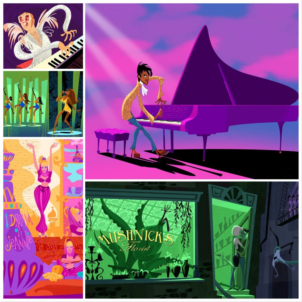
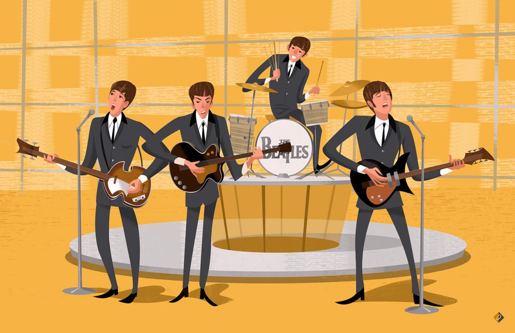
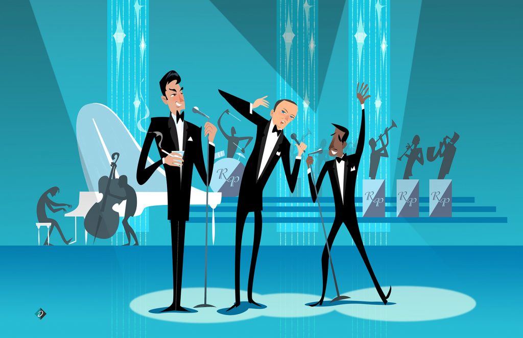
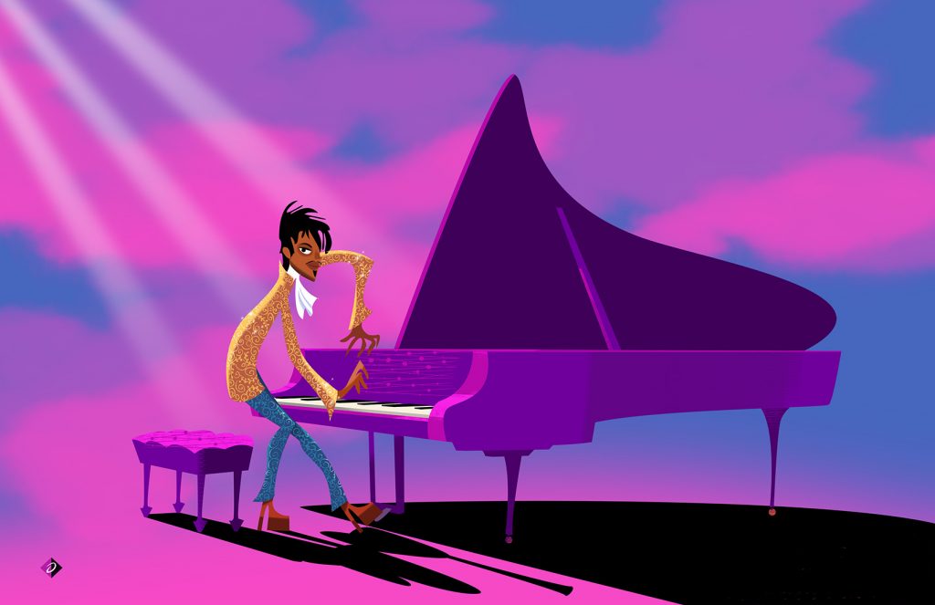
We’re incredibly excited to announce the art of Alan Bodner, which is inspired by mid-century modern design styles, is now available at ArtInsights. The first release will include limited editions featuring classic tv, great Broadway shows, and your favorite musicians from all genres. As you know, we are committed to highlighting artists that actually work in the industry. The art of Alan Bodner fits perfectly with that mandate.
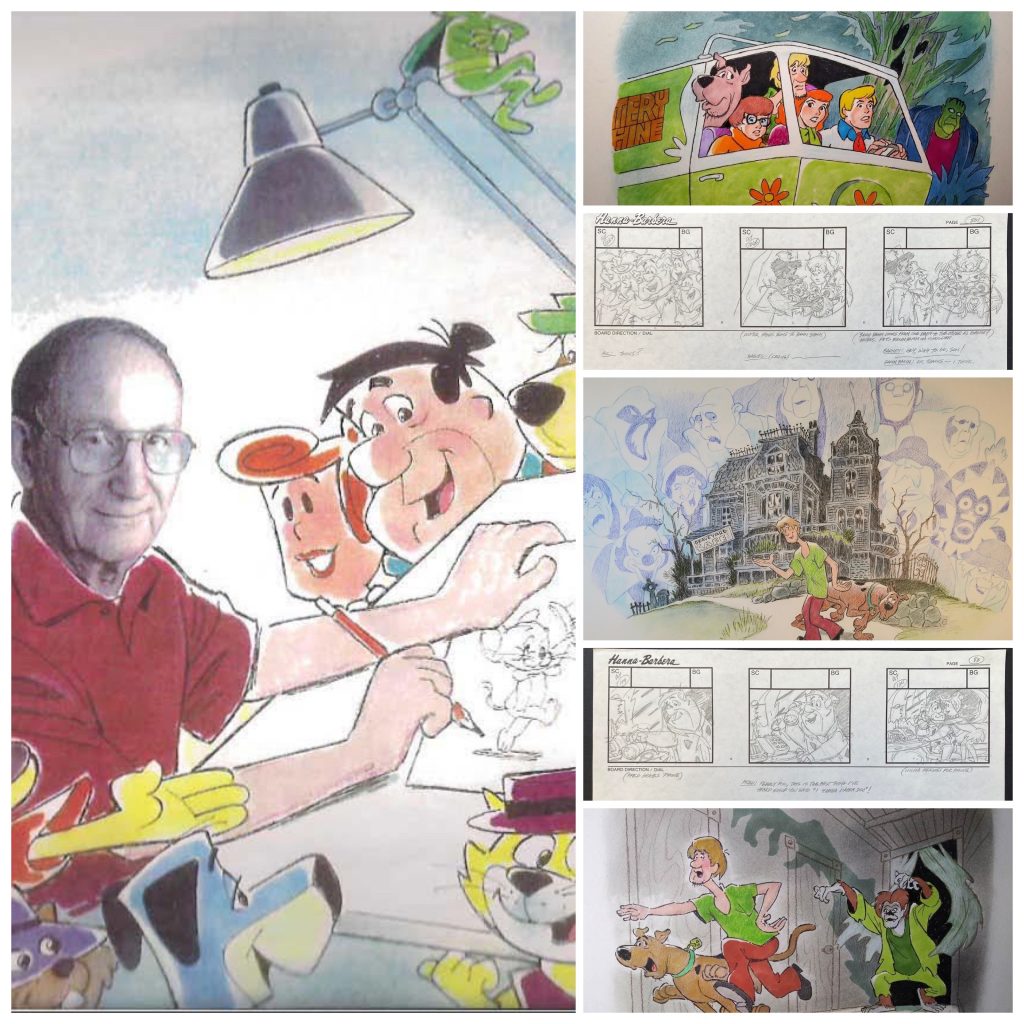
To people in the animation and film industry, Alan Bodner needs no introduction. Fans best know him as the award-winning art director of animation projects as diverse as the Bugs Bunny short Carrotblanca, the cult classic animated feature film The Iron Giant, and Disney’s popular shows Kim Possible, and Tangled: The Series, for which he won a Daytime Emmy Award. Animation insiders, however, know Bodner well. He’s been working in Hollywood since his first gig as a background artist at Filmation. He started in 1979, with The New Adventures of Mighty Mouse and Heckle and Jeckle. The Tom and Jerry Comedy Show and Fat Albert and the Cosby Kids soon followed. He was destined for success.
If kids who grew up in the 80s and 90s were to list their favorite Saturday morning cartoons, no doubt he’s worked on a significant share of them. He lent his talents as background artist to Ghostbusters, She-Ra: Princess of Power, and a slew of Looney Tunes shorts. The wonderfully wacky Daffy Duck shorts Duxorcist, Quackbusters, and The Night of the Loving Duck number among his projects. In the 90s and into the new millennium, he painted backgrounds for Garfield, Rocko’s Modern Life, The Avengers, and Phineas and Ferb, just to name a few. Proving his range and skill with a wide variety of art styles, while developing a look of his own that would be recognizable, Bodner began getting hired as art director. In that position, he could dictate and orchestrate the look and feel of entire projects.
However, it wasn’t his art direction in animation that got him the gig as art director on The Iron Giant. Bodner had been at Warner Bros. Classic Animation, working under legendary background artist Dick Thomas, when storyboard artist Harry Sabin brought his name up to Brad Bird. Though Alan showed the core team his work, he later found out it was his fine art, his abstract paintings and his use of color in them, that inspired Brad Bird to hire him, even though Bodner had never worked in feature films.
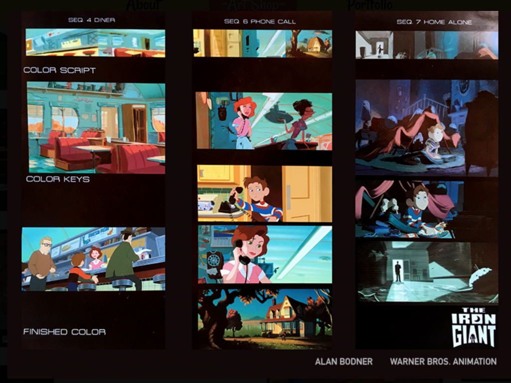
Bodner found the experience immensely educational. He says it was through that project that he learned how to create a cohesive and inspired look. He explains, “It wasn’t just about a single painting; I was really learning to understand how to tell a story through color. I think that’s what Brad imparted to me. I watched movies with him and he would point things out to me. It was like I was going through a college course in cinema. I remember taking frames of black and white films and just copying the lighting. A lot of the films were film noir, filled with mood. The challenge with The Iron Giant was to go from a happy place to a very dangerous one with the film’s color.”
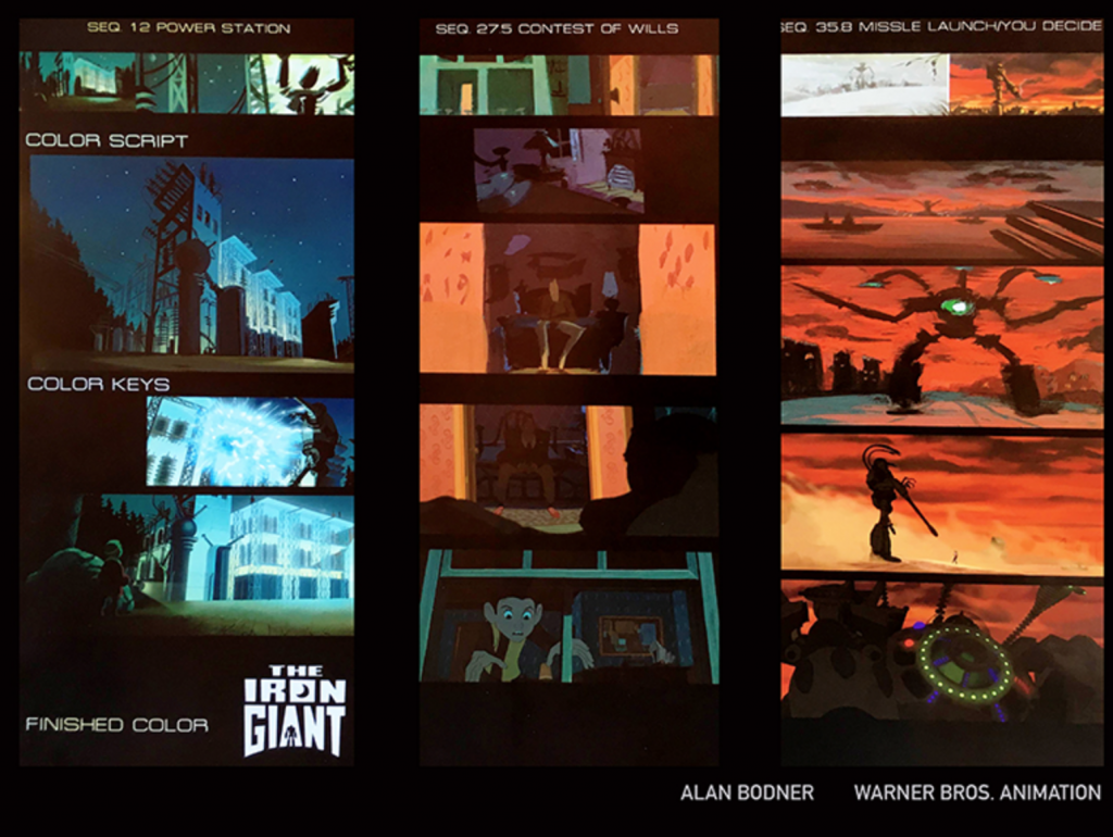
Color script, keys, and finishes by Alan Bodner for The Iron Giant, a feature for which he won an Annie Award.
Alan Bodner shows how to created emotion and feeling through color on The Iron Giant.
If you haven’t seen this wonderful, poignant, visually stunning animated feature, stop right now and get to it.
Alan continued his ascent to well-known and respected animation art director with Kim Possible in 2002 and 2003, art directing the first season, and laying the groundwork for the show’s visual palette. He went on to both create backgrounds for and art direct on Phineas and Ferb, and art direct the critically acclaimed Tangled series.
You can see Alan’s appreciation and fascination with mid-century modern design in this show, which won him a Daytime Emmy.
Most recently, he’s been art directing a new project on Disney Junior, Mickey Mouse Funhouse. It has been particularly rewarding for Bodner, because he was able to draw on his memories watching The Mickey Mouse Club as a kid when considering the styling and feel of the new show. As he told Jazz Tangcay of Variety, the bold colors used in 1951’s Alice in Wonderland were an inspiration for “Mickey the Brave”, the premiere episode of the series. You can watch Mickey Mouse Funhouse now on cable, or many of your streaming providers through Hulu + Live TV and DirecTV Stream. It’s perfect for little kids, and the colors are joyful and eye-popping.
All this background about Alan’s storied career should make it clear why we’re so exciting to be able to get art representing him for our clients. The artist has a singular style and vision that’s super fun and joyful but also harkens back to the look of the great movie poster artist Saul Bass and other famed mid-century modern masters. He himself says he has been very influenced by the art of Warner Bros. background artist Maurice Noble, and you can see how he’s expanded upon that influence and made it his own.
Here’s a review of a great book all about Maurice Noble and his impact on the history of animation.
Alan will continue to create visual worlds for Disney and other studios in the coming years, so it’s exciting to know you can get both original and limited edition art from this award-winning animation insider.
Prices and timing for commissions have not yet been ironed out, but do start thinking about what might groove you. Alan also creates some art in 3D, and those pieces are a sight to behold!
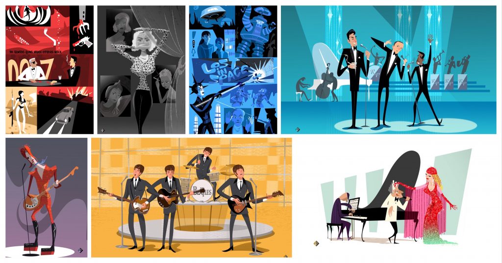
The program is starting with this first release, but there are lots of other wonderful pieces coming soon, all of which you can see on Alan Bodner’s website. That site offers the opportunities to buy other collateral products like phone cases, pillows, shower curtains, and a host of other cool doodads that you’d be buying directly from Alan, so by all means, check all out. Here’s a link to a lot of other images from classic tv, many of which will be turned into limited editions as the program catches wind. Honestly, I can’t wait for the Adams Family piece to premiere! There are lots of other categories, like music and Broadway, but I’m a Little Shop of Horrors fan from way back, so that’s my favorite for sure. His website also has more info about his career and projects. You can explore HIS WEBSITE HERE.
If the above images spark joy in your heart, contact us soon. We have low numbers for these new limiteds right now, and can deliver them quickly, but who knows how fast they’ll go? He’s pretty great, and at the very least the Rat Pack and Fab Five images will blow through and sell out soon!
Lastly, please contact us if you’ve already figured out what you might want as a commission, because we can put you on the waiting list. He still works full time with the studios, and doesn’t have unlimited time to create these beauties!
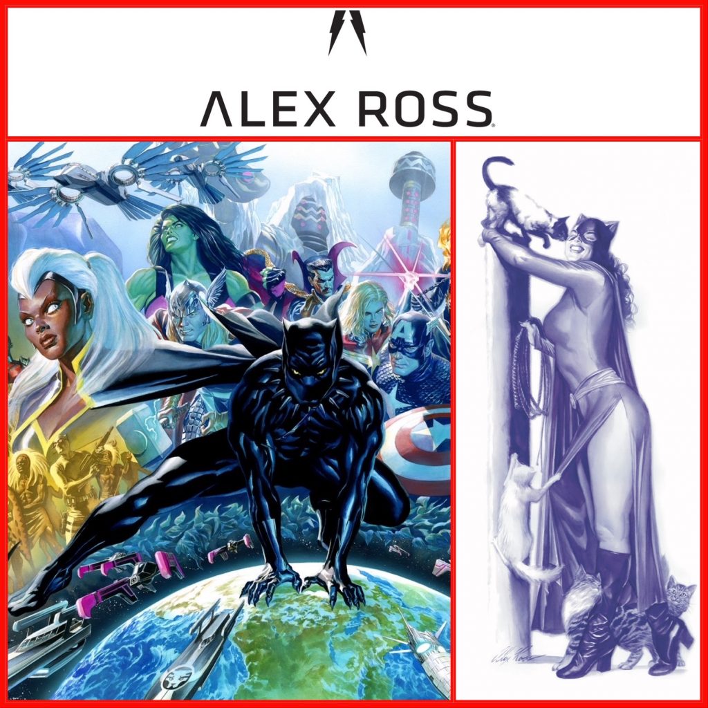
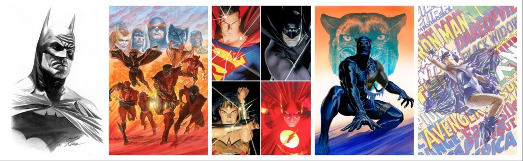
We’re so excited about our Alex Ross Black Panther and Catwoman art! On November 24th, just in time for the holidays, and perfectly timed for the official release of the new Black Panther #1 created by Oscar winner John Ridley and Juann Cabal, ArtInsights is releasing the gorgeous cover art by Alex Ross as a giclee on canvas called “Wakanda Forever“, which it’s a worldwide holiday exclusive! Also, in honor of Chadwick Boseman’s unforgettable portrayal of King T’Challa, and in the spirit of the season, $50 from each Wakanda Forever sale will be donated to the Colon Cancer Alliance.
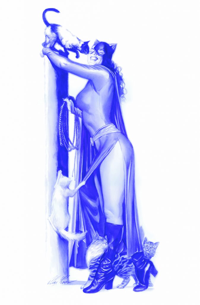
Also as a worldwide exclusive, we have a sexy, playful, and girlie-in-the-best-way image of Catwoman originally used at a variant cover for Batman #50, the wedding issue, called “Catwoman: Meow“. It comes as a giclee on paper, and shows the feline femme playing with her kittens. Wakanda Forever features T’Challa, as well as the art debut of some of the best and most powerful Black female superheroes in Marvel, including Nakia, Ayo, Shuri, Aneka, Okoye, and other members of the Dora Milaje, who are appearing in an Alex Ross art release for the first time.
Catwoman: Meow is one of the only images used as covers for Batman #50 (the infamous wedding issue) that presents Selina Kyle without Bruce, surrounded only by her feline friends. I absolutely love that, and as art, it makes a wonderful feminist statement about self sufficiency, and speaks to the power of animals to comfort and heal.
Pre-orders begin November 19th at 12am. Here are the images, which you can click on to buy the art, or for more information:
Wakanda Forever: We are so proud to have this exclusive, one of my favorite Alex Ross covers ever.Catwoman: Meow proves behind every great woman is a great cat (or four!).
Here is the official press release, which offers lots more information about the art:
ArtInsights Gallery Releases Exclusive Alex Ross Limited Edition Art
“WAKANDA FOREVER” Based on the Black Panther #1 Cover
To Coincide With First Issue Release of the New Marvel Series Written by Oscar winner John Ridley
Reston Town Center, VA – ArtInsights Animation and Film Art Gallery commemorates the new Marvel Black Panther comic series by releasing a worldwide exclusive limited edition by artist Alex Ross called Wakanda Forever based on the image used for the cover of Black Panther #1. Black Panther #1 is the first in the new Marvel comic book series written by Academy Award-winning writer John Ridley (12 Years a Slave) and drawn by Juann Cabal. Both the comic book and the exclusive ArtInsights limited edition will be released on November 24th. For every piece of art sold, Alex Ross Art and ArtInsights will partner to donate $50 to the Colon Cancer Alliance, in honor of Chadwick Boseman’s unforgettable portrayal of King T’Challa, and to help the fight to end colorectal cancer in our lifetime, a disease that disproportionally effects our Black and Brown communities. Wakanda Forever is a giclee on canvas sized at 31 x 24 1/2 inches and is priced at $995. It will be signed by artist Alex Ross, and is limited to 50 in the edition, with an additional 15 each of Artist Proofs, Printers Proofs, and Executive Proofs. Also on November 24th, AtInsights will be releasing the worldwide exclusive of an Alex Ross image of Catwoman called Meow, perfect for feline fanciers and lovers of women who kick ass. Meow will be released as a hand-deckled giclee on paper for $395 in an edition of 50, also with an additional 15 each of APs, PPs, and EPs, and will be signed by Alex Ross. Both images will be available for preorder on Friday, November 18th on the ArtInsights website.
Discussing the release, gallery owner Leslie Combemale explains, “We’re very proud to have a worldwide exclusive of an image that includes a number of Avengers characters in addition to Black Panther, but really puts Black superheroes front and center. It is also the first limited edition to feature some of Marvel’s most compelling and powerful Black female superheroes, including Nakia, Ayo, Shuri, Aneka, Okoye, and other members of the Dora Milaje. This piece isn’t just about the drama and strength Marvel superheroes are known for, it’s also about representation. Honestly, it’s about time. Of course King of Wakanda T’Challa, aka Black Panther, is awesome, but these women are spectacular, great role models, and equally deserve to be celebrated.”
Combemale believes Wakanda Forever offers a unique opportunity this holiday season to give and give back at the same time. “If giving a gift to a Marvel fan this holiday season, knowing part of the sale goes to make a difference in the fight against colorectal cancer makes giving them Wakanda Forever all the more meaningful.” As to the Catwoman limited edition, Combemale relates, “The image is based on a variant cover for Batman #50, the famous wedding issue. This image is one of the only ones created for that issue that features Catwoman, aka Selina Kyle, without Bruce, surrounded by her feline friends. For folks who know how that comic ends, they’ll recognize this art is making a powerful feminist statement.” Combemale ends by saying, “I’m such a Black Panther fan that I have a black cat named T’Challa, and I’ve always loved Catwoman, so these exclusives both hit a place in my heart, and I suspect others will feel the same, for their own reasons.”
ABOUT THE NEW BLACK PANTHER SERIES:
On November 24th, Academy Award-winning writer John Ridley and Marvel’s Stormbreaker artist Juann Cabal launch an all-new BLACK PANTHER series with an action-packed espionage story that will upend everything in T’Challa’s life and have ramifications for the entire Marvel Universe. About the new series, John Ridley told the New York Times, “It’s a hybrid espionage-superhero thriller, but at its core, it’s a love story, and I don’t mean just romantic love, although there’s some of that as well. It’s love between friends. We’re coming out of a summer where we saw Black people fighting for our rights, standing up, fighting in ways that we haven’t had to do in years,” Ridley added. “And it was really important to me after the year we had where we can have these conversations with Black people and we can use words like love and caring and hope and regret and all these really fundamental emotions that everybody has.”
ABOUT ALEX ROSS
Considered one of the greatest artists in the field of comic books, Alex Ross has revitalized classic superheroes into works of fine art with his brilliant use of gouache paint. Ross has transformed comic books by building on the foundation of great artists who came before him. His paintings have revolutionized the comic book industry and transcended the newsstand origins of his profession. The prolific award-winning cover artist has created images for some of DC and Marvel’s most recognizable comic series. The art of Alex Ross is part of permanent collections in museums around the world.
ABOUT ARTINSIGHTS
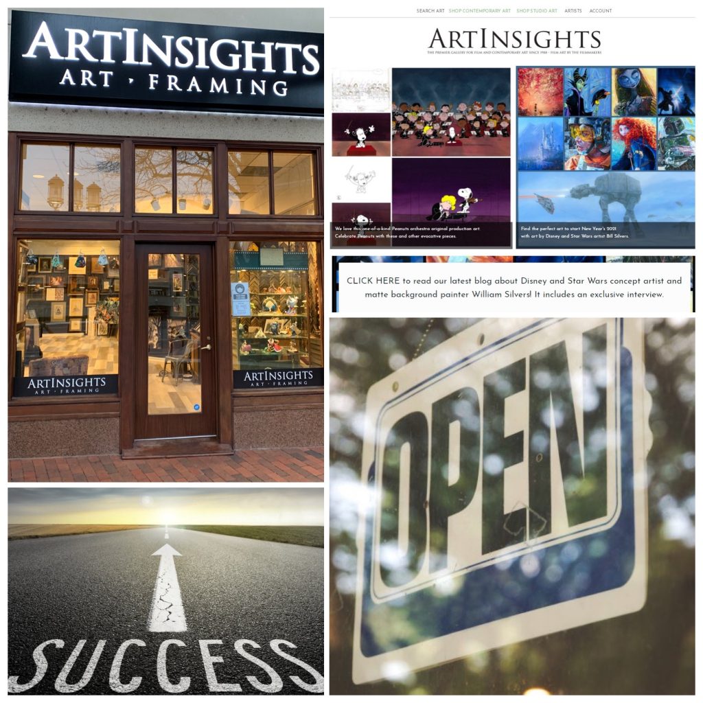
Since 1994, representing a wide range of film and animation art at the gallery in Reston Town Center, ArtInsights focuses on original film production art, and proprietary projects and artist representation relating to the history of animation and film, and the celebration and examination of popular culture by artists working in the film industry. With production art representing films as diverse as Fantasia, Beauty and the Beast, Blade Runner, and Star Wars, and representing artists like iconic movie poster artist John Alvin, studio concept artists William Silvers and Jim Salvati, and Marvel and DC cover artists Alex Ross, the gallery builds collections of original and limited edition art for their growing worldwide collector base. See the work and read the blog on www.artinsights.com.
Here are a few great videos with Alex Ross:
Alex Ross, talking Black Panther:
On Chadwick Boseman’s legacy:
Here is Alex featured on CBS This Morning:
And lastly, I leave you with Alex’s take on how to stay inspired, something we all struggle with when news or the pandemic gets us down, or holiday plans overwhelm:
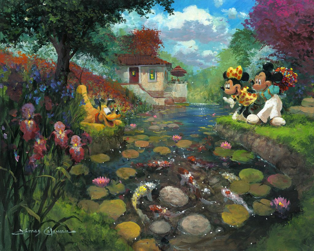
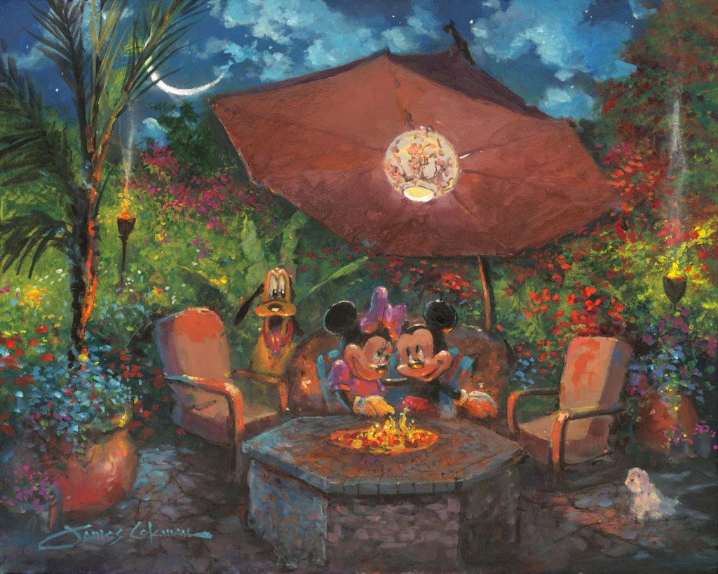
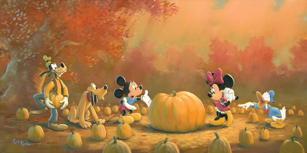
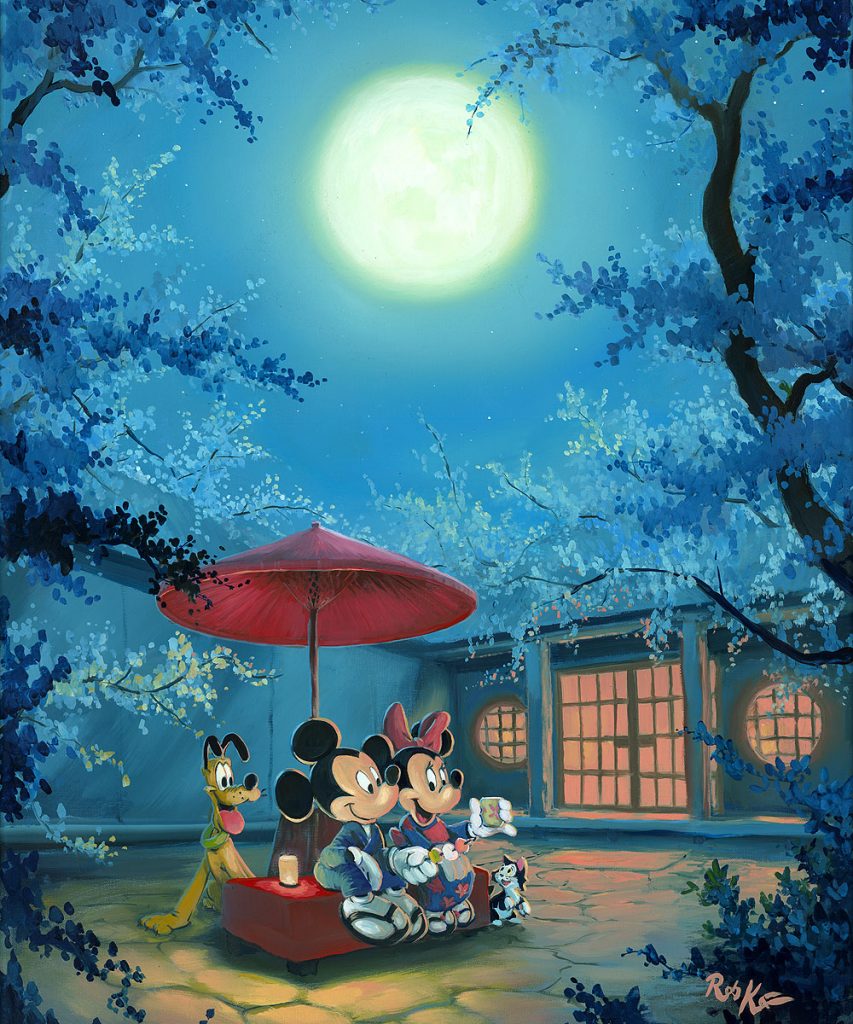
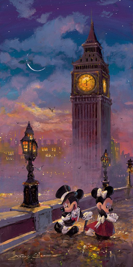
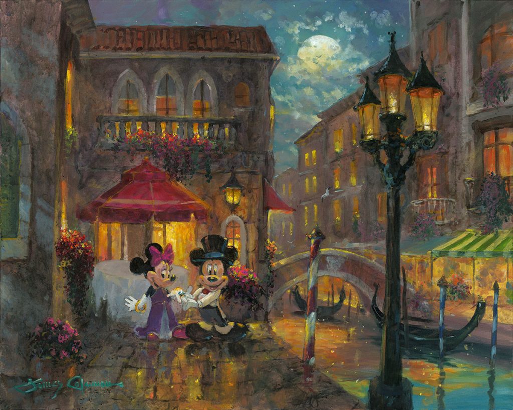
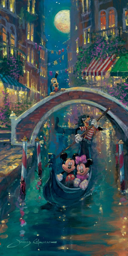
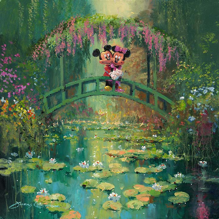
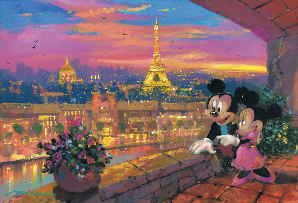
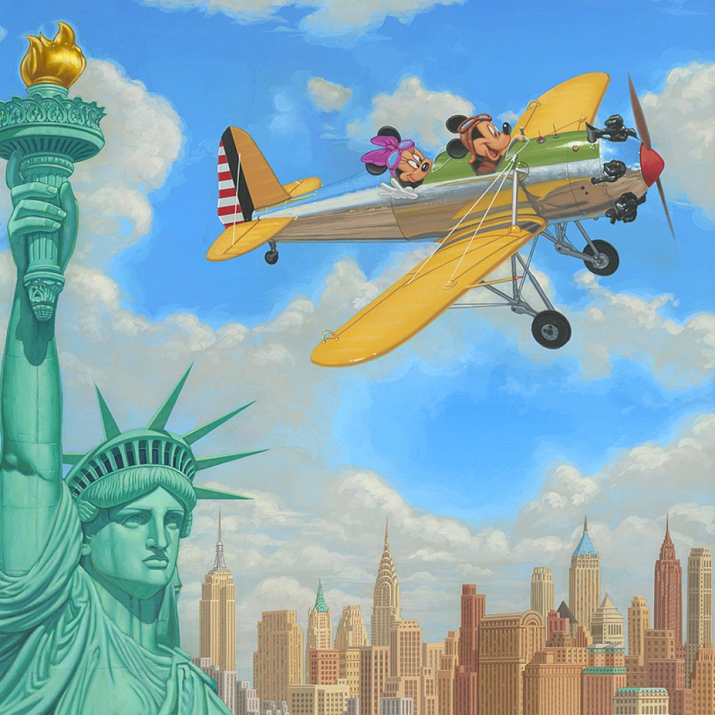
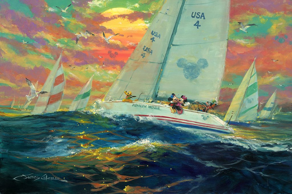
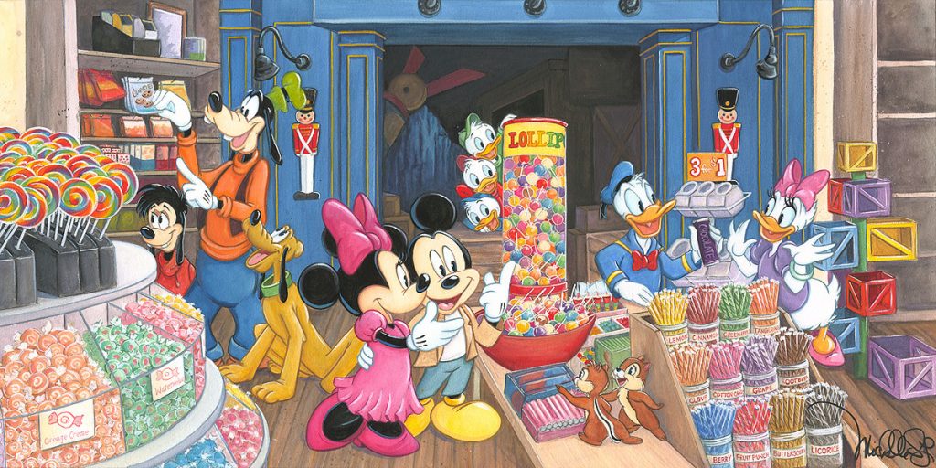
Ah, Mickey and Minnie, that quintessential Disney couple…with the holidays coming up, families and couples all over the country are planning their holidays alone or with beloved family. It’s about making memories that will last with family and friends that mean the world to you and bring you joy. Since there are lots of interpretive Disney images featuring Disney fan favorites Mickey and Minnie Mouse showing the power of togetherness and celebration, whether it’s unwinding by the beach, or traveling around the world together, it seemed like a perfect time to talk about the iconic Disney couple, and show a bunch of delightful images of them making memories. Maybe you’ll see yourself or your family represented in one of them.
If the mood strikes you and it seems the perfect gift this holiday season to bring joy in the form of cartoon critters, peruse your options on our website at your leisure. Get your favorites ordered by the end of November to be sure and get your order in time for Christmas.
You can see all the art featuring Mickey and Minnie together HERE.
Walt Disney made Mickey and Minnie’s relationship clear early on, saying in 1933, “In private life, Mickey is married to Minnie. A lot of people have written to him asking this question, because sometimes he appears to be married to her in his films and other times still courting her. What it really amounts to is that Minnie is, for screen purposes, his leading lady. If the story calls for a romantic courtship, then Minnie is the girl; but when the story requires a married couple, then they appear as man and wife. In the studio we have decided that they are married already.”
Mickey has his sweetheart: Minnie is bottom right corner!
As many of you know, Mickey Mouse was first animated for an ode to Charles Lindbergh, Plane Crazy in 1928, but that short wasn’t released until after March 17th, 1929. It was Steamboat Willie, released November 18th, 1928, in which he made his first public appearance. He did so with his future lady love Minnie as co-star. Did you know Steamboat Willie was a parody of the Buster Keaton film Steamboat Bill, released in May of that year? Walt Disney himself not only directed Steamboat Willie, but supplied the voices of both Mickey and Minnie for the short.
From the very beginning, Mickey was meant to have a love interest. Concept images of him showed a female mouse by his side. As with many relationships, however, it took a few years for them to become a steady couple. The early cartoons show Mickey wooing the flirtatious, musical mouse, and Minnie repeatedly rebuffing Mickey.
It’s in 1929’s Mickey’s Follies, the short that follows Steamboat Willie, in which we learn Minnie’s name and her place in Mickey’s heart is made clear. It was in the song MIckey’s You Hoo, which went on to become a theme song used over the next 90 years. It included his first direct address to the audience, in which Mickey says ‘he’s got a sweetie’ who is ‘neither fat nor skinny’ and that ‘she’s my little Minnie Mouse’. 12 more shorts were produced with Mickey in 1929, but Minnie only co-starred in seven of them, largely playing the role of damsel in distress.
Did you know Pluto started out as Minnie’s dog? In 1930’s The Picnic, Minnie introduces Mickey to her pet dog Rover, marking the first, albeit misnamed, appearance of Pluto. Cat lovers know she also appears in her own shorts with her cat Figaro, who was first introduced in Pinocchio.
Both characters underwent a character redesign in the late 1930s and early 1940s, replacing their rubbery squash and stretch-friendly shapes with more fleshed out figures. Minnie’s new look was introduced in the 1939 short Mickey’s Surprise Party. At the same time, Mickey’s character went further away from troublemaker and more towards everyman. Minnie’s roles started diminishing around this time, going from 50 shorts in the 30s, to a total of 10 in the 1940s. In part, the fact that Marcellite Garner, an ink and paint artist who had become Minnie’s official voice for 1930’s The Cactus Kid, left the studio in 1941 had a huge impact on the character’s inclusion in subsequent cartoons. She voiced over 40 cartoons while continuing to work in the ink and paint department, partnering with Walt as he continued to voice Mickey. Walt was very supportive of Marcellite as she developed Minnie’s character, carving time out between recording sessions to describe and act out all the parts.
Much like Mickey, who didn’t appear in any shorts released theatrically between 1955 and 1983, Minnie has a long break starting with a brief cameo at the end of 1952’s Pluto’s Christmas Tree and lasting until she joined Mickey in his first appearance since 1955, with 1983’s Mickey’s Christmas Carol, where they play Bob Cratchit and his wife.
One of the most romantic stories involving Mickey and Minnie begins with the introduction of artists Wayne Allwine and Russi Taylor as the voices of the the cartoon couple. Allwine was only the third person to provide Mickey’s voice, and did so for 32 years, from 1977 till his death in 2009. Taylor, who was also an award-winning sound and sound effects editor, won the role of Minnie in 1986, when she beat out over 200 other hopefuls for the job. Allwine and Taylor worked closely together for years, falling in love in the process and secretly getting married in 1991 in Hawaii.
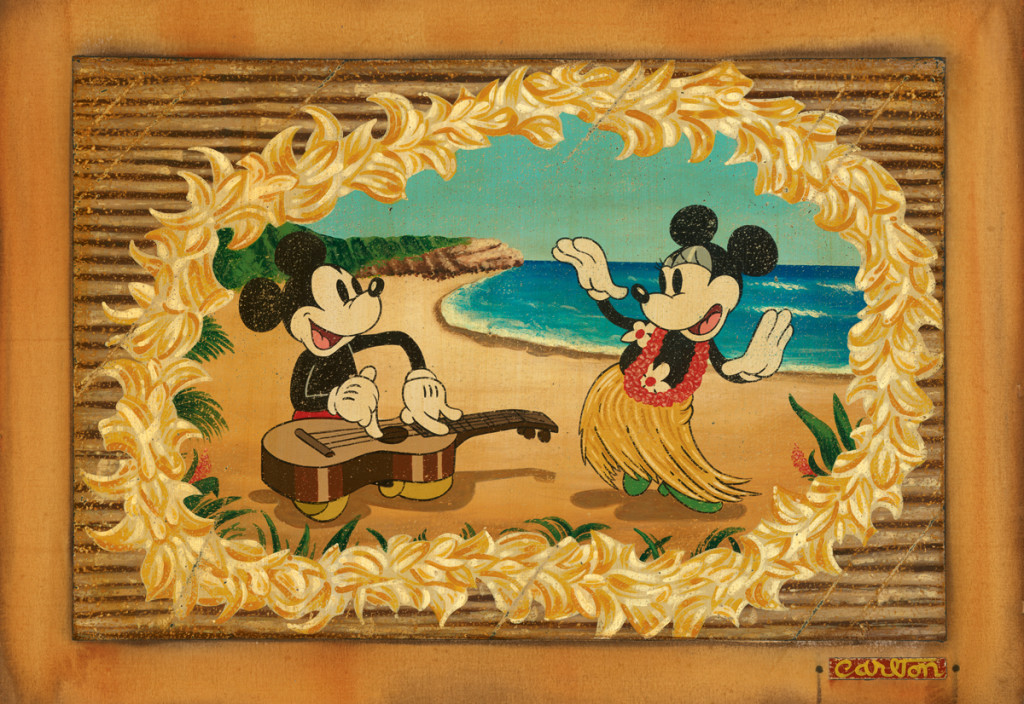
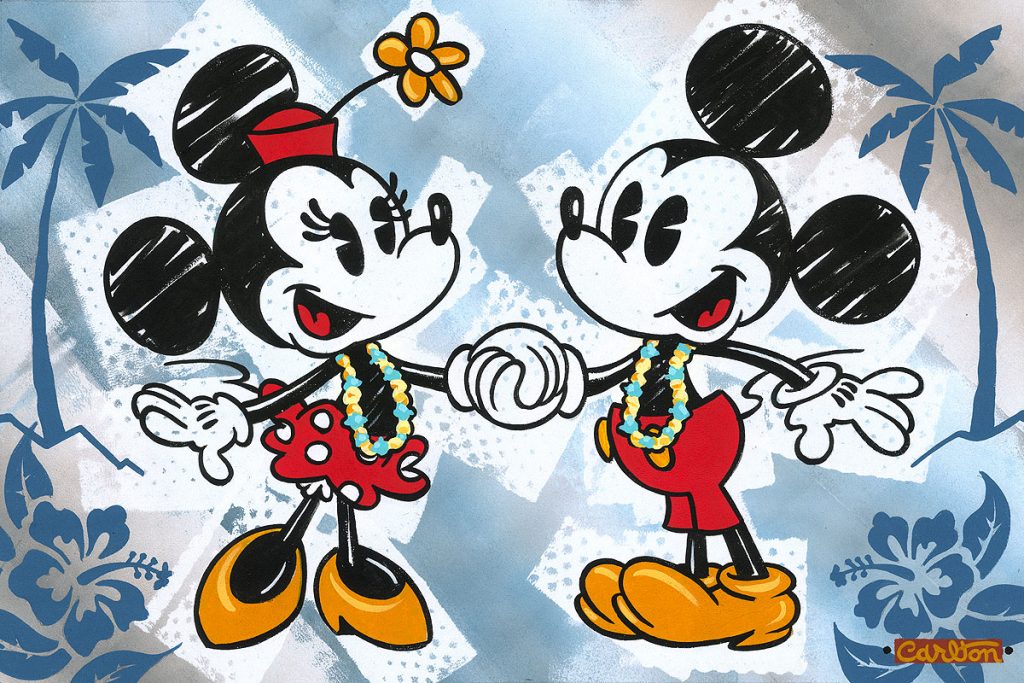
“Hula in Paradise” by Trevor Carlton
Explains Bill Farmer, the voice of Goofy, “Everyone saw it coming. Just watching them work together, I could see their relationship develop into something deeper than a working relationship.” They kept their marriage private because they didn’t want it to color how fans saw the characters, who had remained unmarried. (As far as we know! The two mice might have had a secret wedding too!) Both Wayne Allwine and Russi Taylor were made Disney Legends for their contribution to Disney history. They were said to have made each other better people, which is what love should do. It was after Russi passed away that Farmer is quoted as saying, “When they were together, like Laurel and Hardy, they were just meant to be together as a team, and as a lifelong team. They were just so in love and so wonderful together. I think that love came out in their performances, and gave it a little something extra.”
There were a number of cartoons during the couple’s heyday that celebrate activities couples do together.
From dancing, playing instruments, singing together, or going out on the town in The Barn Dance, Mickey Steps Out, The Shindig, The Whoopee Party, and Mickey’s Gala Premiere…
“This is Bliss” by Trevor Carlton
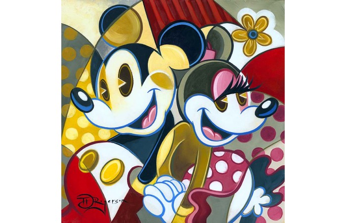
“Cubist Couple” by Tim Rogerson
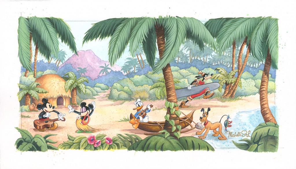
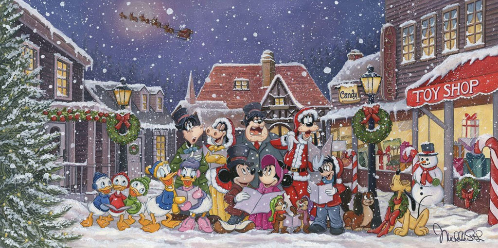
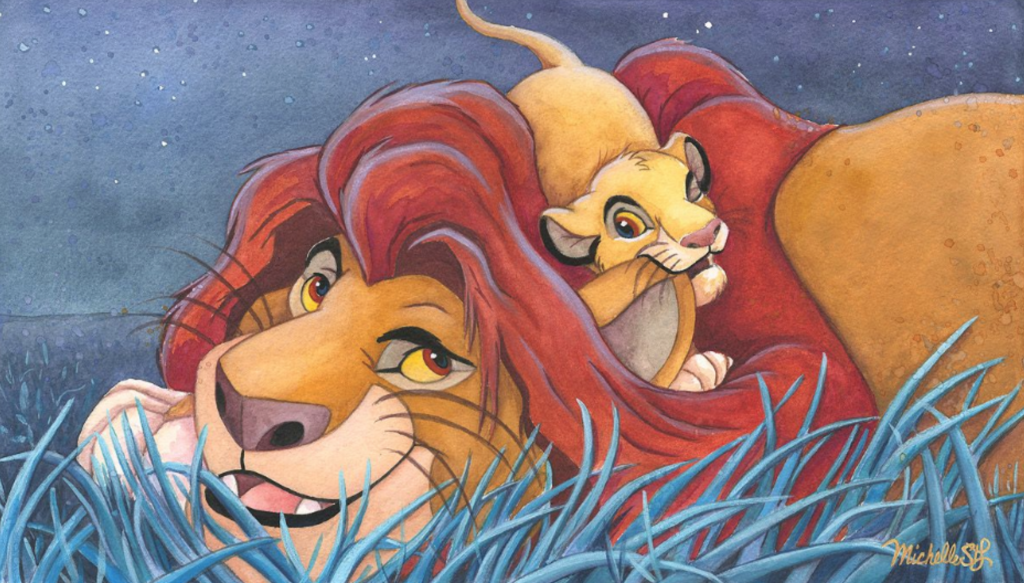
Michelle St. Laurent created a perfect holiday image, centered on Mickey and Minnie, who celebrate with their friends!
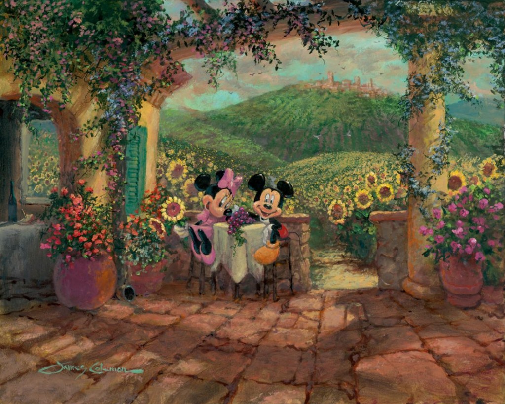
…going on international adventures or navigating exotic climes as they do in cartoon shorts like Mickey in Arabia, The Klondike Kid and Hawaiian Holiday…
There are the times they just show their love, like in Puppy Love and Mickey’s Christmas Carol, but they also enjoy sports or practical activities, as in On Ice, Camping Out, Plane Crazy, The Beach Party, The Barnyard Olympics, Building a Building and The Steeple Chase…
Of course they are always getting each other out of scrapes and jams, as good partners do, like in Shanghaied, The Firefighters, The Gorilla Mystery, Pioneer Days, The Dognapper, and Brave Little Tailor.
Whatever the scenario, this couple is enduring and steadfast, as their 90+ years together attests! You can watch a fair number of these cartoon shorts on Disney+ (although they don’t have a section specific to shorts, remarkably) or of course if you’re curious about any of the many cartoons in which these lovebirds co-star, you can find them by typing them into google or searching on YouTube. Meanwhile, here’s hoping you all get up to some fun and fancy free activities together this holiday season whether at home or off on an adventure. Remember to find some joy and stay safe, and when the stress of family gatherings or holiday shopping makes you feel crazy, watch some cartoon shorts with your favorite Disney couple!
You can see all the art featuring Disney’s iconic couple, Mickey and Minnie HERE.
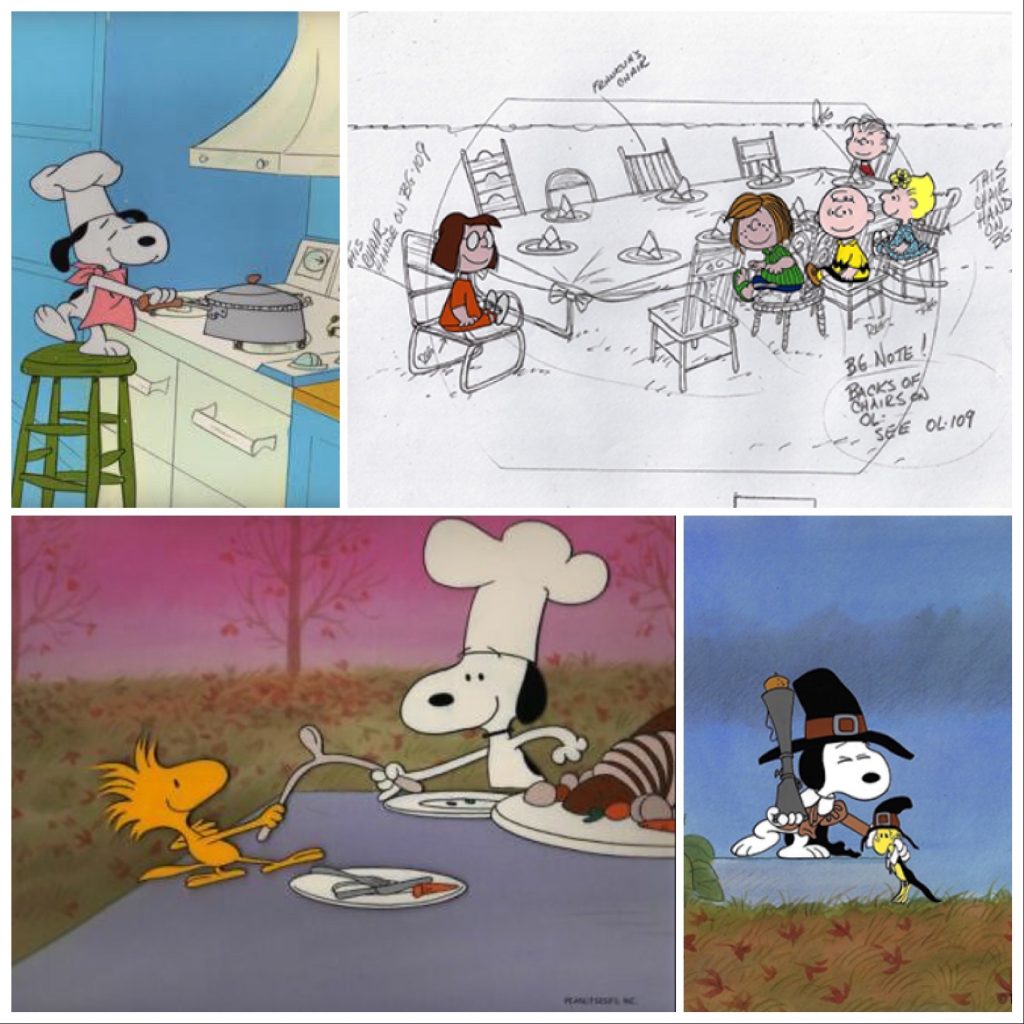
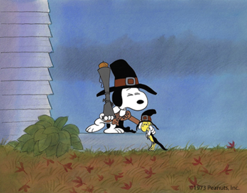
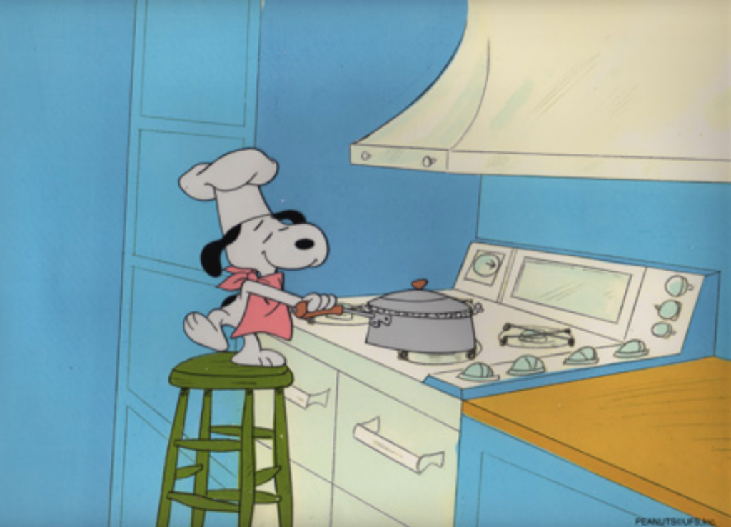
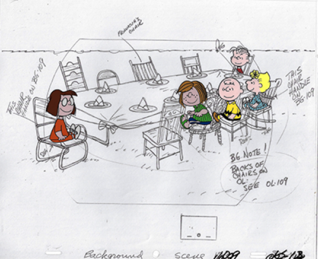
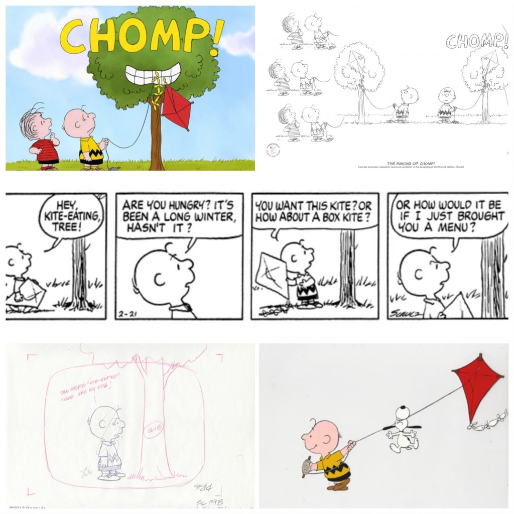
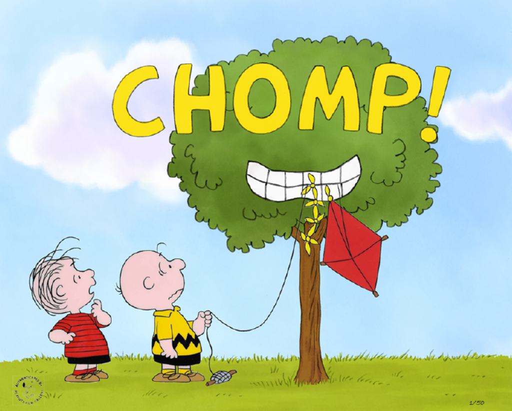
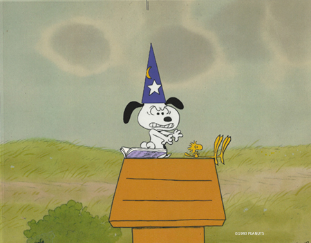
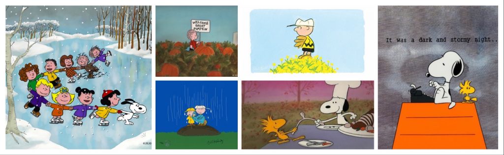
Soon it will be Thanksgiving. Regardless of the complicated origins of the holiday, because of its focus on gathering with friends and family and showing appreciation and love to one another, it has always been and continues to be one of my favorites. In light of the pandemic, this year in particular it will be a time for giving thanks for the continued safety and support of those we love. That brings us to all the various traditions and celebrations so integral to the holiday. Gathering as a family (and sharing stories, or arguing, or both), eating, watching football, and, of course, watching A Charlie Brown Thanksgiving. This blog is dedicated to the classic TV special, and I’m happy to say, I’ve got some art surprises in store!
But first, I’d like to share my perspective on the holiday, which I’ll warn you is both very personal and a bit of a downer, but I promise I get happy at the end. You can skip the paragraphs between the lines if you’d rather just read about Peanuts, but people ask me all the time why I have such a love of cartoons, and this, as much as anything, explains that.
____________
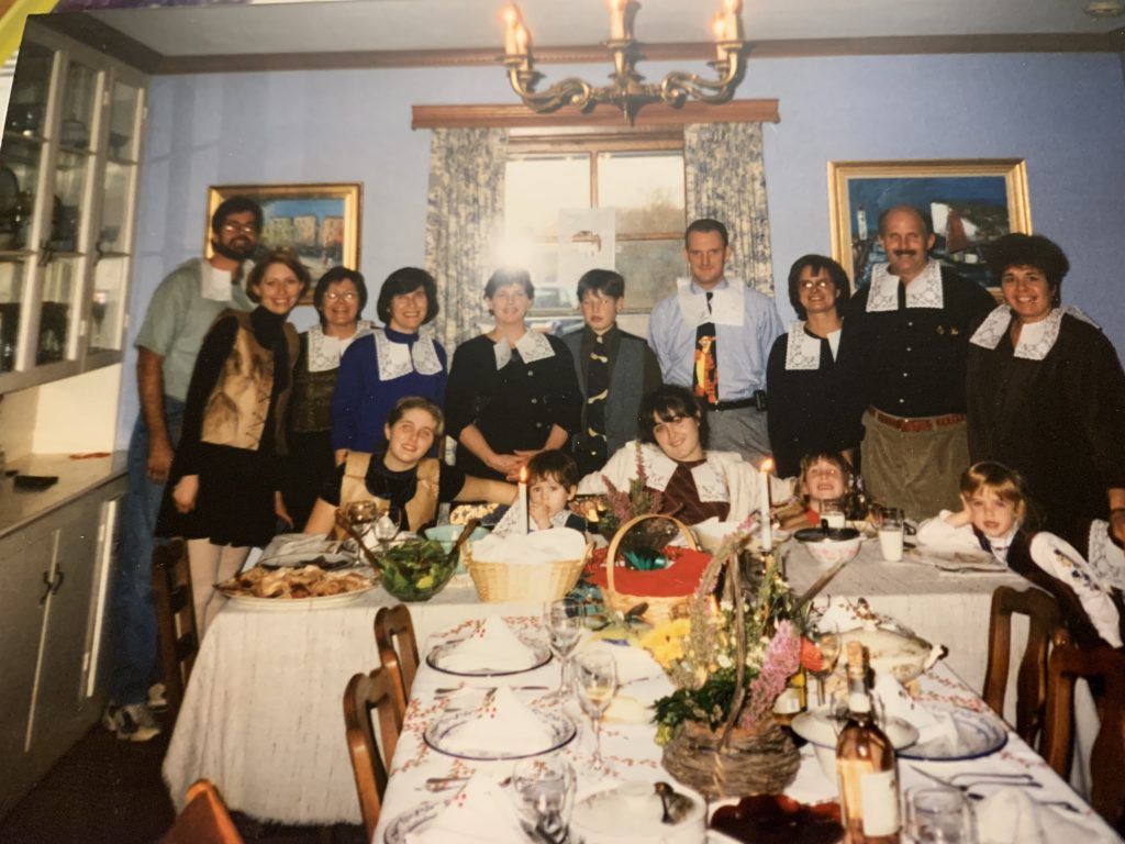
I have a strong connection to Thanksgiving. It has always been my parents’ favorite holiday, and nearly every year, my stepmother Mary (whom I refer to as my ‘second mother’, given the negative connotation Disney inflicted on the title of stepmom) has invited her sister, her brother and his family, and several close friends to join us. Since my parents recently sold our family farm and moved to a condo in Alexandria, the party will be quite a bit smaller this year, and it will take place at my house. I’ve never cooked a turkey in all my life, but there’s a first time for everything, and it’s my turn this year to make it happen. There’s a reason I want to make sure we actually have a gathering, however small, on the holiday.
The Thanksgiving holiday is complicated and weighted for me by the fact that it was the last time I saw my little sister Jane alive. In 1998, Jane, who was 16 1/2 at the time, died in a car accident a week before Christmas. That day I was actually in the gallery, working with Michael, which was a rarity even then. My dad called and told me she’d been killed. It was early afternoon on December 17th. I remember it was both raining and sunny out. That very short conversation between my dad and I played over in my head about every two minutes for over a year. Suffice it to say the loss of a family member, a sibling, a spouse, or especially a child, is the club nobody wants to join.
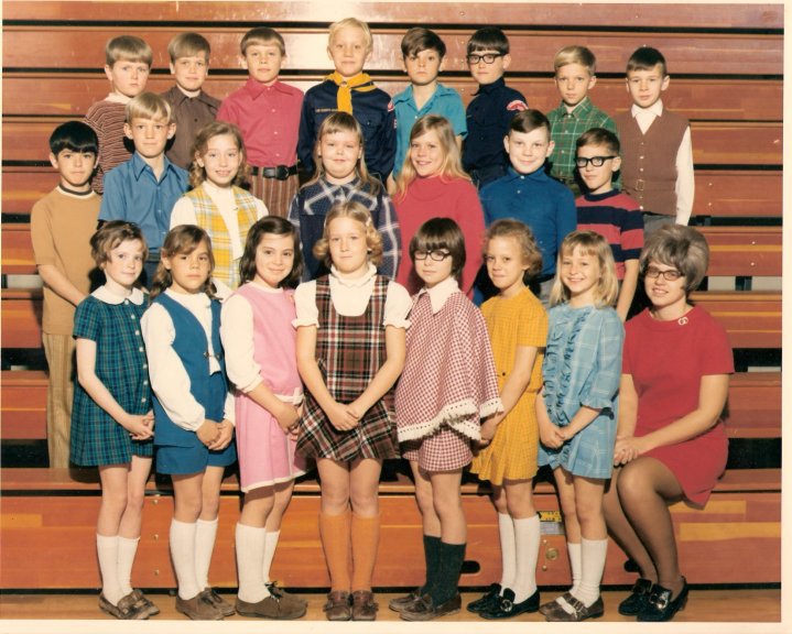
I’m second from the left. Coco is the first seated, and Jane is seated center. We are all dressed as pilgrims, in outfits they made with their cousins that day.
The year before, we’d had a huge Thanksgiving, with something like 15 or 18 people. Jane and our sister Coco, who was 14 at the time, drew really cute paper place settings with turkeys and all our names on them. Though 20 years their senior, I was really close to both Jane and Coco, and I remember we all sat down and watched A Charlie Brown Thanksgiving together, and it brought us a lot of joy that day. It was a cartoon I’d watched many times with them and my dad, who had raised both his older kids, my sister Joëlle and I, and his younger kids, Jane and Coco, on all things Peanuts.
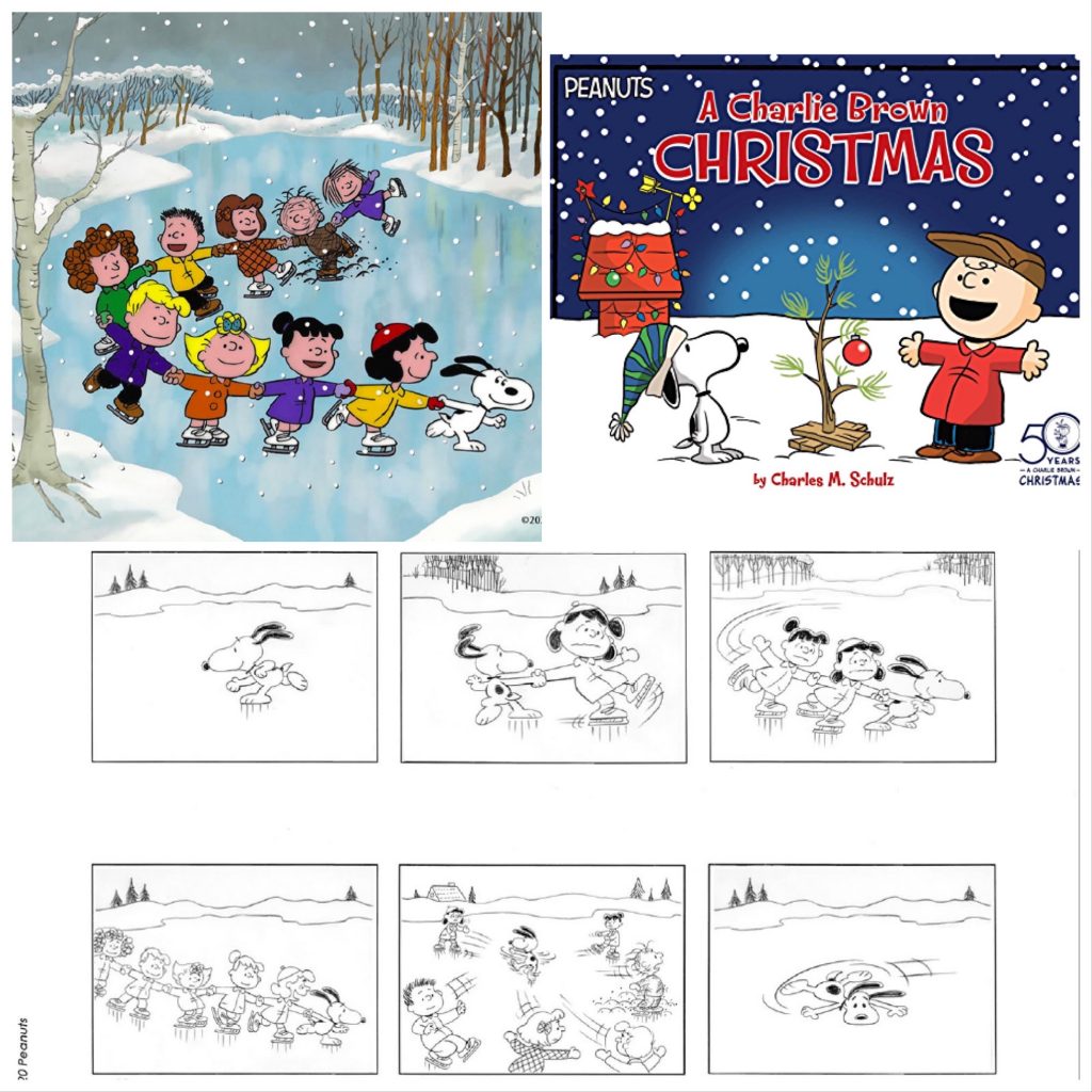
At first, after losing Jane, it was really hard to celebrate Thanksgiving and Christmas. In fact, I pretty much hated even having to see other people happy and celebrating. I went at least 10 years not watching A Charlie Brown Thanksgiving. Though it’s taken time, over the years I switched from hating the holidays around the anniversary of Jane’s death to embracing the joy and celebration of the time. Jane was a huge fan of both holidays, so I’m glad I could find my way back. Now I watch A Charlie Brown Thanksgiving and A Charlie Brown Christmas, dare I say it, ‘religiously’ every year. I still remember the scenes where Jane and Coco and I, (our other sister Joëlle lived in Hawaii for much of the time Jane and Coco were growing up), would speak the lines or stare at the screen contentedly. I held both of their hands multiple times when we watched these specials together. For the Thanksgiving special, our favorite part was when Snoopy cooks the popcorn, but isn’t that true for everyone?
I’m glad to say the Peanuts tv shows don’t break my heart anymore. They only give me warm memories of great times. I find I am thankful, not just for what I have now, but for the 16 years I had my with my sister Jane. When I watch A Charlie Brown Thanksgiving, I think of her. I even think of her whenever I eat popcorn. That’s the power of Schulz’s strip, characters, and cartoons. They really were and still are a part of our story, and, I think, so so many family stories around the world.
_______
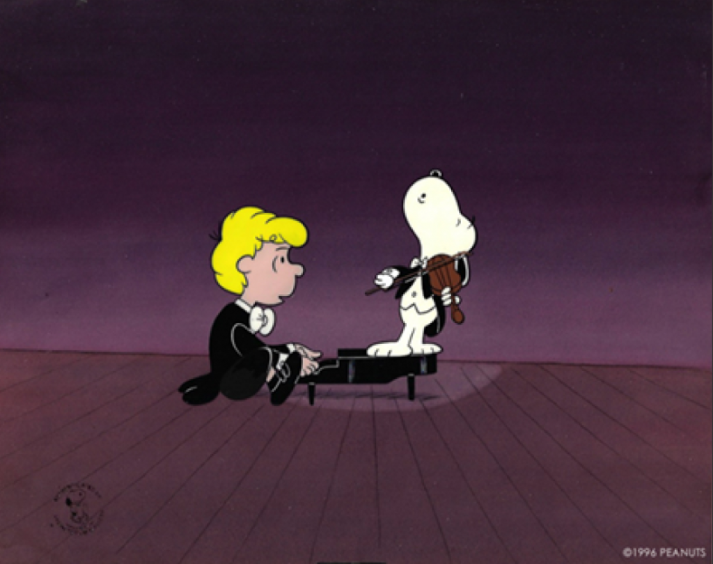
The Emmy Award-winning A Charlie Brown Thanksgiving is the 10th primetime animated special created in partnership between Peanuts created Charles Schulz and animation director Bill Melendez. It first aired on November 20th, 1973.
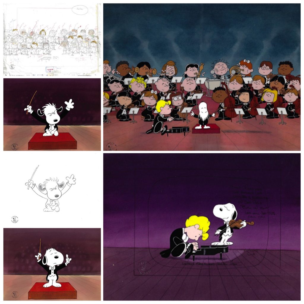
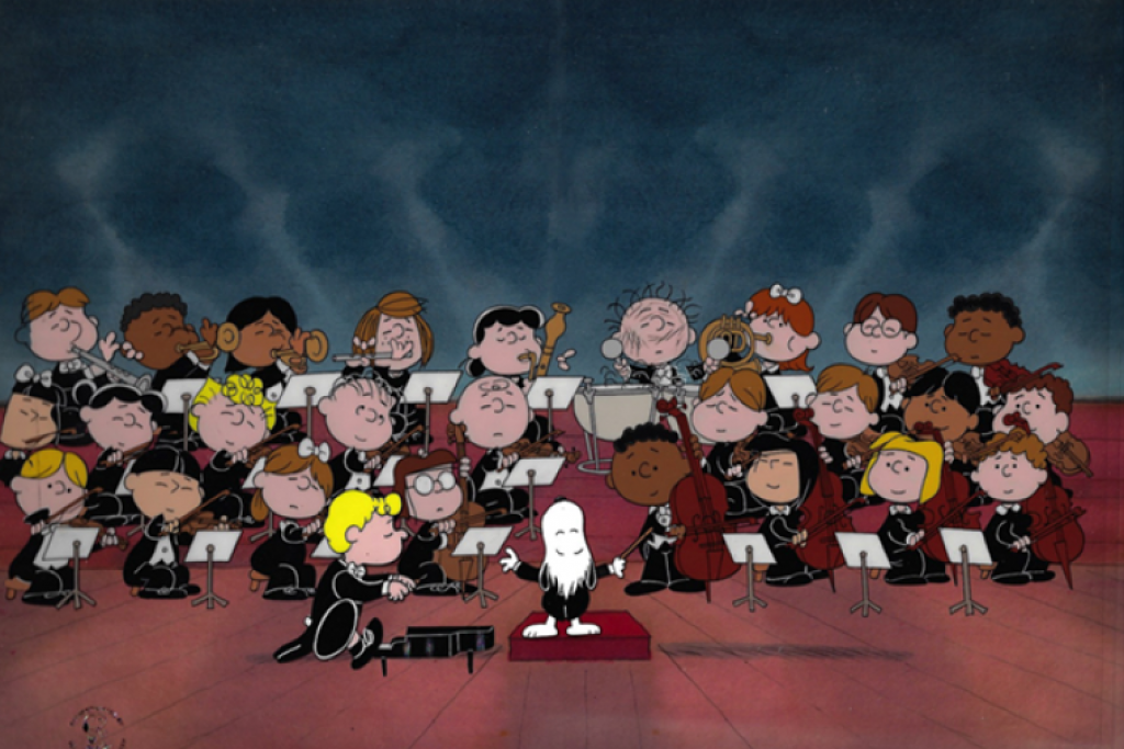
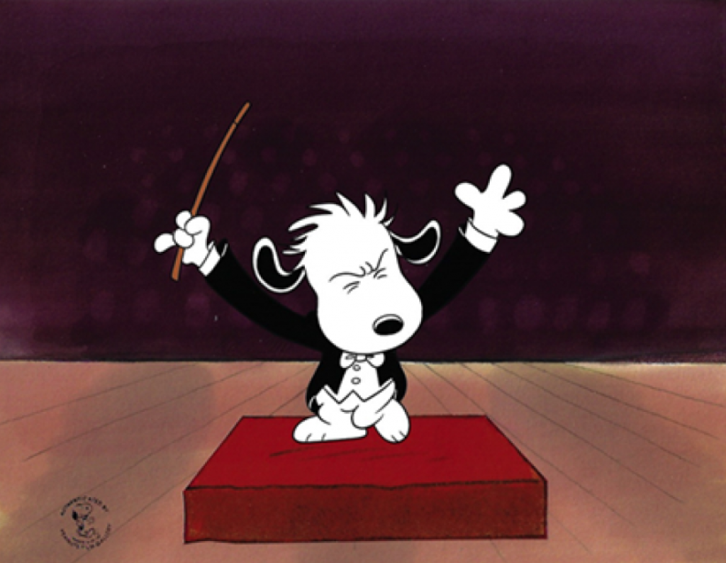
One of the best aspects of the cartoon is the wonderful music. Of Peanuts composer Vince Guaraldi’s early work for the Peanuts animated specials, producer Lee Mendelson said, “There’s no doubt in my mind, that if we hadn’t had that Guaraldi score, we wouldn’t have had the franchise we later enjoyed.” We all enjoy his great music in the Thanksgiving special, but did you know that while the song Little Birdie was of course written by the famed musician, he also sings the song? His singing style in both this song and Joe Cool was inspired by Jack Sheldon, who performed songs for Schoolhouse Rock, which was released around the same time.
Vince had a wonderful voice, actually, that I think was way underutilized. The song Joe Cool was featured in You’re Not Elected, Charlie Brown and There’s No Time for Love, Charlie Brown.
In the mid-2000’s, Vince’s son David found master tapes for seven 70s-era Peanuts specials scored by his dad. They included You’re Not Elected, Charlie Brown, There’s No Time for Love, A Charlie Brown Thanksgiving, It’s a Mystery, Charlie Brown, and You’re a Good Sport, Charlie Brown. Vince was instrumental in remastering these pieces and putting them together into a release called The Lost Cues from the Charlie Brown Television Specials. During Vince Guaraldi’s lifetime, there had been only two Peanuts-related releases, “Jazz Impressions of a Boy Named Charlie Brown” and “A Charlie Brown Christmas”, so adding these lost cues allowed fans to hear a lot more of his work for the Peanuts animated specials. There are 2 volumes in all of the lost cues, and you can find them on a number of music streamers and on physical media, so you should check them out. It might offer an alternative this holiday season to just playing the Christmas special music!
There’s also a great covers release where B.B. King sings “Joe Cool”, and Joe Williams does “Little Birdie”, (and while I’m at it, I’ll say that Patti Austin does a great cover of “Christmastime is Here” on the release as well!) and you can check that out wherever you listen to music.
Todd Barbee was the voice of Charlie Brown for the Thanksgiving special. He had just turned 10 years old at the time of recording the show. Chuck Barbee, Todd’s dad, was the director of photography for Peanuts producer (and writer of the lyrics for “Christmastime is Here”) Lee Mendelson. Lee mentioned that they were having auditions for Peanuts character voices, so Todd tried out. Barbee started out doing voices of secondary characters, then graduated to Charlie Brown in 1972 on You’re Not Elected, Charlie Brown. He always did his recordings alone in the studio, with Bill Melendez helping to guide him through. Explains Barbee, “Bill would always work with us kids in the sound room that had just a podium, a stool, a script, and a big boom mic. Bill would kind of walk us through each scene with his thick Spanish accent and then would leave the room and watch us through the glass with Lee and the sound engineers.” After all these years, Todd is still friends with the voice of Lucy, Robin Kohn.
Many of the artists credited on this tv special worked on lots and lots of Peanuts cartoons, because Bill Melendez made an effort to keep the artists he had on the payroll working as much as possible, and, by all accounts, he was also quite a pleasure to work with. A lot of folks on A Charlie Brown Thanksgiving have long lists of other credits to their names. Bill Littlejohn won the June Foray Award for his contribution to animation. He worked on some great MGM shorts in the 30s and 40s, including some classic Tom and Jerry cartoons. Don Lusk, winner of the Windsor McCay Award at the Annies, worked at Disney on Pinocchio, Fantasia, Bambi, Cinderella, Alice in Wonderland, Peter Pan, Lady and the Tramp, and Sleeping Beauty, leaving to work at other studios after 101 Dalmatians. Bill Melendez Studios was the lucky recipient of all his experience. Al Pabian worked on Looney Tunes and the very first Wile E and Road Runner cartoon, Fast and Furry-ous in 1949, as well as 1953’s Duck Amuck, before joining Melendez at his studio. Sam Jaimes, who directed a number of Peanuts specials, started at Disney with Sleeping Beauty, moved to Hanna Barbera for The Flinstones, and moved to Melendez Studios in the late 60s and worked there for over 20 years. Delightful badass Carole Barnes did animation checking, producing, ink and painting, and concept work, starting at Disney on Sleeping Beauty, then for Tom and Jerry shorts, then for Melendez Studios, where she remained for over 30 years.
Bill Melendez Studios built their own kind of family, which I experienced when I went to a gathering of former employees in person for the 50th anniversary of A Charlie Brown Christmas some years ago. I’ve rarely experienced the kind of warmth I felt while watching the many artists who had worked there over the years visiting with each other.
Whether it’s turkey, stuffing, and cranberry sauce, a tofurky, or the preferred Peanuts spread of toast and margarine, popcorn, pretzel sticks, and jelly beans, Thanksgiving is about family. Whether built or born, by blood or by choice, gathering and being grateful for each other and for the good in our lives is what makes the holiday so special. How nice that we can celebrate with the tradition of watching a Peanuts cartoon together!
Michael and I at ArtInsights wish all of you a safe and happy Thanksgiving!
Right now, I’m giving thanks to the folks at Bill Melendez Studios, who offered up 3 great production cels from the Thanksgiving special for me to offer to collectors and fans of the 1972 classic cartoon:
Snoopy and Woodstock get into the pilgrim spirit for their Thanksgiving feast. Woodstock is aware Thanksgiving is more than the story that isn’t even accurate. He knows it’s all about love and sharing, but he’ll wear the silly costume for his bestie!
Chef Snoopy joyfully prepares a Thanksgiving feast, centered on, of course, POPCORN!
This is a rare production cel from the actual Thanksgiving feast, and features Charlie, Marcie, Patty, Sally, and Linus!
You can see all the Peanuts art featuring A Charlie Brown Thanksgiving HERE. Folks snapped up all the pieces available for purchase almost immediately, so if you’re looking for original production art from the special, contac the gallery and we’ll see if we can find anything more…
I’ll leave you with a great scene that will prepare you for watching the whole special: Snoopy Chef!
With Halloween coming, it’s the perfect time to talk about the Art of Snoopy in general, and Snoopy as the World War 1 Flying Ace specifically, because the Flying Ace made his first animated appearance, in all his heroic glory, in It’s The Great Pumpkin, Charlie Brown right before Halloween on October 27th, 1966. Of all animated characters ever, Snoopy is my very favorite. In part, it’s because my dad read us the comic strip when my sisters and I were little. We had all Schulz’s books of published Peanuts strips in both French and English. We weren’t alone. Peanuts had fans all over the world. By the 70s, the Peanuts strips had been translated into 21 languages and sold in over 75 countries. You can read a hilarious take on how the French fell for Peanuts in this archived article from 1975 in the New York Times.
We watched the special together as a family before I could even talk, and I’ve watched it every year ever since. Of course I remember the rest of the cartoon, like Charlie getting a rock, Lucy wearing that gaudy lime green mask, and Linus showing he was and always would be an eternal optimist. What struck me though, and made it most memorable, was the sequence with Snoopy climbing up on his Sopwith Camel and fearlessly fighting the Red Baron.
Dog on Duty: We have only one of this sold out limited edition, which is available by clicking on the images.
There’s very little distance in time between when the Flying Ace was introduced in newspapers on October 10th, 1965, and his inclusion in Great Pumpkin barely a year later.
Schulz created this incarnation of Snoopy just months after the US started sending troops to Vietnam. At first it wasn’t the plan to parallel Snoopy’s trials with the goings-on in Vietnam, but in time he began using the Flying Ace and his challenges as a means to express his opinions about the horrors of war. He himself had been drafted into World War II, so he had a lot of compassion and empathy for the soldiers over in Vietnam. In fact, he had to leave his mother, who was suffering with cervical cancer at the time, to report for duty, and she died only a few days before he left for basic training. From very early on, soldiers would use images of Snoopy the Flying Ace on their equipment, and created banners and patches of the character in various guises. They proudly carried or wore them as they attempted to survive what must have been hell on earth.
Snoopy was introduced to the Peanuts comic strip on October 4th, 1950, with his first interaction with Charlie Brown happening on October 10th of the same year.
Snoopy’s first appearance in Schulz’s Peanuts comic strip!
Schulz came up with the name because his mother said if they got another dog, they should call him Snoopy. Little did she know part of her legacy would be naming one of the most famous fictional dogs in history! Snoopy’s first appearance landed shortly after the US entered the Korean War on June 27th, 1950. Peanuts had been nationally syndicated in 1950 and started getting really popular in the late 50s. By the mid-1960s, it became the most widely read comic strip in history.
There are references about the Korean war early on in the strip’s continuum, as exampled by this strip from May 3rd, 1954.
Schulz showed his concern and compassion about the horrors of war from early on in Peanuts history.
There are lots of inspirational stories about Snoopy from the Vietnam war. One of the best is one in which his name was used for a frequently airborne canine mascot that a sergeant in the 554 Recon Squadron kept in Vietnam. This sergeant related that Snoopy had repeated scuffles with a very territorial mascot pup of the 388th squadron, coincidentally named the Red Baron. Snoopy flew all missions with the 554th squadron, but his frequent flyer status changed when his owner Robby Robinson, who survived his time in the war, went home. He went on to live a full civilian life riding in cars, boats, and motorcycles in Michigan, California, and Texas, and died an old pup in 1980.
Other references to Snoopy as the Flying Ace include a psychedelic band that used the name Sopwith Camel. They were one of the first San Francisco psychedelic bands to record for a national label.
In 1966, the boys in a band called The Royal Guardsmen were inspired by the character from the comic strip for their song ‘Snoopy vs the Red Baron’, which sold 3 million records. It debuted at #122 on the ‘Bubbling Under the Hot 100’ on December 10th, 1966, and peaked at #2 on The Hot 100 the week of December 31st, 1966. It’s interesting that Great Pumpkin, which debuted Snoopy Flying Ace, was released in October, and the Royal Guardsmen released their song in December of the same year.
Schulz was not amused. He and United Features Syndicate sued the Royal Guardsmen for using Snoopy’s name without permission. UFS won, and all the publishing revenue from that song went to them. Schulz did let the group write more Snoopy songs, though, like this Christmas song ‘Snoopy’s Christmas’, which appeared on the album ‘Snoopy and His Friends’ in 1967.
As far as the art of Snoopy as the Flying Ace goes, it’s nearly impossible to find. Part of why I was inspired to write this blog is because we got one from a Rival Dog Food Company commercial dating back to somewhere between 1969 and 1973.
OMG! A rare Snoopy Flying Ace original production cel from a Rival Dog Food commercial! Click on the art for more info or to buy.
Rival has a fascinating and storied history. In 1932, they were the first company to promote canned dog food, when most folks were still happy to just feed their pups table scraps. Rival held their products to a high standard (which included NOT using horse meat in their formulas), creating food nearly up to human standards. It helped transition dogs into the house to be treated as family members. Rival dog food was so well-made that when the US entered World War 2, Rival stopped creating dog food and pivoted to create rations for the troops. Their plant was already operating under government inspection, meeting the stringent requirements for canning human food. Rival ultimately shipped over 200 million cans to US servicemen. They continued successfully through several company shakeups, and in 1973 were sold to Nabisco, ringing the death knell for the famed brand. It was in the late 60s and early 70s that they enlisted Snoopy to promote their brand, with the last materials being created in late 1973. You can read all about Rival HERE.
Snoopy shows he is a born salesdog in this label for Rival Dog Food.
Here is the one limited edition available celebrating Snoopy as the World War Flying Ace:
The only available limited edition featuring Snoopy fighting the Red Baron is “Snoopy’s Dogfight”. Click for more information or to buy.
That brings us to my favorite Peanuts cartoon featuring Snoopy. It’s the absolutely classic animated feature Snoopy Come Home, released in 1972. I watched that cartoon many times, but what had even more impact on me was the board game I used to play with my sister, Joëlle. We used to sing “No Dogs Allowed” repeatedly while playing it.
Though our game was thrown away in the 80s, I guess, I finally bought a replacement when doing research on this blog. It should be here any day!
Looking forward to playing this Snoopy Come Home board game again with my Peanuts-loving friends!
Snoopy Come Home has lots of special features unique to it as a Peanuts release. First, it is one of the only Peanuts animated cartoons not using Charlie Brown’s name. It’s also the only Peanuts film released during his lifetime with music composed by someone other than Vince Guaraldi. The music is all created by famed Oscar-winning duo, Disney Legends Robert and Richard Sherman. The producers figured that since this was a full length feature, not a TV special, it should have a feel that was different from the specials. You know that ‘No Dogs Allowed’ song? It was sung by Thurl Ravenscroft, who is also famous for singing ‘You’re A Mean One, Mr. Grinch’ in the 1966 tv movie How the Grinch Stole Christmas.
Here is a video featuring the many voices and songs of Thurh Ravenscroft. He was wonderful and prolific!
Snoopy Come Home also features the on-screen debut of Woodstock, Snoopy’s BFFF (Best Fine Feathered Friend) which you can see the original trailer leverages, using music by the Sherman Brothers.
My friends who work with Bill Melendez Studios (Bill created all the traditionally animated cartoons based on Schulz’s comic strip) scoured their archives for something special for me to offer, as we enjoy the Halloween holiday and enter into the Christmas holiday season. I specifically asked for older Snoopy art, and they did not disappoint.
Speaking of the art of Snoopy, here is a production cel featuring nearly every major character from the Peanuts specials, also including some really hard-to-find secondary characters. In fact, this scene is quite historic. It is the first appearance EVER of Franklin in animation. It includes the original cel setup and the layout background from the scene.
And we talked them into going into their archives, and letting us sell their very last piece in this very sold out limited edition, “Home Coming” from Snoopy Come Home.
Snoopy Comes Home! There is one last limited edition from the Home Coming edition available, and we have it. Find it HERE.
Which you can see in the last scene from the cartoon:
It’s almost time for Halloween, and if your family is anything like mine, it’s at least equal to Christmas in importance and excitement. In our house, we have The 31 Days of Halloween. We watch a horror movie or a movie with a great villain, listen to soundtracks like Psycho, Halloween, and, of course, songs from Disney’s The Headless Horseman. This seems like a perfect time to consider a few of Disney’s villains. Villains have played an important part in my love of animation and appreciation for Disney films, and I’m sure some of you can say the same!
I remember back some years ago, before the folks at Disney figured out there were lots of villains fans like me. I would comb the stores all over the parks looking for merchandise featuring Chernabog (not a morning demon), The Evil Queen (a misunderstood crone), Cruella De Vil (I’ve got nothing. She’s bad. She wanted to make a coat out of puppies..) and Shere Khan (voiced by George Sanders, so of course I love him. Don’t be mad at him just because he’s a hungry tiger.) It was extremely rare for me to find anything. Then Nightmare Before Christmas became retroactively popular, and Disney figured out there are scores of fans who loved all the (supposedly) bad guys and gals.
Ever since I started selling animation in 1988, I’ve had loyal fans of villains. Some of them aimed to collect cels or drawings of every single one of them. Others had very specific favorites, and only collected them. Over the years, I’ve sold hundreds of cels and art of Disney villains. It became my specialty. Over the years, they’ve become highly prized, (as I expected), and finding good art in great original condition has become very challenging. Of course, I still try!
What makes the Disney villains such a big deal? For one thing, they are always the character that gets the most story told in the least amount of time. These characters aren’t in a lot of scenes, but the ones featuring them are always some of the movie’s most important moments. In both storytelling and visual quality, they are always the most memorable.
In Snow White, the scene when the Queen turns into the hag is a stunning piece of animation.
An original illustration from Disney Publishing from the Villains storybook: The Queen Transforms. For more info or to buy, click on the art.
The hag isn’t in Snow White for very long, but she’s a gorgeous example of character animation.
An original drawing of the wicked witch from Snow White. For more info or to buy, click on the art.
The witch, or the Queen as an old hag, was designed by Joe Grant.
Concept art by Joe Grant of the witch. You can see more by Joe Grant in John Canemaker’s book “Two Guys Named Joe”
The witch was chiefly animated by Norm Ferguson, who was a supervising animator on the film. She was voiced by stage and screen actress Lucille La Verne, who also voiced the Wicked Queen. As someone who had been performing since 1876, performing Juliet and Lady Macbeth back to back at 14, it was her final film performance.
Chernabog steals the whole movie in his sequence Night on Bald Mountain in Fantasia.
Chernabog is perfect for Halloween, because he is based on a Slavic god who rises from the top of Bald Mountain on Walpurgis Night (The Witches’ Sabbath) which might be on April 30th in Europe and Scandinavia, but the holiday mimics Halloween in the US. It is celebrated by dressing in costumes and conducting rituals to keep evil spirits at bay. In Finland there is much drinking, especially of sparkling wine, and the towns have a carnival-like atmosphere.
A gorgeous drawing of the quintessential villain Chernabog. For more information or to buy, click on the image.
In Night on Bald Mountain, clearly there isn’t enough going on to ward off evil, since Chernabog calls forth his minions from the fiery pits of hell. He is definitely Disney’s most purely evil villain. The Night on Bald Mountain sequence was animated by Vladimir ‘Bill’ Tytla, one of Disney’s Nine Old Men, and my favorite Disney animator. Conceptualized by a mixture of talented artists including Heinrich Kley, Albert Hurter, and Kay Nielsen, who created the model sheet for Tytla’s animation. The animator was Ukranian, and well aware of the character’s mythology. He was once seen working on the animation in total darkness other than the fluorescent light of his drawing table. Bill Tytla, by all accounts, was an intense, serious man, and captured great emotions in his characters, which also included Yensid, Stromboli, and Dumbo. His last work was directing the animation on The Incredible Mr. Limpet.
Just watch a video of his work, and you’ll understand why he’s a fan favorite:
Cruella is one of Disney’s ‘funny’ villains, but she’s still terrifying, not least because she thinks nothing of killing over a hundred dogs to make a coat. She is immediately unforgettable when makes her first entrance in the film, barging into Roger and Anita’s house.
An original production cel of Cruella deVil. For more information or to buy, click on the image.
A Disneyland setup of Cruella and Horace Badun from 101 Dalmatians. For more info or to buy, click on the image.
Cruella originates from the 1956 children’s novel by Dodie Smith, which was originally serialized in Women’s Day as The Great Dog Robbery, with Perdita being called Missis. The animation of Cruella for the original animated feature was done by Marc Davis, from designs by Davis, Ken Anderson, and Bill Peet. Cruella’s half black and half white hair, black dress, and oversized mink coat are all from Smith’s novel. Her skeletal shape and a chain smoking were added by the Disney artists building her look. Her cigarette holder was modeled after the one Marc Davis himself used. The bright red of her coat was an Allusion to her demonic nature. Her character was inspired by actresses Tallulah Bankhead, Bette Davis from All About Eve, and Rosalind Russell from Auntie Mame.
Here is a great little video profile on Marc Davis.
She was voiced by the gorgeous Belly Lou Gerson, known for her voice work in the 40s and 50s, including on Yours Truly, Johnny Dollar, and Lux Radio Theater. She was in the 1958 horror classic The Fly and guest starred in The Twilight Zone. Fans of the under appreciated animated feature Cats Don’t Dance will love knowing she provided the voice of Frances for the film.
These characters resonate with us for a reason. They represent archetypes known all over the world, many of which were examined and studied by psychologists and philosophers throughout history. Carl Jung is most famous for exploring and explaining archetypes, which allow us all to understand life through symbolism (and put people in neat little categories which can be damaging, especially to women.) He believed the path of life makes more sense and can be walked with more understanding and finesse if we know these timeless, recognizable categories in which the human psyche is driven to place everyone they encounter in their daily lives. Knowing what they are allows us all to play with them, lean into them, or mix and match them, should we so choose. They include The Innocent, The Everyman, The Hero, The Rebel, The Explorer, The Creator, The Ruler, The Magician, The Lover, The Caregiver, The Jester, and The Sage. These archetypes can even be leveraged or manipulated in branding and marketing, as explained HERE.
Joseph Campbell talks about the eight types of characters in the hero’s journey in The Hero of a Thousand Faces. They include the hero, mentor, ally, herald, trickster, shapeshifter, guardian, and shadow. You can read more about there HERE. I’m sure you already know Star Wars was cribbed almost entirely from The Hero’s Journey, which you can see HERE. Most of the Disney villains represent the shadow, but might also have a second archetype, as the hag, who is both shadow and shapeshifter, does.
One of Disney’s first focuses on the villains as a team was in 1981, for a special in The Wonderful World of Disney, which included the Evil Queen’s mirror, Captain Hook, Edgar from The Aristocats, Wille the Giant from Mickey and the Beanstalk, Kaa from Shere Khan, The Evil Queen, Cruella, Madam Medusa, and Maleficent. Disney has created more than 127 villains in films, sequels, tv, video games, books, and theme parks. The more recent villains franchise is a collection with villains that have primary members, which includes the Evil Queen, Chernabog, Queen of Hearts, Captain Hook, Maleficent, Cruella, Ursula, Jafar, Scar, Hades, and Dr. Facilier.
We have this piece, which was the basis of an early incarnation of the villains ‘team’, before Dr. Facilier (Disney’s first Black villain) had been introduced. It’s the color model for the Disney sericel, “Dungeon of Doom”.
Original color model for Disney sericel, “Dungeon of Doom”, featuring the villains! For information or to buy, click on the image.
Of course there’s a sub-franchise called Disney’s Divas of Darkness, (folks in the know call it DDD for short). That includes Evil Queen, Lady Tremaine, Queen of Hearts, Maleficent, Cruella, Madam Mim, Madame Medusa, Ursula, Ysma, and Mother Gothel (who was inspired by Cher!). Now THAT sounds like a garden party I’d love to attend.
In my research for this blog, I found there is also a sub-franchise called Disney’s Sinister Cats. It includes bad kitties Lucifer, the Cheshire Cat, Si and Am, Shere Khan, Felicia (from The Great Mouse Detective) and Scar. Who knew? Now I need to find some merchandise from this.
Of course there is a lot of of art created by Disney fine artists celebrating villains. You can find our collection of villains, from Disney and elsewhere, HERE.
One of the most endearing qualities of Charlie Brown, and why we all relate to him, is that he is an eternal optimist. He doesn’t think much of himself, and some folks can relate to that, too. Creator Charles Schulz made the character, not only in his own image, but in that of the everyman. The latest art release in the Peanuts Lexicon Series, “Chomp: Charlie Brown vs. The Kite-Eating Tree” really captures Charlie’s positive perspective, as he faces defeat once again, with that ‘stupid’ Kite-Eating Tree chewing up his kite and ruining the prospect of his and Linus’s kite-flying fun. Given the last 18 months we’ve all endured, Charlie Brown is all of us, and like Charlie Brown, we’ll make another kite and go out again to fly it tomorrow and every day, until the wind raises it to the sky.
In this limited edition, “Chomp: Charlie Brown vs. the Kite-Eating Tree”, I love Charlie’s expression, which is a mix of incredulity, disappointment, and resignation. Still, we know he’ll try again tomorrow.
The Kite-Eating Tree, a favorite of Peanuts fans, has a long and storied past. In his strip, Schulz considered it one of the series’ 12 major set pieces. Inspired by his own experience losing kites into the trees of his childhood home as well as when flying them with his kids, the first time he mentions a kite getting caught in a tree is way back on April 12th, 1956. Then Charlie names his nemesis the Kite-Eating Tree on March 14th, 1965:
The first Peanuts comic strip in which Charlie names the Kite-Eating Tree was on March 14th, 1965.
The kite-eating tree went on to great popularity, and Schulz created a number of strips featuring the non-human character.
March 4th, 1968 appearance of the Kite-Eating Tree: Note they now have their own sign.(it’s a non-gendered tree, of course!)
In January of 1969, the Kite-Eating Tree showed his truly voracious appetite in a series in which they ate Schroeder’s piano:
Chomp Chomp Chomp!
Snoopy the firefighter gets into the act in this strip from January 26th, 1969.
In the finish of the series on February 1st, 1969, it doesn’t end well for the piano, but no doubt the Kite-Eating and Piano-Eating Tree enjoyed a savory treat.
The Kite-Eating Tree appears again in 1977, on February 22nd:
As part of this storyline, Charlie Brown bites the tree, after which he gets a letter from the Environmental Protection Agency. Lucy says he’ll get ‘thrown in the slammer’.
The last appearance of Kite-Eating Tree was on a Sunday strip on February 26th, 1995:
Given its popularity, It was inevitable that the Kite-Eating Tree would be featured in Bill Melendez’s animation of the Peanuts stories. The first cartoon from Melendez was of course the Christmas Special in 1965, but the Kite-Eating Tree made its first appearance in the opening sequence of 1969’s A Boy Named Charlie Brown. Here is a layout drawing showing the character with Charlie:
In its way, the Kite-Eating Tree is terrifying! Look at that grin!
Here is the opening sequence from the cartoon. Interestingly, the parts with the grinning tree were cut out of the version that plays on Hulu (where you can stream the cartoon if you have an account)
The limited edition was designed by Director of Art Development Sandy Thome, who works with the BIll Melendez Studios, and Emmy-winning animation director Larry Leichliter. It is inspired by an original drawing that Schulz sent to Bill of Schulz as Charlie Brown, which was tacked up in the studio for many years. There’s a great story that goes with it…
Larry Leichliter explained it when I spoke to him about the new piece.
“There was this gag with a kite-eating tree. There was a cartoon, a single strip, that was part of the inspiration for the limited edition. The story is that Bill would send out a small Christmas gift to just about everybody that he knew at Christmas time, and it was something simple, like a T shirt, or a little letter opener, or some some little gadget of some kind. One year he made a kite with “Bill Melendez Productions on it, and sent it out. Everybody really liked them, because they were they were fun to play with. Pretty quickly, Schulz sent back this cartoon showing him posed as Charlie Brown looking up at his tree with his string going up to the tree, saying ‘That stupid tree ate my Melendez kite’, and the tree is saying, ‘It tasted like a taco.’ Obviously because Bill Melendez was Mexican.”
Larry Leichliter, speaking to Leslie Combemale of ArtInsights in September of 2021.
What’s really cool from my perspective as gallery owner, is that, having worked with the Bill Melendez Studios for many years, I’ve gotten dozens of Christmas gifts. They’ve sent them every year, and I’ve loved them all. We’ve gotten an umbrella, a phone stand, a notebook, a backpack, a measuring tape, a hat, a puzzle… I’m not even remembering the weirder items. I never knew the tradition was based on the one they had in-house, and now I appreciate them all the more.
Here is the Chomp limited edition cel and the accompanying giclee of the ‘making of Chomp’ graphite drawings made and signed by Larry:
Charlie seems to be thinking, “Whaaaaa? WHYYYY?!”
As usual, Larry drew many many drawings in an effort to capture the mix of incredulity and frustration on the face of eternal optimist Charlie Brown. There’s a ton of nuance that goes into the design, and lots of back and forth between Larry and Sandy, both of whom worked for years with Bill Melendez. They really want to capture the essence of both Bill’s directive as director of A Boy Named Charlie Brown, and Schulz’s character design. There are dozens of permutations before they choose the final possibilities. Here are a few that didn’t make the cut:
Both of the above, Larry and Sandy say, were too angry. The final selection used for Chomp really shows a surprise that no one but an eternal optimist would have. Charlie still believes one day the Kite-Eating Tree will leave the kite alone, and let him have his fun.
I asked Larry, how the development of the limited edition progressed, and how it came together:
I think the first correction I made to it was the size of the tree, because when I first drew it, I drew it way too small in relation to Charlie, and I realized that he could just strangle the tree and pull it down, so I made it bigger! Then I decided to add the teeth and that sort of thing. All the time, I was working on his expression and his attitude. There was a lot of back and forth between Sandy and I, about what what would be the best pose? And at some point, we added Linus I mean, originally, it was just going to be Charlie Brown, and the tree, and the word CHOMP, you know, because we wanted to do this small series of limiteds as a tip of the hat to Schulz by putting these words across the screen. He would put mostly sound effects, or kids laughing, which we used on the first limited edition…the letters onscreen were used pretty often by Schulz, and it was fun when it translated to animation. We really liked doing them.
Larry also talked about his challenges in creating just the right image for Chomp:
Charlie Brown had so many expressions connected with his moment when the kite gets stuck in the tree. There’s frustration, and disappointment and distrust and even outright anger. But mostly it’s just, ‘poor old Charlie Brown’. Resignation. So I was trying to get a dismayed look, because the grimace and the sidelong glance just didn’t seem quite right. Also, at some point, we decided to add Linus to it. Just because Linus is Charlie’s support. In the process, we just try one expression, one drawing after another, until something seems to fit.
As far as the difficulty in drawing Charlie Brown in general, Larry had this to say:
It’s gotten to where it’s not that difficult. Really, Schulz had a great designing sense, and once you kind of tap into it, then you know when you got it right, and when you don’t. He definitely has a different look when he’s facing forward and when he’s in profile, and there are certain proportions, of his hand to his body, the height of his legs and the width of this neck, things like that, that you get used to. One thing is I try to face him towards the camera if I can, because I think most people like that, and I like seeing Charlie Brown looking at the world, but in this case, the profile seemed to work best, so that’s what we went with. As far as what I enjoy about it is just, that, again, the design Schulz has for this character, there very few characters where the design makes them so easy to draw. Another one is Mickey Mouse, and of course he’s iconic as well.
Of course, I figured I’d might as well ask about animating Charlie Brown, as well.
As far as animating Charlie, he really isn’t that easy to animate, because of certain things like the shape of his head, and how it changes when he turns, but then all of the Peanuts characters are like that. They have a different design in profile than they do straight on. There are techniques that you can use in animation to fool the eye into not seeing how the head changes when a character turns. Then there are other things, like the fact that they have very short arms. What do you do if you want him to scratch his nose or take his hat off, all places that his arm won’t reach? You have to stretch his arm to do that. There are ways around it, which Schultz, in many cases, has already thought out for you, and all you have to do is refer to his work. If you don’t see exactly what you’re looking for, you’ll see something that will inspire you to to do it in a way that Schulz would approve.
But why stop there? I asked which characters WERE the hardest to animate.
The hard ones are the ones that you don’t get to draw very often. Like Frieda, for instance. She’s got all this crazy, curly hair and animating it, trying to keep it from just wiggling all over the place, can be a challenge. That challenge can distract you from what you’re trying to do in the first place, which is animated character with some personality and movement. But the more you work with a character, the easier it becomes. Linus is difficult, partly for the same reason, his hair can be very distracting, but also the shape of his head. Linus, Lucy, Frieda, and Schroeder. There are two different head shapes, basically. There’s Charlie Brown’s head shape. And then there’s Linus’s head shape. All of the characters have one or the other. I would say Charlie’s head shape is a little easier to work with than Linus’s. The most difficult is Snoopy, believe it or not, but he’s also the most fun, because both drawing him and animating him is a challenge.
The Peanuts Lexicon Series is really about celebrating the collaboration between Peanuts comic strip creator Charles Schulz and director and animator Bill Melendez, who, along with his team of artists, translated Schulz’s work into the beloved classic cartoons we love.
When I spoke to Sandy, she explained that Charles Schulz was integral to the development of story for Peanuts animation. He always got writing credit for the shows and specials, but it wasn’t a vanity credit, he was really involved in creation.
Mr. Schulz would show Bill strips he’d worked on, and they’d create the storyboards from those strips. We still have a lot of copies in our archives that really represent the seeds of the animated shows.
Sandy Thome, speaking to Leslie Combemale on September 27th, 2021.
Larry added his thoughts on the origins of both the Lexicon Series, and Chomp.
The Chomp kite-eating tree limited edition was actually an amalgam of a couple of shows. Everything really goes back to Schultz and his strip. When we were doing the shows, we were constantly referring to his strip, because one thing that everybody realized early on was that he really enjoyed working on the shows. Bill would go up and meet with Schulz, and the two of them would hammer out a story and Bill would come back and we’d work on the board together. Just the fact that Schultz enjoyed the process of filmmaking as an extension to his strip, I think, which made us more conscientious about studying his work and understanding his drawing, and his characters, and sense of humor…all those things. So you’ll see a lot of his strip in our shows. And that’s why.
Larry Leichliter
Here are two interviews. One that shows Schulz’s personality on an interview with Dick Cavett, and the other that captures Bill Melendez, who famously was considered one of the nicest people to work for in all of animation, as interviewed by animator and historian Tom Sito.
Dick interviews Charles Schulz in 1978.
Here Tom Sito of ASIFA interviews Bill Melendez about his life and career.
I wanted to go back to the cartoons and find a few examples of those scenes where they interpreted Schulz’s use of lettering. There are many more, and I bet you can even guess some of the expressions (like POW! and Snoopy’s howl OOOOOOoooo!), but I just wanted to give you folks a sense, so I found moments from the below specials, and made screen caps. The only one I can get for a collector is the Snoopy image. The rest have been sold for over 2 decades. There are only a few cel levels with words for each scene, so Sandy explained that once she put together about 4 cel setups, the scene was gone!:
You’re In Love, Charlie Brown: Charlie gets flummoxed in front of the class
Bon Voyage, Charlie Brown: Snoopy goes full McEnroe
It’s Arbor Day, Charlie Brown: Sally misses an answer in class
I was fortunate enough to get some original drawings and cels that capture Charlie Brown’s struggle with the Kite-Eating Tree. If you’re interested in buying any of them, you can find them all, along with all our currently available Peanuts are, HERE.
All these images are from original production cels and drawings available for purchase through ArtInsights HERE.
And remember, whether you can relate to Charlie Brown, the Kite-Eating Tree, or both, you can buy the limited edition for $1700 HERE. There are only 50 pieces in the edition and will sell out quickly, so get to it if you are so inspired!
Meanwhile, can YOU guess what the third limited edition after Chomp will be in the Peanuts Lexicon Series? They won’t tell me, so I don’t know, but there are lots of great choices, and I can’t wait to see what they release!
Write your thoughts about Chomp in the comments, and don’t hesitate to contact the gallery via email (artinsights at gmail) if you have any questions.
Meanwhile, here’s hoping you all stay as positive and optimistic as Charlie Brown is. It comes in handy and is the best possible trait when times are tough!
This weekend Reston Town Center is hosting the Northern Virginia Fine Arts Festival from Friday through Sunday, with over 200 artists displaying and selling their original and limited edition art and craftwork. Straying from the usual date in May because of COVID, this weekend promises to be great weather, and since the entire event happens outside, will be sure to limit the chance of sickness for those who attend.
As part of supporting these artists and the sale of their work, ArtInsights is offering 20% off of all framing while the festival is happening.
Come by, find some new art at the Northern Virginia Fine Arts Festival, (which you’ll be buying directly from the artists and thereby supporting their artistic endeavors), and bring it in for framing at our gallery. Of course you can always just stop by and say hi! on the way in or out of attending the fest!
Hope to see you this weekend. Those concerned about safety or coming in for a visit, remember to bring your mask.
When:
Friday / Saturday / Sunday 10am-5pm
From sponsor Tephra Institute (formerly Greater Reston Arts Center):
Now in its 30th year, the Northern Virginia Fine Arts Festival will take place on September 10–12, 2021 and will highlight more than 200 artists who are creating unique, handmade works in the fields of fine art and craft. Drawing upon a robust exhibitor and collector base coupled with Tephra ICA’s contemporary art foundation, the Festival has become one of the region’s most anticipated events, attracting approximately 30,000 people to the unique, outdoor environment of Reston Town Center. The Festival is comprised of one-on-one experiences, performances, and special events leaving an exciting, thoughtful mark in the region. Scroll down to learn more about this marquee event.
Safety precautions will be implemented this year including but not limited to, hand sanitation stations; vaccination requirements for Festival volunteers; and encouragement of social distancing and face mask-wearing in artist booths.
See all the artists coming to the Northern Virginia Fine Arts Festival HERE.
See all the events and children’s activities happening at the fest HERE.
Ed Asner passed away on August 29th at the age of 91, after living a fascinating life with uncompromising integrity, a tenacious curiosity, and, despite exhibiting a gruff, tough guy exterior, an open heart to both loved ones and strangers. Though beloved by Disney fans for his role in Pixar’s 2009 film UP and appreciated by hardcore tv and film fans since the 1950s, many are unaware of his incredibly diverse career as a voice artist for other animated tv and feature films. He was also a staunch and avowed liberal who fought for and won artists’ rights. He’s a personal favorite of mine, and I have followed his career since I was a baby tv and film geek. I even met him, and he lived up to every expectation. (More about that later in the blog.) So today’s blog is a tribute to Ed Asner.
AWARD WINNING WORK
Asner often played the sort of old school father figures a lot of us could relate to: a tough guy with high expectations, an irascible man who had quite a bark, but also a soft side he showed exactly when you needed it. He won two Emmys on two different shows playing a guy who fit that description as Lou Grant, the newsroom boss in Rhoda, The Mary Tyler Moore Show, and later, Lou Grant. Over his career, he portrayed characters both good and bad, from Axel Jordache in 1976’s Rich Man, Poor Man and a slave trader Captain Thomas Davies in 1977’s Roots, to, most memorably, Lou Grant, who famously hated Mary Richards’ spunk but always had her back, Santa in 2003’s Christmas cult classic Elf, and the grumpy but surprisingly openhearted widower Carl Fredricksen in UP. He was in so many classic tv shows there are too many to list, but many fans remember the episodes of Alfred Hitchcock Presents, The Untouchables, Route 66, The Outer Limits, Gunsmoke, The Fugitive, The Wild Wild West, Mission Impossible, and Mod Squad in which he appeared.
Here he talks about his love of the show The Outer Limits, and his disappointment in his episode, “It Crawled from the Woodwork”:
Here is a great video that hits some of the actor’s career highlights shown when he was given the Lifetime Achievement Award at the Washington West Film Festival, which takes place right here in Reston Town Center:
POLITICAL PERSONALITY
It is impossible to separate Ed Asner from his politics, and he wouldn’t have wanted you to. An old school Democrat through and through, he came from Kansas City, Kansas, where the right vastly outnumbered the left. He also fought in WW2, so he had every right to expect the best from the government that sent him to war. He was a democratic socialist before Bernie Sanders and Alexandria Ocasio-Cortez made it cool. In an interview in 2019, he said, “a real Democrat is a euphemism for socialist. I like it. I think Americans were shucked into equating socialism with communism. People have been placed badly by that equation. They’ve screwed themselves. Until they get over that prejudice, our social progress will be slow.”
While working in film and tv, he was also making a name for himself as a trade unionist and political activist fighting for union and labor rights, including during his time as president of the Screen Actors Guild. He was an outspoken critic of former SAG president Ronald Reagan’s support of the right-wing military government in El Salvador and raised money for medical relief in the country. His activism led to CBS cancelling his show Ed Grant in 1982. He also took part in protests opposing the invasion of Iraq, and was instrumental in crafting the petition “Not in Our Name”, a declaration of dissent signed by thousands of people against US military involvement.
When asked why he decided to write the book (which was co-written by Ed Weinberger) he explained, “As a progressive, it’s a story I believe and believe in. If right-wingers truly understood what the Constitution meant they wouldn’t use it as a crutch every time they screw over the poor and the disenfranchised.”
VOICE ARTIST EXTRAORDINAIRE
Many of you know Asner voiced Carl Fredricksen in UP, but in over 30 years he won awards for lending his talent to dozens of major and minor characters on your favorite cartoons, and worked for nearly every studio. He was Goliath’s mentor Hudson, the founding member of the Manhattan Clan in Gargoyles. For DC, he played Perry White in All-Star Superman, Granny Goodness in Justice League Unlimited, and Roland Daggett in Batman: The Animated Series. For Marvel, he was Jonah Jameson in Spider-Man: The Animated Series. He was also featured on The Simpson, American Dad, King of the Hill, Family Guy, The Boondocks, and tons of other shows you know and love.
Here’s a great video compilation of his work:
Star Wars is another colossal franchise in which Asner played a part as voice artist. Not only did he play Master Vrook Lamar in the Star Wars: Knights of the Old Republic video game, he was Jabba the Hutt in the official LucasFilm radio drama of Return of the Jedi, which you can listen to in its entirety here:
Of course to many Carl Fredricksen will always be their favorite Ed Asner role. He talks about that role here:
MEETING A HERO
I was fortunate enough to meet the actor and activist and chat with him for quite a while at D23 a few years ago. I was behind the conference hall waiting to be picked up, and so was Asner. The process of reaching us was convoluted, so it took both our drivers quite a while to get through the maze of checkpoints. I said hello, told him I was a huge fan, and started asking him about his politics and activism. That has always been, to me, one of the most impressive parts of his career. Many artists and performers keep their business and their beliefs separate, but I have always believed those in the limelight should use their platform when they can. Gratefully, I knew his history. He was surprised and pleased with the direction of our conversation, since I think he expected just another delightfully enthusiastic Disney fan. We talked for almost half an hour, and honestly it got pretty deep, including thoughts on death, dignity, integrity and personal responsibility. If I hadn’t already loved him, I would have after that conversation. He reminded me of my dad, who is also big and burly and has never been afraid of deep conversations. When our cars came, we said our goodbyes. His daughter Liza was there, and she’s still my friend on Facebook. She took these great pics of us together:
If you’ve ever wondered if he was a nice guy, I can tell you he really was. For that half hour, especially after signing autographs and talking to fans for hours just beforehand, he couldn’t have faked being nice in the kind of interaction we had. I’ve also heard and read lots of stories since his passing from other folks about what a lovely person he was, whether meeting him for a minute, spending days with him on the road, or as part of a production. I think probably everyone except Charlton Heston was a fan of his!
DUG DAYS
One of Asner’s last voice projects was for Disney+, on the newly released and incredibly charming Dug Days. Dug Days is a series of 5 shorts from Pixar starring Dug (voiced by animator Bob Peterson, screenwriter and co-director of UP, who also wrote and directed all Dug Days episodes), the lovable dog whose high tech collar translates thought to speech, and his human guardian Carl (Asner). Each episode features a different theme, including Science, Puppies, and of course, Squirrel!. The production took place, in part, during the pandemic, which meant the voice artists had to improvise where they recorded their dialogue. Peterson’s ‘recording studio’ was a spider-infested closet in his house. The fact that Peterson was calling the shots meant that he could add little Easter eggs. Carl and Dug’s new home is #333, the same house number that Peterson’s grandmother lived in back in Ohio. Also look for a reference to Toy Story: 4 in the “Flowers” episode. The Ferris wheel is the same as the one in that feature. As a lover of below the line artists, I love knowing that the camera on one of Carl’s shelves is named after Mark Nielsen, production designer on Dug Days.
The trailer shows you all you need to know about why you should put a little time aside for this new series:
For fans of UP, here are a few fine art images that capture Ed Asner’s character Carl Fredricksen’s adventures. You can click on any one of them to buy or for more information.
If you love the Genie from the 1992 animated feature Aladdin, Phil from Hercules, Louis from The Princess and the Frog, or enjoyed 1995’s Pocahontas, you love the work of Disney animator Eric Goldberg. He co-directed Pocahontas and was responsible for some of the best character designs in the New Golden Age of Disney. The artist knew he wanted to be an animator by the age of 4, started making flip books at 6, and began making films at 13, after he got a super-8 camera for his bar mitzvah. His most important mentor was Roger Rabbit director Richard Williams, who offered him his first professional job animating on Raggedy Ann and Andy, then invited him to come to London and work at his studio. Goldberg’s diverse illustration and art training at Pratt came in handy working with Williams, whose projects required being well-versed in many artistic styles.
Goldberg was also a fan of caricature artist Al Hirschfeld from childhood, and Hirschfeld’s influence can be seen in his art from the very beginning of his tenure at Disney. It is once again in evidence on his new Disney project, coming soon to Disney+.
ERIC GOLDBERG GIFTS US NEW GOOFY SHORTS
Goldberg is the director of a new series of 3 HAND-DRAWN shorts releasing on DisneyPlus in August, Walt Disney Animation Studios Presents Goofy in How to Stay At Home, featuring ‘everyman’ (or should I say ‘everydog’?) Goofy in “How to Wear a Mask”, “Learning to Cook” and “Binge Watching”. Goldberg pitched the cartoons to Disney execs Jennifer Lee and Clark Spencer in the fall of 2020, and they loved the idea. While he directed all three shorts and was the supervising animator on “How to Wear a Mask”, he enlisted two other longtime colleagues in traditional animation, Mark Henn and Randy Haycock, to act as supervising animators, Henn on Binge Watching and Haycock on Learning to Cook. They’ll play on Disney+ beginning on August 11th. Of course Disney Legend Bill Farmer, who has voiced Goofy since 1987 will bring the character to life with his delightful vocal stylings.
It’s a well-balanced mix of the classic look Goofy had in the ‘How To’ shorts of the 40s and 50s and the more modern style of contemporary animation. There are also some homages to older Disney shorts. In How to Wear a Mask, there’s sampled music from 1942’s How to Play Baseball. In Learning to Cook, Goofy is wearing the outfit he wore in 1942’s MIckey’s Birthday Party, and the new short uses the same score as the classic short. In Binge Watching, the use of squash and stretch, one of the basic building blocks of Disney’s classic traditional 2D animation, is essential to making the humor work and the story hold together.
Can you see Hirschfeld’s influence in the new Goofy shorts? Goldberg himself would say you can see the power of line in all great animation, but specifically in these new cartoons, he wanted a thicker yet crisp line and great flow that would give the character an updated look, but, perhaps not coincidentally, harkens back to the style for which Hirschfeld is so famous.
ALL HAIL HIRSCHFELD
Goldberg has long had a fascination with and was highly influenced by the work of caricaturist and illustrator Al Hirschfeld, whose work he’d followed since high school. Hirschfeld was inspiration for many of the character designs in Aladdin, especially Goldberg’s Genie, which was created with flowing lines, based on the curvilinear drawings for which Hirschfeld was known. Animating Genie was a completely different experience from the norm, in that the film’s directors and co-writers Ron Clemens and John Musker created the character with Robin Williams in mind.
To pitch Robin Williams on doing Aladdin, Goldberg, at the suggestion of Musker and Clements, took some lines from Robin Williams comedy albums and animated Genie to them. One day after he had a few scenes done, Jeffrey Katzenberg walked in with Robin Williams, and they showed him Goldberg’s work. He had animated from the famed Williams routine talking about schizophrenia. He had created a second head for Genie to talk to himself. He made him laugh and it helped persuade Williams to play the character. Much of his scenes were ad-libbed. Goldberg would review his recorded dialogue, then select the best lines and animated the character around them for each scene.
Musker and Clements loved the Hirschfeld-ian design of Genie, so they decided to have all the roles drawn in the same style. Glenn Keane was animating Aladdin, and Goldberg partnered with all the other animators to create a cohesive look in all the characters, making this unified cast. When Hirschfeld saw Aladdin, he gave the team of artists the ultimate compliment and confirmed they were successful by saying, “It all looks like it was drawn with the same hand.”
For Fantasia 2000, Eric directed and wrote two traditionally animated sequences, “Rhapsody in Blue” and “The Carnival of the Animals”, aided by and his wife Susan, who took on the role of art director. Rhapsody in Blue, chosen by Goldberg because it’s his favorite piece of classical music, was a complete artistic love letter to both New York and Al Hirschfeld, and the artist actually came onto the short as official artistic consultant. As part of his desire to be true to his hero’s style and aesthetic, Goldberg actually hid Hirschfeld’s daughter Nina’s name, just as the artist himself did in hundreds of drawings, in various locations in the short, like in Duke’s toothpaste tube and Margaret’s collar.
GOLDBERG DISNEY-FIES HIRSCHFELD FOR SHANGHAI DISNEYLAND
When Shanghai Disneyland was being developed and built, Imagineering wanted to build a Brown Derby or Sardi’s style eatery decorated with Hirschfeld style drawings of Disney characters. Dave Bossart, head of special projects at Disney at the time, looked to Goldberg to create the over 200 drawings. They made a book of all the images called “An Animator’s Gallery: Eric Goldberg Draws the Disney Characters, and displayed some of the original drawings in person at D23 in 2015. If you ever go to Shanghai Disneyland, you can see his finished work at Mickey and Pals Market Cafe.
Eric Goldberg gives the Hirschfeld treatment to Disney characters for Shanghai DIsneyland’s Mickey and Pals Cafe
Goldberg himself explained what makes Hirschfeld such a remarkable artist. “Hirschfeld’s poses were always very strong, very clear, very readable. And my favorites of his work are the ones that are very simple. I think those were his favorites as well. He used to say, ‘When I don’t have the time I make a complex, fussy drawing and when I do I make a simple one.’ Because it does take some effort to boil things down to their essence and Hirschfeld was a master at that. It’s just amazing.”
Goldberg got to spend time with his hero when they had become genuine friends. The studio had him out to Disney a year after Aladdin was released. Eric and Susan Goldberg got to take Al and his wife Dolly to Disneyland. Over the years he was able to get to know the artist very well personally, and the man didn’t diminish, but rather enhanced the legend. Eric and Susan requested Hirschfeld to allow them to use his style for a new short, and after some contemplation and time, he gave permission to use any and all characters he’d drawn in his career. Ultimately, Hirschfeld worked as artistic consultant on what became Rhapsody in Blue, which was one of the best sequences in Fantasia 2000.
GOLDBERG, HIRSCHFELD, AND JONES
To allow Goldberg to express his love for the Hirschfeld line, the folks working with Warner Brothers and the Chuck Jones family engaged him to do his treatment on the classic characters of Chuck Jones. They’ve turned them into limited editions signed by Eric Goldberg himself. In each drawing, he has captured not only the characters but the Hirschfeld style. It’s not easy to encapsulate Wile E. Coyote and the Road Runner, or Marvin Martian and K-9 with such simplicity. We now have all Eric’s Chuck Jones images from the Fine Line series available for purchase on our site.
Peppermint Patty is not just a quirky kid with, as she herself puts it, ‘hair full of split ends’, she’s an icon, and rightly so. In this Peanuts Profile, we take a look at the art of Patricia Reichardt, or as she’s better known, Peppermint Patty.
Here’s Peppermint Patty, coming in hot from the very beginning, showing she is casual, comfortable with herself, and a great but competitive athlete:
Peppermint Patty’s first appearance on August 22nd, 1966.
Let’s start by getting one thing clear. Though at the very least, we know that Peppermint Patty is gender queer, Charles Schulz himself said that Peppermint Patty and Marcie were not lesbians. That doesn’t mean they can’t be wonderful, inspiring icons for feminism and queer pride. After all, at her debut on August 22nd, 1966, tomboys and girls who were wearing more butch (read comfortable) clothing, were often mocked and ridiculed, or even arrested for wearing predominately men’s attire. It was only the 1969 Stonewall Riots of June 28th through July 3rd that helped end that kind of discrimination. Though we are all used to it now, a comic strip character that spoke her mind, wore what she wanted, could best both boys and girls at every sport she played, and had a clear feminist agenda, was groundbreaking at the time.
Peppermint Patty and Franklin strip from February 2nd, 1970
Arguably the most well-developed character outside of Charlie Brown and Snoopy, it was through Peppermint Patty that Schulz took a committed stance on gender equality for women in sports and elsewhere.
Peppermint Patty, or Patricia Reichardt, is a Peanuts anomaly. She is being raised by a single father, is the only character in Peanuts to wear sandals, which she is passionately committed to because her dad gave them to her, and she can beat everyone, boy or girl, in every sport she plays. Initially, freckle-faced Patty was inspired by Charles Schulz’s cousin Patricia Swanson. Her last name was taken from his secretary Sue Reichardt.
Peppermint Patty and Marcie strip from September 27th, 1973.
In the cartoons, she was voiced by both young male and female actors. For Peppermint Patty’s appearances in animation, Vince Guaraldi created a theme specifically for her. Peanuts Producer Lee Mendelson, who wrote the lyrics to Christmastime is Here, was particularly fond of her theme.
Schulz often mentioned his friendship with Billie Jean King, which began in the early 1970s. King was a strong proponent of equality for women in sports, and was instrumental in getting Title IX passed, which prohibits sex discrimination in all federally funded school programs, including sports. It had a huge impact. Since Title IX passed, female participation at the high school level has grown by 1057 percent, and by 617 percent in college. As Schulz had always believed women could do and should be allowed to do anything men could do, he got behind Title IX and equality for women in sports, in his strip and, by extension, in animation, chiefly through Peppermint Patty.
In 1974, King started the Women’s Sports Foundation. Within a few years, Schulz became a member of the board of trustees. In terms of their friendship, King said she always knew when ‘Sparky’ wanted to talk to her, because he’d put her name in the strip. He was fearless enough to have played doubles with King at the Snoopy Cup tennis tournament in 1984. Though Schulz already felt strongly about equality for women, his longterm friendship with King inspired him to mirror his beliefs in Peanuts. With over 300,000,000 readers at the height of its popularity, the Peanuts comic strip was a powerful tool he could wield to help normalize female athletes.
Here is a series of strips from October, 1979, which was, in part in reaction to the continued backlash against Title IX, and to help push the public towards acceptance of gender equality in sports. Peppermint Patty goes full advocate, sometimes even using actual statistics, and it’s a glorious thing:
Peppermint Patty art: An original production cel of sleepy Patty and Marcie in school, available at ArtInsights.
Also unique to Peppermint Patty in pop culture and certainly in comic strips is the fact that she has a loving single father (we are never told her mother is dead, but its inferred), who celebrates her for exactly who she is. It’s the reason she is so hell-bent on wearing her sandals every day. She asked him for them and he got them for her, calling her a ‘rare jewel’. Though Patty has a few issues around how she looks, she knows she is lovable because of her dad. Schultz’s wife Jean also said Patty sleeps in class because she stays up late waiting for her dad to come home from work. Awwwww.
Although, as mentioned in his Peanuts Profile, Franklin was a character that Schulz wasn’t entirely comfortable representing because he himself was not Black. He had a daughter who loved sports, however, and spent a lot of time with Bille Jean King, and both were inspirational in bringing Peppermint Patty authentically to life. She is a character that has always been and continues to be a symbol of independence, equality, and self expression. If she can wear her beloved Berks every day, we can let our own freak flags fly, whatever they may be.
Ah, the art of Franklin…When Franklin made his first appearance in a Peanuts comic strip on July 31st, 1968, he did it without any fuss. He showed up at the beach, having found Charlie Brown’s beach ball. “Is this your beach ball?” were his first words. He notices Chuck is attempting to make a sandcastle, but, as Franklin says, “It looks kind of crooked.” to which Charlie replies, “I guess maybe where I’m from I’m not famous for doing things right.”
The next day, on August 1st, 1968, the second strip appeared. In it, Franklin and Charlie Brown are building a better sandcastle together, creating a nice metaphor I hope we can all get behind.
On August 2nd, the third day in a row Franklin makes an appearance, Charlie asks if Franklin can come over and spend the night. Friendship officially started!
In all the years between that first appearance and the last time an original Charles Schulz Peanuts comic appeared in print on February 13th, 2000, Franklin never made fun of or said a bad word to Charlie.
This blog is called The Art of Franklin, not just because ArtInsights got some great original art from the Peanuts specials featuring Franklin (shameless plug but also rare art! yay!!), but because there is definitely an art to Franklin. He may not be the most verbose member of the Peanuts gang, but he is beloved by children and former children all over the world. The fact that he’s entirely positive as a character, smart, a good athlete, a great friend, inquisitive, and self-assured, is the subject of some discussion. Is he too perfect to be interesting? As one of literally millions of Franklin fans, I’d say absolutely not. Though he would have been more three dimensional with some foibles, it’s no surprise Franklin, or as we learn many years later, Franklin Armstrong, was a pillar of the Peanuts community. Charles Schulz was very much a supporter of civil rights, but he had serious reservations that, as a white comic strip artist, he could do justice to a Black character.
In 1968, at the time of Franklin’s debut, had been a very difficult year for America, and this is especially true for Black Americans. Martin Luther King had been assassinated on April 4th, leading to widespread riots across the country. Robert Kennedy, a huge proponent of civil rights, was gunned down on June 6th. The Vietnam War was in the news every day, and the news wasn’t good.
It was in the midst of all that a retired LA school teacher and mother of 3, Harriett Glickman, appealed to Charles Schulz in a letter to the Peanuts creator.
She explained her inspiration for the letter in an interview at the Charles M. Schulz Museum: “It isn’t something that you wake up and decide to do just one day. My sister and I were both raised in a home where our parents, just through the way they lived, kept us understanding our role in the world and our sense of responsibility for others. It was the kind of thing we took into our consciences without having to be taught. It was just the values we had, the respect for other people, and all of which we learned from our parents. In the early days, our parents marched in demonstrations for the rights for workers and for unions. There were so many issued throughout the years that needed my involvement. Then I had small children. Writing a letter was what I could do at the time. However, that letter was the result of my whole life. It was seeing racism in this country, knowing that no matter what there was ugliness and violence, and my letter was nothing compared to the little girl who stood in the doorway to integrate a school with crowds of people spitting at her.”
Schulz wrote back to Glickman, and his response was that he didn’t think he was qualified. He doubted he could write a Black character without unintended condescension.
Seeing he was hesitant, she enlisted two Black friends and parents, Ken Kelly and Monica Gunning. Here’s the letter from Ken Kelly, who was a space engineer who worked on the Surveyor lunar vehicle, and later became an important LA housing advocate. He died on February 27th, 2021 at 93.
This letter is courtesy of the Schulz Museum. If you’re a Peanuts fan, visit it when you can!
It was the combination of these entreaties that led to Schulz creating Franklin. He let Glickman know he’d gotten the other letters, and that she’d be pleased with an upcoming Peanuts story. When United Features Syndicate questioned whether it was a good idea to run the strips, Schulz told them to run the strips as is, or he’d quit. On July 31st, 1968, they ran Franklin’s debut.
The addition of Franklin to the Peanuts gang was not without controversy, and it has continued to this day. The way the characters in the strip speak has a sort of old world charm and simplicity that can be taken entirely the wrong way, or just doesn’t work when dealing with the complex issues of racism, privilege, and inclusion. There’s argument around some of the depictions in the animated specials, famously, when Franklin was seated on his own side of the table at Thanksgiving in A Charlie Brown Thanksgiving, or the fact that he leads the kids in a dance to a rap song in It’s Spring Training, Charlie Brown. In the case of the Thanksgiving special, there aren’t any animators alive to talk about how they laid out the scene, so it allows people who know nothing about animation to speculate. Suffice to say both Charles Schulz and Bill Melendez were known for giving thought, such as it was at the time, to diversity and inclusion, and Melendez, who hired men and women of all backgrounds, was universally considered the nicest man in animation. The dancing in Spring Training, (which was released in 1992) made the special a product of its time, and was meant to appeal to all kids of the era.
Based on the repeated backlash that began in 1974 and continues to this day, Schulz was right about the difficulty of white artists representing a Black character, but he knew the power that 100 million readers could have on systemic or societal change. Although he always said he just wanted to make a funny strip, he tried to make a difference when he could. There’s no denying the power and influence of seeing a Black child represented in print and onscreen to the many many Black kids who read the comic strip, or watched the TV specials.
In fact, one such kid, Robb Armstrong, who saw the first strip in 1968 as a 9 year old, was inspired to a career in comic art from seeing a Black kid that looked like him in print. His comic strip JumpStart has become the most widely syndicated daily strip by an African American in the world. When his strip was first syndicated, he learned he was in great company, as Peanuts was also published through United Feature Syndicate. He asked to meet one of his artistic heroes, Schulz, and was turned down by the higher ups at the syndicate. Several years later they did meet, and became very good friends. In the 1990s, when a video was being released in which all the characters needed surnames, Schulz asked his then longtime friend Robb Armstrong if he could give his surname to Franklin, who was honored, and thus the iconic comic character became Franklin Armstrong.
In the new documentary about Charles Schulz called Who Are You, Charlie Brown?, a number of well-known personalities, including Al Roker, talk about Franklin’s influence, and the importance of seeing a Black kid as part of the Peanuts gang. A comic strip that over a hundred million people read every week had the potential to have a huge influence over how kids saw the world, and each other. Schulz knew he could make a difference, and even over his own concerns, he created Franklin as the cool, smart, talented, kind Black kid who deserved being treated with appreciation, respect and love. To both Black and white kids who grew up reading him in the funnies and watching him in the specials, he had an enormous impact.
Here are all the films in which Franklin makes an appearance:
As with all art, in which sometimes it takes a while to get the nuances exactly right, the art of Franklin as a character continues to be a work in progress. Speaking of progress, times change. The creation of Franklin was something to celebrate in 1968, but in both print and animation there were bound to be growing pains along the way, especially, as Schulz himself said, when a white artist is bringing a Black character to life at such a volatile time in US history. In the latest feature, 2015’s The Peanuts Movie, Franklin is just one of the gang. He’s as smart as ever (he’s in the student council) and organized (he’s running the school talent show), but he isn’t singled out, and his ‘Blackness’ isn’t part of the story. Regardless, he’s the favorite character of many a Peanuts fan, and is a legitimately important figure in the civil rights movement.
There’s a ton of great Peanuts content on AppleTV+. Have you checked it out? There’s a new Snoopy show which is about to have another season, and a mocumentary on Peanuts and NASA called Snoopy in Space, and even older shows and tv specials you might not have seen. Just released is a new documentary the chronicles the life and work of Charles Schulz called Who Are You, Charlie Brown?, which is an official documentary created with the blessing of his family. Narrated by Lupita N’yong’o, it includes interviews with his wife Jean Schulz, as well as famous folks inspired by the comic strip and subsequent animated specials and shows like graphic artist and author of “Only What’s Necessary: Charles M. Schulz and the Art of Peanuts” Chip Kidd, directors Paul Feig and Kevin Smith, and tennis legend Billie Jean King.
The documentary has a score by composer Jeff Morrow, who has worked on all the new Peanuts shows and specials on AppleTV+. It’s quite an honor to have been selected to follow in the footsteps of the great Vince Guaraldi, who created the wonderful, iconic music for A Charlie Brown Christmas, among many other Peanuts scores.
Guaraldi grew up inspired by his uncles, who both headed jazz big bands in San Francisco. Early in his career, he worked with famed vibraphonist Cal Tjader before going out on his own, releasing music that would have kept him in obscurity had a DJ not played a B-side with Cast Your Fates to the Wind on it, which garnered him a Grammy Award. Peanuts producer Lee Mendelson heard Cast Your Fate while driving across the Golden Gate Bridge, and sought out Guaraldi to compose for a documentary on Peanuts called A Boy Named Charlie Brown in 1963. It was the start of a long career composing for Peanuts specials. Guaraldi’s music for A Charlie Brown Christmas in 1965, which was his 8th studio album, is consistently one of the top selling Christmas albums every year to this day, and is in both the Grammy Hall of Fame and the National Recording Registry. His last recording for a Peanuts special was for 1976’s It’s Arbor Day, Charlie Brown. Only several hours after finishing the recording, Guaraldi died suddenly of a heart attack just moments after leaving the stage of a live performance..
“Houndini’s Hat Trick” from It’s Magic, Charlie Brown
Following Guaraldi, composer Judy Munsen stepped in, working alongside Ed Bogas to create music for specials like What a Nightmare, Charlie Brown!, Bon Voyage, Charlie Brown, and It’s Magic, Charlie Brown. In 2000, jazz pianist and producer David Benoit released the memorial album Here’s to You, Charlie Brown, in recognition of Charles Schulz’s passing. He was involved variously in recording interpretations of Guaraldi Peanuts songs and creating music for specials. Benoit also played piano for the recent The Peanuts Movie, on a score with a mix of music by Guaraldi, and new compositions for orchestra created by Canadian composer Christophe Beck. That’s where Jeff Morrow comes in.
Morrow had been working with fellow Canadian, Emmy and Annie Award Christophe Beck, when Beck began work on The Peanuts Movie. It was through his mentorship with Beck that Morrow got the gig as the new composer for all things Peanuts. I spoke to Morrow about what inspired him to become a composer (animation fans will love knowing it involves The Lion King), how the self-ascribed music geek got into the business, and why Peanuts characters are all the inspiration he needs to create music that fits right into the discography for the iconic property.
ArtInsights:You have said you’ve always been really into film music. What scores were or are the favorites that influenced you?
Jeff Morrow: When I was really young the one that I feel like hooked me was The Lion King, by Hans Zimmer.The music is high emotion. Very dramatic. It was the first time I remember really noticing music in a film. I was nine years old. At that point in my life I was very nerdy and into classical music. I think when I was in third grade I said my favorite music was Mozart. You know that the score for The Lion King actually gets quite classical times, in the part where his father dies especially. It could be Mozart, it’s very much in that sort of vein of music.
Then as I got older, I got really into the more classic stuff for a while, like Bernard Herrmann’s North by Northwest.
The way I got into film music was, I didn’t actually grow up thinking I wanted to be a film composer, because I grew up in Toronto. I didn’t know anyone who was a film composer, so I didn’t really think of it as a thing I could do, until until much later after I had a bit of a career going as a professional musician. Being a composer, it helps that I’m just very much into all kinds of music. I was definitely, for one period of my life, a total jazz snob. Now I’m very omnivorous in what music I listen to.There’s a Duke Ellington quote where he says, “there’s only two kinds of music, good music and bad music.”
Tell me how you got involved in scoring for Peanuts in the first place, which was on The Peanuts Movie working with Christophe Beck.
I had a sort of career going in Canada, scoring kid TV shows and some TV commercials and little low budget films, short films, and features. And then, through this program at the Canadian Film Center, I met Chris down here in LA, in a meeting. We sort of hit it off and and I kept in touch with one of his assistants. Two years later I got an email saying, ‘Hey, Jeff, remember me? We need help. Do you live in LA?’ And I said, ‘No, but I can live in LA. Just give me two weeks.’ And, yeah, two weeks later, I was down here in LA. I was making coffee for Christophe for a couple of weeks, and then he asked me to write something, and he must have liked it, because from at that point on, I was co-writing with him, and ended up getting to write a bit of music for The Peanuts Movie, which was amazing. It was recorded at the Fox stage here in LA, with the 80 piece orchestra.
So how did you connect with Apple for the new Peanuts projects?
“Mission Control: We’re Ready for Assignment” available at ArtInsights
Wildbrain and Apple, this is now a number of years later, were getting together to produce all of this new peanuts content, and through Chris I was recommended for for the job. That’s basically how it happened. They asked me to demo. I got together 3 of my now-favorite musicians, but people I just met, into an incredible jazz trio, Ryan Shaw, Jordan Siegel, and Trey Henry. We got together in the studio old school, with everyone of the same room like they used to do, not all of us sectioned off in booths. Apple and Wildbrain loved the demo, and I got the job. So the first thing I did was this little mockumentary for NASA. Jeff Goldblum and Ron Howard were in it. So I thought that was it was kind of a fun way to start. Also, given that Vince Guaraldi actually started scoring Peanuts with a documentary, it seemed like perfect symmetry.
The way that you connected with Christophe Beck and stayed in touch, is that sort of similar to the way you packaged your little demo and took it to Eggplant Productions in Canada? That shows some pretty impressive determination.
Yeah, a little bit, I guess. I feel, of course, very privileged to grow up with supportive parents who encouraged me to do that kind of thing, and whatever cultural norms that suggest that I should be doing that, because I know not everyone has that sort of opportunity to get out there and be connected with some of these people. I just put together a jazz CD of my weird trombone music, googled “music production, Toronto”, and then dropped it off at a few places. The local newspaper in Canada actually did like a little piece on me getting a job there called “Cold Calls Lead to Hot Jobs”.
The first thing you must have been thinking about for Who are you, Charlie Brown? was how to work with a very famous existing music. Also, here you are creating music the story of Charles Schulz, that’s a big deal. What was your strategy from the beginning?
I knew I wanted to sort of pay homage to the sound of The Peanuts cartoons. I kind of the thought was if it was on in the other room, you would recognize it as being in the same world as what you’ve heard. The music Guiraldi wrote for the original stuff was written for kids. I don’t mean viewers, I mean, it’s written for the characters. This documentary is a story about a real life of an adult human. So it needed definitely a slightly different approach. The starting point was the instrumentation, with piano, bass and drums, but then expanded on that to include cello, flute, and clarinet, then vibes.
A number of cues start with solo bass, which is great.
Using bass is a good way to get in under people’s voices. It’s a very supportive sound. If someone’s talking and the bass comes in, you can get into a piece of music without it really announcing itself so much.
There’s definitely inspiration to be found in Guaraldi’s work.
Exactly. It’s not like Vince Guaraldi came up with this stuff in a vacuum. The reason the music sounds like it does is that he wrote it based on the characters. They’re simple kids, but there’s a profoundness to most of them. If I sat there at the piano trying to come up with the next Peanuts Guaraldi theme, it would be too much pressure. So I was mostly thinking about their characters, like Charlie Brown and Linus, and about how serious or philosophical they are. In terms of Schulz himself, he’s just such an empathetic guy, which is why his characters have so much depth to them. It becomes clear in the documentary that when he’s in the room with someone, he’s fully understanding them and picking up on characteristics from them. He’s clearly a person who notices people and takes it all in. I was just thinking about that and what, musically, could represent that?
With your jazz trio, was there a lot of improvisation on the way to creating the cues?
Always. It’s one of the great joys of working on this whole Peanuts world is working with these amazing musicians, just to let them loose on on some of the stuff. These days, working on a film, usually your computer demo is very accurate to what the final is going to be. I had to have a pact with the directors and producers the beginning. In order to get that indescribable vibe you can get from musicians in a room improvising together, it’s gonna be slightly different than what the computer demo sounds like. Thankfully, everyone’s been really receptive of that. It’s such an amazing thing to write a framework for the musicians in some of these cases, and then just watch them bring it to life. As composer, there’s this sort of knob that I turn towards improvisation and then back towards the more compositional throughout, to track the story.
A production cel from The Music and Heroes of America available at ArtInsights Gallery
You’ve said all your scores have a concept behind them. What was the concept behind Who Are You, Charlie Brown?
Well, I find especially with documentaries it’s nice to box yourself into a certain set of parameters. I find you end up with something much more interesting. It’s definitely more of a challenge for me, but that’s where it gets fun. So in the case I knew I wanted it to be this small ensemble score, and I want to be able to accomplish every emotion or feeling required within that instrumentation. The piano bass, drums, vibes, cello, flute, and clarinet, that was my limiting factor, basically. It was essentially my imagining The Peanuts band got together, invited a couple of friends, and then had to score a documentary, but those were the only tools they had. No symphony orchestra or synthesizers.
You’ve worked with Henry Jackman and Christophe Beck. What did you learn from them that you’ve taken with you and has informed your work?
What I discovered working with people like Chris and Henry, who have done this for a long time, and been very successful, is that when they get a note from a director, or producer, editor, or assistant producer, they really take it to heart. It’s actually quite impressive. If they just spent the last week working on this couple of minutes of giant symphonic music, and then someone says, ‘I don’t think that’s really working’, they have no ego about it, which is a skill that I feel requires a rewiring of your brain. You can’t just wake up one morning and be totally cool with any kind of changes people want to make to your music. It’s a skill that has to be developed over time. With them, that’s one of hundreds of different things, but as an example that’s something I learned from them. What it allows for in the creative process if that’s your perspective, going into a project, is that it’s really a collaboration.
What was your understanding or experience with Peanuts before you started composing for the property? Did you listen to the Christmas music growing up?
“Snoopy’s Audition” available at ArtInsights
Of course, I listened to it every Christmas growing up, and, you know, became a jazz musician. So there’s definitely something there that inspired me in my life. That music is up there with Miles Davis Kind of Blue. It’s certainly as or maybe even more famous.
How has your perspective on the characters changed since you’ve been working on the Peanuts scores?
It’s just such a thrill and a privilege to be able to work in this world with these characters. To get to write music for them is means I get to dive into their personalities a little more. I just feel like I have a much deeper understanding of where they’re all coming from, and have empathy for them. I might have found Lucy a bit annoying as a kid. I don’t feel that way now.
Who is your favorite character?
Well I would have said Schroeder, because he’s a musician and plays piano like I did when I was a kid. I was a little bit of a Schroeder at some point as a kid, a bit snobby about music. I’m much more in the Linus camp now. I love his soliloquies and his general philosophy.
I love Franklin, and in the documentary you really learn about the impact he had on pop culture and on Black Americans who saw themselves on tv and in the comic strip.
I learned about that from watching the documentary when I was working on the score. Speaking to Schultz’s empathy, to present just a kid with no fanfare when he was introduced, which is, I think, a beautiful thing, and then he gave him huge both a humility and a realness that just placed him in the scene without fanfare but just smart, good friend. I spent a lot of time on the piece of music that goes with that segment of the documentary. , It’s a very important moment. These characters so compelling that if I’m tracking what they’re doing, and their emotions, and how they are onscreen, then it makes the job enjoyable. There’s always hair being pulled out, but it’s very enjoyable.
Are you working on anything right now?
I’m actually working on more Peanuts music, because there’s a lot more great stuff coming to AppleTV+. You and your readers will have to stay tuned because you’re going to love it!
You can watch Who are You, Charlie Brown?now on AppleTV+. The score by Jeff Morrow for Snoopy in Space is available now on Apple Music, with the score for Who are You, Charlie Brown? coming soon.
This week, Disney confirmed to CNN that Rachel Zegler is, indeed, the newest live action Disney princess. She’ll be starring in the upcoming live action remake of Disney’s first full length animated feature Snow White and the Seven Dwarfs, released in 1937. Zegler will no doubt be a household name after Steven Spielberg’s West Side Story remake, in which she plays Maria, releases this later this year. She is also already signed on to Zachary Levi’s DC sequel Shazam: Fury of the Gods. Her singing videos on social media have already gleaned her millions of fans around the world. Here’s one where she proves she’s got the Disney princess vocal chops:
She’ll be an official part of Disney’s world with Snow White!
Directing and producing Snow White is Marc Webb. Webb, who is best known for 2012’s The Amazing Spider-Man 1 & 2 (these are the ones with Andrew Garfield and Emma Stone), has ample credentials filming musical performances. He’s the director behind nearly a hundred music videos from the early 2000s, for bands and musicians including Green Day, Fergie, My Chemical Romance, Miley Cyrus and Evanescence. More recently he has executive produced 11 TV shows, including the quirky musical comedy My Crazy Ex-Girlfriend, so he should be an expert at casting projects well! Writing the remake is Erin Cressida Wilson, a former professor at UC Santa Barbera, Brown and Duke. She wrote the adapted screenplays for Secretary and The Girl on the Train, both of which we can fairly assume (and even hope) are as far in tone and subject matter as you can get from what a Disney Snow White remake will offer.
All this information about yet another live action version of a Disney classic makes me curious about the history of Snow White, beyond the 1937 Disney animated feature and first official version published by the Grimm brothers. Let’s tuck into a little history, and backstory of the girl we all know as ‘the fairest of them all’.
The Grimm brothers published her story 1812 as Tale 53 in Grimms’ Fairy Tales. Present in that first version were the Evil Queen, the seven dwarfs, a poison apple, a magic mirror, and the icky glass coffin. With only a few changes, the Grimm plot is surprisingly close to that of the Disney feature…
In the *2nd and best known version of the Grimm tale, a queen shallowly wishes for a daughter ‘with skin as white as snow (yikes..this explains why Nazis used the original story in teaching their master race theory to German children), lips as red as blood, and hair as black as ebony’, then promptly dies in childbirth. As is the custom in old fairy tales, the father picks his second wife very badly. *In the original version of the story, the cruel, evil mother was Snow White’s biological mother, but it is believed they changed that to make the story more palatable to kids…
After seven years of the new queen’s mirror telling her she is ‘the fairest one of all’, the hyper-honest mirror informs her that Snow White has usurped the title.
“Bring Back her Heart” limited edition by Jim Salvati
The queen tasks a huntsman to kill this attractive 7-year-old (?) and bring back, not her heart, but her lungs and liver (which, by the way, in the tradition of the best cannibal queens, she plans to eat..), but he can’t bring himself to do it. Snow runs into the forest, finds the dwarf cottage, and falls asleep in one of their beds. They find her after searching for a prowler, and she explains she had to escape to save her life. The dwarfs say she can stay if she works as their housemaid (child labor laws having yet to be invented..). Ten years pass, and she has grown even more beautiful. When the queen queries her mirror, it tells her Snow White is still top of list and hiding out with the dwarfs.
Gathering Flowers by Disney concept artist Lisa Keene
The queen decides to kill Snow White herself. First, disguised as a peddler, she offers Snow silky bodices as a present, and laces them so tightly that the teen collapses.
Original art of the Queen and hag from Disney publishing. Stories of the crone archetype believing themselves less-than certainly persist!
The dwarfs show up just in time to loosen the laces and revive her. Next, the peddler gives Snow a poisoned comb that overtakes her (a story point that was originally considered for the 1937 Disney feature), but the dwarfs come and take it out of her hair, reviving her. Finally, the disguised queen brings an apple that Snow bites, putting her in a coma. The dwarfs, thinking Snow is dead, put her in a glass coffin. (This borders on creepy, right? How did they know she wouldn’t decompose? Or didn’t they care? Creeeeepy.)
No Ordinary Apple limited edition by Jim Salvati
A prince happens upon Snow the next day, and after hearing her story from the dwars, they give him permission to take her home for a proper burial, but along the way her coffin gets jostled. This dislodges the poison apple slice from her throat and revives her! He declares his love for her, and they marry. (Mais, bien sur!)
This original called Someday My Prince will Come by Peter Ellenshaw captures the moment from Disney’s feature. So different from how the Grimm tale ends!
Once again, the queen discovers there’s someone fairer, so she toddles off to the wedding to investigate. Finding Snow, she attempts filicide, but the new bride explains all about the queen and her dirty deeds. The prince condemns the queen to wear a pair of scalding iron slippers and dance until she drops dead, giving new meaning to killing it on the dance floor.
There is a lot of conjecture as to the inspiration for the Grimm tale. At the time of publication, none of the first tales were seen as suitable for children, but they were, in fact, all based on folk tales and stories they’d collected from friends and acquaintances. The Grimms were also hardcore historians, and they might have injected some history into Tale #53. Recently it was uncovered that Snow White may have been based on the life of Countess Margaretha von Waldeck. She was famous for her beauty, had a very strict stepmother, and died at 21 under mysterious causes that, in retrospect, might have been poison.
Forest Bridge limited edition by Rodel Gonzalez. Which one is Lazy?
Margaretha’s father owned several copper mines in which the majority of workers were children, (???) and it has been suggested the 7 dwarfs were inspired by the children laboring at the mine. Similar to dwarfs, the children used to live by the dozens in a single room house.
The first time the dwarfs got names was in the 1937 Disney feature. Originally they had a pool of about 50 names for the 7, including Jumpy, Deafy, Dizzey, Hickey, Wheezy, Baldy, Gabby, Nifty, Sniffy, Swift, Lazy, Puffy, Stuffy, Tubby, Shorty and Burpy. Of the many versions of the story between 1812 and 1937, Disney’s is also the only one in which the prince and Snow White meet before she is poisoned.
There are many versions of this story that have existed as oral tales or put in print around the world. In Italy, one of many variants has the ingenue running away from home riding an eagle, which takes her away to a palace inhabited by fairies. In France, one story has dwarfs played by Korrigans, dwarf-like creatures from the Breton folklore, another incorporates three dragons with whom she lives at the bottom of a well. In the Scottish version Gold Tree and Silver Tree, Silver Tree is the queen, and Gold Tree is the far superior (and younger) beauty. Silver pretends to fall ill and declares only eating her daughter’s heart and liver will cure her.
Later versions exist in film and on tv. The first two are silent films, one made in 1902 that is lost, and another that still exists made in 1916.
There are several more risqué versions of the story, including a 1969 German sex comedy and other even more colorful ones, but no need to elaborate on them here. There are horror flicks like Snow White: A Tale of Horror, and of course more recent live action films that include 2012’s Mirror Mirror, starring Julia Roberts and Lily Collins, and the Hunstman series starring Charlize Theron and Kristen Stewart. Here is behind the scenes footage from Snow White and the Huntsman.
Any excuse to post Charlize Theron being queenly and Chris Hemsworth being princely.
You’d be surprised to know that Disney is not the first animated version of the story. In 1933, Fleischer Studios released a Betty Boop cartoon called Snow White. It is considered a milestone of animation and was added to the film registry at the Library of Congress in 1994. What makes this short particularly wonderful is that it features Cab Calloway as Koko the Clown. Koko dances while he sings “St James Infirmary”, and that scene is rotoscoped from footage of Cab Calloway.
Here’s just a taste of how fantastic and magnetic Cab Calloway was as a performer.
Even with all the alternate versions of the story released in comics, theater, in literature and elsewhere, in 2013, the US Patent and Trademark Office granted Disney a trademark for the name “Snow White”, which covers absolutely any and everything you can imagine, from internet to radio to all media, only excepting literary works of fiction and nonfiction. Given that, let’s hope the upcoming Disney live action film will satisfy fans of the classic tale. At least it looks like Rachel Zegler is up to the task!
I leave you with a video of the full 1933 Betty Boop cartoon, in which even playing against wonderful voice artist Mae Questel, Cab Calloway steals the show.
1. Betty’s dress! 2. All hail Cab Calloway!
As ever, ArtInsights has art representing Disney’s first animated feature, the classic Snow White and the Seven Dwarfs. You can see all the art HERE, and please contact us if looking for original production art from the film!
With all the Father’s Day gift guides out there, I thought it was time to create a Father’s Day gift guide specific to animation and film. Dads love movies and cartoons, so we’ve curated a collection of fun images of superlative cartoon dads and great characters the whole family will love.
Pulling those images together got me thinking about some of my favorite dads in cartoon and film. Some are decidedly dysfunctional, while others set the bar very, very high. Not all are dads in DNA, but all help shape those in their care, for better or worse. Let’s get to it, shall we?
Bob Parr aka Mr. Incredible
Incredibles to the Rescue, by Disney artist Tim Rogerson
In the Operation Kronos database, Mr. Incredible is given the threat rating of 9.1, the highest of all the supers, but that doesn’t mean he isn’t a beleaguered dad just trying to get through the day without one of his kids burning the house down or another disappearing into an existential crisis from which there is no recovery. He shows great respect for his wife and partner Helen, stepping up when she gets chosen as the face of the superhero legalization campaign. Bob is voiced by Craig T Nelson, who has played a number of classic dads in film and TV, including Steve Freeling in 1982’s Poltergeist and Zeek Braverman in the small screen version of Parenthood.
Goofy and Pluto
Super Goof by Trevor Carlton
In various spots on the internet (including official Disney sites!) it says Goofy is the only one of the fab five, which includes Mickey Mouse, Minnie Mouse, Donald Duck, Goofy, and Pluto, to have a son, but that’s not true. Pluto and Fifi have puppies in 1937’s Pluto’s Quin-puplets. This very sweet and pup-tastic short shows a dad who isn’t quite up to the task of watching his little ones, but what parent with 5 babies wouldn’t find wrangling them a challenge?
https://www.youtube.com/watch?v=avctI_gZEPc
Goofy, on the other hand, has a long and storied relationship with his son Max, who first appeared as ‘Goofy Jr’ in 1952 in Fathers are People. Imagine one of those ‘How To’ shorts like How to Ski or How to Have an Accident at Work that starred Goofy, but call it ‘How to Father’. It’s a spoof on the many classic live action shorts that capture life in the 50s. They couldn’t seem to decide on the name for Goofy’s son, calling him George in 1953’s Father’s Day Off (This short is the one time Jr/George/Max is voiced by voice artist extraordinaire June Foray). Max finally became a permanent name for Goofy’s son in Goof Troop. Max has his dad’s laugh and is as often as accident prone as Goofy. What’s special about Goofy’s fatherhood is we see an arc in which he and Max deal with father/son issues and grow from them.
Batman production cel of the Caped Crusader and patriarch of the Bat fam.
Bruce Wayne appears to have been a busy guy in terms of building family, and it’s no wonder after the losses of his childhood. Is he a great role model? Probably not, but he definitely has a strong work ethic, and even as a vigilante he does have an unbendable moral code. What skills as a father he does possess are probably from Alfred, who is not only his butler, but a genius and father figure. There’s a long list of adopted kids in Wayne’s history. First is Dick Grayson, aka Nightwing, who arguably surpassed his mentor/adopted father in skill and positive public perception. Jason Todd, aka Robin and Red Hood, became Wayne’s second son after he met the street kid trying to steal the tires off the Batmobile, but their relationship is complicated. Tim Drake, aka Red Robin, is also adopted by Wayne, after Jason Todd is killed (but before Todd is resurrected. Ahh, comics…). Wayne also has several biological children, including Damian Wayne aka Robin, and Helena Wayne, who is the daughter of Bruce Wayne and Selena Kyle (aka Catwoman). Whether or not Batman is a great dad, he certainly tried to show acceptance and love of a sort to many a lost child. As to whether all things Batman are great as Father’s Day presents, that depends on the dad in question. Most fathers I know would love anything from a Batman c, to a coffee cup, to the original Batmobile, which sold in 2013 for 4.2 million.
Father and Son: Mufasa and Simba by Michelle St. Laurent
Probably the best of all cartoon dads, Mufasa (which means king in Swahili) is king of Pride Rock, and loves his son with all his lion-heart. He has a great relationship with his son Simba, teaching him how to be respectful of all things, show courage, and understand the circle of life. He also sacrifices himself to save his son. His appearance as spirit is inspirational to those who believe their lost loved ones are looking over them. It’s interesting to note that James Earl Jones, the voice of Mufasa in both the animated feature and the live-action film, also has one son, Flynn Earl Jones, who has followed in his father’s footsteps as a voice artist. You can find some of his work on Audible.
Yoda and Obi Wan Kenobi
Anticipation of Hope: Yoda by William Silvers
Patience: Yoda by Mike Kungl
Perhaps you thought I was going to choose Darth Vader. Vader really is one of the most famous fathers in film history, and probably the best of parental cautionary tales, but I’m going another direction. I submit that Yoda and Obi Wan are better and stronger father figures to Luke, teaching him self-reliance, strength of character, courage, and the power of the force. Luke was lucky to have two masters of the force as mentors, and not all those who inspire are parents. If we could only learn and live by Yoda’s words, ‘there is no try’, the world would be better off.
Finally, my very favorite animated dads are from Finding Nemo. Crush watches over his baby boy, Squirt, but also chooses to help even random strangers, as he does with Nemo and his dad Marlin. Teacher, Australian current surfer, and all around rad dude, the 150 year old green sea turtle is all about doing good and bringing joy. That might explain why he’s voiced by Finding Nemo’s writer/director Andrew Staunton. Marlin, as neurotic, pessimistic, and overprotective a clownfish as he is, is still a great dad. His love for his son sparks a fearlessness and determination that leads to powerful change in himself, and also leads the way to his lost son. Marlin and Crush are polar opposites showing all kinds of dudes can be wonderful parents to their sons and daughters.
Another Memorial Day is here, and it’s always a good time to celebrate our brothers and sisters, both veterans and those actively in the military with Memorial Day cartoons.
At first I was going to write about the many really impressive propaganda cartoons of WW2, because I’ve always been fascinated by propaganda of all eras. The problem with propaganda cartoons is they are invariably racist to one group or other, the worst being the representation of the Japanese and Chinese. There were Japanese-American soldiers fighting in World War II who came back to find their families in internment camps. Actually, our friend and animation legend Willie Ito experienced the horrors of the Japanese internment camps, and you can hear his stories about that HERE. There is also, as far as I know, only one cartoon representing Black soldiers, released during WW2 on January 16th, 1943, which is Coal Black and de Sebben Dwarfs, written and directed by Bob Clampett. Unfortunately it has such stereotyped characters that in April of 1943 it was protested by the NAACP, who called on Warner Bros. to withdraw it. It became one of WB’s “Censored Eleven”. I went through all eleven cartoons, and… yikes! They are a strong argument for why people of color have always needed and still need to have positive representation onscreen.
I also thought about posting some anti-war cartoons, but again, that doesn’t really highlight how lucky we are to have people in the military who have in the past or who are protecting and defending our country or standing for those around the world needing to be protected, as the military did in World War II. What’s happening right now, and how much politics enters into who we help and who we don’t, doesn’t lessen the importance and value of what the individuals who serve do.
That being said, if you DO want to watch several of the the most famous anti-war cartoons, there are three that immediately come to mind:
Peace on Earth (1939): This is an MGM cartoon directed by Hugh Harman which has become a yearly Christmas staple in my house. It is a gorgeous and poignant short which features Mel Blanc as the voice of Grandfather squirrel, and captures a post-apocalyptic world in which only animals exist. War destroys man, and the animals, inspired by a book that speaks of loving one another, rebuild the world as non-violent and peaceful. Peace on Earth was nominated for an Oscar, but lost to The Ugly Duckling.
Mickey Mouse in Vietnam(1969): Originally titled Short Subject, this underground animated short was directed by the Whitney Lee Savage, father of Adam Savage of Mythbuster fame. It’s short and sweet, coming in at a minute and ten seconds. An award winner at the International Short Film Festival Oberhausen in 1970, it’s not a happy flick, but you can watch Mickey Mouse do his brief military duty below.
Graveyard of the Fireflies (1988): Although director/screenwriter Isao Takahata is an anti-war advocate, he vehemently denies his film, which is based on the 1968 short story by Akiyuki Nosaka, is anti-war. Arguably the most depressing piece of animation anyone could ever watch, (name another if you have a sadder one, by all means), the story takes place at the end of World War II, and tells of a brother and sister who die of starvation after Kobe is firebombed. Watch at your own peril, and with your anti-depressants close at hand.
For the main substance of this Memorial Day Cartoons blog, instead of writing about pure propaganda or anti-war shorts, I wanted to find cartoons that in some way celebrate or highlight the sacrifice of those in our armed forces, but also speak to the importance of supporting them and each other in hard times, such as we’ve had during the pandemic. I also wanted to include really 2 really important cartoons that literally changed the course of World War II.
With that in mind, here are some cartoons that will keep your attention and capture a moment in America you can watch in honor of Memorial Day:
Let’s start with a great featurette released in 1983 on Memorial Day as a prime-time special, and was introduced by Charles M. Schulz.
What Have We Learned, Charlie Brown? (1983): If you’ve ever watched Bon Voyage, Charlie Brown (1980), you know that Charlie Brown, Linus, Snoopy, Woodstock, Peppermint Patty and Marcie took a trip to France. This adventure takes place during that trip, though it isn’t mentioned in Bon Voyage. Schulz explained, “I kept thinking how interesting it would be if they should somehow get lost on this little trip and end up at Omaha Beach and envision the scenes of the famous D-Day Invasion of World War II. I even thought that they might pass through Belgium and we could show some landscapes affected by World War I, and how emotional it could be if one of the characters somehow could be made to recite the immortal poem, John McCrae‘s In Flanders Fields.”
Of course Linus does indeed recite the poem, and here’s a clip of that:
You can see the whole featurette on Daily Motion, complete with Marcie giving motorists a piece of her mind in French. It’s pretty great, especially if you’re a fan of everyone’s favorite philosopher, Linus.
Then there are two cartoons released by Disney I especially l love, one that promotes buying war bonds, and the other than asks us all to use all our brain and heart power, and not succumb to bigotry and hate when at war (or, I might add, at any time).
All Together (1942): Walt Disney created four educational and propaganda shorts in partnership with the National Film Board of Canada. They were part of an attempt to keep the studio afloat, after the outbreak of the war in Europe lost them an important market for their films. This 3-minute cartoon was released theatrically, and asked Canadians to support their troops by buying war bonds. Directed by Jack King, it features Walt himself voicing Mickey Mouse, which is the only time Mickey is in a WW2 propaganda film. It shows a parade of Disney characters including Pinocchio, Donald Duck, the Seven Dwarfs, and Pluto, carrying banners about buying bonds. The cartoon was later used in the US theaters, after it entered the war.
Reason and Emotion (1943): Nominated for an Oscar upon its release, you’ll recognize this Disney propaganda short as a major influence on Pixar’s Inside Out, as confirmed by director Pete Docter. Essentially the message is the US version of ‘Keep Calm and Carry On”. Animators Ward Kimball and Ollie Johnson worked on this cartoon, which argues it is essential to use both your head and your heart, not just your heart, or rather your emotions, lest you be manipulated by Hitler’s fear-mongering. The film is also trying to make people aware of how propaganda works, so they could better recognize it when faced with it. You can watch Reason and Emotion on Daily Motion.
Representing all the armed forces wasn’t possible, but I do have three out of four, with the Army, Navy, and Air Force, and apologies to all the Marines out there. I guess the Marines didn’t need cartoons?
The Mighty Navy (1941): Popeye’s 100th theatrical short made him an iconic member of the US Navy, and gave him the white uniform he would often wear in the future. Onboard a Navy training ship, Popeye encounters challenges, especially with the stringent rules and the complicated equipment. When the ship gets surrounded by the enemy, Popeye takes matters into his own muscled hands. In the end he is honored by being adopted as the official insignia of the Navy Bomber Squadron. Reality followed fiction in this case, as images of Popeye started being used on insignias and as nose art.
Donald Gets Drafted (1942): Released on May 1st, 1942, this famous WW2-era Donald short is a favorite among Donald fans and animation art collectors, and is the first time we hear Donald’s full name, Donald Fauntleroy Duck. The short shows Donald enthusiastically heading to the draft board after getting his draft notice, and although he wants to join the Air Force, it is the Army that takes him. After he runs the gauntlet of a number of tests during basic training, Donald winds up in a room full of potatoes with KP duty. What is most interesting about the cartoon, though, is that pacifist Carl Barks, who co-wrote the cartoon, infused it with anti-military messages. He was against the US’s involvement in the war. Barks wanted to show the difference between the reality of wartime Army experience, and the recruitment propaganda that glamorized the life and heroism of military service. Donald was a wartime star, and the most famous of his cartoons from that era, Der Fuehrer’s Face, won an Oscar.
Victory Through Air Power (1943): Based on Alexander P de Seversky’s 1942 book of the same name, this short is extremely important to the outcome of the second world war. Financed personally by Walt, the New York Times devoted a half page to pictures and captions from the film just before its release. The studio had converted itself to a propaganda machine after Pearl Harbor, and the main target of this film was to gain the attention of people in power and realign their way of thinking. It was a success in that way. It influenced both FDR and Winston Churchill in significant ways.
We can’t forget our four-legged veterans and military ‘personnel’. Dogs have been essential during both times of peace and war.
War Dogs (1943): MGM, by way of Hanna and Barbara, celebrated dogs on duty with a short that features one of the less intelligent of the pups in service. Though it does have a brief, unfortunate caricature of a Japanese soldier, the rest of the cartoon is quite sweet in how it explains, even in the midst of the comedic elements this mockumentary uses, the true value of canine recruits.
Lest you believe even a small percentage of pups are as daft as the one represented in War Dogs, I’ll leave you with a live action short released by the Department of Defense as part of the “Big Picture” series, which highlighted aspects of the armed forces. It was filmed in the 50s, and shows the uses and training of Army dogs in Korea and Germany.
That’s it for today’s blog! I’ve had World War II and wartime animation art before, and if you’re interested in this wartime cartoon art as a collector, let me know and I’ll be on the lookout for art from this historic era. Happy Memorial Day, my friends!
As part of our 40th anniversary show for It’s Magic, Charlie Brown, we are giving original drawings by Larry Leichliter that are hand-dedicated by the artist with purchases of any Peanuts art. Pick well.. it’s one drawing per family, not per piece of art purchased!
Order now, and you can choose one of these three drawings:
Snoopy and Woodstock Happy Dance:
Happiness is a warm puppy. Happiness is also a spring day and a good friend to enjoy it with!
Charlie Brown and Snoopy: Suppertime
Feeding his pal Snoopy is one thing Charlie Brown gets right every time!
Snoopy and Lucy: Dog Kisses
“Ugh! I’ve been kissed by a dog! I have dog germs! Get hot water!! Get some disinfectant!! Get some iodine!”
This awesome Peanuts art be hand-drawn with or without a dedication (as you prefer) by Larry Leichliter.
You might think about getting the new limited edition just released for the 40th anniversary of It’s Magic, Charlie Brown. MAGICIANS TAKE NOTE!
ABOUT LARRY:
Leichliter’s career in animation began in 1974 when he worked on BE MY VALENTINE, CHARLIE BROWN. This was followed by numerous other Peanuts specials that he was a crew member of throughout the late 1970s and 1980s. Since then, he has worked on many animated television series, particularly those made for Nickelodeon, which includeHey Arnold!, ChalkZone, The Fairly OddParents, CatDog, SpongeBob SquarePants, The Mighty B!, and Catscratch. Leichliter more recently was a director for the Cartoon Network original series Adventure Time, for which he directed 114 episodes and the original short. Adventure Time also garnered him three Primetime Emmy Award nominations in the category “Outstanding Short-Format Animated Program” in 2010, 2011, and 2012. He is now retired and creating limited edition designs for Sopwith Productions. You can read about Larry HERE.
Emmy-award winning director and animator Larry Leichliter spends every morning hiking with his Australian shepherds for hours, in part to take in the beauty of nature that inspires him, in part to exercise and invigorate his all-too-smart canine best friends. He has always had dogs in his life. It’s no wonder, then, that he loved the over 30 years he spent animating Charlie Brown, his anthropomorphic beagle Snoopy, and the whole Peanuts gang at Bill Melendez Studios.
Born one lovely May day in the LA area, Larry spent his childhood, as many did, watching cartoons like Betty Boop and Popeye and reading the funny papers, where he fell in love with Peanuts comic strip. A reserved and introspective kid, he resonated most with Linus in particular, appreciating his loyal friendship with Charlie Brown and his musings on life.
In school he was good in math and loved to draw, but it didn’t occur to him he could be an animator or filmmaker until he was in high school. Once he got the idea into his head, he committed to going to a college where he could study but also take art classes. He went to Berkeley and UCLA, studying math and psychology, but by far enjoyed his art classes the most.
A great influence on his work and love of animation was when he went to the Tourney of Animation at the LA Museum of Art and saw the work of German abstract animator and filmmaker Oskar Fischinger. Fischinger was creating abstract animation years before anyone else, and was a huge influence on the Toccata and Fugue in D Minor segment of Fantasia.
Here is An Optical Poem from 1937, which he created for MGM.
Another animator that inspired Larry’s career aspirations was another German animator, avant garde artist Lotte Reiniger, whose work was also represented at the Tourney. Lotte is most famous for her silhouette animation, with her 1926 film The Adventures of Prince Achmed, thought to be the oldest surviving feature-length animated film, considered her masterpiece. Once again an example of a female artist being relegated to the footnotes in history, you animation fans should get to know her and her work. Without her, there might have been no multiplane camera!
Larry got his first gig in animation at Hanna Barbara in late 1969, and was there in the early 70s, where he worked as assistant animator on cartoons like Scooby Doo, Harlem Globetrotters, and Josie and the Pussycats. He found this introduction into the world of animation exciting, because not only did he work with artists of amazing talent, but it was his first time working with people from all over the world, and from a wide diversity of cultures. He says it felt very freewheeling, and the artists there had very individual perspectives and artistic visions, refusing to be pigeonholed. He recalls them playing a game where they yelled out “FRUIT ROLL”, and would roll pieces of fruit all the way through the studio from one section to the other. He worked with some of the greatest animators in history, including Iwao Takamoto and Bob Singer.
After a stint at Hanna Barbara, he followed a lot of fellow artists to Ralph Bakshi’s studio, Ralph Bakshi Productions, and worked on some of the animator’s edgy, some would say notorious underground projects in the early 70s, learning from folks like MGM Tom and Jerry animator Irv Spence the great Looney Tunes artist Virgil Ross.
It was in 1974 that Larry found his home at Bill Melendez Studios as an assistant animator under Bernie Gruver and Al Pabian. The first cartoon he worked on there in 1974 was Be My Valentine, Charlie Brown, which debuted on CBS on January 28th, 1975.
Here’s a cute scene that captures his two favorite characters to animate, Linus and Snoopy:
It was feast or famine at Bill Melendez, as was often the case at animation studios, and Larry got laid off, so being a lover of nature, he took a cross-country bike trip, touring America and stopping to visit family and friends at various points across the US. When he was done after three months, the studio was ready for him again, and back he went with his old pal Al Pabian, to work on It’s Arbor Day, Charlie Brown, again as assistant animator, which means he cleaned up key drawings, did the in-between drawings, and whatever else was needed. It was with 1977’s Race for Your Life, Charlie Brown that he first got animator credit, which means he had to animate a certain number of feet of film in order to qualify.
There’s a delightful scene that captures the ‘wave’ of feminism happening in the late 70s, as well as the mellow confidence we know and love from Snoopy and Woodstock.
At the same time, it was at Bill Melendez Studios where Larry was able to take advantage of an offer through the Local 839 Animation Guild union, and go to art school, since the union would pay a percentage of the tuition. He went back and forth for some years animating some and assisting on other projects, with Larry’s absolute favorite Peanuts special What a Nightmare, Charlie Brown and our special anniversary cartoon It’s Magic, Charlie Brown being examples of the latter.
Larry explains why he has such a soft spot for What a Nightmare, Charlie Brown, “The reason is, at the time we were making that show, my wife Cathy and I were guest hosting Japanese foreign exchange students at our house. As part of their time there, I would bring the group of them to the studio and give them a tour, and then we’d all watch a cartoon. That cartoon was easy to watch, because it didn’t have a lot of dialogue. They just loved it. What a Nightmare, Charlie Brown has a very different look, too. Part of that is the style of Tom Yakutis,, who did a lot of the backgrounds and designed a lot of the look of that show. The story itself is quite a departure for Snoopy.”
Here is a gorgeous series of drawings created for the Golden Book version of What a Nightmare, Charlie Brown:
Larry animated over 30 Peanuts cartoon specials and tv show episodes as animator. What it took for him to become an animation director was for him to leave and direct projects elsewhere, so that Bill and his crew could see him in a new light. He then went on to direct in partnership with Bill Melendez himself, as well as on his own, for Peanuts specials, and shows like Hey, Arnold, SpongeBob Squarepants, Gravity Falls, Adventure Time, for which he won an BAFTA, and Over the Garden Wall, for which he won a Primetime Emmy.
Larry has been designing limited editions for Sopwith Productions, which archives Peanuts animation and sells the official art for Bill Melendez Productions since 2013, with Snoopy’s Dogfight. For his first design, he drew so many storyboards and images that he filled a section of wall wider and taller than he is! His challenge and the fun of these designs, Larry says, is maintaining the integrity of the drawing and animation styles of the many animators he knew and respected during his tenure at Bill Melendez Studios.
Larry very much enjoys the storyboard element in his limited edition design! The new limited edition for It’s Magic, Charlie Brown will premiere on April 28th at 7pm EST. Look for it HERE.
When asked the hardest challenge in animating the Peanuts characters, Larry explains, “The biggest problem in Peanuts is turning from profile to front on, because the two poses are slightly different anatomically, like the eyes in relationship to the nose and mouth. The shape of the head is different in profile. To do a head turn was hard. One of the first things I learned as an in-betweener was not to turn the head straight, but turn it with a slight dip or some kind of an arc. The advantage of doing that was you wouldn’t see things shift in alignment.”
Want to learn more about Larry and hear stories from his career animating Peanuts cartoons? Larry Leichliter is taking part in an anniversary celebration of It’s Magic, Charlie Brown, which originally aired on April 28th, 1981.
Some great production art from It’s Magic, Charlie Brown
We’ll be interviewing him and putting the interview online for fans and collectors to see. We’ll have an exclusive pre-release of the new limited edition designed by Larry Leichliter from the cartoon, and with any art we sell, whether it be limited edition or original production art, collectors will get a hand-drawn image of Snoopy or Snoopy and Woodstock signed by the animator. You can see all of Larry’s art HERE.
WE WILL SEND OUT AN EMAIL BLAST AT 7pm EST APRIL 28th
WITH LINKS TO ALL THE EXCLUSIVE ART
so make sure you’re signed up for our newsletter!
For more information or to see all the art available, contact the gallery at artinsight at artinsights dot com!
In celebration of the 40th anniversary of the Peanuts animated special “It’s Magic, Charlie Brown“, which first aired on April 28th, 1981, ArtInsights is having a (virtual) special event! It will feature Peanuts cartoon animator and director Larry Leichliter.
We will have exclusive original animation art from It’s Magic, Charlie Brown as well as rare production cels and drawings from the history of Peanuts animation, and premiere the new limited edition from the Charlie Brown special!
So many great images from It’s Magic, Charlie Brown. Happy anniversary!
There will be an interview with Larry Leichliter via Zoom, which will be posted on our ArtInsights YouTube channel, with links on our website, and a collection of art available for purchase, with hard-to-find scenes and art from your favorite Peanuts cartoons.
The new It’s Magic, Charlie Brown limited edition and the exclusive original production art will posted and available starting at 7pm on April 28th.
We’ll send out an email blast at 7pm EST on the 28th, so make sure you’re on our mailing list, or set your Snoopy alarm clock for 6:59pm!
If collectors are interested in particular images, they can contact the gallery via our email with inquiries. The collection will include some cels with original backgrounds, as well as rare original illustrations from the book versions of various Peanuts specials.
A preview of art that will be available
The limited edition will go live and be available at 7pm EST on April 28th. There are only 50 pieces in the edition, and it’s the first in a series, so you’ll want to snap it up if it grooves you, because it will only get better as the releases continue!
It’s Magic Charlie Brown tells the story of Snoopy as he finds a book of magic and becomes fascinated, learning to do tricks, which he first tests on his pal Woodstock. He then performs for the Peanuts gang, which is met with mixed results. Charlie Brown is called up to the stage, Snoopy does a magic trick that makes him disappear, which is successful. A bit too successful, it turns out, because he can’t seem to bring him back. Cue the lit sign saying “METAPHOR” above the poor guy’s ‘block’head.
Woodstock certainly is a good friend…
The rest of the special is about Snoopy TRYING to bring Charlie Brown back, and failing that, giving him a way to be recognized as present, like caking him with mud so he can be seen. The special has a wonderfully classic scene involving Lucy and Charlie Brown and a football. No, he never ever learns. The beauty of Charlie Brown is he is an eternal optimist. I don’t want to ever see him lose his trust.
Andrea Alvin comes by her strong sense of nostalgia honestly. Born in 1947, she grew up in 50s Fresno, California, which she says was ‘always a little backward, always a little late in everything. If you wanted hip and new, you had to go to LA.” There was a candy store around the corner from her grammar school, and they sold sweets through the fence to Andrea and her friends. Six years younger than her only sibling, her brother Mel, she often spent her time alone, drawing in her room. Her mother was, as Andrea puts it, “a major force”, who owned a bustling beauty salon, so Andrea always believed women could do whatever they aspired to. She remembers her mom was almost always on a diet, but every once in a while would give her and Mel $20, a LOT in those days, to go buy candy at the store, and the three would sit together, eating candy and watching movie musicals all day. If there’s a better recipe for imprinting nostalgia than Jujubes and Judy Garland, I can’t imagine what it would be.
In high school, Andrea was popular-adjacent. Her two best friends Donna and Suzy were the most popular girls in school. She graduated early. She always knew art would be her career, so in 1966 she applied to Art Center in Pasadena.
At the time, women made up only a fraction of the student body, and all potential students were encouraged to go to a junior college first. Also there were lots of soldiers coming back from Vietnam just starting school. That put the average age of students in their 20s. Still, barely 18, she and her pal Carol applied and were accepted. Her parents were very supportive of her artistic aspirations, but they did expect her to make a living at it, so she focused on advertising art and illustration. When Andrea graduated in 1969, she had already gotten a job working as an animation designer and animator at Film Fair, quickly followed by a stint at Spungbuggy Works. In both places she created commercials for products like Tootsie Roll and Chicken of the Sea. She also did work for the newly created Children’s Television Network, which would go on to create Sesame Street.
All the while, she was honing her photo-realistic painting style, which she had discovered through her interaction with famed artist photo-realist Robert Cottingham.
In 1970, she was introduced to John Alvin by a friend. Explains Andrea, “Wendy had too many boyfriends, so she brought John over to my house thinking we’d hit it off. It was like, ‘Here! Take him!’”, Andrea laughs. When asked whether they clicked, she responds, “It was instantaneous.” They were married in 1971.
From the very beginning of John’s career as an iconic movie poster illustrator, Andrea worked and partnered with him. Her influence and perspective is in evidence in a number of famous posters. She contributed substantially to the creation for ad campaigns like Batman Returns, Batman Forever at Warner Brothers, and Pinocchio and The Hunchback of Notre Dame at Disney. She has won awards for her illustration and design work in film, and was an equal partner in the company Alvin and Associates, which she started with John.
Movie posters from Alvin and Associates
When John passed away unexpectedly at 59 in 2008, Andrea had more than just emotional pieces to pick up, she found her voice as an artist had changed. While she’d been exercising her photo-realistic talent all along, she wanted to reflect on and integrate how loss had impacted her. As it turns out, even now, nostalgia continues to be a comfort and a subject that speaks to her, as it always has been. But, she explains, her art has definitely evolved.
“As far as nostalgic images, I had started painting a lot of these subjects before he died. It took me a long time to process what I wanted to say, and how to say it in my art, and in the last 4 or 5 years, somehow I’ve come to this more detailed type of painting I’ve been doing, that started with the candy canes and the gumballs. I pulled back from my subject matter. I had one big subject. Now I’ve pulled back, and you get more subject, but also more detail. I don’t know what that says or how that happened, but I have a wider view. I’m not rushing through to complete anything. I have the solitude to sit and look at my work and the detail has come from that. With my more recent work, there’s an atmosphere. There’s a mood.”
Andrea has created official images for Warner Brothers and Disney, engaging her appreciation of animation and film while incorporating her unique style, and she has also created art that speaks to her love of all things nostalgic. Her fans and collectors are grateful. Whether it’s candy, toys, or cartoon characters, Andrea Alvin gives joyful moments from our childhoods back to us in ways only she can.
I spoke to Andrea Alvin about her career and asked her about her newest work in this exclusive interview:
LC: What does the word ‘art’ mean to you and what about being an artist fulfills you as a person?
Andrea Alvin: That’s a big question. Art takes many forms, for example my daughter is an artist, she sings and performs. Art brings beauty and social consciousness into the world. It makes us think, it evokes an emotional response. Being an artist is who I am. I have always wanted to be an artist. It influences how I view the world, both literally and figuratively.
LC: What in your childhood drew you to becoming an artist? How did your inner artist express itself when you were a kid?
Andrea Alvin: I was a very shy child and was happy to spend time alone drawing and coloring and living in my imaginative world. Both my parents and my brother were extroverts and I was not going to try to compete for attention. My brother is six years older than me, so a good portion of my childhood was like being an only child, spending time alone or with adults. Art was my company and my escape.
LC: You went to Art Center. What was the experience of that as a female artist? Were you clear on what style and modality you wanted to work in? How did it form you or help you hone your skill?
Andrea Alvin: When I went to Art Center College of Design in Los Angeles, I was one of about ten women in a school of five hundred. I never thought about being a female artist until I saw how much of a minority we were. I think it just made me work harder. Also, I wanted to major in Advertising Design, but I was told that girls only majored in Packaging Design or Fashion Illustration. I started as a fashion illustration major, but I couldn’t draw in that style. I was really bad at it! So, I switched to Ad Design and also took as many painting classes as I could along the way. My parents were set on me having a career, that paid actual money, when I graduated. Art Center was very demanding and accepted only a high level of skill and craftsmanship from every aspect of its curriculum. I have been able to use those skills over the years in the various journeys throughout my career.
LC: You were half of “Alvin and Associates”, which was focused on film advertising design. Your partner and husband John created some really iconic posters. Can you talk about what role you played in creating imagery?
Andrea Alvin: This is where my Ad Design major at Art Center came in handy. When John began getting illustration jobs for movie posters, I was the unknown person in the background helping with concepts, copy lines and critiques. One of my more famous “ghost” contributions is on the Blazing Saddles poster. I came up with the idea to put the Hebrew lettering on Mel Brooks’s Indian head band that says, “Kosher for Passover.” A painting did not leave the studio without my second set of eyes helping to determine that it was ready to release.
When John and I formed Alvin & Associates, we didn’t have any second thoughts about whether we could do it. We were great partners. I was strong in design and concepts and I knew what John could do with an image. We had an unspoken shorthand. A great example is the re-release poster for Disney’s Pinocchio. The image is of the Good Fairy looking down on the little puppet and touching him with her magic wand. I created the layout, chose the specific models and knew John would create the magic that turns him into a boy. I created the concepts and designs for “Batman Returns” and “Batman Forever.” Those posters were a design challenge because all of the movie stars’ likeness contracts. I knew John could make the various images into a cohesive image. I won a Key Art Award for best design of a poster for Batman Forever.
I was the one who moved us into using the computer and Photoshop very early. I saw a demo and knew this was the future. I’d say we were on the bleeding edge of its use in creating movie posters.
LC: Describe your artistic aesthetic, where it comes from (in terms of inspiration—artists you loved, movements that inspired your own work) and what kinds of images draw you to paint them?
Andrea Alvin: Over time my work has become a melding of Impressionism with Photorealism. The brushwork is evident and in some cases fairly loose, but it resolves photographically from a short distance. They look extremely tight in a photograph, but in reality they are not. My objective is, that it definitely looks like a painting and the viewer is aware of the artist’s presence.
As I mentioned earlier, I went to a design school and studied advertising. Andy Warhol and other Pop artists inspired my subject matter. They opened the door to using subjects from popular and commercial culture. In reality, no subject was off limits. In the 80’s, Photorealism became a movement and I really connected with it. Artists like Ralph Goins, Wayne Thiebaud, and Audrey Flack were painting photo-real still lifes of every day subjects with superb mastery. Chuck Close influenced me with the way he filled the canvas with his subjects. John Singer Sargent’s brushwork is inspirational. I still look to the work of those artists.
LC: What is it about nostalgia that makes you want to capture it on canvas?
Andrea Alvin: I started painting subjects that had a nostalgic aspect because I wanted to paint things that were very “American.” To me, the toys and snacks that I grew up with seemed to define my generation and those beyond. We are a consumer society. These are subjects that everyone can relate to. I found that if I used light and atmosphere in my work, it evoked a warm feeling in the viewer. I also find it humorous to elevate these subjects in a grandiose manner. Having a four foot square painting of Oreo Cookies hanging my living room makes me smile.
LC: Could you tell us a bit about some of your most recent pieces?
Andrea Alvin:
“Samuel’s Candy Canes”
Samuel’s Candy Canes: original and limited edition are both available.
Each year, Rhinebeck, the town I live in, has a winter celebration called Sinterklaas. It is a combination of a Norman Rockwell Christmas and Mardi Gras. The whole town participates and it brings in people from all over. One year I brought my camera and was shooting pictures throughout the day. I wandered into Samuels Sweet Shop, the town’s only candy store, and it was appropriately decorated for the event. I saw the candy canes in the vintage bucket draped with festive lights, and it really spoke to me. Whenever I look at it I think of SInterklaas and the feeling of the winter holidays. It’s cold outside, but here I am in a warm cozy spot and I’m going to enjoy something sweet. I hope it makes the viewer feel that way as well.
“Got a Penny?”
Got a Penny limited edition giclee on canvas from Andrea Alvin’s Guilty Pleasures collection
Generally I only paint from my own photographs, but once in a while, someone has a photo that inspires me. This one, of the gum ball machine was taken by a friend that I went to high school with, Jerry Lane. He’s a professional news cameraman, so it was of excellent quality. Thank you Jerry!
It reminded me of going to the store with my mother. These machines were strategically placed outside the door, so you couldn’t miss it, whether you were coming or going. “Please Mom, have you got a penny? I really need that gum.” We always knew if a mother gave in to the annoying begging, because the gum would turn our mouth and teeth a bright red or green or blue for hours.
“Putting Out the Fires”
Putting Out the Fires from Andrea Alvin’s Playthings collection
I grew up in Fresno, California. It is a place of scorching hot summers with temperatures in the triple digits for days on end. Squirt guns were great fun and a way to stay cool. I was really taken with the shapes, colors and transparencies of these toys. When I completed the painting and was looking for a title, the Marjorie Stoneman Douglas high school shootings took place. It put a different spin on the subject. Was there a way to portray the subject of guns, even though they are whimsical toys. was not negative? Thus, the title, Putting Out the Fires. Sadly those fires are still burning and the shootings continue.
LC: You’re working now on a piece with ice cream sundaes called “In the Good Old Summertime”. Why did you pick that subject and what is it saying?
In progress: “In the Good Old Summertime” Ice Cream Sundaes by Andrea Alvin from her Guilty Pleasures collection
Andrea Alvin: My friend in Los Angeles, Lynda Fenneman, took this picture. There is a motel and coffee shop in the San Fernando Valley that has been restored to its original mid century grandeur and is used as a movie set. I connected with this photo because of the iconic nature of the ice cream sundaes and their setting. I’ve cropped in on it to make them even more heroic. Nearly every town had a movie theater and a restaurant with a soda fountain. In my town, we had Carnation. My older brother and his high school friends would hang out there. They called it “The Flower.” “Meet me at The Flower” was a Saturday night invitation. For my grammar school friends and me, it was the lure of the cone shaped glass, chocolate sauce and whipped cream that beckoned to us. It’s those shared memories and the fun of painting those reflections and surfaces that drew me to this subject.
LC: We did a project on candy hearts. What about that was fun or engaged you as an artist?
Andrea Alvin: The candy message hearts are so iconic. They are a perennial Valentine candy. We had fun changing up the messages to be more inclusive to today’s culture. From the traditional Soul Mate and Party Time, we added Love is Love, Queen, and Butch. The colors are sweet and fun and they are really like chunks of chalk, so painting them was a bit of a challenge. We donated a portion of the sales to the Trevor Project, so it felt good to give to a worthy cause.
LC: How has the pandemic effected you as an artist and how has it been integrated into your work?
Andrea Alvin: When I knew we were on lockdown, I thought, “this should be a very creative time.” Unfortunately, I had a very hard time concentrating on art work. It took me a while to get back into painting regularly. I think that my subject matter is a perfect distraction from the bad news and depression that so many people felt. It always makes me feel better.
LC: What one bit of advice would you give to artists who want to be successful?
Andrea Alvin: First, hone your skills. Go to art school or study and practice to be as good as you can be at your chosen art form. Do it for the love of the process and not for the money. Success is not about sales or how much money you can make, it’s about being good at what you do and constantly growing and creating. It takes a lot of drive and a self recognition that “you can do it” no matter what obstacles come your way.
LC: If you have to pick one quote that expresses how you approach life, what would it be and why?
Andrea Alvin: From the artist Chuck Close – “Inspiration is for amateurs. The rest of us just show up and get to work.”
Today I’m going to discuss Pepé le Pew and the controversy around the classic cartoon character, who won an Academy Award for 1949’s For Scent-imental Reasons. a cartoon we’ll talk about in this blog. I’ll also drop the images of art available for sale representing the character, since purchases have gone through the roof, in case ‘ardent’ fans of the skunk want to add an image of him to their collection.
It all started when New York Times columnist Charles M. Blow caused a stink about Pepé le Pew saying he adds to rape culture, proving once again anyone can get attention even if they know very little about the history of animation.
“blogs are mad bc I said Pepe Le Pew added to rape culture. Let’s see. 1. He grabs/kisses a girl/stranger, repeatedly, w/o consent and against her will. 2. She struggles mightily to get away from him, but he won’t release her 3. He locks a door to prevent her from escaping.” It’s true … Penelope Pussycat was often in Pepe’s clutches.”
While some of that may be true, there’s much more to the story.
First off, and this may be a nitpick, the kitty in early Pepé cartoons wasn’t named Penelope. That name was created and retroactively applied to what the classic WB cartoons called “Le Chat” or “Le Cat” by the Warner Brothers marketing department.
Secondly, there are multiple scenes within the Pepé le Pew cartoons in which the tables are turned, and le Chat becomes the aggressor.
In fact, that occurs in the aforementioned 1949 Oscar winner, as you can see in this video that shows the beginning and end of the cartoon:
That’s not to say that aggression from either side is acceptable, it’s just that ‘Penelope Pussycat’ is still included in the next WB release, and Pepé is not.
For my own part, I saw For Scent-imental Reasons in French, which I’d have to say in retrospect is a very interesting experience. French culture has been, without question, behind the curve as it relates to consent, but to this day French women definitely shrug off inappropriate advances as par for the course, creating hard lines in the sand for anyone wanting to cross them. I have given this whole discourse serious consideration, because I am and always have been a strong proponent of consent.
The thing is, Pepé is a cartoon character. He was created in the 40s, (not an excuse) but he was modeled after Charles Boyer, who played abusive characters on more than one occasion, as well as Maurice Chevalier, who was one of the stars of a film that celebrated a teenager becoming a courtesan for a man dozens of years his senior (1958’s Gigi).
There are so many classic characters that could be retired or should at least be reevaluated, but a cartoon character, especially one created by an animator that is no longer alive to defend him, can easily be cancelled.
Since Chuck isn’t here to speak for his creation, here, from Emma Award winning producer Linda Jones, are thoughts on her father Chuck Jones and his Oscar winning creation Pepé le Pew:
From Linda Jones:
Pepe Le Pew is, I think, more than a lothario… like many of the other comedic characters, both animated and live, I think the underlying theme is one of exaggerating those characteristics we all (or those of us who are honest) recognize to some degree in ourselves. That’s much of what comedy is…. Let’s not throw the baby out with the bathwater.
If the Pepe cartoons were currently being made, I would say they should and would be considered inappropriate. Whether Warner Bros. decides to shelve the cartoons, as well as the character appearing in new movies, that is a decision they have every right and responsibility to consider… These are changing times and changing mores. Pepe’s pursuit of an unattainable goal was (and still is) a well-used story line…the pursuer, the object and the venue vary, but the underlying idea is classic and will continue to be used and, perhaps, overused.
I don’t know what my father would say about this now…but I know for certain that his career was devoted, entirely and always, to entertainment…to helping us all to laugh. Many have assigned motives and messages to his films…political, societal, even religious. None of them are correct. He was an animated film director and he spent his professional life in the pursuit of entertainment.
There has been reference to these particular cartoons contributing to a “rape culture.” Does this infer that “rape” is a current or recent phenomena? Another discussion for another time, but I have a great deal of difficulty believing that anyone, anywhere was so influenced by watching Pepe Le Pew cartoons that they pursued a life of debauchery. Sorry, it just doesn’t make sense to me. However, as a life-long supporter of women’s rights, I believe it is time to re-visit the past policies, arts, norms, behaviors and make sure we are not making mistakes as we move forward.”
All this fuss has led to WB removing Pepe from all future Looney Tunes storylines and productions. Or did it? Apparently the script was already problematic as it relates to Pepé: In Space Jam: A New Legacy, ascene reportedly involved Pepe hitting on a human character played by Greice Santo and her in turn slapping him away and pouring a drink on him. Then LeBron James was meant to teach Pepe about consent. As Deadline writes, “Pepe then tells the guys that Penelope cat has filed a restraining order against him. James makes a remark in the script that Pepe can’t grab other Tunes without their consent.” There’s no question that’s unacceptable, but it’s also not in keeping with Pepé true character. I suppose if WB isn’t going to stay true to or expand Pepé, it’s better he is left to history, no?
Meanwhile, for fans of the Pepé le Pew character, here are some limited editions created by those who love his history, and you can find them all HERE.
Also, it seems worth mentioning, that a cartoon and real life often bear little to no resemblance. For example, if you think this cartoon ‘mating ritual’ is bad, you should read about the mating of both CATS (which involves teeth and pain and such) and SKUNKS (not much better, to be honest).
What do YOU think about the character being cancelled? It’s a complicated subject, to be sure. I’ve read a number of posts saying American women were uncomfortable with Pepé le Pew as children. That’s not good. I’m sure if that had been my experience, I’d be more inclined to agree with his removal. I do remember thinking I’d have smacked him hard on his little black and white nose. On the other hand, questioning what is consensual, what is crossing the line, and how to be clear about our own boundaries is something we should all learn to do, and early. Perhaps the cartoons could hold a warning, like films that include copious amounts of smoking, or, for that matter, Gone With The Wind (a film I can barely watch, as visually beautiful as it is)?
Jim Salvati is doing the artist thing the right way.
I’ve been thinking a lot about the artists I know during this pandemic. Of course I’m thinking of artists of all kinds, including actors, musicians, and filmmakers, many of whom haven’t worked regularly in what is now over a year. There are also visual artists who have continued to create images, sometimes for art galleries, sometimes in work as illustrators or concept artists. Regardless of the artistic expression, the pandemic has surely had an influence, if not on their income, on the way they create, or find a way to continue in the face of such unprecedented times, or what they are doing to find ways to continue to express themselves.
Of all the artists I know, one I knew would internalize what’s been happening and express it in art, as well as stay centered and forward-moving, is Jim Salvati. The man is, paradoxically, both really chill and really intense at the same time. Here’s a guy who has been a working illustrator, movie concept artist, fine artist, and art professor for over 30 years. Deadlines are a part of his daily life, so it seems reasonable to imagine he’d be pretty stressed out.
But no.
Raised in the beach culture of Southern California, Jim has always found a balance of his own art and the water has helped him to keep centered. When the surf’s up, he works from the crack of dawn to 2pm and then goes surfing. When there’s no surfing, he can work 12 hour days until the project is done. Either way works, because both art and nature feed his soul.
As an artist, Jim is a storyteller, and has always been drawn to intense, or complicated subjects. He seeks to find both the darkness and joy in them. He tells his students at the Art Center College of Design to get their passion out in their work, and to express their own experiences through the work as well. It makes sense then, that what he has seen and experienced in the pandemic is reflected in his art. He is quoted as saying, ““The different emotions, gestures, moods, environments, and style of people in my life and those that I cross paths with, all become part of my storytelling.” Here is a piece he did as a commission of Eddie Van Halen during the pandemic, which is part of the Jim Salvati art series of musicians:
Eddie Van Halen by Jim Salvati
A few other musician images created by Jim Salvati.
I love that he looks like he’s praying, but the deity is music and his own craft as a guitarist. The image is both chill and intense, right?
This expression of intensity and getting to the depth and the meat of his subjects is nothing new. Even as a Disney fine artist, he finds the emotion and simple truth at the heart of the image. Here is a Lilo and Stitch original titled “A Part of the Family”, where he captures what it means to be family in one moment.
For fans of Salvati and Lilo and Stitch, this piece is available, by the way! Click for more info!
I don’t know anyone else who would create an image like this one… “An Evil Task” by Jim Salvati
There are lots of other examples from his work with Disney that have the same intensity. His paintings are layered and thick with paint. believing an uneven surface adds to the emotion of the story. Even in limited editions, those layers translate visually.
I asked Jim to answer a few questions about his life as artist during the pandemic, what music inspires him, and other things that offer a glimpse into the brain and art process of Jim Salvati. Here are his fascinating answers!
Leslie Combemale: What does art mean to you, and what about being an artist fulfills you as a person?
Jim Salvati: Art means pretty much everything to me. I was raised in a art family, and very influenced by my uncles to get into this industry. It is a very rewarding career to see your work on the big screen, magazines, posters and on collectors’ walls. A very rewarding career. It’s difficult for sure to make every painting, whether digital or analog, perfect every time. It’s the pressure and the looming deadlines. You could say I am 100 % addicted to art and it’s pretty much on my mind 24/7, day and night..when I need sleep.
LC: One of the things I most love about working with you is commissions are always even better than I could imagine. What about doing commissions inspires you as an artist, and can you name a recent one that you really enjoyed?
Jim: Commissions are very exciting, and very scary at the same time, and always challenging, because there’s pressure to make it perfect. I’m always hoping the client is just as happy. Recent 2021 commission is the new book Moby Dick. It’s a huge project that has not been printed at this level since 1930..the “Rockwell Kent Edition”. 15 Paintings and inkings. It’s a legacy project. This one is for the history books.
LC: What are your favorite Disney and your favorite non-Disney pieces you’ve done lately and why?
Jim: Recently doing some Disney concept work that is not produced yet. I took a break to deal with some family stuff. My incredibly cool Dad and I had a intentional break away from art that was very much needed, because I have never been unemployed, and have never taken a break, ever.
I am now getting back to Disney work, all new and not yet seen. Being a perfectionist, I will send in the Disney work when I think it’s ready and perfect, to keep the tradition of always sending in my best work to them.
LC: Do films and tv shows impact your artistry? if so, what are a few that have impacted you lately or continue to inspire you and why?
Jim: I consider myself a film and music nerd. My taste in film is very eclectic. It’s all over the place. I love films and soundtracks so much. All films inspire me. It’s such a great art form. Films are almost impossible to make. It’s such a difficult industry . There are so many moving parts, that it is amazing some films even get made. I also watch the ‘Making of’ documentaries. Just watch Heart of Darkness and you will see the ‘Making Of Apocalypse Now‘. It was impossible to complete, and almost killed Martin Sheen and Francis Ford Coppola. Even student films are tough to complete. I have recently been into small independent films. The most recent film I loved is NY fine artist Julian Schnabel’s film about Vincent Va Gogh, Eternity’s Gate. I loved Jojo Rabbit for the filmmaking, story telling, and the Bowie soundtrack. Julian Schnabel is the business model I follow: art and filmmaking.
LC: What is the most valuable way you’ve found to find joy as you’ve moved through the pandemic?
Jim: I consider myself a music nerd as well. My taste in music is very eclectic and extremely all over the place. I listen to it all, and I’m looking for new music all the time. Can’t list 5! My brain is spinning even thinking about that! David Bowie is my go-to. I also go through phases from art jobs that influence my listening, like a project I started that had me revisiting The Doors and even watching the film Doors live at the Hollywood Bowl from 1968. It is astonishing to watch, because the band members are trying to keep up with Jim Morrison! It’s a great concert, but if you watch closely, it’s stressful because of Jim’s unpredictability. I do love his lyrics. I am always a bigger fan of written lyrics.
LC: What is the most valuable way you’ve found to find joy as you’ve moved through the pandemic?
Jim: That’s easy. I engulfed my life in producing art that took on a ton of work…then took a break to concentrate on family and fitness, which benefits mental health. I worked out by riding, hiking, and of course surfing, and doing anything to move. About one year ago I was at a concert with thousands of young people, shoulder to shoulder, and one of the best concerts I have ever been to… I mentioned my eclectic taste…this concert, which was exactly one year ago, was electronic music by Dj Destructo, with actor Idris Elba, who started his career as a DJ, then became a great actor, but Idris still does concerts. It was one of the best concerts I’ve ever attended. No one sat down the whole time. It really reminded me that the electronic music industry is totally influenced by Kraftwerk! I really love it live music and miss concerts so much. That is what I miss most, then travel. I survived the one year shut down and it makes me feel so fortunate…especially since I sold more paintings lately then before the pandemic! The break was good for me and now back neck deep in art. The Disney work is coming soon!
LC: How has the pandemic impacted your creativity or painting?
Jim: The pandemic and my intentional break in not doing art for awhile has made me more creative and fresh. I am working on a film now that is so incredible. It’s fresh, new, and a never-seen-before concept. It’s rewarding and so creative to be part of something new. Disney will be with me forever. I needed a break to re-boot and get a fresh new direction. Disney has been in my life and career since I started. I have never been without my Disney family.
The pandemic is wearing on me for sure, so I’m trying my best to give back to people in need, and to the students who are so 100% engaged and committed in their education..I want to give them my best.
Here, in honor of Jim Salvati’s love of surfing, is this blog’s Covid Comfort Cartoon, from 1972’s Snoopy Come Home:
All across the country this February, we’ve been inundated with winter weather. At the time of this writing, Texas has been without power for way too long, due to a crushing storm, and that system has blown across to the Atlantic, dropping snow and ice as it has traveled. Perhaps, even with the few snow storms we’ve had in 2021, we might be ready for balmy, spring and summer weather. In the interest of remembering the winter chill with warm feelings rather than bitterness that rivals the wind chill factor, I thought it fitting to consider the best, most charming, most romantic, nostalgic winter scenes in the history of Disney.
With that in mind, here are ten snow scenes from Disney that will warm your heart better than any bonfire.
FANTASIA (1940):
It’s true that on my list of ten, Fantasia is the oldest, but it’s also the perfect start, because in Disney’s Fantasia, the Nutcracker Suite takes us through all four seasons, with the Waltz of the Flowers moving from fall to winter.
One of the things I’ve noticed at the gallery is that when kids love Fantasia, (and bear with me, because I’m sure this seems weird) they tend to be really smart. In the 28 years that I’ve owned an art gallery, I’ve seen lots of these kids grow up, and the Fantasia fans are all doctors, professors, and other professions that require optimal brainpower.
The original production cels and concept art from Fantasia are always beautiful as art, beyond as a means to an end. The ink work on the surface of the cels is intricate, often in multiple colors, and in the case of the fairies, many have diaphanous wings. You can see examples of some of the concept art and cel work from Fantasia, HERE.
2. BAMBI (1942)
I know the scenes in snow from Bambi can bring back traumatic memories from kids who remember Bambi’s loss, but the scene where Bambi learns to walk on ice is one of the most charming (and technologically advanced in terms of character action for the time) sequences ever at Disney. The backgrounds by Tyrus Wong combined with the sweet friendship captured between Bambi and Thumper in this scene work to make the film a favorite across time and across generations.
3. MAKE MINE MUSIC (1946): Peter and the Wolf
For those who know Peter and the Wolf from bedtime stories or, if you have musician parents, from Prokofiev, Disney’s version brought the characters and music into vivid life. The composer met Disney during a tour of the west in 1938, and played the piece on piano for him. Sterling Holloway, who is best known as the voice of Winnie the Pooh, was the original narrator. The whole story takes place in the snow, and it perfectly evocative of winter. Here’s the short with David Bowie doing the narration!
4. LADY AND THE TRAMP (1955)
There are two scenes that take place at Christmastime in Lady and the Tramp, but only one actually shows the snow and ice. The last scene in the movie captures Jock and Trusty coming to visit Lady, Tramp, and their growing family, braving winter (even with Trusty’s broken paw) to do so. One of my favorite images from Disney Fine Art is of the canine family outside their house in the snow, and it’s done by Rodel Gonzalez. You can see it HERE.
5. 101 DALMATIANS (1960)
I’m sure you Disney fans will agree, when you think of Disney and snow, you think of 101 Dalmatians, and the intrepid mom and dad ushering their own and their adoptive pups through the driving snow, away from Cruella, and back to the safety of Roger and Anita. This is a very popular scene for art collectors who love the movie, but many forget just how miserable the dogs are for most of their trek. Still, there’s no question it’s beautifully animated. If you dig Dalmatians, you can find official art and production cels on our site HERE. All I can say is, poor pups! These are some great parents…
https://youtu.be/FvA-VhFONTU
6. SWORD AND THE STONE (1963)
One of the most iconic moments that represent literature (loosely, I’ll grant you) is the moment Wart pulls the sword from the stone in Disney’s 1963 version of the Arthurian legend by T.H.White. The film is often forgotten in the lists of best Disney films, but it was a box office success at the time. Disney had bought the rights to the White’s novel all the way back in 1939, but much like The Little Mermaid, it took decades to come to the screen. Some of the best minds and talents in animation worked on the film, including story artist Bill Peet, art director Ken Anderson, background artist Walt Peregoy, and animators Frank Thomas, Ollie Johnston, Les Clark, Eric Larson, and Don Lusk. Floyd Norman (who has a great documentary about his life in animation) was an assistant animator on the film, and it leveraged the genius of composers The Sherman Brothers. Iconic!
7. THE RESCUERS (1977)
Little is as charming as classy mouse Bianca, played by Ava Gabor, dressed in winter attire. Even better is witnessing the very sweet relationship between her and Bernard (Bob Newhart). Spies, orphans, diamonds, and bats come together to tell as story that was well received the world over. The Rescuers has one of animator Milt Kahl’s best and favorite creations in Madame Medusa. Alls well that ends well, even in the midst of snow and ice, as you see here in the last scene of the films.
https://www.youtube.com/watch?v=ItWCRj0Ep6s
8. BEAUTY AND THE BEAST (1993)
Few would argue that the snow scenes in Beauty and the Beast are some of the most romantic and memorable in Disney’s history. It was a film that was loved and held a special place in the hearts of those who worked on it, as you can see in the documentary Waking Sleeping Beauty about the Disney renaissance. The song “Something There” shows Belle and the beast getting closer and Belle seeing the sweeter side of her furry friend/soon to be beloved. There is a lot of animation art that captures this scene, one of which you can find HERE. Paige O’Hara, the voice of Belle, is one of the official artists creating art based on the film, (much of which is very muc about snow!) and you can find their work HERE.
https://youtu.be/nwZEcdBMLLU
9. MONSTERS INC. (2001)
“What?”, you say? Toy Story has snow? Two words: Abominable Snowman. The scenes that start with Mike and Sully finding themselves in sub-zero temps with no idea how to get back are some of the most exciting and memorable of the whole film. How wonderful that Mike and Sully meet a new friend and show how well they work together as best friends!
There’s not much official art of Monsters Inc., but official Disney artist Tim Rogerson made a great piece, complete with the Abominable Snowman, representing all your favorite characters from this great cartoon! You can find it HERE.
10. FROZEN (2013)
It’s good that I can to begin and end this blog post with iconic winter scenes, and finishing off the 10 Disney snow scenes is a film that is really all about winter. I mean, ‘the cold never bothered me anyway’ continues to be on the lips of fans all over the world. The highest-grossing Disney film of all time, Frozen also had one of the longest incubation periods, with the first thoughts of turning it into a feature starting in 1937. For many years it was going under the title “The Snow Queen”, and in fact, I remember speaking to friends inside the studio in the 1990s who were working on treatments and ideas for it. The focus by animators and story artists was to be as realistic as possible in terms of capturing Norway’s fjords and the naturalistic environments, so much so that, for example, they brought a live reindeer named Sage to the studio to study. The name Frozen was meant not only to speak to the frigid world of Arendelle, but also the frozen relationships and Elsa’s frozen heart that needed to be thawed. In that respect, the cold weather, the snow and the ice, were a way of advancing story and character in a way that hadn’t been done before at Disney. The perfect example of that is in the song ‘Do You Want to Build a Snowman”:
I leave you with the usual “Covid Comfort Cartoon”, and this week, it’s Chip & Dale’s third cartoon, “Chip an’ Dale”. It’s all comfort, while capturing the chipmunk characters to a T.
For my first blog of 2021, I want to talk about cartoon love, love and romance in animation and animation art. Every February, as I look around the gallery, I consider just how much of animation and cartoon shorts are focused on love and romance. To be sure, it’s a strange year to celebrate Valentine’s Day. In 2020, Much of the world wasn’t yet aware of the impending pandemic, so for many it was business as usual. Some couples went out to dinner, some celebrated with gifts or champagne, and friends got together and had a Galentine’s party. My husband and I don’t really celebrate, but last year we did make a good meal and watch horror movies, and I got a ‘secret Valentine’ from my dad, as I have since I was 10 years old.
This year is different. We are all still hunkered down. Most of us aren’t going out to restaurants. We also all need as much joy as we can muster, because we are still apart from some of our favorite people. What we CAN do this year, though, is watch cartoons. We can watch them with our partners, or make Galentine’s an event this year by planning a watch party through Disney+ . There are so many movies and shorts that celebrate love, and the streaming site has pulled together a collection to make us feel a little closer to each other.
About Cartoon love: Some of the best Disney shorts feature iconic couples, like 1938’s Brave Little Tailor and 1940’s Donald Duck Steps Out. Donald Duck Steps Out is one of the cartoons available as part of this Valentine’s Day collection. So is the 1936 classic Mickey’s Rival.
As to feature films, the first that comes to mind is Lady and the Tramp, which is actually listed in AFI’s “100 Years 100 Passions”. How about prince and princess stories like Snow White, Sleeping Beauty, Cinderella? There are also more recent classics like Aladdin, The Little Mermaid, and Beauty and the Beast.
There are also movies that show families that love and protect each other, like 101 Dalmatians and The Aristocats, as well as recent hits Finding Nemo, UP, and Wall-E.
Disney themselves has a great video about cartoon love, the top ten romantic moments in movies. I would definitely not put them in this order, but who am I to argue with the House of Mouse?
Let’s suppose that you ARE looking for a gift for your Disney loving loved one. Let me take you through a few we’ve got here at ArtInsights.
While we’re at it, we might as well add a little “I LOVE YOU. I KNOW.” to the equation. It isn’t animation, but it’s officially Disney, and Princess Leia makes everything better or at least bearable, even isolation.
Whether you are surrounded by family or braving the pandemic alone, these animated friends will help you through until we can be together again.
In honor of the month where we remember love and appreciate those who keep us close, here is the first COVID COMFORT CARTOON of 2021:
2012’s Paperman, a gorgeous and very romantic short that won both an Academy Award and Annie Award for Best Animated Short.
Stay safe out there, and remember, we’re all in this together. Let’s make sure we let those we love know it as often as possible.
Many of our great friends who also happen to be clients have been supporting ArtInsights gallery since last March when the Covid Pandemic effectively shut down the country (or it certainly should have..), and it’s not just heartwarming but an honor for that to be the case, but we’ve been asked many times by them, by folks online, and by friends how ArtInsights and how Michael and I are faring in what must be the worst time for small business since The Great Depression. That’s almost 100 years. Bummer for us to be part of this time in the economy, but since we’ve been in small business for over 30 years, we can’t be completely shocked. The short answer is that we’re hanging in there and doing ok up to this point, and that’s not a little because of our loyal clients, old and new. I thought I’d share our experience, and how we’ve found new clients at a time when so few are spending money at brick and mortar small businesses.
First, I’ll say something I’ve said many times to friends and clients. Very very few people get into owning and running an art gallery expecting to make a living at it. Even in the world of animation (and I’d say film art, but there are so few of us out there, there’s nothing to compare us to) nearly all the galleries are owned by people who don’t need to make money. Mostly it’s something people who don’t have to work and come from a trust fund or a family with money do because it seems like fun, or charming…or maybe a place to drink wine and chat? We are not those people. We can’t really afford to make many mistakes, at least not big ones. For example, the one time I misunderstood how advertising on YouTube worked and spent $800 in one week, I barely slept for days. (Lesson learned there!) Our time is our currency, and that’s what we spend instead of a big budget for advertising and marketing. We’ve had to learn how to do things ourselves. That includes what art we offer here in the gallery.
Our focus has been film art and animation for the 25+ years we’ve been in Reston Town Center. We have had to, during that time, shift and change with what we see in the marketplace. Here are a few examples:
We noticed about 20 years ago there was a lot of restored animation art showing up at auction, so we started trying to only represent production art that was in original condition.
When Disney kept switching the companies they had representing their art, stopped selling production art, and started only selling ‘Interpretive Disney Art’, we started focusing on the artists that actually worked for Disney, rather than those randomly chosen for their style. We have amplified Michelle St. Laurent (art directed for Disney production designer at the theme parks) , Tim Rogerson (graphic designer for the theme parks), Toby Bluth (art director for The Tigger Movie, etc), Lorelay Bove (visual development/concept artist at Pixar), Peter and Harrison Ellenshaw (Oscar winning matte background painter and special effects artists, respectively), James Coleman (background artist for many Disney films, including The Little Mermaid) Jim Salvati (concept artists for multiple studios), Bill Silvers (concept and background artist for multiple studios, worked on Lilo & Stitch & a bunch of other Disney movies) and John Alvin (movie poster artist who worked on over 250 posters, created Lion King, The Little Mermaid, & Aladdin posters for Disney).
When artists who had spent a large part of their careers at Hanna Barbera and Warner Brothers started selling their art, we started commissioning art from them, (other galleries followed suit, but imitation is the sincerest form of flattery, and more commissions mean more money for these wonderful people!), so we have exclusive art by Bob Singer and Willie Ito.
When artists went out on their own or approached Disney directly to sell their art, we found ways to amplify and represent their work, leading to exclusive art from them, so we have art from Bill Silvers you can only get at ArtInsights.
When auctions started selling more and more animation art that had been restored, we carried less animation art, but focused on more exclusive, rarer images like key set-ups and concept art.
We saw that Warner Brothers, Disney, and Hanna Barbera limited editions were being overproduced, so we limited our inventory of them, guiding our clients to original art and only the most iconic limited editions, and only when the price was right.
We’ve had a good internet presence since the beginning of our business. Let me tell you, that’s been interesting. Anyone who had to have a good website that represents original art but couldn’t spend $10,000 on creating it had quite a time in the 1990s. What that meant was doing a lot of blogging and a lot of updating ourselves. We’ve also had about 10 completely new websites over the years. That got us used to adding inventory and writing about animation and film art. You know that website Marvel designed as a cool way to center the story in 1994? Our website looked almost exactly like that:
This website made me nostalgic for the ArtInsights website’s 3rd incarnation!
It’s the fact that we always focused as much on our website and selling online as we did in the brick and mortar store that has, in part, saved us during the pandemic. We literally see nearly no one that isn’t a longterm client or ours, or someone who has searched us out online right now in the gallery. (at the moment, I’m quite glad of that, because I don’t want some random, vaguely interested lookie-loo giving me and mine Covid)
We have had to use Facebook, twitter, and Instagram (free, not paid) to get our message out as well. That worked better before they made it impossible for anyone to see posts without paying for them. Occasionally we still make a sale through social media, but it’s not usually from someone just seeing a post. It’s mostly from being part of secret groups. Facebook and all the other social media sites should have offered free advertising and marketing to small businesses during the pandemic. They said they were going to, but I never saw any proof that it actually happened…this has been a problem for small businesses since 2016, when political pages and advertising took over Facebook et al.
So, how have we found ways to be ok through Covid in 2020? It really started with my ability to write (see my work on: TheCredits, and The Alliance of Women Film Journalists) and my concern for other folks who were FREAKING out about their loved ones or themselves dying of a horrible virus. Early in the pandemic, we shut the gallery to in-person visits. I tried to think what I could do to help people feel better, and how I could help artists and wholesale companies I wanted to support. Since I’ve been in the animation and film art business for longer than most folks, I figured I could write about what I knew, and I could interview artists and figures in animation that might distract and entertain. I talked to Bob Singer, (and got exclusive original Hanna Barbera art directly from him) Talked to Don Cameron about his work on Batman: The Animated Series
Tim rocks! I was glad to catch up with him and talk about his life in the time of Covid.
While it’s true I knew a lot I could just write about off the cuff, in the process of all this blogging, I found out all sorts of things. I learned about the Willow movie production when I was researching for the John Alvin Willow art blog. I might have learned more about A Charlie Brown Christmas than I ever thought I’d know for my Christmas Peanuts animation art blog and (actually one of my favorites in terms of research, a REAL black hole in the best way!) was when I dove into the story behind Snoopy and his connection to NASA for the release of the new ‘Mission Control: We’re Ready for Our Assignment’ Peanuts limited edition.
As to my dear friend John Alvin, I wrote about his work on Hook, in part because *MIRACLE of MIRACLES!* Andrea Alvin found 5 copies of a production used image from the film used for the opening sequence from the film. We sold them all as a result of the blog, but you can always check with me to see if she finds any others.
The wonderful art created by John Alvin for the opening sequence of Hook.
Andrea Alvin’s closets are like the door to Narnia. She keeps finding things and calling me with exciting news. I keep hoping she’ll discover more production art used for Blade Runner or some such, but that’s just a dream I have (that also includes electric sheep..).
I also wrote a blog about the art from Cats Don’t Dance, from which we found two original backgrounds. John Alvin did the movie poster for that movie. I had no idea there was such an obsessive fanbase for art and information from Cats Don’t Dance. I had never watched it, and once I did, I had a better idea why so many people love it, especially dancers.
I had a wonderful chat with Ruth Clampett, the daughter of Bob Clampett, about Bob’s tv show Beanie and Cecil, and got some exclusive art from the original cartoon. That blog was a big hit, and we sold most of the art we got from the Clampett estate because of it. I can tell you Beany & Cecil fans are the best! After all these years, they still just love those quirky characters!
Sopwith Productions, the company that sells all the art from the Bill Melendez Studios, is my absolute favorite wholesale company. They are always willing to connect me with animators and artists for interviews, and that makes me, and the Charlie Brown TV animated specials and Peanuts art collectors so happy!
So much wonderful art representing the Peanuts cartoons! Thanks, Sopwith!
It was through them that I got the art from the MetLife commercial featuring all the Peanuts characters together as an orchestra. They are some of the most beautiful cels I’ve ever seen, and since Snoopy is my favorite character and I grew up watching Charlie Brown cartoons, I loved learning about why these cels are so gorgeous. Bill Melendez got paid the same amount for a 15-30 second commercial as he did for making a 30 minute Peanuts cartoon special! I talk about this in my Beethoven’s 250th Birthday Peanuts animation blog.
Early on, I included something called the “COVID COMFORT CARTOON” or “COVID COMFORT CLIP” at the end of every blog, which was just a clip relating to a cartoon or film mentioned. It was fun finding something appropriate. I think my favorite was the one with the Hex Girls, a fictitious band first featured in Scooby Doo! and the Witch’s Ghost. In the late 90s when the band was introduced, it became a cult favorite for kids first exploring their sexuality, because there’s some androgyny and queerness afoot there, something you didn’t see in cartoons at the time.
I found that sometimes the links I added went bad, depending on who uploaded it in the first place, so I got choosier and more specific about what I included in the blogs. I have also always included some Covid Comfort in my newsletters, which started out weekly at the beginning of the pandemic, and have been shifted to bi-weekly (because the blogs take so much time to research and because I’m often adding a lot of art to the site before each newsletter…)
One of the other things ArtInsights has been doing through the Covid pandemic is incorporating charity connections in much of our sales. Early on, we gave 10% of all sales of anything hero-related to charities helping get PPE and safety support for frontline workers. We also started donating 10% of all sales of Harry Potter art to the National Center for Transgender Equality. That commitment will continue until we have sold all Harry Potter art currently in stock, and we won’t be ordering any more after we sell them through. We feel too strongly about supporting our trans brothers and sister to put any more money into JKR’s pockets, even as we still hold Harry Potter dear to our hearts and always will.
I’m sure you have seen our posts and promos about a partnership with our friend Julie, who makes masks over on Etsy at Joyful Creations by J. For folks who have been able to come by the gallery, you could and still can buy masks at the store, but all the money goes to Julie, who worked at a job that was too dangerous for her, being in a high-risk family, and now makes masks and creates clothing through her Etsy store. We started doing that in March, back when more folks were mask-adverse. (Gratefully most sane folks are wearing them now.)
All these blogs, COVID COMFORT CARTOONS, working with Julie, connecting with charity, having exclusive art you can only get through my gallery and posting about all of it on social media led way way more folks to find us online, which led to more clients and more sales.
Is it more work? Yes. It is way more work. Michael and I have never been afraid of work. If you’re someone who is in small business, especially with ArtInsights, an art gallery that has to make enough money to support a family, you can’t be afraid of hard work and long hours. But I also believe we have been succeeding because I started out the pandemic just wanting to soothe and comfort our friends and clients and anyone else who might find us. I also wanted the gallery’s success to extend to artists and companies we know and love. Never let anyone tell you that doing well and doing good can’t go hand in hand.
What do I think 2021 will bring to ArtInsights? I honestly have no idea. I hope I can find more interesting things to write about that relate to the art we sell and the artists we love and want to support. I know we’ll have a very low profile in terms of the physical gallery until the current virulent and terrifying wave of the virus is quelled. We’ll be focused online, where we can all gather and interact safely. Does it sting a little we are paying so much to be in a nice center when we aren’t many clients? Maybe a bit. But its also lovely that we are in an outside mall, where shoppers feel safer, and lovelier still that we can control our retail environment so that those who ARE high risk feel safe coming for a physical visit. We will be there, masked up, door open for ventilation, pens and door knobs wiped down, just like I’d want it in my favorite stores.
At ArtInsights, we feel incredibly grateful with all the small businesses closing down that we have, so far, found a way to survive. Hopefully our way will continue to keep us open, safe, and stable until we all see better days. With clients like you, we stand a very good chance.
What can you do to help? You can buy some art from our gallery! One of the ways we’ve stayed viable and on the radar of collectors is that we have so much art you can’t get anywhere else. From Bill Silvers artist proofs, to limited edition and original art by John Alvin, to exclusive collections of original art featuring Charlie Brown, Snoopy, and friends, we have some special pieces that you won’t see anywhere else.
Please go through our website and find some treasures for you family and/or to liven up the living space you’ll be working in and experiencing for the near future. Click here to see our latest acquisitions.
Thanks to all of you, old clients, new clients, potential clients…you are why we are still here and why we will be here in the future. You are the only reason, really. THANKS.
In the tradition of 2020/2021, I’ll end this blog with Covid Comfort Clips: Seems like a great idea to show the trailers to 3 great animated features released this year, all of which deserve at the very least to be nominated for an Oscar:
SOUL. Loved this film, as will every jazz fan and pianist the world over.
OVER THE MOON: Directors Glen Keane and John Kahrs make something beautiful.
WOLFWALKERS: the third in the Irish Folklore Trilogy. Gorgeous, spiritual, and moving.
Beethoven turns 250 in December. We don’t actually know the date of his birth, but we do know he was a December baby. Since Schroeder has had a passion for the composer since he was able to put his fingers to a keyboard, we asked the folks at Sopwith if there was any special Peanuts art celebrating classical music. Guess what? YES THEY DO! So now we have Peanuts Beethoven art just in time.
MetLife, which has a history with the Peanuts characters in their commercials, created one of their best in which all our most beloved Peanuts characters are featured. Now there’s Charlie Brown and the Peanuts gang in production art from the commercial, and it’s a unique opportunity to get Snoopy, Schroeder, Lucy, Linus, Charlie Brown, Peppermint Patty, Pig Pen, Marcie, and Franklin, plus a bunch of other great characters in one production cel. There are also some gorgeous production drawings and some color keys that go with them. Also there are some great production cels of Schroeder and Snoopy together performing, and Snoopy conducting with the sort of passion you’d expect from everyone’s favorite beagle.
What’s most interesting is the fact that Bill Melendez Studios got the same budget for these 15 second or 30 second commercials as they did for a 30 minute tv special! That explains how beautiful and detailed this Peanuts production art is. They had so much time to do their very best!!
You can find the Peanuts Beethoven art on the Peanuts page HERE, and if you love listening to or playing classical music or playing in an orchestra, this is a unique opportunity.
Here are some of my favorites:
I wish we could find the actual commercial, but we haven’t luck yet, but I called them and hope they’ll go through their research and send a copy of it at some point. Still, I have NEVER seen all these characters together in a production cel, so this is a musical win for us all!
Disney and Star Wars concept artist William Silvers, ‘Bill’ to his friends, has the sort of Olympic level of chill a traffic controller would envy. He looks like a surfer that just stepped out of a particularly bitchin’ wave. The only time he doesn’t have a mellow smile on his face is when he’s concentrating on his painting, and even then, one sneaks out from time to time…and why wouldn’t he smile? He’s living the life most artists only dream of, and he knows it. What’s more, he appreciates it.
Artist William Silvers is 2nd in on the top level, already looking chill.
Bill was born in a small town in Ohio to hardworking parents. He remembers from his very first memories being inspired by his dad, who was also an artist, but tucked away his aspirations to work at a factory to keep his family in food and shelter. His dad supported Bill’s love of drawing, and applauded him when, even as a young child, he copied cartoons from the paper. Explains Bill, “My happy place was drawing for hours and creating different characters. This was my escape from the reality. Even as a child I already knew I was going to leave the small town.” It wasn’t an automatic he would go to college or study art past high school, though. With six kids in a household struggling to make ends meet, financial resources were limited. Thank goddess for his teachers, who believed in him and pushed him his senior year to do whatever it took to pursue his art after graduation.
Once again inspired by his dad’s work ethic, Bill took factory jobs and worked in restaurants while keeping up his studies, all to raise the money for college. He attended Bowling Green University and left Ohio at 23, heading to the big city of New York. There he found endless inspiration from the artists he met and connected with, all of whom believed in him and offered a sort of cheerleading that made him determined to succeed.
It was having some of his art featured on Seinfeld episodes, Season 5 Episode 17 “The Wife”, and Season 4, Episode 19 “The Implant” (which featured Teri Hatcher), that brought him to the attention of Disney.
Bill Silver’s art is real, and it’s spectacular…
You’ll know the Teri Hatcher episode from this little gem:
They approached him about a position as a background artist in the Feature Animation Department for the film Mulan. He took the job, and has been working steadily and successfully ever since. You will see his backgrounds in some of the best films of the New Golden Age at Disney, including Tarzan, Lilo & Stitch, and Brother Bear.
Yes, Bill Silvers did this background for Lilo and Stitch.
Concept work for Mulan by William Silvers
He relayed a story to me about how important working fast was during his time at Disney. He got used to painting both very precisely and very quickly, because time was always in short supply. The problem was, he painted way faster than some of the other folks working there, so he’d be done with his daily projects hours before anyone else. He still can paint very quickly, but likes going back through his work and adding even more layers. It’s why his originals, regardless of the style in which he paints them, have such visual depth.
William Silvers has clocked time at nearly every film studio, on some of the most beloved properties, including Star Wars. He worked for Industrial Light and Magic, a division of LucasFilm, in 2004. In Revenge of the Sith, if you watch the scene where (spoiler alert!) Anakin strikes down the young padawans, you’ll see some of his gorgeous work.
A wonderful background for Revenge of the Sith by William Silvers
He relayed the story to me of one day when he was working on that scene. No one who goes into the studio is able to bring in anything, including cell phones or computers, lest they leak important plot points or images. Everyone signs a non-disclosure contract. During a break, he was checking in with his wife Ewa, and told her he couldn’t tell her anything about what he was doing, but to remember that day. When the film came out, he showed her that scene, and told her he knew that day he had worked on the darkest storyline he’d ever be part of. He says he still feels that way, all these years later.
Padawans all over the place…Revenge of the Sith background by William Silvers
In addition to Star Wars and multiple films at Disney, he also lended his artistry to the backgrounds in The Day After Tomorrow, as well as DreamWorks films How To Train Your Dragon 2, (where he created backgrounds for the scene where they discover the secret home of the dragons, among many other scenes), Mr Peabody & Sherman, The Croods, Rise of the Guardians, Puss in Boots, and the Kung Fu Panda franchise. He also worked with Warner Bros, and Sony on a number of films.
Background art for Kung Fu Panda by William Silvers
All these projects brought him to the attention of Universal, who hired him as senior designer, and he has since been involved in the design of their theme parks worldwide. If you’ve ever ridden Skull Island: Reign of Kong and enjoyed it, you have him, in part, to thank!
Some years into his career at Disney, he started working creating Disney Fine Art with several of the official companies, ultimately landing in the enviable position of dealing directly with Disney at the theme parks. He always has the support and help of his wife Ewa, who, to be honest, is the perfect partner and compliment for Bill, with her personality traits of gentle kindness and sensitivity, as well as her listening skills. She is always in attendance when he is featured at the artist special events throughout the year. You can meet him in person during one of these events and see his smile and experience his laid back attitude in person the next time your visit to Disney World coincides with an art event there.
Here are some great limited editions available through ArtInsights, that you can find by going HERE.
We at ArtInsights are blessed to not only be friends with Bill and Ewa, but also represent his art at the gallery, with images of his artists proofs from before he worked with the parks. From Lilo and Stitch to Disney Princesses to some great images from the Star Wars saga, we’ve got exclusive images that come directly from Bill, and what’s more, you can access both art designed much like the backgrounds he created during his stint there, as well as art created in a more fluid, subjective style that he also loves to do. You can only get these images through ArtInsights! From time to time, we also have access to original art, so keep checking back to see what goodies we’ve gotten from our very artistic, joyful, and inspired pal.
Bill knows he is incredibly lucky to do what he loves for a living. He attributes his success to his background. The trick is to keep going, and do what only you can do. He reasons, “What I realize now is my small-town upbringing and limited resources, as well as my heritage, has preserved in me a personal code and standards. These are the things I live by every day and teach my children; to retain your individuality, to work hard with dedication, to follow your dreams, but stay grounded.”
Bill Silvers with some of the biggest names in Disney history, including Harrison Ellenshaw, John Lasseter, and Ward Kimball, Glen Keane, Roy Disney, Don Hahn, and Disney Fine Art artists Michelle St. Laurent and Tim Rogerson.
What I love most about Bill is his sense of optimism and inclusivity. He believes every time we help each other win, we all win. When it comes to art, being the very best isn’t as important as doing your best, and finding joy in that journey of always working to be better. Says Bill, “There will always be someone with skills greater than your own. I’m not looking to follow others or pull them down. I don’t compete with anyone but myself and I’m myself am my most harsh critic! I don’t create art just to make money. Throughout my career, I’ve been blessed by amazing opportunities to work for the best studios in the filming, gaming and theme park industry. I’ve work among some of the most influential and creative individuals. I’ve been truly blessed, and that’s my greatest reward! I guess I’m the proof that ‘all our dreams can come true if we have the courage to pursue them’, even if you are just a small-town kid. “
We asked William Silvers a few questions about his life and career:
What is your favorite movie you worked on and why?
Mulan was a perfect film to kickstart to my film career. I was able to start on the film in the early stages of development, taking me through the entire process of preproduction all the way to post. The experiences and knowledge about the film industry I gained was invaluable. Mulan will always have a special place in my heart.
What is one of your best memories in terms of learning experiences as part of your career?
Although the Disney backgrounds were traditionally created in Acrylics, the directors for Lilo And Stitch decided to use the watercolor technique abandoned since the 40s. This made Lilo And Stitch one of the most challenging and fun films to work on over the years. As a training exercise, the background artist would take trips to paint in watercolors throughout the Disney parks. We also studied the film classics, like Snow White and Pinocchio.
Can you describe your process in creating art for film?
As background artist, we were responsible for the mood and color of the films, we created the entire environment the animated characters lived in. Theatrical staging was a key feature of the backgrounds painted for Disney films. Similar to backdrops on Broadway, the backgrounds were painted to enhance the main characters and not distract or overpower them by attracting too much attention. Although Mulan was a stylized film, we looked to Bambi for inspiration on staging and painting style.
You have two distinct styles. What about each of them feeds you as an artist?
I have a natural tendency to paint in a very detailed way, so I love to challenge myself to be as loose and impressionistic as I can. I believe this is good exercise to help me be more creative in the painting process.
List your 5 favorite movies:
Pinocchio, Snow White, Bambi, Mulan, Lilo and Stitch and Star Wars.
You listen to music when you paint, yes? How do you decide what you’ll play, and what are some of your favorite pieces or songs to listen to when working?
Music to me is very important when I am painting. During the block-in stage, I listen to hard rock. I have a tendency to lose myself while I’m painting, as my concentration is focused on the painting. The block-in stage can be intimidating, so the music helps to keep me focused. After the block-in stage is finished, the detail work is done with softer, more meditative music, more Andrea Bocelli and less Guns and Roses!
What do you find is consistently the thing that brings you most inspiration as an artist?
There is truly nothing more exciting then challenging yourself and broadening your creativity with some of the best artists in the film industry. Disney Feature Animation was at the height of popularity during the Mulan years, and all the artists were treated accordingly. It was during a visit from John Lassiter to the Disney Animation Studio that I realized the wave would not last forever. John brought with him the first finished sequence to Toy Story to screen for the studio. I was blown away by what I’d seen, and immediately bought a computer and started preparing for the inevitable shift from 2D to 3D animation. I found out I love working on a computer as much as I do in the traditional way, with paints in my hand.
If you weren’t an artist, what would you be doing for a living?
I have always loved architecture. If I wasn’t an artist, I most certainly would have been an architect.
What is one sentence that reflects your philosophy of life or the best advice for living?
Life is short! Focus it on doing what you love and what will make you happy!
We did an interview in person with Bill some years ago, where he talks in-depth about his career and his art styles. Check it out!
It’s the most wonderful time of the year? Ok, well in 2020, it stands to reason that the end is the most wonderful time, right? Still, even with the challenges and stress of a pandemic, an election, strife, and not nearly enough films watched in theaters to make up for it, we’re finding ways to show our loved ones we care, to share our joy with family and friends, and to find ways to come together, even if it’s via FaceTime, Zoom, or 15 feet away as the 40 degree winds blow. We find a way. And the holidays means it’s time for the ArtInsights Holiday Gift Guide!
The holidays are still coming, and we could all use a little fun and frivolity, and maybe a little help gifting from afar, and this year, folks are searching for that special gift that brings peace, distraction, brings a smile, and says “every little thing is going to be all right”.
For many who follow ArtInsights, the perfect present might come in the form of film and cartoon art, so we’re here to help. We have gifts in a wide variety of price ranges, from your favorite films, featuring your favorite characters. Maybe your dad loves Yoda. Your Mom might be a Potterhead. Your kids might be into Batman or Captain America or Elsa. Whatever it is, we’ve got you.
First up, here is a collection of art ready to ship and in stock to give you ideas and solve the quest to find gifts for folks in your life who are the pickiest, or hardest-to-find-gifts-for, or already-have-everything.
And in your very own galaxy, we have Star Wars art. We’ve got art created by artists who worked on the films, all of which are exclusive or from sold out editions. Click on the image to see all our Star Wars images.
A STAR WARS HOLIDAY GIFT GUIDE
Give the power of the force this holiday season!
How about a little Harry Potter? Do you believe in magic? We could all use a little right about now. Let the power of Potter put a spell on the wizards and witches in your life. 10% all sales goes to the National Center for Transgender Equality.
The folks who release all things Charlie Brown and Peanuts have offered us some wonderful pieces this year, and if you and yours love Snoopy, Woodstock and all the Peanuts characters, we have lots of sold out and exclusive art you can only get through ArtInsights. From the Christmas to Halloween to Thanksgiving specials, you’ll find all sort of heartwarming images, and at a variety of prices to fit the budget.
As you may know, we’ve been working with famed Hanna Barbera character and layout artist Bob Singer. Bob is in his mid-90s, and still quite a hoot. We have some great original art by him for those who love original art of classic animation, including Scooby Doo, The Flintstones, Top Cat, and more.
A HANNA BARBERA HOLIDAY GIFT GUIDE: Scooby-Doo, Flintstones, Yogi Bear, and more, all by Bob Singer
Did you know November 13th is the 80th anniversary of the release of Fantasia? The evocative beauty of this classic Disney animated feature has yet to be matched or surpassed. We have art that stirs the art and music inside, and many of our available pieces are both well-priced and from sold out limited editions. Once a fan of Fantasia, always a fan of Fantasia!
There’s always room on the wall for another Alex Ross image. What? You don’t have any? How about your blossoming comic book artist daughter or son, or the partner you always suspect is only pretending not to be a superhero? Check out all our Alex Ross artist’s proofs, exclusives, and pieces from sold out editions. You’re sure to find something for your batcave or fortress of solitude.
A MARVEL AND DC HOLIDAY GIFT GUIDE: featuring Alex Ross
We also have original production cels and drawings, and art by Jim Lee, all from DC Comics. YOU CAN FIND ALL THAT HERE.
As ever, we love working with our friend Bill Silvers to offer our clients exclusive Disney and Star Wars limited editions. You can find beautiful images of your favorite Disney princesses, villains, and magical beasts on the Bill Silvers page on our website.
And in case none of that is resonating, maybe just checking out some of our Disney original and limited edition art. We have 101 Dalmatians, Beauty and the Beast, rare original drawings of Mickey Mouse and the Fab Five, and more! SEE IT ALL HERE.
ANDDON’T FORGET YOUR MASK!
Lastly, if you’re looking for stocking stuffers that are both practical and festive, we have partnered with our friend Julie to offer ‘MOVIE MAGIC’ masks, which you can buy directly from her for $12.00 each. There are lots to choose from, including Dr. Who, Wonder Woman, Winnie the Pooh, Nightmare Before Christmas, Star Trek, Snoopy, and so many more.
and if you’re nearby and plan on stopping into the gallery, we have lots of her masks here for you to pick up in person.
We are ArtInsights wish you safety and good health now and into the new year, as well as peace and love shared with family and friends. You are never truly alone. If you find it hard this season, remember to reach out. A little bit of joy and comfort is always just a phone call, a Zoom, or a FaceTime away.
Thanks to you all for your support of our gallery. All the best to you!
With the exciting news that a Willow tv show is officially happening at the Disney+ streaming service, and starting production next year, I thought it might be a great time to look back on the beautiful illustration art created for the original John Alvin Willow posters. The art represents many different aspects of what made John Alvin one of the greatest as well as one of the most singular movie poster artists in history. In this blog, I’m going to show a number of John Alvin’s art created for the Willow movie campaign, some of which have never been published before.
First, a bit of information on the new show. Ron Howard, director of the original film, is executive producing. The only official star of the film is Willow is Warwick Davis, reprising his role as Willow Ufgood. It will introduce all-new characters to the world of enchantment that features fairy queens and two-headed Eborsisk monsters. Says Davis, “So many fans have asked me over the years if Willow will make a return, and now I’m thrilled to tell them that he will indeed. Many have told me they grew up with ‘Willow’ and that the film has influenced how they view heroism in our own world. If Willow Ufgood can represent the heroic potential in all of us, then he is a character I am extremely honored to reprise.”
Jonathan Kasdan and Wendy Mericle are executive producing, with Kasdan writing the pilot. Also getting an E.P credit is director Jon M. Chu (of Crazy Rich Asians fame) who will be directing the pilot. “Growing up in the ’80s, Willow has had a profound effect on me,” said Chu. “The story of the bravest heroes in the least likely places allowed me, an Asian-American kid growing up in a Chinese restaurant looking to go to Hollywood, to believe in the power of our own will, determination and of course, inner magic. So the fact that I get to work with my heroes from Kathleen Kennedy to Ron Howard is bigger than a dream-come-true. It’s a bucket-list moment for me. Jon Kasdan and Wendy Mericle have added such groundbreaking new characters and delightful surprises to this timeless story that I can’t wait for the world to come along on this epic journey with us.”
The original Willow film was released in 1988, and though it wasn’t an immediate triumph at the box office, it became a huge cult classic, leading to the creation of a board game and a number of computer games.
John Alvin was brought in quite early in the 88 production, and in those days, John, who was already storied for creating the E.T., Blade Runner, and Cocoon posters, had a lot of interaction with both Ron Howard and producer George Lucas. The Alvin key art for the Cocoon movie poster is a perfect example of that “Alvin-izing” that drew fans to films with ‘the promise of a great experience’.
John Alvin’s Cocoon movie poster
John started working before he had seen any final movie images. Some of his earliest designs for the film were extensive sketches that intentionally called to mind the art of Frank Frazetta. Those were drawn on grey Canson paster paper and have a beautiful classical quality. Some of the original poses of the lead characters found their way into the finished posters.
John Alvin’s early Willow sketches, inspired by Frank Frazetta
John Alvin did three movie posters for Willow, which in itself is a rarity. He was one movie poster artist that would get the entire campaign to work on, from start to finish, including the teaser poster, and all other marketing designs, including images for buses, and other ancillary locations.
Concept work for the Willow marketing campaign
For Willow, his first image was the teaser, and really leveraged his ‘Alvin-izing’ to full effect. It was released 9 months before the film’s release, and just created a magical quality to pique interest in seeing more. Swirling clouds of orange and yellow are lit by the sun and magical light, and said “forget what you know or what you think you know”. This poster represents another aspect of John’s unique abilities, and that is his ability to create logo treatments. John Alvin loved creating his own typography or logo designs, as he did for E.T., and a number of other films. Willow is another example of that. Most movie poster artists stick to painting, often from other people’s ideas, but John would often come up with the idea, the composition, the painting itself, and the logo treatment. It’s what makes John Alvin so unusual and important to the history of film art.
Concept work by John Alvin for the Willow advance poster.
The Willow advance poster by John Alvin
His second poster was one that blended the iconic design style he was known for (again, the ‘Alvin-izing’) and told more about the film by presenting the characters. It had all the magic of the teaser image, but also celebrated the archetypal imagery reminiscent of Joseph Campbell’s ‘A Hero’s Journey’. And why not? George Lucas was involved, after all.
Concept work and the Willow ‘Journey Image’ movie poster by John Alvin
It still wasn’t the ‘kitchen sink’ design style represented in the best known one-sheet he did with all the faces of the characters. In the book The Art of John Alvin, Andrea Alvin called the second poster ‘The Journey Image’, which was compiled from various production shots he got as inspiration. It’s interesting the number of designs he came up with that could have been the one-sheet, some of which I think are more inspiring and visually compelling than what they ultimately chose.
Concepts for an iconic archetypal design for the Willow one-sheet
earliest concepts for John Alvin’s Willow one-sheet
The final one-sheet again incorporated elements from both the first and second poster, while also showing the lead actors in close-up. What I’ve mentioned as ‘kitchen sink’ design was used to great effect early on in the history of film art and classic movie posters, but with traditional illustration, there was always room for creativity and additional storytelling, as with John Alvin’s Blade Runner poster, which prominently showed Harrison Ford, as per his contract, but also featured the architecture and world fans of the film recognize as unique to the film. Creative kitchen sink designs were used beautifully by Bob Peak and Richard Amsel, two other greats of film history.
Some gorgeous versions of the one-sheet by John Alvin for Willow
In the process of John Alvin painting the final one sheet, he created a finish for which he got notes to alter the faces a bit, which he did. However, the finish he sent in in advance of that one was still used for the computer game. Notice the differences.
As Andrea explains in her book, it is very rare for a movie poster artist to be able to create three unique posters that build on one another, as is using a unique logo design created by the illustrator. For that reason, Willow is a great example of John Alvin’s important place in film history. His work also turns out to have had a significant effect on inspiring the longterm fans of the film, who number the Willow posters among their favorites in the sci-fi and fantasy genres. It’s wonderful to think that a movie on which he had an impact as artist will now live on and build a whole new set of fans in a new incarnation.
We can’t wait to see the new Willow tv series on Disney+!
John Alvin’s logo treatment and image of his teaser poster is featured here!
We celebrate John Alvin every day. When you watch the new series, think of his contribution to the beloved classic, and to the whole of film history.
*The estate of John Alvin is currently not accepting offers for purchase of single images from his Willow art collection. For more information about the work and art of John Alvin, contact Artinsights.
One of my favorite releases by Sopwith Productions, who release all the official Peanuts art from the animated specials, is “Snoopy’s Audition”, from everyone’s favorite Christmas cartoon, the ultimate mood stabilizer, A Charlie Brown Christmas. It’s one of the early limited editions created and designed by Peanuts animator and director Larry Leichliter, and especially the layout drawings capture one of the best scenes from the cartoon. Here is the limited edition set:
It is $2400, with a huge amount of work on it and in a teeny edition of 65, and we happen to have one of the sold out edition IN STOCK and ready for gifting. You can find even more info on it and buy it HERE.
Here is the trailer for the cartoon, which shows a tiny snippet of the sequence used for the limited edition… (although, let’s be honest, we ALL remember the scene, right?)
But enough selling, let’s talk a bit about A Charlie Brown Christmas, the best Christmas cartoon with the best score EVAH!
First off, of course there would be no Peanuts animated specials at all without Lee Mendelson and Bill Melendez. Lee Mendelson was the executive producer of many Peanuts specials, but he started out his association with all things Peanuts by approaching Charles Schulz about making a documentary about him and his Peanuts comic strip. He had just done a doc on Willie Mays called A Man Named Mays:
Charles Schulz, or ‘Sparky’, as his friends called him, had watched and enjoyed it, so they collaborated on the documentary A Boy Named Charlie Brown in 1963. Meanwhile, Coca-Cola approached Mendelson about producing an animated Christmas special for tv, and he immediately called Sparky about creating something featuring the Peanuts characters. Schulz suggested using Bill Melendez, who had worked with Sparky creating some Peanuts Ford Motor Company commercials. Networks weren’t interested in the special.
Then, in April of 1965, the Peanuts characters graced the cover of Time magazine, which increased interest in an animated special, and the clock started ticking. Mendelson and Schulz created an outline for a special in less than a day.
April 9th, 1965 Time Cover
They created the first and most classic cartoon in only 6 months, with the script having been whipped together in only a few weeks. and it aired on December 9th, 1965. Schulz built the idea around ‘the meaning of Christmas’, interspersed with scenes of skating, something he did as a child. He also included a substantive scene in which a bible verse is quoted, and though there were a few specials that specifically mentioned Christianity, this was the first animated cartoon to incorporate religion in its plot and structure.
It won both an Emmy and Peabody Award. It got both high ratings and critical acclaim. Lee Mendelson actually wrote the lyrics to the Christmas classic ‘Christmastime is Here’ in only minutes.
It is so fitting that Mendelson wrote such an enduring Christmas classic, as, in a bittersweet endnote, Lee just died on Christmas Day of 2019. I interviewed him about his work a few years ago, and you can watch him talk about all this himself (and watch me all excited talking to him!):
The cartoon was anything but ordinary. They did a lot of ‘outside the box’ decisions as part of it, like hiring voice actors that were children, having no laugh track (Schulz’s idea), and using jazz as the soundtrack. It seems to all make sense now, since we’ve seen it so many times (it has played every year at Christmas since 1965) but at the time everyone thought it would fail miserably.
I talked to Bill Melendez’s son Steve about working on the Christmas special, and he relates how he came up with the scene with Linus sharing the message of Christmas onstage.
Since Larry Leichliter is responsible for the design of the new limited edition as well as the storyboard that accompanies it, I asked him about his love of the Christmas special, and about creating the storyboard.
What makes “A Charlie Brown Christmas” special to you?
Larry: “First of all It’s a Christmas cartoon. Not that I love every Christmas cartoon, but it’s Peanuts, and I’ve always loved Peanuts. What makes it special and have such longevity is not the nostalgia of remembering being a kid and watching this show for the first time, although that’s a wonderful memory. I think for all of us, It’s a story that forever rings true.
I love watching Charlie Brown wrestle with his problem, with the help of his friend Linus. His encounters with the realities of the world and its insensitivity to his plight are tragic and funny and he makes me root for him every time. Then there is Linus, who sticks by him like a true friend. He ultimately always shows him the way to his answer and a release from his problem.”
Who is your favorite character in Peanuts?
“Linus has always been my favorite Peanuts character. The combination of his vulnerability (he is a thumb-sucking, blanket-hugging child, after all) and his knowledge and philosophical beyond-his-years personality is irresistible. He is Charlie Brown’s truest friend. Even Snoopy isn’t as loyal.”
How did you compose the storyboard, and what do you love about creating them? it really captures a moment fans love from the cartoon.
“Thanks! I love showing some of the “behind the scenes” elements of making cartoons. In this case, I couldn’t decide right away just what moment of the skating scene would be ideal for our project, so it was suggested that I might pose out the “crack the whip” sequence in a story board. Then it was just a matter of showing the characters adding onto the chain until they all inevitably fly off. I think it captures not only the nostalgia, but also what is funny and charming about the special as a whole.”
If you want to get a sense of Larry and his great career, you can watch my discussion with him and Sandy Thome, head of art development for all things relating to Charlie Brown animated cartoons. Beyond being incredibly talented, he’s quite shy, and a lovely guy.
We have other Peanuts animation art, and of course, we can always find cels based on what you’re looking for (though, not from the Christmas special, not anymore!) check out what we have right now HERE, and contact us for special requests.
We recently unearthed some great storyboards from Hollyrock-a-Bye Baby, a Flinstones cartoon from 1993 that celebrates family, friendship, and the joy of children and grandchildren. Bob Singer, who worked at Hanna Barbera for many years, has signed this great Hanna Barbera production art, and we have them for sale on our website. Check them out HERE.
Hollyrock-a-Bye Baby aired right before Christmas, and only weeks after I Yabba-Dabba-Doo!, which featured Pebbles and Bamm-Bamm getting married. (we knew that was going to happen, didn’t we?) In the movie, they move to Hollyrock, where Bamm-Bamm has hopes of becoming a screenwriter. The cartoon features the voice as Jean Vander Pyl as Wilma, who originated the character in the early 60s, when she made $250 an episode for her work! She was also the voice of Rosie the Robot on The Jetsons, and guest starred in episodes of lots of famous sitcoms of the 50s and 60s, including Leave it to Beaver and Father Knows Best. You’ll also find consummate voice artists Mark Hamill playing Slick, and Russi Taylor as baby Pebbles.
Here’s a preview clip showing you the cartoon, which you can rent or buy online:
This Flintstones production art from Hollyrock-a-Bye Baby shows some of the quirky elements of the show that created such a following by reinventing LA, or La La Land, as a stone-age landscape. Some of the storyboards capture that vibe, showing ‘Boulder Hills’, the ‘Hollyrock Bowl’, and other classic landmarks of the city, as well as moments from the birth of Pebbles and Bamm-Bamm’s kids.
As it’s Halloween season, we are thrilled to also get original art by Bob Singer representing his favorite Hanna Barbera cartoon, Scooby-Doo, with characters Scooby-Doo, Shaggy, the Scooby Gang, and the monsters they fight every week! Bob talks about his work on the show in a new interview we did with him about his career and life, freshly posted on YouTube. You’ll be among the first to see it! Look for the moment when he pulls out old layout drawings and character studies of the monsters he created for Scooby-Doo!
Run, kids, run!
Intrepid heroes about to step into some scary stuff
Interestingly enough, it turns out the lore about the iconic van says that it was originally owned by Flash Flannigan, the keyboard player for a band called ‘The Mystery Kids’. He sold the van to Fred Jones when he quit the band, and the rest is Scooby-Doo history! I wrote another blog about Scooby-Doo, and you can find that HERE.
It is particularly exciting to get this Bob Singer art, since he rarely paints anymore, being in his mid-90s. We have some great images representing his time at Warner Brothers and Hanna Barbera. If you love those classic cartoons, this is a great way to get art by someone who had a hand in creating them!
Let us know if you’re interested in a commission by Bob Singer, and we’ll check to see if he’s up for it. You never know! He’s truly one of the last great animators who worked at as many studios as he did, along with one of my favorite men in the world, Willie Ito. Bob is a wonderful talent and a great guy and we’re all very lucky he turned his talent towards the cartoons of Hanna Barbera!
I’ll leave you with another “COVID COMFORT CARTOON”.
Bob talked about how he designed the ‘10,000 volt ghost’, so here is a video of every scene he’s in from the original show:
We just got two gorgeous Cats Don’t Dance original backgrounds. I knew John Alvin did Cats Don’t Dance production art. He created the movie poster, so I started researching about the history of the flick when we found the backgrounds. I watched the movie, and read up on this poor under-appreciated cat-centric cartoon.
This overlooked animated feature from 1997 is so much fun! I decided to write about this week on the Artinsights blog. By the end, you’ll want to watch Cats Don’t Dance, whether you’re already a huge fan, or you’ll be seeing it for the first time…
The coolest thing about Cats Don’t Dance is the original idea for the film came out of the semi-feral cats that have roamed around the Warner Brothers lot since the beginning of the studio.
Scott Bakula as a singing cartoon cat in 30s Hollywood is something that sounds best to his obsessive fans, most of whom know that he started as a performer on stage in New York, and has quite the singing chops. So it should come as no surprise that he starred in the oddly under-the-radar cartoon geek cult favorite Cats Don’t Dance.
Need confirmation that Scott Bakula can sing? He was chosen to perform at the Kennedy Center Honors for Stephen Sondheim in 1993:
Cats Don’t Dance is a highly entertaining animated feature from 1997 that should have been a hit, but was released at the worst possible time, when Turner Feature Animation merged with Time Warner. During the last gasps of Turner Feature Animation, head management kept rotating in and out, and every transition meant drastic changes in the movie. Ultimately, it just got lost in all the upheaval and studio noise.
The story is of optimistic, fresh faced (or whiskered) cat named Danny (Bakula), who dreams of fame in Hollywood, and arrives from his hometown in Indiana with stars in his eyes. He lands a small role in a movie called Li’l Ark Angel, that stars Darla Dimple, a super creepy animated parody of Shirley Temple, which sort of morphs Temple with Tiffany, the bride of Chucky. He plays against love interest Sawyer (voiced by Jasmine Guy, sung by Natalie Cole), a white cat that could be the feline version of any number of human actresses like Judy Garland or Ginger Rogers. Darla is determined to keep Danny, Sawyer and their animal actor colleagues in the shadows and away from her spotlight, so trouble ensues.
Here is a trailer for the movie:
The list of performers cast as the animals is impressive. It includes Kathy Najimy, Betty Lou Gerson, voice of Cruella de Vil in 1960’s 101 Dalmatians in her last role, Hal Holbrook, Don Knotts, and René Auberjonois, who won a Tony Award for the musical Coco in 1970, way before voicing the chef in The Little Mermaid. Director Mark Dindal did voice duty with Max, Darla’s muscle-bound valet and enforcer.
Fans of Emperor’s New Groove should know Cats Don’t Dance’s director Dindal also helmed the new Disney classic, and is currently working on an animated feature about Garfield. Clearly cats are a thing! (Maybe you recall that Yzma turns into a cat. Not only did he animated that, he was the cat’s voice for about a split second..)
Also notable is that the film was originally meant to be a Michael Jackson vehicle, who was going to star, produce, and help with the choreography. At that point, it was going to be a live action and animation hybrid. All the musical numbers were written by Randy Newman, who was hot off of 1995’s Toy Story and 1996’s James and the Giant Peach. Song and dance legend Gene Kelly acted as choreography consultant. The movie was his last project and was dedicated to his memory.
Our pal, cinema artist John Alvin did the movie poster for Cats Don’t Dance, and he was with the project from the very beginning. Alvin and Associates, which included both John and his wife Andrea Alvin, created some wonderful concepts along the way. Says Andrea of the experience, “It’s basically a Judy Garland and Mickey Rooney movie. I really liked it, and had a great time designing one sheets that looked like those old movie musicals from the 30’s and 40’s. It was one of those that I had a lot of design influence, and John refined and painted.”
Here are some images of John Alvin Cats Don’t Dance concept art, many of which are being shown to the public for the first time:
Cats Don’t Dance Production art by John Alvin created for the movie poster
I had known the art from Cats Don’t Dance was in the Warner Brothers archives for a while, since I’d seen some of it when I visited the studio years ago. At that time, the art hadn’t been available. When someone inside WB offered me two Cats Don’t Dance original production backgrounds of iconic Hollywood landmarks, I leapt at it.
Who doesn’t want their own Hollywood sign? Click for more info or to buy!
This great piece is from the opening sequence of the movie, and is shown at 1:18 in Danny’s Arrival Song:
We also got a Cats Don’t Dance production background that captures those famed iconic movie openings at Grauman’s Chinese Theatre:
Grauman’s Chinese Theatre Cats Don’t Dance original production background
So much of Hollywood history happened there. Here are a few premiere videos:
Hell’s Angels premiere at Grauman’s Chinese Theatre in 1930
Here’s a brief history of Grauman’s Chinese Theatre!
And one more, because any excuse to post a video of Marilyn Monroe and Jane Russell…this is the two gorgeous bombshells putting their hands in cement…
Isn’t it time you checked out this charming little film about optimism and working together that deserves more than being forgotten?
You can watch it here for $1.99, and probably on lots of other of your favorite streaming services:
Mickey has been a classic draw for Disney fans since 1928. Strangely, the fascination in terms of collecting started to wane in the mid-90s, and only in the last few years has he started having a resurgence. Now, since the 90th anniversary of Mickey Mouse in 2018, collectors are snapping up the oldest Mickey Mouse drawings and cels of the character they can find. They are especially keen on art from cartoons where Mickey was voiced by Walt Disney between 1928 and 1947. The exceptions are Carl Stalling, who voiced Mickey in 1929’s The Karnival Kid, and Clarence Nash, for 1934’s The Dognapper.
Though Mickey Mouse appears in 130 Disney cartoons, Mickey didn’t have any official shorts between 1955 and 1983. He was one of the stars of The Mickey Mouse Club, but for over 25 years there were no Mickey shorts created for theatrical release.
Mickey was created in 1928 by Ub Iwerks as an underdog that appealed to all those looking to pull themselves up by their American bootstraps. It may be that his first words, uttered in 1929’s Karnival Kid, were “hot dogs! hot dogs!”, but with his exclamations of 30s slag words “swell!” and “gee whiz!” that made him beloved by fans around the world.
Based on the swashbucklers of the silent era, Mickey Mouse was always getting himself into trouble, and appealing to folks who were feeling low from the financial strain of the depression, playing characters from all walks of life, from swanky tuxedoed mouse-about-town to mouse of the people firefighters to intrepid explorers like prospectors and world travelers. Always a lover of dogs, shorts with his pal Pluto appeal to pet lovers, just as the shorts where he and his lady love Minnie have romantic adventures appeal to couples who seek an innocent representation of their partnership.
Steamboat Willie premiered at Universal’s Colony Theater in New York on November 18th, and was an immediate hit. By 1932, there was a fan club, the Mickey Mouse Club had a million members. By 1934, Mickey merchandise brought in $600,000 a year. The financial success of the character really is responsible for building the huge media empire we all know today. It’s true that, as Walt said, “It all started with a mouse”.
To me, some of the best and most affordable animation art is the graphite art from early Mickey Mouse cartoons. To be honest, those have always been my Mickey Mouse cartoons. Early characterization of Mickey Mouse was much edgier, and more interesting. From the late 20s to the mid-30s, Mickey Mouse was rubbery, while the animators were experimenting with squash and stretch, and working out how to express action and character through animation.
Finding beautiful Mickey Mouse production drawings from the late 20s to mid-30s is exciting for Disney fans, and one way you can tell the really old Mickey Mouse drawings is by the number of peg holes in the drawing, with 2 holes being prevalent up until 1935. You can read about the evolution of the peg HERE.
How cool is it to get Mickey Mouse drawings from back when he was in his first formative years? Those drawings are in the hundreds, not the thousands, unlike drawings from The Sorcerer’s Apprentice in Fantasia, which go for thousands of dollars. The Sorcerer’s Apprentice is one of the most recognizable cartoons from the character, but is also right after the character’s redesign by Disney animator and member of the 9 Old Men, Freddie Moore.
This one original drawing is interesting in that it was used for both 1930’s The Shindig and 1932’s The Whoopee Party.
Mickey Mouse cuts a rug in this original production drawing from 1932’s The Whoopee Party.
The joyful character Mickey is dancing with is a pig, in case you wondered. Here is a video from 1930:
Here are some freaky elements of the most desirable animation art images and Mickey Mouse drawings and cels: the best are when you can see both ears laying side by side on his head (and that goes for Minnie Mouse, too!). An animated expression, like one of shock or surprise, or that famous determined look he did so well, is also very important.
Mickey Mouse original drawing: Mickey’s Fire Brigade, 1935
Mickey and Minnie original drawing from 1932’s Mickey in Arabia
Two classic early Mickey Mouse cartoons that Mickey fans love Dognappers and Mickey’s Fire Brigade, show the character as policeman and fireman, respectively.
Many folks want drawings and cels of Freddie Moore Mickeys. Moore who was known at the resident Mickey specialist. In 1938 the famous animator redesigned Mickey’s body away from looking as much like what Ward Kimball called Mickey’s “rubber hose, round circle” design, or what made when they used squash and stretch on him look so noodle-like. Mickey’s eyes have changed a lot through the years, but Freddie Moore ultimately gave him the smaller white eyes with pupils you see in more recent cartoons.
Here’s an original Mickey drawing from 1937, as he is changing:
Mickey Mouse Original Drawing: Mickey’s Amateurs 1937
And here are two drawings from 1939 and 1941, both from very famous Mickey Mouse cartoons:
Mickey Mouse original drawing: Canine Caddy 1941
Mickey and Pluto original drawing: Society Dog Show 1939
These original Mickey Mouse drawings are from the beginning of Freddie Moore’s redesign of the character.
Watch this delightful cartoon with Mickey and his beloved pup.Speaking of beloved pups, here is an original Pluto drawing from 1933’s Mickey’s Pal Pluto
Still, the Mickey cartoons from the early 30s have a truly vintage feel and represent a time when the Mickey Mouse Club was new and animation was influencing kids just coming out of the depression. At the time, Mickey was a cheeky rogue. Minnie Mouse from that era is also fascinating, as she was stronger, more opinionated, and seemed an equal part of their partnership, pre-polka dot, and pre-bow, when she still sported a hat with a flower on top.
Minnie Mouse and Peg Leg Pete original drawing: Klondike Kid 1932
Mickey and Minnie original drawing: Mickey’s Gala Premier 1933
Original drawings of Minnie Mouse with Peg Leg Pete and Mickey Mouse, show her early design as a character.
Here is the great very old cartoon that features Mickey, Minnie, Pluto, and a host of very famous Hollywood stars, including Clark Gable, Laurel and Hardy, and Mae West. It’s also a movie within a movie, where these stars are all watching Mickey Mouse cartoons!
They gave her a makeover in the 1940s, and she’s looked almost exactly the same since then. The way both she and Mickey were drawn and characterized in their early cartoons is what created the love for those two from fans all over the world. It was in 1932, after all, when Walt Disney got an honorary Oscar for his creation.
Whether you are more a fan of pre-1935 Mickey (before Freddie Moore started altering his design) or post-35, when he starts looking more like the Mickey we see today, Mickey represents classic, vintage America in a way that little else can.
To see the collection of all the vintage Disney Mickey Mouse drawings available, GO HERE.
Michelle St Laurent has made an indelible mark on the Disney fine art scene, and over her career has become one of the artists whose work is the most sought-after by Disney collectors. It’s plain to see why. Read on for more about Michelle St. Laurent and for an exclusive interview!