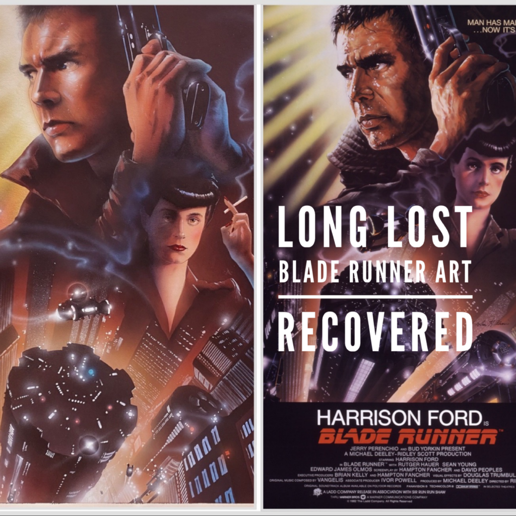
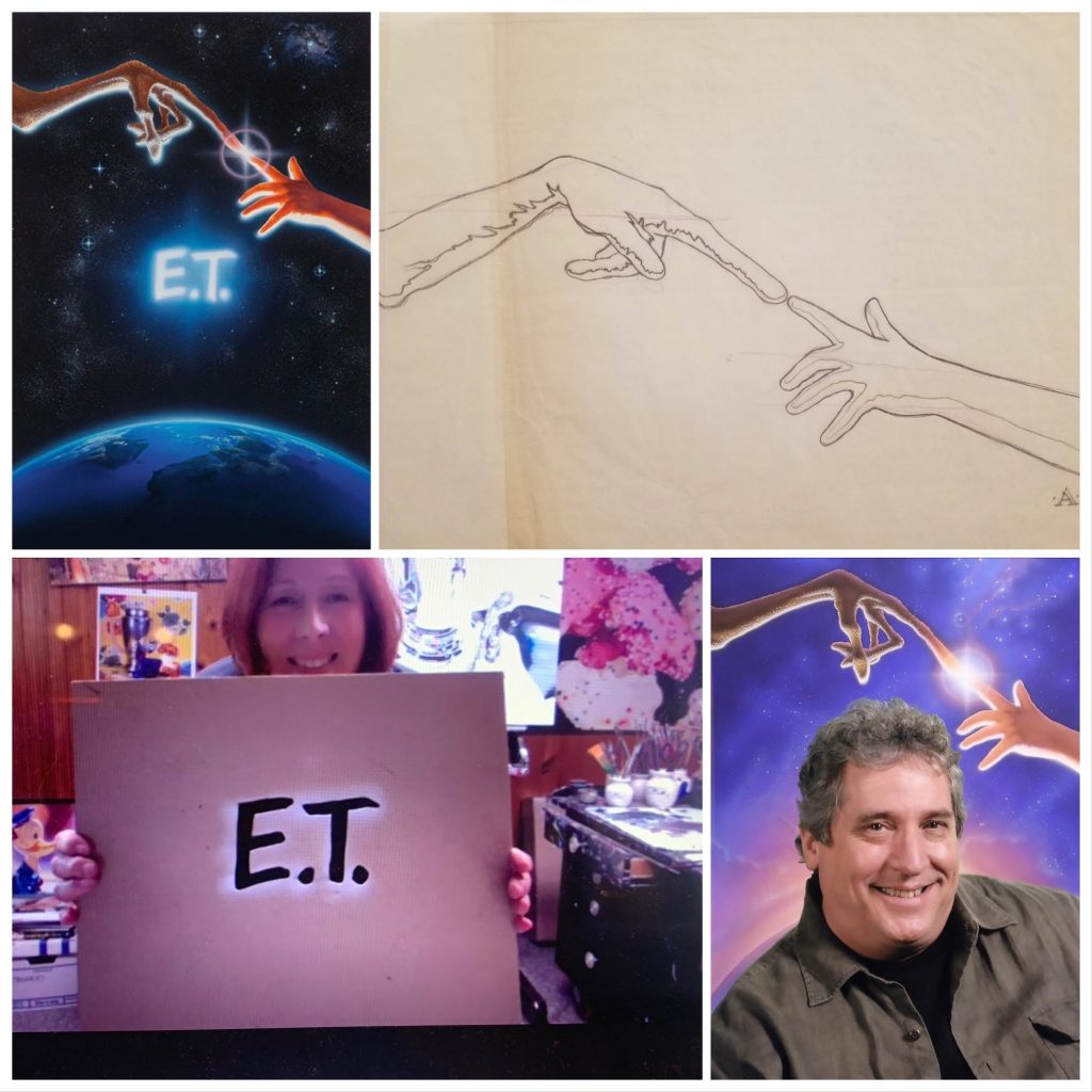
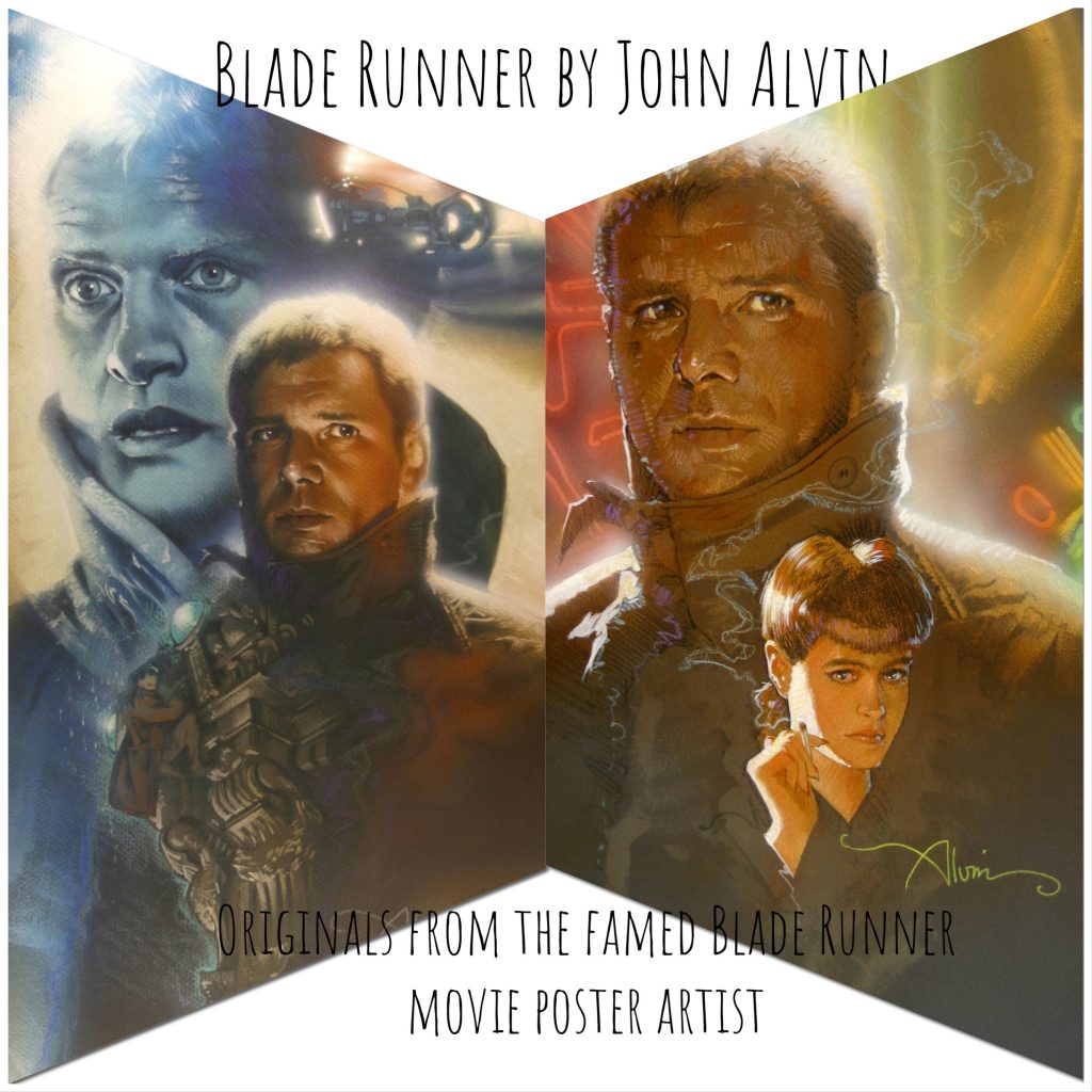
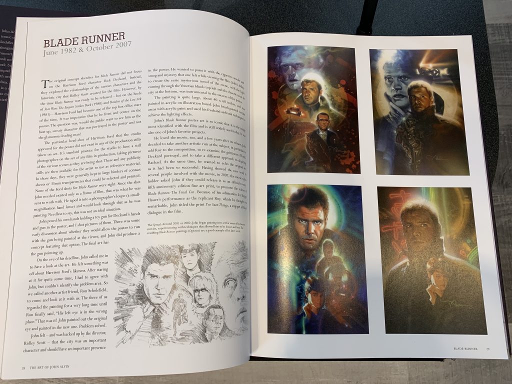
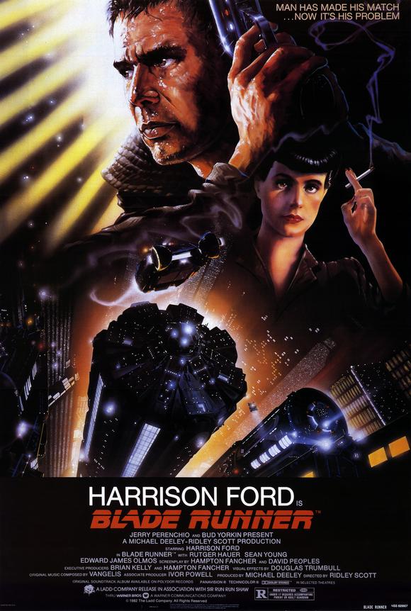
Long lost John Alvin Blade Runner art has been recovered in a settlement that represents a landmark win for illustrators and artists’ rights.
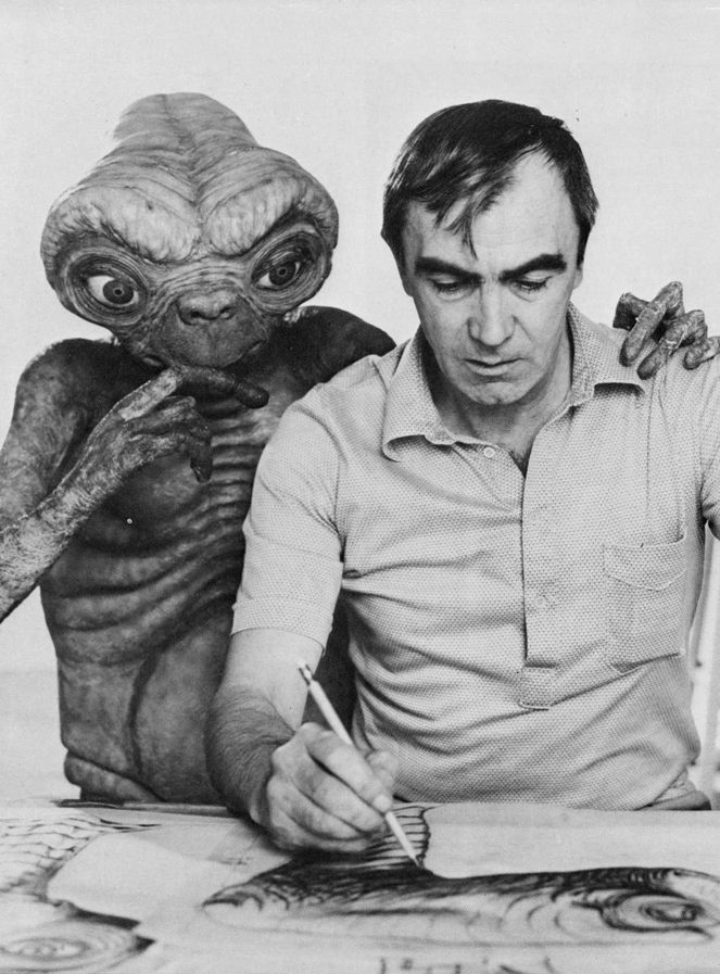
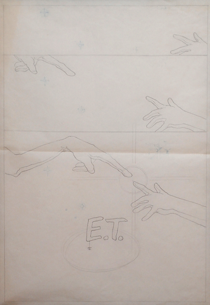
As many of you know, not only do we sell Disney Fine Art and original production art from cartoons and live action films, Leslie of ArtInsights is also the official representative for the estate of cinema artist John Alvin. If you’re not sure who he is, he’s responsible for over 200 movie posters in the history of film, from the 70s through the 90s (and you can read more about him HERE.) From E.T. to Blazing Saddles to Blade Runner, film fans will recognize his art instantly when they see the movie posters. Directors, art departments, and film marketing firms who collaborated with him have repeatedly said his art had a significant affect on the success of their films.
We have been working in partnership with the Alvin family to get back art not returned at the time these movies were released. A lot of art disappeared, despite the fact that John Alvin was freelancing and his work was supposed to be returned to him. Years later, many pieces are still unaccounted for, and still other art has shown up at auction.
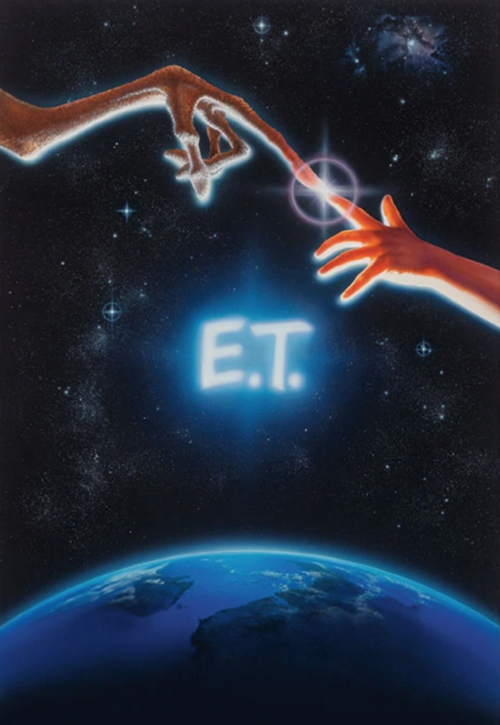
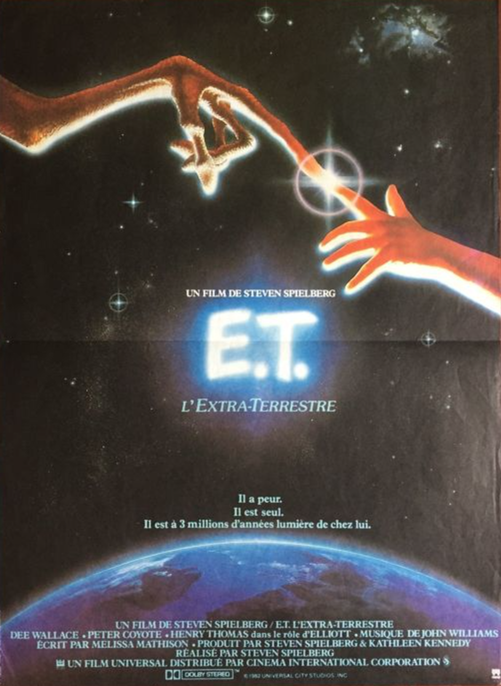
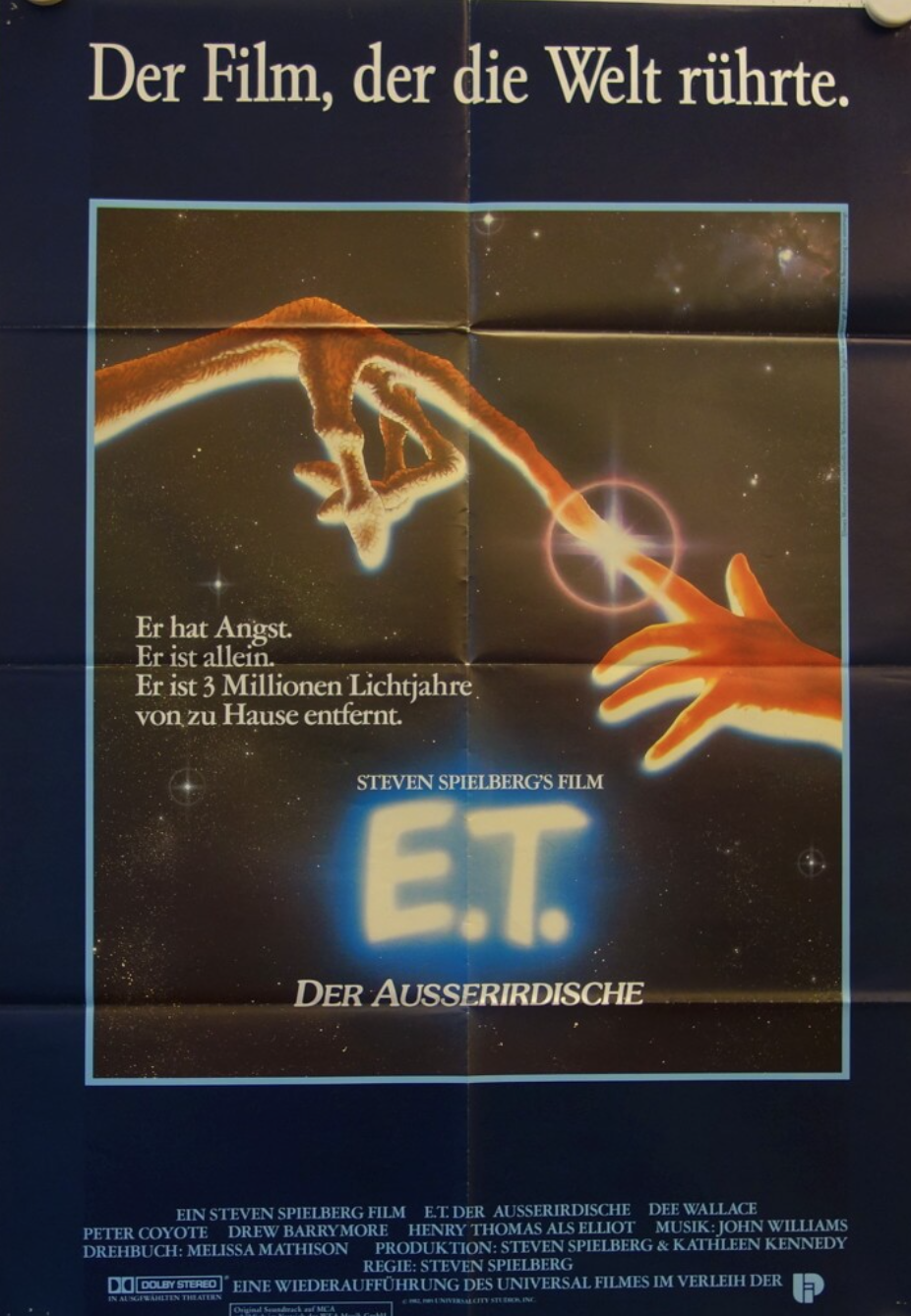
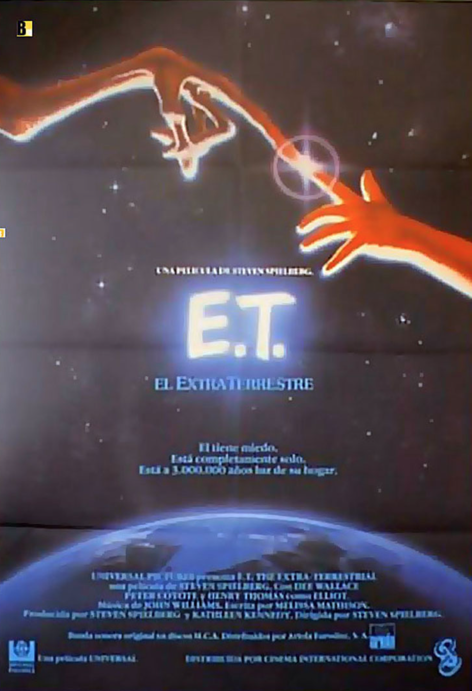
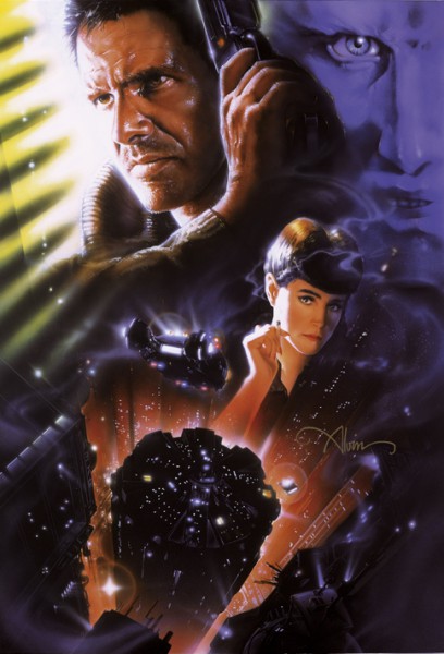
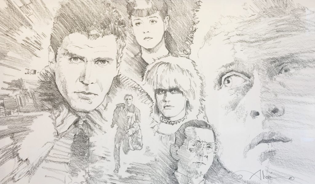
Such is the case with Blade Runner, and now, long lost John Alvin Blade Runner art has been recovered! We are incredibly excited that Andrea Alvin and the whole Alvin family is now in control of a high comp from the film. It’s the last image created before they created the finished art used to make the Blade Runner movie poster.
This settlement has the potential to have a huge impact on other artists getting art returned to them that is rightfully theirs.
SO MANY artists important to film history have missing art, removed from studios or production houses. Some of those pieces are iconic and valuable, and are sold for large sums without the artists themselves or their families benefitting. It’s more than time for that to change. Along with John Alvin, other heroes of film illustration like Drew Struzan, the brothers Tim and Greg Hildebrand, Roger Kastel, and Bob Peak all had issues getting art returned. If someone steals a painting from the Louvre, the entire French government is engaged to get it back! It should be no different for the work by these all-too-unsung artists. Hopefully the recovery of John Alvin’s Blade Runner art is a portent of things to come. There are artists still working in the film industry today, as well as illustrators working in other industries like publishing or music that could benefit from this win. We are thrilled, and we think all movie and art lovers should be, too!
Andrea Alvin herself speaks to the importance of the Blade Runner settlement in the press release below:
====
LONG LOST BLADE RUNNER ART RECOVERED
LAWSUIT SETTLEMENT REPRESENTS A LANDMARK WIN FOR ILLUSTRATORS AND ARTISTS RIGHTS
Pittsburgh, PA (April 4, 2024)— A lawsuit brought by the Alvin Art Estate to halt what the estate claimed was the unauthorized sale of art belonging to the estate has been settled. The estate’s suit was led by Andrea Alvin, wife of movie poster artist and illustrator John Alvin. The settlement confirms ownership by the Alvin Estate of an original painting created in the making of the movie poster for Ridley Scott’s 1982 sci-fi classic, Blade Runner. The mixed media painting was a comprehensive, the closest to the final art used in making the key art for the finished Blade Runner movie poster, one of the most recognized sci-fi movie poster images in film history. The outcome will likely be used as a precedent in future lawsuits by artists working to get art back from those who have obtained it without purchase or permission of the artist.
John Alvin and many other artists working as freelancers in the film industry in the 70s, 80s, and 90s had contracts requiring the art be returned to the artist after being used in campaigns. However, there has long been a practice of people “finding artwork”, often removing it from flat files inside a studio, claiming ownership, and selling the art in a gray market. In those cases, the artists neither get the art back nor benefit from the sale of that art.
In the case of the Blade Runner art, Andrea Alvin, who is an artist and was equal partner in Alvin and Associates, discovered the art’s whereabouts when it appeared for sale at auction. She knew by the information included in the auction listing, that it had been purchased from an employee at Warner Brothers. Because Warner Brothers never owned the art, no employee at Warner Brothers could legally claim ownership or have permission or rights to possess and sell the art.
When contacted, Andrea Alvin offered this quote: “The Blade Runner and all artwork created in the process of the film campaigns to which John contributed represent his life’s work. Whether we keep art or it winds up in the collections of fans, these images are his legacy. We are pleased with the outcome, and so happy to now have control over its destiny, which is as it should be.”
Alvin further explains why this lawsuit provides a framework for other artists to recover original art: “Where the conflict comes in, and where people get confused, is there’s a difference between owning the publication rights and intellectual property, and owning the art itself. The settlement supports the idea that it’s possible to get art back into the rightful hands of the artists and creators.”
As a requirement of the settlement, the art will be sold through Heritage Auctions in the “Signature Hollywood Auction” to be held on July 13th and 14th of this year.
ABOUT JOHN ALVIN:
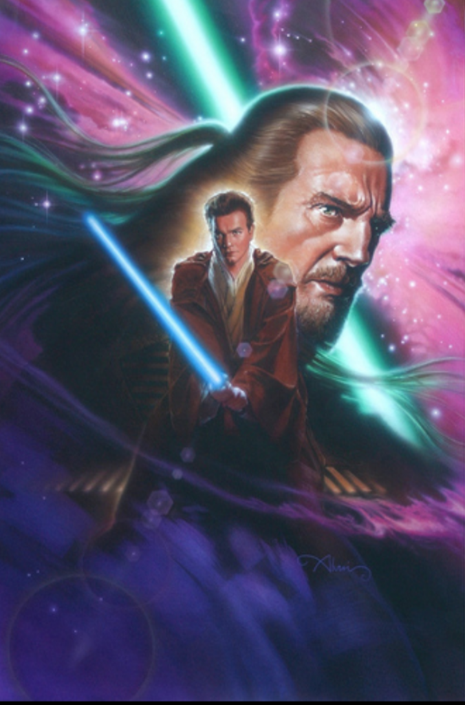
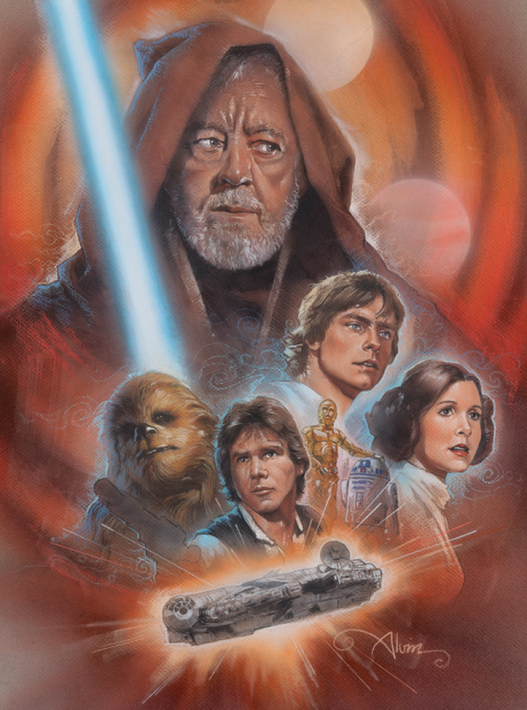
John Alvin (1948-2008) was an American cinematic artist and painter who illustrated some of the 20th century’s most iconic movie posters, working in the industry for over 35 years. He came into prominence by creating the poster art for Mel Brooks’ Blazing Saddles in 1974, and went on to design art for over 250 films, creating more images for Spielberg productions than any other single artist, including the poster art for Empire of the Sun, The Color Purple, Always, Jurassic Park, and E.T.His poster for Blade Runner, considered by many as one of the top classics of sci-fi, is immediately recognizable around the world. He also supplied specialized work for George Lucas and the Star Wars saga, with Alvin’s Star Wars Concert and Star Wars Tenth Anniversary images considered two of the most collectible posters of the entire franchise. He is also recognized for movie poster images from Disney’s New Golden Age. His posters for The Lion King, Beauty and the Beast, The Little Mermaid, and Aladdin are in part what led to Disney studio executive Fred Tio coining the phrase “Alvin-izing” in reference to his style. His work have been on display in museums across the world, including the Smithsonian Museum, which exhibited Alvin’s art for The Phantom of the Paradise as one of the best posters of the 20th century. John Alvin’s career places him as one of the most important figures in film art and Hollywood history.For more information, please visit https://johnalvinart.com/
====
You can see the art we currently have for sale by John Alvin HERE, but of course let us know if you’re interested in his work or the films he worked on… Although currently most of the Alvin art is part of the John Alvin Art Estate and unavailable for purchase, we do get limited edition and original art from time to time. It’s worth getting on our list!
Join us in congratulating the Alvin family, and in celebrating the importance of this for illustrators everywhere!
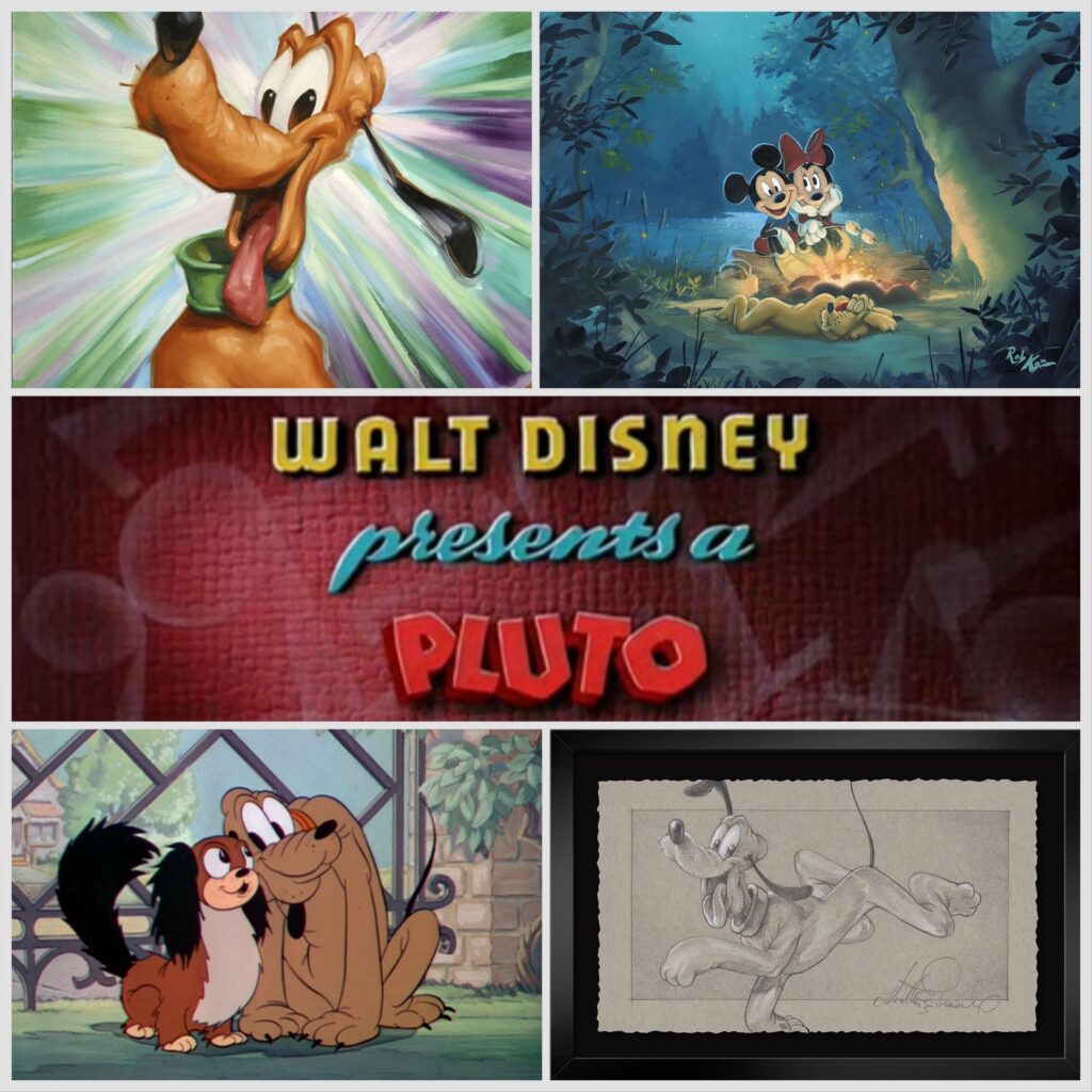
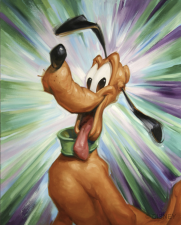
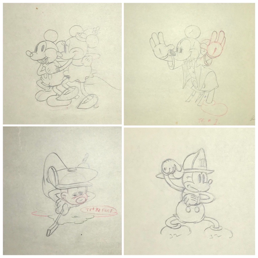
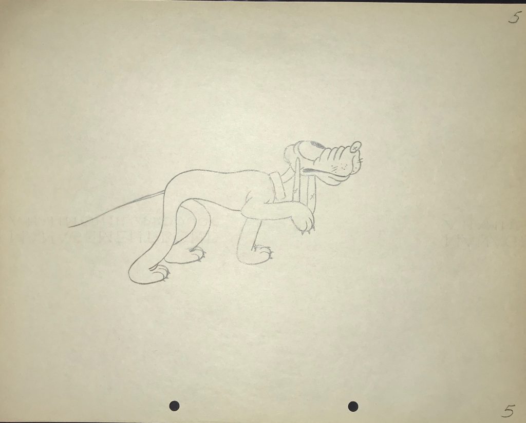
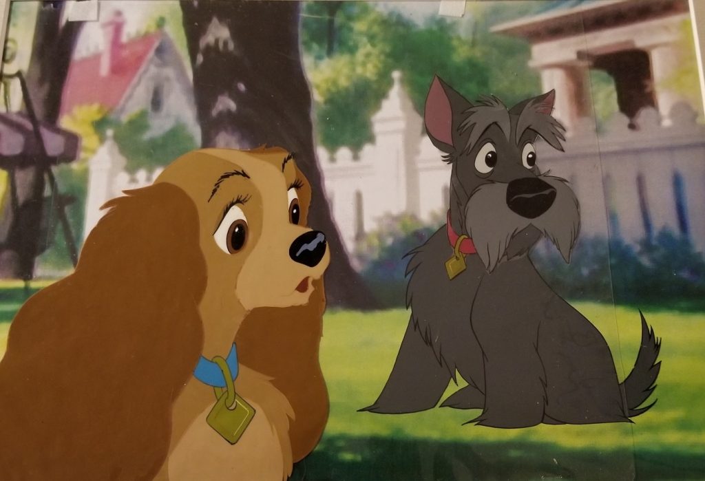
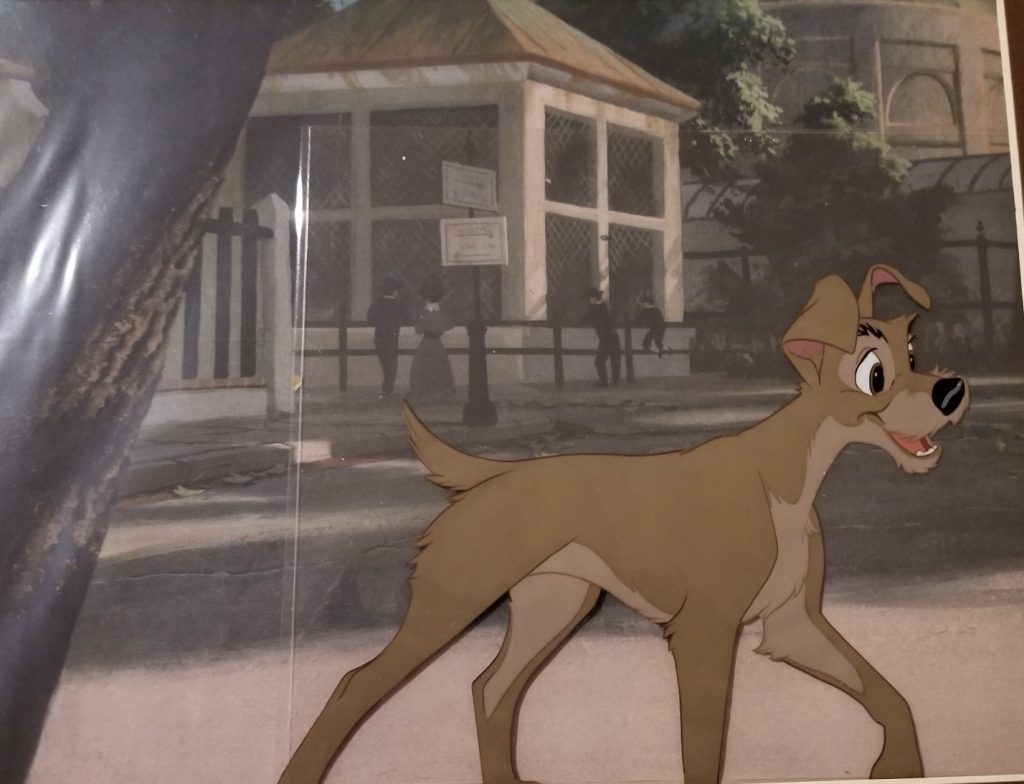
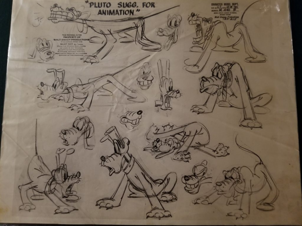
As it’s the early part of 2024, and we at ArtInsights are in a new era with our hybrid in-person and online model, I thought it would be a good idea to start a fresh, fun new Spotlight blog series, and since I grew up in a family always surrounded by canine companions, I decided on Disney Dogs. There are just so many to love! Of course it makes sense to start at the beginning, with Mickey’s faithful dog Pluto, who is probably the oldest pup still appearing onscreen, at 94 years old!
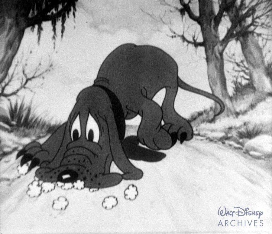
Pluto’s actual birthday is pretty soon, too. He was introduced on March 19th, 1930, in The Chain Gang. If there was any doubt what breed he favors, it’s bloodhound! (Who knew?) Years later, after he was more than just a nameless bloodhound, he was declared a mixed breed by the Disney folks.
Unnamed, but Pluto in the making!
Unlike characters like Goofy, who is an anthropomorphized dog, Pluto is a dog who acts like a dog….mostly. Did you know before his character was set, in one cartoon, he actually spoke? It was in 1931’s Moose Hunt, where he was officially made Mickey’s pup. At one point, Mickey says, “SPEAK!”, and Pluto gets on his knees and says, “MAMEE!” (that’s a reference to Al Jolsen in The Jazz Singer, which was released in 1927, and was the first full length feature with synchronized sound)
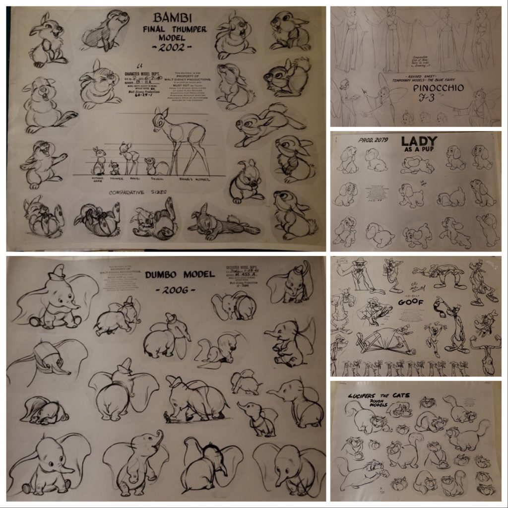
Pluto was designed by animator Norm Ferguson, who is best known for animating the witch in Snow White, and worked on many of the greatest Disney classics, including Pinocchio, Fantasia, Bambi, and Cinderella. Frank Thomas and Ollie Johnson, two of the Nine Old Men of Disney, who together wrote the essential 1981 tome Disney Animation: The Illusions of Life, believed in the genius of Ferguson’s work. They called the flypaper sequence featuring Pluto in the short Playful Pluto (a 1934 cartoon in which the pup went from a minor character to getting his first key role) a “milestone in personality animation…through it all, his reaction to his predicament and his thoughts of what to try next are shared with the audience. It was the first time a character seemed to be thinking on the screen, and, though it lasted only 65 seconds, it opened the way for animation of real characters with real problems.”
If you click here you can see a comparison of the color sequence from 1939’s Beach Picnic in which Shamus Culhane reworked the original work by Ferguson in 1934’s black and white cartoon, Playful Pluto. Ferguson’s animation is a thing a beauty!
Pluto appeared in 24 Mickey Mouse cartoons before his first solo performance. He began as the headliner with the Silly Symphony cartoons Just Dogs (1932) and Mother Pluto (1936).
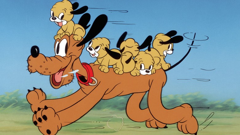
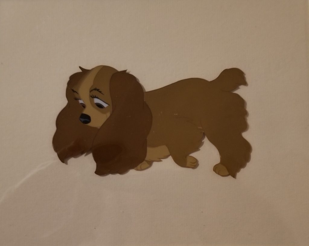
In the first installment of his own series of cartoons, Pluto has puppies! He has 5 rambunctious sons in 1937’s Pluto’s Quin-puplets, a short in which his puppy love Fifi the Peke is the mommy to his babies. One of those puppies appears again in 1942’s Pluto Junior. Pluto also has a brother named K.B, who appears in 1946’s Pluto’s Kid Brother.
Pluto Quin-puplets!
Although there are several cartoons featuring Pluto as the star, there aren’t consistent shorts with him as the lead until 1940, when the series called “PLUTO” begins, starting with Bone Trouble.
Of the 89 shorts Pluto appeared in between 1930 and 1953, 4 were nominated for Academy Awards. It was one in which he was heavily featured, though, 1941’s Lend a Paw, (which you can see HERE), that won an Oscar. While, like all but one of his cartoons, he still only barks, his “devil” and “angel” alter-egos do speak!
Pluto has two love interests in his history. Minnie’s pet Fifi, was his paramour early on, and their love was strong! They appear together in Puppy Love (1933), Pluto’s Quin-puplets (1937), Mickey’s Surprise Party (1939), and Society Dog Show (1939).
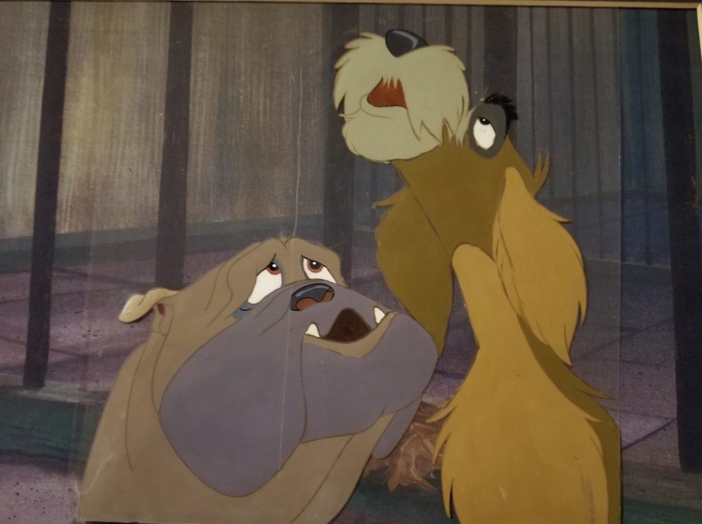
She is replaced with Dinah the Dachshund (what happens to Fifi? unclear…), who first appeared in The Sleep Walker (1942). Dinah is a bit of a flirt, in that she also dates Butch the Bulldog, but eventually she dumps him for his bad attitude. The most charming short with them together is Pluto’s Heartthrob, which you can see here.
Pluto as a character wasn’t in a short for nearly three decades. He was last seen in 1953’s The Simple Things, and then finally returned in the 1990 short The Prince and the Pauper as, once again, Mickey’s trusty pup. Since then, he has continued to be one of the most popular characters of the Disney animated family, and a beloved part of what Disney fans call “The Sensational Six”, along with Mickey, Minnie, Donald, Daisy, and Goofy.
YOU CAN SEE ALL THE DISNEY FINE ART OF PLUTO AVAILABLE AT ARTINSIGHTS HERE, but here are a few of my favorites:
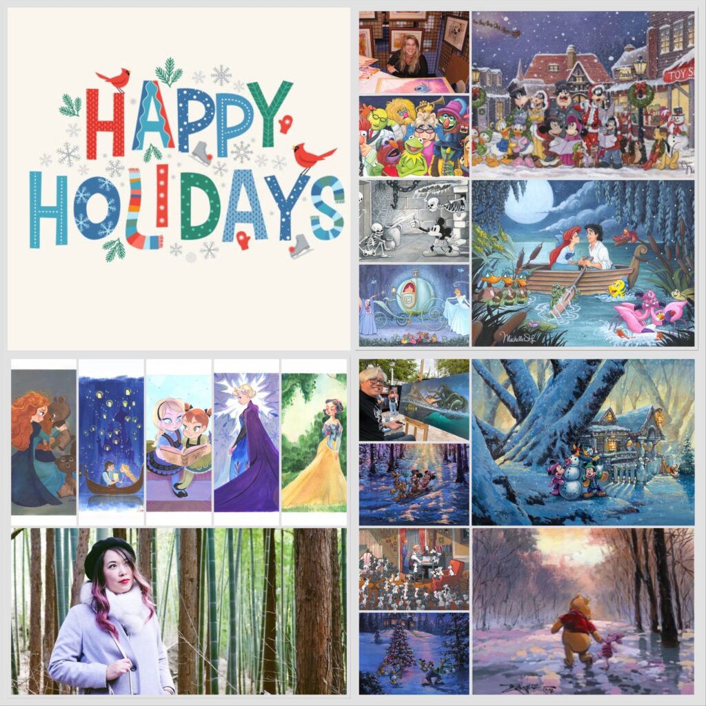
We’re in the midst of Honukkah 2023 and, as Joni Mitchell would say, “It’s coming on Christmas”, and with all that’s happening in the world, it’s something that should be celebrated right now. I’ve discovered, over time, that Disney fans and collectors are the most avid lovers and celebrants of Christmas, Hanukkah, the Winter Solstice, and any other winter holiday they can embrace. Disney fans believe in finding joy. They (or maybe should I say, YOU) believe in finding the best, seeing the good, and celebrating that, no matter what else is happening. So, how about holiday greetings from Disney fine artists to all of their fans? YES! YES, THAT’S A GREAT IDEA!…
This love of Disney and joy is evidenced by some of the popular shorts and features embraced during the darkest times in American history. Some of Disney’s earliest Christmas cartoons were released during the Great Depression. 1931’s Mickey’s Orphans, 1932’s Santa’s Workshop and Mickey’s Good Deed, and 1933’s The Night Before Christmas were all not only innovative, but also joyful holiday Disney cartoon shorts. Through the years, Walt Disney Studios has released what have become some of the classic cartoons connected to the season, including the Sorcerer’s Apprentice, which was part of 1940’s Fantasia, Once Upon a Wintertime, released as part of 1948’s Melody Time, Lady and the Tramp, which in 1955 features lovely Christmas scenes, and of course more recent favorites like 2009’s 4-time Emmy winner, Prep & Landing, which you SHOULD ABSOLUTELY SEE! (It’s on Disney+, along with a bunch of other Disney holiday classics, and you can find them HERE)
Keeping all that history in mind, I am honored that when I put a call out to some of my favorite Disney Fine Artists, many came back with very sweet and appreciative holiday wishes to their collectors and fans! Below are their names and some of their best official Disney limited editions available to collectors, which you can click to see their whole collection.
========
WILLIAM SILVERS
“So often around the holidays, it takes such effort to really get into the spirit, we are in such a whirlwind preparing for Disney art events and shows. Then Ewa and I realize how incredibly lucky we are to be a part of this Disney family. Collectors are so generous and so kind to us, and say such wonderful things about the art I create, it brings us right back to why we celebrate the season. It’s about family, and kindness, and gratitude. We want to take this time to thank all of you for being so supportive of my work and to all my fellow artists that create Disney images. Disney is about finding joy, and that’s exactly what the holidays are about.
Thank you all for all your support and kindness, and for all the time I get to spend with the collectors who support my art. I look forward to a great new year, creating more art, and meeting more of you. Happy Holidays!
Bill Silvers & Ewa Podolska-Silvers”
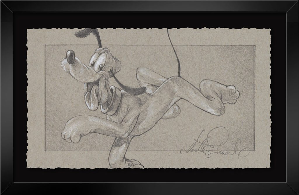
HEATHER EDWARDS
“I am so lucky to be able to say that I love the people I get to work with at Disney Fine Art and every one of you who have come into my life over the years. A little over a decade ago, if you’d told me I would be working with Michael and his amazing team at DFA creating Disney artwork, I probably would’ve laughed. How awesome is it that I have been blessed to work with such good people and stories that are so beloved! It has truly been a gift to me. I hope and strive to return that gift to all of you through painting in the decades to come.
Humbly yours and the Happiest of Holidays,
Heather Edwards”
CRAIG SKAGGS
“It’s hard to believe it’s time for decorations, carols, and holiday get-togethers already. It’s been such a busy year of creating new work, this year seemed to go by in a blink.Next year is already looking like it’s going to be even busier. I can’t thank my fans enough for their continued support. Rest assured I’ll continue to push myself to produce the best possible Disney art I can to keep those smiles and dreams alive.
Merry Christmas, Happy Holidays, peace and love to everyone!
Craig Skaggs”
TIM ROGERSON
“It still blows my mind that I get to do what I love everyday, the thing I’ve done ever since I could first hold a pencil, and that’s to bring my favorite characters to life through art. It’s only been possible because of all the love and support I’ve received these past 20 years from galleries and collectors all over the world. I’m forever grateful. To Leslie at ArtInsights and to all her collectors, I wish you all a Merry Christmas, a Happy Hanukkah, and a new year filled with happiness and amazing art!
Cheers, Tim”
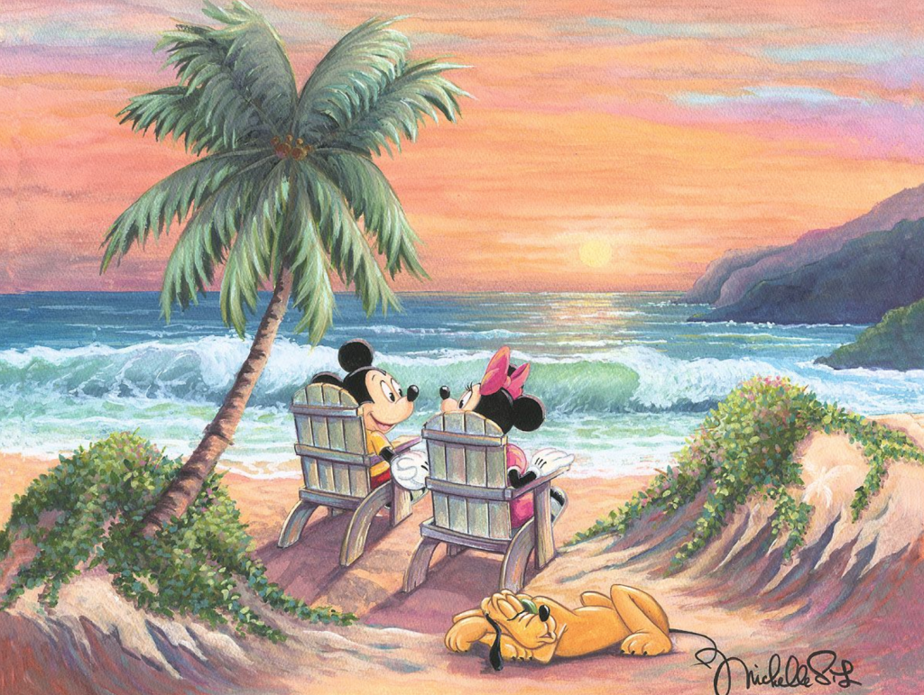
MICHELLE ST. LAURENT
“Happy Holidays to all! This has been a very busy year of creating many new Disney Fine Art original paintings and Limited Editions. Thank you so much to all my collectors who love and appreciate the art so much. All the hard work really is a dream come true and I love sharing it with all of you.
See you real soon, Michelle”
VICTORIA YING
“As 2023 comes to a close, I want to reflect on my artisticjourney so far. I’m so grateful to Disney and the Disney community for being a huge part of my creative life and continuing to inspire me as I go forward to tell my own stories. Without Disney, I wouldn’t have had the grounding to understand storytelling and creating magic. I’ll always be proud of the time I spent at the studios helping create timeless tales with incredible teams. Thank you, to every member of this community who has made it possible to make beautiful things.
Victoria”
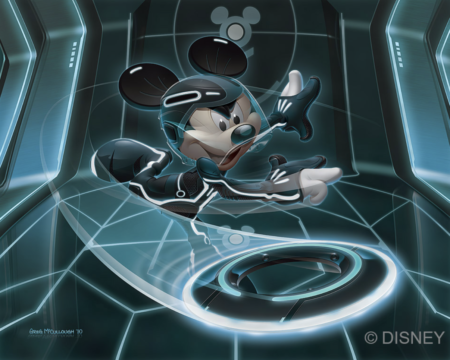
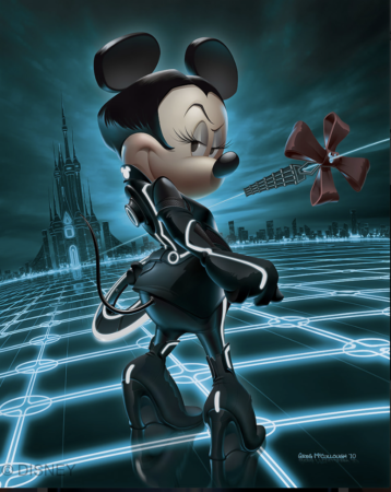
GREG MCCULLOUGH
““Dreams come true …when the work is put forth.” We are living the dream.Thanks to all our fans and collectors who make it possible.We are so ever grateful.We wish you all a joyful holiday and may all your wishes come true.
Greg and Nath McCullough”
JOHN ROWE
“Wishing everyone a happy holiday, Christmas, winter, day off, and new year season! All the best to you all!
John Rowe”
DENYSE KLETTE
“I love this time of year. Being able to see family and friends is the part I cherish the most. Living in Canada our Christmas season is usually always white and chilly. One of our traditions is homemade hot chocolate with alot of marshmallows after a day of skiing. Sometimes with a little extra something. Our Disney tree is up and shining bright and the gifts are showing up underneath. This year has flown by with all the Disney events and shows. I can’t tell you how much I love creating the art for the different galleries. I think one of my favorite part is seeing my prints on the Shop Disney site. Its a pinch me moment. I am grateful everyday that this is how I making my living. Merry Christmas to everyone.
Denyse”
RODEL GONZALEZ
“I’m humbled waking up every morning knowing that I’m able to do what I love to do. It’s an added blessing knowing that I can create Disney, Star Wars and Marvel art aside from my own fine art. In this season I wish all the best to the Disney collectors, galleries, and fans from all over the world that have collected my artwork… I feel super grateful and blessed to have had all your support through the years. Merry Christmas and Happy 2024!
Rodel Gonzales”
JIM SALVATI
“I paint Disney art for grown ups! My new Soul work is the perfect example of grown up art . Soul is being released again next year, and I have some new cool pieces coming, even a silk screened piece. Happy Holidays!
Jim Salvati”
========
We at ArtInsights wish you happy days, holidays and beyond, and a very safe and prosperous new year for 2024. We feel incredibly fortunate that we’ve been so successful, not only in our gallery space for the last 30 years, but now in our new hybrid model. And, REALLY, we couldn’t do it, we couldn’t work staring at nature and with cats curled up nearby, without you. You, our loyal clients, have bought great art and supported us through all the best and worst years, and we are humbled and so appreciative that you trust us and honor us with your support. Thank you. Thank you. Thank you! and now it’s on to 2024. The best is yet to come!
Love, peace, and joy,
Leslie and Michael (and T’Challa and Lobo, our home gallery cat-interns!)
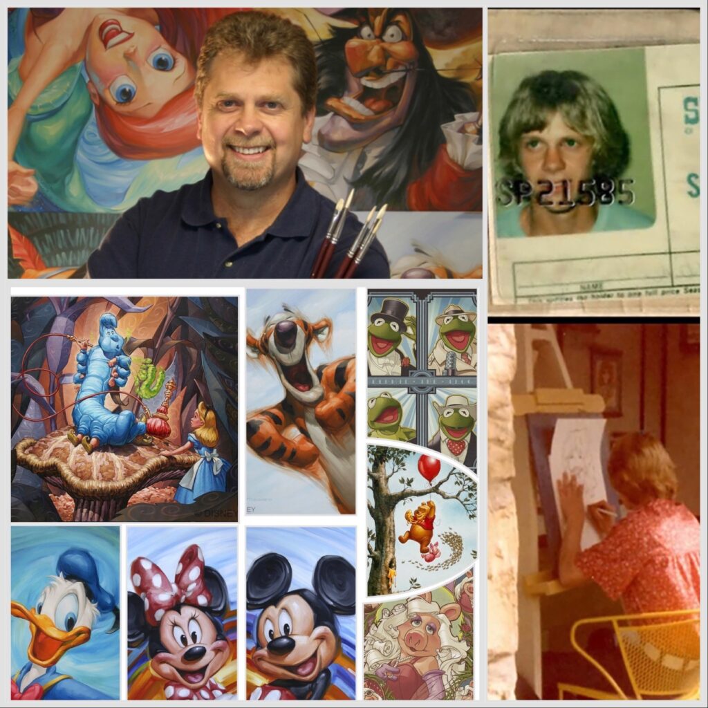
Greg McCullough is one of the most beloved artists working today, and has a strong following of collectors who seek him out at his Disney events throughout the year. He releases art regularly, and those pieces are only available directly through Disney at his events. Greg has been working in the film and animation industry and as an illustrator since we was a teen. He learned his love of art from his family, and continues to seek joy through art every day with his artistic collaborations and life experiences with his wife, Nathalie. ArtInsights has the honor of exclusively representing art by Greg through “The Archive of Disney Editions by Greg McCullough”. As part of the release of these vintage, sold out images to our collectors, we spoke to Greg about his career and what brings him joy in this exclusive interview:
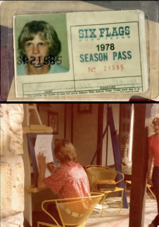
You worked as a caricature artist at Six Flags Over Texas as a teen. Can you talk a bit about your love of art and how it began as a younger child that led to Six Flags?
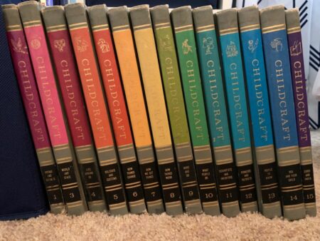
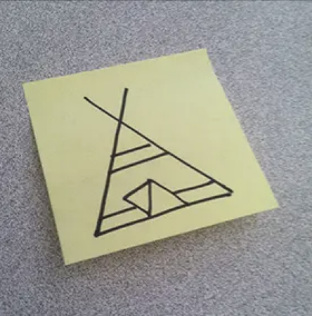
Greg McCullough: I was inundated with things that inspired creativity from the start. My mom had a 1964 Childcraft Encyclopedia Set with one book “Make and Do”, and my mom and I concentrated on that. There were things like “How to carve a turtle from a bar of soap”. My grandfather taught me to build with tools, and I loved spending time with them doing crafts. I taught my fellow kindergarteners how to draw a teepee. “Seek and Find” books gave me a love of black and white line work. I still have some of the early drawings of spacecrafts I did.
Childcraft encyclopedia
Greg’s teepee drawing
Greg at Six Flags!
I worked at Six Flags in 1978, when I was still a teenager, and I did caricatures of their guests. I did that for 3 summers, but also continued to do caricatures at events and conventions for many years.
My dad’s parents were really into art. They were Norman Rockwell collectors, to which I am still tightly bound as an artist.
Who were your biggest influences as a fledgling artist and who inspires you now, and why?
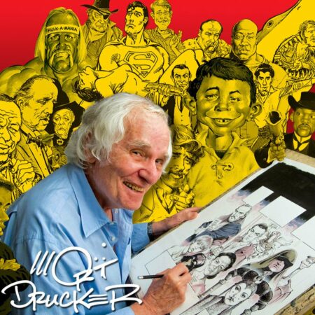
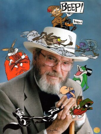
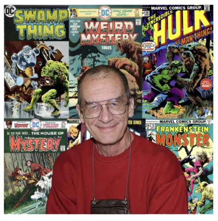
When I was a teenager, I loved the work of Mort Drucker of Mad Magazine, animator Chuck Jones, and Bernie Wrighson, who did the best horror comics. When I started doing illustration and was looking to the best advertising illustrators in history, I was inspired by CF Payne, Bill Mayer, Chuck Slack, Dave Willardson and John Hammagai. In terms of design, I’ll always look to JC Leyendecker for his style, color, and boldness. In terms of living artists, I love James Tennison, because he has an amazing amount of color everywhere, and he had an uncanny ability to draw what he sees, and someone who passed away recently, but will always be an inspiration in terms of style and business savvy, is John Howard Sanden.
Mort Drucker
Chuck Jones
Bernie Wrightson
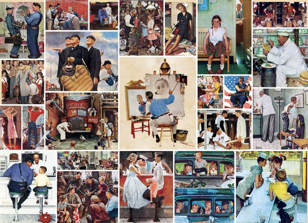
I’m now full circle to Norman Rockwell, and study both his work and the the work of Leyendecker in my paintings, and I think I’ll always be inspired by them. They’re the best of the best in the history of illustration fine artists.
Norman Rockwell art
JC Leyendecker art
You started Artifx Studio in 1994, and did commercial work for some very high profile clients. How did illustrating in the commercial space feed your artistic soul, and what are your favorite projects from that time?
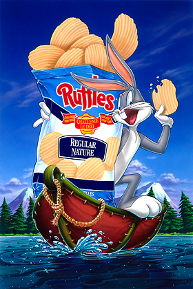
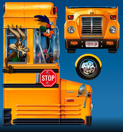
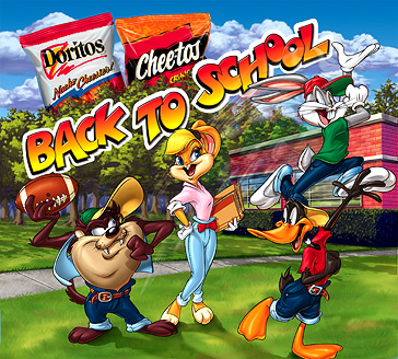
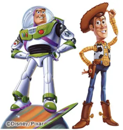
I’ve always been a technician, drawing fun things while mercilessly pushing my artistic skills. I started oil painting around 2003, and painting in oils is closest I’ve come to feeling what I paint. In terms of my favorite projects, there are so many! I did a huge Looney Tunes project of 30-plus illustrations for Frito Lay in 1994. I Bought my first house via Bugs Bunny! I loved my work for McDonalds, which lasted for 5 years, and It’s been a complete honor doing anything involving Disney and Pixar.
Greg McCullough art for Frito Lay:
Speaking of them, what are some of the best highlights from your work with Disney and Pixar, in terms of how it has advanced your style and aesthetic as an artist? What brings you joy in your work with Disney?
When I was finishing up illustrations for the Toy Story 2 packaging for Mattel, I got an email from John Lasseter asking for prints of my Toy Story/Mattel illustrations for his personal collection. Working for Disney and Pixar brought respect to Artifx, and allowed me to have better choice in terms of the projects I took on.
Toy Story art created by Greg McCullough for Pixar
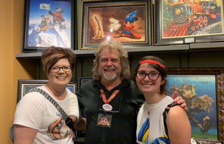
I have found working full-time as an artist, showing and signing at the Art of Disney, has allowed me to give back at levels I never would have considered. I am fortunate beyond comprehension. Seeing a smile on others bring me joy, and I am told repeatedly, often on a daily basis, how my paintings bring a smile. What could possibly be better than that?
Collectors are all smiles while photographed with Greg
What outside of the creating of art itself, best feeds your inspiration and joy as a creative person?
I spent my formable, elementary days on my grandfather’s farm in Texas. Nature, pine trees, and oxygen are my plug-ins to truly charge up my depleted batteries. My wifeNath and I spent three years RV’ing up the Appalachian Mountains into Quebec from Orlando, and then turning right at New Mexico, exploring Utah, Wyoming, Montana, Canadian Rockies and setting for three months in Banff Canada.
Greg and Nath on one of their adventures
What imagery or work have you not yet done as an artist you’d still like to tackle?
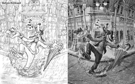
Personally I am at the beginning of what I’m calling “ROCKWELL ERA”. That started last year with Rockwell inspired “charcoals”and SOO very excited to see how far and where this leads!
(For further explanation of Greg McCullough’s “Rockwell Era”, here’s a quote from his facebook page:
“Last November I spent 4 life changing days scouring the Norman Rockwell Museum in Stockbridge MA. I wanted to know “How he did what he did, so fast, so perfect and still had fun?” For me, the missing puzzle piece is simple but not easy. For every painting, Norman Rockwell created a fully rendered charcoal drawing at the size of his final canvas, approximately 30″x40″. It’s a huge, messy job that my ego, laziness and all my time spent gathering copious amounts of reference told me from a tight sketch and lots of reference, I can figure out everything needed as I paint the final canvas. I was mistaken! It’s been a real challenge!”
I also believe the time is close, though long awaited, to begin to do relief sculpts of my most popular paintings. Doing what I love every day really means my creative spirit is always being fed, and I’m always looking to the newest way to express what’s inside me as an artist. Talking to fans and collectors is also endlessly inspiring. As I said, I’m grateful every day.
Below see some ArtInsights exclusives now available on our website. You can see all of Greg McCullough’s images by clicking HERE.
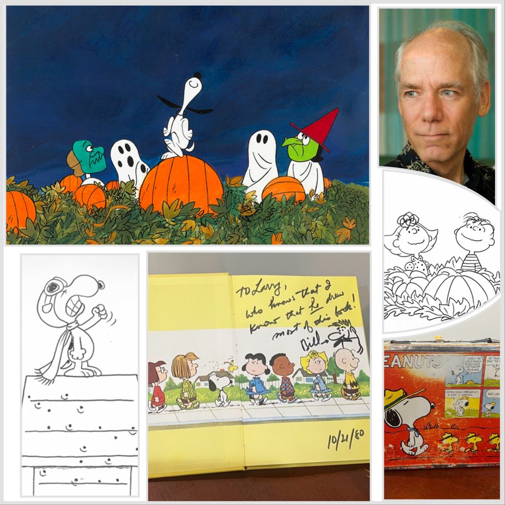
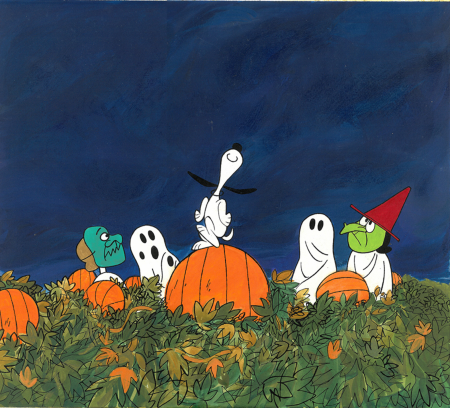
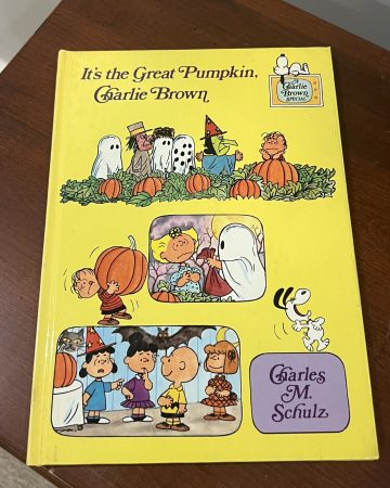
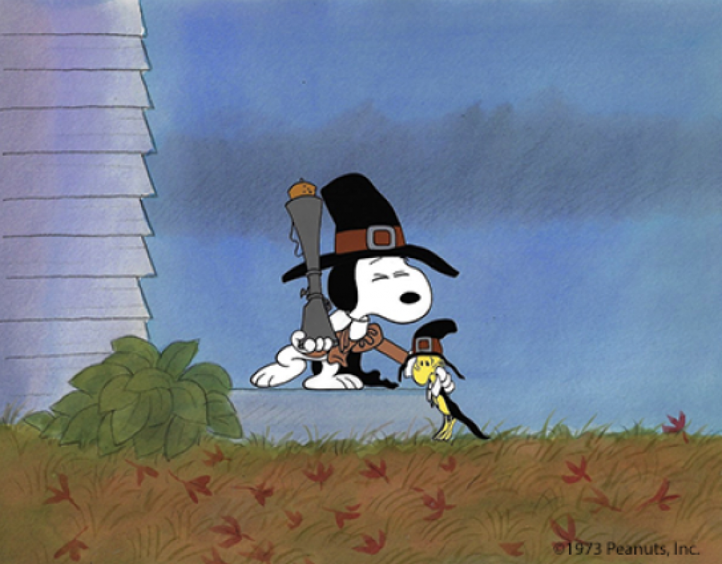
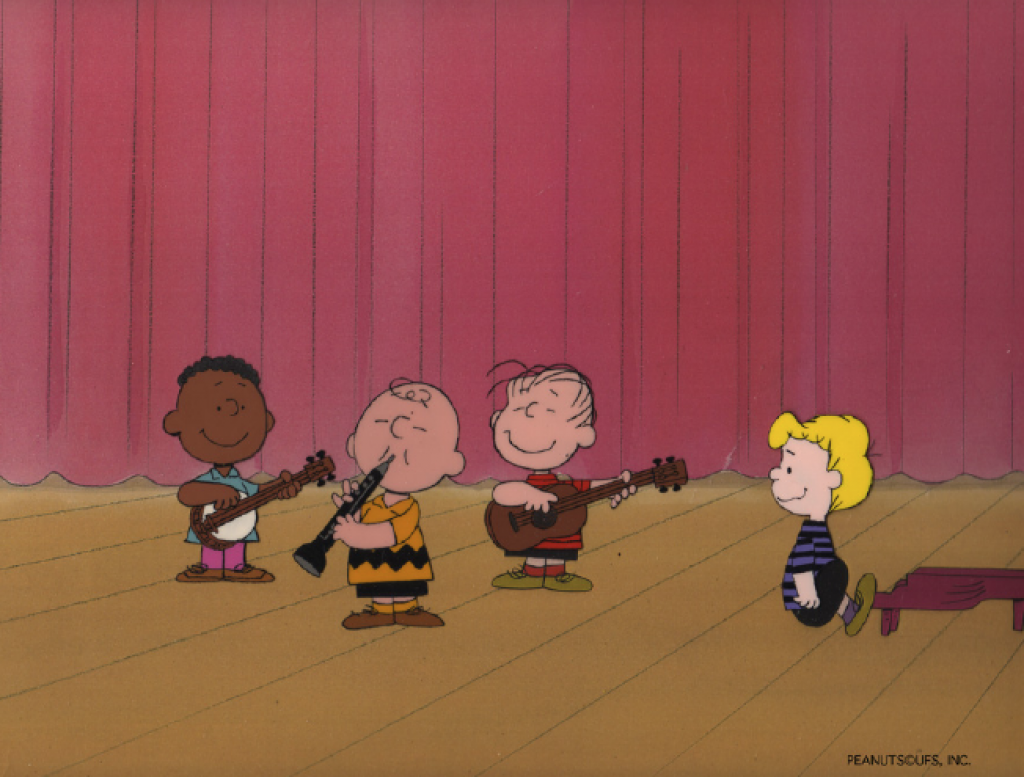
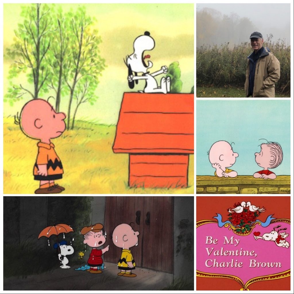
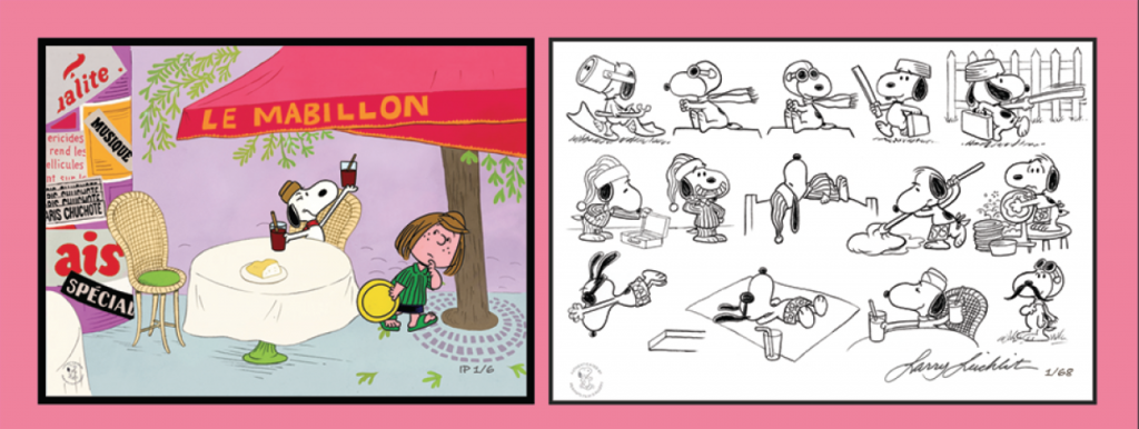
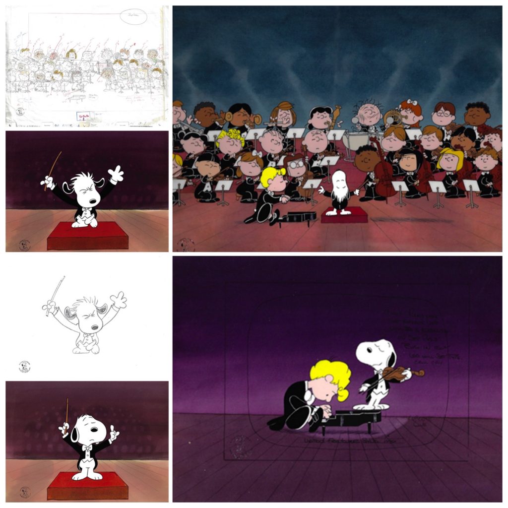
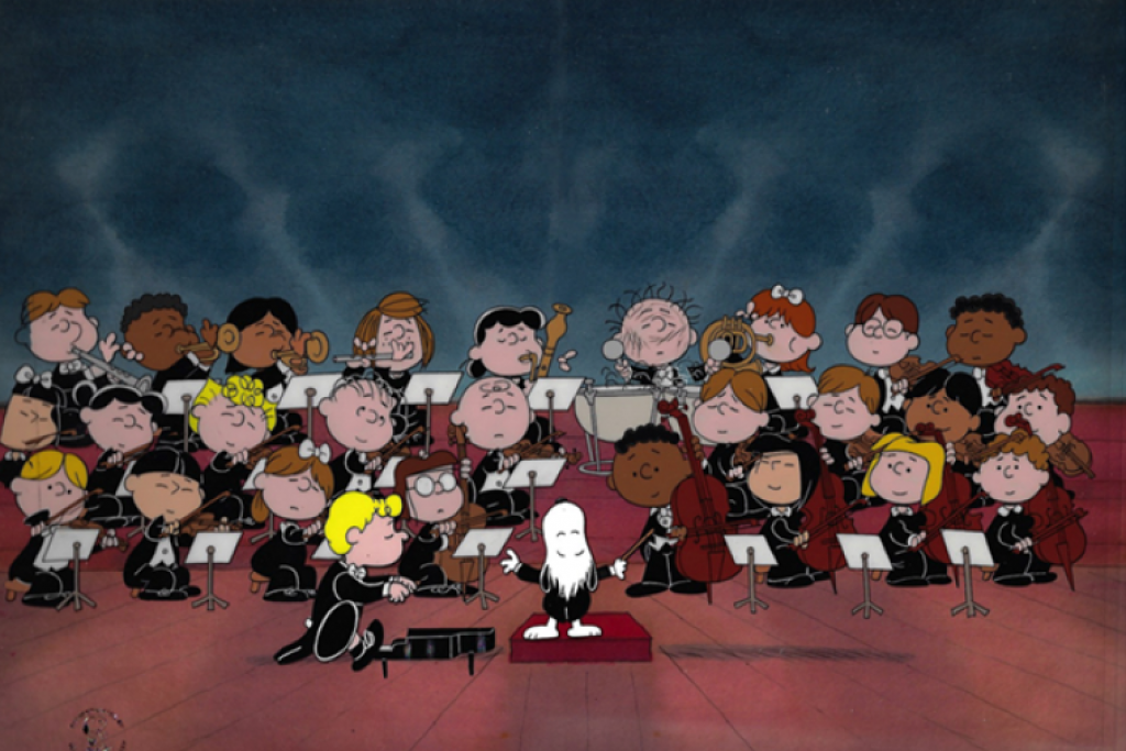
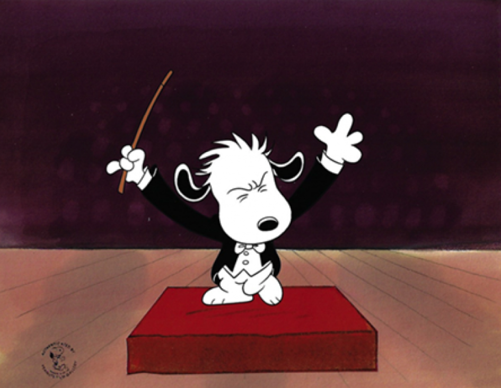
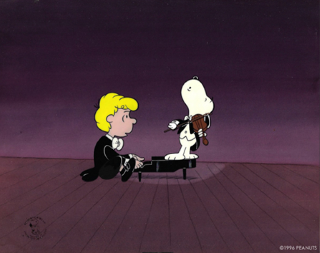
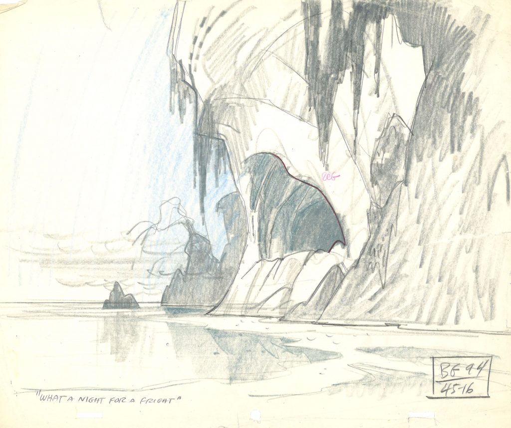
As part of our Peanuts art special event, “Halloween in August” featuring the new limited edition The Great Pumpkin, award-winning animation director and artist Larry Leichliter added layout drawings to original vintage cels that needed context.
Here’s one example:
He is also creating original drawings based on two images from It’s The Great Pumpkin, Charlie Brown for folks who buy art during our event, which includes the new limited edition, The Great Pumpkin.
The new limited edition “The Great Pumpkin”, based on the work of Ed Levitt from 1966.
The limited is based on the cover by Ed Levitt for a storybook created in conjunction with the release of It’s The Great Pumpkin, Charlie Brown. (You can read more about Ed on our blog about him HERE.
We at ArtInsights went through the whole movie in order to pick one great image that would inspire him and he could use, but we sent him about a dozen screen caps, and it was so hard for him to choose, he wound up choosing two, both of which are wonderful….
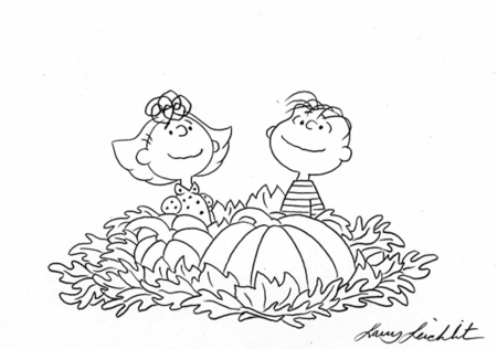
Larry captures Snoopy and the agony of defeat! “You’ll pay for this, Red Baron!”
Nothing quite captures eternal optimism like Sally and Linus in the pumpkin patch, waiting for The Great Pumpkin!
These images are then the basis for original drawings created for collectors who buy art during our show, given as a special gift. (Only one per household, and only until September 2nd. We don’t want to take advantage of his kindness or have him doing this forever!)
We caught up with Larry and talked to him about his experience as an artistic kid in LA, his memories of Halloween and It’s the Great Pumpkin, Charlie Brown specifically, and what inspired him most during his years working with Bill Melendez and company, and animating at Bill Melendez Studios, where the Peanuts cartoons were made.
Did you see animated features as a kid?
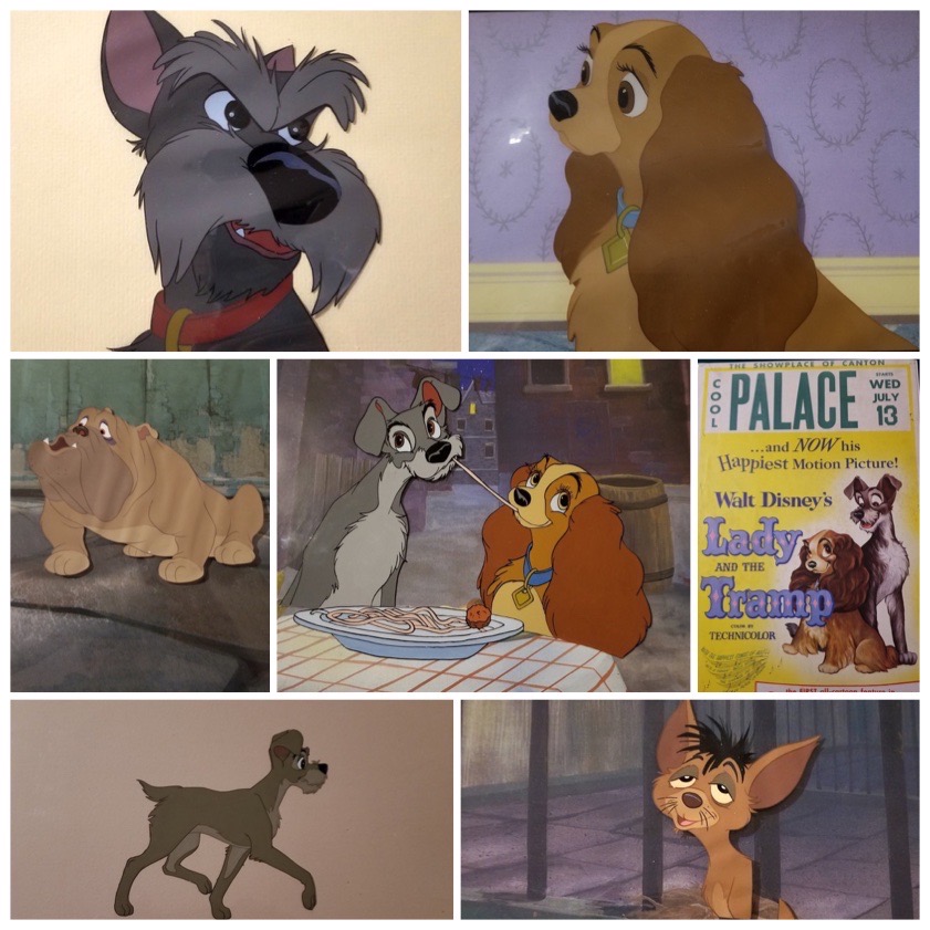
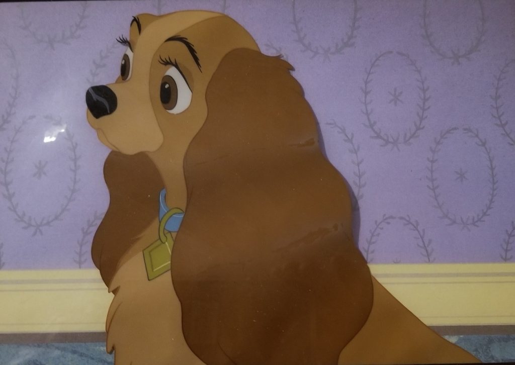
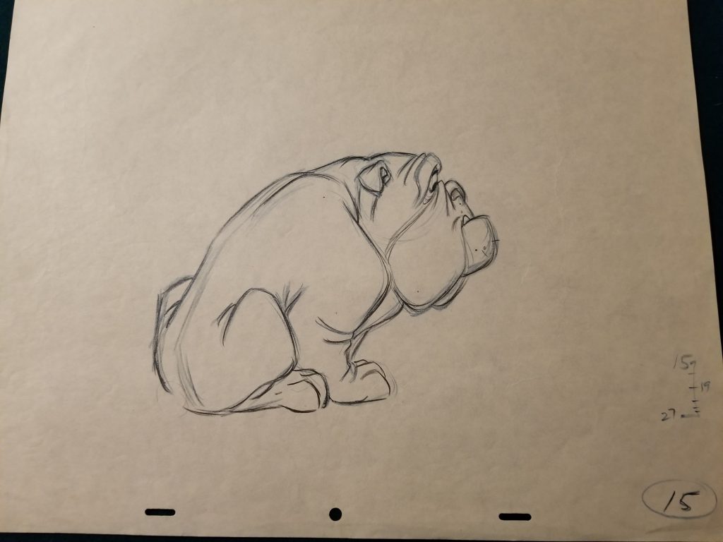
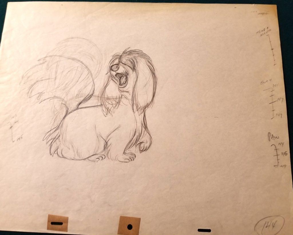
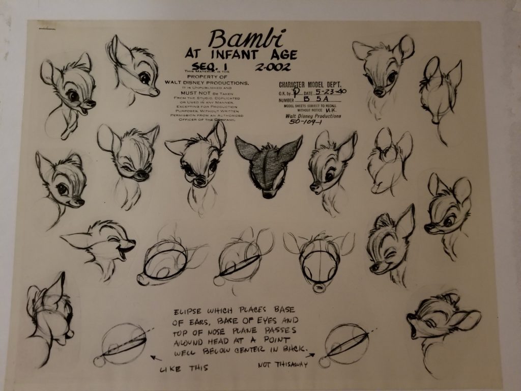
Larry Leichliter: I think I remember seeing Bambi or Pinocchio at the movie theater. I always liked to draw as a kid, and the Disney films in particular inspired me to draw. I remember I also used to draw the characters from Lady and the Tramp a lot. Copying characters from those cartoons represented my early attempts at outlines, but it wasn’t until much later, though, that I actually learned how to draw. In school, whether it’s life drawing or cartoons, you understand you’re drawing volumes and forms first, to get proportions, and then you do the details.
Did you learn squash and stretch from classes or from watching cartoons?
It’s one of the first things you learn, and I don’t even remember where I first heard the terms and learn the concept, but I do remember as a kid, making flip books. The first kind of flip book that I made was, you take a pencil, and you roll up a piece of paper on the pencil, then you could make a drawing on the piece of paper underneath, and pull the pencil down and unroll the paper that you had rolled up on the pencil, and make another drawing, and you can run the pencil up and down, and paper would curl up on the pencil, and you could make those two drawings animate. That was my first foray into animation.
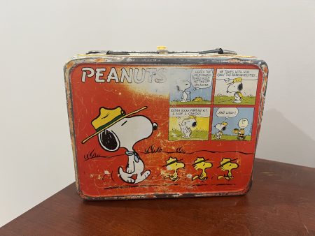
You’ve always had a love of Peanuts, and you even have proof from your own career…
I do! This is the lunchbox that I took to work every day, no matter where I worked, whether it was a Disney or Warner Brothers or any other studio, but a friend of my wife’s gave this to her, it was her son’s, and he gave it to her because he knew that I worked on Peanuts cartoons, and from that point on, in fact, even while I was working at Melendez Studios, I would take my lunch to work in that lunchbox every day, so people got to know me is the Peanuts guy.
Larry’s very much used Peanuts lunchbox
How much do you refer to Schultz’s drawings, and how much to the earlier Melendez cartoons, in terms of creating Snoopy and other Peanuts characters on-model? firstly, when you were working on the cartoons, and secondly, for the layouts that you do now, as part of the limited editions?
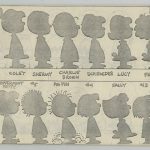
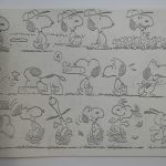
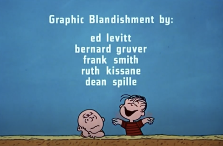
Schultz is always my first reference, because I can’t say enough about his sense of design, and how ideal these characters are, in terms of their design. They’re simple, and yet very expressive, and in some ways, easy to draw, but in other ways, you have to pay attention, so I do refer to his drawings frequently. There was a fellow who worked for Bill in the early days, his name was Frank Smith, and he did the original model sheets for the studio. I use the copy I have of his model sheets all the time. They sit on my desk.
You have that for every character? I’d love to have that, as would every collector, I’m sure!
Yeah, they have all poses of the different characters. I have the first model sheet I received when I started working there back in 1970, and it’s something I’ve kept the entire time, because it’s such a great model sheet. The drawings look so much like Schultz’s drawings. They’re just really well-drawn, and that was Frank Smith. The other thing I do, when I get a cel or drawing that needs a flesh-out out background or a layout,I’ll go and look at the film, and then I’ll look at the original artwork produced by the studio to try and recreate what it actually looked like in the film, using the original art as reference, as well as whatever other information I can gather from research. That’s how I put layouts or the look of limited editions together.
Can you name any mentors that were helpful when you worked for Bill Melendez?
First and foremost, I’d say Al Pabian. He was a wonderful guy. I started at the studio as an assistant animator, and Al was the lead assistant animator, so sharing an office with him was a real opportunity for me, because he gave me a lot of the introductory information that I needed to get a handle on how to draw the characters and what to look out for and stuff like that. Beyond that, I’d have to say Don Lusk, although he only worked at the studio a few years. He had the office right next to mine. We were actually situated in houses. There were three houses on Larchmont Boulevard. Al Pabian and I had a bedroom in the back with a window that looked out on the backyard, which was paved, and we use for a parking lot. I remember, there were two bathrooms, maybe three or four bedrooms, and a kitchen.
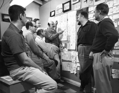
A story meeting at Melendez Studios
Don Lusk had his office to himself in another bedroom, right next to ours, and I could go in and chat with him every once in a while. One of the things he told me when we were talking about animation was that he liked, when he started a scene, he would think about how to motivate the character, and what was going to get the thing moving. He said, “I like to throw the character off balance, and then see what he does.” When I look at his scenes, there’s a lot of movement in them, because the character is always off balance and trying to regain his balance in some way. It may not be really slapstick, although many times it was, sometimes it was just emotional, but the movement, the characters being out of balance, was always part of what he would do. That turned out to be essential, and an interesting introduction to me for how to begin animating.
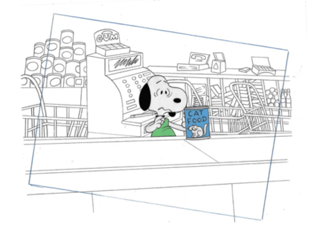
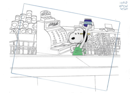
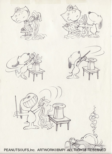
When you create a layout behind a production cel to give it context, how do you go about that without being too distracting? I’m thinking of the scene with Snoopy in the supermarket, during the Joe Cool sequence in There’s No Time for Love, Charlie Brown.
An original production cel of Snoopy from There’s No Time for Love, Charlie Brown, with a hand-prepared layout by Larry Leichliter
Like you say, you don’t want the background or other elements in the background to be so interesting that they distract you from the main character, or what the action is in in the scene. The great thing about the design of the show, and again, this goes back to Schultz and how he inspired all of the artists that work on the show, is that the style of drawing throughout the specials is usually very clean and simple, sometimes even stylized. A circle will not be a true circle, it’ll be this kind of oval. A box will not be a straight square box, it’ll be somewhat off. So that scene that you’re talking about in the grocery store, there were all these grocery carts and there’s a lot of cross-hatching going on, but there is a way to do it where you get the pattern, and it’s fairly detailed, but it’s not overly distracting.
What do you remember, yourself, about the Halloween special?
When the Christmas special came out, I was in high school already, and we looked forward to it with great anticipation. My brother and sister and I all sat down in front of the television and watched it.When the Halloween special came out, I didn’t know about it ahead of time, so I went to school the next day, and everybody was talking about it, and all the great scenes with Snoopy fighting the Red Baron, and the trick or treating, and I was like Charlie Brown, like I got a rock. I had missed it. So I never missed it after that, the next year and every year following, because, you know, we were all big fans of the Peanuts books. I still have several of them from back then that I keep on my office shelf.
Did you love horror movies and watch them? If so, what was the first one?
Oh definitely. It’s hard to remember which one I saw first, but I remember seeing and loving The Blob, with Steve McQueen, and The Night of the Living Dead, which is a great movie and still a favorite, but that was later in the 60s.
I love that horror movies offer an opportunity for the writer and director to speak to subjects with societal importance and can make social commentary, which is true for both The Night of the Living Dead and Invasion of the Body Snatchers, but also so many others, but that’s also true in the case for Schulz’s Peanuts comic strips. They have that in common.
Yeah, that’s one of the best things about both. I grew up in Los Angeles, and a lot of those old B movies were made at various locations in LA, but one of the most popular was Griffith Park. And you’re mentioning Invasion of the Body Snatchers. There was a set of caves up in the hills in in Griffith Park, that you could just walk up a slight hill and come to. It was big and went all the way through this small hill, and opened up into sort of a natural amphitheater. It was it was an interesting place to play, which I did a lot, and that cave is in Invasion of the Body Snatchers.
You actually have a connection to It’s The Great Pumpkin, Charlie Brown as an artist.
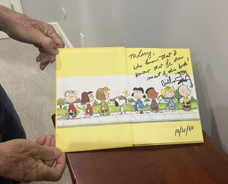
Yes! One of the first chances that I had to work on Snoopy as the flying ace and so many other Peanuts characters at Halloween was this book of It’s Great Pumpkin, Charlie Brown from the 70s. I drew most of the drawings in it based on the film. Doing these images really took me back to the many times I watched the cartoon.
Bill Melendez wanted Larry to know that, even though the cover says the book was by Charles Schulz, he knew Larry drew most of the images!
What came up?
Well, I was reminded of one of my favorite moments, which is when Sally says, “”Are you sure it’s legal? I wouldn’t want to get accused of taking part in a rumble.” Sally has so many great lines in that cartoon.
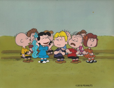
Things like this didn’t occur to me until later, watching the show, but there’s this conversation between Sally and Linus in the pumpkin patch that I’m in love with, because the animator who worked on it and the kids who did the voices, they were just so in sync with each other. The acting by the kid who played Sally, and the simple, subtle gestures with her head and with her looks to the side fit so well with the attitude in the dialogue. I asked Bill one day, “Who animated that scene?”, and he said it was Ruth Kissane, who was, I think, the only female animator at the studio in those days, and it’s just wonderful.
Great Pumpkin! This list represents some very heavy hitting animators!!
My favorite line was “If anyone had told me I’d be waiting in a pumpkin patch on Halloween night I’d have said they were crazy.”
What do you tell kids or people going into animation in terms of advice?
I never did well in interviews. Somebody would recommend me for a job, so they’d call me in, I’d go in, and have an interview, and I wouldn’t get the job because I was so bad in interviews. But the fact that somebody I worked with thought enough of my work and of me to recommend me made all the difference. It opened up a lot of opportunities for me. So what I tell people when I’m teaching classes is to be sure and make friends. Get to know the people that you’re working with. I don’t think people really need to be advised of that, because for most folks it’s something that just comes naturally, but artists can be reserved. If you’re shy, like I am, and tend to keep to yourself, try to break out of that. Try to get to know people. That’s what’s really going to help you along.
You can read more about the new limited edition “The Great Pumpkin”, or buy it (and, for a limited time, get an original drawing by Larry Leichliter!) by clicking on the image below:
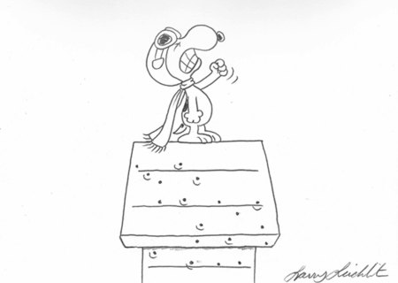
To finish off our blog and interview, here’s a video of Larry showing us all how to draw Snoopy doing his happy dance:
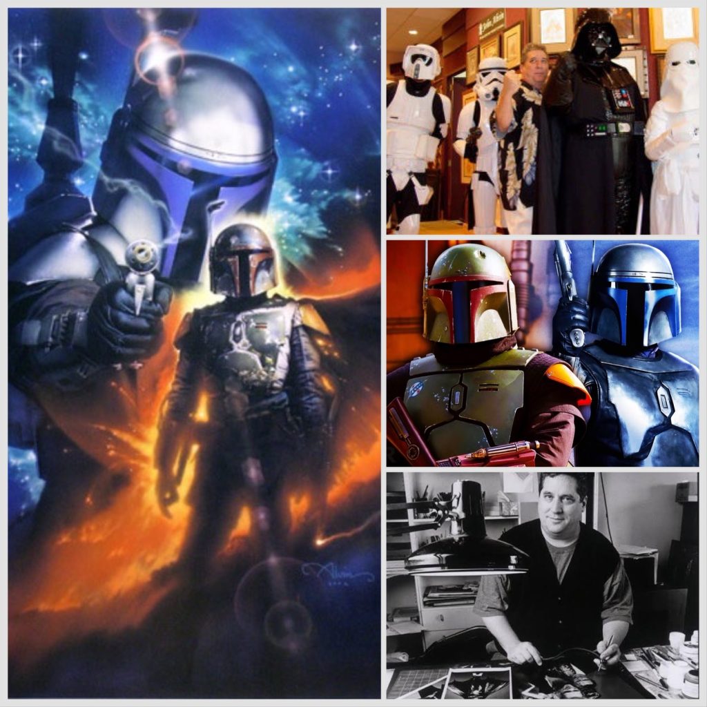
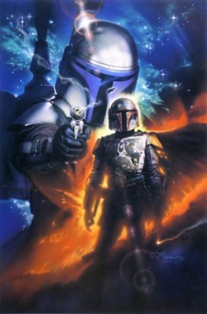
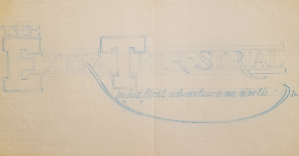
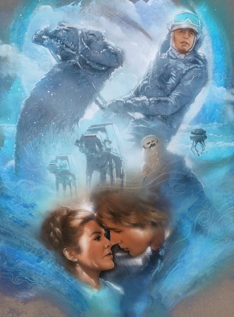
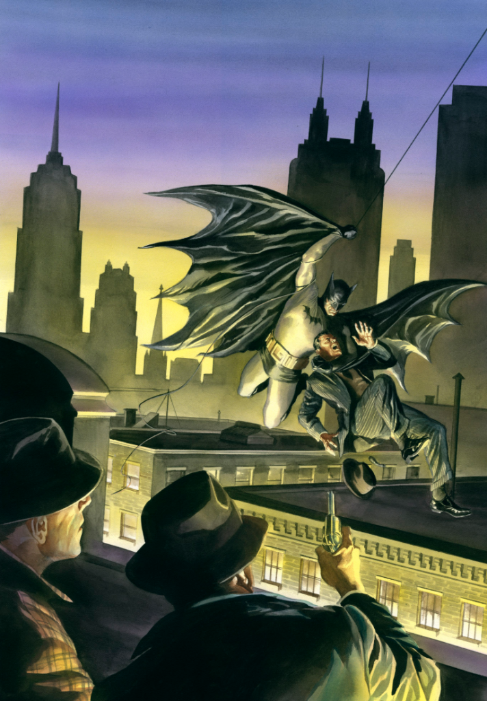
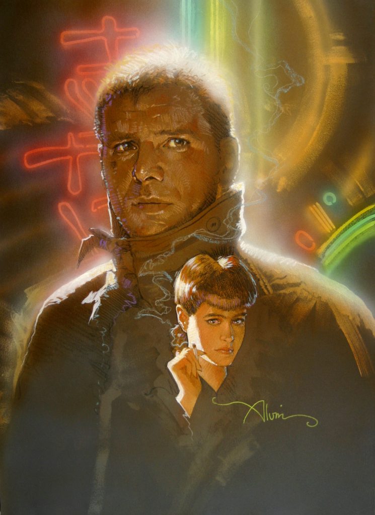
Today, we’re going to talk about Boba and Jango Fett, and a piece created by John Alvin called Like Father Like Son. I love The Mandalorian. I love Padro Pascal, I mean, who doesn’t? In fact, Grogu has become my second favorite Star Wars character after Yoda. All that being said, as bounty hunters go, my heart will always belong to Boba Fett, the OG bounty hunter. As even Star Wars series mastermind John Favreau will tell you, without Boba Fett, the Mandalorians and Mandalore would not exist.
I’m sure if John Alvin were still here today, he’d love Mando and Grogu, too, but as it was, he was one of the first diehard fans of Boba Fett all the back in the late 70s.
WHAT’S UP WITH BOBA?
Boba has been in the news a lot lately. There’s been a lot of conjecture recently about whether they’ll be a second season of The Book of Boba Fett, and it’s looking more and more, based on recent information, that we won’t be seeing a season two. The Mandalorian, however, is trundling along into another season, and a feature film spearheaded by producer/director Dave Filoni is now in the works.The film will, in his own words, “focus on the New Republic, and “close out” the interconnected stories that are told in series including The Mandalorian, The Book of Boba Fett, Ahsoka, and other Disney+ shows.” It’s being called the “Mandoverse”, and a number of folks are imagining the various powerful characters working together as a sort of version of Star Wars Avengers. Still, let’s be honest. As far as bounty hunters are concerned, (and to paraphrase a famous Disney quote), It all started with Boba Fett.
If you’re not someone who can win every Star Wars trivia contest, you may be wondering how the Mandalorian and Boba Fett, and Boba Fett and Jango Fett are connected.
BOBA AND JANGO HISTORY
There’s a huge difference between Mando and Boba. Mando (or Din Djarin) is adopted by the Mandalorians as a foundling, and grows up learning the way of the Mandalore. Both are bounty hunters, but Boba Fett isn’t a Mandalorian.
Jango Fett IS a Mandalorian. Like Din Djarin, Jango is raised as a foundling, and in the ways of the Mandalore, After fighting in the Mandalorian Civil Wars, Jango becomes the best and most renowned bounty hunters in the galaxy. Subsequently, Sith Lord Darth Tyranus hires Jango to be the template for millions of clones, secretly bred on the lonely aquatic planet of Kamino in the outer rim. His body, face, and all his DNA are used to build an army of clone troopers. As payment, Jango is given a clone, whom he calls Boba, to raise as his son.
Jango was a bad dude. He took part in a plot to assassinate Senator Padmé Amidala, and conspired with Count Dooku to decimate the Jedi Order. He was beheaded in the First Battle of Geonosis.
Boba Fett, who is the first bounty hunter represented in the Star Wars canon, not only has all the talents and skills of his father and genetic donor, but uses an altered version of Jango’s Mandalorian armor. Driven largely by a need for revenge against his father’s death, he works both with the gangster Jabba, and the Sith Lord Darth Vader. While trying to prevent Han Solo’s rescue by Luke Skywalker, he falls into the Great Pit of Carkoon, and into the jaws of the man-eating sarlaac. BUT WAIT! He survives and escapedsthe sarlaac and joins forces with a Tusken tribe, where he finds a stronger sense of honor and integrity, building his own moral code. He becomes the ruler of the territories of Mos Espa, and gains the respect of its citizens by protecting them in repeated attacks by violent outside forces.
Maybe you’d like to see an official timeline for Boba’s life and career. LucasFilm is only too happy to oblige, and you can read it here:
or perhaps an official video might be better at breaking down Boba’s history. You can see that HERE, or below:
Boba Fett, and by extension all the Mandalorians, are, in part, based on what was dubbed in the spaghetti westerns of Sergio Leone as “the man with no name”. George Lucas was very strongly influenced by Leone’s films, as indicated by this quote. “There were quite a few films made about bounty hunters in the Old West. That’s where that came from. He is also very much like the man-with-no-name from the Sergio Leone Westerns.”
Boba Fett figures far more prominently in terms of inspiration for the original trilogy than you might imagine. In Lucas’s early draft of the Star Wars: A New Hope, Boba Fett was the prototype for Darth Vader. Vader started out as an intergalactic bounty hunter. When Darth evolved into a sort of dark knight, Boba Fett became the bounty hunter.
So: how did a character that has very little screen time in the original Star Wars trilogy become so popular? Toys. Two years before Empire Strikes Back was released, Kenner created a series of action figures, and Boba Fett was one of the hardest to obtain, making that toy highly prized by Star Wars fans.
For fans of what is NOT arguable the best Star Wars movie, here is a video of behind the scenes from The Empire Strikes Back:
“IT’S ALL ABOUT BOBA” (John Alvin)
That brings us to John Alvin, and his love of Boba Fett and Star Wars (and the piece Like Father Like Son), because Andrea Alvin remembers that toy.
I spoke to her about her memory of John and his interest in and fascination with Boba Fett, which he had from the beginning. She explains, “Whenever you bought one of the toys, there was the chance of a special prize, and that prize was a Boba Fett action figure. It was before he was a big deal, after the first movie. He had gotten enough attention from fans that they used him as a premium, and he was very hard to get. You’d have to buy a bunch of the toys over and over just trying to get him. Of course, John got multiples of it.”
John was also a huge fan of the Sergio Leone movies, so it was no surprise to her at the time that he was attracted to the character. “He was always a fan boy for Boba. He and his friends would talk about plot points, and where they thought George would take him in the next movies. They’d all parse out what his connection to the rest of the characters might be, who he might be related to, how he might figure in future plots, and if they’d ever get to know his backstory. With all the many characters, heroes and villains, Luke Skywalker’s journey towards being a Jedi, Leia’s stint as a scantily clad slave, it was still all about. Boba. He was always the one they’d talk about.”
BOBA, “LIKE FATHER LIKE SON”, and the inspiration for FORCE OF INFLUENCE Series:
Out of his fascination with who is related to whom and the timeline of it all, John Alvin created a series called “Force of Influence”. Many of the originals from that series were purchased by George Lucas himself, because he too used the connections between characters as a lynchpin for the whole saga.
One of the first pieces John worked on in the series was “Like Father Like Son”, with Boba and Jango Fett together in one image. Andrea remembers him working on the original. “The piece was really big, at least 20 x 30. He watched the movies the whole time he was painting it. We must have seen the original Star Wars trilogy hundreds of times. It was in constant rotation. It got to the point where he could literally speak the whole movie while painting. Much as I loved them too, I knew what seemed like overkill to me was inspiration to him. It’s why he wanted to gHet the “heavy light” and the emotional truth of the visual image exactly right.”
She goes on to talk about the color story of Like Father Like Son. “The color is very much in his aesthetic, that turquoise blue and orange. Jango is the father figure, so he’s standing behind, and there’s this fiery light between Jango and Boba. It has this great composition with the fire swooping up from left to right and right to left is this lens flare and smoke. John was a master at leading the viewer’s eye. It’s great visual storytelling and a very dynamic piece.”
In going through the archives a few weeks ago, Andrea found a small number of hand-signed limited editions created from this original, which is owned by George Lucas. For a limited time while they last, the John Alvin art estate is offering these limited editions to Star Wars fans. Click on the image of Like Father Like Son or HERE to buy this iconic image of two classic Star Wars characters.
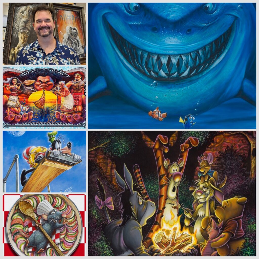
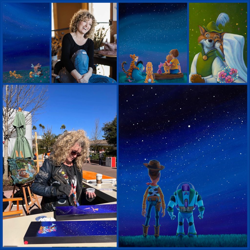
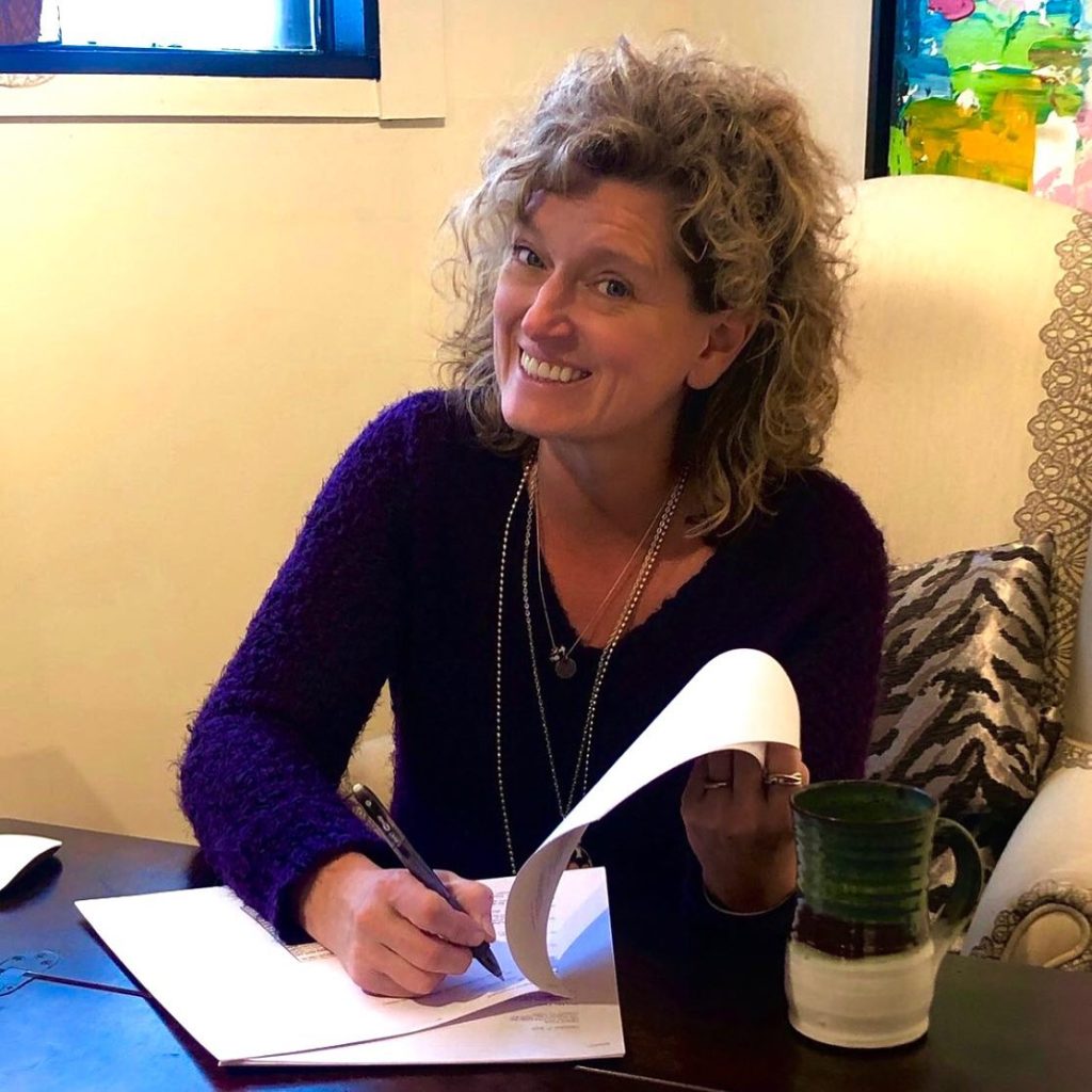
Disney Fine Art has just released a lovely new series by Canadian artist Denyse Klette called “The Stardust Collection”, and it felt worth a blog to me. I just added Denise’s work to the site, and I think it’s going to be very popular, especially to people who love stargazing!
Denyse has always wanted to be an artist, and loved art and drawing from a young age. In fact, she remembers copying images out of a Disney “How to Draw” book at the age of 4. By 16, she had her first piece published, a comic strip, in two local Canadian papers.
Early Comic Strip by Denyse Klette
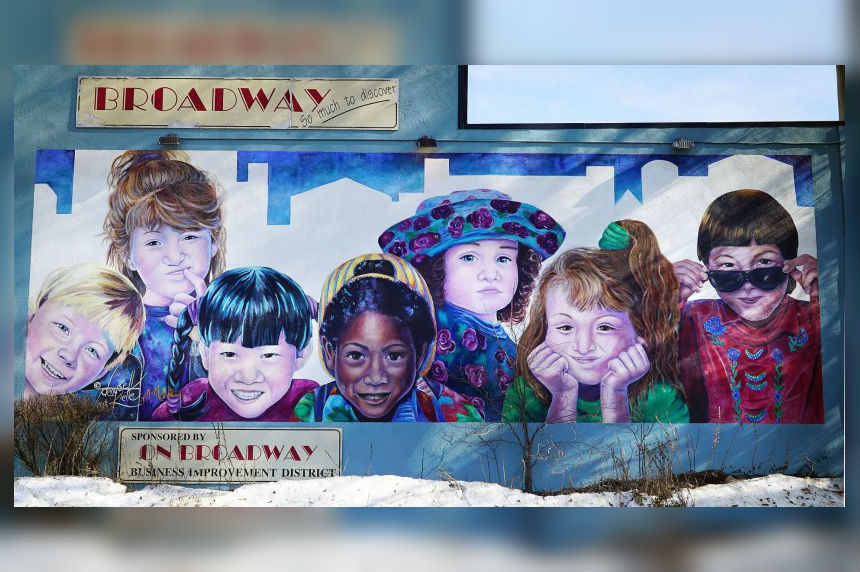
As a young wife and mother in Toronto, she began studying with a mentor, and they subsequently started a mural company together. Working steadily with that mentor was one of the most influential experiences in terms of developing her talent and learning color theory, something that would be important in her work as a Disney artist. For over 26 years, a 12 foot tall and 30 foot long mural created by her in 1993 could be seen on top of the Broadway Bridge in the city of Saskatoon. Two of the children represented in the mural are inspired by her daughters. That mural was instrumental in getting her commissions to do portraits, many of which are of high profile corporate and political subjects.
Broadway Mural in Saskatoon by Denyse Klette
Denyse went on to create the art for the Belly Button Buddies series, which ended up including two award-winning books, a cd, and a live show, which became a popular tv show!
“Belly Button Buddies”
She has also done quite a bit of commissioned work, including a hotel and casino that features 39 of her originals and over 450 giclees in their rooms and public spaces. She has created many images that have been licensed and sold into the mainstream. In fact, you may have used one of the adult coloring books or puzzles she created through a licensing deal with Macmillan Publishing.
A major turning point in Denyse’s outlook on life and perspective on art happened during her mom’s treatment for cancer and the building of her new home. There was an accident in which Denyse severed her left thumb (Don’t panic, fans! She uses her right hand to paint!). This instilled a daily reminder not to take life and joy for granted, and to choose joyful subjects when creating art.
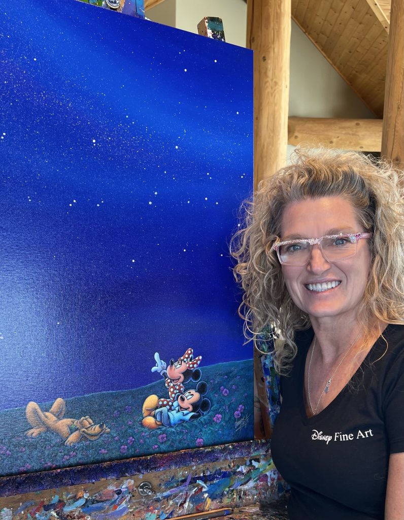
Of course the idea of choosing joy leads perfectly to her work with Disney Fine Art. A sculpture she created caught the attention of a gallerist in Florida, who put it on display at the Fine Art Expo at Disney World. Visiting the exhibit inspired her to create her first Disney painting, which she submitted to Disney Fine Art. Only a short time later, she was signing a contract to create official Disney art.
Denyse Klette signing her Disney Fine Art contract
See how her choices brought her full circle from that 4 year old artist, and her first Disney “How to Draw” book to becoming one of the few artists selected as official Disney artists?
Denyse Klette and “Minnie’s Milky Way” from the Stardust Collection
“Follow your bliss. If you do follow your bliss, you put yourself on a kind of track that has been there all the while waiting for you, and the life you ought to be living is the one you are living. When you can see that, you begin to meet people who are in the field of your bliss, and they open the doors to you. I say, follow your bliss and don’t be afraid, and doors will open where you didn’t know they were going to be. If you follow your bliss, doors will open for you that wouldn’t have opened for anyone else.”
Denyse Klette shows following your bliss can be a way to your best life. Nowhere is this better exampled than the new Stardust Collection, and you can see all the images by clicking HERE.
I asked Denyse to answer 5 questions about herself & the new series.
5 QUESTIONS WITH DENYSE KLETTE
What inspired the Stardust collection for you and what do you hope collections will be most moved by seeing the work?
I’m one of the official brand creators for Swarovski crystals so when I’m working on originals I use the crystals and embed them into the pieces.
Disney Fine Art came up with the beautiful stardust finish for the reproductions that gives them the magical sparkling touch. They are so so pretty in person! Can you ever have enough sparkles???? I hope that collectors will see my love for the characters and the little story I’m trying to tell in each piece.
“Infinite Possibilities” has multiple layers of meaning, because it sort of speaks to space travel as well as the imagination. Can you talk about that image?
I LOVE this one too! Even though this is a relatively simple design it made me think of several things.
1. There are moments with some friendships where no words ever need to be spoken…its the moment of time that you remember together.
2. The old question of what adventure is out there?
3. I love the peacefulness of this scene too. Just the two of them and the stars. You can practically hear the silence.
4. To me it is a reminder to stop and just take in the beauty of the world we live in.
“Infinite Possibilities” by Denyse Klette
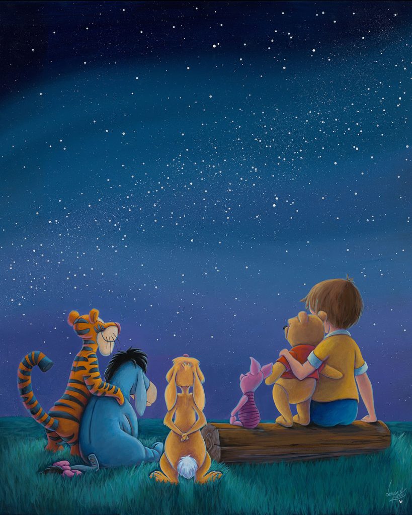
Good Friends are Like Stars celebrates friendship but also captures the sweetness of the 100 Acre Woods characters. What was the inspiration for this piece?
We are fortunate to live out in the country, so we as a family have sat and just watched the sky. It’s amazing how you never get tired of shooting stars or the magic of the northern lights dancing for us. Even though it is beautiful if you are by yourself, there is something about sharing the magic with friends or family. The stars always remind me that we are so small, and to be thankful for the small things. After all Pooh said “Sometimes the smallest things take the most room in your heart”
“Good Friends are like Stars” by Denyse Klette
What inspires you the most about creating art for Disney and how does it feed you artistically?
I think it’s the freedom that they have given me to create with my style and flare. I love experimenting with new mediums and techniques to make each one unique which definitely feeds me artistically!
The amazing collections of Disney characters and stories is so huge that I am constantly coming up with new ideas! My biggest complaint is I don’t have enough hours in the days! 😁
How does it feel to be the first Canadian official Disney Fine Artist?
I don’t think there are words for how exciting it was to sign with them. 🎉 It truly is a pinnacle in my art career. Like millions of other people, I grew up loving Disney so I try to remind myself every time I walk into my studio how incredibly fortunate and magical it is to create art for them.
See all the Stardust Collection images on our official Denyse Klette artist page, HERE.
This Valentine’s Day, ArtInsights is doing cupid’s work, and watched lots of sweet, poignant, and sometimes heartbreaking cartoon shorts in the hopes of bringing you a worthy list for the holiday. I got weepy so you don’t have to, or at least not as often! I wanted to find 10 great cartoons from a variety of studios that would represent love in many of its most positive and joyful forms. As long as I can remember, my parents have sent me a Valentine. In fact, I just got one from them. Valentine’s Day is just another opportunity to tell the many people (and creatures!) you love them. See our list below, set in chronological order of release, for an animated celebration of love you can share with your valentine, be they your parent, pet, partner, or paramour.
THE UGLY DUCKLING 1939
Though there was an earlier incarnation of this Hans Christian Andersen story brought to the screen by Disney in 1931, the better version was released in 1939, released on April 7th, as a Silly Symphonies short. It won the Best Animated Short Subject Oscar. It was the last of the Silly Symphony series, ending it on a high note. Several of the most famous and beloved animators in Disney history worked on the film, including Milt Kahl and Eric Larson, and featured the voice of Donald Duck, Clarence Nash, doing duck sounds. As love-related cartoon shorts go, this story is a timeless one that brings to life the experience of feeling lost and finding your clan, and the love that surrounds you when you do.
MR DUCK STEPS OUT 1940
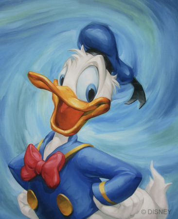
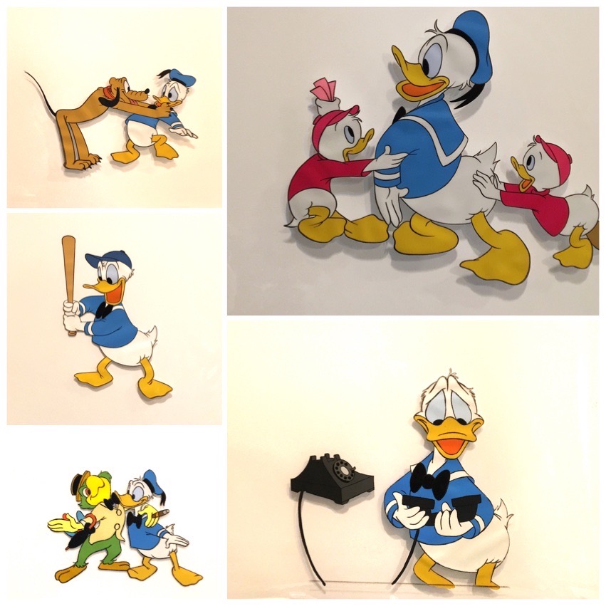
Of all the entries on this list, Mr. Duck Steps Out, which features Donald Duck, Daisy, and his nephews Huey, Dewey, and Louis, is the most specific to Valentine’s. Donald comes to call with a heart-shaped box of chocolates for his sweetie. This is a joyful short with dancing, romance, and fun, but also speaks to the patience and understanding sometimes needed in blended families. Here Daisy is presented as Donald’s permanent love interest for the first time. The story for Mr. Duck was created in part by Carl Barks and Jack Hannah, and animators on this short include Les Clark and Dick Lundy. Find art of Donald Duck HERE.
JOHNNY FEDORA AND ALICE BLUEBONNET 1946
This, for full disclosure, is one of my very favorite pieces of animation every released. Released as part of Disney’s animated anthology Make Mine Music, the whole story is told through song, sung by The Andrew Sisters. It was directed by Jack Kinney, who also helmed many of the best “How To” Goofy shorts. It’s about two hats who fall in love while on display next to each other in a department store, only to be separated when Alice is bought. Much struggle and many challenges later, there’s a very sweet happy ending. It’s about commitment, y’all.
FEED THE KITTY 1952
This is one of two shorts featuring a pup and kitty that love each other I’ve included in the list. Why? Well, for one thing, this cartoon has been rated as one of the top 50 best in history. Directed by Chuck Jones, Feed the Kitty, the first short featuring bulldog Marc Anthony and kitten Pussyfoot, is a masterclass in comedic timing, and character design. The great voice artist Mel Blanc, though uncredited, can be heard as a pained, clawed Marc Anthony. It’s the relationship between the dog and kitten that holds the whole thing together and makes it so memorable. It’s a reminder that (as in the case of Pussyfoot kneading Marc Anthony’s back and possibly drawing blood in the process) a little pain is part of a life of love, but it’s all worth it. Find art of Marc and Pussyfoot HERE.
THE DOT AND THE LINE: A ROMANCE IN LOWER MATHEMATICS 1965
Again, directed by Chuck Jones, but co-directed by artist Maurice Noble, and winner of an Academy Award, this short was released by MGM. It tells the story of a dot and line, and their romance, which goes through a number of challenges before all is said and done. Weird and wonderful, it’s an esoteric and visually fascinating cartoon, perfect for the more nonconformist animation fans.
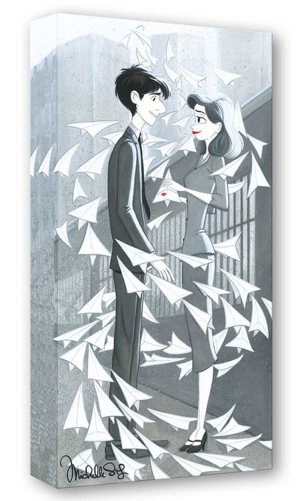
PAPERMAN 2012
Our only black and white entry, this computer animated short was directed by John Kahrs, who also supplies the voice of the male lead. Produced by Disney, it was the first short cartoon to win an Oscar since 1970. It takes place in the 40s, and is a story of missed and second chances, love at first site, destiny, and Cupid-help from an unexpected source. The whole thing is very romantic, with the lead character George inspired by George Bailey, the lead character in another memorable romance of sorts, It’s a Wonderful Life. Find art of Paperman on the website HERE.
KITBULL 2019
Traditionally animated, Kimball is directed by female animator Rosanna Sullivan, and produced by Pixar. It became a sensation after being released on YouTube and racking up 93 BILLION views, and ultimately got nominated for an Oscar. It’s the story of a teeny homeless kitten who befriends a pit bull, and it’s just really a portrayal of pure, unconditional love in action. It’ll make you feel all your feelings and remind you of whatever favorite creature you’ve got now or had in your life that made your life fuller and more beautiful. The short was part of Pixar’s SparkShorts program, which offered opportunities to unknown voices in animation. Sullivan was inspired by the hand-drawn animation she saw as a child, and wanted to create animation that couldn’t be replicated inside a computer. Her work and commitment to 2D led to a wonderful, poignant film that will become one of your favorites, especially if you’re an animal lover.
HAIR LOVE 2019
I dare you to get through this one with dry eyes. Directed by Matthew Cherry and another Oscar winner, Hair Love centers on seven-year-old Zuri, who is trying, unsuccessfully, to do her own hair with hair tutorials. Enter her dad, Stephen, who commits to figuring out how to tame Zuri’s gorgeous hair into her desired do. The end, (and I reveal this for folks who don’t need this kind of surprise), shows Zuri and Stephen bringing Zuri’s mom home from the hospital, where she’s been getting chemotherapy. It’s actually a happy ending, and what can I say? Love is in every frame of this cartoon.
(Matthew Cherry: https://youtu.be/IAGHJRSsc6A)
OUT 2020
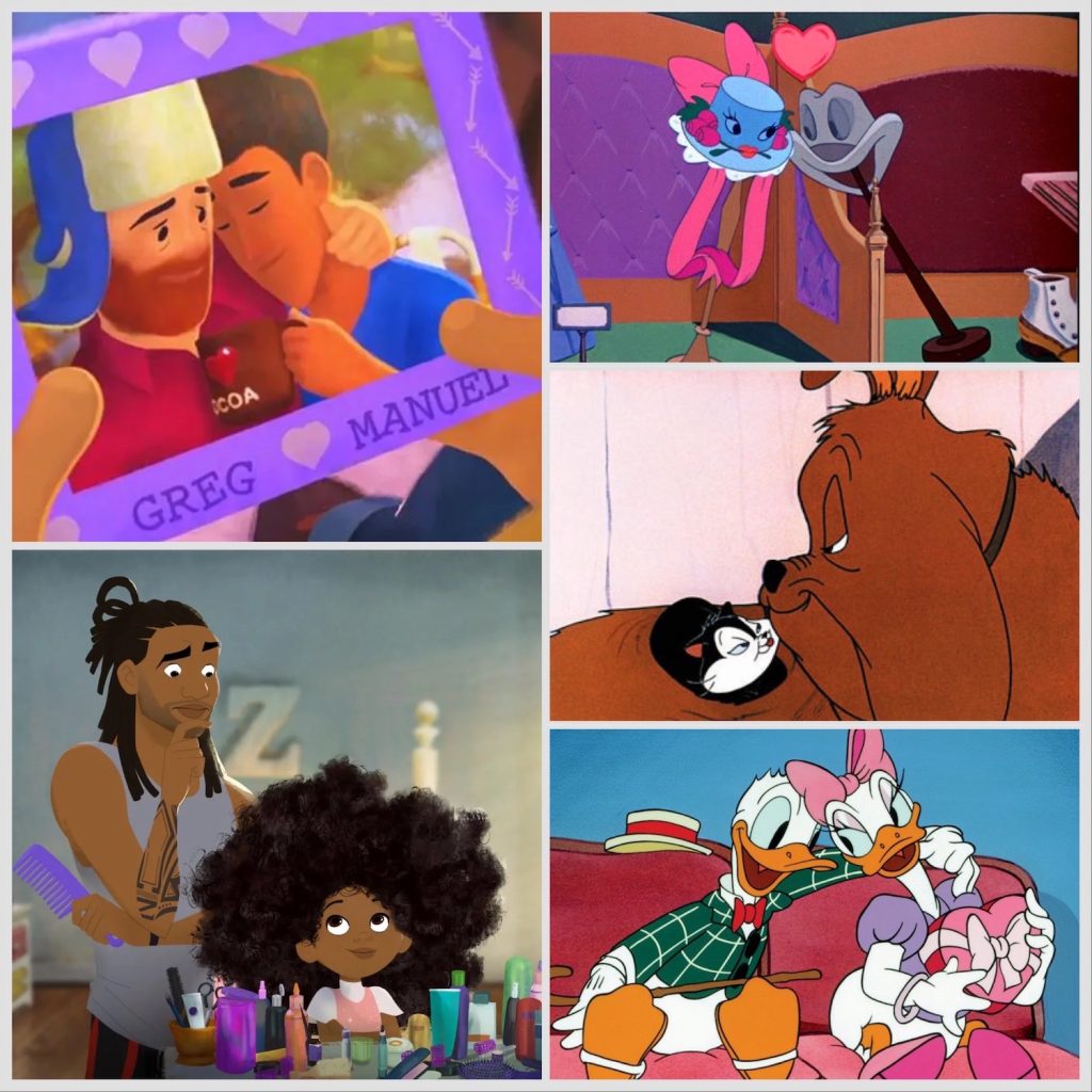
Another potential tearjerker, written and directed by Steven Hunter, this is the 7th in the Pixar SparkShorts program. It is both Disney and Pixar’s first short to feature a gay lead character. It’s a bit convoluted, but very sweet, and celebrates familial and romantic love in ways not seen before onscreen. Love is love, and Valentine’s Day is for everyone!
US AGAIN 2021
3D computer animated short Us Again is a Disney release, written and directed by Zach Parrish. The film, which shows an older married couple reinvigorate both their bodies and souls through dance was inspired by his own grandparents and a viral video of married choreographers Keone and Mari Madrid dancing as an elderly couple. Female composer created the soundtrack before the animation was created to give the Madrids, who created the choreography for the short, music to work with. You can see this cartoon on Disney+, and watching it, at the very least, will remind you of a few things: you’re never too old to dance or be in love, love can help keep us young, and “thinking young” helps keep love partnerships healthy and vibrant.
As a reminder, the gallery has lots of great pieces of art that celebrate love in animation. You can find a nice collection specific to romance HERE. May you all have a happy Valentine’s Day, and may you always remember you are loved.
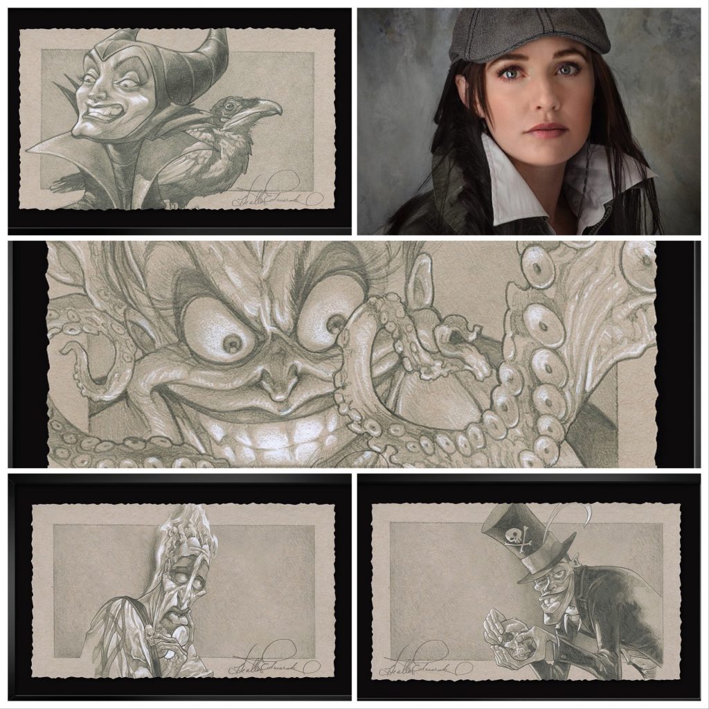
In the latest Disney Fine Art release, there is a wonderful collection premiered by Heather Edwards, and it’s all VILLAINS! Heather has been creating beautiful fantasy art from the beginning of her career, and became an official Disney artist over a decade ago. Her originals are snapped up before they’re even released, or are done as commissions. Every piece she creates is full of symbolism, often has hidden images, and, of course, hidden Mickeys! I’ll be writing a separate blog specifically speaking to each of her pieces and the symbols, images, and Easter eggs she includes, but first, collectors should get to know her as a person and as an artist, and see her new collection!
I spoke to Heather about her life in art, her inspiration, and her new collection, The Heather Edwards Graphite Collection, which is full of tasty, flamboyant “baddie” characters that don’t get nearly enough attention. Perfect for October and the coming of Halloween!
Leslie of ArtInsights: How did you get your start with Disney?
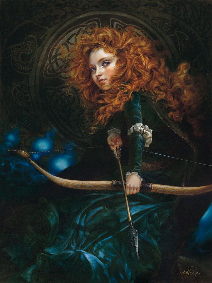
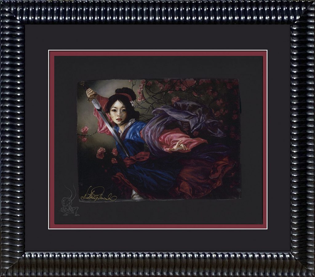
Heather Edwards: Well, this is a bit of a longish story. First thing’s first, while I loved watching Disney animated films growing up, I never dreamt of being a Disney artist. I was more interested in painting animals and horses and such. It wasn’t until I had been convinced to take my adventure into fantastical art that I stumbled, if you will, into the Disney realm. About ten years into my professional art show career, a gentleman crossed paths with me at my booth at SDCC and asked, rather simply, if I had ever created any Disney related artwork or had been interested in it. I told him, “no.” He then proceeded to ask if I would now be interested in doing so. I told him that I probably was not. (Again, I hadn’t ever dreamt of being a Disney artist and didn’t think it would be something I would be interested in–primarily for the fact that I was envisioning doing the animated versions of the characters. I was focused on employing classical realism in my artwork and those two styles are vastly divergent). The gentleman then proceeded to procure his business card to hand to me, on which it read that he was a marketing rep with Disney and he told me that if I was ever interested that I should give him a call. Lol, if I have a super power, it is the uncanny ability to put my foot in my mouth. Anyway, I took the card and he walked away. As it happens, a very good friend of mine who had watched all of this go down encouraged me to send some sketches to the Disney rep–but only in a style that was entirely my own, which was to bring the characters to life in a way that brought both reality and classical merit. So I did. There was much back and forth over the course of 18 months where things didn’t seem to go anywhere, and then, poof, the emails went silent. I didn’t know what to do. My good friend again advised “just do”. So I painted up Cinderella’s New Day (Cinderella), Elegant Warrior (Mulan), and Her Father’s Daughter (Merida).
Happily, everybody loved them and images of them went viral online after being hung (exactly two years after my first encounter with the Disney rep) at SDCC the year that I finished them. A month later we were hanging the same originals (plus I See the Light – Rapunzel) at the D23 Expo.
I See the Light Rapunzel limited edition by Heather Edwards
That’s where the paintings caught the eye of the folks at Disney Fine Art. A contract was the next step. And the rest is history.
Who are some of your role models as an artist and as a person?
I’m not sure I would say that any artist is particularly a “role model”—albeit I thoroughly admire their work and creativity and that inspires me. As for a role model as a person, I can unequivocally say that a very fine friend of mine by the name of Connie Lane is a star in my mind. She is the epitome of kindness, grace, strength and integrity—everything I am striving to become. Not to mention she was personally an Ambassador to Walt Disney while he was alive. Yeah, then there’s that. 🙂
Who are some of your favorite creators right now that inspire you?
My favorite creators right now are still probably the ones I’ve had for a very long time. I love the styling and sensitivity of the PreRaphaelites of the late 19th century. I also love the vast number of Renaissance artists that were their roots. That being said, however, I am daily delving into modern creative sources in order to find new ways to express my ideas. There has been no one singular artist or one singular style that has grabbed me, per se; I let an image strike me in the moment. I then ask myself why I stopped to look closer at it and if it is something that resonates, I let it “stay.”
I understand that your experiences being raised in and loving nature has had a huge impact on your work as an artist. Can you talk about that a bit?
Absolutely! There are many things my parents taught me growing up, but when it comes to art (and life, I guess!) one of the most impactful things I learned was to be observant and to find beauty in everything. Living a rather sheltered childhood meant that this was focused on my surroundings—and I preferred the out-of-doors. Unlike several of my siblings, during summers off of school, I would wake up as the sun rose to watch the effects the changing light had on and through the blades of grass in the lawn. I would examine the rust on the old metal porch chairs and sleep outside on stormy nights to study the ever-morphing clouds, inhale the moisture in the air and feel the reverberation of thunder. These are just the tiny number of things that I still enjoy doing, and all of it—visual, tactile, audial, etc—has an effect on the way in which I create.
Please give us an idea of a day in your life as a painter, what your process or your daily regimen is as an artist?
No two days are the same for me, honestly. But usually, it’s wake up, feed the cats and dog, take the dog for a walk, put the house in order, pick some weeds, smell some roses… yup, I still take time to observe the sunlight coming through the variegated purple leaves of my canna lilies, et al… make sure that everyone at home has what they need to succeed for the day, and then I head to my studio. You’d think that I would sit right down and get to painting when I get there, but no. There are emails to answer and bills to pay, orders to fulfill and a fire to light under my chair so I get motivated to get to work. When that finally has a chance to happen, I drop into my “zone” and nothing can stop me from painting until all the energy for it has left me for the day. Some days that’s 12 hours. Some days that’s one hour. For me, though, I cannot “surface” paint. I truly have to be in a creative “zone” in order to be successful. This requires a level of mental gymnastics to purge my brain of everything else so that I can focus fully on what’s in front of me. A meditation of sorts. Depending on the day, this can take a while or it can happen almost immediately. But once I’m where I need to be, it is very easy to let the creative juices flow.
How does music play a role in your creative experience? (or does it?) what kinds of songs do you play while painting or what most inspires your muse?
Music (or the lack thereof) is extremely important to my creative experience. I find that with certain creative endeavors, only a certain type of music will do. Music definitely sets a mood and it lends strength to the stories that are being told in my artwork. Generally, I go for instrumentals as I find that lyrics have a tendency to draw me away from my task at hand, and these can range from dramatic classical symphonies to drop-into-the-background game soundtracks. But sometimes, it actually brings more success when I have the opposite, such as alternative rock, jazz, or international music. Other times, if I have anything playing (let alone any noise at all), I am so distracted that I cannot accomplish anything I am trying to do. During those times, I literally meditate the entire time I am painting.
You are a mom with a big family. How do you balance your family with your artistry and how do those experiences feed each other?
Being a mom with a big family has been both a challenge and a blessing. Being able to work a flexible schedule—and up until recently, working from home—definitely helped. But it also made it hard, lol. Trying to paint while you’ve got a pair of identical toddlers crawling and climbing into trouble at any given moment keeps you on your toes (and away from painting)! Traveling for art shows used to be difficult, especially when there were little ones to tote around with me or leave behind with sitters. Now that the kids are grown (the youngest twins are now 16), things run a bit more smoothly. Both my art/career and family have had direct influences on each other, though. Some of my kids have latched onto that creativity and are running with it, and have even made notable money at it. And there is no question that my kids/family have influenced my work—as simply as some of my children being models for me, to full paintings being inspired by experiences I have had individually with them and that we have had as a whole family.
Where did the “DOG and DRAGON” name come from and what is it in reference to?
Before I married my husband now, we both owned and operated separate creative businesses. When we came together, we decided that we wanted something that was “ours”. One night at a Chinese restaurant while waiting for our food to arrive, we chatted over the Chinese zodiacs that they always put on the table as a place setting for diners. We discovered that he was a “dog” and I was a “dragon”. It kind of rolled off the tongue and we thought it sounded cool, so it stuck.
Who is your favorite Disney character? Why?
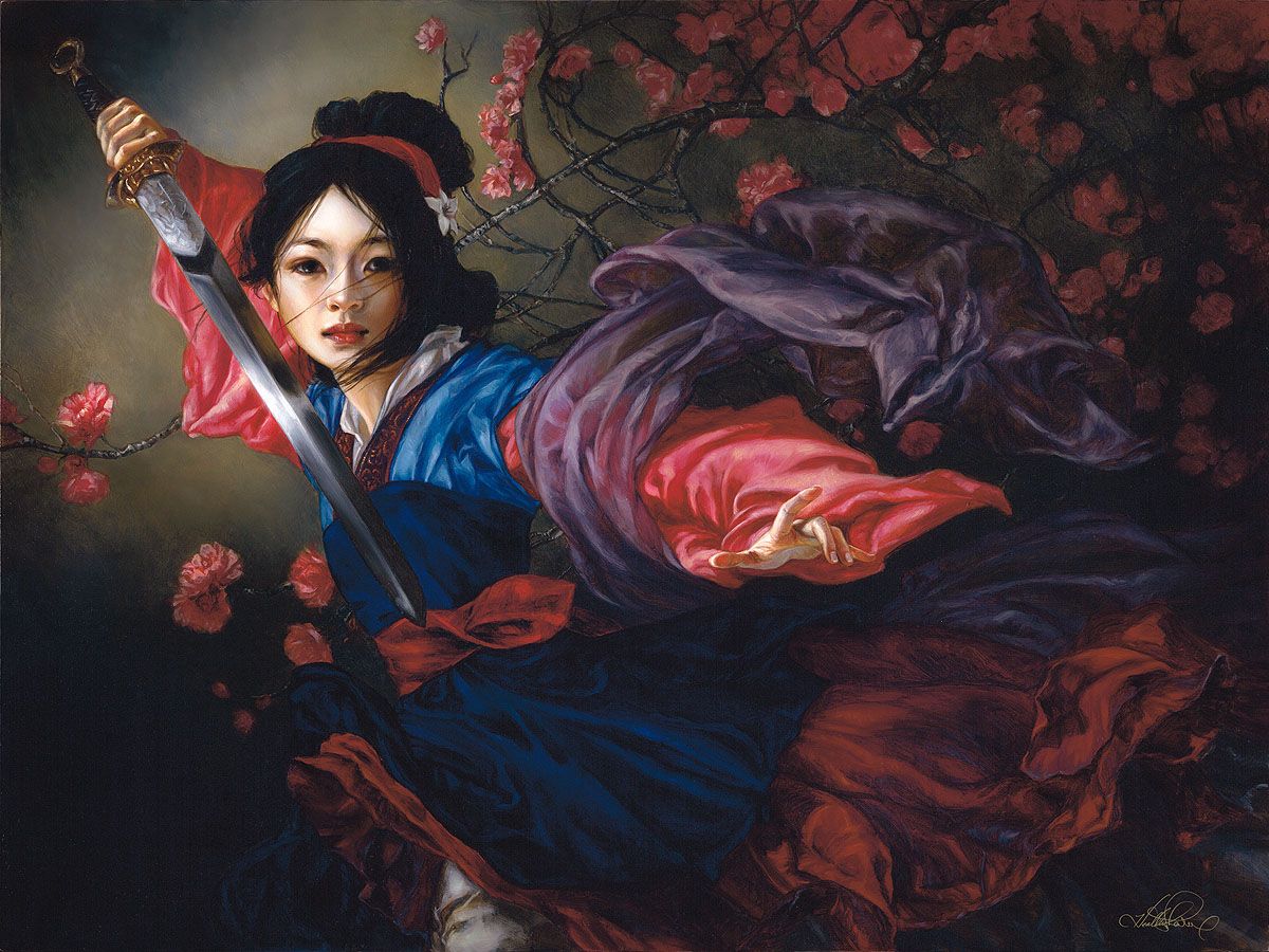
My favorite Disney character has always been Mulan.
The Elegant Warrior Mulan Chiarograph by Heather Edwards
The initial response I get from most people why that might be is usually for the fact that she’s strong and bold and doesn’t need a prince to save her. Absolutely, I agree, one hundred percent. However, it goes far deeper than that for me. Mulan truly resonated with me because I felt very intimately a version of her predicament. I felt like I didn’t fit in anywhere. I was confused at who and what I should be and my role in family, community and society. I felt I understood my purpose, but didn’t at the same time. Like her, I have felt, and sometimes still do feel, conflicted about a future that is unknown. Yet, from Mulan I took courage and decided to fight against my fears and the expectations of negative influences around me and make my dreams happen instead—and I always will.
In your non-Disney fantasy art, you use a lot of symbolism. There are symbols in your Disney art, too? Can you give us a few examples?
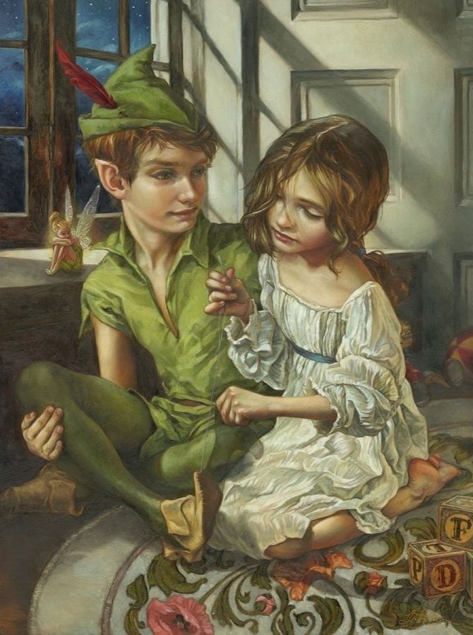
Hahaha, I can’t seem to help myself when it comes to symbolism in my artwork, whether my Disney or independent work. A couple of examples? In Sewn in His Shadow, (Peter Pan and Wendy) there are symbols of Wendy’s journey and purpose in this painting.
Sewn to His Shadow by Heather Edwards
I like to capture transitional moments and here Wendy is contemplating “growing up”, becoming a young woman, and in a way, leaving behind being a child. Amongst all the other visual indications of this, the symbol of it is found in the design of the rug beneath the two figures—of blossoming flowers from buds. In the painting Dig a Little Deeper, (Tiana, from The Princess and the Frog) the symbolism of the dreams of the characters of the film and how they conflict and/or coincide are found in the beignets, Tiana’s father’s copper pot and the background Art Nouveau design work of lily pads. There is, of course, much more to the explanation of that symbolism, but that’s it in a nutshell.
Did the pandemic have an impact on your creativity or your artistic perspective?
The pandemic, in and of itself (whether that be Covid-19 or the shutdown), did not have an impact on either my creativity or my artistic perspective, or furthermore, on the business aspect of creating (although it did shift). I just kept on painting and creating and doing the things I always did—only with a mask on, lol. Although, when I think back on it, in 2019 I had begun to tire of attending so many art shows and had thought to cut several, if not most, from my schedule. But when there weren’t any shows to attend for the next year and a half, I discovered how much I missed connecting with people! On the flip side, some of the unexpected aftermath of the pandemic (which I will refrain from enumerating here), did however have a lasting impact on my art, both in content and in the way I produce.
Let’s talk about your new releases of villains. First, what inspired you to create the series?
To be absolutely honest, what inspired these pieces was a bit of pressure from Disney Fine Art, ha! My new paintings, especially the Disney ones, sell almost immediately after they are completed. Because of that, whenever I end up at Disney shows (like Festival of the Arts in Orlando or D23 in Anaheim) I rarely have something by way of originals to offer to people. I’ve done nine of the Villains in the Graphite Series so far (six are released) and the first three were done for a gallery show. The following six were done a few months later for Festival of the Arts. All of them were done while either in a hotel or on an airplane under the stress of finishing them in time for those shows.
Can you go through and talk about each of these images: What did you seek to capture in each of the characters?
In hopes of not offending any of my audience who adore the Villains, but being entirely honest at the same time, I will state the following. I have never been a fan of putting the Villains as central figures of any of my paintings. The reasons are several, but the main thing is that, while I enjoy watching their characters in film and understand the subtle nuances of any multifaceted character, whether “good” or “bad”, I do not wish to immortalize any such character or glorify their villainy in paint. Perhaps that may seem a little harsh, but it is the way I feel and I always try to go with my gut. In creating the drawings of the Villains for the Graphite Series, instead of “bringing them into this world” as I try to do with my other character paintings, what I sought to capture in each of the characters was their “essence”—to give them life and reality, but stay accurate to their Disney design. With this approach, I believe that I am staying true to my core feelings on the subject and yet can fill a niche that folks have been wanting me to fill for a long time.
What were the challenges or ease of creating them?
I suppose the biggest challenge for creating them was doing them justice while at the same time refraining from overemphasizing their negative aspects. The easy part was the actual work. I spent years and years as a pencil artist, so returning to graphite was like “going home”. I love drawing.
What do you love about each of them?
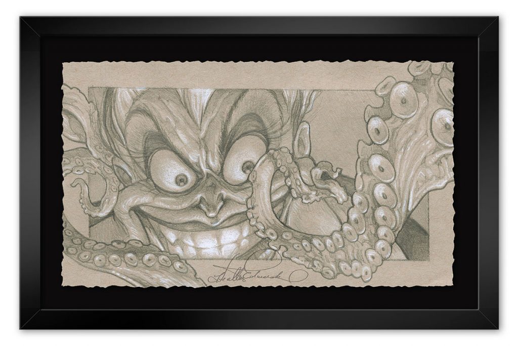
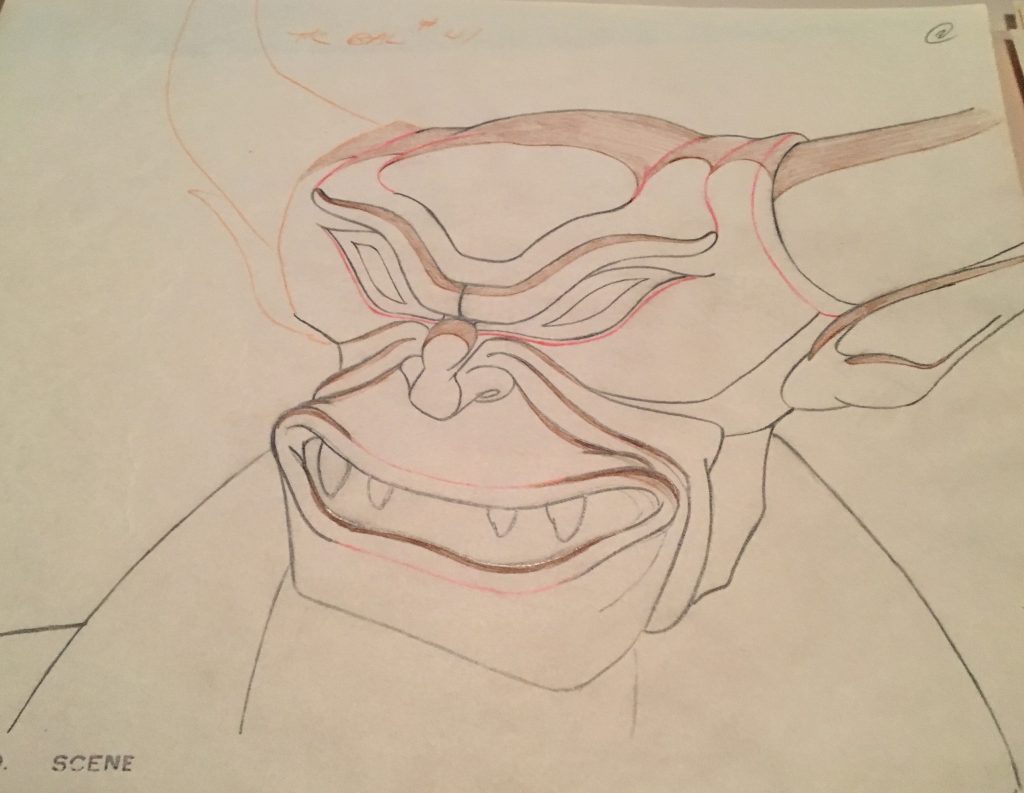
Life’s Full of Tough Choices (Ursula):
I love Ursula’s tentacles! Of course, I love doing anything wildlife related, so this was pure joy.
A Most Gratifying Day (Maleficent):
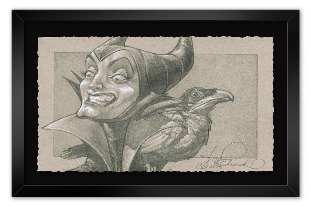
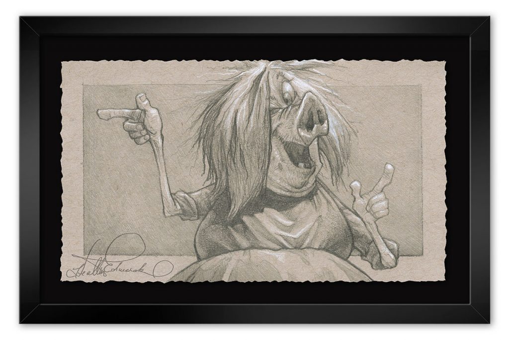
I think my favorite thing about this image of Maleficent and Diablo is capturing their contemptuous expressions. Kind of a challenge with a bird.
Everybody’s Got a Weakness (Hades):
Hades’ contemplative frustration combined with the posing, wrinkles and even bloodshot eyes got me on this one. Even Villains struggle.
Friends on the other Side (Facilier):
I really liked the lighting on this one.
I’m Afraid I’ll Have to Destroy You (Mim):
Unlike most of the Villains, I don’t actually think of Madam Mim as a Villain. She’s more mischievous than anything and I think that’s why I like her so much. And she’s funny. And terribly underrepresented.
Let the Games Begin (Queen of Hearts):
With this one, it was fun to take a very simple character design (compared to many of the other Villains) and make her alive and full of complexity.
You can see all Disney art by Heather Edwards HERE.
The new Willow live action original series has a premiere date of November 30th on Disney+, which is not as far away as it seems, and fans of the classic 1988 feature film are starting to get excited. That premiere date was announced at the Star Wars Celebration in May, along with a teaser trailer:
WIllow Teaser trailer released in May of 2022 at Star Wars Celebration
As many already know, this new series will be picking up some 20 years after the events of the movie, and introduces a number of new characters. Obviously Willow Ufgood (Warwick Davis, reprising his role from the film) and the new cast will get up to some magical adventures.
Here is a “Meet the Cast” video, released in November of 2021:
You may not recognize these folks, but allow me to jog your memory of where you’ve seen some of them. Starring in the Willow cast are Rosabell Laurenti Sellers (Tyene Sand in Game of Thrones), Erin Kellyman (of The Green Knight and The Falcon and the Winter Soldier), Tony Revolori (known as Flash in Spiderman: Homecoming and Zero in The Grand Budapest Hotel). Actors you may not know but are likely to become household names include actor/writer/directors Amar Chadha-Patel and Dempsey Bryk and Ruby Cruz, last seen in Mare of Easttown.
The official synopsis from the Disney+ page reads:
“An epic period fantasy series with a modern sensibility set in an enchanted land of breathtaking beauty, “Willow” features a diverse international cast with Jonathan Kasdan, Ron Howard, Wendy Mericle, Kathleen Kennedy, and Michelle Rejwan serving as executive producers. The story began with an aspiring magician from a Nelwyn village and an infant girl destined to unite the realms, who together helped destroy an evil queen and banish the forces of darkness. Now, in a magical world where brownies, sorcerers, trolls, and other mystical creatures flourish, the adventure continues, as an unlikely group of heroes set off on a dangerous quest to places far beyond their home, where they must face their inner demons and come together to save their world.”
(Disney+)
Here you can see Warwick talking about Willow 2022:
Originally, John M. Chu would have helmed the pilot episode, but after both he and his replacement Jonathan Entwistle exited the project due to scheduling conflicts, director Stephen Woolfenden (Outlander) stepped in for the first two episodes. Four of the eight episodes are directed by female filmmakers, two by writer/director Philippa Lowthorpe (The Crown, Call the Midwife), and two by writer/director Debs Paterson (A Discovery of Witches, Harlots).
One of the most exciting aspects of the show to me and to the Alvin family, is the fact that they are using John Alvin’s logo treatment from the original feature film, which he hand-designed, to promote the film and as its title:
Willow title, using the original design created by John Alvin for 1988’s Willow
On the left is John Alvin’s Willow advance poster, and the second and third are posters used around the world at the film’s release.
He designed it pretty early on in the work for the 1988 Willow poster:
This is an early design from the Alvin estate of work by John Alvin on the Willow poster.
The three above images are comps for the Willow advance poster. John has already designed the typography and is using it as an integral part of the design.
The original Willow film was released in 1988, and though it wasn’t an immediate triumph at the box office, it became a huge cult classic, leading to the creation of a board game and a number of computer games.
John Alvin was brought in quite early in the 1988 production, and in those days, John, who was already storied for creating the E.T., Blade Runner, and Cocoon posters, had a lot of interaction with both Ron Howard and producer George Lucas. The Alvin key art for the Cocoon movie, which was also directed by Ron Howard, who was set to direct Willow, is a perfect example of that “Alvin-izing”, that drew fans to films with ‘the promise of a great experience’.
John Alvin’s Cocoon movie poster
Here is another example of John’s typography, which he was integrating into his marketing design in a complex image including all the main characters.
Concept work for the Willow marketing campaign
Below are several images based in iconic archetype imagery, one that used that emotional and dramatic shadowing, and the other that included more of the kitchen sink style that showed the lead characters more distinctly.
Concepts for an iconic archetypal design for John Alvin’s Willow one-sheet
Here are some good examples of comps for the “kitchen sink” poster that included all the lead characters featured in the film. Of course the title treatments are in evidence in all the images. Creative kitchen sink designs were used beautifully by Bob Peak and Richard Amsel, two other greats of film history.
Some gorgeous ideas moving towards the finished image of the one-sheet by John Alvin for Willow
Although Val Kilmer made a cameo appearance in Top Gun: Maverick, there has been no indication that he’ll do the same for the Willow series, something Warwick Davis has mentioned he hoped would happen.
Here for fans of the Val Kilmer-starring original, and for those who have no idea why Willow is such an enduring cult classic, is the official trailer for the 1988 Ron Howard film:
John Alvin’s logo treatment and image of his teaser poster is featured here!
We celebrate John Alvin every day. When you watch the new series, think of his contribution to the beloved classic, and to the whole of film history.
*The estate of John Alvin is currently not accepting offers for purchase of single images from his Willow art collection. For more information about the work and art of John Alvin, contact Artinsights.
If I said I had a favorite movie poster and then touched my two index fingers, you’d know which poster I meant. The mark of a great movie poster is one that, when the movie is mentioned, it’s the poster image it conjures, not a scene from the movie. E.T. the Extra-Terrestrial is the ultimate example of that, and my friend, movie campaign artist extraordinaire John Alvin, is responsible for that glorious image. Saturday, June 11th marks the 40th anniversary of the release of E.T., so now is the perfect time to celebrate and go deeper into the making of John Alvin E.T key art., which represents one of the most iconic movie posters of all time.
John Alvin created hundreds of movie posters, many of them instantly recognizable. They include lots of classics from the 70s, 80s, and 90s, including Blazing Saddles, Young Frankenstein, Blade Runner, Gremlins, Willow, Dark Man, The Goonies, Cocoon, The Lion King, Aladdin, Beauty and the Beast, Arachnophobia, and so many more. His career was cut short when he passed away in 2008 unexpectedly. Though there was much of the creative spark left in him, he still left a wonderful body of work behind, and had a long, storied career.
He got into the film business shortly after graduating from the famed Art Center in Pasadena. He had created some images for plays with advertising professional Anthony Goldschmidt. Anthony was working on the advertising campaign for Mel Brooks, and his movie Blazing Saddles. As Andrea Alvin, John’s wife and partner in Alvin and Associates, and author of the book The Art of John Alvin explains, “He and Anthony had worked together on posters for some plays, and Anthony came to John and said, ‘Mel Brooks is doing a movie, and I’m doing the titles for it. He hates everything that Warner Brothers is doing. Would you want to do a painting on spec where we’ll be partners and send it in and see if Mel Brooks likes it?’ They did that and Brooks loved it. That’s how John got started in movies.”
Andrea says that from the day Blazing Saddles was released, John never had another slow day as an artist. Word had gotten around about his work, and Brooks had become a fan. John worked as freelancer with Goldschmidt, who used him as his go-to artist through Intralink Film Graphic Design, which Goldschmidt started in 1979. “He can do anything”, he said, according to Intralink’s senior art director Judith Kahn. “He became Intralink’s de factor resource for executing the appropriate imagery wherever an illustration was needed. Whether the drill was functional, for example a deft hand needed for rendering a quick pencil sketch to convey the idea to a client, often for trailer graphics or a main title sequence, contexts for which John is little known, or fully collaborative, the ace artiste called upon to execute a key art image whose concept we’d pitched and secured approval on, John’s versatility proved second-to-none.”
Never is that more in evidence than the art John created for Steven Spielberg’s E.T. He started working very early on, way before it was shot, when it was called “A Boy’s Life”. Andrea recalls several title permutations. First it was called A Boy’s Life, then E.T. and Me, and then finally E.T. the Extra-Terrestrial.
One of the cues in the wonderful score by John Williams is called E.T and Me:
One of the original names for the film E.T. exists as a cue by John Williams. Have a listen and enjoy the nostalgia!
He was asked to do a lot of preliminary stuff, like the designs and images for the trades to promote and get buzz going inside the industry for Spielberg’s new film. One item was a big foldout trade ad. Andrea still has one of them in her collection, and she is allowing me to show it here:
The back side of the E.T. trade brochure, created very early in the campaign.
On the front of this trade brochure, the three images are all hand-painted by John Alvin.
John did a lot of work designing and tailoring a logo for the titles. Andrea explains the way he created the writing for the back of the trade brochure. “What they used at the beginning, which was done before the film was shot, they were doing a lot of logo exploration. John did a lot of hand-lettering, although this was designed from a typeface. Nothing exists exactly like this. He did the mask, and painted the sky inside the letters and the big swash on the R that goes to the end. That’s all hand done. For the brochure, it’s basically an artistic modification, whereas the lettering on the finished poster was created by John, and unique to him.” As she reminded me, there were no computer programs for graphics back in 1982, so the type was set, and any modifications were done by hand.
A rough title design created by John Alvin for E.T.This title design is very close to the one used early in the campaign for the industry brochure.
The idea of The Creation of Adam as a basis for the image was decided early on for the key art. That being said, what would the hand look like? The poster itself did not have to go through that many permutations before Spielberg and his team were happy with it, but John initially found it a challenge because he had not seen what the alien looked like and had no basis for design. Not wanting to reveal E.T’s true form, the filmmakers offered John a rubber hand to work from. It was, as I remember from John laughingly talking to me about it, “impossible”.
E.T. and his designer, Oscar-winning artist and special effects wizard Carlo Rambaldi
What they gave him was this flaccid, flat, dead or fake-looking greenish piece of rubber, and there was no way he could get the magic of this charming, soon-to-be beloved alien right with a piece of rubber. Ultimately they persuaded the E.T. team to get John a blueprint of Elliott’s hand, drawn by creator Carlo Rambaldi, and John used that as reference in creating the poster. I asked Andrea if she still had the drawing. “I wish! They took it back as soon as John was finished with it.”
With Rambaldi’s blueprint for E.T.’s hand, John was able to create that mysterious drama we all know and love. Remember, at the time, it was the only clue about what the alien would look like! As is always the case in the process of making a finished painting to use as key art, John created a number of images for approval before being able to proceed. At this point, he had really leaned into his signature style, using what is now known as “heavy light”, but what would the composition of the image be? Whose hand could he use as a model for Elliott? They had sent some photographs of kids’ hands, but nothing seemed quite right, so John took his pictures of his own daughter Farah’s hand in all the positions that might work for his image. It’s Farah’s hand in all the below graphite concept art, and, ultimately, the famous finished poster.
In addition to needing an accurate model for the alien and Elliott, John needed to get the titles exactly right. He wound up creating it himself. Here’s what he used to make E and T on the poster, which Andrea still has in her collection:
Andrea Alvin holds up the E.T. logo, the title letters John created and used to make the E.T. movie poster.
Says Andrea, “The reason he made this was so he could spray through it, and have it kind of blurry on the edges, so it was soft. If he had cut a mask for it, it would have been very hard-edged. In keeping with the poster that all that this “heavy light” he made this mask, which is on the back of a 14 x 16 tracing pad, and he cut it out and sprayed through it. You can see the paint that’s still on it from when he did it. They wanted, on the finished poster, something that looked a little more hand-made, so it’s not like a typeset logo.” She goes on to explain why John chose to create this particular kind of design, which has become iconic and recognized all over the world, for the letters. “They wanted something that had a more casual feel about it. The movie is about kids, really, and this is more of a hand-lettered look. By the time the movie was getting ready to release, they knew it was about kids and more visceral.”
John Alvin’s original art used to create the E.T. the Extra-Terrestrial movie poster
The key art was painted in a very large format, and the process was, well, what would now be called old fashioned. Andrea relates, “It was a big piece of art. It was like 30 x 40, okay, or 40 x 60, because they had to do it large, so that when they took a transparency of it, it had all the details. Now you can take a picture of a small thing at a high resolution, but they couldn’t do that then, so they had to do a big, big painting. I was was in the room with him when he was doing it. I mean, we didn’t to wear masks. We’d end up blowing our nose blue for a couple of days from all this overspray!”
So. What was his process? John Alvin was famously vague about how he worked, although he mentored many younger illustrators coming up in the industry. He didn’t want to take the magic away from the finished product by dissecting the way his key art was made. Still, Andrea can answer that question. “In the case of the E.T. art, it followed the way John’s process would be generally. If there were a lot of details, like on the alien hand E.T, which has a lot of texture, he would do that with a paintbrush, in acrylic paint. He masked that off, and then he painted the sky with the airbrush. He came back in and did airbrush work over the top of the painting, and then he put in details on top of that with Prismacolor pencil.” That’s why it’s so common to see “mixed media” in the description of an illustration original!
John Alvin’s poster, which won the Best Poster Art Saturn Award in 1982, was used for releases all around the world, and then for nearly all the merchandise.
French John Alvin E.T. artGerman John Alvin E.T. artSpanish John Alvin E.T. art
Did John Alvin know it would be such a huge hit, shattering box office records that took years to break? According to Andrea, “Until the movie was released, we didn’t know that it was that big a hit. Then, as it became released, they took his finished art and put it on everything. I happened to go to the Los Angeles Gift Show that year, for whatever reason, and it was, I mean, from keychains, to bath towels, to sheets, it was on everything. So you can still find a lot of the merchandise with his image on it.”
John’s E.T. poster graced the original packaging for all the toys released from the film.
One of the most remarkable stories connected to E.T. and the Alvins is that, by sheer coincidence, they wound up moving to the neighborhood where some of the film was shot in the Porter Ranch area of the Valley. They bought the house, moved in, and then discovered it was where the Halloween and chase scenes were filmed!
John always believed he was creating, as he called it, “the promise of a great experience”. In the case of 1982’s E.T., not only was it an enchanting feel-good film, it also had John Alvin’s magical touch, which, without even revealing the characters or plot lines, or, as is the case now, using a photograph that promoted one lead actor, had an enormous impact on turning movie lovers into E.T. audience members. It was Spielberg that made good on the promise of a great experience. The snowball effect that led to E.T. holding the record for the highest grossing movies for years started even before the first move trailer. It started with a poster. It started with John Alvin. On the 40th anniversary of the release of E.T., let’s thank John, wherever he is.
You can celebrate the 40th anniversary by seeing E.T. the Extra-Terrestrialin theaters in IMAX this August! It will play exclusively on IMAX starting August 12th.
For more fun and fascinating info on the making of E.T., check out this documentary:
If you’re in the mood for some serious fan service, as well as a healthy dose of advertising, there’s a 2019 E.T. sequel of sorts in the form of a 4 -minute holiday ad starring Henry Thomas called “A Holiday Reunion”:
Soon it will be Thanksgiving. Regardless of the complicated origins of the holiday, because of its focus on gathering with friends and family and showing appreciation and love to one another, it has always been and continues to be one of my favorites. In light of the pandemic, this year in particular it will be a time for giving thanks for the continued safety and support of those we love. That brings us to all the various traditions and celebrations so integral to the holiday. Gathering as a family (and sharing stories, or arguing, or both), eating, watching football, and, of course, watching A Charlie Brown Thanksgiving. This blog is dedicated to the classic TV special, and I’m happy to say, I’ve got some art surprises in store!
But first, I’d like to share my perspective on the holiday, which I’ll warn you is both very personal and a bit of a downer, but I promise I get happy at the end. You can skip the paragraphs between the lines if you’d rather just read about Peanuts, but people ask me all the time why I have such a love of cartoons, and this, as much as anything, explains that.
____________
I have a strong connection to Thanksgiving. It has always been my parents’ favorite holiday, and nearly every year, my stepmother Mary (whom I refer to as my ‘second mother’, given the negative connotation Disney inflicted on the title of stepmom) has invited her sister, her brother and his family, and several close friends to join us. Since my parents recently sold our family farm and moved to a condo in Alexandria, the party will be quite a bit smaller this year, and it will take place at my house. I’ve never cooked a turkey in all my life, but there’s a first time for everything, and it’s my turn this year to make it happen. There’s a reason I want to make sure we actually have a gathering, however small, on the holiday.
The Thanksgiving holiday is complicated and weighted for me by the fact that it was the last time I saw my little sister Jane alive. In 1998, Jane, who was 16 1/2 at the time, died in a car accident a week before Christmas. That day I was actually in the gallery, working with Michael, which was a rarity even then. My dad called and told me she’d been killed. It was early afternoon on December 17th. I remember it was both raining and sunny out. That very short conversation between my dad and I played over in my head about every two minutes for over a year. Suffice it to say the loss of a family member, a sibling, a spouse, or especially a child, is the club nobody wants to join.
I’m second from the left. Coco is the first seated, and Jane is seated center. We are all dressed as pilgrims, in outfits they made with their cousins that day.
The year before, we’d had a huge Thanksgiving, with something like 15 or 18 people. Jane and our sister Coco, who was 14 at the time, drew really cute paper place settings with turkeys and all our names on them. Though 20 years their senior, I was really close to both Jane and Coco, and I remember we all sat down and watched A Charlie Brown Thanksgiving together, and it brought us a lot of joy that day. It was a cartoon I’d watched many times with them and my dad, who had raised both his older kids, my sister Joëlle and I, and his younger kids, Jane and Coco, on all things Peanuts.
At first, after losing Jane, it was really hard to celebrate Thanksgiving and Christmas. In fact, I pretty much hated even having to see other people happy and celebrating. I went at least 10 years not watching A Charlie Brown Thanksgiving. Though it’s taken time, over the years I switched from hating the holidays around the anniversary of Jane’s death to embracing the joy and celebration of the time. Jane was a huge fan of both holidays, so I’m glad I could find my way back. Now I watch A Charlie Brown Thanksgiving and A Charlie Brown Christmas, dare I say it, ‘religiously’ every year. I still remember the scenes where Jane and Coco and I, (our other sister Joëlle lived in Hawaii for much of the time Jane and Coco were growing up), would speak the lines or stare at the screen contentedly. I held both of their hands multiple times when we watched these specials together. For the Thanksgiving special, our favorite part was when Snoopy cooks the popcorn, but isn’t that true for everyone?
I’m glad to say the Peanuts tv shows don’t break my heart anymore. They only give me warm memories of great times. I find I am thankful, not just for what I have now, but for the 16 years I had my with my sister Jane. When I watch A Charlie Brown Thanksgiving, I think of her. I even think of her whenever I eat popcorn. That’s the power of Schulz’s strip, characters, and cartoons. They really were and still are a part of our story, and, I think, so so many family stories around the world.
_______
The Emmy Award-winning A Charlie Brown Thanksgiving is the 10th primetime animated special created in partnership between Peanuts created Charles Schulz and animation director Bill Melendez. It first aired on November 20th, 1973.
One of the best aspects of the cartoon is the wonderful music. Of Peanuts composer Vince Guaraldi’s early work for the Peanuts animated specials, producer Lee Mendelson said, “There’s no doubt in my mind, that if we hadn’t had that Guaraldi score, we wouldn’t have had the franchise we later enjoyed.” We all enjoy his great music in the Thanksgiving special, but did you know that while the song Little Birdie was of course written by the famed musician, he also sings the song? His singing style in both this song and Joe Cool was inspired by Jack Sheldon, who performed songs for Schoolhouse Rock, which was released around the same time.
Vince had a wonderful voice, actually, that I think was way underutilized. The song Joe Cool was featured in You’re Not Elected, Charlie Brown and There’s No Time for Love, Charlie Brown.
In the mid-2000’s, Vince’s son David found master tapes for seven 70s-era Peanuts specials scored by his dad. They included You’re Not Elected, Charlie Brown, There’s No Time for Love, A Charlie Brown Thanksgiving, It’s a Mystery, Charlie Brown, and You’re a Good Sport, Charlie Brown. Vince was instrumental in remastering these pieces and putting them together into a release called The Lost Cues from the Charlie Brown Television Specials. During Vince Guaraldi’s lifetime, there had been only two Peanuts-related releases, “Jazz Impressions of a Boy Named Charlie Brown” and “A Charlie Brown Christmas”, so adding these lost cues allowed fans to hear a lot more of his work for the Peanuts animated specials. There are 2 volumes in all of the lost cues, and you can find them on a number of music streamers and on physical media, so you should check them out. It might offer an alternative this holiday season to just playing the Christmas special music!
There’s also a great covers release where B.B. King sings “Joe Cool”, and Joe Williams does “Little Birdie”, (and while I’m at it, I’ll say that Patti Austin does a great cover of “Christmastime is Here” on the release as well!) and you can check that out wherever you listen to music.
Todd Barbee was the voice of Charlie Brown for the Thanksgiving special. He had just turned 10 years old at the time of recording the show. Chuck Barbee, Todd’s dad, was the director of photography for Peanuts producer (and writer of the lyrics for “Christmastime is Here”) Lee Mendelson. Lee mentioned that they were having auditions for Peanuts character voices, so Todd tried out. Barbee started out doing voices of secondary characters, then graduated to Charlie Brown in 1972 on You’re Not Elected, Charlie Brown. He always did his recordings alone in the studio, with Bill Melendez helping to guide him through. Explains Barbee, “Bill would always work with us kids in the sound room that had just a podium, a stool, a script, and a big boom mic. Bill would kind of walk us through each scene with his thick Spanish accent and then would leave the room and watch us through the glass with Lee and the sound engineers.” After all these years, Todd is still friends with the voice of Lucy, Robin Kohn.
Many of the artists credited on this tv special worked on lots and lots of Peanuts cartoons, because Bill Melendez made an effort to keep the artists he had on the payroll working as much as possible, and, by all accounts, he was also quite a pleasure to work with. A lot of folks on A Charlie Brown Thanksgiving have long lists of other credits to their names. Bill Littlejohn won the June Foray Award for his contribution to animation. He worked on some great MGM shorts in the 30s and 40s, including some classic Tom and Jerry cartoons. Don Lusk, winner of the Windsor McCay Award at the Annies, worked at Disney on Pinocchio, Fantasia, Bambi, Cinderella, Alice in Wonderland, Peter Pan, Lady and the Tramp, and Sleeping Beauty, leaving to work at other studios after 101 Dalmatians. Bill Melendez Studios was the lucky recipient of all his experience. Al Pabian worked on Looney Tunes and the very first Wile E and Road Runner cartoon, Fast and Furry-ous in 1949, as well as 1953’s Duck Amuck, before joining Melendez at his studio. Sam Jaimes, who directed a number of Peanuts specials, started at Disney with Sleeping Beauty, moved to Hanna Barbera for The Flinstones, and moved to Melendez Studios in the late 60s and worked there for over 20 years. Delightful badass Carole Barnes did animation checking, producing, ink and painting, and concept work, starting at Disney on Sleeping Beauty, then for Tom and Jerry shorts, then for Melendez Studios, where she remained for over 30 years.
Bill Melendez Studios built their own kind of family, which I experienced when I went to a gathering of former employees in person for the 50th anniversary of A Charlie Brown Christmas some years ago. I’ve rarely experienced the kind of warmth I felt while watching the many artists who had worked there over the years visiting with each other.
Whether it’s turkey, stuffing, and cranberry sauce, a tofurky, or the preferred Peanuts spread of toast and margarine, popcorn, pretzel sticks, and jelly beans, Thanksgiving is about family. Whether built or born, by blood or by choice, gathering and being grateful for each other and for the good in our lives is what makes the holiday so special. How nice that we can celebrate with the tradition of watching a Peanuts cartoon together!
Michael and I at ArtInsights wish all of you a safe and happy Thanksgiving!
Right now, I’m giving thanks to the folks at Bill Melendez Studios, who offered up 3 great production cels from the Thanksgiving special for me to offer to collectors and fans of the 1972 classic cartoon:
Snoopy and Woodstock get into the pilgrim spirit for their Thanksgiving feast. Woodstock is aware Thanksgiving is more than the story that isn’t even accurate. He knows it’s all about love and sharing, but he’ll wear the silly costume for his bestie!
Chef Snoopy joyfully prepares a Thanksgiving feast, centered on, of course, POPCORN!
This is a rare production cel from the actual Thanksgiving feast, and features Charlie, Marcie, Patty, Sally, and Linus!
You can see all the Peanuts art featuring A Charlie Brown Thanksgiving HERE. Folks snapped up all the pieces available for purchase almost immediately, so if you’re looking for original production art from the special, contac the gallery and we’ll see if we can find anything more…
I’ll leave you with a great scene that will prepare you for watching the whole special: Snoopy Chef!
Ed Asner passed away on August 29th at the age of 91, after living a fascinating life with uncompromising integrity, a tenacious curiosity, and, despite exhibiting a gruff, tough guy exterior, an open heart to both loved ones and strangers. Though beloved by Disney fans for his role in Pixar’s 2009 film UP and appreciated by hardcore tv and film fans since the 1950s, many are unaware of his incredibly diverse career as a voice artist for other animated tv and feature films. He was also a staunch and avowed liberal who fought for and won artists’ rights. He’s a personal favorite of mine, and I have followed his career since I was a baby tv and film geek. I even met him, and he lived up to every expectation. (More about that later in the blog.) So today’s blog is a tribute to Ed Asner.
AWARD WINNING WORK
Asner often played the sort of old school father figures a lot of us could relate to: a tough guy with high expectations, an irascible man who had quite a bark, but also a soft side he showed exactly when you needed it. He won two Emmys on two different shows playing a guy who fit that description as Lou Grant, the newsroom boss in Rhoda, The Mary Tyler Moore Show, and later, Lou Grant. Over his career, he portrayed characters both good and bad, from Axel Jordache in 1976’s Rich Man, Poor Man and a slave trader Captain Thomas Davies in 1977’s Roots, to, most memorably, Lou Grant, who famously hated Mary Richards’ spunk but always had her back, Santa in 2003’s Christmas cult classic Elf, and the grumpy but surprisingly openhearted widower Carl Fredricksen in UP. He was in so many classic tv shows there are too many to list, but many fans remember the episodes of Alfred Hitchcock Presents, The Untouchables, Route 66, The Outer Limits, Gunsmoke, The Fugitive, The Wild Wild West, Mission Impossible, and Mod Squad in which he appeared.
Here he talks about his love of the show The Outer Limits, and his disappointment in his episode, “It Crawled from the Woodwork”:
Here is a great video that hits some of the actor’s career highlights shown when he was given the Lifetime Achievement Award at the Washington West Film Festival, which takes place right here in Reston Town Center:
POLITICAL PERSONALITY
It is impossible to separate Ed Asner from his politics, and he wouldn’t have wanted you to. An old school Democrat through and through, he came from Kansas City, Kansas, where the right vastly outnumbered the left. He also fought in WW2, so he had every right to expect the best from the government that sent him to war. He was a democratic socialist before Bernie Sanders and Alexandria Ocasio-Cortez made it cool. In an interview in 2019, he said, “a real Democrat is a euphemism for socialist. I like it. I think Americans were shucked into equating socialism with communism. People have been placed badly by that equation. They’ve screwed themselves. Until they get over that prejudice, our social progress will be slow.”
While working in film and tv, he was also making a name for himself as a trade unionist and political activist fighting for union and labor rights, including during his time as president of the Screen Actors Guild. He was an outspoken critic of former SAG president Ronald Reagan’s support of the right-wing military government in El Salvador and raised money for medical relief in the country. His activism led to CBS cancelling his show Ed Grant in 1982. He also took part in protests opposing the invasion of Iraq, and was instrumental in crafting the petition “Not in Our Name”, a declaration of dissent signed by thousands of people against US military involvement.
When asked why he decided to write the book (which was co-written by Ed Weinberger) he explained, “As a progressive, it’s a story I believe and believe in. If right-wingers truly understood what the Constitution meant they wouldn’t use it as a crutch every time they screw over the poor and the disenfranchised.”
VOICE ARTIST EXTRAORDINAIRE
Many of you know Asner voiced Carl Fredricksen in UP, but in over 30 years he won awards for lending his talent to dozens of major and minor characters on your favorite cartoons, and worked for nearly every studio. He was Goliath’s mentor Hudson, the founding member of the Manhattan Clan in Gargoyles. For DC, he played Perry White in All-Star Superman, Granny Goodness in Justice League Unlimited, and Roland Daggett in Batman: The Animated Series. For Marvel, he was Jonah Jameson in Spider-Man: The Animated Series. He was also featured on The Simpson, American Dad, King of the Hill, Family Guy, The Boondocks, and tons of other shows you know and love.
Here’s a great video compilation of his work:
Star Wars is another colossal franchise in which Asner played a part as voice artist. Not only did he play Master Vrook Lamar in the Star Wars: Knights of the Old Republic video game, he was Jabba the Hutt in the official LucasFilm radio drama of Return of the Jedi, which you can listen to in its entirety here:
Of course to many Carl Fredricksen will always be their favorite Ed Asner role. He talks about that role here:
MEETING A HERO
I was fortunate enough to meet the actor and activist and chat with him for quite a while at D23 a few years ago. I was behind the conference hall waiting to be picked up, and so was Asner. The process of reaching us was convoluted, so it took both our drivers quite a while to get through the maze of checkpoints. I said hello, told him I was a huge fan, and started asking him about his politics and activism. That has always been, to me, one of the most impressive parts of his career. Many artists and performers keep their business and their beliefs separate, but I have always believed those in the limelight should use their platform when they can. Gratefully, I knew his history. He was surprised and pleased with the direction of our conversation, since I think he expected just another delightfully enthusiastic Disney fan. We talked for almost half an hour, and honestly it got pretty deep, including thoughts on death, dignity, integrity and personal responsibility. If I hadn’t already loved him, I would have after that conversation. He reminded me of my dad, who is also big and burly and has never been afraid of deep conversations. When our cars came, we said our goodbyes. His daughter Liza was there, and she’s still my friend on Facebook. She took these great pics of us together:
If you’ve ever wondered if he was a nice guy, I can tell you he really was. For that half hour, especially after signing autographs and talking to fans for hours just beforehand, he couldn’t have faked being nice in the kind of interaction we had. I’ve also heard and read lots of stories since his passing from other folks about what a lovely person he was, whether meeting him for a minute, spending days with him on the road, or as part of a production. I think probably everyone except Charlton Heston was a fan of his!
DUG DAYS
One of Asner’s last voice projects was for Disney+, on the newly released and incredibly charming Dug Days. Dug Days is a series of 5 shorts from Pixar starring Dug (voiced by animator Bob Peterson, screenwriter and co-director of UP, who also wrote and directed all Dug Days episodes), the lovable dog whose high tech collar translates thought to speech, and his human guardian Carl (Asner). Each episode features a different theme, including Science, Puppies, and of course, Squirrel!. The production took place, in part, during the pandemic, which meant the voice artists had to improvise where they recorded their dialogue. Peterson’s ‘recording studio’ was a spider-infested closet in his house. The fact that Peterson was calling the shots meant that he could add little Easter eggs. Carl and Dug’s new home is #333, the same house number that Peterson’s grandmother lived in back in Ohio. Also look for a reference to Toy Story: 4 in the “Flowers” episode. The Ferris wheel is the same as the one in that feature. As a lover of below the line artists, I love knowing that the camera on one of Carl’s shelves is named after Mark Nielsen, production designer on Dug Days.
The trailer shows you all you need to know about why you should put a little time aside for this new series:
For fans of UP, here are a few fine art images that capture Ed Asner’s character Carl Fredricksen’s adventures. You can click on any one of them to buy or for more information.
There’s a ton of great Peanuts content on AppleTV+. Have you checked it out? There’s a new Snoopy show which is about to have another season, and a mocumentary on Peanuts and NASA called Snoopy in Space, and even older shows and tv specials you might not have seen. Just released is a new documentary the chronicles the life and work of Charles Schulz called Who Are You, Charlie Brown?, which is an official documentary created with the blessing of his family. Narrated by Lupita N’yong’o, it includes interviews with his wife Jean Schulz, as well as famous folks inspired by the comic strip and subsequent animated specials and shows like graphic artist and author of “Only What’s Necessary: Charles M. Schulz and the Art of Peanuts” Chip Kidd, directors Paul Feig and Kevin Smith, and tennis legend Billie Jean King.
The documentary has a score by composer Jeff Morrow, who has worked on all the new Peanuts shows and specials on AppleTV+. It’s quite an honor to have been selected to follow in the footsteps of the great Vince Guaraldi, who created the wonderful, iconic music for A Charlie Brown Christmas, among many other Peanuts scores.
Guaraldi grew up inspired by his uncles, who both headed jazz big bands in San Francisco. Early in his career, he worked with famed vibraphonist Cal Tjader before going out on his own, releasing music that would have kept him in obscurity had a DJ not played a B-side with Cast Your Fates to the Wind on it, which garnered him a Grammy Award. Peanuts producer Lee Mendelson heard Cast Your Fate while driving across the Golden Gate Bridge, and sought out Guaraldi to compose for a documentary on Peanuts called A Boy Named Charlie Brown in 1963. It was the start of a long career composing for Peanuts specials. Guaraldi’s music for A Charlie Brown Christmas in 1965, which was his 8th studio album, is consistently one of the top selling Christmas albums every year to this day, and is in both the Grammy Hall of Fame and the National Recording Registry. His last recording for a Peanuts special was for 1976’s It’s Arbor Day, Charlie Brown. Only several hours after finishing the recording, Guaraldi died suddenly of a heart attack just moments after leaving the stage of a live performance..
“Houndini’s Hat Trick” from It’s Magic, Charlie Brown
Following Guaraldi, composer Judy Munsen stepped in, working alongside Ed Bogas to create music for specials like What a Nightmare, Charlie Brown!, Bon Voyage, Charlie Brown, and It’s Magic, Charlie Brown. In 2000, jazz pianist and producer David Benoit released the memorial album Here’s to You, Charlie Brown, in recognition of Charles Schulz’s passing. He was involved variously in recording interpretations of Guaraldi Peanuts songs and creating music for specials. Benoit also played piano for the recent The Peanuts Movie, on a score with a mix of music by Guaraldi, and new compositions for orchestra created by Canadian composer Christophe Beck. That’s where Jeff Morrow comes in.
Morrow had been working with fellow Canadian, Emmy and Annie Award Christophe Beck, when Beck began work on The Peanuts Movie. It was through his mentorship with Beck that Morrow got the gig as the new composer for all things Peanuts. I spoke to Morrow about what inspired him to become a composer (animation fans will love knowing it involves The Lion King), how the self-ascribed music geek got into the business, and why Peanuts characters are all the inspiration he needs to create music that fits right into the discography for the iconic property.
ArtInsights:You have said you’ve always been really into film music. What scores were or are the favorites that influenced you?
Jeff Morrow: When I was really young the one that I feel like hooked me was The Lion King, by Hans Zimmer.The music is high emotion. Very dramatic. It was the first time I remember really noticing music in a film. I was nine years old. At that point in my life I was very nerdy and into classical music. I think when I was in third grade I said my favorite music was Mozart. You know that the score for The Lion King actually gets quite classical times, in the part where his father dies especially. It could be Mozart, it’s very much in that sort of vein of music.
Then as I got older, I got really into the more classic stuff for a while, like Bernard Herrmann’s North by Northwest.
The way I got into film music was, I didn’t actually grow up thinking I wanted to be a film composer, because I grew up in Toronto. I didn’t know anyone who was a film composer, so I didn’t really think of it as a thing I could do, until until much later after I had a bit of a career going as a professional musician. Being a composer, it helps that I’m just very much into all kinds of music. I was definitely, for one period of my life, a total jazz snob. Now I’m very omnivorous in what music I listen to.There’s a Duke Ellington quote where he says, “there’s only two kinds of music, good music and bad music.”
Tell me how you got involved in scoring for Peanuts in the first place, which was on The Peanuts Movie working with Christophe Beck.
I had a sort of career going in Canada, scoring kid TV shows and some TV commercials and little low budget films, short films, and features. And then, through this program at the Canadian Film Center, I met Chris down here in LA, in a meeting. We sort of hit it off and and I kept in touch with one of his assistants. Two years later I got an email saying, ‘Hey, Jeff, remember me? We need help. Do you live in LA?’ And I said, ‘No, but I can live in LA. Just give me two weeks.’ And, yeah, two weeks later, I was down here in LA. I was making coffee for Christophe for a couple of weeks, and then he asked me to write something, and he must have liked it, because from at that point on, I was co-writing with him, and ended up getting to write a bit of music for The Peanuts Movie, which was amazing. It was recorded at the Fox stage here in LA, with the 80 piece orchestra.
So how did you connect with Apple for the new Peanuts projects?
“Mission Control: We’re Ready for Assignment” available at ArtInsights
Wildbrain and Apple, this is now a number of years later, were getting together to produce all of this new peanuts content, and through Chris I was recommended for for the job. That’s basically how it happened. They asked me to demo. I got together 3 of my now-favorite musicians, but people I just met, into an incredible jazz trio, Ryan Shaw, Jordan Siegel, and Trey Henry. We got together in the studio old school, with everyone of the same room like they used to do, not all of us sectioned off in booths. Apple and Wildbrain loved the demo, and I got the job. So the first thing I did was this little mockumentary for NASA. Jeff Goldblum and Ron Howard were in it. So I thought that was it was kind of a fun way to start. Also, given that Vince Guaraldi actually started scoring Peanuts with a documentary, it seemed like perfect symmetry.
The way that you connected with Christophe Beck and stayed in touch, is that sort of similar to the way you packaged your little demo and took it to Eggplant Productions in Canada? That shows some pretty impressive determination.
Yeah, a little bit, I guess. I feel, of course, very privileged to grow up with supportive parents who encouraged me to do that kind of thing, and whatever cultural norms that suggest that I should be doing that, because I know not everyone has that sort of opportunity to get out there and be connected with some of these people. I just put together a jazz CD of my weird trombone music, googled “music production, Toronto”, and then dropped it off at a few places. The local newspaper in Canada actually did like a little piece on me getting a job there called “Cold Calls Lead to Hot Jobs”.
The first thing you must have been thinking about for Who are you, Charlie Brown? was how to work with a very famous existing music. Also, here you are creating music the story of Charles Schulz, that’s a big deal. What was your strategy from the beginning?
I knew I wanted to sort of pay homage to the sound of The Peanuts cartoons. I kind of the thought was if it was on in the other room, you would recognize it as being in the same world as what you’ve heard. The music Guiraldi wrote for the original stuff was written for kids. I don’t mean viewers, I mean, it’s written for the characters. This documentary is a story about a real life of an adult human. So it needed definitely a slightly different approach. The starting point was the instrumentation, with piano, bass and drums, but then expanded on that to include cello, flute, and clarinet, then vibes.
A number of cues start with solo bass, which is great.
Using bass is a good way to get in under people’s voices. It’s a very supportive sound. If someone’s talking and the bass comes in, you can get into a piece of music without it really announcing itself so much.
There’s definitely inspiration to be found in Guaraldi’s work.
Exactly. It’s not like Vince Guaraldi came up with this stuff in a vacuum. The reason the music sounds like it does is that he wrote it based on the characters. They’re simple kids, but there’s a profoundness to most of them. If I sat there at the piano trying to come up with the next Peanuts Guaraldi theme, it would be too much pressure. So I was mostly thinking about their characters, like Charlie Brown and Linus, and about how serious or philosophical they are. In terms of Schulz himself, he’s just such an empathetic guy, which is why his characters have so much depth to them. It becomes clear in the documentary that when he’s in the room with someone, he’s fully understanding them and picking up on characteristics from them. He’s clearly a person who notices people and takes it all in. I was just thinking about that and what, musically, could represent that?
With your jazz trio, was there a lot of improvisation on the way to creating the cues?
Always. It’s one of the great joys of working on this whole Peanuts world is working with these amazing musicians, just to let them loose on on some of the stuff. These days, working on a film, usually your computer demo is very accurate to what the final is going to be. I had to have a pact with the directors and producers the beginning. In order to get that indescribable vibe you can get from musicians in a room improvising together, it’s gonna be slightly different than what the computer demo sounds like. Thankfully, everyone’s been really receptive of that. It’s such an amazing thing to write a framework for the musicians in some of these cases, and then just watch them bring it to life. As composer, there’s this sort of knob that I turn towards improvisation and then back towards the more compositional throughout, to track the story.
A production cel from The Music and Heroes of America available at ArtInsights Gallery
You’ve said all your scores have a concept behind them. What was the concept behind Who Are You, Charlie Brown?
Well, I find especially with documentaries it’s nice to box yourself into a certain set of parameters. I find you end up with something much more interesting. It’s definitely more of a challenge for me, but that’s where it gets fun. So in the case I knew I wanted it to be this small ensemble score, and I want to be able to accomplish every emotion or feeling required within that instrumentation. The piano bass, drums, vibes, cello, flute, and clarinet, that was my limiting factor, basically. It was essentially my imagining The Peanuts band got together, invited a couple of friends, and then had to score a documentary, but those were the only tools they had. No symphony orchestra or synthesizers.
You’ve worked with Henry Jackman and Christophe Beck. What did you learn from them that you’ve taken with you and has informed your work?
What I discovered working with people like Chris and Henry, who have done this for a long time, and been very successful, is that when they get a note from a director, or producer, editor, or assistant producer, they really take it to heart. It’s actually quite impressive. If they just spent the last week working on this couple of minutes of giant symphonic music, and then someone says, ‘I don’t think that’s really working’, they have no ego about it, which is a skill that I feel requires a rewiring of your brain. You can’t just wake up one morning and be totally cool with any kind of changes people want to make to your music. It’s a skill that has to be developed over time. With them, that’s one of hundreds of different things, but as an example that’s something I learned from them. What it allows for in the creative process if that’s your perspective, going into a project, is that it’s really a collaboration.
What was your understanding or experience with Peanuts before you started composing for the property? Did you listen to the Christmas music growing up?
“Snoopy’s Audition” available at ArtInsights
Of course, I listened to it every Christmas growing up, and, you know, became a jazz musician. So there’s definitely something there that inspired me in my life. That music is up there with Miles Davis Kind of Blue. It’s certainly as or maybe even more famous.
How has your perspective on the characters changed since you’ve been working on the Peanuts scores?
It’s just such a thrill and a privilege to be able to work in this world with these characters. To get to write music for them is means I get to dive into their personalities a little more. I just feel like I have a much deeper understanding of where they’re all coming from, and have empathy for them. I might have found Lucy a bit annoying as a kid. I don’t feel that way now.
Who is your favorite character?
Well I would have said Schroeder, because he’s a musician and plays piano like I did when I was a kid. I was a little bit of a Schroeder at some point as a kid, a bit snobby about music. I’m much more in the Linus camp now. I love his soliloquies and his general philosophy.
I love Franklin, and in the documentary you really learn about the impact he had on pop culture and on Black Americans who saw themselves on tv and in the comic strip.
I learned about that from watching the documentary when I was working on the score. Speaking to Schultz’s empathy, to present just a kid with no fanfare when he was introduced, which is, I think, a beautiful thing, and then he gave him huge both a humility and a realness that just placed him in the scene without fanfare but just smart, good friend. I spent a lot of time on the piece of music that goes with that segment of the documentary. , It’s a very important moment. These characters so compelling that if I’m tracking what they’re doing, and their emotions, and how they are onscreen, then it makes the job enjoyable. There’s always hair being pulled out, but it’s very enjoyable.
Are you working on anything right now?
I’m actually working on more Peanuts music, because there’s a lot more great stuff coming to AppleTV+. You and your readers will have to stay tuned because you’re going to love it!
You can watch Who are You, Charlie Brown?now on AppleTV+. The score by Jeff Morrow for Snoopy in Space is available now on Apple Music, with the score for Who are You, Charlie Brown? coming soon.
This week, Disney confirmed to CNN that Rachel Zegler is, indeed, the newest live action Disney princess. She’ll be starring in the upcoming live action remake of Disney’s first full length animated feature Snow White and the Seven Dwarfs, released in 1937. Zegler will no doubt be a household name after Steven Spielberg’s West Side Story remake, in which she plays Maria, releases this later this year. She is also already signed on to Zachary Levi’s DC sequel Shazam: Fury of the Gods. Her singing videos on social media have already gleaned her millions of fans around the world. Here’s one where she proves she’s got the Disney princess vocal chops:
She’ll be an official part of Disney’s world with Snow White!
Directing and producing Snow White is Marc Webb. Webb, who is best known for 2012’s The Amazing Spider-Man 1 & 2 (these are the ones with Andrew Garfield and Emma Stone), has ample credentials filming musical performances. He’s the director behind nearly a hundred music videos from the early 2000s, for bands and musicians including Green Day, Fergie, My Chemical Romance, Miley Cyrus and Evanescence. More recently he has executive produced 11 TV shows, including the quirky musical comedy My Crazy Ex-Girlfriend, so he should be an expert at casting projects well! Writing the remake is Erin Cressida Wilson, a former professor at UC Santa Barbera, Brown and Duke. She wrote the adapted screenplays for Secretary and The Girl on the Train, both of which we can fairly assume (and even hope) are as far in tone and subject matter as you can get from what a Disney Snow White remake will offer.
All this information about yet another live action version of a Disney classic makes me curious about the history of Snow White, beyond the 1937 Disney animated feature and first official version published by the Grimm brothers. Let’s tuck into a little history, and backstory of the girl we all know as ‘the fairest of them all’.
The Grimm brothers published her story 1812 as Tale 53 in Grimms’ Fairy Tales. Present in that first version were the Evil Queen, the seven dwarfs, a poison apple, a magic mirror, and the icky glass coffin. With only a few changes, the Grimm plot is surprisingly close to that of the Disney feature…
In the *2nd and best known version of the Grimm tale, a queen shallowly wishes for a daughter ‘with skin as white as snow (yikes..this explains why Nazis used the original story in teaching their master race theory to German children), lips as red as blood, and hair as black as ebony’, then promptly dies in childbirth. As is the custom in old fairy tales, the father picks his second wife very badly. *In the original version of the story, the cruel, evil mother was Snow White’s biological mother, but it is believed they changed that to make the story more palatable to kids…
After seven years of the new queen’s mirror telling her she is ‘the fairest one of all’, the hyper-honest mirror informs her that Snow White has usurped the title.
“Bring Back her Heart” limited edition by Jim Salvati
The queen tasks a huntsman to kill this attractive 7-year-old (?) and bring back, not her heart, but her lungs and liver (which, by the way, in the tradition of the best cannibal queens, she plans to eat..), but he can’t bring himself to do it. Snow runs into the forest, finds the dwarf cottage, and falls asleep in one of their beds. They find her after searching for a prowler, and she explains she had to escape to save her life. The dwarfs say she can stay if she works as their housemaid (child labor laws having yet to be invented..). Ten years pass, and she has grown even more beautiful. When the queen queries her mirror, it tells her Snow White is still top of list and hiding out with the dwarfs.
Gathering Flowers by Disney concept artist Lisa Keene
The queen decides to kill Snow White herself. First, disguised as a peddler, she offers Snow silky bodices as a present, and laces them so tightly that the teen collapses.
Original art of the Queen and hag from Disney publishing. Stories of the crone archetype believing themselves less-than certainly persist!
The dwarfs show up just in time to loosen the laces and revive her. Next, the peddler gives Snow a poisoned comb that overtakes her (a story point that was originally considered for the 1937 Disney feature), but the dwarfs come and take it out of her hair, reviving her. Finally, the disguised queen brings an apple that Snow bites, putting her in a coma. The dwarfs, thinking Snow is dead, put her in a glass coffin. (This borders on creepy, right? How did they know she wouldn’t decompose? Or didn’t they care? Creeeeepy.)
No Ordinary Apple limited edition by Jim Salvati
A prince happens upon Snow the next day, and after hearing her story from the dwars, they give him permission to take her home for a proper burial, but along the way her coffin gets jostled. This dislodges the poison apple slice from her throat and revives her! He declares his love for her, and they marry. (Mais, bien sur!)
This original called Someday My Prince will Come by Peter Ellenshaw captures the moment from Disney’s feature. So different from how the Grimm tale ends!
Once again, the queen discovers there’s someone fairer, so she toddles off to the wedding to investigate. Finding Snow, she attempts filicide, but the new bride explains all about the queen and her dirty deeds. The prince condemns the queen to wear a pair of scalding iron slippers and dance until she drops dead, giving new meaning to killing it on the dance floor.
There is a lot of conjecture as to the inspiration for the Grimm tale. At the time of publication, none of the first tales were seen as suitable for children, but they were, in fact, all based on folk tales and stories they’d collected from friends and acquaintances. The Grimms were also hardcore historians, and they might have injected some history into Tale #53. Recently it was uncovered that Snow White may have been based on the life of Countess Margaretha von Waldeck. She was famous for her beauty, had a very strict stepmother, and died at 21 under mysterious causes that, in retrospect, might have been poison.
Forest Bridge limited edition by Rodel Gonzalez. Which one is Lazy?
Margaretha’s father owned several copper mines in which the majority of workers were children, (???) and it has been suggested the 7 dwarfs were inspired by the children laboring at the mine. Similar to dwarfs, the children used to live by the dozens in a single room house.
The first time the dwarfs got names was in the 1937 Disney feature. Originally they had a pool of about 50 names for the 7, including Jumpy, Deafy, Dizzey, Hickey, Wheezy, Baldy, Gabby, Nifty, Sniffy, Swift, Lazy, Puffy, Stuffy, Tubby, Shorty and Burpy. Of the many versions of the story between 1812 and 1937, Disney’s is also the only one in which the prince and Snow White meet before she is poisoned.
There are many versions of this story that have existed as oral tales or put in print around the world. In Italy, one of many variants has the ingenue running away from home riding an eagle, which takes her away to a palace inhabited by fairies. In France, one story has dwarfs played by Korrigans, dwarf-like creatures from the Breton folklore, another incorporates three dragons with whom she lives at the bottom of a well. In the Scottish version Gold Tree and Silver Tree, Silver Tree is the queen, and Gold Tree is the far superior (and younger) beauty. Silver pretends to fall ill and declares only eating her daughter’s heart and liver will cure her.
Later versions exist in film and on tv. The first two are silent films, one made in 1902 that is lost, and another that still exists made in 1916.
There are several more risqué versions of the story, including a 1969 German sex comedy and other even more colorful ones, but no need to elaborate on them here. There are horror flicks like Snow White: A Tale of Horror, and of course more recent live action films that include 2012’s Mirror Mirror, starring Julia Roberts and Lily Collins, and the Hunstman series starring Charlize Theron and Kristen Stewart. Here is behind the scenes footage from Snow White and the Huntsman.
Any excuse to post Charlize Theron being queenly and Chris Hemsworth being princely.
You’d be surprised to know that Disney is not the first animated version of the story. In 1933, Fleischer Studios released a Betty Boop cartoon called Snow White. It is considered a milestone of animation and was added to the film registry at the Library of Congress in 1994. What makes this short particularly wonderful is that it features Cab Calloway as Koko the Clown. Koko dances while he sings “St James Infirmary”, and that scene is rotoscoped from footage of Cab Calloway.
Here’s just a taste of how fantastic and magnetic Cab Calloway was as a performer.
Even with all the alternate versions of the story released in comics, theater, in literature and elsewhere, in 2013, the US Patent and Trademark Office granted Disney a trademark for the name “Snow White”, which covers absolutely any and everything you can imagine, from internet to radio to all media, only excepting literary works of fiction and nonfiction. Given that, let’s hope the upcoming Disney live action film will satisfy fans of the classic tale. At least it looks like Rachel Zegler is up to the task!
I leave you with a video of the full 1933 Betty Boop cartoon, in which even playing against wonderful voice artist Mae Questel, Cab Calloway steals the show.
1. Betty’s dress! 2. All hail Cab Calloway!
As ever, ArtInsights has art representing Disney’s first animated feature, the classic Snow White and the Seven Dwarfs. You can see all the art HERE, and please contact us if looking for original production art from the film!
Emmy-award winning director and animator Larry Leichliter spends every morning hiking with his Australian shepherds for hours, in part to take in the beauty of nature that inspires him, in part to exercise and invigorate his all-too-smart canine best friends. He has always had dogs in his life. It’s no wonder, then, that he loved the over 30 years he spent animating Charlie Brown, his anthropomorphic beagle Snoopy, and the whole Peanuts gang at Bill Melendez Studios.
Born one lovely May day in the LA area, Larry spent his childhood, as many did, watching cartoons like Betty Boop and Popeye and reading the funny papers, where he fell in love with Peanuts comic strip. A reserved and introspective kid, he resonated most with Linus in particular, appreciating his loyal friendship with Charlie Brown and his musings on life.
In school he was good in math and loved to draw, but it didn’t occur to him he could be an animator or filmmaker until he was in high school. Once he got the idea into his head, he committed to going to a college where he could study but also take art classes. He went to Berkeley and UCLA, studying math and psychology, but by far enjoyed his art classes the most.
A great influence on his work and love of animation was when he went to the Tourney of Animation at the LA Museum of Art and saw the work of German abstract animator and filmmaker Oskar Fischinger. Fischinger was creating abstract animation years before anyone else, and was a huge influence on the Toccata and Fugue in D Minor segment of Fantasia.
Here is An Optical Poem from 1937, which he created for MGM.
Another animator that inspired Larry’s career aspirations was another German animator, avant garde artist Lotte Reiniger, whose work was also represented at the Tourney. Lotte is most famous for her silhouette animation, with her 1926 film The Adventures of Prince Achmed, thought to be the oldest surviving feature-length animated film, considered her masterpiece. Once again an example of a female artist being relegated to the footnotes in history, you animation fans should get to know her and her work. Without her, there might have been no multiplane camera!
Larry got his first gig in animation at Hanna Barbara in late 1969, and was there in the early 70s, where he worked as assistant animator on cartoons like Scooby Doo, Harlem Globetrotters, and Josie and the Pussycats. He found this introduction into the world of animation exciting, because not only did he work with artists of amazing talent, but it was his first time working with people from all over the world, and from a wide diversity of cultures. He says it felt very freewheeling, and the artists there had very individual perspectives and artistic visions, refusing to be pigeonholed. He recalls them playing a game where they yelled out “FRUIT ROLL”, and would roll pieces of fruit all the way through the studio from one section to the other. He worked with some of the greatest animators in history, including Iwao Takamoto and Bob Singer.
After a stint at Hanna Barbara, he followed a lot of fellow artists to Ralph Bakshi’s studio, Ralph Bakshi Productions, and worked on some of the animator’s edgy, some would say notorious underground projects in the early 70s, learning from folks like MGM Tom and Jerry animator Irv Spence the great Looney Tunes artist Virgil Ross.
It was in 1974 that Larry found his home at Bill Melendez Studios as an assistant animator under Bernie Gruver and Al Pabian. The first cartoon he worked on there in 1974 was Be My Valentine, Charlie Brown, which debuted on CBS on January 28th, 1975.
Here’s a cute scene that captures his two favorite characters to animate, Linus and Snoopy:
It was feast or famine at Bill Melendez, as was often the case at animation studios, and Larry got laid off, so being a lover of nature, he took a cross-country bike trip, touring America and stopping to visit family and friends at various points across the US. When he was done after three months, the studio was ready for him again, and back he went with his old pal Al Pabian, to work on It’s Arbor Day, Charlie Brown, again as assistant animator, which means he cleaned up key drawings, did the in-between drawings, and whatever else was needed. It was with 1977’s Race for Your Life, Charlie Brown that he first got animator credit, which means he had to animate a certain number of feet of film in order to qualify.
There’s a delightful scene that captures the ‘wave’ of feminism happening in the late 70s, as well as the mellow confidence we know and love from Snoopy and Woodstock.
At the same time, it was at Bill Melendez Studios where Larry was able to take advantage of an offer through the Local 839 Animation Guild union, and go to art school, since the union would pay a percentage of the tuition. He went back and forth for some years animating some and assisting on other projects, with Larry’s absolute favorite Peanuts special What a Nightmare, Charlie Brown and our special anniversary cartoon It’s Magic, Charlie Brown being examples of the latter.
Larry explains why he has such a soft spot for What a Nightmare, Charlie Brown, “The reason is, at the time we were making that show, my wife Cathy and I were guest hosting Japanese foreign exchange students at our house. As part of their time there, I would bring the group of them to the studio and give them a tour, and then we’d all watch a cartoon. That cartoon was easy to watch, because it didn’t have a lot of dialogue. They just loved it. What a Nightmare, Charlie Brown has a very different look, too. Part of that is the style of Tom Yakutis,, who did a lot of the backgrounds and designed a lot of the look of that show. The story itself is quite a departure for Snoopy.”
Here is a gorgeous series of drawings created for the Golden Book version of What a Nightmare, Charlie Brown:
Larry animated over 30 Peanuts cartoon specials and tv show episodes as animator. What it took for him to become an animation director was for him to leave and direct projects elsewhere, so that Bill and his crew could see him in a new light. He then went on to direct in partnership with Bill Melendez himself, as well as on his own, for Peanuts specials, and shows like Hey, Arnold, SpongeBob Squarepants, Gravity Falls, Adventure Time, for which he won an BAFTA, and Over the Garden Wall, for which he won a Primetime Emmy.
Larry has been designing limited editions for Sopwith Productions, which archives Peanuts animation and sells the official art for Bill Melendez Productions since 2013, with Snoopy’s Dogfight. For his first design, he drew so many storyboards and images that he filled a section of wall wider and taller than he is! His challenge and the fun of these designs, Larry says, is maintaining the integrity of the drawing and animation styles of the many animators he knew and respected during his tenure at Bill Melendez Studios.
Larry very much enjoys the storyboard element in his limited edition design! The new limited edition for It’s Magic, Charlie Brown will premiere on April 28th at 7pm EST. Look for it HERE.
When asked the hardest challenge in animating the Peanuts characters, Larry explains, “The biggest problem in Peanuts is turning from profile to front on, because the two poses are slightly different anatomically, like the eyes in relationship to the nose and mouth. The shape of the head is different in profile. To do a head turn was hard. One of the first things I learned as an in-betweener was not to turn the head straight, but turn it with a slight dip or some kind of an arc. The advantage of doing that was you wouldn’t see things shift in alignment.”
Want to learn more about Larry and hear stories from his career animating Peanuts cartoons? Larry Leichliter is taking part in an anniversary celebration of It’s Magic, Charlie Brown, which originally aired on April 28th, 1981.
Some great production art from It’s Magic, Charlie Brown
We’ll be interviewing him and putting the interview online for fans and collectors to see. We’ll have an exclusive pre-release of the new limited edition designed by Larry Leichliter from the cartoon, and with any art we sell, whether it be limited edition or original production art, collectors will get a hand-drawn image of Snoopy or Snoopy and Woodstock signed by the animator. You can see all of Larry’s art HERE.
WE WILL SEND OUT AN EMAIL BLAST AT 7pm EST APRIL 28th
WITH LINKS TO ALL THE EXCLUSIVE ART
so make sure you’re signed up for our newsletter!
For more information or to see all the art available, contact the gallery at artinsight at artinsights dot com!
All across the country this February, we’ve been inundated with winter weather. At the time of this writing, Texas has been without power for way too long, due to a crushing storm, and that system has blown across to the Atlantic, dropping snow and ice as it has traveled. Perhaps, even with the few snow storms we’ve had in 2021, we might be ready for balmy, spring and summer weather. In the interest of remembering the winter chill with warm feelings rather than bitterness that rivals the wind chill factor, I thought it fitting to consider the best, most charming, most romantic, nostalgic winter scenes in the history of Disney.
With that in mind, here are ten snow scenes from Disney that will warm your heart better than any bonfire.
FANTASIA (1940):
It’s true that on my list of ten, Fantasia is the oldest, but it’s also the perfect start, because in Disney’s Fantasia, the Nutcracker Suite takes us through all four seasons, with the Waltz of the Flowers moving from fall to winter.
One of the things I’ve noticed at the gallery is that when kids love Fantasia, (and bear with me, because I’m sure this seems weird) they tend to be really smart. In the 28 years that I’ve owned an art gallery, I’ve seen lots of these kids grow up, and the Fantasia fans are all doctors, professors, and other professions that require optimal brainpower.
The original production cels and concept art from Fantasia are always beautiful as art, beyond as a means to an end. The ink work on the surface of the cels is intricate, often in multiple colors, and in the case of the fairies, many have diaphanous wings. You can see examples of some of the concept art and cel work from Fantasia, HERE.
2. BAMBI (1942)
I know the scenes in snow from Bambi can bring back traumatic memories from kids who remember Bambi’s loss, but the scene where Bambi learns to walk on ice is one of the most charming (and technologically advanced in terms of character action for the time) sequences ever at Disney. The backgrounds by Tyrus Wong combined with the sweet friendship captured between Bambi and Thumper in this scene work to make the film a favorite across time and across generations.
3. MAKE MINE MUSIC (1946): Peter and the Wolf
For those who know Peter and the Wolf from bedtime stories or, if you have musician parents, from Prokofiev, Disney’s version brought the characters and music into vivid life. The composer met Disney during a tour of the west in 1938, and played the piece on piano for him. Sterling Holloway, who is best known as the voice of Winnie the Pooh, was the original narrator. The whole story takes place in the snow, and it perfectly evocative of winter. Here’s the short with David Bowie doing the narration!
4. LADY AND THE TRAMP (1955)
There are two scenes that take place at Christmastime in Lady and the Tramp, but only one actually shows the snow and ice. The last scene in the movie captures Jock and Trusty coming to visit Lady, Tramp, and their growing family, braving winter (even with Trusty’s broken paw) to do so. One of my favorite images from Disney Fine Art is of the canine family outside their house in the snow, and it’s done by Rodel Gonzalez. You can see it HERE.
5. 101 DALMATIANS (1960)
I’m sure you Disney fans will agree, when you think of Disney and snow, you think of 101 Dalmatians, and the intrepid mom and dad ushering their own and their adoptive pups through the driving snow, away from Cruella, and back to the safety of Roger and Anita. This is a very popular scene for art collectors who love the movie, but many forget just how miserable the dogs are for most of their trek. Still, there’s no question it’s beautifully animated. If you dig Dalmatians, you can find official art and production cels on our site HERE. All I can say is, poor pups! These are some great parents…
https://youtu.be/FvA-VhFONTU
6. SWORD AND THE STONE (1963)
One of the most iconic moments that represent literature (loosely, I’ll grant you) is the moment Wart pulls the sword from the stone in Disney’s 1963 version of the Arthurian legend by T.H.White. The film is often forgotten in the lists of best Disney films, but it was a box office success at the time. Disney had bought the rights to the White’s novel all the way back in 1939, but much like The Little Mermaid, it took decades to come to the screen. Some of the best minds and talents in animation worked on the film, including story artist Bill Peet, art director Ken Anderson, background artist Walt Peregoy, and animators Frank Thomas, Ollie Johnston, Les Clark, Eric Larson, and Don Lusk. Floyd Norman (who has a great documentary about his life in animation) was an assistant animator on the film, and it leveraged the genius of composers The Sherman Brothers. Iconic!
7. THE RESCUERS (1977)
Little is as charming as classy mouse Bianca, played by Ava Gabor, dressed in winter attire. Even better is witnessing the very sweet relationship between her and Bernard (Bob Newhart). Spies, orphans, diamonds, and bats come together to tell as story that was well received the world over. The Rescuers has one of animator Milt Kahl’s best and favorite creations in Madame Medusa. Alls well that ends well, even in the midst of snow and ice, as you see here in the last scene of the films.
https://www.youtube.com/watch?v=ItWCRj0Ep6s
8. BEAUTY AND THE BEAST (1993)
Few would argue that the snow scenes in Beauty and the Beast are some of the most romantic and memorable in Disney’s history. It was a film that was loved and held a special place in the hearts of those who worked on it, as you can see in the documentary Waking Sleeping Beauty about the Disney renaissance. The song “Something There” shows Belle and the beast getting closer and Belle seeing the sweeter side of her furry friend/soon to be beloved. There is a lot of animation art that captures this scene, one of which you can find HERE. Paige O’Hara, the voice of Belle, is one of the official artists creating art based on the film, (much of which is very muc about snow!) and you can find their work HERE.
https://youtu.be/nwZEcdBMLLU
9. MONSTERS INC. (2001)
“What?”, you say? Toy Story has snow? Two words: Abominable Snowman. The scenes that start with Mike and Sully finding themselves in sub-zero temps with no idea how to get back are some of the most exciting and memorable of the whole film. How wonderful that Mike and Sully meet a new friend and show how well they work together as best friends!
There’s not much official art of Monsters Inc., but official Disney artist Tim Rogerson made a great piece, complete with the Abominable Snowman, representing all your favorite characters from this great cartoon! You can find it HERE.
10. FROZEN (2013)
It’s good that I can to begin and end this blog post with iconic winter scenes, and finishing off the 10 Disney snow scenes is a film that is really all about winter. I mean, ‘the cold never bothered me anyway’ continues to be on the lips of fans all over the world. The highest-grossing Disney film of all time, Frozen also had one of the longest incubation periods, with the first thoughts of turning it into a feature starting in 1937. For many years it was going under the title “The Snow Queen”, and in fact, I remember speaking to friends inside the studio in the 1990s who were working on treatments and ideas for it. The focus by animators and story artists was to be as realistic as possible in terms of capturing Norway’s fjords and the naturalistic environments, so much so that, for example, they brought a live reindeer named Sage to the studio to study. The name Frozen was meant not only to speak to the frigid world of Arendelle, but also the frozen relationships and Elsa’s frozen heart that needed to be thawed. In that respect, the cold weather, the snow and the ice, were a way of advancing story and character in a way that hadn’t been done before at Disney. The perfect example of that is in the song ‘Do You Want to Build a Snowman”:
I leave you with the usual “Covid Comfort Cartoon”, and this week, it’s Chip & Dale’s third cartoon, “Chip an’ Dale”. It’s all comfort, while capturing the chipmunk characters to a T.
For my first blog of 2021, I want to talk about cartoon love, love and romance in animation and animation art. Every February, as I look around the gallery, I consider just how much of animation and cartoon shorts are focused on love and romance. To be sure, it’s a strange year to celebrate Valentine’s Day. In 2020, Much of the world wasn’t yet aware of the impending pandemic, so for many it was business as usual. Some couples went out to dinner, some celebrated with gifts or champagne, and friends got together and had a Galentine’s party. My husband and I don’t really celebrate, but last year we did make a good meal and watch horror movies, and I got a ‘secret Valentine’ from my dad, as I have since I was 10 years old.
This year is different. We are all still hunkered down. Most of us aren’t going out to restaurants. We also all need as much joy as we can muster, because we are still apart from some of our favorite people. What we CAN do this year, though, is watch cartoons. We can watch them with our partners, or make Galentine’s an event this year by planning a watch party through Disney+ . There are so many movies and shorts that celebrate love, and the streaming site has pulled together a collection to make us feel a little closer to each other.
About Cartoon love: Some of the best Disney shorts feature iconic couples, like 1938’s Brave Little Tailor and 1940’s Donald Duck Steps Out. Donald Duck Steps Out is one of the cartoons available as part of this Valentine’s Day collection. So is the 1936 classic Mickey’s Rival.
As to feature films, the first that comes to mind is Lady and the Tramp, which is actually listed in AFI’s “100 Years 100 Passions”. How about prince and princess stories like Snow White, Sleeping Beauty, Cinderella? There are also more recent classics like Aladdin, The Little Mermaid, and Beauty and the Beast.
There are also movies that show families that love and protect each other, like 101 Dalmatians and The Aristocats, as well as recent hits Finding Nemo, UP, and Wall-E.
Disney themselves has a great video about cartoon love, the top ten romantic moments in movies. I would definitely not put them in this order, but who am I to argue with the House of Mouse?
Let’s suppose that you ARE looking for a gift for your Disney loving loved one. Let me take you through a few we’ve got here at ArtInsights.
While we’re at it, we might as well add a little “I LOVE YOU. I KNOW.” to the equation. It isn’t animation, but it’s officially Disney, and Princess Leia makes everything better or at least bearable, even isolation.
Whether you are surrounded by family or braving the pandemic alone, these animated friends will help you through until we can be together again.
In honor of the month where we remember love and appreciate those who keep us close, here is the first COVID COMFORT CARTOON of 2021:
2012’s Paperman, a gorgeous and very romantic short that won both an Academy Award and Annie Award for Best Animated Short.
Stay safe out there, and remember, we’re all in this together. Let’s make sure we let those we love know it as often as possible.
Beethoven turns 250 in December. We don’t actually know the date of his birth, but we do know he was a December baby. Since Schroeder has had a passion for the composer since he was able to put his fingers to a keyboard, we asked the folks at Sopwith if there was any special Peanuts art celebrating classical music. Guess what? YES THEY DO! So now we have Peanuts Beethoven art just in time.
MetLife, which has a history with the Peanuts characters in their commercials, created one of their best in which all our most beloved Peanuts characters are featured. Now there’s Charlie Brown and the Peanuts gang in production art from the commercial, and it’s a unique opportunity to get Snoopy, Schroeder, Lucy, Linus, Charlie Brown, Peppermint Patty, Pig Pen, Marcie, and Franklin, plus a bunch of other great characters in one production cel. There are also some gorgeous production drawings and some color keys that go with them. Also there are some great production cels of Schroeder and Snoopy together performing, and Snoopy conducting with the sort of passion you’d expect from everyone’s favorite beagle.
What’s most interesting is the fact that Bill Melendez Studios got the same budget for these 15 second or 30 second commercials as they did for a 30 minute tv special! That explains how beautiful and detailed this Peanuts production art is. They had so much time to do their very best!!
You can find the Peanuts Beethoven art on the Peanuts page HERE, and if you love listening to or playing classical music or playing in an orchestra, this is a unique opportunity.
Here are some of my favorites:
I wish we could find the actual commercial, but we haven’t luck yet, but I called them and hope they’ll go through their research and send a copy of it at some point. Still, I have NEVER seen all these characters together in a production cel, so this is a musical win for us all!
We recently unearthed some great storyboards from Hollyrock-a-Bye Baby, a Flinstones cartoon from 1993 that celebrates family, friendship, and the joy of children and grandchildren. Bob Singer, who worked at Hanna Barbera for many years, has signed this great Hanna Barbera production art, and we have them for sale on our website. Check them out HERE.
Hollyrock-a-Bye Baby aired right before Christmas, and only weeks after I Yabba-Dabba-Doo!, which featured Pebbles and Bamm-Bamm getting married. (we knew that was going to happen, didn’t we?) In the movie, they move to Hollyrock, where Bamm-Bamm has hopes of becoming a screenwriter. The cartoon features the voice as Jean Vander Pyl as Wilma, who originated the character in the early 60s, when she made $250 an episode for her work! She was also the voice of Rosie the Robot on The Jetsons, and guest starred in episodes of lots of famous sitcoms of the 50s and 60s, including Leave it to Beaver and Father Knows Best. You’ll also find consummate voice artists Mark Hamill playing Slick, and Russi Taylor as baby Pebbles.
Here’s a preview clip showing you the cartoon, which you can rent or buy online:
This Flintstones production art from Hollyrock-a-Bye Baby shows some of the quirky elements of the show that created such a following by reinventing LA, or La La Land, as a stone-age landscape. Some of the storyboards capture that vibe, showing ‘Boulder Hills’, the ‘Hollyrock Bowl’, and other classic landmarks of the city, as well as moments from the birth of Pebbles and Bamm-Bamm’s kids.
As it’s Halloween season, we are thrilled to also get original art by Bob Singer representing his favorite Hanna Barbera cartoon, Scooby-Doo, with characters Scooby-Doo, Shaggy, the Scooby Gang, and the monsters they fight every week! Bob talks about his work on the show in a new interview we did with him about his career and life, freshly posted on YouTube. You’ll be among the first to see it! Look for the moment when he pulls out old layout drawings and character studies of the monsters he created for Scooby-Doo!
Run, kids, run!
Intrepid heroes about to step into some scary stuff
Interestingly enough, it turns out the lore about the iconic van says that it was originally owned by Flash Flannigan, the keyboard player for a band called ‘The Mystery Kids’. He sold the van to Fred Jones when he quit the band, and the rest is Scooby-Doo history! I wrote another blog about Scooby-Doo, and you can find that HERE.
It is particularly exciting to get this Bob Singer art, since he rarely paints anymore, being in his mid-90s. We have some great images representing his time at Warner Brothers and Hanna Barbera. If you love those classic cartoons, this is a great way to get art by someone who had a hand in creating them!
Let us know if you’re interested in a commission by Bob Singer, and we’ll check to see if he’s up for it. You never know! He’s truly one of the last great animators who worked at as many studios as he did, along with one of my favorite men in the world, Willie Ito. Bob is a wonderful talent and a great guy and we’re all very lucky he turned his talent towards the cartoons of Hanna Barbera!
I’ll leave you with another “COVID COMFORT CARTOON”.
Bob talked about how he designed the ‘10,000 volt ghost’, so here is a video of every scene he’s in from the original show:
Mickey has been a classic draw for Disney fans since 1928. Strangely, the fascination in terms of collecting started to wane in the mid-90s, and only in the last few years has he started having a resurgence. Now, since the 90th anniversary of Mickey Mouse in 2018, collectors are snapping up the oldest Mickey Mouse drawings and cels of the character they can find. They are especially keen on art from cartoons where Mickey was voiced by Walt Disney between 1928 and 1947. The exceptions are Carl Stalling, who voiced Mickey in 1929’s The Karnival Kid, and Clarence Nash, for 1934’s The Dognapper.
Though Mickey Mouse appears in 130 Disney cartoons, Mickey didn’t have any official shorts between 1955 and 1983. He was one of the stars of The Mickey Mouse Club, but for over 25 years there were no Mickey shorts created for theatrical release.
Mickey was created in 1928 by Ub Iwerks as an underdog that appealed to all those looking to pull themselves up by their American bootstraps. It may be that his first words, uttered in 1929’s Karnival Kid, were “hot dogs! hot dogs!”, but with his exclamations of 30s slag words “swell!” and “gee whiz!” that made him beloved by fans around the world.
Based on the swashbucklers of the silent era, Mickey Mouse was always getting himself into trouble, and appealing to folks who were feeling low from the financial strain of the depression, playing characters from all walks of life, from swanky tuxedoed mouse-about-town to mouse of the people firefighters to intrepid explorers like prospectors and world travelers. Always a lover of dogs, shorts with his pal Pluto appeal to pet lovers, just as the shorts where he and his lady love Minnie have romantic adventures appeal to couples who seek an innocent representation of their partnership.
Steamboat Willie premiered at Universal’s Colony Theater in New York on November 18th, and was an immediate hit. By 1932, there was a fan club, the Mickey Mouse Club had a million members. By 1934, Mickey merchandise brought in $600,000 a year. The financial success of the character really is responsible for building the huge media empire we all know today. It’s true that, as Walt said, “It all started with a mouse”.
To me, some of the best and most affordable animation art is the graphite art from early Mickey Mouse cartoons. To be honest, those have always been my Mickey Mouse cartoons. Early characterization of Mickey Mouse was much edgier, and more interesting. From the late 20s to the mid-30s, Mickey Mouse was rubbery, while the animators were experimenting with squash and stretch, and working out how to express action and character through animation.
Finding beautiful Mickey Mouse production drawings from the late 20s to mid-30s is exciting for Disney fans, and one way you can tell the really old Mickey Mouse drawings is by the number of peg holes in the drawing, with 2 holes being prevalent up until 1935. You can read about the evolution of the peg HERE.
How cool is it to get Mickey Mouse drawings from back when he was in his first formative years? Those drawings are in the hundreds, not the thousands, unlike drawings from The Sorcerer’s Apprentice in Fantasia, which go for thousands of dollars. The Sorcerer’s Apprentice is one of the most recognizable cartoons from the character, but is also right after the character’s redesign by Disney animator and member of the 9 Old Men, Freddie Moore.
This one original drawing is interesting in that it was used for both 1930’s The Shindig and 1932’s The Whoopee Party.
Mickey Mouse cuts a rug in this original production drawing from 1932’s The Whoopee Party.
The joyful character Mickey is dancing with is a pig, in case you wondered. Here is a video from 1930:
Here are some freaky elements of the most desirable animation art images and Mickey Mouse drawings and cels: the best are when you can see both ears laying side by side on his head (and that goes for Minnie Mouse, too!). An animated expression, like one of shock or surprise, or that famous determined look he did so well, is also very important.
Mickey Mouse original drawing: Mickey’s Fire Brigade, 1935
Mickey and Minnie original drawing from 1932’s Mickey in Arabia
Two classic early Mickey Mouse cartoons that Mickey fans love Dognappers and Mickey’s Fire Brigade, show the character as policeman and fireman, respectively.
Many folks want drawings and cels of Freddie Moore Mickeys. Moore who was known at the resident Mickey specialist. In 1938 the famous animator redesigned Mickey’s body away from looking as much like what Ward Kimball called Mickey’s “rubber hose, round circle” design, or what made when they used squash and stretch on him look so noodle-like. Mickey’s eyes have changed a lot through the years, but Freddie Moore ultimately gave him the smaller white eyes with pupils you see in more recent cartoons.
Here’s an original Mickey drawing from 1937, as he is changing:
Mickey Mouse Original Drawing: Mickey’s Amateurs 1937
And here are two drawings from 1939 and 1941, both from very famous Mickey Mouse cartoons:
Mickey Mouse original drawing: Canine Caddy 1941
Mickey and Pluto original drawing: Society Dog Show 1939
These original Mickey Mouse drawings are from the beginning of Freddie Moore’s redesign of the character.
Watch this delightful cartoon with Mickey and his beloved pup.Speaking of beloved pups, here is an original Pluto drawing from 1933’s Mickey’s Pal Pluto
Still, the Mickey cartoons from the early 30s have a truly vintage feel and represent a time when the Mickey Mouse Club was new and animation was influencing kids just coming out of the depression. At the time, Mickey was a cheeky rogue. Minnie Mouse from that era is also fascinating, as she was stronger, more opinionated, and seemed an equal part of their partnership, pre-polka dot, and pre-bow, when she still sported a hat with a flower on top.
Minnie Mouse and Peg Leg Pete original drawing: Klondike Kid 1932
Mickey and Minnie original drawing: Mickey’s Gala Premier 1933
Original drawings of Minnie Mouse with Peg Leg Pete and Mickey Mouse, show her early design as a character.
Here is the great very old cartoon that features Mickey, Minnie, Pluto, and a host of very famous Hollywood stars, including Clark Gable, Laurel and Hardy, and Mae West. It’s also a movie within a movie, where these stars are all watching Mickey Mouse cartoons!
They gave her a makeover in the 1940s, and she’s looked almost exactly the same since then. The way both she and Mickey were drawn and characterized in their early cartoons is what created the love for those two from fans all over the world. It was in 1932, after all, when Walt Disney got an honorary Oscar for his creation.
Whether you are more a fan of pre-1935 Mickey (before Freddie Moore started altering his design) or post-35, when he starts looking more like the Mickey we see today, Mickey represents classic, vintage America in a way that little else can.
To see the collection of all the vintage Disney Mickey Mouse drawings available, GO HERE.
Michelle St Laurent has made an indelible mark on the Disney fine art scene, and over her career has become one of the artists whose work is the most sought-after by Disney collectors. It’s plain to see why. Read on for more about Michelle St. Laurent and for an exclusive interview!
It is said often online, or really anywhere where people talk movies, that the movie Hook is beloved by anyone who was a kid when it came out in 1991, while adults were less enthused by the film. Here we are, almost 30 years later, and those kids are now adults, and they are loud and proud about their fandom. There are websites and wiki pages and fan Facebook pages, all celebrating Steven Spielberg’s riff or extenuation of the story of Peter Pan. There’s even a famous, award-winning song by the musician Skrillex called ‘Bangarang’, inspired by the famous battle cry uttered by the Lost Boys.
SHOUTS TO ALL MY LOST BOYS!….
There are so many interesting aspects of the Hook movie that not everyone knows.
So it’s particularly cool that we have Hook movie art! We are so excited to have an exclusive piece of movie history direct from the John Alvin estate, that occupies a unique place in movie history, in that it is both a prop and movie campaign art. There is a map, the original of which is 40 x 60, that was used in the making of the teaser trailer for Steven Spielberg’s Hook. I was talking to John Alvin’s wife about the piece, which we have in his archives. She mentioned, off the cuff, that she had all of the printed versions of the map. They were created on special paper, so that at a particular time during the trailer, the map could catch fire. We have partnered with Andrea to sell these great images, which are also 40 x 60. There are only 6 of them available!
The movie art of an old map created by John Alvin for the Steven Spielberg cult classic Hook.
Here is a video of the trailer that uses John Alvin Hook art nearly the entire time, and switches to live action right after the map goes up in flames:
I spoke to Andrea Alvin about the John Alvin Studios working on Hook, and she relayed a few interesting tidbits fans would love to know. John Alvin was hired, initially, to do a treatment as a potential movie poster. He came up with a design of Wendy’s window, with curtains and Wonderland in the distance. He only did one graphite, and one full-color image that was 20 x 30 inches. Eventually, as most people know, the finish was illustrated by Drew Struzan. However, John Alvin also worked on the advance poster for the film, which was just a single hook. The marketing people had created a large image of the hook used by the captain, but the image looked flat. So they sent a large print of it to John, and he “Alvin-ized” it, adding light flairs and reflected light to give it a more dramatic, compelling look.
John Alvin called what he did “the promise of a great experience”, which included creating curiosity in potential viewers, often by using iconic imagery imbued with light to add a mystical, ethereal quality. He certainly did that with this Hook image!
Around the same time, the studio came to John and asked him to create a map that would include Neverland and part of the real world to be used for the entire teaser trailer, and John came up with the now-famous map, meant to look mysterious and centuries old.
He knew the map had to be big, because to use it for the whole trailer, the camera would have to pan across it. He also knew in the trailer it would be burned through. So he made the 40 x 60 map, and they printed copies on special paper that burns easily.
Explains Andrea Alvin, “We had a layout that we had to follow, for what the actual map would be, for example, where Wonderland would be. We had to follow that, and design it to look like an old map on parchment. A lot of the painting was done in thinned-out acrylics, and sponged on, to make it look like parchment. Then he drew the little locations over the top. He had to find a good compass rose to put on it to make it look old and original, so he did copious research in books, because this was before the internet had everything anyone would ever need, and he finally discovered the perfect image. John hand-lettered all the words on the map, too, which was unusual. Nearly no illustrators would do hand-lettering or design their own for their posters, but John did.”
Both John Alvin and his wife Andrea went to the ArtCenter College of Design in Pasadena, where many other famous artists and directors have gone, including Ralph McQuarrie, Syd Mead, Eyvind Earle, Bob Peak, Drew Struzan, Zack Snyder, and Michael Bay. For those focusing in illustration and fine art, taking hand-lettering classes was mandatory. John Alvin had not only a love but an affinity for it, and you can see the expression of his talent on many of his one-sheets, including Young Frankenstein, Blazing Saddles, E.T., Victor/Victoria, Gremlins, Willow, The Princess Bride, and The Phantom of the Paradise, just to name a few.
John Alvin knew that a great lettering design is integral to a great poster design.
Andrea Alvin continues, “Most movie poster artists hire a lettering artist and then drop it in. You can’t go buy at typeface that looks like that, and it’s essential to the art and the look of the poster.”
As to how John felt about the movie Hook, Andrea says she remembers he loved it, even though many critics panned it. “To John, it was like a musical without the music. John liked fantasy movies and he loved popcorn movies made to be entertainment. The goal wasn’t to make great art, it was to make a great movie that entertained, and that it did.”
It’s interesting that John felt that way. Originally, Spielberg wanted to make the film as a musical. His interest in the story went all the back to his childhood, and in fact he directed a story based on Peter Pan in school when he was only 11 years old. He had worked on various versions of the story in the early 80s, even considering creating a musical.
At the same time, award-winning composer John Williams and lyricist and composer Leslie Bricusse were working on a Broadway play of Hook, and wrote a number of songs, which could have been used for the movie, since Spielberg had hired Williams as the composer for the film score. Ultimately, there were two songs used in Hook, “When You’re Alone”, which went on to be nominated for an Oscar, and “I Don’t Want to Grow Up”.
The script needed some help, and one of the script doctors hired but uncredited for her work was Carrie Fisher. Here she is talking about being a fixer, and being hilarious, as usual.
Since its release, Hook has remained a favorite to many who saw the film as kids, and has expanded its fandom since then, not least because of all the quirky elements to be enjoyed. There are many star cameos, from George Lucas and Carrie Fisher playing a couple kissing on the bridge at the very beginning of the film, to Jimmy Buffett, David Crosby, and Glenn Close playing pirates, Gwyneth Paltrow playing a young Wendy, and Phil Collins playing a police inspector. Check a few of them out here:
Robin Williams, Dustin Hoffman, and Bob Hoskins are all in top form, although for Williams, another film he starred in around that time eclipsed this one, and for good reason. It was the following year, in 1992, that Disney’s Aladdin was released, with Williams as the Genie. The other high-profile cast member was a 24-year-old Julia Roberts, who was badly miscast, and also had a horrible year that led to so much tabloid talk, she had to do an interview only weeks before Hook’s release. To capture a female superstar early in her career who is clearly a novice at damage control, you can read the 1991 interview in Entertainment Weekly HERE.
In 2017, Dante Basco, who played fan favorite Lost Boy Rufio, executive produced an unauthorized short film, “Bangarang: The Hook Prequel”, that was funded through Kickstarter. It’s about how Roofus, a bullied Filipino kid, finds his courage and becomes a Lost Boy. This short is a testament to the power of the Hook fandom. The campaign raised nearly $69,000 when the goal was only $30,000! You can watch it here:
For those who are looking for a really rare, exclusive piece of film history, we can’t think of anything better than a map of the ‘known’ and ‘unknown’ world that comes directly from famed movie poster artist John Alvin’s estate. The art will also come with a certificate from Andrea Alvin designating it as one of 6 pieces that belonged to the Alvin family.
To see Hook, you can go to any major streaming service, or look for listings on your cable schedule. It’s playing repeatedly for free on mine this June, and I’ll be watching it soon. Join me. Maybe we’ll hear each other screaming BANGARANG!
We’ll end by posting part of my interview with John 11 years ago at my gallery. You’ll notice as usual, he’s wearing his iconic red shoes!
John Alvin talks about his career and some of his favorite films with Leslie at ArtInsights.
It’s that time again, for San Diego Comic-Con 2020 and the very impressive collection of new releases that makes the Alex Ross Art booth the go-to magnet of thousands of fans and collectors that swarm SDCC every year! This year, though, the San Diego Comic-Con Alex Ross experience will be a virtual experience. That might not be the same as pushing through the throngs of geeky cosplayers like cattle, but it will be a helluva a lot safer! It’s called #SDCC@Home, and the fact that it’s virtual means you have all the more access to the work you love, through SDCC and Alex Ross Art-connected moi!
Who is Alex Ross? Here’s a segment from CBS This Morning featuring Alex:
Those of you not interested or not in the market to buy any art, skip to below the line, where you can read more about Alex Ross and see some videos with him talking about his work, inspiration, and career.
THE CURIOUS CAN CONTINUE TO SCROLL DOWN AND SEE ALL THE GOODIES…
All the planned releases are going forward, and as usual, I’m working to get #1 and AP1 of every edition. Soooo, if you’re hot for that special highly-desired number one or Artists Proof #1, you should contact us immediately via our email at artinsights@gmail.com.
What’s coming out? Well, one we can show you, and the rest you’ll have to contact me to see an image. We would ask you not to share online in any way before the official release date of July 22nd. Don’t get me in trouble with one of the foremost figures in illustration! Let’s get to it.
First, the gallery has AP1 of this new Black Widow image, which is one of those heroines that both men and women have grown to love with surprising ferocity. Why not? She’s complicated, gorgeous, brilliant, and lethal. It was meant to be released in tandem with the live action film, slated for earlier in the year, but postponed because of the pandemic. That’s all the more reason for us to celebrate the powerful character. Ross used her original costume, as he most fondly remembers her, and injects a pop art aesthetic in the background, using the title graphic from some of the most classic and wonderful comic titles in history.
Specs are:
edition size of 50, with 15 APs, PPs and EPs, size is 20 x 30 inches, and the price is $825 for the regular edition, $925 for #1, and $1025 for AP1.
Here’s the image. Contact us to snap up the AP1!
Black Widow signed giclee on canvas:
DC Comics Shadows Series signed giclees on paper
Available on Wednesday, July 22nd, starting at 6pm PST!
Specs are:
Batman, Superman, Wonder Woman, Aquaman, and Shazam!
Edition size is 75, with 25 APs, PPs and EPs. Retail is $475 each for the regular edition, with APs at $675.
Each piece has an image of 13 x 25.75 and paper size of 16 x 28.75.
The first 50 are set aside for sets, as are #1-#15 of the APs.
The sets are $1725 for the regular edition, $2425 for #1 and the APs.
CONTACT US FOR MORE INFORMATION OR TO BUY (artinsights@gmail.com)
We’re very excited about the new Alex Ross David Bowie image, which has been in the works for a loooong time. In fact, he had been in talks with David Bowie and his representatives way before he passed away. David Bowie himself saw the sketch for the new release and loved it. One of Alex Ross’s favorite memories of listening to Bowie was his narration of Prokofiev’s Peter and the Wolf, which he did because he wanted to give it to his then 7-year-old son Duncan for Christmas. It was one of Bowie’s favorite projects ever.
The dramatic image is of David and his magical two-colored eyes, but with hooves as legs, and ode to his beloved project. We can send images of these out, but please don’t share them online before the release date on July 22nd.
Bowie by Alex Ross signed giclee on paper:
You can find this piece starting at 6pm PST Wednesday the 22nd!
Specs are:
Edition size is 50 regular edition, 15 APs, PPs and EPs.Retail is $425 regular edition, with APs at $595. (AP1 is $695)
Image size is 12 x 25.75, paper size 15 x 28.75.
CONTACT ME FOR AN IMAGE AND TO PURCHASE (artinsights@gmail.com)
We have access to the AP editions for the signed lithograph on paper of Original Seven, which is a continuation of the Originals series that includes this piece, Avengers Assemble, and The X-Men.
The X-Men signed lithograph on paper:
You can order this image starting Wednesday July 22nd, at 6pm PST.
Specs are:
The X-Men: Wolverine, Night Crawler, Jean Grey, Cyclops, Storm, and Colossus
Signed by Alex Ross, APs reserved for galleries, we have AP1.
Edition size is 295, with 25 APs, PPs, and EPs. Retail is $495 for APs, with AP1 at $595.
Image size is 14 x 28, paper size 18 x 32. Contact us through email for more information.
The Original Seven signed lithograph on paper:
You can order this image starting Wednesday July 22nd, at 6pm PST.
Justice League of America:
Green Lantern, Flash, Superman, Batman, Wonder Woman, Aquaman, and Martian Manhunter
Signed by Alex Ross, APs reserved for galleries, we have AP1.
Edition size 295, 25 APs, PPs, and EPs. Retail is $595. AP1 is $695.
Image size is 39.5 x 17 image size, and 42.5 x 20.5 paper size.
Many of you know we’ve been selling the art of Alex Ross for some time now, and we even exclusively represented him at the New York Comic-Con and other cons around the country. Ross is one of the most recognized, lauded comic book illustrators in the world, and is collected across the globe, from China to Chattanooga Tennessee.
An artist represented in museums like The Louvre, The Andy Warhol Museum, The Norman Rockwell Museum, and many others, he has brought a new spotlight and acceptance to comic books. His iconic realism and intricate, tight illustration style, which of course is inspired by the work of Norman Rockwell and his contemporaries, has a visceral, nostalgic quality that resonates with comic fans and collectors of comic book art.
He’s also been a bit of a muse to the filmmakers who built the Marvel and DC cinematic universes. In fact, did you know Alex Ross did the opening credits for Spider-Man 2? opening credits: Of course you did, but you want to watch it again, don’t you?
Speaking of San Diego Comic-Con, we get asked a lot if Alex will be at the convention. Almost without exception, the answer would be no. The reason is he is one of the only illustrators working today that creates exclusively in the traditional way. He does not do digital illustration. Here he talks about why:
“creating art is a tactile interaction so I love the fact that i get to work with real materials. I’m still working with paper and with a brush and paint. That to me is very stimulating. I’m completely ignorant of the modern tools. I’ve never taken to using computers. But for everybody else that has, there’s really no difference between them and I, in terms of what drives us. There’s no superiority in one way of working versus another. It’s all about creating something and getting it out there because however the audience absorbs it is what matters.”
I’ve contended that there is something about physical painting, or physical art created all by hand, that creates a connection between the creator and the collector, as if there’s an exchange of artistic energy. It might sound ‘woowoo’, but there’s so much attention, passion, and drive on the part of the artist during the act of creating, it seems obvious to me that the canvas or paper and whatever was used as a medium would be infused with that intention and creative energy. That’s not to say that digital art doesn’t have power. It can convey as much to the viewer as any image done traditionally. It’s just in terms of being in the presence of the physical painting, as a collector, that I believe there is a marked difference in terms of magnetic visual appeal.
Here is a video about some of his techniques within his artistic process:
So the fact that Alex Ross works by hand, and is committed to continuing to do so, speaks to his love of the history of illustration, expands his reach back to those who influenced him, and excuses him from personal appearances in the potentially 100s of cons that happen around the world every year.
He will, from time to time, appear at an Alex Ross exhibit museum opening, as exampled by his being at the first day of the Museum of the Shenandoah Valley, which is only about an hour from my gallery. Folks who wanted to meet him started lining up 8 hours before the museum opened that day. He stayed 3 hours after closing, and still didn’t meet every of the thousands of people in line.
Perhaps you want to hear Alex talk about his life and work on, say, a podcast. I have just the thing. Comic Book Central, is hosted and produced by Emmy Award-winning producer Joe Stuber, has been called “the Actors’ Studio of comic books”, and has an episode with Alex. Start 18 minutes in after all the commercials, and you’ll enjoy their chat. He talked about the influence the show The Electric Company had on him as a child. Here’s the very first Spidey Adventure episode, which stars Danny Seagren as Spidey (he worked for Jim Henson as a puppeteer and played Big Bird on The Ed Sullivan Show), and is narrated by none other than Morgan Freeman! (interview: https://13thdimension.com/tvs-original-spider-man-breaks-his-silence/)
The work of Alex Ross is not for everyone. There are some who prefer the more 60s-styled work that feels more like what classic comic books looked like, as in the art of Jim Lee. If you’re a fan of superheroes and iconic characters that help us aspire to be more fearless and more courageous in our lives, a reminder in the form of one of his images may be the perfect thing to add to your world. Wouldn’t it be delightful, if you are working from home, to have your favorite superhero looking back at you as you do what you do?
How about Alex Ross’s Batman? He is known for how he draws the caped crusader, and his art of that character has had a huge influence on his popularity. Here he is talking about the tortured, driven, and in-need-of-therapy Mr. Wayne.
I’ll leave you with the fact that despite the desire by the powers-that-be to keep Alex Ross as apolitical as possible, he has always found subversive ways to express his opinion through his art. As anyone who knows the history of comic books will tell you, the characters represented therein are the first “social justice warriors”. It has ever been thus. Comic superheroes defend the weak, tend to be aliens or immigrants of some kind, and stand up to oppression and bullying.
Here is a perfect example, loaded onto his YouTube page a few weeks ago. Note the fact that nowhere does it say anything except on his YouTube page itself. It’s titled “Comic Heroes”.
It’s only if you go onto the YouTube page that you see this (a message that states simple “black lives matter”. WE AGREE, ALEX.
Lady and the Tramp was released June 22nd, 1955, making this June its 65th anniversary. The film was so popular, a live-action version of it came out in 2019! The original movie has so much history, and such a strong fanbase, we at ArtInsights thought it would be a great idea to pull together a collection of original art available for sale to our Lady and the Tramp collectors. Check out all the art, then read on for my own experiences as an animation art gallery owner selling Lady and the Tramp art for over 32 years, as well as videos and trivia about this classic Disney film.
6. Large Lady Portrait
1: Lady & Jock Cels
4. Lady Art Corner Cel
3. Lady Big Art Corner
17. Jock Art Corner Cel
11. Tramp Art Corner Cel
7. Lady Drawing on Right
2. Lady Art Corner Cel
12. Bull & Toughie Art Corner
24. Lady Key Drawing
5. Lady Looking Back
21. Peg Art Corner
25. Large Peg Drawing
13. Bull Art Corner Cel
10. Tramp Art Corner
19. Lady Art Corner
9. Tramp Art Corner
34. Boris 16Field Drawing
16. Bull Art Corner
20. Pedro 12 Field Cel
14. Bull Art Corner Cel
18. Jock Production Cel
22. Peg Art Corner
27. Peg Key Eric Larson
15. Bull Art Corner Cel
36. Bull 16 Field Drawing
23. Peg on Prelim Bkgd
8. Lady Puppy Drawing
26. Peg Eric Larson 16F
28. Tony John Lounsbery
29. Tony John Lounsbery
31. Beaver Drawing
32. Beaver Drawing
33. Beaver Drawing
35. Bull 16 Field Drawing
Click on the image to enlarge, and contact us for prices and availability!
I have some vivid, lasting memories of my experience with selling Lady and the Tramp production cels as an animation art gallery owner. I have several clients that I’ve known nearly the entire time I’ve been in the business, who have been collecting Lady and the Tramp cels for over 25 years. When I started in 1988, you could find Lady and the Tramp production art, including cels, for as little as $200. Although the Spaghetti Scene production cels have always been the most expensive, and have never been cheap, there was always cels and drawings you could get for very little.
I have had some wonderful key set-ups in my time selling Lady and the Tramp art. Because of these longterm clients, they usually never make it to the general public, and that’s ok. Gratefully, most of these folks are willing to let us show the art in the gallery for a few months before they take it home and it’s never seen again.
CALL IT PUPPY LOVE
Some years ago, there was a poll done for the most romantic films of all time, (this was pre-The Notebook which I’ve never seen, by the way) and Lady and the Tramp was 2nd on the list. At the time, I thought it was odd, but if you’ve looked at any of those “Most Romantic Movies of All Time” lists, they are full of really depressing choices, and very unhealthy relationships: Gone With the Wind? Casablanca? Love Story? and Brokeback Mountain is so sad I could never watch it again. So, yes, I’m onboard with Lady and the Tramp being one of the most romantic movies of all time. It has since been one of only two animated features added to the AFI’s “100 Greatest Love Stories of All Time”, landing at 95. Once again, however, you’ll see lots of very depressing, fatal or extremely toxic relationships on the list. Who’s Afraid of Virginia Woolf, A Streetcar Named Desire, and Last Tango in Paris are #89, #67, and #48…I’ll stick with Lady and the Tramp.
DISNEY ART CORNER AND RESTORATION GEEK SPEAK
The problem as always been that Lady and the Tramp falls during the Art Corner era of Disney art. Most of the cels from the movie were trimmed down, put against a litho background or colored mat, sealed into that recognizable Disneyland mat, and sold at the Art Corner at Disney. As I’ve mentioned before in other blogs, that means they are all stuck to their backgrounds. That the art is stuck to the background does not inherently reduce the value of the art. If you’re buying a full cel, or even if you get a Disneyland mat set-up, a few bits of separation are no big deal, and you shouldn’t restore any piece that just has a bit of flaking. Only restore art that is impossible to enjoy as it is.
GIVING VOICE TO A CLASSIC
Some of my favorite voice artists worked on Lady and the Tramp. You may find it’s more than a coincidence, as an animation art collector, that your favorite characters from wildly different movies are all voiced by the same artist. For example, Barbara Luddy, who voiced Lady, also gave voice to Merryweather in Sleeping Beauty, and Kanga in Winnie the Pooh. *She is also in the Primal Scream episode of 1975’s The Night Stalker! Verna Felton, one of my personal favorites, lends her voice to Aunt Sarah. She’s also the Fairy Godmother in Cinderella and the Queen of Hearts in Alice in Wonderland. *For fans of I Love Lucy, she’s in two episodes from 1953.
My favorite characters in Lady and the Tramp, including the two lead stars, are all pound dogs. I love Jock, but my favorites are Bull, Toughie, Pedro, and Boris. Voice actor Bill Thompson, who had a long and successful career, played both Jock and Bull. You might find it fun to know he voiced another Scot, Scrooge McDuck in 1967’s Scrooge McDuck and Money. He’s also Mr. Smee in Peter Pan, the White Rabbit in Alice in Wonderland. Bearing that in mind, it won’t surprise you he voiced Droopy and Ranger J Audubon. The voice of Pedro and Toughy, both of whom I LOVE, are courtesy of Dal McKennon, who was a very successful character actor on TV in the 50s and 60s. I love that IMDB says he was the voice of Max in How the Grinch Stole Christmas, but he’s uncredited!
Tramp was played by Larry Roberts, who has just the one screen credit, having been discovered onstage by a Disney insider. Before that, he had fought in World War 2 and performed for the troops during the Korean War. He was a popular guest on variety shows, but retired in the late 50s. He then turned his interests towards clothing design, which he did till shortly before his death by AIDS-related causes in 1992.
Here’s a great video about the voice artists, including an interview with the voice of the Gopher, Stan Freberg:
A PART OF ANIMATION HISTORY
Some of the greatest animators of all time worked on Lady and the Tramp. Hamilton Luske, who won an Oscar for Visual Effects in Mary Poppins, directed Lady and the Tramp with the same directing partners he worked with on Cinderella and Alice in Wonderland, Clyde Geronimi and Wilfred Jackson. It was scored by Oliver Wallace, who won an Oscar for his score for Dumbo. He also scored about a million Disney shorts, including 1939’s Society Dog Show, and Der Fuehrer’s Face. If you love the music to Cinderella, Peter Pan, or Alice in Wonderland, you can thank Oliver Wallace. The backgrounds were done, in part, by famed artists Claude Coats and Eyvind Earle.
I remember going to the Disney Animation Research Library when Lella Smith was in charge. It was a tour set up for members of the Disney Advisory Board. She had laid out a bunch of backgrounds, layouts, and storyboards from Lady and the Tramp. Most of the folks walking through didn’t know as much about the vintage stuff as I did, nor did they recognize the work of both Claude Coats and Eyvind Earle, as I did. I literally had to hold back tears seeing all this beautiful art. Lella saw me getting overwhelmed, and we talked for quite some time while the other members kept walking. I really believe the fact that the art moved me so much is why Lella and I became friends.
My friend Willie Ito worked on Lady and the Tramp as an in-betweener. It was one of the first jobs he had at Disney, and he got to work on the spaghetti scene! He remembers it fondly.
Given that Lady and the Tramp artist Willie Ito spent part of his childhood in a Japanese Concentration Camp in the US, maybe we should talk about Si and Am.
A WORD ABOUT THE RACISM IN LADY AND THE TRAMP
Depending on where you fall on the ‘we learn from history’ continuum, you either believe the Si and Am, the Siamese cats that wreak havoc at the Darlings, blaming it on poor Lady, are an abomination, an important reminder of the history of racism against Asians in the US, or just a silly, ill-advised part of an otherwise great movie. To me, the part of the characterization that is most problematic (apart from the song) is that Siamese cats in general are portrayed as evil creatures up to no good, AND they’re voiced as Asian. I’m strongly on the side of never cutting anything out of any movie, even the blackface in Holiday Inn. Our country, as we all know, has a history of racism still showing itself today. We have to acknowledge where that comes from, recognize it, note it, and learn from it. I spent my whole childhood hating Siamese cats because of Lady and the Tramp. I don’t think I internalized that kind of judgment on Asian folks, but racism is an insidious thing. I mean, people stopped going to Asian restaurants because of COVID, somehow making a correlation there, however stupid that is, so….
The original pair of cats was drafted and designed in 1943, and was meant to suggest the yellow peril. They were called Nip and Tuck. In Ward Greene’s novelization, written during the production, Si and Am actually offer a tearful and genuine apology to Tramp for hiding a rat’s body in the nursery as a joke.
The 2019 live action version of Lady and the Tramp changed the cat breed to Rex, calling them Devon and Rex. What I think should happen for the original, is the film should have an introduction by a scholar of Asian cultural anthropological studies, who can frame that part of the film for today.
Here’s a video of Peggy Lee working on the song, and performing it, which is, no matter how you look at it, fascinating.
THE STORY BEHIND THE CHARACTERS
Lady was designed after story man Joe Grant’s cocker spaniel Lady. She had been sidelined when Joe’s baby arrived. He showed Walt some sketches he made of her in the late 30s, who found them intriguing so he asked Grant to work up some storyboards. Walt didn’t like them, so the idea was shelved. In 1943, Walt bought the rights to a story by Ward Greene called Happy Dan The Cynical Dog, and the studio started working on some version of that, which kept including Lady in some fashion. Grant left the studio in 1949, and never got the credit for his part in making Lady and the Tramp a classic. Watch Disney historians and animators talking about the original story here:
A BOX OFFICE SUCCESS
When Lady and the Tramp came out, it was the most successful movie since Snow White, even though originally it was panned by critics. That only goes to show how wrong we movie critics can be.
I know from personal experience just how beloved the film is, especially by Disney fans. It’s for this reason that I thought I’d bring together a collection of Lady and the Tramp original production cels and drawings for sale on this special occasion of the film’s 65th anniversary. None of these pieces are listed on the gallery website. For more information, prices, and to inquire about purchasing any of the images, email me at artinsights@gmail.com.
It’s a wonderful collection of Lady and the Tramp art actually used in the making of the film. Using the numbers listed for each image, please contact us immediately to find out about availability!
Zoinks! We have Scooby-Doo original production art this week as our Wednesday Wonders, and I’m happy to day we are SUPER timely for once! Let me explain…(and then let me relay some fun facts and info on one of my favorite cartoons, Scooby-Doo!)
This May sees the online release of the computer-animated feature SCOOB!, direct to streaming. It features the voice of Frank Welker as the title character, who is a member of the original 1969 Scooby-Doo, Where Are You! voice cast. Rounding out the Mystery gang are Will Forte as Norville ‘Shaggy’ Rogers, Gina Rodriguez as Velma, Zac Efron as Fred, and Amanda Seifried as Daphne. Riding in the wake of the On Demand success of Trolls World Tour, which broke all digital records when offered for $19.99 for home viewing, Warner Brothers is following suit. They have decided to stick to their May 15th opening date. The movie had moved its opening date several times already, so now they’re gambling on its potential to capture a quarantine audience looking for fun family viewing.
Here’s the trailer:
THE SCOOBY-DOO ORIGIN STORY
When you think of scary cartoons, Scooby-Doo is almost always the first that comes to mind. The character and the cartoon shows, which originated in 1969 with Scooby-Doo, Where Are You!, followed friends Fred, Daphne, Velma, Shaggy, and his pup Scooby-Doo on adventures where they’d drive around solving mysteries in dark, creepy locations around the country, though in the end the monster, creature, or ghost wound up being a trick by the local town’s often high-profile crook.
Originally, creators Joe Ruby and Ken Spears, who were writers at Hanna-Barbara, came up with a show called “Mysteries Five”, where a dog named “Too Much” was just a sidekick. The names of the kids and what they did were different, too. They were musicians in a band, Geoff, Mike, Kelly, Linda, W.W., and a bongo-playing dog, who solved mysteries when they weren’t playing gigs.
Then the name changed to “Who’s S-S-Scared?”. It was CBS head of daytime programming Fred Silverman who renamed both the show and the character to Scooby-Doo. Though the story put out by Ruby and Spears is that Silverman was inspired by Frank Sinatra, which made good press, the likeliest origin story is from a song by the fictional band The Archies, “Feelin’ So Good (S.K.O.O.B.Y-D.O.O.)” which had been released in 1968. At the time, Silverman had been deeply involved in overseeing The Archie Show as the head of children’s programming for CBS. The Archies are most famous for Sugar, Sugar, which was the top single of 1969!
Here’s the song that (likely) inspired Scooby-Doo!:
Scheduled opposite ABC’s The Hardy Boys, the original show became a ratings success, and led to a rash of copycat shows produced by Hanna Barbera with a team of kids and a sidekick solving crimes, including Josie and the Pussycats, The Amazing Chan and the Chan Clan, Speed Buggy, and Jabberjaw, just to name a few!
SCOOBY-DOO: THE CHARACTER
The character, designed by one of the most famous character designers in cartoon history, Iwao Takamoto. Knowing it was a cowardly Great Dane, he asked help in creating Scooby from a colleague at Hanna-Barbara who was a Great Dane breeder, and added as many elements that would be considered undesirable for a show dog: spots, a sloped back, and to be honest, Scooby looks like he has hip dysplasia! Scooby was originally voiced by Don Messick, who was an integral part of all the shows from 1969 through the 90s, and then passed away in 1997. Messick is also known for Astro on the Jetsons, and Muttley in Wacky Races, Boo-Boo Bear in Yogi Bear, Poppa Smurf in the Smurfs, and tons of other famous characters.
WHAT’S BOB GOT TO DO WITH IT?
Our friend, Hanna Barbera concept artist Bob Singer, worked with Takamoto on the original 1969 show, Scooby-Doo! Where Are You? and designed a number of the monsters, villains, and creatures in the Hanna Barbera character design department. He started with Hanna Barbera before Scooby-Doo was developed, and was part of the crew of animators and concept artists who built the show from the ground up. He worked in layouts, character design, story development with storyboards, and a host of other duties in the tight group of artists, and he has the stories to prove it. Some of your favorite secondary characters were designed by him.
This Scooby-Doo animation art collection was pulled from the first two animated features created at Warner Brothers, (Hanna Barbera became part of Time Warner in 1996, when Turner merged with Time Warner) Scooby-Doo! on Zombie Island (1998) and Scooby Doo and the Witch’s Ghost (1999). It includes both Scooby-Doo original production cels and original production backgrounds. There are some great moments capturing Scooby and Shaggy together, and we’re excited about the Mystery Mobile cel and background and Scooby gang production cel.
We wanted, though, as you’ve seen lately, to incorporate as many folks who could benefit from this collection as possible in terms of small businesses and artists, so all the Scooby-Doo production cels will come with a Bob Singer signature and remarque drawing of Scooby. So not only will you have an original production cel from Scooby-Doo, you’ll also have an original drawing of Scooby’s head done by Bob Singer, who worked at Hanna Barbera from the beginning, and worked alongside Iwao Takamoto on Scooby-Doo! Where are You?, which means this time, when you buy these this Scooby Doo production art, you’re supporting our gallery, plus the small business that sells all the official Hanna Barbera art, as well as legend of animation Bob Singer, during the pandemic. Everybody wins, and it doesn’t get better than that!
An original layout from 1968!
You can also buy a rare original layout from Scooby Doo! Where are You and an original layout drawing of Scooby-Doo himself. Check out all Bob Singer’s art HERE.
ABOUT THE SCOOBY-DOO ORIGINAL PRODUCTION ART COLLECTION
Scooby-Doo on Zombie Island, a direct-to-video animated ‘horror’ film came out in 1998, after the popularity of Scooby Doo soared in the 90s due to reruns being aired on the Cartoon Network. What makes both Scooby-Doo on Zombie Island and Scooby-Doo and the Witch’s Ghost particularly cool is both cartoons feature real supernatural characters instead of someone like the sheriff or local real estate mogul dressed in a costume. In fact, the basis for the story is Daphne, Fred, Velma, and Shaggy, the members of Mystery Inc. have gone their separate ways because they are bored by all the fake ghosts they catch. No worries, this story features voodoo dolls, zombies, and even were-cats! This feature was nominated for both an Annie Award for Outstanding Achievement in Animated Home Video Production, and a Motion Picture Sound Editors Best Sound Editing Award.
One of the best trivia stories about Scooby-Doo on Zombie Island is that Casey Kasem, who originated the voice of Shaggy, was offered the role, but had recently gone vegan, and demanded that they remove all meat and dairy from the character’s diet. They recast the role with Billy West, famous for his voice acting on Doug, Futurama, and The Ren & Stimpy Show. He also provided the voices of Bugs Bunny and Elmer Fudd for Space Jam.
You can watch the trailer for it here. Notice the tagline “This time…they’re real!” Also notice Shaggy is already eating meat and cheese in the trailer…and lots of cats! (would cats survive in the bayou? or would they be gator snacks?)
SCOOBY DOO AND THE WITCH’S GHOST HAS REAL WITCHES, BOTH GOOD AND BAD?
Soon after the great success of Zombie Island, they released Scooby-Doo! and the Witch’s Ghostin 1999, which got nominated for the same Annie award and Motion Picture Sound Editors award. Once again, this featured real ghosts instead of masked crooks. They once again replaced the voice of Shaggy, this time with Scott Innes, who was already voicing Scooby-Doo, because Billy West was busy with Futurama. Scooby-Doo! and the Witch’s Ghost features an eco-goth band named The Hex Girls, and, happily for any wiccans reading this blog, both good and bad wiccan practitioners are represented in the story. The Hex Girls band and characters, it’s worth noting, became huge fan favorites, and appeared in a number of other Scooby-Doo movies and episodes thereafter!
*Note: This cartoon features the voice of the incomparable Tim Curry as Ben Ravencroft, reason enough to give it a watch!
In the time of a pandemic, it’s great to be reminded that our pets, whether dog, cat, fish, or fowl, are our best friends, our comfort, and a part of our family, and they always have our back!
Always hungry. Always scared. Always the perfect team!
For this week’s COVID Comfort Cartoon, I’ve picked the Hex Girls performing live, with special guests that come onstage: Scooby and the whole gang! No, it’s not Halloween, but it IS a scary time. Yes, it’s cheesy, but it’s fun, silly, and distracting from our new-usual daily scares! And seriously, The Hex Girls are famous to folks who were coming of age or were questioning their sexuality in 1998 through the early 2000’s as great affirmation of innocent yet positive individual expression. Hit it, sisters!
I love finding vintage cels. I loved even more finding vintage Donald Duck production art. As much as I enjoy a Disney cartoon, I’ve never much been a fan of Mickey Mouse. Friendly, funny, and sweet, he just didn’t resonate with me. Donald Duck? The grumpy Disney duck in Navy uniform (of sorts) is another story. I could relate to his anger management issues, and his often hollow attempts to find joy. When he did find happiness, we all knew it was real.
Last year on June 9th, It was Donald Duck’s anniversary. He turned 85. We thought now is as good a time as any to celebrate the character with Donald Duck production cels. Let me tell you the story of how we came by this great original art:
A friend worked at Disney in the 70s. There was research going on for the art program, and every day they pulled art from the Disney morgue (what is now known as the Animation Research Library) and every night they planned to put it all back, and the folks in charge said, “Oh, just keep it if you want it. It’s more trouble to put back.” These were very VERY different times. This friend completely forgot they had the art. It sat in boxes for decades. When they were finally moving after many years, they stumbled onto the box of art. Interestingly, a number of them were laminated. As you all may or may not know, I don’t sell laminated animation art (see my blog about that HERE.) so I offered to sell the unlaminated animation art they had. The art included a Briar Rose and a Philip and Samson Sleeping Beauty production cel (in original condition, full cels, which is rare, since they are mostly trimmed or laminated!) a few Mickey Mouse production cels, and these lovely, iconic images of Donald Duck, which was one of their favorite characters.
Donald doing Donald things, and doing it with his pals! Click on the image to see all the art for sale!
I haven’t found where these cels are from, and I’m not likely to track them down. I am guessing they were for TV. A number of them are hand-inked (with a thin ink-line to boot), so those are definitely from before 1958. What I do know is they are one step away from Disney, and have only been in three places: Disney, my friend’s house, and my gallery. No damage, no restoration, no trimming. Just great, affordable Donald Duck production cels, perfect for Disney fans who love the character!
Why DONALD DUCK? I mean, it did all ‘start with a mouse”. Well, Donald Fauntleroy Duck, in a lot of ways, represents Walt Disney Studios in ways that Mickey Mouse never did. Most notably, Donald was the cartoon character of choice when it came to the war effort.
During World War II, Donald was the one that Walt Disney used in all the propaganda cartoons. In fact, Disney won an Oscar for perhaps the most famous Donald Duck cartoon, Der Fuehrer’s Face in 1943, only a year after the studio won its first Oscar for a Mickey Mouse cartoon with Lend a Paw in 1942. You can read a bit more about Walt Disney’s support in the war effort on the National Museum of American History blog, HERE. Due to the fact that Donald was in so many wartime cartoons, he wound up on the nose of nearly every kind of US combat aircraft at the time. He was also the mascot for a number of fighter squadrons.
On the left, WW2 Donald pin art, on the right, WW2 Donald nose art.
I’m a sucker for World War II propaganda movies, be they features or cartoons. This is by far the best one of the bunch in terms of humor. 1943’s Education for Death is too shocking for repeated viewing. There are a number of cartoons featuring Donald used in the war effort.
It’s interesting to note that there was a long stretch of time when there were very few Mickey Mouse cartoon shorts released, whereas they were releasing tons of Donald Duck cartoons. While 1942-1950, Mickey made only 12 appearances, Donald was in a whopping 67 cartoons!
The most interesting thing I discovered when researching about Donald Duck, was that he is incredibly popular in Germany. Comic books in German featuring the character sell hundreds of thousands of copies, half of which are over 16. In part that’s to the credit of Erika Fuchs, who began translating Disney comics into German in 1951, and did so until her retirement in 1988. Her choices of translation led to a character far more erudite, in fact quoting classic German literature, and even injecting political subtexts into the stories. There’s a fan club called D.O.N.A.L.D that celebrates “Donaldism”, conventions celebrating him, serious lectures on his philosophies, and a museum that opened in 2015 dedicated to Erika Fuchs in her home town, Schwarzenbach an der Saale.
Visit this museum to celebrate the female writer who brought greater popularity to Donald Duck!
I know a lot of collectors who fancy Donald and are avid collectors, but a lot of Donald Duck production cels from the older cartoons are very expensive, and few are in very good condition. Cels from the 50s and 60s are almost all Disneyland mat set-ups sold at the art corner at Disney, which means they’re stuck to their background or restored. These pieces are unusual in that they are full, untrimmed cels from an era when Disney cut their art down to smaller sizes and stuck them on litho backgrounds, making them all 9 x 12 inches. This Donald Duck production art is inexpensive, and has a great story!
Meanwhile, why Donald Duck now, in the time of COVID? Because Donald Duck perseveres. He may lose his temper, or act the prankster, but he always chooses to be optimistic and hope for the best. That’s a message we can all take to heart, even if it does come, or maybe especially because it comes from a cartoon duck.
Here is the COVID Cartoon Comfort for this week’s Wednesday Wonders: It’s a clip from the fantastic“Aquarela do Brasil” from 1943’s Saludos Amigos. There’s so much joy and friendship in this cartoon. It seems perfect as people around the world join together to show compassion and concern for all those affected by the pandemic. You can see the whole cartoon on Disney+.
Heroes have generally meant one thing in comics, cartoons, and film. They are the people from other worlds with superhuman strength like Superman, or tortured souls with dark pasts who choose to keep crime-ridden streets safe like Luke Cage and Batman, gods and goddesses like Thor and Wonder Woman, or people thrown into the role by a series of unfortunate events, like Captain Marvel, Spider-Man, and Black Panther.
There’s a lot of talk about heroes these days, and what it means to be one in real life. We’ve always thought of firefighters and those in what we used to call “the front lines”. The COVID pandemic has opened the world’s eyes to the bravery of doctors, nurses, respiratory therapists, ambulance drivers, grocery checkers, teachers, mail people, and a host of other folk who are risking their lives to save others, help people stay food secure, and getting us all through this chaotic, unfortunate, very bad, not so good historic experience.
Some chose those roles long ago. There’s no denying running into a burning building is a fearless, heroic thing to do. Doctors and nurses care for the sick with unwavering compassion and commitment, often working more hours than any human should be expected to work. The grocery clerks, teachers, mail people and many others around us didn’t realize they’d have to put their lives on the line just to keep food on their own tables. They are the Spider-Men and Captain Marvels of our new reality.
With all that in mind, we at ArtInsights decided we’d like to donate 10% of sales of all superhero art, now through June 1st to COVID-19 relief efforts and support.
Up high for the REAL-life heroes!!
In addition, this week’s Wednesday Wonders will be a sale of 10% off of select heroes art!
This includes Alex Ross limited editions. This includes a number of sold out Artist Proofs (or APs) and exclusive images you can’t get anywhere else. So our clients and friends get 10% off, and we also donate another 10% to relief and support to REAL LIFE HEROES who are helping the fight against this pandemic, and who are keeping us safe.
When you bring home these heroes, you’ll also be donating to COVID relief. You’ll also get 10% off of these images and more, from Wednesday, April 15th to Friday, April 17th, at 11:59pm!
Whether or not the art is ‘on sale”, which will only be from Wednesday to Friday at 11:59pm, we will be donating 10% to charity.
Our choices are:
DIRECT RELIEF : Direct Relief is a humanitarian aid organization, active in all 50 states and more than 80 countries, with a mission to improve the health and lives of people affected by poverty or emergencies – without regard to politics, religion, or ability to pay. They are coordinating with public health authorities, nonprofit organizations and businesses in the U.S. and globally to provide personal protective equipment and essential medical items to health workers responding to coronavirus (COVID-19).
NURSES HOUSE: Nurses House has partnered with the American Nurses Foundation to help nurses nationwide affected by COVID-19. Through July 31, 2020, Nurses House will be accepting applications from RNs, LPNs and LVNs who are unable to work due to a COVID-19 infection, caring for a family member with COVID-19, or are under employer mandated quarantine. In order to help as many nurses as possible, they desperately need our support.
*If you’d like us to donate to another cause that relates to the pandemic, please let us know, and we’ll send the donation there.
As many of you know, we’ve had a good relationship with the Alex Ross representatives, and have been fortunate to get many artist proofs of Alex Ross releases, as well as exclusive Alex Ross art in our gallery. The artist has always celebrated heroes, with his visually dramatic imagery, and love of comic book history. We love his Thor, and all his Marvel superheroes. We especially love the Alex Ross Avengers art, but we also have a soft spot for Alex Ross Batman images.
It looks like only Iron Man is wearing a COVID appropriate mask…
If you know us, you also know we love the aspirational quality of Jim Lee’s personal story, and his very vivid, compelling art. We all know Jim Lee does it for the love of comics. Who else would make a mint selling a comic company only to keep working in the business? They didn’t name him one of the leaders of DC Comics for nothing!
Wash your hands, Catwoman!
The Jim Lee art we are offering at 10% discount between Wednesday and Friday night are our favorite Jim Lee Hush art and a release of Batman’s 80th Anniversary Jim Lee art, as well as Trinity, which celebrates Batman, Superman, and Wonder Woman.
**A WORD ABOUT ALEX ROSS APs and JIM LEE APs**
There is a reason so many fans clammer for Alex Ross and Jim Lee AP1s. APs, in and of themselves, are no longer intrinsically worth more than a regular edition. Originally, when limited edition art was created, it was done by hand, and the lower the number, the more paint there would be on the paper, so getting a lower number would mean a better image. Now that limited editions are made through the giclee process, there’s no difference between #1 and #100.
HOWEVER: If a collector is buying a piece from a series and they can get either #1 or AP1, if they ever want to sell it, it will be FAR easier to sell than any other numbers in the series. Also, when you have an edition, the APs are a smaller subset (there are usually 5, 10, or 25 artist proofs in any edition). So that makes them a bit more special. I don’t believe getting AP2 through any other number is a big deal, or even worth buying for more money, unless the rest of the edition is sold out and you are able to at least get an image. Then it makes a lot of sense. If you can buy AP1 or the #1 in any edition, though, that’s pretty great. It might cost a bit more, but as mentioned before, it will be a lot easier to sell later if you (or your progeny) should ever want to sell.
Maybe these girls going to grow up to be doctors and nurses! Whatever they do, we love them.
Also part of this assortment are a few special pieces. We have ONE original production cel of The Powerpuff Girls signed by the creator of the show.
We know Disney would approve we are offering some SOLD OUT images of Anna and Elsa from Disney’s Frozen. We thought we’d add them for folks who like their heroes on the softer side, although, needless to say, Elsa can be pretty fierce! Honestly, we included Anna and Elsa because one of our friends is a nurse who also cosplays Elsa, so it is a tribute to her, as she is currently living apart from her family and working around the clock at hospital, helping COVID patients.
Elsa reminds us we will all see the light at the end of all this.
(She hasn’t sung “The COVID never bothered me anyway”, because there’s not much joy where she is right now.) To her, it’s all in a day’s work, even if it’s scary work without proper equipment. Still, we want to recognize her bravery, even if she doesn’t. Lastly, we included a piece by John Alvin, because he was always very supportive of charity partnerships, and he’d want to do all he could to support our heroes. Andrea Alvin feels the same way. The Cold of Hoth is great John Alvin Star Wars art, and it will be discounted from Wednesday to Friday night and included in the heroes assortment.
As to our COVID Cartoon Comfort? This week, we are sending you The Powerpuff Girls singing “Love Makes the World Go Round”, but with Icelandic subtitles. Iceland is a heroic country right now!
The country has done more testing of their population for the Coronavirus than any other country, and they’ve discovered that at any given time, half the population that has the disease aren’t showing any symptoms.
So this cartoon is also a reminder that loving each other means keeping each other safe! All the best to you,
When a future sci-fi classic and an sci-fi-loving art geek collided
ArtInsights Gallery just got the last two original paintings representing Blade Runner created by the campaign artist who designed and painted the official movie poster in 1982. John Alvin is the illustrator for the iconic image used to promote what would become one of the classics of the science fiction film genre. He made only a few paintings featuring the characters from Ridley Scott’s film, and we can now proudly say we have or have sold every one of them. The last full color mixed media images of Blade Runner art are in the gallery right now.
A DUSTIN HOFFMAN DECKARD?
Imagine Dustin Hoffman as Deckard. It’s hard to do, and yet, he was one of the major actors not only considered but attached to the film early on. Also in play were Paul Newman, Al Pacino, and Gene Hackman. When Hoffman left the project over artistic differences, the filmmakers settled on Harrison Ford, who was just finishing Raiders of the Lost Ark at the time.
JOHN ALVIN & RIDLEY SCOTT SHARED A LOVE OF ARCHITECTURE
John Alvin wasn’t the first choice to make the movie poster, either. It’s not that they had someone else in mind, but rather, that the marketing folk had ideas they wanted to use. Alvin was in on an early meeting that included Ridley Scott, at which point he told Scott that he thought the architecture was really important to the poster and needed to be a major feature. Scott stopped what he was doing and saying and turned to John Alvin, asking him to explain what he had in mind. He explained what he had in mind for the poster, which would include Harrison Ford as Deckard, replicants Roy Batty and Rachael, with the architecture and gear featured in the film figured prominently. He would use what he called “heavy light” (what Disney executives would later consider part of “Alvin-izing”) to add a bit of film noir atmosphere. Though ultimately Roy was not part of the key art for the movie poster, the rest of John’s ideas can be seen in the famous finished poster image.
He would revisit the idea of Roy Batty as an essential part of the poster later, when he created an anniversary image that made Roy the dramatic central focus of the art.
Only four full color John Alvin Blade Runner original paintings were painted later representing Blade Runner. All are shown in the book The Art of John Alvin:
JOHN ALVIN DID VERY LITTLE BLADE RUNNER ART
A page in the book The Art of John Alvin shows his Blade Runner images
The world and look in Blade Runner was very much influenced by futuristic architecture, as well as what Ridley Scott called, “medieval meets electronics”. He felt validated in this blend of aesthetics in seeing the harbor in Hong Kong, which had both junks and skyscrapers.
BLACK & PEACH WITH A PURPOSE
Of course another major influence was film noir. As Ridley Scott said, “The hunter falls in love with his quarry.” Rachael is not strictly a traditional femme fatale, though Deckard falling in love with her certainly could lead to his downfall. In John Alvin’s Blade Runner movie poster, the image of her hovers just below Deckard’s gun-filled hands, the smoke of her cigarette drawing the eye to both the lead character and the architecture featured in the poster.
Sharp light, a broody hot femme, guns, orange, peach and black = film noir awesomeness!
FILM NOIR STYLE SAVES THE DAY
Alvin’s Blade Runner poster is as far off model as he could have gone without losing the spirit of these characters. John Alvin himself talked about that. When he was painting Harrison Ford as Deckard, the only source material he had was a postage stamp-sized image of him in costume. He had to get a jewel’s loop and a magnifying glass to draw him. He determined that utilizing the stylized yet gritty representation so popular in film noir movie posters, with their sharply lit faces and angled light, would be a way of problem-solving or working around the lack of good images of the actors in costume. Even the shards of light in the Blade Runner art are an updated take on the way light was used in the early days promoting film noir.
These are some of the very few graphites presented by John Alvin that led to the finished Blade Runner key art.
John Alvin Blade Runner 10th Anniversary image “I’ve Seen Things”
Once the go-ahead from Ridley Scott happened for the John Alvin Blade Runner key art, there were only a few detailed graphites drawn before they chose a finished design. There are often many stages required to get to the final look of a poster. Collectors and fans, no doubt, wish there were more original images. John Alvin wished that, too, since Blade Runner was one of his favorite movies of all time. Though we aren’t 100% sure, we’ve been told people have seen the original art for the poster, and it’s with Ridley Scott. The original art for the 10th anniversary image, which features a much larger Roy Batty in the poster, went at auction over 20 years ago, for almost $100,000, a record for the time.
Once photoshop made traditionally illustrated movie posters largely a thing of the past, John Alvin and his wife Andrea moved to across the country to be nearer to their daughter, who was building a career in theater and around Broadway. He started creating images for the fine art market, and became quickly very much in demand to movie lovers who knew his work and new collectors who were just starting to see the value of illustration art as “real art”, and original movie poster art as an important aspect of film history.
Since George Lucas had been one of his biggest collectors for years, and had commissioned a Star Wars art collection that John entitled, “The Force of Influence”, there were lots of studies for that work that art galleries were able to access and buy to offer to collectors.
JOHN ALVIN REVISITS A CLASSIC
Blade Runner was a different story. It was only because John loved the film so much that he decided to revisit the film and create a few images to develop ideas he wasn’t able to play with when he worked on the Blade Runner movie poster. One of the things he wanted to do was design a poster image that had Roy Batty as the biggest figure in the art, while still incorporating the architecture. The original Blade Runner art we now have in the gallery on display and for sale includes this piece, and as you can see, John was able to use better source material. This allowed the characters to be more on-model. He wove the architecture into Deckard’s jacket, but also used points of light to draw the eye across one of concept artist Syd Mead’s famous “spinner” crafts so recognizable from the film.
In this Blade Runner original illustration art by John Alvin, Roy Batty looks almost like a specter who is haunting Deckard, and making him question his own humanity. Last Blade Runner available for sale from the John Alvin Estate!
There was also interest on John’s part to create image that included Pris, played by Daryl Hannah, who is not only a fan favorite, but represents a strong female character, albeit a replicant known as a “basic pleasure model”. He also loved the character Eldon Tyrell, who he felt expressed the quality of hubris, especially as he was playing God in experimenting with Rachael in creating her, using memories from his own niece, but not telling her she was a replicant. Alvin saw Tyrell as a tragic figure, and wanted to create an image with Tyrell and his “children”, including Roy Batty, his prodigal son. Unfortunately, he never got a chance to finish this graphite in full color.
The flow of his image gets across the conflict between Deckard and Batty, but also captures Tyrell, the father, and his replicant family. *The original is sold.
In addition to the conflict between Deckard and Batty, John believed the fascination Deckard and Rachael held for each other, though doomed from the start, was one of the aspects of the film that held the story together the most. Much like the film noir plots from the earlier 20th century, he felt their magnetism for each other is part of what made good on what he called the “promise of a great experience”. John always said that’s what he strived to deliver as a movie poster artist.
The love scene from which John Alvin got the name for the below original, called “Kiss Me”, is accompanied by music by the great score created by Vangelis, with the tenor sax solo performed by renowned British musician Dick Morrissey. The plaintive notes on the sax express the mix of idealism and fatalism in their relationship. John Alvin, who loved Vangelis’s score and played his hard-to-get copy of it often, strived to capture that duality. He also believed their story was inseparable from the world they lived in, so he wanted that expressed as well in the art.
John Alvin Blade Runner original art “Kiss Me” shows the shadow and light representative of Deckard and Rachael, and their starcrossed lives. *The original is sold.
The Blade Runner art itself is like all of John Alvin’s original art. It has a way of breaking apart close up and coming together when seen from a distance. Seeing the art in person, it is exciting to be able to dissect how he achieved the emotionally intimate quality for which his illustration art is most well-known. He was someone who did not like to paint in front of others, keeping secrets about how he reached his artistic goals, both big and small. He used any and every tool and medium at his disposal to translate what he had in his mind into physical art. It’s a shame there isn’t more Blade Runner art by John Alvin out there. He passed away over 10 years ago, and even with the release of 2017’s Blade Runner 2049, the 1982 film only becomes more of a classic. Though the film didn’t win a lot of awards, cinephiles did have the good sense to give it a Hugo Award fro Best Dramatic Presentation in 1983. Stop by ArtInsights while the art is still in the gallery to see some of John Alvin’s masterwork. If interested in the only original official Blade Runner piece for sale created by the movie poster artist, CHECK THIS PAGE.
Read an interview with Ridley Scott about Blade Runner
Snoopy's best friend, Woodstock, the Peanuts character, was named after the Woodstock Music Festival. In celebration of the 50th anniversary, Sopwith Productions is releasing original art used in the making of the Peanuts cartoons! Read all about it here, and see the rare, great Woodstock production cels and drawings on offer!
We are thrilled to announce Warner Brothers has offered us Hush and Detective 1000, two exclusive limited editions based on the art of Jim Lee, the nicest man in comics, and the co-publisher of DC Comics. Can you believe one of them is a worldwide art exclusive coming out right when they are releasing a feature film??
“Hush” by Jim Lee. Selina Kyle aka Catwoman says, “Let the latex do the talking…”
“HUSH”, is based on the 15th anniversary of HUSH, which is considered one of the best graphic series released, featuring Batman and Catwoman! It was rated #10 of the top 25 Batman graphic novels by IGN. Our art release is purrfectly timed to the release of the new animated film Batman: Hush!
In July 2018, an animated adaptation was announced during San Diego Comic-Con which will feature a “gauntlet of Batman villains including Poison Ivy, Ra’s al Ghul, the Joker, and, of course, the bandage-faced mystery villain Hush”. The film is set to be released next month, on July 20th.
This adaptation of the seminal DC classic tale, Batman: Hush centers on a shadowy new villain known only as Hush, who uses Gotham’s Rogues Gallery to destroy Batman’s crime-fighting career, as well as Bruce Wayne’s personal life – which has already been complicated by a relationship with Selina Kyle, aka Catwoman.
Here is the trailer for this new release:
We are also excited about our worldwide Jim Lee exclusive of the Batman: Detective 1000 fine art giclee, which comes on both paper and canvas. You can’t go into a Barnes and Noble or comic book shop without seeing this spectacular cover, celebrating Batman Detective #1000. The image has every important villain and superhero in Gotham, even Alfred!
The editions are on paper, (numbering 250) and on canvas (only 100 available), and will make a commanding statement in Batcaves all over the world!
Alfred brings tea to a Gotham ass-kicking party, where Batman says everyone is invited!
This image captures so much action and subtext, you could stare at it for hours and keep seeing new things, which is one mark of a truly great piece of art. Artist Jim Lee brings both darkness and light, creating visual flow from the left bottom corner, up through the characters, but landing on the haunting glow that is Joker’s visage, before drifting off the bottom right with Scarecrow. There’s more genius in this art than some non-comic fans might imagine, as future art historians will prove.
Detective Comics has remained in publication longer than any other DC Comics title, and indeed, the very name DC was taken from its initials! However, since Action Comics was published weekly for a short time in the 1980s, and Detective was bi-monthly for a period in the 1970’s, Action has a higher issue count. Nonetheless, in March 2019, Detective became only the third American comic book in history – after Action and the Four Color series of the 1930s-60s by Dell Comics – to publish a 1,000th issue.
Detective Comics #27 (March 1939 with a printed date of May 1939) featured the first appearance of Batman. That superhero would eventually become the star of the title, the cover logo of which is often written as “Detective Comics featuring Batman”. Because of its significance, issue #27 is widely considered one of the most valuable comic books in existence, with one copy selling for $1,075,000 in a February 2010 auction!
“Batman is one of the most enduring characters in popular culture, and his debut in DETECTIVE COMICS represented a pivotal moment in comics and pioneered a new type of superhero that would appeal to every generation,” said DC Publisher Dan DiDio. “Batman continues to have an impact on entertainment worldwide and the 1,000th issue of DETECTIVE COMICS is a testament to the creative genius of Bob Kane and Bill Finger and is a fitting tribute to Batman on his 80th anniversary.”
We are so loving our new, updated gallery space, and it was wonderful of our friends at Warner Brothers official DC art and Jim Lee to celebrate our many years as an animation and film art gallery with us. Come visit or buy these images online!
We all saw the colossal success of Avengers: Endgame coming, didn’t we? Maybe how fast it has succeeded took us by surprise, but we all knew a huge blockbuster was coming..so imagine our glee when we scored the exclusive international premiere of Avengers: Invincible, the only official and licensed Avengers: Endgame Marvel art release!
Alex Ross’s Avengers: Invincible has been a piece that collectors have been clamoring for for years. There’s a reason, beyond the characters represented, that the art appeals to Marvel fans on both a visceral and artistic level. In his composition, Alex Ross uses light to move the eye from one side of the image to the other, creating a sort of visual heroism, especially as they are all turned in one direction, facing their future together. The colors he uses, too, are calming: bright without being frenetic, complimentary to each other that creates a subliminal message of teamwork.
The Avengers: Invincible Larger than Life is big enough to be the one dramatic image in anyone’s collection, especially if they are superhero fans, but also this kind of art brings whole families together to smile, geek out, argue who is the best/worst/strongest, as Marvel fans of all ages are inclined to do…(obviously, it’s T’Challa/Black Panther..says the girl with a cat named after him)
People who are new to all things Marvel as of the films remember the time when most of us only knew the names of a few Marvel superheroes, and only from our comic-book loving friends. Kevin Feige has changed that forever, I’d say. Avengers: Invincible features Quicksilver, Thor, Wasp, Hercules, Giant Man, Black Panther, Captain America, Hawkeye, Vision, Scarlet Witch and Iron Man. These characters are becoming household names, along with the actors that play them. How cool that we can have an artistic, authentically comic-book-based image that celebrates them? Museums are buying up originals by Alex Ross for their collections, along with other famous comic book artists that celebrate pop culture, and it’s high time!
There are only 25 in the edition. We love that. It means true fans will wind up with this image. Come by the gallery if you live in the area, so you can see this piece in person. Or you can trust us when we say it’s evocative in a way that will keep on giving to Marvel fans as it sits on the wall looking heroic.
Stay tuned for the next big release we get an exclusive on, it makes us happy to bring these pop culture images into your lives to bring a smile to your days!
In the 30+ years I’ve been selling vintage Disney art, I’ve largely avoided photostat model sheets. I mean, they are copies. They are copies created 50 years or more ago and used by character animators as a roadmap for the artists working under them of how to draw some of the most iconic characters in history, but copies nonetheless. Whenever I’ve been able to score an original graphite model sheet, it’s my absolute favorite thing to sell. They are incredibly rare, and knowing a model sheet with great provenance is in the collection of one of my clients thrills me. So there’s a huge difference about how I have felt about the original vs photostat models.
That being said, over the years, original graphites and concept art have become very expensive, and people have started collecting photostats more and more. Obviously, though, it’s very easy to fake them. I’ve seen countless images on Ebay for sale, often framed, for very little money, but that are also clearly not authentic.
Lately, I’ve become more interested in offering original photostat model sheets. They may be more expensive than they used to be, but they still have great history, and the images are so exciting. Who used them back then? Where did they keep it? (for example, often you see they have pinholes where they were put on the wall for the animators to follow)
I know with absolute certainty that the model sheets I have access to are authentic. This person has only ever bought from animators, and they are super tied into that crowd and have been for decades. Also, the collector who has them has had them for so long that they supersede the advent of giclees on paper, and copiers that could do the sort of fake they make and pass off as authentic nowadays. Granted, they are generally a lot more money than the fakes proliferating the auctions and sites now. It all comes down to how much it matters to you that the piece you’re buying was there then, a part of the history of creating the cartoon for which they were utilized.
With that in mind, there are a few rules you might want to follow when buying photostat model sheets:
Know your seller. I can’t stress this enough. This assumes you’re actually after an original, not a copy of a copy. If all you care about is the image, not the history, it doesn’t matter. If you’re wanting to get a photostat model sheet that was used by animators working on that character, you have to get it from someone who traces everything they ever sell all the way back to Disney. I say this in part because there are many people with integrity who buy pieces that have changed hands many times, and they just base their buys on what the seller is telling them. It’s a bit like “Telephone”. If the seller you bought it from got it from someone who was duped, that’s several layers away from the criminal who has faked model sheets. Stick with highly rated, well-versed dealers if you want a model sheet used by Disney animators.
If you buy from Ebay, or any other auction, limit your spending to under $300. To my mind, this is actually true for any sale on there. If you get a fake for under $300, at least you have an image. For over $300, and it had better be real. You’ll never know if aren’t buying it from someone with a pristine reputation who has been in the animation world a long time.
As always, only buy characters you love. Original model sheets represent a part of that character being brought to the screen. There are literally many millions of fans all over the world who love them. Don’t add something about which you feel mediocre to your collection.
Don’t buy them framed. If you are buying them from someone who will be framing them, look at them unframed first. There are many obvious signs of a fake model sheet, not least of which is the paper it’s printed on.
How much should you spend? I’ve seen vintage photostats from $150 to $650. Beyond that price, you might just save your money and be on the lookout for an original. It will be much more, but as I’m always teaching my clients, it is better to have fewer pieces of higher quality.
We almost always have at least one original graphite model sheet in the gallery. If you’re wanting to get some photostats, we have some available right now, and we can also try to track down ones that show your favorite characters. Here are a few photostats we have at present, but contact us for availability or to have us find specific characters.
Above are two photostat model sheets of Snow White.
These Bambi and Thumper photostat model sheets really capture how they are drawn and their expressions for the animators using them.
Here are two from Dumbo, showing Dumbo and Timothy, two best friends, from all angles.
Two classic secondary characters that are fan favorites from Cinderella, Lucifer and Jaq.
Here are two of the most fragile, beautifully rendered characters in Pinocchio, The Blue Fairy and Cleo, both of whom required translucent paint.
Who can forget the characters that populated The Song of the South? I’m sure plenty of folks at Disney would love you to, but Briar Fox and Briar Bear stick with you like a briar from the patch.
If you’re interested in adding some photostat model sheets (or for that matter, some original graphite ones) to your collection, let us know and we’ll set about finding exactly what you’re after or add it to your wish list!
Premiering live on March 2nd at Mindy Johnson’s Ink and Paint: The Women at Walt Disney’s Animation is a collection of vintage Disney concept and character drawings that will fascinate and excite fans and collectors of Disney art! ArtInsights already has them on-hand, but will be unveiling them at the event, which is from 2-5pm. Come see them in person!
Snow White original production drawing
The animals from Snow White with color notes
A great Geppetto with color notes
Concept art for Fantasia of the centaurs
This is a concept of Flower by Marc Davis!
Gorgeous Fantasia Rite of Spring concept art
A rare, vintage Mickey drawing, with color notes!
A Mickey art props drawing for Canine Caddy, a Disney classic cartoon!
A screen shot very close to the graphite from Canine Caddy, a classic 1941 Mickey Mouse cartoon, in which Mickey is voiced by Walt Disney. Note the touches of color on the drawing, as well as the difference in Mickey’s design between this and 1932’s Mickey’s Good Deed.
We will be showing and selling drawings from Snow White, Pinocchio, Fantasia, Bambi, Dumbo, and some fantastic shorts like Canine Caddy, The Picnic, Mickey’s Elephant, and more!
The above drawing from 1932’s Mickey’s Good Deed (also called Mickey’s Lucky Break) has two pegholes, as was the case in the earliest Mickey cartoons. This is an early example of a cartoon where Mickey’s voice was supplied by Walt Disney, and is one of the most charming Christmas-themed Disney shorts.
Baby Pegasus concept art
This concept art piece of a pegasus baby from Fantasia has an official Walt Disney Productions stamp in the corner, usually used as part of the Courvoisier Galleries releases!
He just gave Yensid back his hat and broom. He’s had fun being a very bad apprentice!
This wonderful original production drawing of Mickey from Fantasia has a perfect expression of the trouble-making apprentice, and some great notes and extras on it!
A screen cap of the finished sequence a few moments away from the drawing.
See the Sorcerer’s Apprentice section of Fantasia here:
When Mindy does her presentation, she’ll take you through the exciting and historic elements of some of these drawings, like the color key notes on the Geppetto from Pinocchio, the influence of women on the work created for Fantasia, and how the history of women in animation plays an important role in your favorite classic Mickey cartoons from the early 1930s!
This queen finished graphite celebrates both costume and character design!
Here she is as the drawing is translated into film!
This original drawing of the Queen from Snow White is not only exquisite, it also shows the complexity of creating images for animation. Disney envisioned the character as a mix of Lady Macbeth and the Big Bad Wolf. She is the first character to ever speak in a Disney feature film, and the first character to die in one, as well. In this drawing, you can see her reflection in the mirror, a close-up of her face, as well as the drama of her costume. The screen cap next to the drawing shows what was finally put onscreen as part of the film. The notes about the production and scene, as well as the notes near her face are just the sort of special additions fans and aficionados are looking for their collections!
The rarest of the rare. A Chernabog drawing from Night on Bald Mountain.
He would be nothing without his pack of demons to do his bidding!
In all the time I’ve been selling and writing about animation, I’ve only seen a handful of graphites from Night on Bald Mountain that I could trace back to the studio. A friend of mine has one of the only cels of Chernabog in existence, and wow is it a beaut! The character was animated by Bill Tytla, who had meant to be inspired by the poses of Bela Lugosi, who had been brought in for visual reference. Instead, he used Night on Bald Mountain director Wilfred Jackson’s shirtless poses to create the images he needed.
Timothy Mouse kisses the magic feather
The crows laugh
Both images from Dumbo have added notes and color as part of their drawings. The film won an Oscar for Best Original Score. For folks who love both Dumbo and Lilo and Stitch, they do have something in common. Both used watercolor backgrounds extensively as part of their artistic aesthetic.
We hope any who are interested in great original art from Walt Disney that carries significant historical significance will contact us about acquiring these lovelies. Remember that these images are subject to availability, so check with us! Meanwhile, we hope to see you this Saturday between 2-5pm!
When Mindy Johnson started out writing her book Ink & Paint: The Women of Walt Disney’s Animation, her plan was to make a compact little tome that celebrated what many thought must have been a very small percentage of those in the Disney’s workforce responsible for the experimentation and advancements for which the animation studio is known. After, as Alice might do, “going down the rabbit hole” of research and discovery, Johnson wound up writing a book with quite a bit of heft, at 384 pages and sized at 10 x 2 x 13 inches.
We were curious, since Mindy is coming for a lecture and book signing, to get a few thoughts from her on what she discovered early in the course of her research. Of course she’ll be talking about it all in greater length when she’s here in the gallery, but we figured our friends all across the globe might enjoy knowing what got her so curious about the subject.
5 THINGS THAT MIGHT SURPRISE YOU ABOUT THE HISTORY OF DISNEY ANIMATION:
1. SO MANY WOMEN!
“Most books out there would lead you to think there were only a handful of women animators or artists who contributed to Disney’s animation, but it turns out there were thousands of women whose remarkable artistry inspired, defined and contributed to Disney’s classic animated titles.”
2. MEN INKED! MEN PAINTED!
“We’ve been lead to believe that it was only women who did the inking & painting on these films, but men were involved at various points throughout the history of Disney Animation.”
3. SO MUCH MORE THAN JUST LINES
“People thought Inkers were simply tracing the pencil drawings of the animators, but truthfully, Inkers are translating the line with tapered starts & stops, and specifically defined line widths for each character and scene — very calligraphic!”
4. THEN, NOW AND FOREVER
“Women were at the forefront of the various technologies that advanced animation – xerography and Digital technology.”
5. IMAGINE THOSE PICTURES OF ROSE FROM TITANIC, ONLY IN ANIMATION…
“Many remarkable women worked within Disney Animation whose accomplishments went far beyond animation – including several record-breaking pilots and ‘firsts’ within aviation, a world renowned opera star, and the founder of an international club for tall people!”
So many changes in Reston Town Center, and this time they are for the better! For one thing, we are excited to hear the award-winning restaurant chain True Food is coming to the center, as is Peet’s Coffee! It will be a while, but we’re excited there’s new blood coming, and it’s fresh, hot, and trendy.
The lobby of our building is getting a complete makeover, and it will be all done at the beginning of April. Of course, our gallery is going to be in a bit of upheaval until then, but ultimately it will be so good! We are looking forward to having much larger, cleaner, more modern windows facing the lobby. You can see the new look below:
The images supplied by Boston Properties on the lobby update.
While they are doing the work, we’ll be starting to make changes inside and outside the gallery, some of which we’ll want to be a surprise for our clients, but one thing we want to let everyone know is we’ll have lots of new frames- (Come see them! They are SUPER DUPER COOL, and in all styles and sizes!)
Meet our new door out to the great wide world, finally here after 26 years!
They’ll now be across from the new door out to the street, with the table and samples more easily seen from the outside storefront. Our new door out to the street will be the new way into the gallery, but we’ll also have the lobby entrance back at the end of the renovation. Lots of pretty changes will also be happening, but you’ll see them as they develop. Bear with us, stop by and see them in progress, and come celebrate with us when they are all done!
We’ll be having some events in the meantime, and we have a few special collections we’re looking forward to announcing soon.
Some of the exciting announcements for new stores and restaurants in Reston Town Center include:
Meanwhile, we just want to say how grateful we are to you all, as many of you have been taking this retail journey with us lo these many years. We couldn’t do it without you!
Happy February, we hope to see you, and we wish you all good things throughout the month and into Spring!
BEST WISHES,
Leslie, Michael, and the whole ArtInsights gang.
ps. Yes, Leslie had foot surgery, and so far all is well. If you visit soon, you’ll see her with her big boot and her silly scooter, which looks way more fun when you’re not the one having to use it…