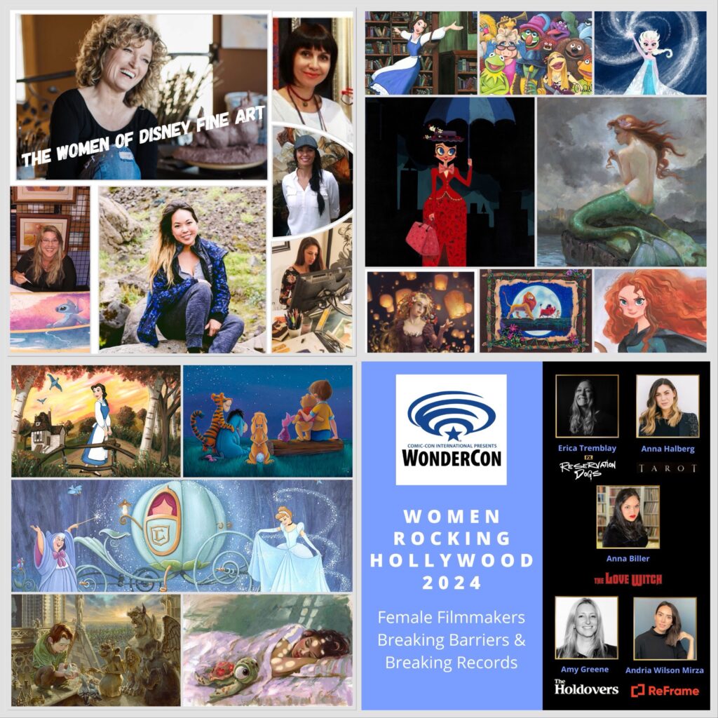
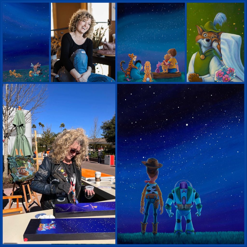
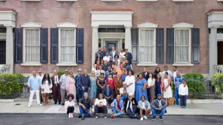
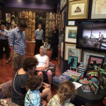
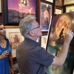
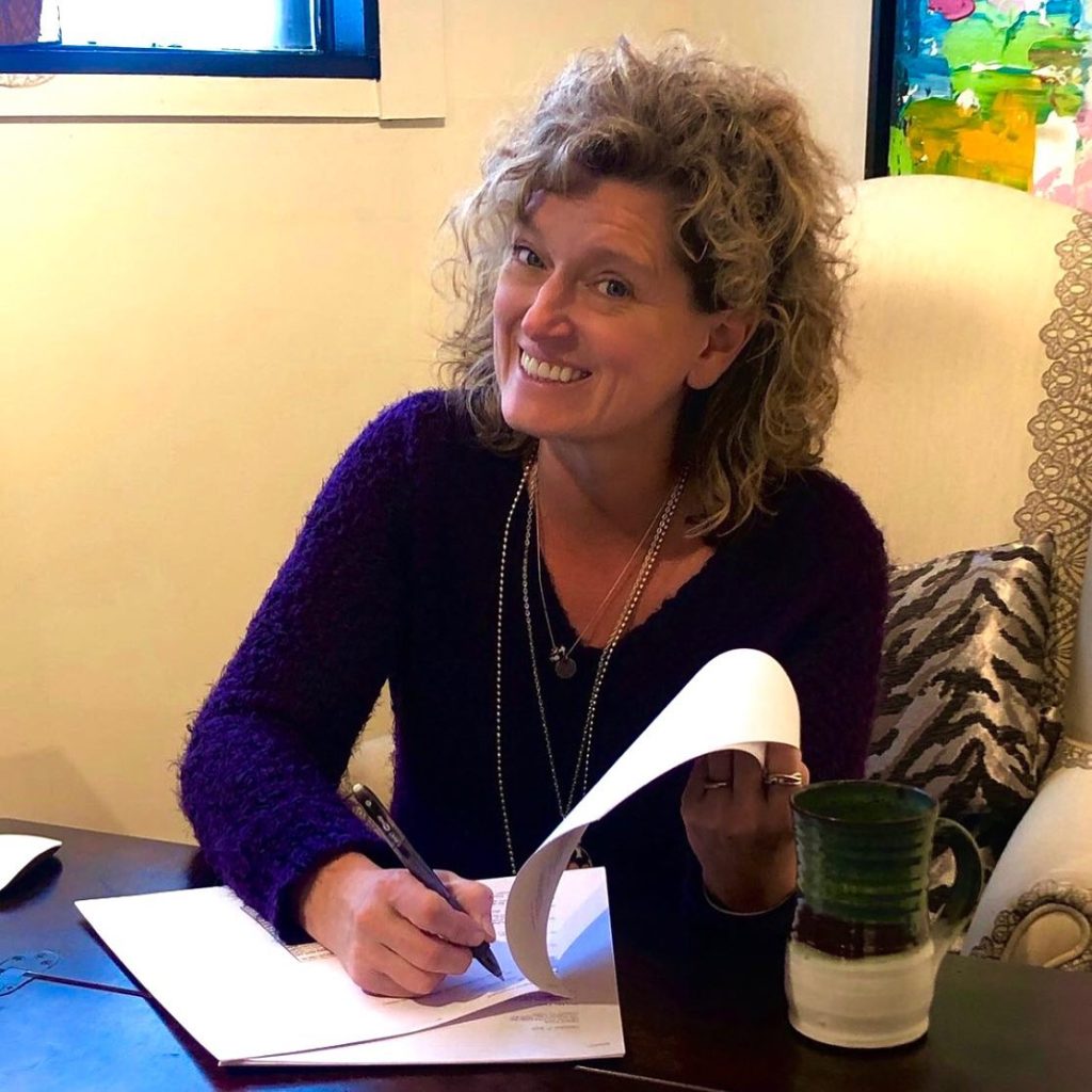
Recently, we travelled to LA for WonderCon to present the 10th Women Rocking Hollywood panel. The event is part of the other life of ArtInsights co-owner Leslie Combemale (that’s me!) as a film journalist, writing for the Motion Picture Association and on the Alliance of Women Film Journalist site. I am an enthusiastic supporter of women in film who believes parity for women working in the film industry is essential. Better represention means better cinema! Every year since 2016 I have put together a group of female filmmakers to speak about their careers, new projects, and the experience of being a woman working in the film industry. Until 2024, these have been at San Diego Comic-Con in July, but this year I made the switch to LA, and WonderCon. For every panel, I and my ArtInsights partner and hubs Michael Barry create a video for those who can’t attend, to inspire aspiring female filmmakers, and to excite fans who want to support projects created by women. That got me thinking. Since we just published the video, it seemed the perfect time to talk about it here, and, in synergistic fashion, amplify the many wonderful women of Disney Fine Art!
First, here’s the description of the panel and the video of the panel:
Women Rocking Hollywood 2024: Female Filmmakers Breaking Barriers & Breaking Records
Greta Gerwig’s Barbie was the top grossing film of 2023 and is now the highest grossing comedy of all time. Barbie and 2023 releases like Polite Society, Joy Ride, Saltburn, and Past Lives show female filmmakers can and do create blockbusters, great films, and soon-to-be classics, whether or not they get recognized at awards time. Women are also excelling on the small screen. So why are the numbers of women hired by studio projects still so small, especially for women of color? We talk to creative, successful women in film about the way forward, and how gains through SAG/Aftra and the DGA are helping increase the percentage in Hollywood and beyond. Scheduled to appear and discuss the state of the business and their exciting new projects areErica Tremblay (writer/director, Reservation Dogs, Fancy Dance),Anna Halberg (writer, House/Wife, director, the upcoming Tarot), Amy Greene (producer/stunt coordinator, The Holdovers, stunt coordinator/executive producer, Somewhere in Queens), Anna Biller (writer/director/producer, The Love Witch, the upcoming The Face of Horror), and Andria Wilson Mirza (director, Women in Film’s ReFrame, producer, Queen of My Dreams). Moderated by Leslie Combemale (founder, Women Rocking Hollywood, lead contributor, The Alliance of Women Film Journalists).
You can read more about each panelist and the panel in this lovely article by the head of the AWFJ by clicking HERE.
Here’s the panel:
You can also see all the other panels, by going to the Women Rocking Hollywood website, HERE.
I love that the panel happened on March 30th, ending Women’s History Month with a flourish and a celebration of powerful women working in film!
FEMALE ARTISTS WORKING IN HOLLYWOOD
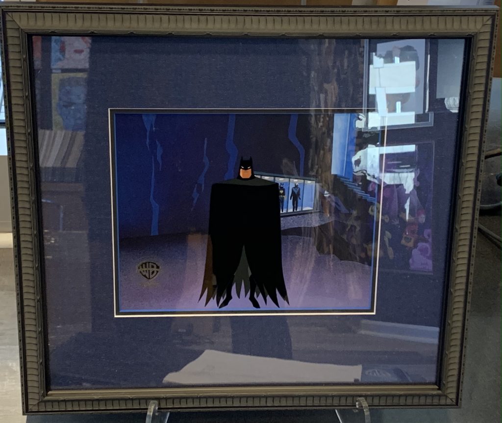
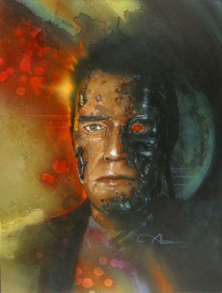
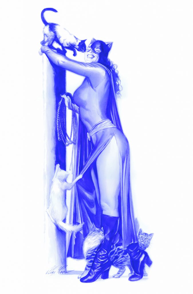
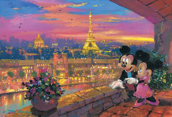
In my role as co-owner and gallerist at ArtInsights Animation and Film Art Gallery, I’ve always thrilled to see women represented as official studio artists. Honestly, historically, there are very few women who worked as illustrators in live-action film, whether it’s on campaigns or as production concept artists, although there are more in recent years. Andrea Alvin, the wife of John Alvin, was his partner in Alvin and Associates, and worked on some very important movie campaigns, contributing essential elements that impact the finished images. Two, right off the top of my head, are the Batman and Blazing Saddles posters. But it was John who signed his name, and was the front-man. He was the one known for Alvin-izing. There have also always been female storyboard and concept artists, but it’s only recently that concept art from films has become collectible, and the focus is on big names like Ralph McQuarrie. The contributions by women in the field are rarely celebrated. Although more women work in those careers now, their work with the studios is almost always ‘work for hire’, which means they can’t sell the art they create or promote the projects they’ve worked on, which is another reason people don’t know them. The women who DO get celebrated are those who work as official artists like those for Disney Fine Art.
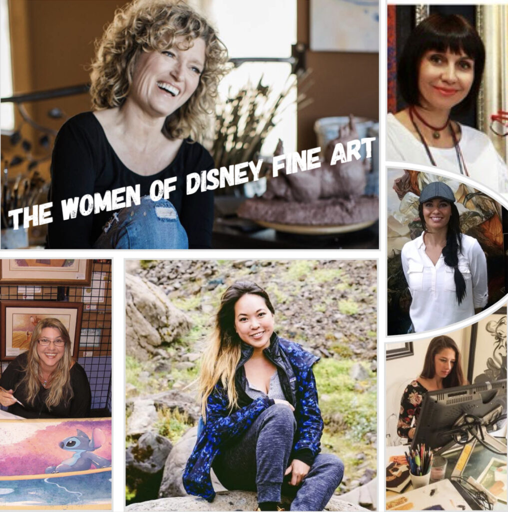
THE WOMEN OF DISNEY FINE ART
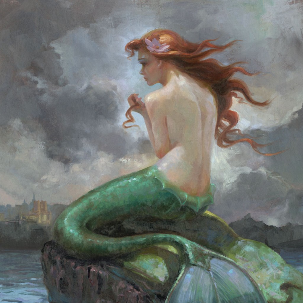
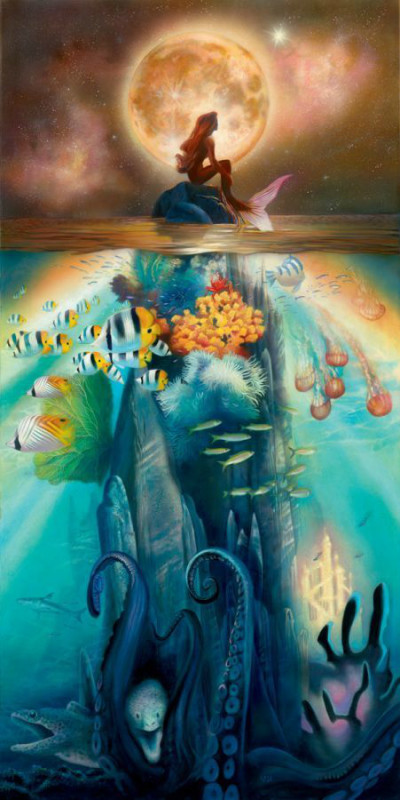
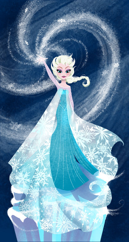
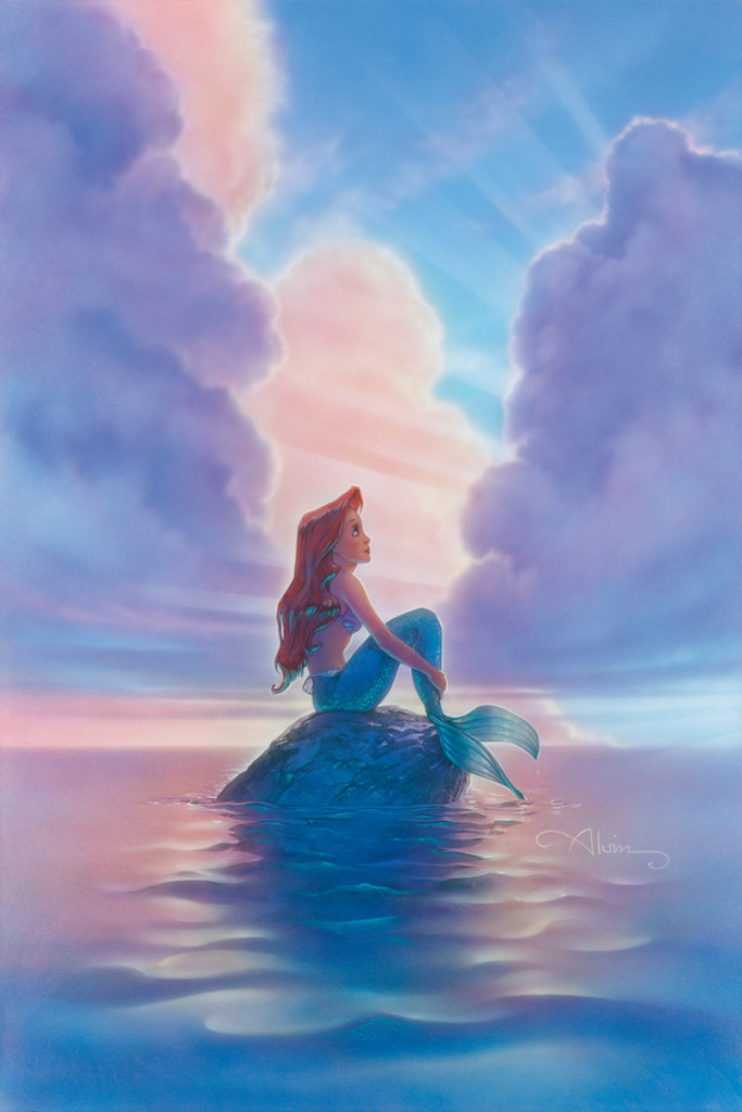
That rare visibility happens when female artists get selected to create interpretive studio art. Such is the case with Disney Fine Art. A number of the female artists who are official Disney artists have worked in official capacities in the studios. Take Disney artist Lisa Keene, for example. She started as a background artist on The Black Cauldron, and in her nearly 40-year career at Disney, she has done everything from visual development to production design to art direction, working on all the big films of Disney’s New Golden Age.
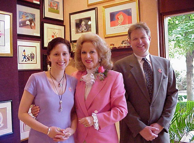
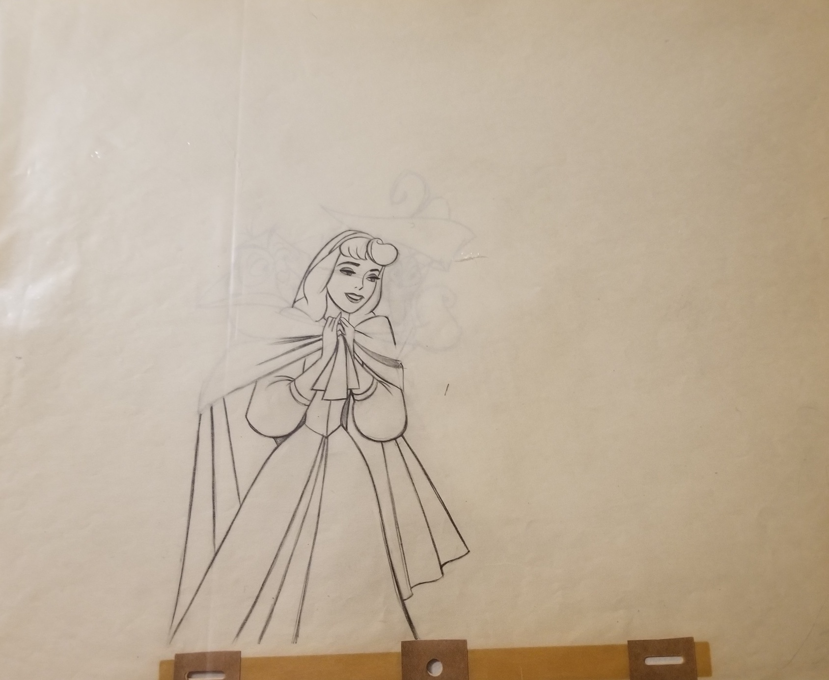
“At Odds With the Sea” by Disney artist Lisa Keene, who worked as a background artist on the 1989 Disney classic, The Little Mermaid
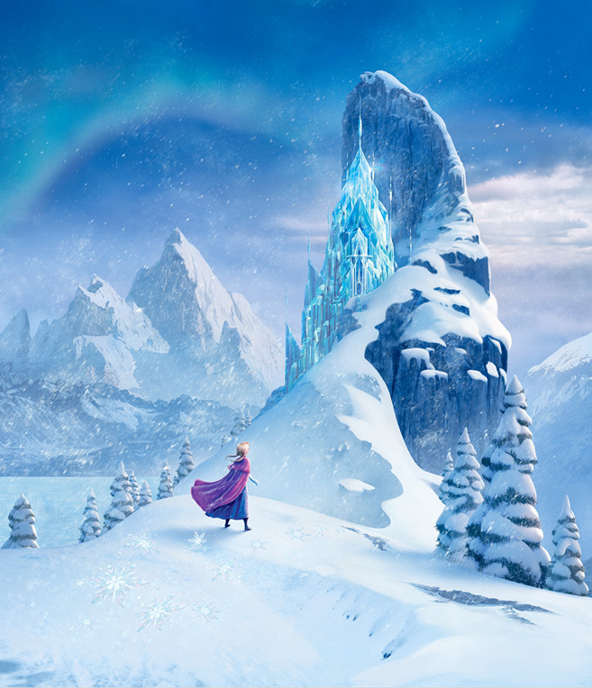
It would not be an exaggeration to say Frozen looks the way it does because of her, but she also had a huge impact on Big Hero 6, Moana, and Tangled. You can see all her interpretive Disney Fine Art HERE. There’s not much of it, but as you can see in the Lisa Keene Little Mermaid art above, what is available is gorgeous.
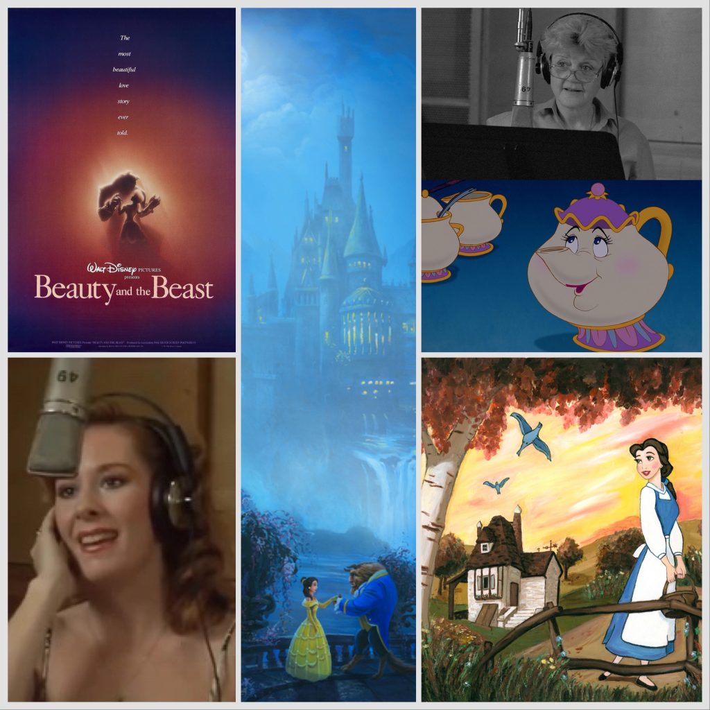
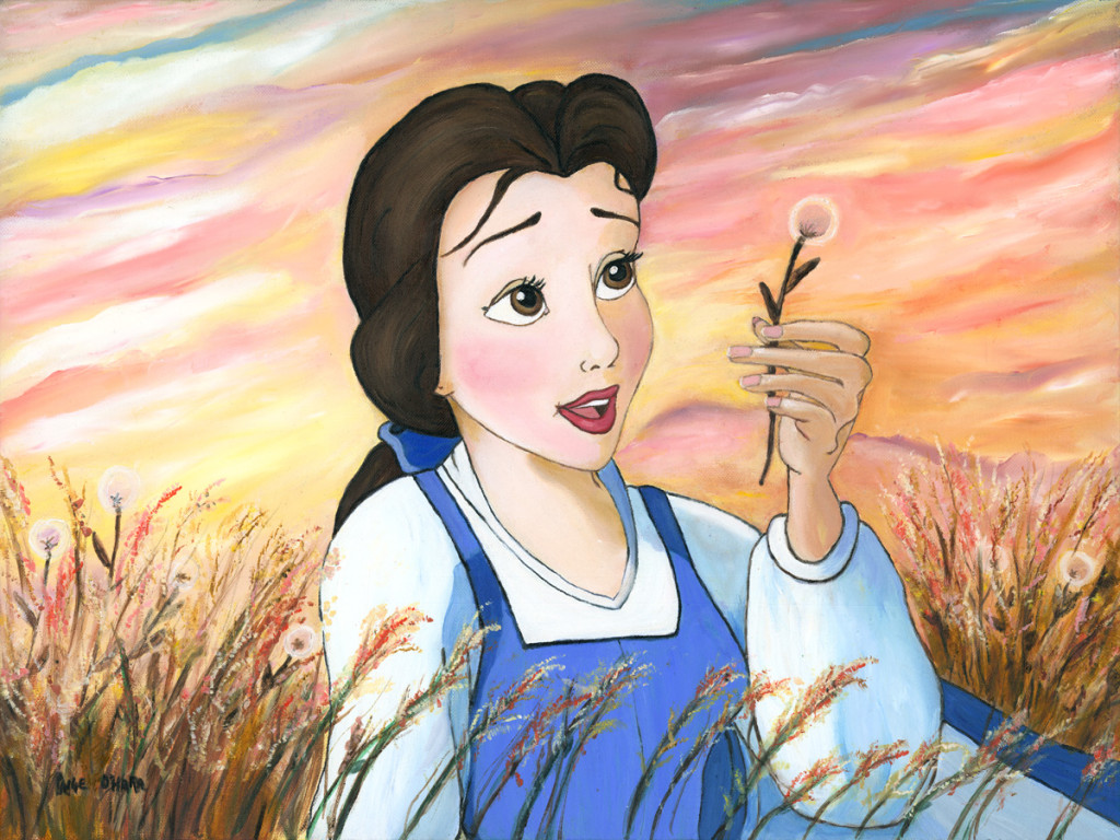
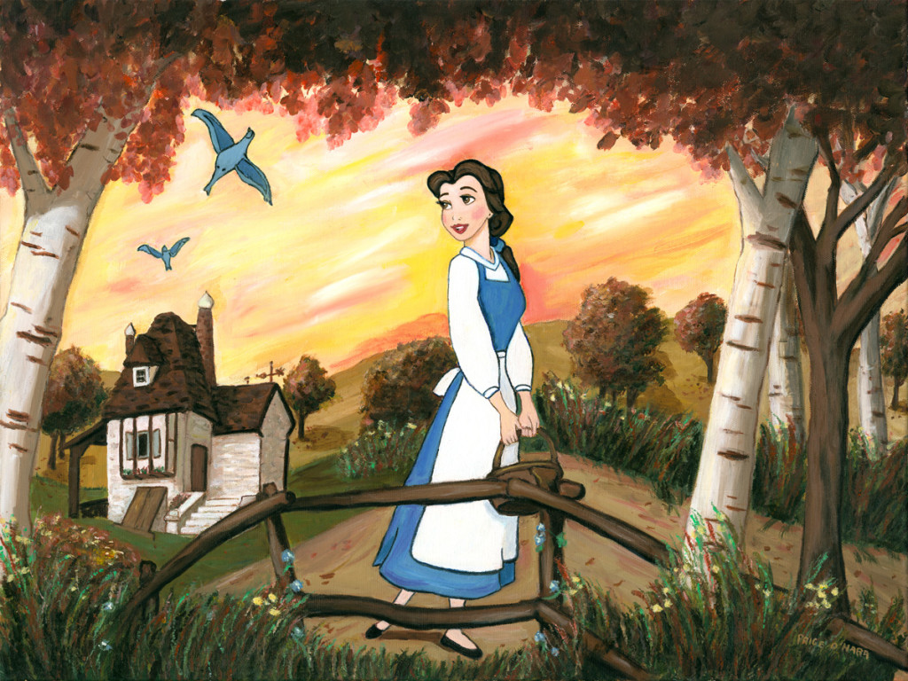
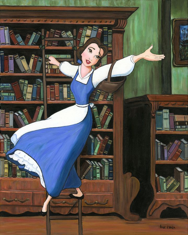
“Little Town” by the voice of Belle, Paige O’Hara
Then there’s Disney Legend and Broadway star Paige O’Hara, best known as the voice of Belle in 1991’s Beauty and the Beast. O’Hara was 35 when she played the teen character. Although she was replaced after playing her in the original film, its sequels, and the animated tv show, it is her voice we think of when we think of the iconic role, and it’s her voice we hear as Belle in 2018’s Ralph Breaks the Internet. Paige has been painting since she was a child, and it was a way to make money while she was working to become known as an actress. She continued to paint for herself through her performing career, and wound up signing with Disney Fine Art after bringing a painting of Belle she had created to one of her Beauty and the Beast signings. As a big fan of the film, it’s pretty cool for Disney lovers to be able to get signed limited edition images of Belle created by Belle herself! You can see all the Disney Fine Art images available by Paige O’Hara HERE.
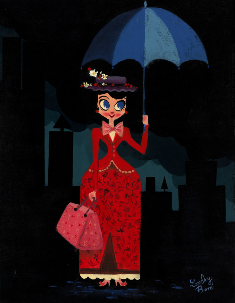
Another talented artist who worked on Disney films is Lorelay Bové. Born in Spain, she attended the prestigious CalArts, known as a training ground for future Disney artists. She has worked in visual development for some of your favorite Disney/Pixar films, including Wreck It, Ralph, Tangled, and Zootopia, and contributed Little Golden Books for The Princess and the Frog and Toy Story. Her style has often been compared to that of Mary Blair, which you can see in the image she created inspired by Mary Poppins:
“Mary’s Umbrella”, by Disney visual development artist Lorelay Bové
You can see all available Lorelay Bové Disney art HERE.
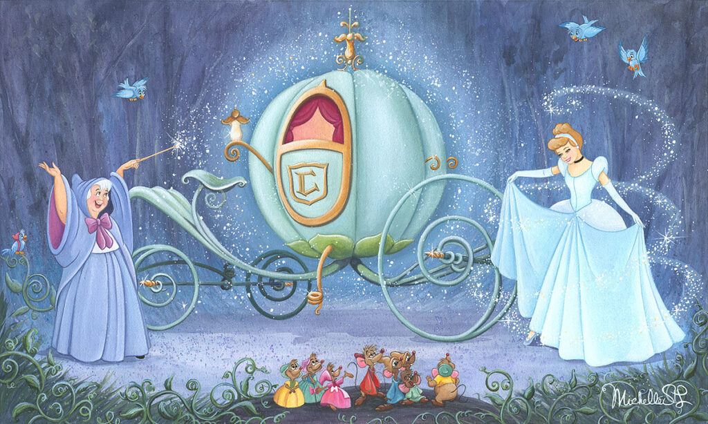
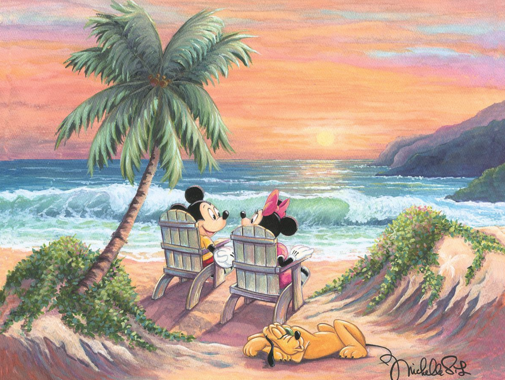
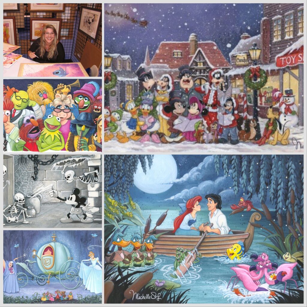
Michelle St. Laurent has become quite the Disney Fine Art star, selling out all the art at her shows whenever she appears. We are happy to say we had the very first show featuring her work for Disney Fine Art wayyyy back when. Michelle has had a fascinating career working in and around Disney, particularly as a production designer for special events inside Walt Disney World. You can read our blog about her life and career, including an exclusive interview with her, HERE.
“Fit for a Ball” Cinderella limited edition by Michelle St. Laurent
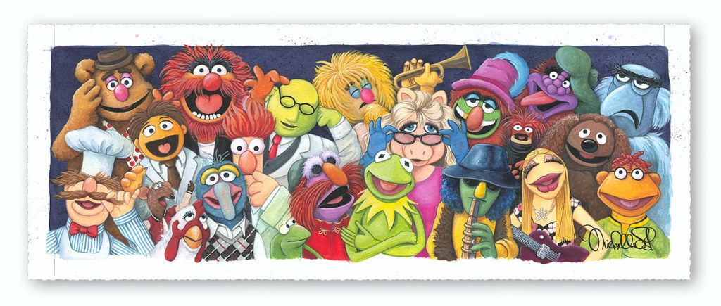
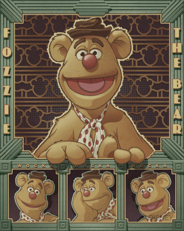
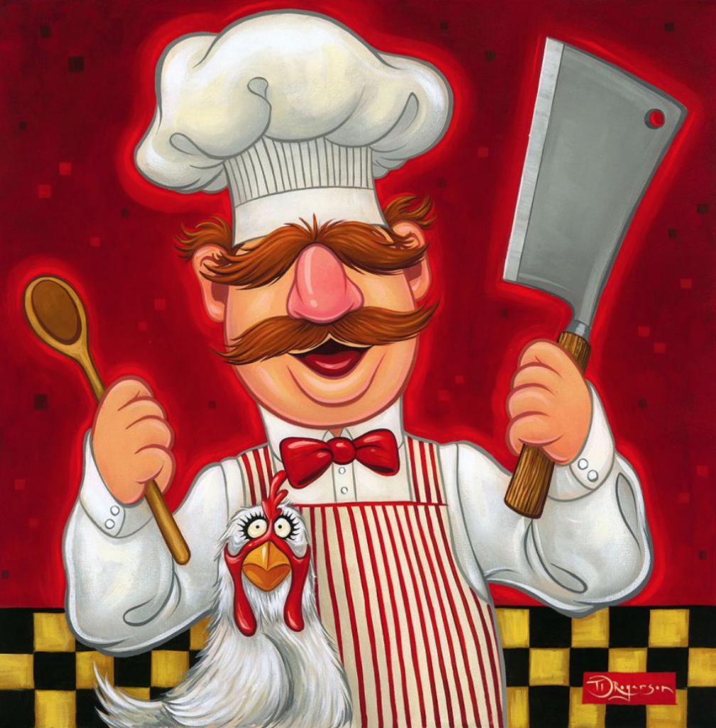
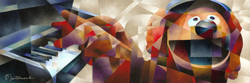
Michelle has also created some wonderful images inspired by the Muppets, one of her favorite shows. This is our favorite:
“Backstage at the Show”, a Muppet limited edition by Michelle St. Laurent
You can see all of Michelle St. Laurent’s latest and greatest art HERE.
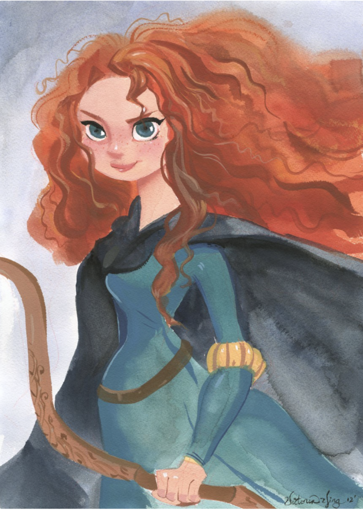
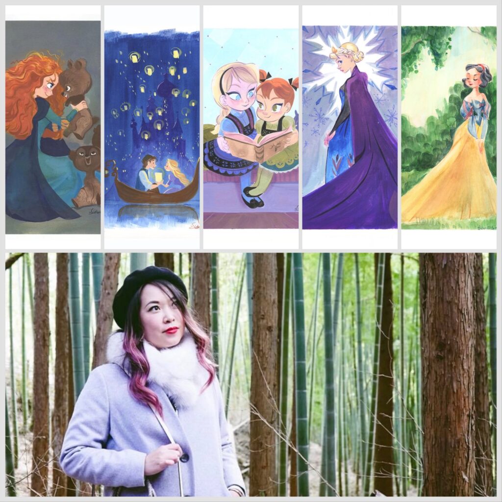
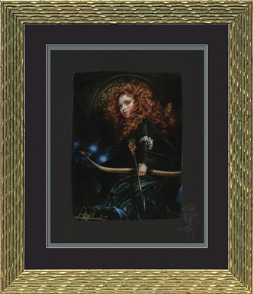
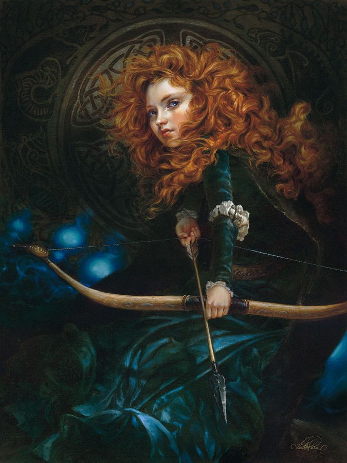
Victoria Ying has loved Disney her whole life, has had a fascinating career, and she’s showing no signs of slowing down. During middle school she’d already made up her mind that she wanted a career in the arts, and went on to attended Art Center College of Design in Pasadena, California where she majored in Illustration with a minor in Entertainment Design. In her role as a Visual Development artist for Walt Disney Animation Studios, she created thousands of concepts, including numerous characters designs, environments and character costumes for films such as Tangled, Prep and Landing, Wreck-it Ralph, Frozen, Paperman, Big Hero 6, and Moana. Most recently she’s released very popular and award-winning books of her own characters and imagery, which you can see on her own website HERE. Victoria has been on multiple panels with ArtInsights featuring women working in the animation industry, and we’ve loved watching her flourish in everything she does. Click on the below image to see all her gorgeous limited editions for Disney Fine Art.
“Merida” by Victoria Ying.
Click on the below image to see all the Disney Fine Art by Victoria Ying.
We love the playful, joyful images Disney artist of Victoria Ying.
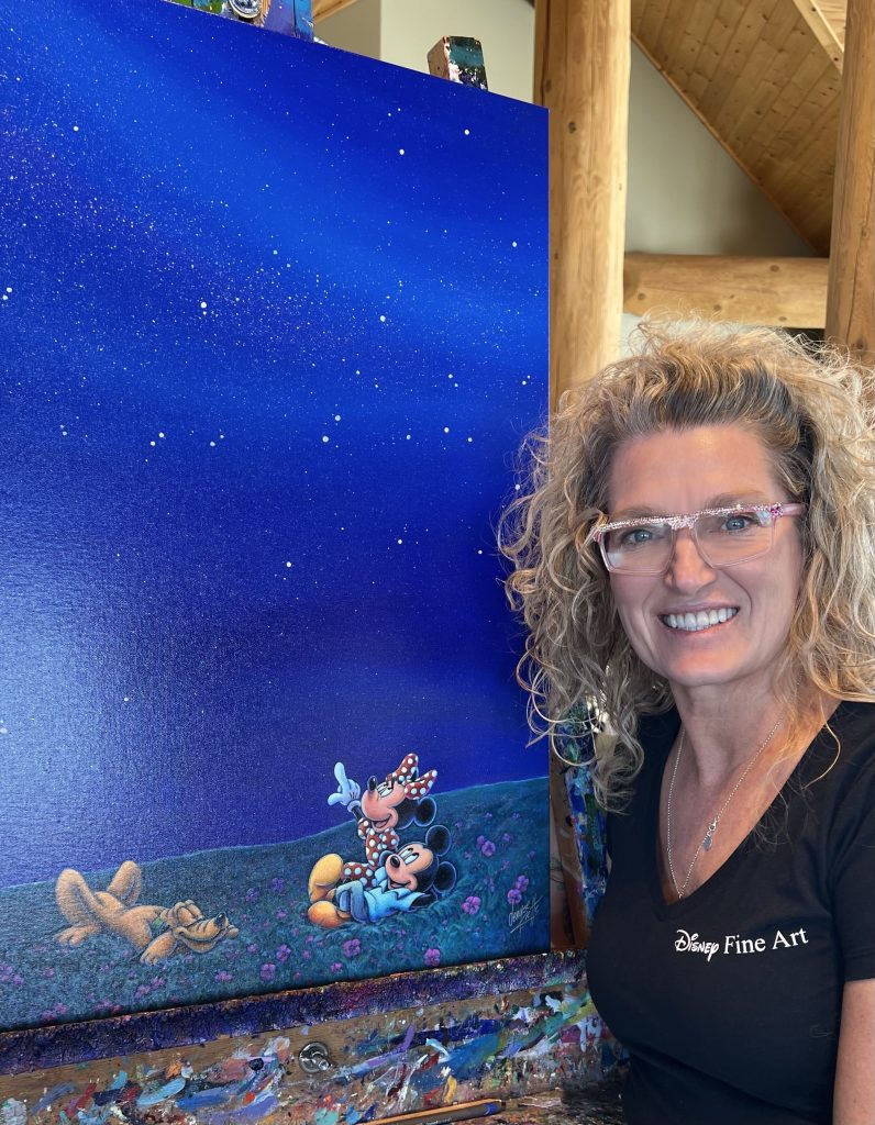
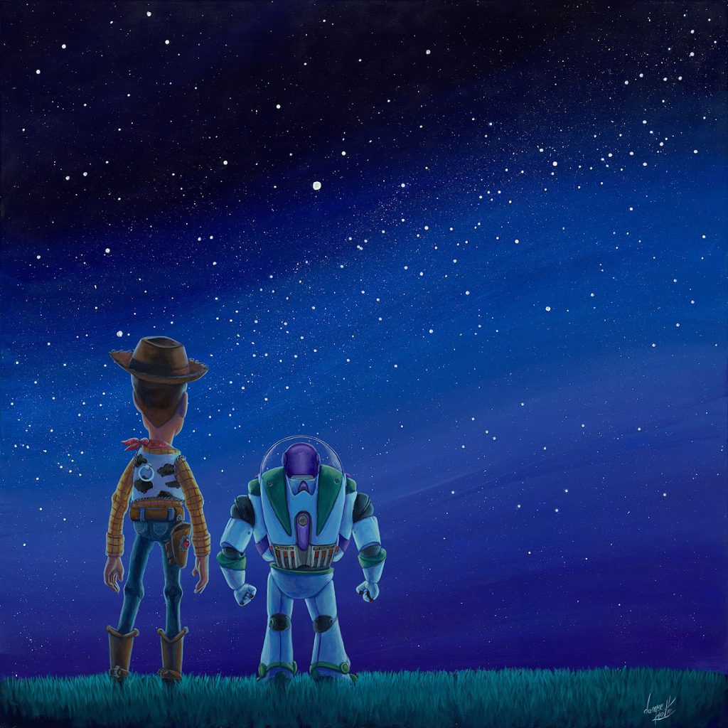
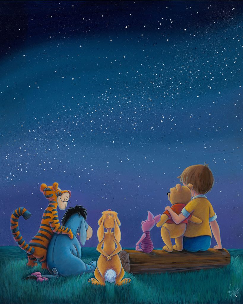
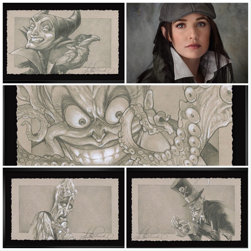
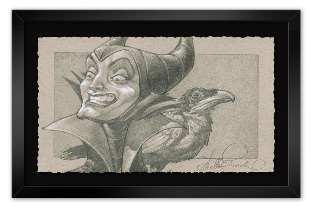
Artists added more recently as official artists for Disney Fine Art are Denyse Klette and Heather Edwards. Both have long and storied careers in the fine art world. I spoke to each of them for interviews on our blog. You can read about Denyse Klette’s career and art HERE. Denyse is proud to be the first Canadian artist added to Disney Fine Art roster.
We wrote about Denyse Klette when her new “Starlight” collection was released. Click on the image to see all her Disney art.
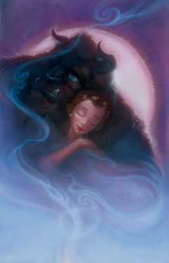
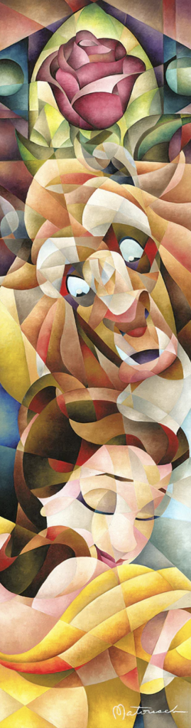
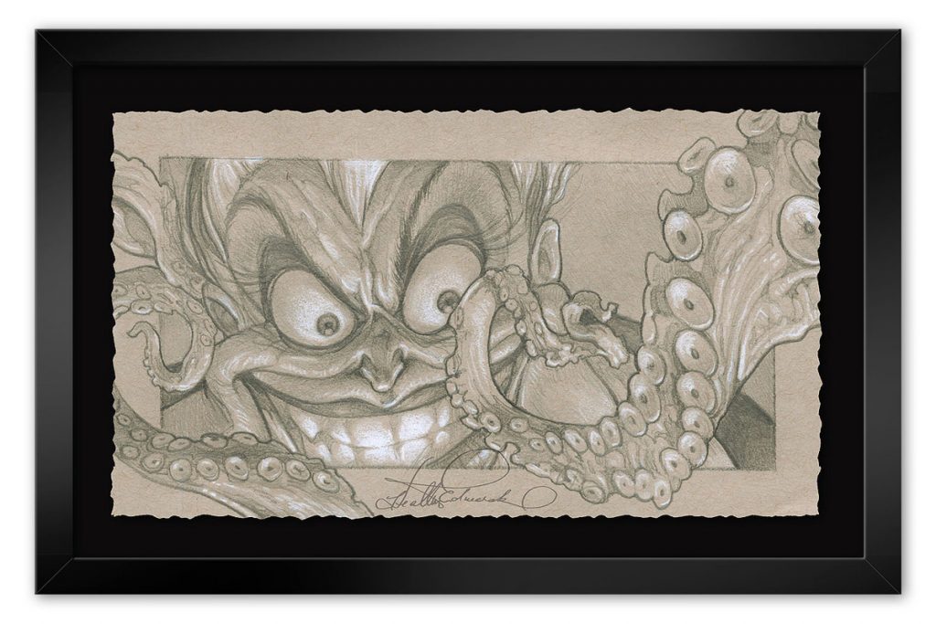
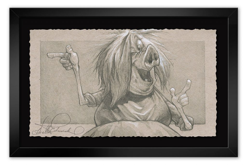
Heather Edwards has been hiding wonderful and often mystical images in her art since she first started creating. I remember realizing, after years of seeing the image, that Beast was hiding in her art featuring Belle. I have never looked at her art the same way again! Find out about what inspires Heather Edwards in the blog about her career and art, including an exclusive interview, HERE.
“Love Blooms in Winter” by Heather Edwards. Do you see Beast above Belle, and the rose on her left, painted into the trees? Of course you do! You’ll be looking at the art you purchase by Heather Edwards for years seeing new things you’ve never seen before!“God Help the Outcasts”, the latest Disney Fine Art image by Heather Edwards. There are a bunch of Disney characters hidden in the art. See if you can find them!
We only just added a new name to our female Disney Fine Artists, because we saw this wonderful piece she had created that I know fans of Finding Nemo will love, and also because she is a Ukrainian artist, and I love supporting her work! Her name is Irene Sheri, and she paints gorgeous “fine art”, but brings that talent and inspired, emotional vision to her Disney Fine Art. You can see all her art HERE.
How sweet is this piece called “Dreaming of the Reef” by Ukrainian Disney Fine Artist Irene Sheri?
As you can see, there is a wealth of female talent in animation and live action, as directors, producers, writers, artists, and illustrators. I love being able to amplify their work through my Women Rocking Hollywood panels and with the Alliance of Women Film Journalists, as well as through ArtInsights Animation and Film Art Gallery. These are inspired women at the top of their game, using their talent and infusing their work with their unique perspectives. We should celebrate and support them in all the ways we can!
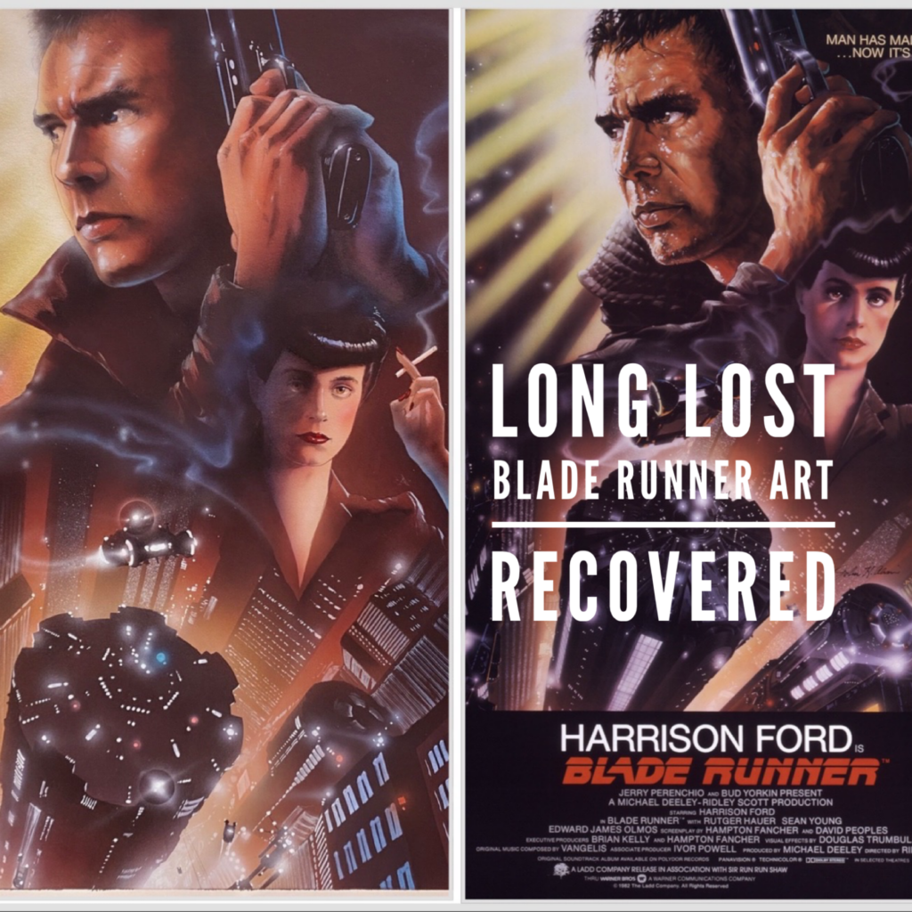
Long lost John Alvin Blade Runner art has been recovered in a settlement that represents a landmark win for illustrators and artists’ rights.
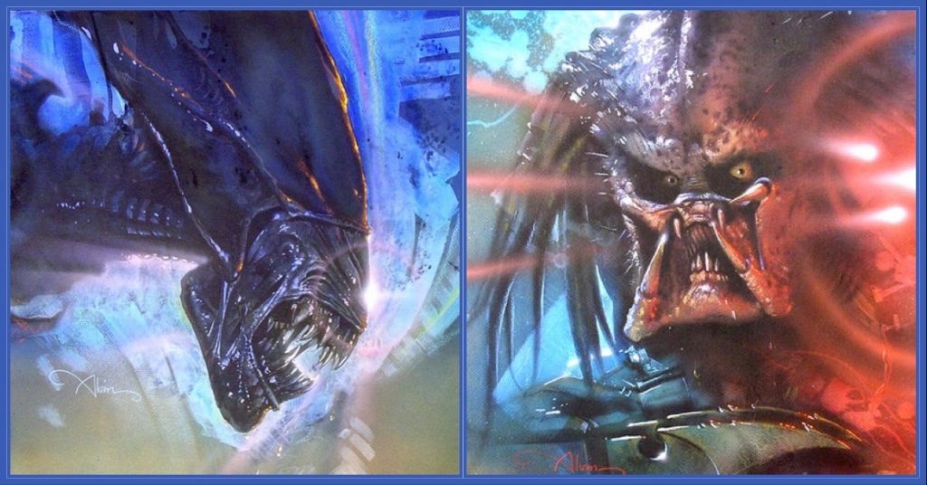
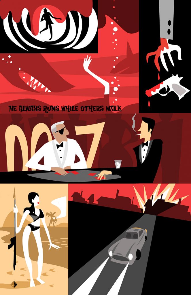
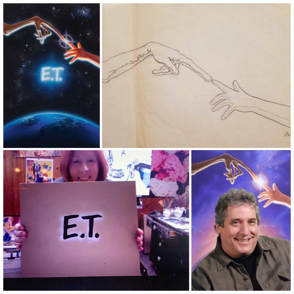
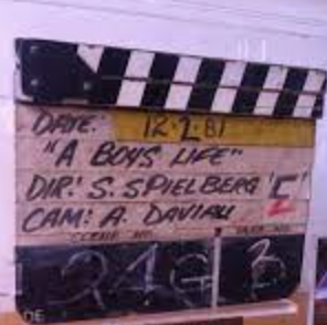
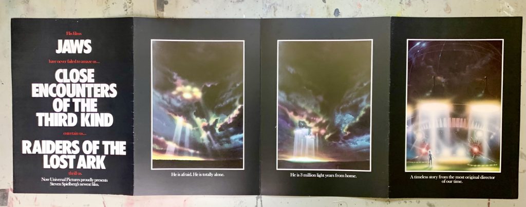
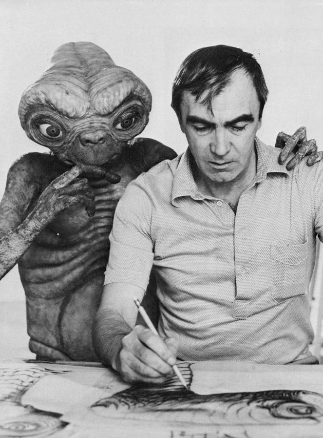
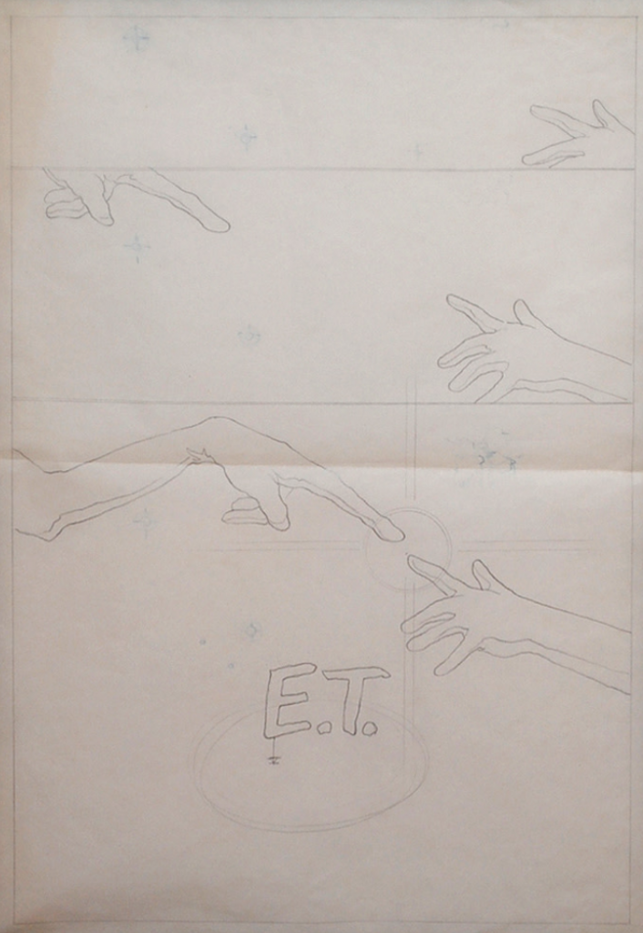
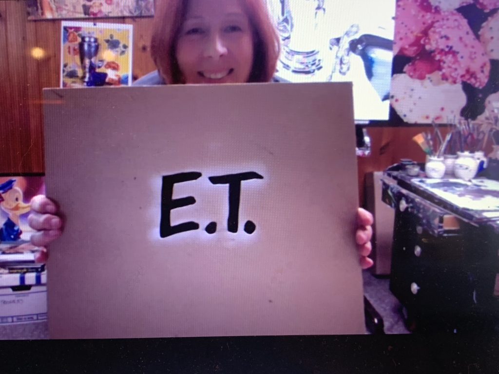
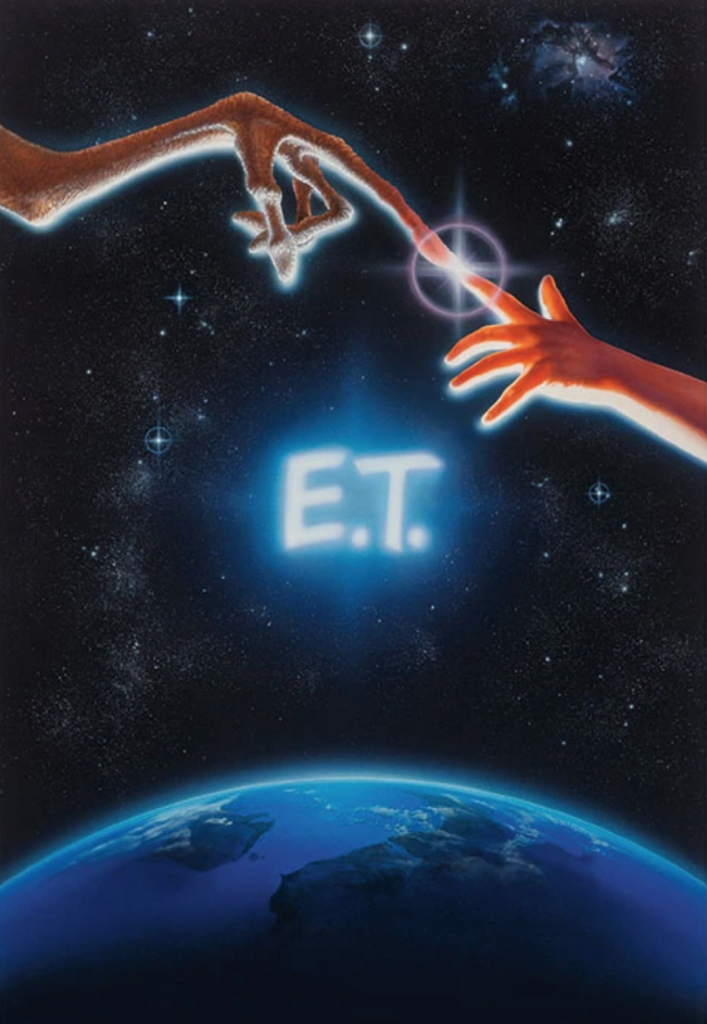
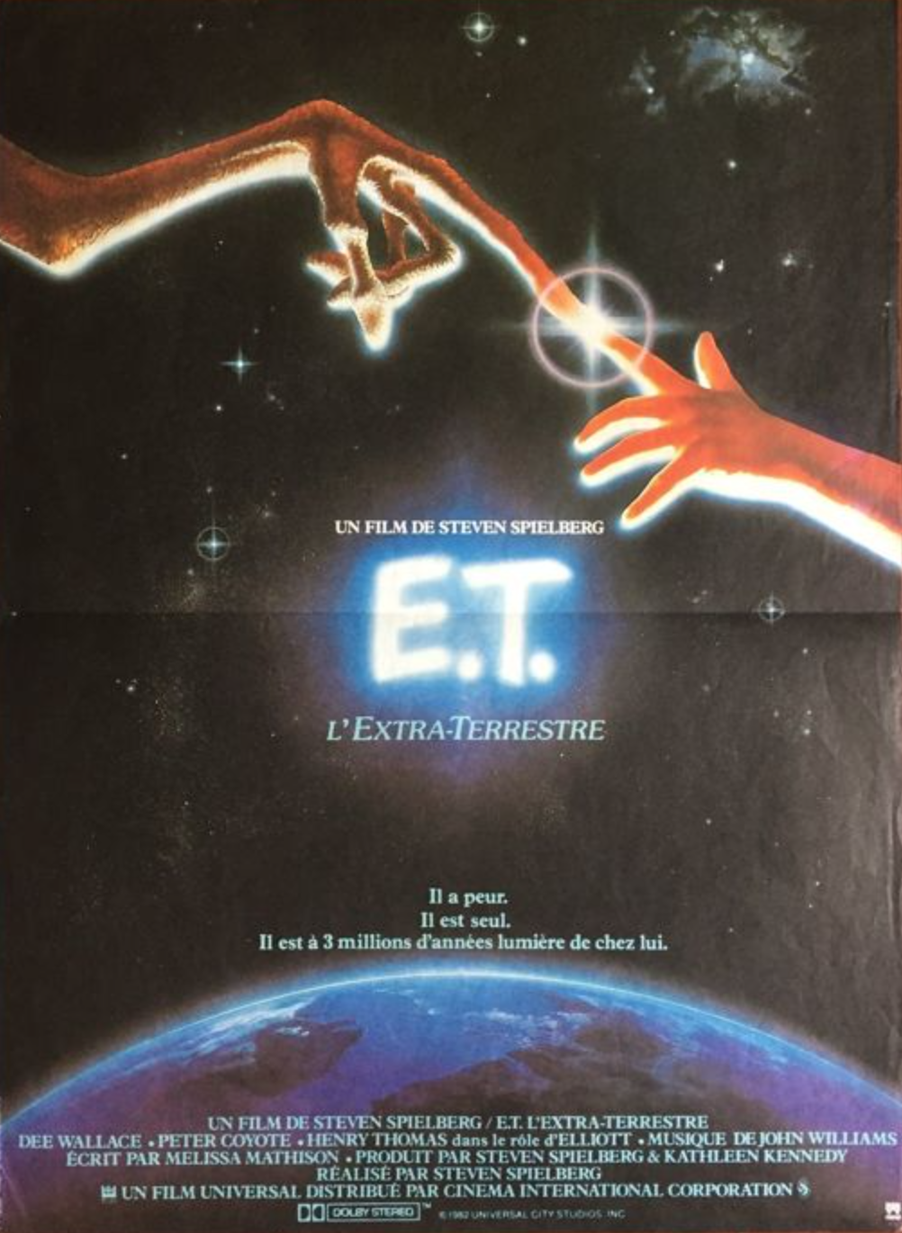
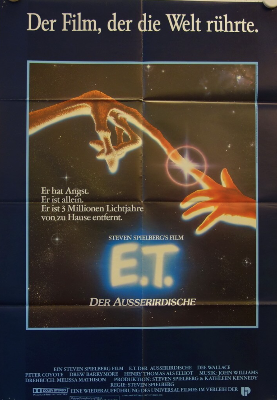
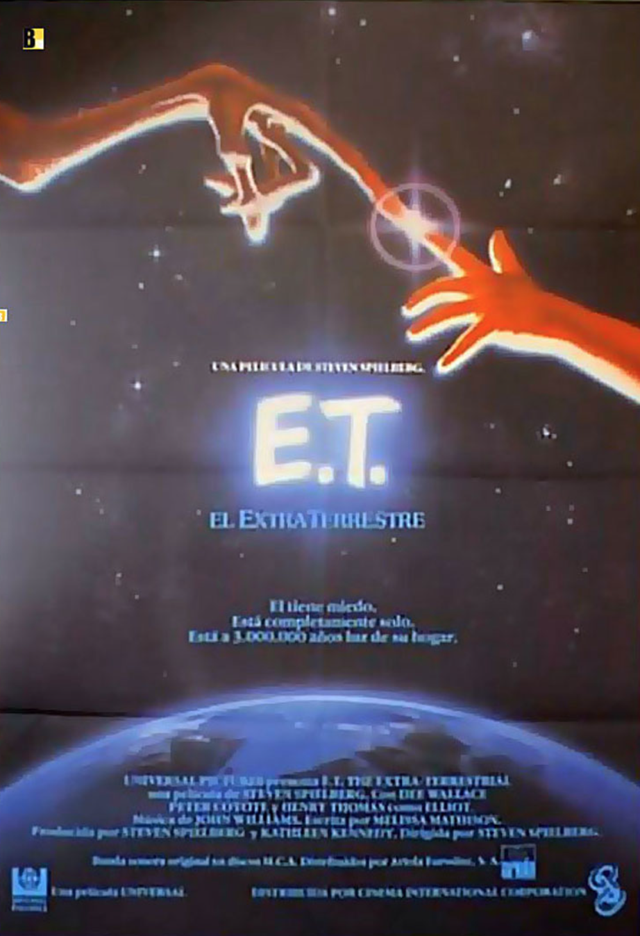
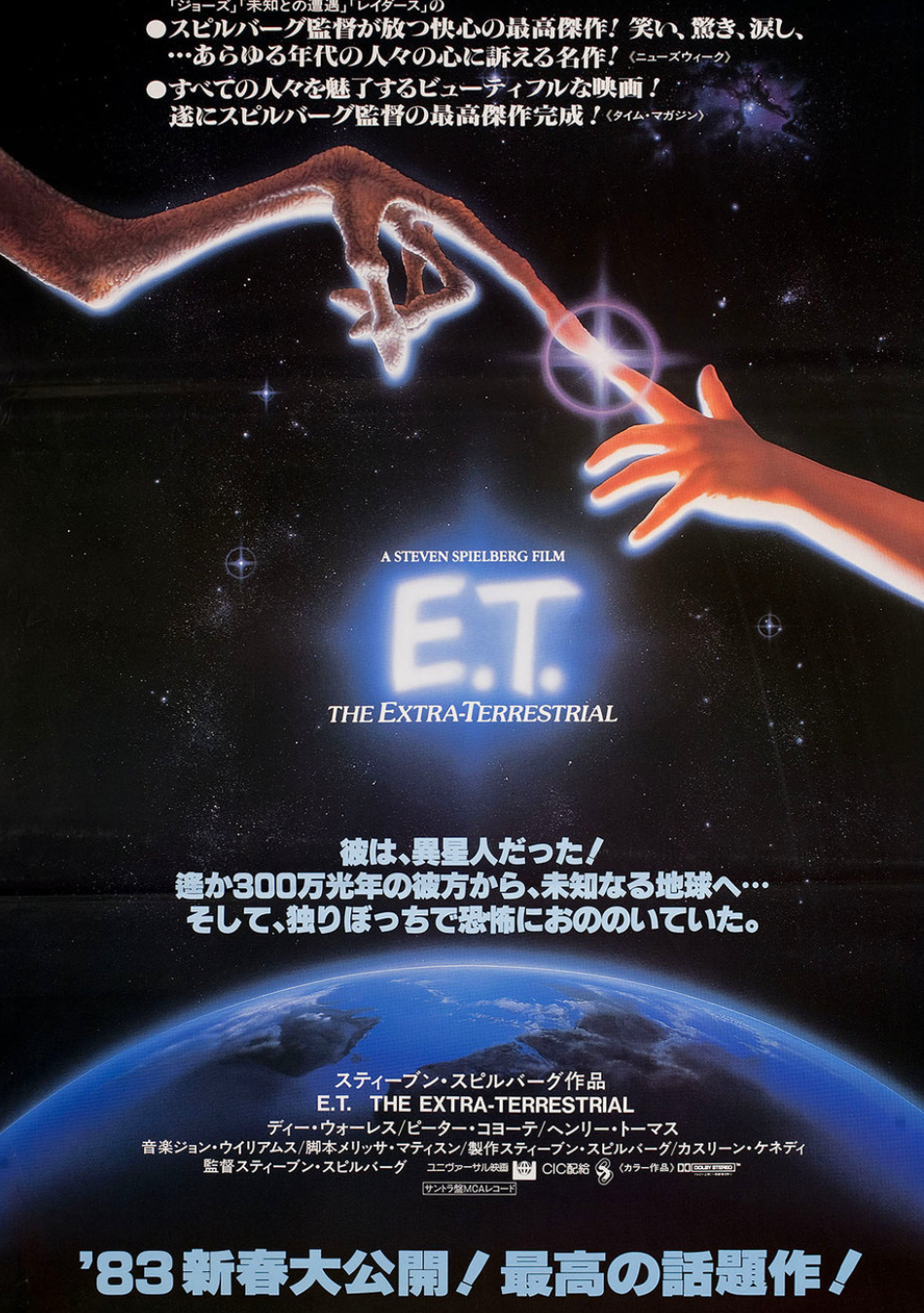
As many of you know, not only do we sell Disney Fine Art and original production art from cartoons and live action films, Leslie of ArtInsights is also the official representative for the estate of cinema artist John Alvin. If you’re not sure who he is, he’s responsible for over 200 movie posters in the history of film, from the 70s through the 90s (and you can read more about him HERE.) From E.T. to Blazing Saddles to Blade Runner, film fans will recognize his art instantly when they see the movie posters. Directors, art departments, and film marketing firms who collaborated with him have repeatedly said his art had a significant affect on the success of their films.
We have been working in partnership with the Alvin family to get back art not returned at the time these movies were released. A lot of art disappeared, despite the fact that John Alvin was freelancing and his work was supposed to be returned to him. Years later, many pieces are still unaccounted for, and still other art has shown up at auction.
Such is the case with Blade Runner, and now, long lost John Alvin Blade Runner art has been recovered! We are incredibly excited that Andrea Alvin and the whole Alvin family is now in control of a high comp from the film. It’s the last image created before they created the finished art used to make the Blade Runner movie poster.
This settlement has the potential to have a huge impact on other artists getting art returned to them that is rightfully theirs.
SO MANY artists important to film history have missing art, removed from studios or production houses. Some of those pieces are iconic and valuable, and are sold for large sums without the artists themselves or their families benefitting. It’s more than time for that to change. Along with John Alvin, other heroes of film illustration like Drew Struzan, the brothers Tim and Greg Hildebrand, Roger Kastel, and Bob Peak all had issues getting art returned. If someone steals a painting from the Louvre, the entire French government is engaged to get it back! It should be no different for the work by these all-too-unsung artists. Hopefully the recovery of John Alvin’s Blade Runner art is a portent of things to come. There are artists still working in the film industry today, as well as illustrators working in other industries like publishing or music that could benefit from this win. We are thrilled, and we think all movie and art lovers should be, too!
Andrea Alvin herself speaks to the importance of the Blade Runner settlement in the press release below:
====
LONG LOST BLADE RUNNER ART RECOVERED
LAWSUIT SETTLEMENT REPRESENTS A LANDMARK WIN FOR ILLUSTRATORS AND ARTISTS RIGHTS
Pittsburgh, PA (April 4, 2024)— A lawsuit brought by the Alvin Art Estate to halt what the estate claimed was the unauthorized sale of art belonging to the estate has been settled. The estate’s suit was led by Andrea Alvin, wife of movie poster artist and illustrator John Alvin. The settlement confirms ownership by the Alvin Estate of an original painting created in the making of the movie poster for Ridley Scott’s 1982 sci-fi classic, Blade Runner. The mixed media painting was a comprehensive, the closest to the final art used in making the key art for the finished Blade Runner movie poster, one of the most recognized sci-fi movie poster images in film history. The outcome will likely be used as a precedent in future lawsuits by artists working to get art back from those who have obtained it without purchase or permission of the artist.
John Alvin and many other artists working as freelancers in the film industry in the 70s, 80s, and 90s had contracts requiring the art be returned to the artist after being used in campaigns. However, there has long been a practice of people “finding artwork”, often removing it from flat files inside a studio, claiming ownership, and selling the art in a gray market. In those cases, the artists neither get the art back nor benefit from the sale of that art.
In the case of the Blade Runner art, Andrea Alvin, who is an artist and was equal partner in Alvin and Associates, discovered the art’s whereabouts when it appeared for sale at auction. She knew by the information included in the auction listing, that it had been purchased from an employee at Warner Brothers. Because Warner Brothers never owned the art, no employee at Warner Brothers could legally claim ownership or have permission or rights to possess and sell the art.
When contacted, Andrea Alvin offered this quote: “The Blade Runner and all artwork created in the process of the film campaigns to which John contributed represent his life’s work. Whether we keep art or it winds up in the collections of fans, these images are his legacy. We are pleased with the outcome, and so happy to now have control over its destiny, which is as it should be.”
Alvin further explains why this lawsuit provides a framework for other artists to recover original art: “Where the conflict comes in, and where people get confused, is there’s a difference between owning the publication rights and intellectual property, and owning the art itself. The settlement supports the idea that it’s possible to get art back into the rightful hands of the artists and creators.”
As a requirement of the settlement, the art will be sold through Heritage Auctions in the “Signature Hollywood Auction” to be held on July 13th and 14th of this year.
ABOUT JOHN ALVIN:
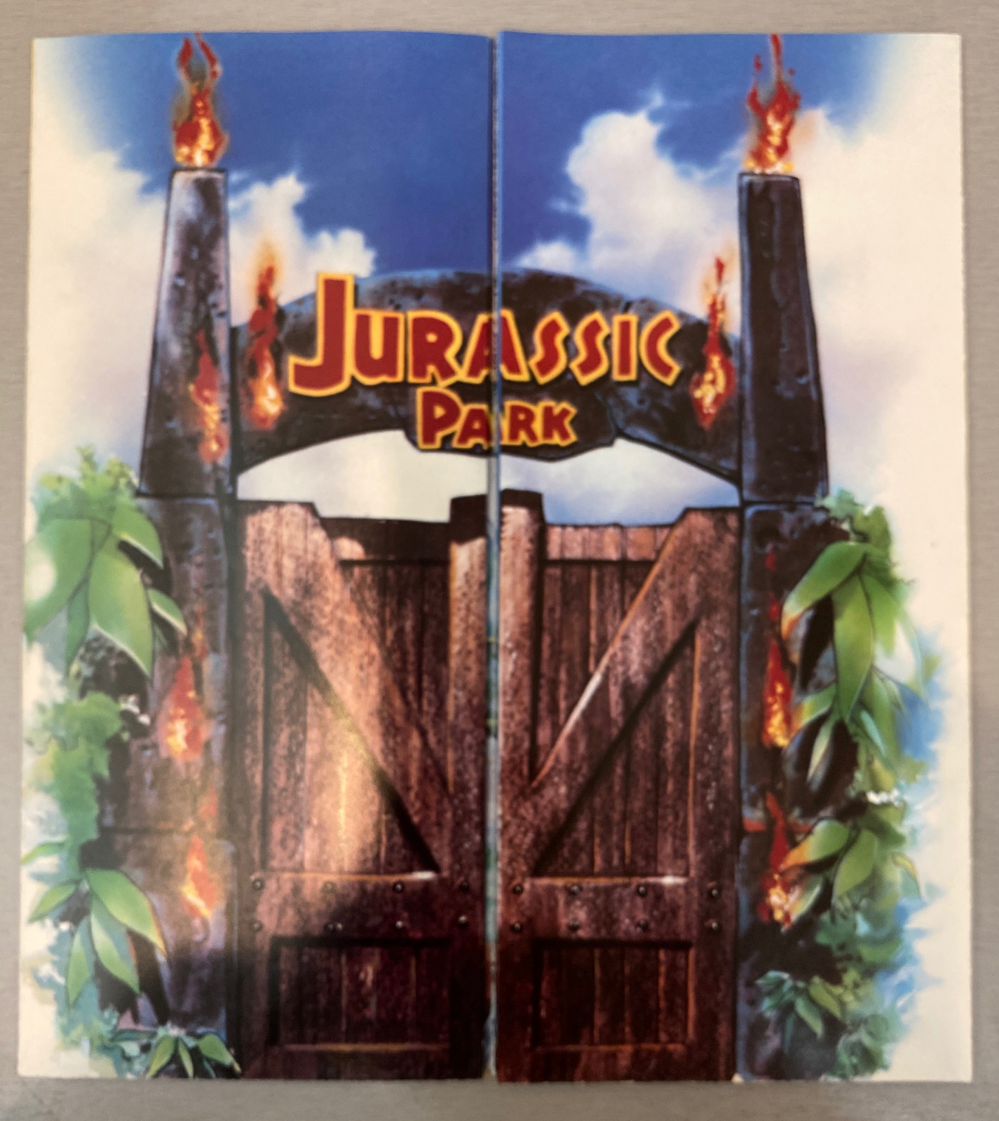
John Alvin (1948-2008) was an American cinematic artist and painter who illustrated some of the 20th century’s most iconic movie posters, working in the industry for over 35 years. He came into prominence by creating the poster art for Mel Brooks’ Blazing Saddles in 1974, and went on to design art for over 250 films, creating more images for Spielberg productions than any other single artist, including the poster art for Empire of the Sun, The Color Purple, Always, Jurassic Park, and E.T.His poster for Blade Runner, considered by many as one of the top classics of sci-fi, is immediately recognizable around the world. He also supplied specialized work for George Lucas and the Star Wars saga, with Alvin’s Star Wars Concert and Star Wars Tenth Anniversary images considered two of the most collectible posters of the entire franchise. He is also recognized for movie poster images from Disney’s New Golden Age. His posters for The Lion King, Beauty and the Beast, The Little Mermaid, and Aladdin are in part what led to Disney studio executive Fred Tio coining the phrase “Alvin-izing” in reference to his style. His work have been on display in museums across the world, including the Smithsonian Museum, which exhibited Alvin’s art for The Phantom of the Paradise as one of the best posters of the 20th century. John Alvin’s career places him as one of the most important figures in film art and Hollywood history.For more information, please visit https://johnalvinart.com/
====
You can see the art we currently have for sale by John Alvin HERE, but of course let us know if you’re interested in his work or the films he worked on… Although currently most of the Alvin art is part of the John Alvin Art Estate and unavailable for purchase, we do get limited edition and original art from time to time. It’s worth getting on our list!
Join us in congratulating the Alvin family, and in celebrating the importance of this for illustrators everywhere!
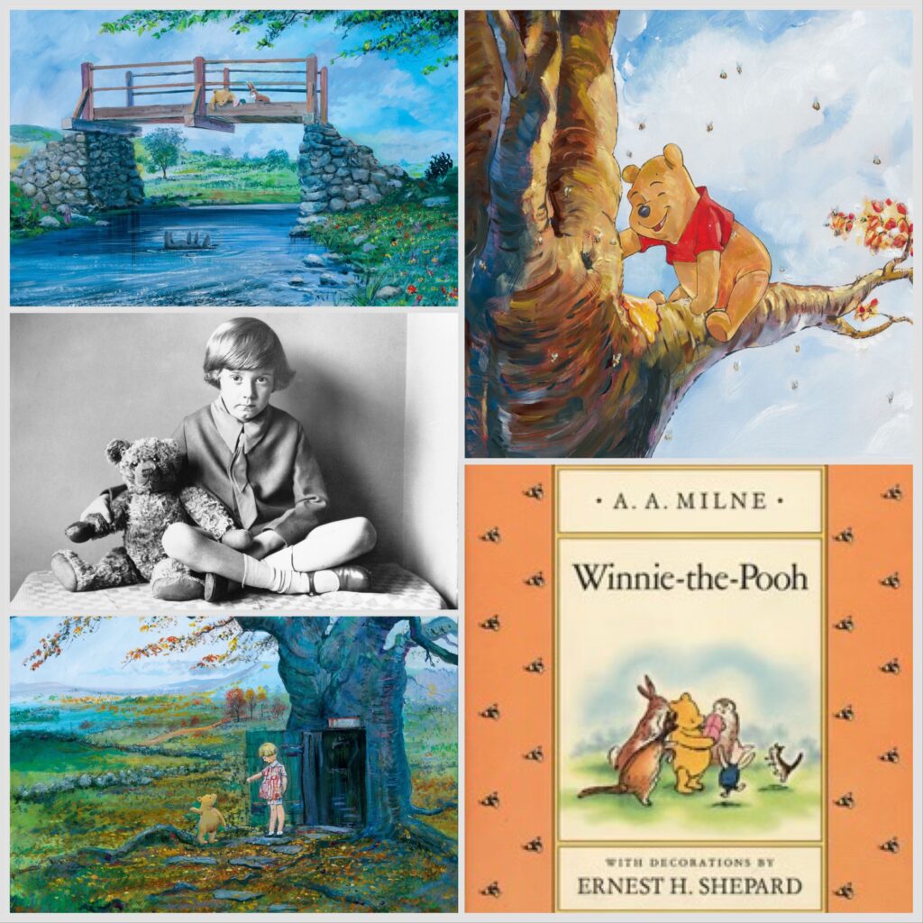
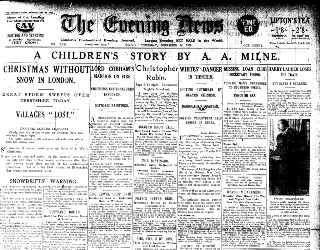
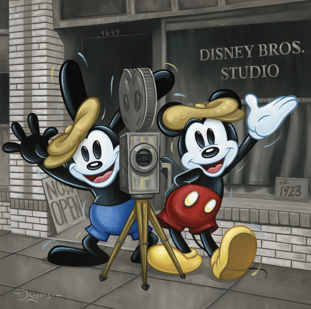
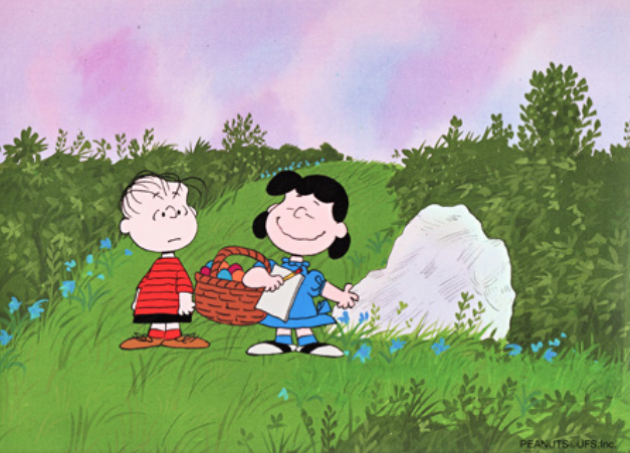
It’s actually officially spring, and so like the bear with very little brain, i was racking mine to think of the best idea for a blog that celebrated a Disney character that exists in a natural world we’d most enjoy in spring, and of COURSE I realized Winnie the Pooh is the perfect subject! Then I went down a “rabbit hole” (although he’s my least favorite character) doing research about the history of Pooh. Everyone knows A.A. Milne and E.H. Shepard wrote and illustrated the original stories and Disney created the cartoons starting in 1966, but there’s so much more to know about England’s beloved bear and Disney’s second most successful character (after Mickey). I’m here to meet the challenge of telling you a bit more than you might already know, so let’s dive into the history and art of Winnie the Pooh together, shall we?
A LOT OF BOOK BOTHER ABOUT A GREAT BEAR:
A.A. Milne was a writer who had joined the staff of the British publication Punch in 1906. His son Christopher Robin was born in 1920, and inspired by him, he wrote a collection of poems, When We Were Young, illustrated by Punch staff political cartoonist E.H Shepard, in 1924. They followed that with short stories which included those that became part of the Winnie-the-Pooh books.
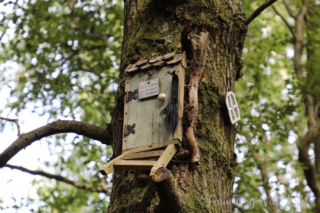
The paper published on Christmas Eve 1925 with Milne’s Winnie-the-Pooh in it
The first time Winnie-the-Pooh was mentioned by name was on in a story commissioned by The Evening News for Christmas Eve, 1925. The character was inspired by a stuffed toy Milne had bought for his son, and a female bear named Winnie they’d seen at the London Zoo. That bear has its own story. A Canadian vet and soldier named Harry Colebourn bought a bear cub on a whim and brought her (yes, Winnie, named after his home town of Winnepeg, was a girl cub) from Canada to England, where she became the mascot for his militia cavalry regiment. While he was in France, he kept Winnie at the London Zoo, where she became a star attraction. It was there that Christopher Robin met her. He loved the experience so much that he named his teddy bear after her.
Here’s a great piece where Harry’s great grand-daughter, Lindsay Mattick, talks about the legacy of Winnie the bear:
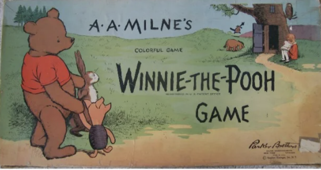
Inspiration for the Hundred Acre Woods for the books and, subsequently, the Disney animated shorts, is based on Ashdown Forest in East Sussex. Milne had bought a home a mile away from the Five Hundred Acre Wood, an old beech wood forest that dates from before 1670, and is now part of private land on the Buckhurst Park estate. Here are a few pictures from a part of the woods you CAN acces, photographed by travel blogger & Disney fan Nikki from Traveling With Nikki; (Please read her wonderful article HERE)
Winnie the Pooh would be nothing without the collaboration between Milne and his illustrator on the series, EH Shepard, and the writer knew that, although before they worked together on their first project, neither thought Shepard’s illustrations were a good fit. Realizing the impact Shepard’s images had on the success of Winnie-the-Pooh, Milne arranged to have him share in the royalties. You can learn so much more about A.A. Milne in this great British documentary:
Shepard did indeed have a tremendous influence of the beloved series. Not least because while the name of the character came from Christopher Robin’s toy, the look of Winnie was inspired by the toy bear Growler, belonging to Shepard’s son. Although that stuffed bear was destroyed by the family dog, the toy belonging to Milne’s son is housed at the New York Public Library, where it has been since 1987, and seen by thousands of Pooh fans every year.
A success as an illustrator when still in his 20s, E.H. Shepard had created images for editions of Aesop’s Fables and David Copperfield by 1907. He was an officer of note during World War 1, receiving the Military Cross, all while still contributing as Punch’s leading political cartoonist. Both his children, Graham and Mary, were also illustrators. Mary Eleanor Jessie Knox is known for her work as the artist in Mary Poppins, by TJ Travers. Although in 2022, an image by Shepard from Winnie the Pooh broke an all-time record as the highest price paid for an illustration, he had a long and storied career, which you can see in this video:
In 1930, the merchandising and media rights to Winnie-the-Pooh were bought by Stephen Slesinger. It must have been the best business decision he’d ever made! By 1931, it was a $50 million a year business, with Milne retaining 66% of the sales income. Slesinger is credited with showing Winnie in his red shirt for the first time, which you can see here on the 1931 board game: (We’ve gotten used to him in red, but honestly, in retrospect, it looks kind of weird, right?)
After Stephen’s unexpected passing in 1953, it was his widow Shirley that took over all things Winnie. She licensed the rights to Disney at the same time the Milne family did so, in 1961.
WALT DISNEY’S WONDERFUL WINNIE:
Walt was interested in getting the film rights to Pooh as early as 1938, when he saw his daughter Diane was enamored with the books, but it wasn’t until the 60s that he made a deal with both Milne and the Slesinger family. Then Walt was all in. By 1964, Disney was planning to create a featurette based on the books to attach to a live action release. It was Walt who dropped the hyphen in Winnie the Pooh’s name, (so if you’re English, feel free to keep adding them!) Their first release was 1966’s Winnie the Pooh and the Honey Tree, and was included in a double bill with live action feature The Ugly Dachshund. The Honey Tree was based on the first two chapters of the first book. Wolfgang (Woolie) Reitherman was tapped to direct. He was one of the “Nine Old Men” of Disney, and worked on every feature from Snow White through Fox and the Hound, becoming director with 101 Dalmatians in 1960. For Honey Tree, he cast his son Bruce to play Christopher Robin, who also voiced Mowgli in The Jungle Book. In later featurettes, other voice actors were used for the same character.
Meanwhile, some great voice actors were used longterm for other characters and roles in the film. First, of course, is Sebastian Cabot. You would know him as Bagheera in The Jungle Book, but he’s also the narrator for the Winnie the Pooh series. Barbara Luddy, who voiced Lady in Lady and the Tramp, voices Kanga. Clint Howard, brother to actor/director Ron Howard, and someone with over 250 credits starting when he was a toddler, plays Roo.
For much of Winnie’s history at Disney, Sterling Holloway voices Winnie the Pooh. He’s also the Cheshire Cat in Alice in Wonderland, Kaa in The Jungle Book, but started working with Disney early on as Mr. Stork in Dumbo and as the voice of adult Flower in Bambi. Here’s something I learned in my research for this blog: Ralph Wright, who lends his voice to Eeyore, also wrote not only most of the Winnie the Pooh featurettes, but also helped write Lady and the Tramp, Sleeping Beauty, and dozens of Disney shorts. I can never forget consummate character actor John Fiedler, who plays Piglet, also plays a key role in an original Star Wars series classic episode, “The Wolf in the Fold”. He plays Jack the Ripper! Most of my friends and clients know I’m not a fan of Rabbit (he’s such a know-it-all!) but I loved learning that the actor that voices him, Junius Matthews, also played Scottie in Lady and the Tramp, and Archimedes in Sword in the Stone.
Although Honey Tree didn’t win nor get nominated for any major awards, 1968’s Winnie the Pooh and a Blustery Day won the Oscar for Best Animated Short, and 1974’s Winnie the Pooh and Tigger Too was nominated in the same category.
In addition to those I’ve mentioned, a ton of incredibly talented animators worked on the Winnie the Pooh series, including Dale Baer, Don BLuth , Andy Gaskell, Frank Thomas and Ollie Johnston, who animated Winnie and Piglet, MIlt Kahl, who worked on Tigger, John Lounsbery, who worked on Owl, and John Pomeroy, who animated Rabbit.
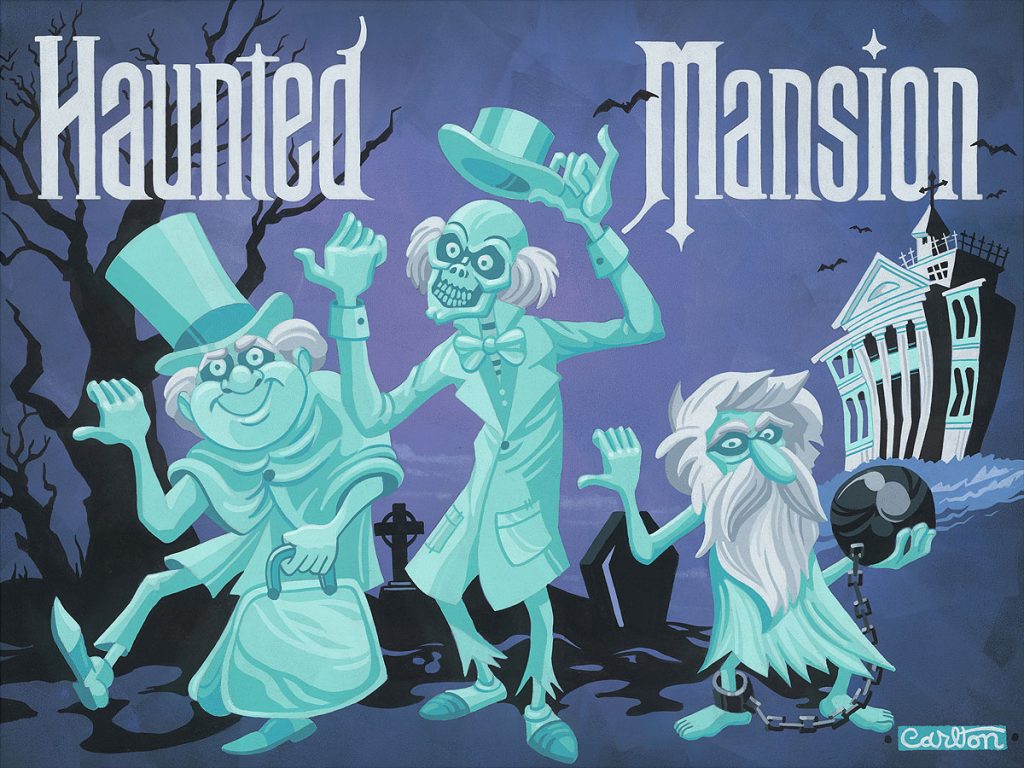
The music from Winnie the Pooh was done by the legendary Sherman Brothers, who wrote the songs, and Buddy Baker, who wrote the scores for many live action features and Disney shorts between 1960 and 1981, and, notably, the Haunted Mansion at Disneyland.
While I’m not sure how long this link will be good, here’s the very informative Disney documentary on the making of Winnie the Pooh. It has EVERYONE!
POOH IN POP CULTURE:
Pooh in pop culture is represented in the most wonderful to the most bizarre ways, as is often the case with iconic characters and stories. In the wonderful column, we have the fact that they’ve been translated to not only many live languages, but also into Latin, including Winnie ille Pu, which was first published in 1958, and, in 1960, became the only Latin book ever to have been featured on The New York Times Best Seller list. Pooh has also been published in books that explain complex philosophy via the character, including the Tao of Pooh and the Te of Piglet, which explain Taoism. Pooh and the Philosophers by John T Williams considers the teachings Kant, Descartes, Plato, and Nietzsche via the bear with very little brain. Go figure!
There is a sport, Pooh Sticks, created based on the game Pooh plays with his friends where they drop sticks into a stream and see whose stick first crosses the finish line. A World Championship Pooh Sticks race takes place in Oxfordshire every year.
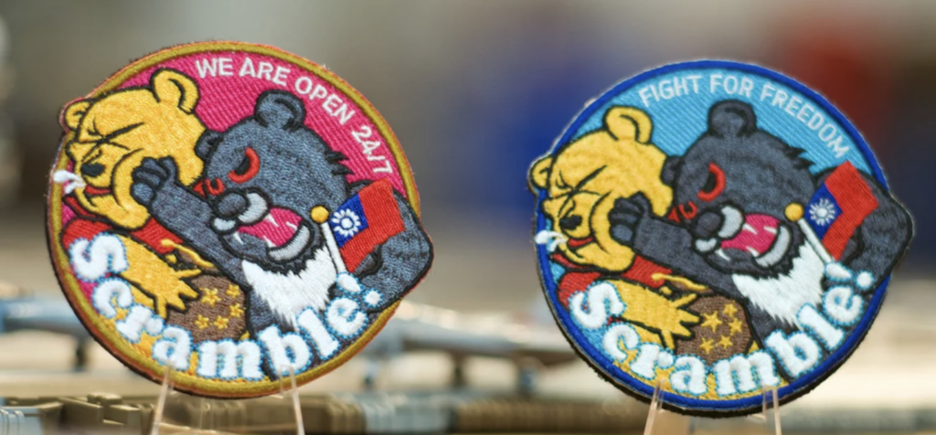
Depending on your perspective, this is either awesome or not. China has banned images and films relating to Winnie the Pooh, because on social media Xi Jinping has been compared unfavorably to the character. In fact, Pooh was featured on a South Park episode Band in China, and in it, Winnie the Pooh is brutally killed. As a result, South Park too was banned in China. More recently, Taiwanese air force pilots have taken to wearing patches depicting a Formosan bear punching Winnie the Pooh, meant to represent the Chinese president, as a defiant symbol of the island’s resistance to Chinese war games.
On the truly darker (and, I’ve gotta say, hilarious) side of Pooh in pop culture, we have the infamous video created that superimposes Pooh with Apocalypse Now. If you’re a fan of both and haven’t seen this, it’s a MUST-SEE. If you aren’t, avoid it. It will make you sad.
And the minute Winnie the Pooh went out of copyright, British filmmaker Rhys Frake-Waterfield created the live action slasher film Winnie the Pooh: Blood and Honey, as part of his Twisted Childhood Universe (TCU). Though considered by critics as one of the worst films ever made (that’s a hard title to win, by the way) it has made over 6 million with a budget of only $100,000. Feast your eyes, or maybe don’t, on its trailer:
===
Meanwhile, as always, ArtInsights has some wonderful images of Winnie the Pooh and friends, for fans of the films, books, and characters, and you can find them all HERE.
But of course we should show you some of the great official art of Winnie the Pooh. and Winnie the Pooh Disney fine art, so here are some of our favorites:
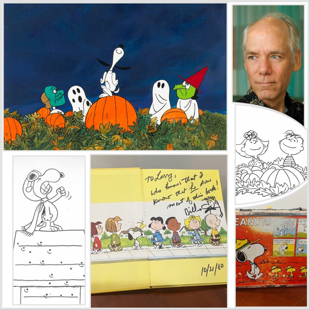
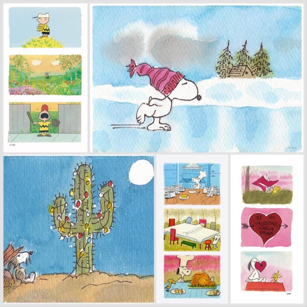
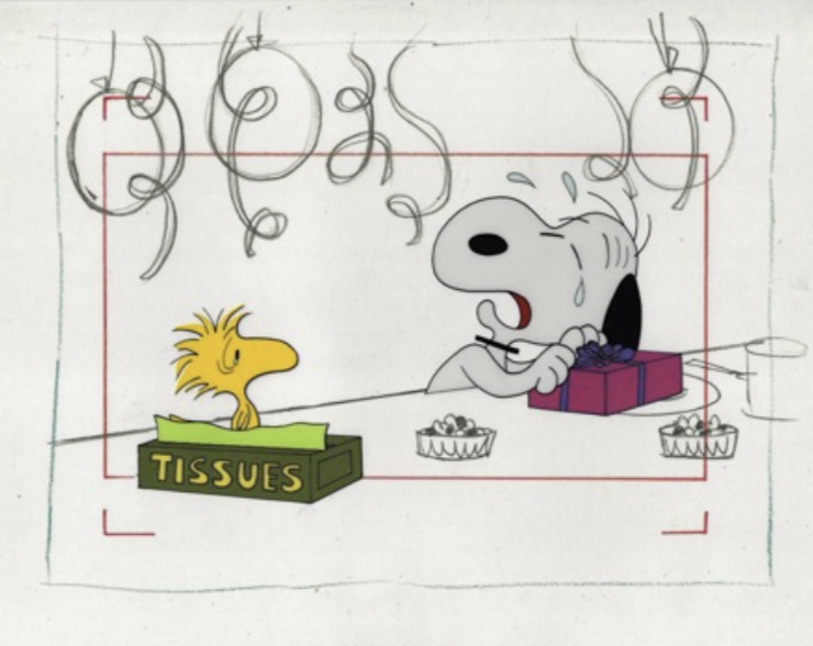
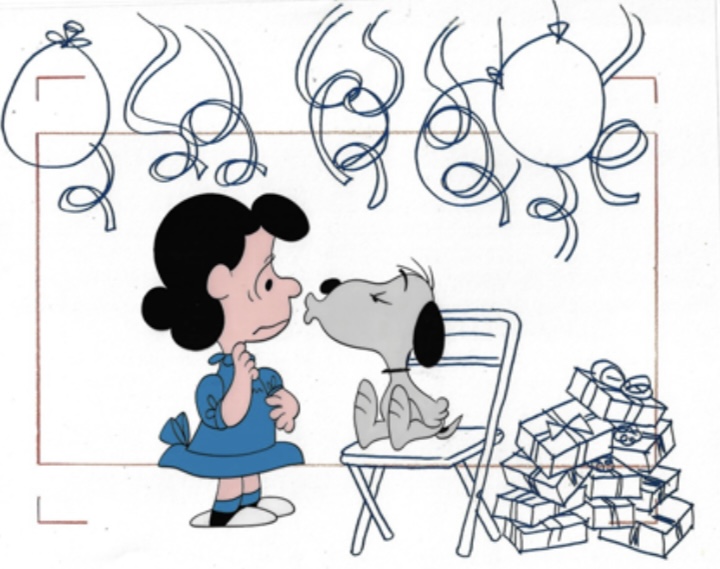
Those who’ve been reading my blog for a while, or who have collected art through ArtInsights are well aware that Franklin is my favorite HUMAN character…(Snoopy is my favorite creature, although i LOVE Woodstock!) I wrote a blog about Franklin about 3 years ago, which you can read HERE, about a lot of his history. That was the first time I had an exclusively Franklin-focused gallery show.
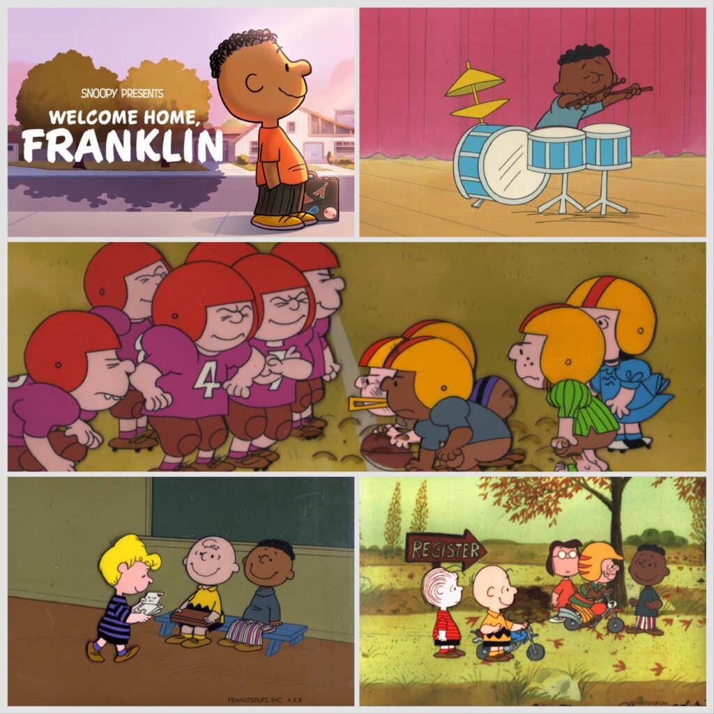
Now I know all of us Franklin Armstrong fans are thrilled that he’s gotten his own special called Snoopy Presents: Welcome Home, Franklin, which premiered today (February 16th, 2024) on Apple TV+. If you don’t know about the 51st Peanuts special, here’s the trailer:
The story follows Franklin as he moves into the same town as the Peanuts characters. Here’s the official logline from Apple:
“The origin story for one of Peanuts’ most beloved characters, Franklin, follows how he approaches making new friends. Franklin’s family is always on the move with his dad’s military job, and everywhere he goes Franklin finds support in a notebook filled with his grandfather’s advice on friendship. But when Franklin tries his usual strategies with the Peanuts gang, he has trouble fitting in. That’s until he learns about the neighborhood Soap Box Derby race. According to his grandfather, everyone loves a winner! He’s sure that winning the race will also mean winning over some new friends. All he needs is a partner, which he finds in Charlie Brown. Franklin and Charlie Brown work together to build a car and in the process become good buddies. But as the race nears, the pressure mounts — can their car and their newfound friendship make it to the finish line?”
What makes this special particularly exciting and, well, special, is that Robb Armstrong, whose last name Charles Schulz (Sparky to his family and friends) used for Franklin after asking permission from his longtime friend, is a co-writer on the project.
Franklin Armstrong and Charlie Brown in “Snoopy Presents: Welcome Home, Franklin,” premiering February 16, 2024 on Apple TV+
I had the pleasure to interview Robb for the MPA’s The Credits, and he talked a lot about how the kerfuffle around the Thanksgiving special (where Franklin is alone on one side of the Thanksgiving table, leading folks on the internet to call the entire special, and, indeed, Peanuts in general, racist) lit a fire in him to tell Franklin’s story and address the issue from the 1973 special, as well as how his own life is reflected in the animated character named after him. You can read it HERE (once it gets posted to the site, which was supposed to be today, but maybe won’t be!)
Here he is talking about his own experience and his involvement with the Armstrong Project, which offers scholarships to art students of color interested in pursuing a career in animation and art:
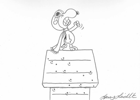
In our recent interview, Robb also talked with me about the origin of his love for Peanuts, and how it inspired what has become an incredibly successful career as the creator of JumpStart. I asked him which particular Peanuts comic strips stand out in his mind:
“There are many great ones, but I love Snoopy. He’s a figment of his own imagination, but also he’s a real dog. He lives in his own world, and doesn’t have the same rules that confine the rest of the cast. Schulz did a strip once with Snoopy on top of his dog house as the World War 1 flying ace, and he’s about to go off to fight the Red Baron. He’s determined this is going to be it, the final confrontation, and prepared to die. All this is very unlike other comic strips. He’s talking about war and fighting and someone’s not going to live. So Snoopy is on top of the house, leaning and bent forward, and really intense, paws clenched, then Charlie Brown rings a dinner bell and the entire orientation of the comic strip flips, so he can go back home to eat. It is the funniest visual comic strip I’ve ever seen. It just shows you what can be done using this tiny piece of real estate that were given as cartoonists, and it’s one of the things that attracted me to it and that still attracts me to it. What also amazes me is words can always be understood by a child. The thoughts, the sentiment, the emotional content isn’t complex. A little kid can understand it. I just love that.”
Robb co-wrote the special with Sparky’s son and grandson Craig and Bryan, and writer/director/producer Cornelius Uliano. Craig, Bryan, and Cornelius also executive produced the special, much as they did the award-winning feature The Peanuts Movie, which the three also co-wrote. Of course those who watch the special will see how much influence the original comic strip has in the story and spirit of Welcome Home, Franklin. Here’s what Robb had to say about that:
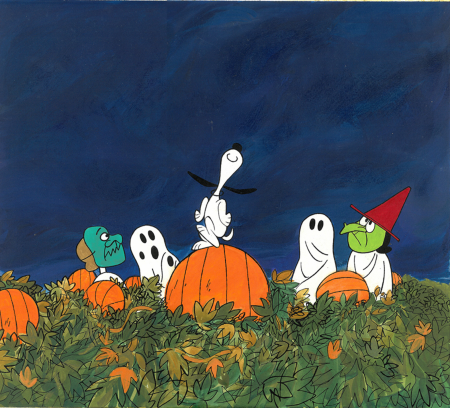
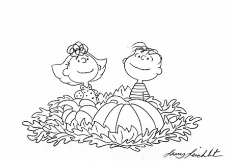
“Everything goes back to the comic strip. Craig Schulz is great about redirecting, almost like a traffic cop, always saying, “Go that way, guys.” We would always go back to the canon and history of the strip. That’s where we pulled out the scene about The Great Pumpkin and all that, but rather than dwell on any one thing, it was fast. Franklin just quickly entered the pumpkin patch, and ruins it. Right away, he just walks into the patch and snaps the life out of a pumpkin. We’d seen Linus in that environment with the pumpkins, and his obsession with The Great Pumpkin, but we’d never seen Linus lose his temper. He’s always a very spiritual, even-tempered guy, and then Franklin stumbles in and clumsily does that. Linus is like, “What have you done?” It’s like the end of his world. We always grab things from the canon of Peanuts. That’s the best place to go to move things forward. Go back, then go forward, go back, then go forward. There were lots of things, like Franklin meeting Charlie Brown on the beach back in 1968, that are so important that you don’t have to think about it much. If we meet on a beach, though, this whole thing has to take place during beach-y, friendly weather. You can’t do anything that’s too cold-weather related, no sledding, no ice skating. It’s a given that they have to meet on the beach, because Sparky introduced Franklin there, when he meets Charlie Brown. So you start with concrete moments, and we have to deal with the table, but it doesn’t have to be Thanksgiving, they just have to be at a table. So that’s cool, we can do that anywhere, anytime, but we’ve got to land on that at the end. We started with all the things that were engraved in stone, and build the rest of the story around them. The key was always going to the comic strip itself as our North Star.”
Here are Robb, Welcome Home, Franklin director Raymond Persi and Craig Schulz talking about the special:
Throughout the history of the animated specials, that has been the case. Bill Melendez, the animation director who was entrusted by Sparky to bring the Peanuts story to the screen starting all the way back in 1965, always referred to the original strips as the basis for the animated shows.
Here’s Bill talking about A Charlie Brown Christmas, and animating Sparky’s great characters and bringing them to life onscreen:
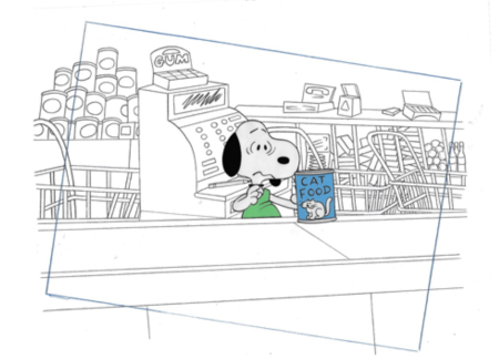
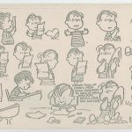
As an animation art dealer and expert, finding Franklin images has always been a challenge. The thing about Franklin Armstrong is he isn’t in that many scenes in the early specials. That being said, here’s a cool story about how this new exhibit came to be:
I knew that Robb had co-written Welcome Home, Franklin, and was very interested in talking to him about his role. I contacted my editor at the MPA, who didn’t know the story about Robb and the fact that Franklin was, in part, named after him, and of course he LOVED that, so he accepted my pitch to interview him. Then I contacted the folks at Apple TV+ about it, and they too gave me the thumbs up. They sent along a screening link and I got to see the show in prep for my interview. Having seen many of Robb’s strips, and knowing that he has lately been working on the live action version of JumpStart, starring Terry Crews, I knew he would do right by the character, but it was even more charming than I expected.
Knowing that I was going to talk to Robb, I thought I’d give my friends at Peanuts a call and ask if there was any art from the older specials (because Welcome Home, Franklin is computer animated, so there is no “art” as such). I knew from the last exhibit I had that images of Franklin are very hard to come by, so I didn’t have much hope. BUT, WAIT! It turns out that the Schulz Museum had contacted them to pull the best art they could find in preparation for a travelling exhibit about Franklin, so they worked their animation-loving fingers to the bone searching for great art, only to discover the Schulz Museum decided they didn’t need them after all, so there was all this art, just waiting for me! What a joyful moment that was!
So, today is the first day of my Welcome Home, Franklin Armstrong exhibit. I have several gorgeous key setups, meaning original cels and matching backgrounds, from the history of Peanuts animation specials, as well as a production cels from various productions. Again, the Peanuts folks went above and beyond by sending along exclusive images of the storyboards from these specials. They tell the story behind some of the images in this Franklin Armstrong collection.
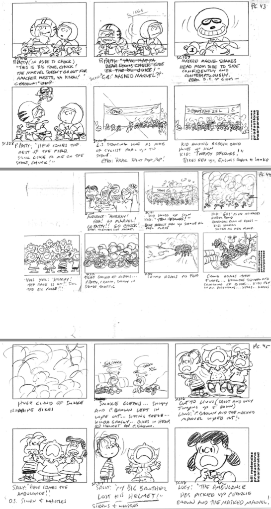
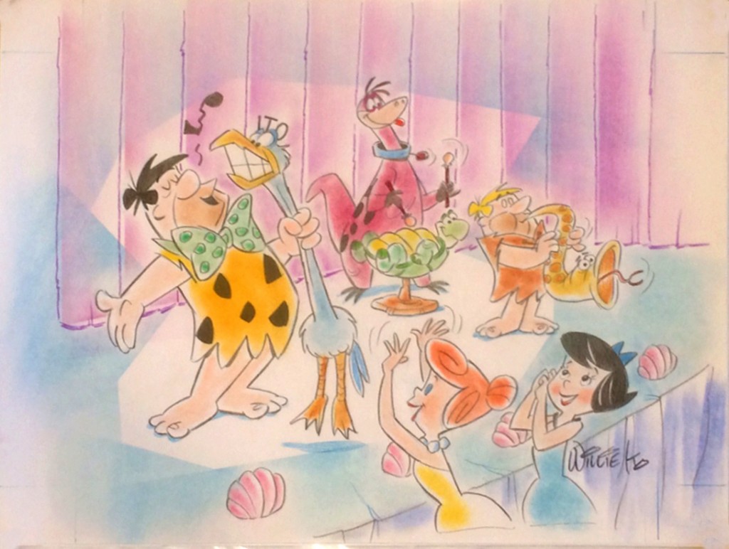
First, let’s talk about 1975’s You’re A Good Sport, Charlie Brown.
A production cel with Linus, Charlie Brown, Marcie, Patty, and Franklin, with original drawings, from You’re A Good Sport, Charlie Brown. Click on the image for more information or to buy the art.
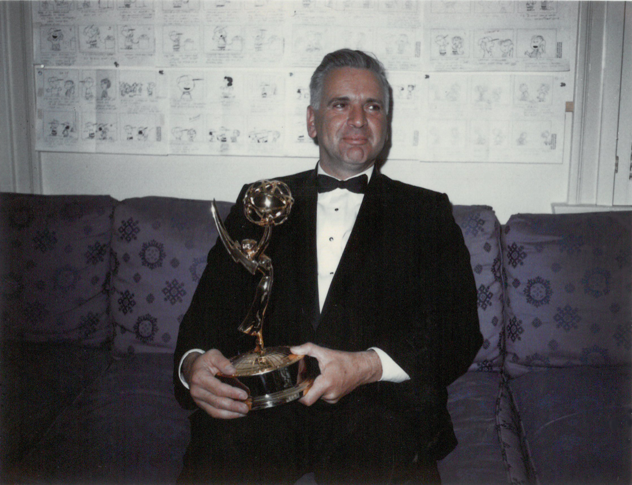
This special was the 14th prime-time special, and in it Peppermint Patty and Charlie Brown take part in a motocross race. (*side note: I always thought it was motoRcross..) It was the last Peanuts special to air during Vince Guaraldi’s lifetime. It was a departure for the composer, because it blended his signature jazz with fund, disco and pop music. The score was quite popular at the time! You’re A Good Sport won Schulz his third Emmy, with the first two being A Charlie Brown Christmas and A Charlie Brown Thanksgiving.
The film was directed by award-winning animator Phil Roman, who had worked on Peanuts specials as far back as 1968. He went on to win a number of Primetime Emmys, for The Simpsons in 1995, 1996, 1997, 1998, and 1999, and for King of the Hill in 1997 and 1998. He is also the recipient of the InkPot Award at SDCC, and the prestigious Winsor McCay Award at the Annie Awards in 1996. Here are some original storyboards used in the making of that special that the above original reflects:
This storyboard is property of the Sopwith / Peanuts archives
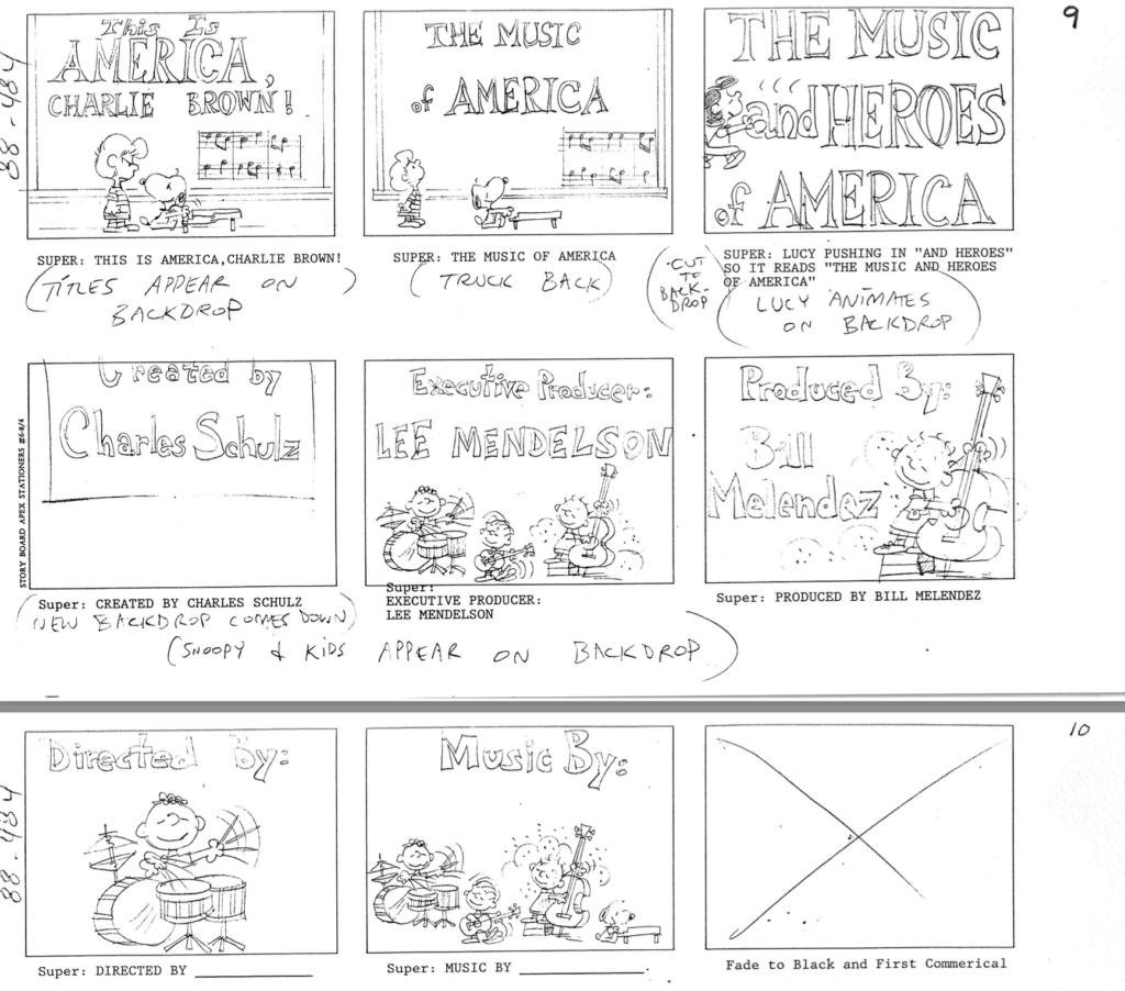
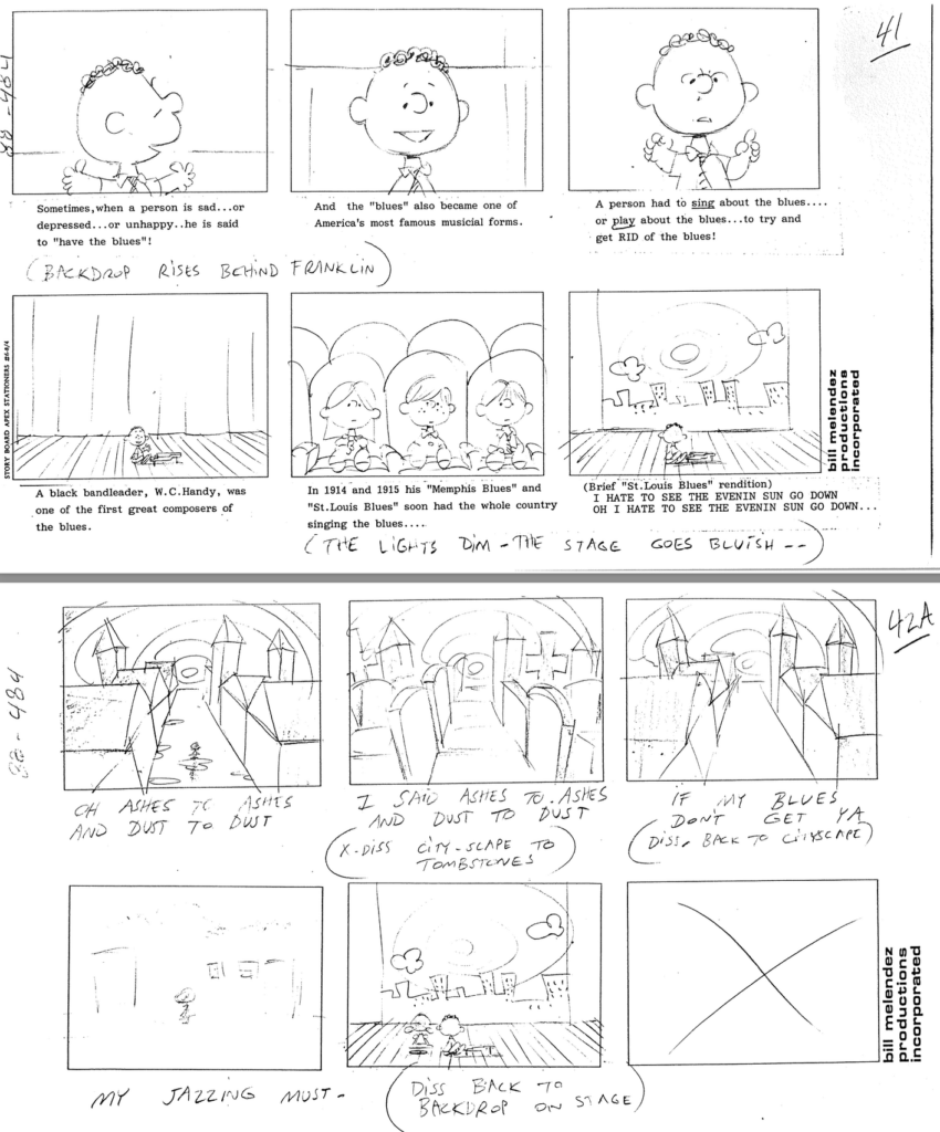
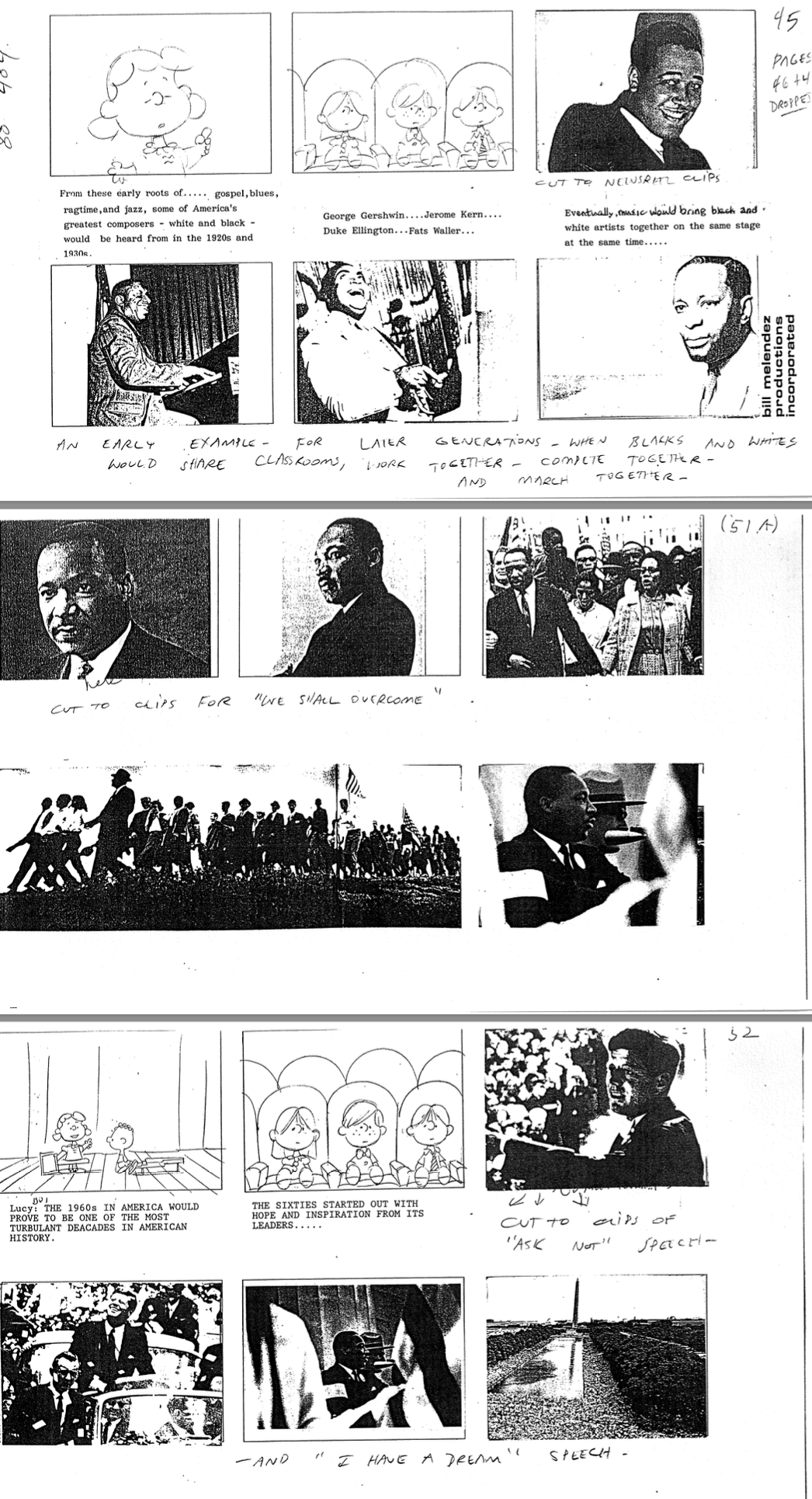
The second is This is America: The Music and Heroes of America. It’s a pretty powerful special, actually. In it, Franklin talks (briefly) about the history of slavery, and several of the most inspiring Black American heroes are featured. You can see the entire special HERE. At the end of the show, you can see the storyboards come to life. It’s fascinating!
This storyboard is property of the Sopwith / Peanuts archives
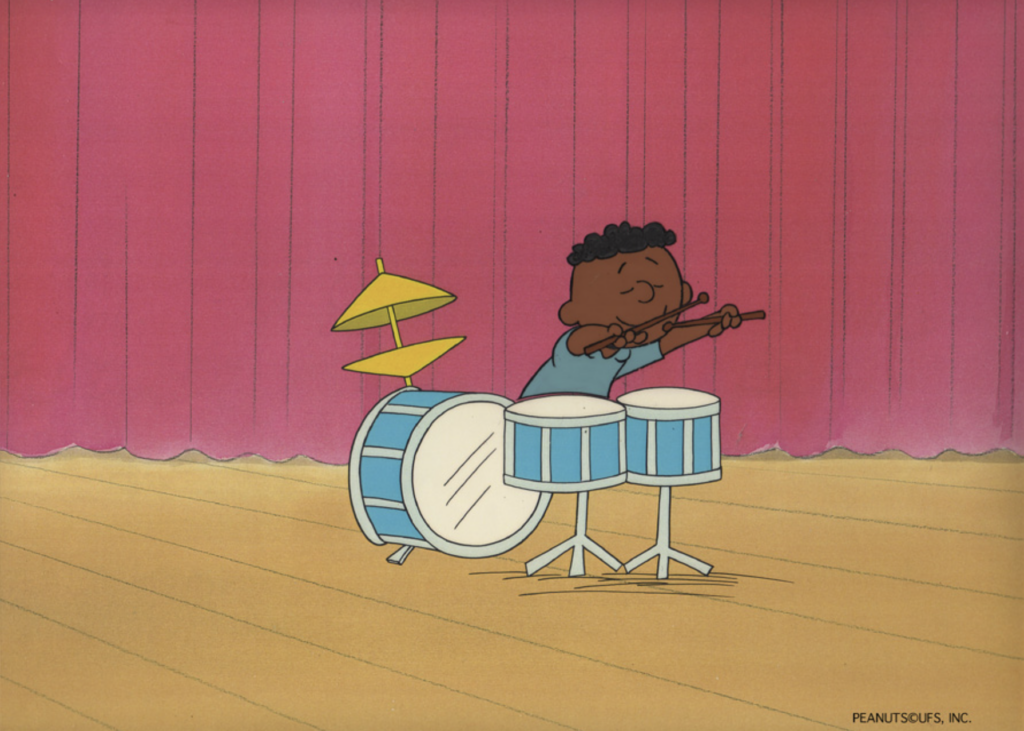
You can see the production cel of Franklin playing drums in the opening sequence of the special:
Franklin playing drums, one of the many instruments he can play, according to Peanuts canon, & shown in multiple specials. He’s a musical kid! Click on the image for more information or to buy the art.
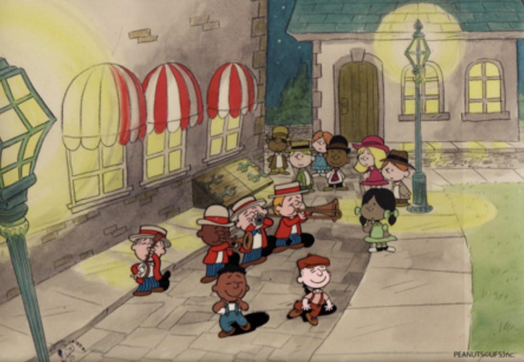
The below storyboard shows the scene in which Franklin plays a character in historic New Orleans, from which many important blues and jazz musicians hail.
This storyboard is property of the Sopwith / Peanuts archives
Check out this great cel from the above sequence, available as part of the Franklin Armstrong show at ArtInsights:
Franklin does much of the narration in this Peanuts release. He is also seen variously playing banjo, drums, and piano, and as a character inside the stories from history he tells. The Music and Heroes of America is one of 8 episode mini-series that aired in 1988 and 1989. The other episodes cover The Mayflower voyagers, the birth of the constitution, the Wright Brothers at Kitty Hawk, The NASA space station, the building of the trans-continental railroad, the great inventors, the Smithsonian and the presidency. This Is America features compositions by Dave Brubeck, Wynton Marsalis, George Winston, Dave Grusin, and Desirée Goyette.
This storyboard is property of the Sopwith / Peanuts archives
Here is a fun image of Franklin, Charlie Brown, Linus and Schroeder playing together from the show:
Franklin on banjo, Charlie on, looks like oboe, Linus on guitar, and Schroeder on piano. Click on the image for more information or to buy this art.
The end of This Is America: The Music and Heroes of America has a poignant collection of images from the civil rights movement, as seen in the storyboard below:
This storyboard is property of the Sopwith / Peanuts archives
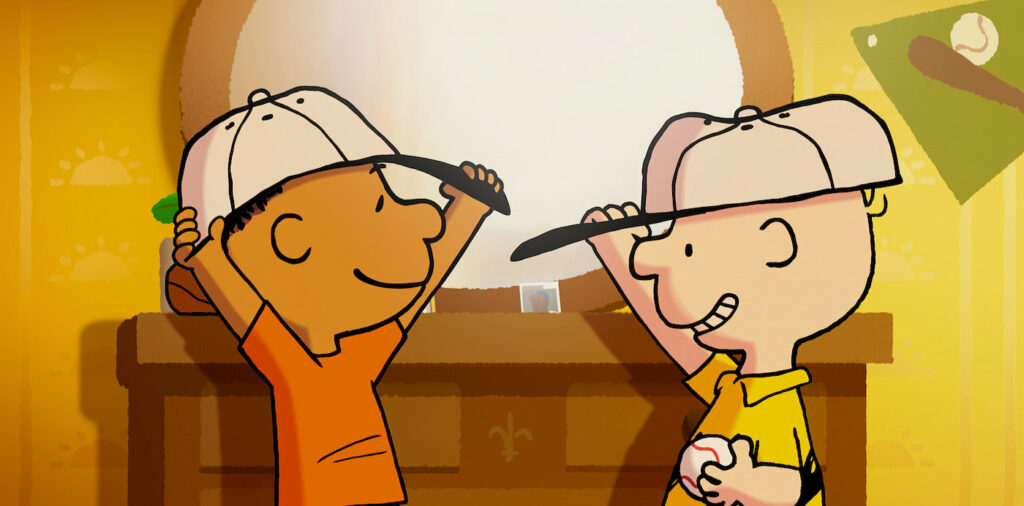
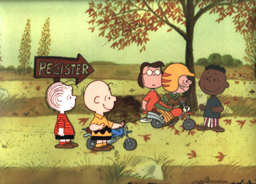
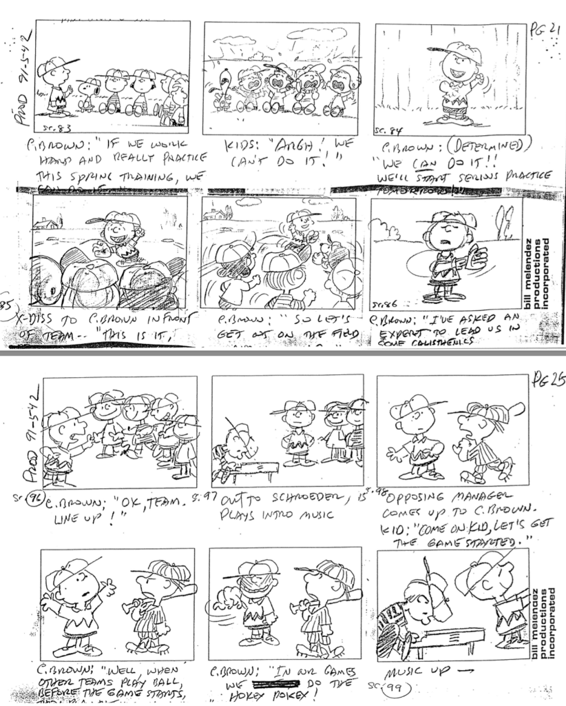
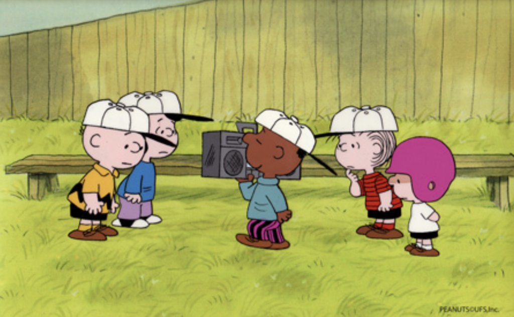
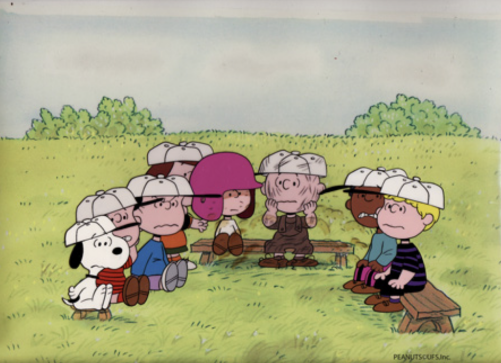
Lastly, we have It’s Spring Training, Charlie Brown, from 1992. It is one of several specials that heavily feature baseball in the storyline, along with 1966’s Charlie Brown’s All-Stars.
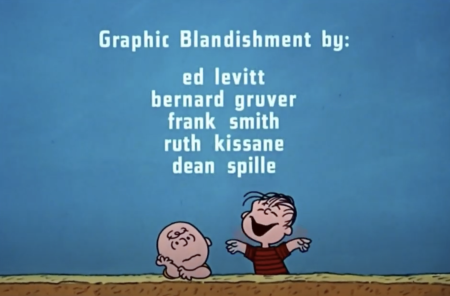
You can’t ask for a better image bringing together baseball and the Peanuts gang than this key setup, which has a Dean Spille original background. These backgrounds and cels that belong together from the specials are very hard to find, because there are hundreds of cels for every one background. Spille was featured in a former blog on the site in 2018, HERE.
Snoopy’s not kidding around in this key setup with original background by Dean Spille from It’s Spring Training, Charlie Brown. For more information or to buy the art, click on the image.
Here’s a great storyboard that shows the gang on the ball field.
This storyboard is property of the Sopwith / Peanuts archives
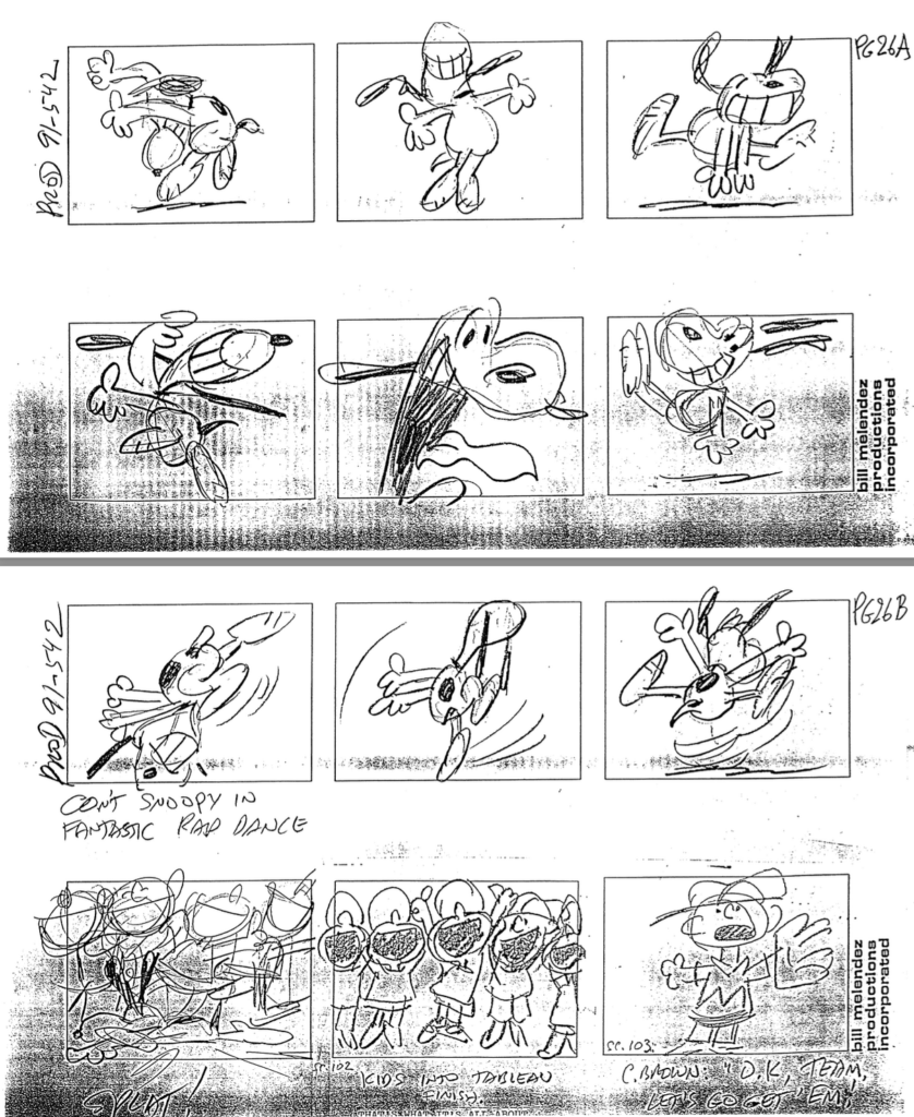
This was when breakdancing and rapping was at the center of the pop scene, and this 35th Peanuts special featured Franklin showing those dance moves to the very square Peanuts gang. You can see the whole special HERE.
Charlie Brown, Lucy, Franklin, Linus, and Leland in It’s Spring Training, Charlie Brown. For more information or to buy this art, click on the image.
Snoopy gets into the spirit of the dance in this storyboard from the special:
This storyboard is property of the Sopwith / Peanuts archives
Here’s a great cel setup with many characters in the Peanuts gang, working to get inspired for their game:
Snoopy, Linus, Lucy, Leland, Pigpen, Franklin, and Schroeder getting psyched out at the ball game. For more information or to buy this art, click on the image.
The below storyboard captures some of the vibe happening in the cel above:
This storyboard is property of the Sopwith / Peanuts archives
=====
We have other great images in our Welcome Home, Franklin Armstrong exhibit and art sale. You can see them all by going HERE.
====
Here are a few more of them below, for your enjoyment, including one key setup from the Valentine’s Special, in which Franklin, Charlie Brown, and Schroeder are all looking very happy. What a great image!
You can enjoy my interview with Robb Armstrong, once it gets posted, by going to my interview with him on the Motion Picture Association’s site, The Credits. It’s always a delight when my two loves, the art of animation and film journalism come together!
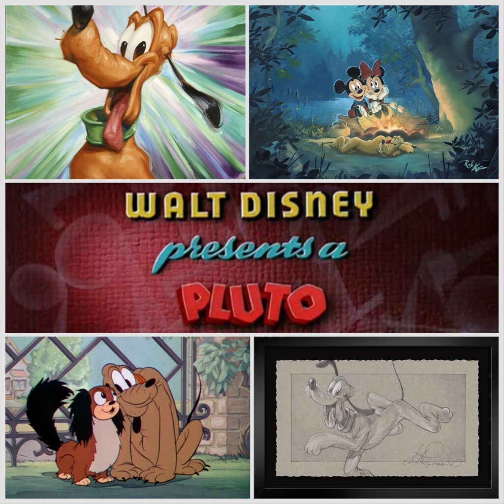
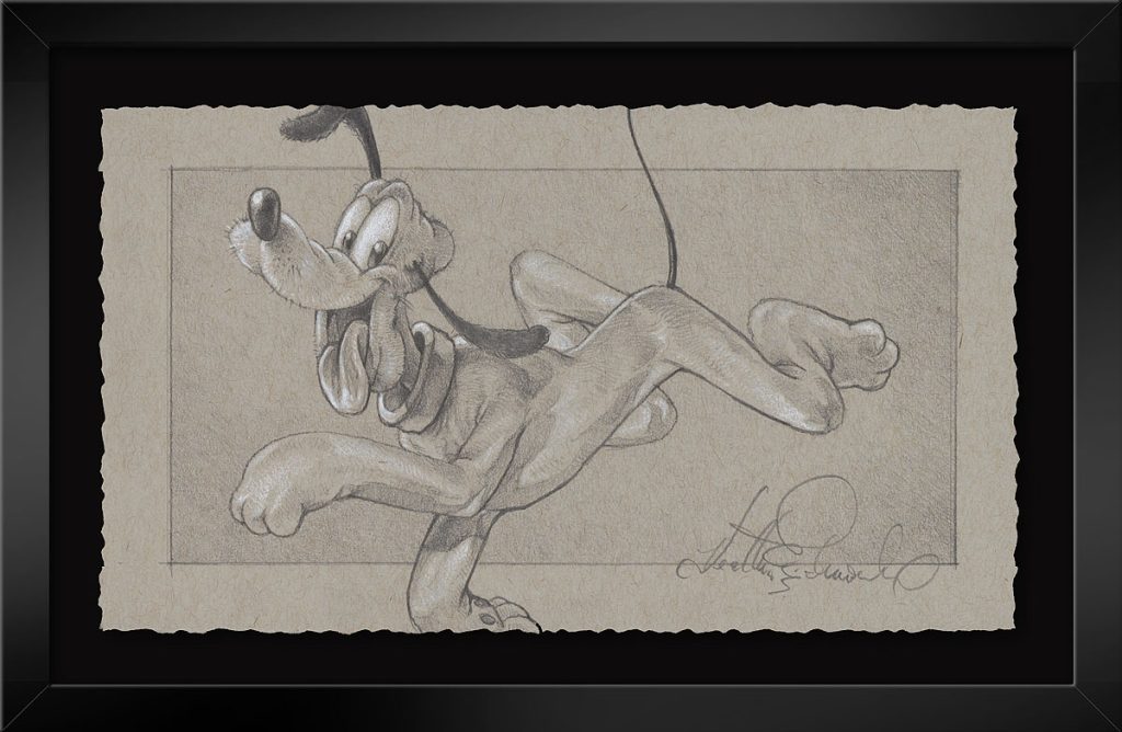
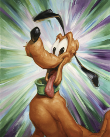
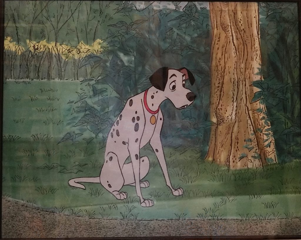
As it’s the early part of 2024, and we at ArtInsights are in a new era with our hybrid in-person and online model, I thought it would be a good idea to start a fresh, fun new Spotlight blog series, and since I grew up in a family always surrounded by canine companions, I decided on Disney Dogs. There are just so many to love! Of course it makes sense to start at the beginning, with Mickey’s faithful dog Pluto, who is probably the oldest pup still appearing onscreen, at 94 years old!
Pluto’s actual birthday is pretty soon, too. He was introduced on March 19th, 1930, in The Chain Gang. If there was any doubt what breed he favors, it’s bloodhound! (Who knew?) Years later, after he was more than just a nameless bloodhound, he was declared a mixed breed by the Disney folks.
Unnamed, but Pluto in the making!
Unlike characters like Goofy, who is an anthropomorphized dog, Pluto is a dog who acts like a dog….mostly. Did you know before his character was set, in one cartoon, he actually spoke? It was in 1931’s Moose Hunt, where he was officially made Mickey’s pup. At one point, Mickey says, “SPEAK!”, and Pluto gets on his knees and says, “MAMEE!” (that’s a reference to Al Jolsen in The Jazz Singer, which was released in 1927, and was the first full length feature with synchronized sound)
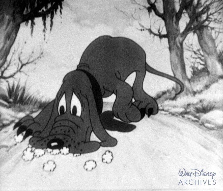
Pluto was designed by animator Norm Ferguson, who is best known for animating the witch in Snow White, and worked on many of the greatest Disney classics, including Pinocchio, Fantasia, Bambi, and Cinderella. Frank Thomas and Ollie Johnson, two of the Nine Old Men of Disney, who together wrote the essential 1981 tome Disney Animation: The Illusions of Life, believed in the genius of Ferguson’s work. They called the flypaper sequence featuring Pluto in the short Playful Pluto (a 1934 cartoon in which the pup went from a minor character to getting his first key role) a “milestone in personality animation…through it all, his reaction to his predicament and his thoughts of what to try next are shared with the audience. It was the first time a character seemed to be thinking on the screen, and, though it lasted only 65 seconds, it opened the way for animation of real characters with real problems.”
If you click here you can see a comparison of the color sequence from 1939’s Beach Picnic in which Shamus Culhane reworked the original work by Ferguson in 1934’s black and white cartoon, Playful Pluto. Ferguson’s animation is a thing a beauty!
Pluto appeared in 24 Mickey Mouse cartoons before his first solo performance. He began as the headliner with the Silly Symphony cartoons Just Dogs (1932) and Mother Pluto (1936).
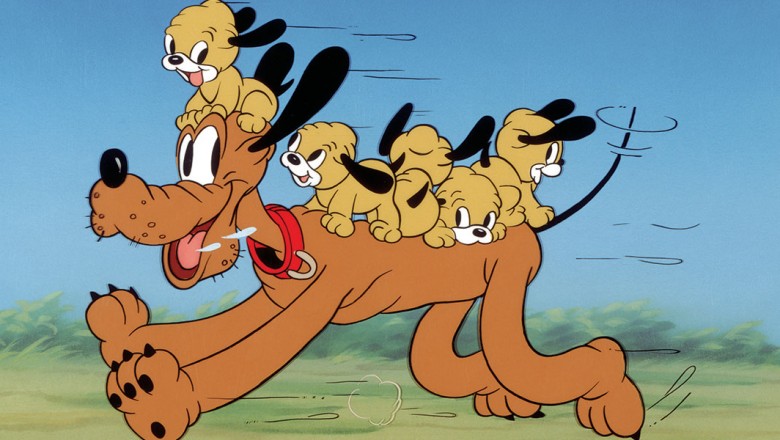
In the first installment of his own series of cartoons, Pluto has puppies! He has 5 rambunctious sons in 1937’s Pluto’s Quin-puplets, a short in which his puppy love Fifi the Peke is the mommy to his babies. One of those puppies appears again in 1942’s Pluto Junior. Pluto also has a brother named K.B, who appears in 1946’s Pluto’s Kid Brother.
Pluto Quin-puplets!
Although there are several cartoons featuring Pluto as the star, there aren’t consistent shorts with him as the lead until 1940, when the series called “PLUTO” begins, starting with Bone Trouble.
Of the 89 shorts Pluto appeared in between 1930 and 1953, 4 were nominated for Academy Awards. It was one in which he was heavily featured, though, 1941’s Lend a Paw, (which you can see HERE), that won an Oscar. While, like all but one of his cartoons, he still only barks, his “devil” and “angel” alter-egos do speak!
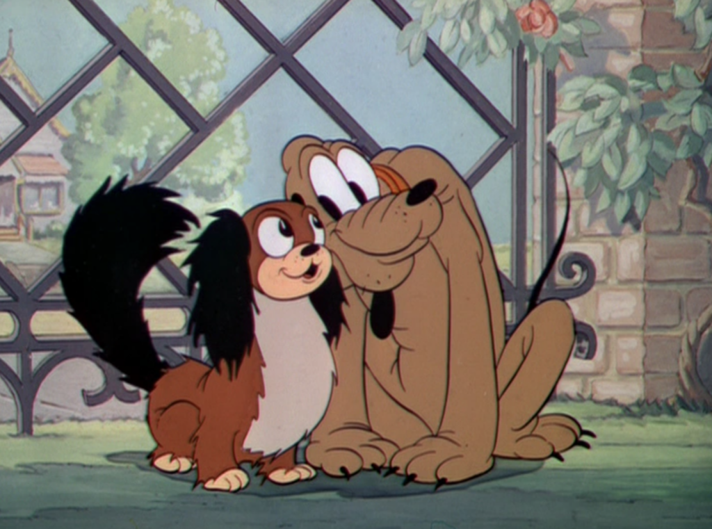
Pluto has two love interests in his history. Minnie’s pet Fifi, was his paramour early on, and their love was strong! They appear together in Puppy Love (1933), Pluto’s Quin-puplets (1937), Mickey’s Surprise Party (1939), and Society Dog Show (1939).
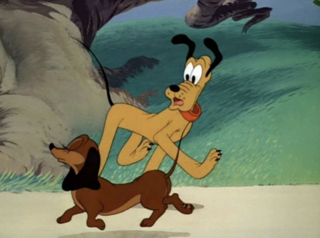
She is replaced with Dinah the Dachshund (what happens to Fifi? unclear…), who first appeared in The Sleep Walker (1942). Dinah is a bit of a flirt, in that she also dates Butch the Bulldog, but eventually she dumps him for his bad attitude. The most charming short with them together is Pluto’s Heartthrob, which you can see here.
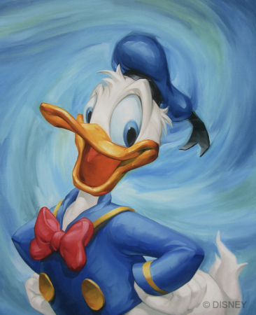
Pluto as a character wasn’t in a short for nearly three decades. He was last seen in 1953’s The Simple Things, and then finally returned in the 1990 short The Prince and the Pauper as, once again, Mickey’s trusty pup. Since then, he has continued to be one of the most popular characters of the Disney animated family, and a beloved part of what Disney fans call “The Sensational Six”, along with Mickey, Minnie, Donald, Daisy, and Goofy.
YOU CAN SEE ALL THE DISNEY FINE ART OF PLUTO AVAILABLE AT ARTINSIGHTS HERE, but here are a few of my favorites:
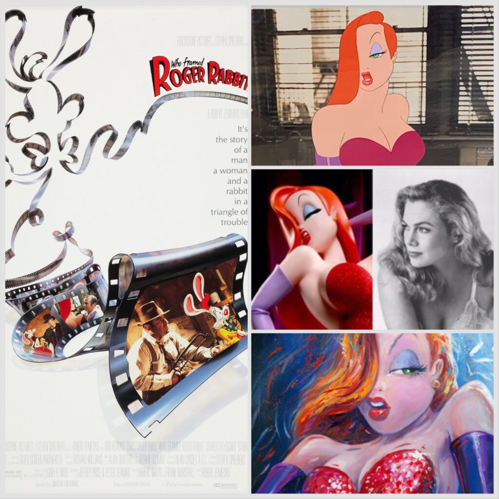
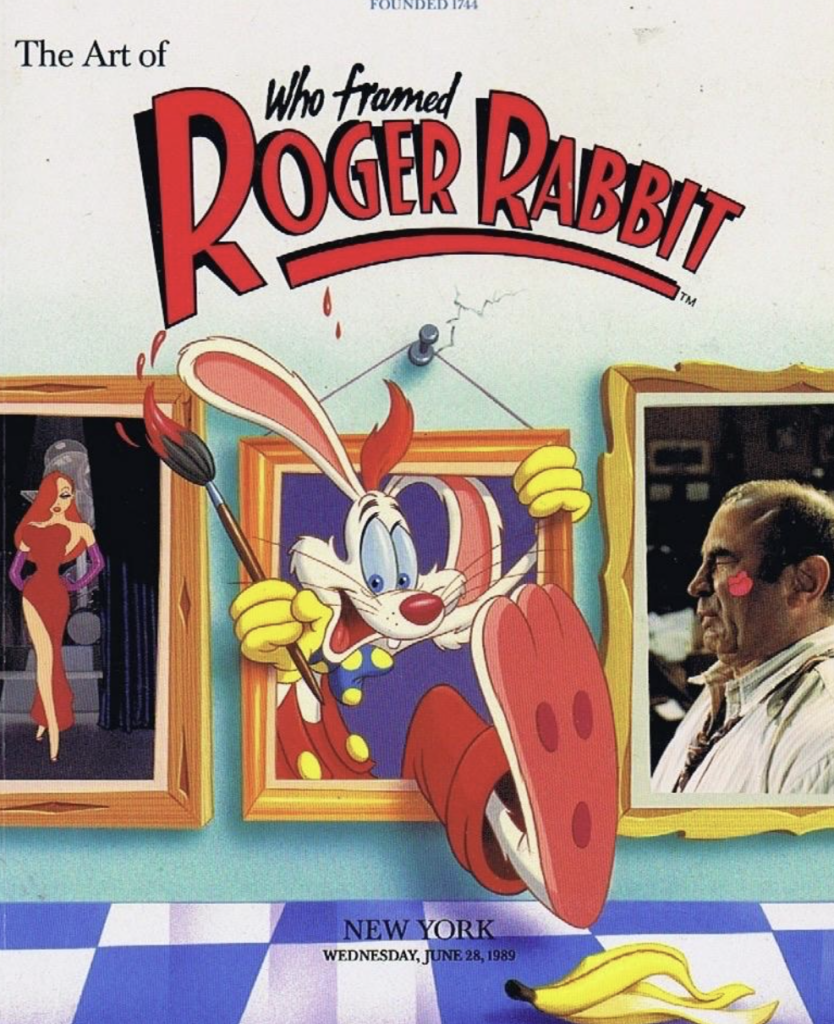
Why is Who Framed Roger Rabbit: Adventures in Toontown our first blog of 2024? Why are we talking about the animation/live action hybrid’s history and legacy of art?
The impetus is that I recently got an email from our Disney Fine Art wholesalers announcing that as of January 23rd, they could no longer sell any Who Framed Roger Rabbit art. (This is true at the parks as well!) As it was, they only had a few images available, probably due to the fact that as of June 23rd, 2023, Disney had lost the license to the film. Obviously, the Disney Fine Art folks had some sort of extension that ended in 2024.
It makes sense, though, doesn’t it? Who Framed Roger Rabbit, released in 1988, broke so many rules in terms of studios working together and licensed characters being seen on the same screen that Hollywood folks have repeatedly said it could never happen again. THAT, along with the genius animation and character voicing, is what makes the film such an important one in animation and film history.
The story is based on Gary K. Wolf’s novel Who Censored Roger Rabbit? Believe it or not, Terry Gilliam was at one point offered a chance at directing the film, and Daryl Van Citters was attached as animation director, but eventually the live action fell to Robert Zemeckis, with Richard Williams directing the animation. A metric ton of famous actors were offered the role of Eddie Valiant, including Robert Redford, Jack Nicholson, and Eddie Murphy, before Bob Hoskins took it on. Roger was, at one point, was being voiced by Paul Reubens before the job went to Charles Fleischer.
Here’s a video showing an early development of the film, featuing Paul Reubens and showing just how much the film noir aspect of the film was already at play:
At the time, the film won Oscars for best editing, best sound effects, and best visual effects, as well as a special achievement award for director Richard Williams for “animation direction and creation of the cartoon characters”. In 2016, it was selected for preservation in the National Film Registry by the Library of Congress.
Here’s Robin Williams (as Mickey Mouse!) and Charles Fleischer doing quite the comic bit before giving Richard Williams his Oscar. In his speech, Williams singles out animator (and now Disney Legend) Andreas Deja as being essential to the making of the film:
Andreas talks about his work on the film at the Academy’s 25th anniversary celebration of the film. You can see that HERE. He also references his experience working on the crowd scenes on his own blog HERE.
I also interviewed Andreas about his career, and he talks about Roger, Lilo, the Nine Old Men and more:
As to the voicing, just look at the spectacular talent from the history of animation present for this film. Mel Blanc, who died in 1989, was featured as some of his classic characters, including Bugs Bunny, Daffy Duck, Porky Pig, Tweety, and Sylvester. June Foray voiced Toon Patrol member Wheezy and Lena Hyena. She is known for a host of characters, including WB’s Witch Hazel, Granny in the Sylvester and Tweety, Lucifer in Disney’s Cinderalla, and Rocky and Natasha in Jay Ward’s Rocky and Bullwinkle. Mae Questel, born in 1908 and who died only 10 years after the film, played Betty Boop, a character for which she is most know, having voiced over 50 shorts between 1931 to 1939. She also supplied the sass for Popeye’s Olive Oyl starting in 1933 to her hiatus in 1938. Wayne Allwine and Russi Taylor, known for both voicing Mickey and Minnie Mouse AND being married in real life. Both have since passed away.
Although Charles Fleischer already had done many live action roles on TV, his work as Roger Rabbit became what he was most well-known for in his career. Fleischer was so into the role, that he asked to have a life-sized suit made for him to wear while on-set, and delivered his lines against Bob Hoskins in it throughout the production.
Uncredited stars involved in the film included Kathleen Turner and Amy Irving as the speaking and singing voice of Jessica, respectively, and even the great Little Richard took part, as Bullet #5.
And, as something we can file under the delightful title “You Can Find Everything On the Internet”, here are Tony Anselmo as Donald Duck and Mel Blanc as Daffy Duck in Roger Rabbit:
Roger Rabbit was also a film in which an animation studio co-owned by a woman (Jane Baer) worked on an entire sequence in Toontown.
The list of cameos featured in the film is as wide and as long as the Grand Canyon, and I’m not just talking about the usual Disney suspects. The film featured representative characters from Warner Brothers, (of course), but also MGM, Fleischer Studios, Famous Studios, Terrytoons, Walter Lantz Productions and RKO Pictures as well. You can see the whole list HERE.
Shortly after I started working in the animation field at one of the first galleries exclusively devoted to animation, Sotheby’s had an auction for art from Roger Rabbit. It was on June 28th, 1989. I’d say that was really the moment when cels started going nuts in the marketplace.
It was the first time people started paying high prices for art from newer animation features, and that, over the following few years, propelled a lot of the prices of older features into the stratosphere.
Strange, too, because at the time I was working at the new defunct gallery Artworks, in Old Town Alexandria, and really at the time there were only galleries worldwide that specialized in animation art. There was Howard Lowery, who had auctions, Gallery Lainzburg, who sold through their catalog, Circle Galleries, who were selling art we were selling for 4 times the price, and several other dealers few folks knew about. That was it! Still, the auction was a BIG deal, with most of the high-profile folks from the production in attendance, and prices going crazy almost from the beginning.
I remember being dressed up, wearing vintage black stiletto heels and walking way too far in them, and then sitting in shock as I watched the prices going up and up and up, and seeing famous people holding up their paddles, clearly with the attitude that price was no object. I was able to buy a few pieces for clients I had at the time, and I’m happy to say that either they or their progeny still own them. It was baptism of fire into an industry that expanded incredibly quickly from then on, because I saw the kind of passion some people had for cartoons. I was incredibly lucky to be there at the beginning of such a swell in interest for animation art, and to be able to meet so many voice artists and animation professionals who are now no longer with us.
One couple I have worked with almost from the beginning of my career is the biggest collector of Roger Rabbit art and collectibles in the world. I must have sold them over 50 original production cels from the film, maybe more, but they were at the auction as well, and as of this year, they have, I think, over 300 cels from the movie. They are also the biggest collectors of Nightmare Before Christmas, and have many of the spectacular dioramas and figures used in the film, in case you needed to feel a bit more envy of these folks. I can at least tell you they’re lovely people. The art found a loving home!
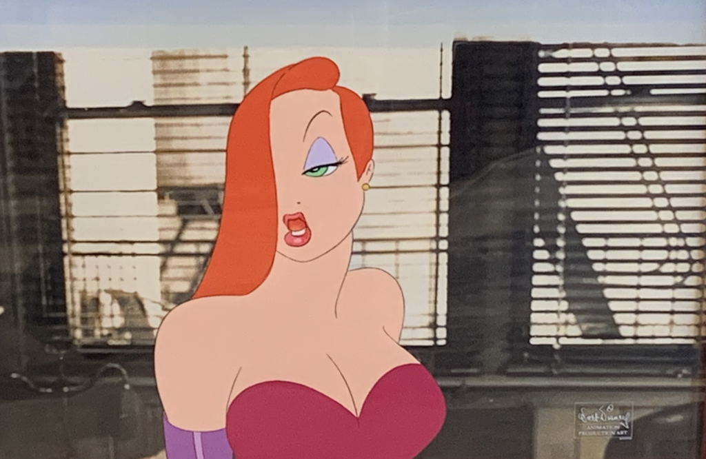
As for Jessica Rabbit, images of her were the last thing available from Disney Fine Art, before they pulled all images a few days ago. Fortunately, we have this gorgeous piece available from Disney artist Bill Silvers, and it really captures the fact she really IS “drawn that way”. You can see that image HERE.
some of you know, we currently have a wonderful original production cel of Jessica Rabbit. It was purchased wayyyyy back in the early 90s, and now we have it for one of you Jessica fans!
Here is a video that shows Jessica and Eddie in the film. Our Jessica cel is 31 seconds into the scene!
I hope you enjoyed my deep dive into Roger Rabbit, and my experiences with the film and art. Those times are an important part of my education in the art of animation! It’s a beautiful thing that so many talented artists no longer with us are captured forever in this animated classic.
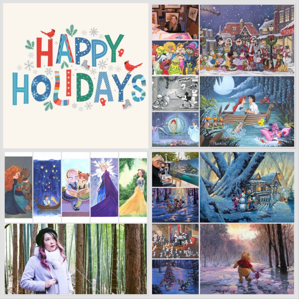
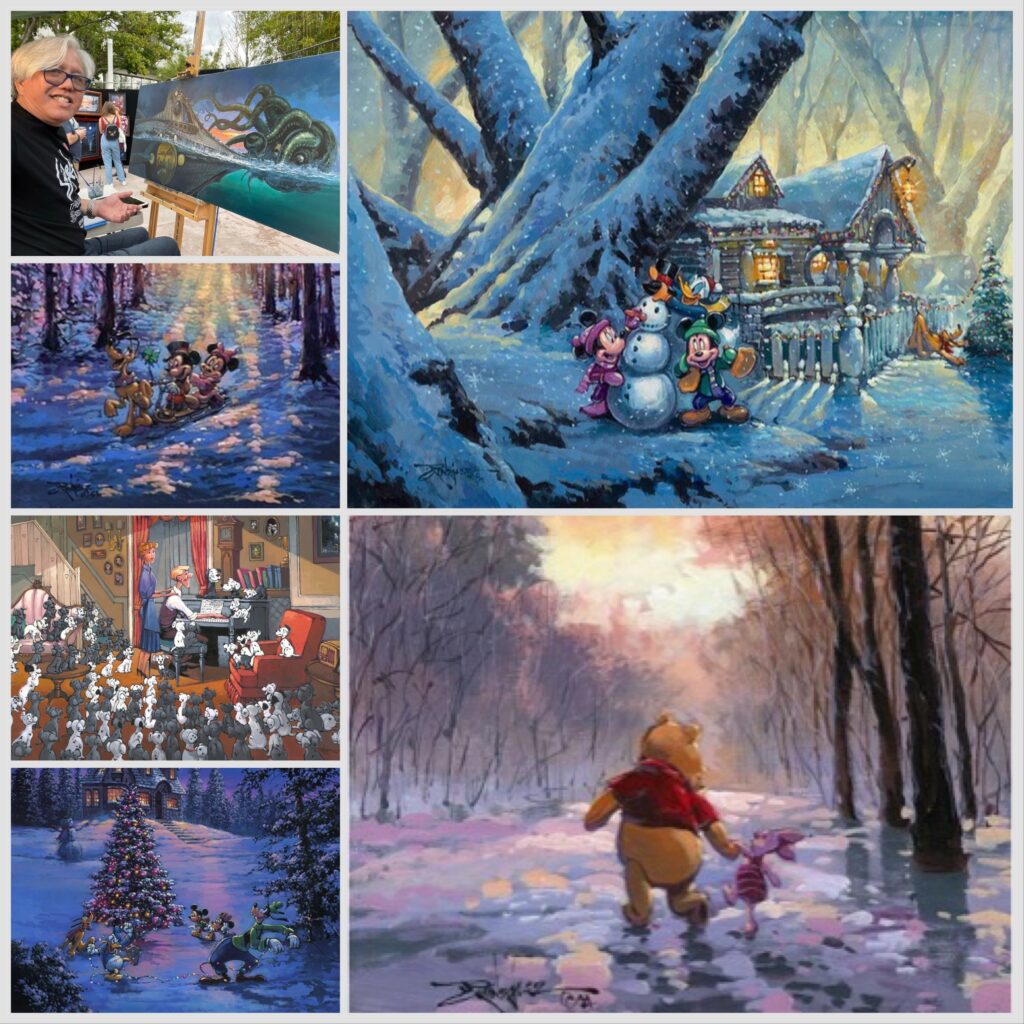
We’re in the midst of Honukkah 2023 and, as Joni Mitchell would say, “It’s coming on Christmas”, and with all that’s happening in the world, it’s something that should be celebrated right now. I’ve discovered, over time, that Disney fans and collectors are the most avid lovers and celebrants of Christmas, Hanukkah, the Winter Solstice, and any other winter holiday they can embrace. Disney fans believe in finding joy. They (or maybe should I say, YOU) believe in finding the best, seeing the good, and celebrating that, no matter what else is happening. So, how about holiday greetings from Disney fine artists to all of their fans? YES! YES, THAT’S A GREAT IDEA!…
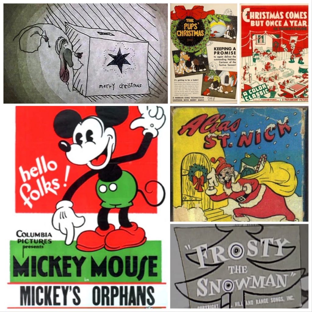
This love of Disney and joy is evidenced by some of the popular shorts and features embraced during the darkest times in American history. Some of Disney’s earliest Christmas cartoons were released during the Great Depression. 1931’s Mickey’s Orphans, 1932’s Santa’s Workshop and Mickey’s Good Deed, and 1933’s The Night Before Christmas were all not only innovative, but also joyful holiday Disney cartoon shorts. Through the years, Walt Disney Studios has released what have become some of the classic cartoons connected to the season, including the Sorcerer’s Apprentice, which was part of 1940’s Fantasia, Once Upon a Wintertime, released as part of 1948’s Melody Time, Lady and the Tramp, which in 1955 features lovely Christmas scenes, and of course more recent favorites like 2009’s 4-time Emmy winner, Prep & Landing, which you SHOULD ABSOLUTELY SEE! (It’s on Disney+, along with a bunch of other Disney holiday classics, and you can find them HERE)
Keeping all that history in mind, I am honored that when I put a call out to some of my favorite Disney Fine Artists, many came back with very sweet and appreciative holiday wishes to their collectors and fans! Below are their names and some of their best official Disney limited editions available to collectors, which you can click to see their whole collection.
========
WILLIAM SILVERS
“So often around the holidays, it takes such effort to really get into the spirit, we are in such a whirlwind preparing for Disney art events and shows. Then Ewa and I realize how incredibly lucky we are to be a part of this Disney family. Collectors are so generous and so kind to us, and say such wonderful things about the art I create, it brings us right back to why we celebrate the season. It’s about family, and kindness, and gratitude. We want to take this time to thank all of you for being so supportive of my work and to all my fellow artists that create Disney images. Disney is about finding joy, and that’s exactly what the holidays are about.
Thank you all for all your support and kindness, and for all the time I get to spend with the collectors who support my art. I look forward to a great new year, creating more art, and meeting more of you. Happy Holidays!
Bill Silvers & Ewa Podolska-Silvers”
HEATHER EDWARDS
“I am so lucky to be able to say that I love the people I get to work with at Disney Fine Art and every one of you who have come into my life over the years. A little over a decade ago, if you’d told me I would be working with Michael and his amazing team at DFA creating Disney artwork, I probably would’ve laughed. How awesome is it that I have been blessed to work with such good people and stories that are so beloved! It has truly been a gift to me. I hope and strive to return that gift to all of you through painting in the decades to come.
Humbly yours and the Happiest of Holidays,
Heather Edwards”
CRAIG SKAGGS
“It’s hard to believe it’s time for decorations, carols, and holiday get-togethers already. It’s been such a busy year of creating new work, this year seemed to go by in a blink.Next year is already looking like it’s going to be even busier. I can’t thank my fans enough for their continued support. Rest assured I’ll continue to push myself to produce the best possible Disney art I can to keep those smiles and dreams alive.
Merry Christmas, Happy Holidays, peace and love to everyone!
Craig Skaggs”
TIM ROGERSON
“It still blows my mind that I get to do what I love everyday, the thing I’ve done ever since I could first hold a pencil, and that’s to bring my favorite characters to life through art. It’s only been possible because of all the love and support I’ve received these past 20 years from galleries and collectors all over the world. I’m forever grateful. To Leslie at ArtInsights and to all her collectors, I wish you all a Merry Christmas, a Happy Hanukkah, and a new year filled with happiness and amazing art!
Cheers, Tim”
MICHELLE ST. LAURENT
“Happy Holidays to all! This has been a very busy year of creating many new Disney Fine Art original paintings and Limited Editions. Thank you so much to all my collectors who love and appreciate the art so much. All the hard work really is a dream come true and I love sharing it with all of you.
See you real soon, Michelle”
VICTORIA YING
“As 2023 comes to a close, I want to reflect on my artisticjourney so far. I’m so grateful to Disney and the Disney community for being a huge part of my creative life and continuing to inspire me as I go forward to tell my own stories. Without Disney, I wouldn’t have had the grounding to understand storytelling and creating magic. I’ll always be proud of the time I spent at the studios helping create timeless tales with incredible teams. Thank you, to every member of this community who has made it possible to make beautiful things.
Victoria”
GREG MCCULLOUGH
““Dreams come true …when the work is put forth.” We are living the dream.Thanks to all our fans and collectors who make it possible.We are so ever grateful.We wish you all a joyful holiday and may all your wishes come true.
Greg and Nath McCullough”
JOHN ROWE
“Wishing everyone a happy holiday, Christmas, winter, day off, and new year season! All the best to you all!
John Rowe”
DENYSE KLETTE
“I love this time of year. Being able to see family and friends is the part I cherish the most. Living in Canada our Christmas season is usually always white and chilly. One of our traditions is homemade hot chocolate with alot of marshmallows after a day of skiing. Sometimes with a little extra something. Our Disney tree is up and shining bright and the gifts are showing up underneath. This year has flown by with all the Disney events and shows. I can’t tell you how much I love creating the art for the different galleries. I think one of my favorite part is seeing my prints on the Shop Disney site. Its a pinch me moment. I am grateful everyday that this is how I making my living. Merry Christmas to everyone.
Denyse”
RODEL GONZALEZ
“I’m humbled waking up every morning knowing that I’m able to do what I love to do. It’s an added blessing knowing that I can create Disney, Star Wars and Marvel art aside from my own fine art. In this season I wish all the best to the Disney collectors, galleries, and fans from all over the world that have collected my artwork… I feel super grateful and blessed to have had all your support through the years. Merry Christmas and Happy 2024!
Rodel Gonzales”
JIM SALVATI
“I paint Disney art for grown ups! My new Soul work is the perfect example of grown up art . Soul is being released again next year, and I have some new cool pieces coming, even a silk screened piece. Happy Holidays!
Jim Salvati”
========
We at ArtInsights wish you happy days, holidays and beyond, and a very safe and prosperous new year for 2024. We feel incredibly fortunate that we’ve been so successful, not only in our gallery space for the last 30 years, but now in our new hybrid model. And, REALLY, we couldn’t do it, we couldn’t work staring at nature and with cats curled up nearby, without you. You, our loyal clients, have bought great art and supported us through all the best and worst years, and we are humbled and so appreciative that you trust us and honor us with your support. Thank you. Thank you. Thank you! and now it’s on to 2024. The best is yet to come!
Love, peace, and joy,
Leslie and Michael (and T’Challa and Lobo, our home gallery cat-interns!)
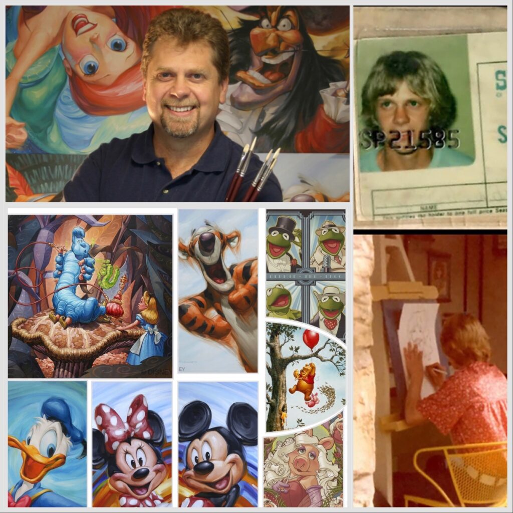
Greg McCullough is one of the most beloved artists working today, and has a strong following of collectors who seek him out at his Disney events throughout the year. He releases art regularly, and those pieces are only available directly through Disney at his events. Greg has been working in the film and animation industry and as an illustrator since we was a teen. He learned his love of art from his family, and continues to seek joy through art every day with his artistic collaborations and life experiences with his wife, Nathalie. ArtInsights has the honor of exclusively representing art by Greg through “The Archive of Disney Editions by Greg McCullough”. As part of the release of these vintage, sold out images to our collectors, we spoke to Greg about his career and what brings him joy in this exclusive interview:
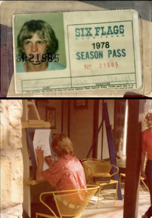
You worked as a caricature artist at Six Flags Over Texas as a teen. Can you talk a bit about your love of art and how it began as a younger child that led to Six Flags?
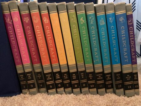
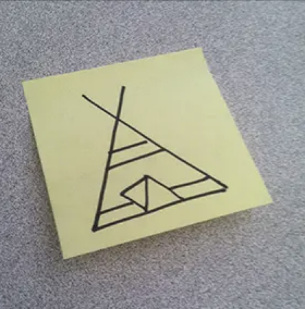
Greg McCullough: I was inundated with things that inspired creativity from the start. My mom had a 1964 Childcraft Encyclopedia Set with one book “Make and Do”, and my mom and I concentrated on that. There were things like “How to carve a turtle from a bar of soap”. My grandfather taught me to build with tools, and I loved spending time with them doing crafts. I taught my fellow kindergarteners how to draw a teepee. “Seek and Find” books gave me a love of black and white line work. I still have some of the early drawings of spacecrafts I did.
Childcraft encyclopedia
Greg’s teepee drawing
Greg at Six Flags!
I worked at Six Flags in 1978, when I was still a teenager, and I did caricatures of their guests. I did that for 3 summers, but also continued to do caricatures at events and conventions for many years.
My dad’s parents were really into art. They were Norman Rockwell collectors, to which I am still tightly bound as an artist.
Who were your biggest influences as a fledgling artist and who inspires you now, and why?
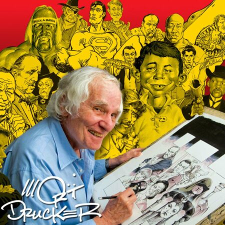
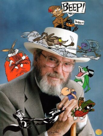
When I was a teenager, I loved the work of Mort Drucker of Mad Magazine, animator Chuck Jones, and Bernie Wrighson, who did the best horror comics. When I started doing illustration and was looking to the best advertising illustrators in history, I was inspired by CF Payne, Bill Mayer, Chuck Slack, Dave Willardson and John Hammagai. In terms of design, I’ll always look to JC Leyendecker for his style, color, and boldness. In terms of living artists, I love James Tennison, because he has an amazing amount of color everywhere, and he had an uncanny ability to draw what he sees, and someone who passed away recently, but will always be an inspiration in terms of style and business savvy, is John Howard Sanden.
Mort Drucker
Chuck Jones
Bernie Wrightson
I’m now full circle to Norman Rockwell, and study both his work and the the work of Leyendecker in my paintings, and I think I’ll always be inspired by them. They’re the best of the best in the history of illustration fine artists.
Norman Rockwell art
JC Leyendecker art
You started Artifx Studio in 1994, and did commercial work for some very high profile clients. How did illustrating in the commercial space feed your artistic soul, and what are your favorite projects from that time?
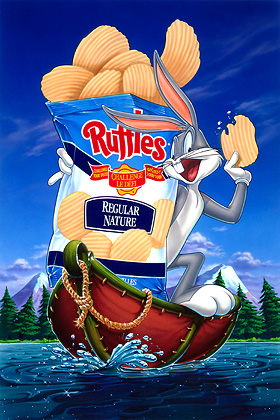
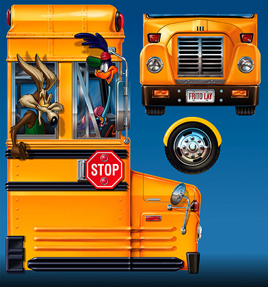
I’ve always been a technician, drawing fun things while mercilessly pushing my artistic skills. I started oil painting around 2003, and painting in oils is closest I’ve come to feeling what I paint. In terms of my favorite projects, there are so many! I did a huge Looney Tunes project of 30-plus illustrations for Frito Lay in 1994. I Bought my first house via Bugs Bunny! I loved my work for McDonalds, which lasted for 5 years, and It’s been a complete honor doing anything involving Disney and Pixar.
Greg McCullough art for Frito Lay:
Speaking of them, what are some of the best highlights from your work with Disney and Pixar, in terms of how it has advanced your style and aesthetic as an artist? What brings you joy in your work with Disney?
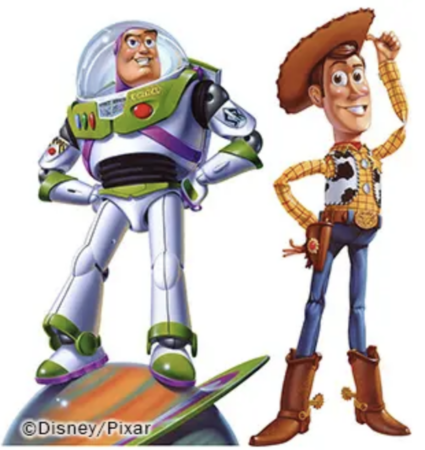
When I was finishing up illustrations for the Toy Story 2 packaging for Mattel, I got an email from John Lasseter asking for prints of my Toy Story/Mattel illustrations for his personal collection. Working for Disney and Pixar brought respect to Artifx, and allowed me to have better choice in terms of the projects I took on.
Toy Story art created by Greg McCullough for Pixar
I have found working full-time as an artist, showing and signing at the Art of Disney, has allowed me to give back at levels I never would have considered. I am fortunate beyond comprehension. Seeing a smile on others bring me joy, and I am told repeatedly, often on a daily basis, how my paintings bring a smile. What could possibly be better than that?
Collectors are all smiles while photographed with Greg
What outside of the creating of art itself, best feeds your inspiration and joy as a creative person?
I spent my formable, elementary days on my grandfather’s farm in Texas. Nature, pine trees, and oxygen are my plug-ins to truly charge up my depleted batteries. My wifeNath and I spent three years RV’ing up the Appalachian Mountains into Quebec from Orlando, and then turning right at New Mexico, exploring Utah, Wyoming, Montana, Canadian Rockies and setting for three months in Banff Canada.
Greg and Nath on one of their adventures
What imagery or work have you not yet done as an artist you’d still like to tackle?
Personally I am at the beginning of what I’m calling “ROCKWELL ERA”. That started last year with Rockwell inspired “charcoals”and SOO very excited to see how far and where this leads!
(For further explanation of Greg McCullough’s “Rockwell Era”, here’s a quote from his facebook page:
“Last November I spent 4 life changing days scouring the Norman Rockwell Museum in Stockbridge MA. I wanted to know “How he did what he did, so fast, so perfect and still had fun?” For me, the missing puzzle piece is simple but not easy. For every painting, Norman Rockwell created a fully rendered charcoal drawing at the size of his final canvas, approximately 30″x40″. It’s a huge, messy job that my ego, laziness and all my time spent gathering copious amounts of reference told me from a tight sketch and lots of reference, I can figure out everything needed as I paint the final canvas. I was mistaken! It’s been a real challenge!”
I also believe the time is close, though long awaited, to begin to do relief sculpts of my most popular paintings. Doing what I love every day really means my creative spirit is always being fed, and I’m always looking to the newest way to express what’s inside me as an artist. Talking to fans and collectors is also endlessly inspiring. As I said, I’m grateful every day.
Below see some ArtInsights exclusives now available on our website. You can see all of Greg McCullough’s images by clicking HERE.
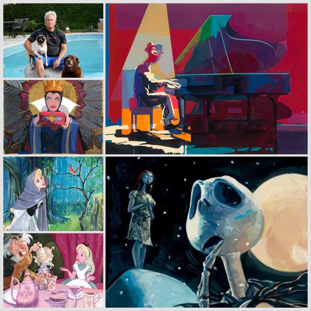
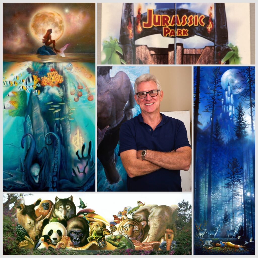
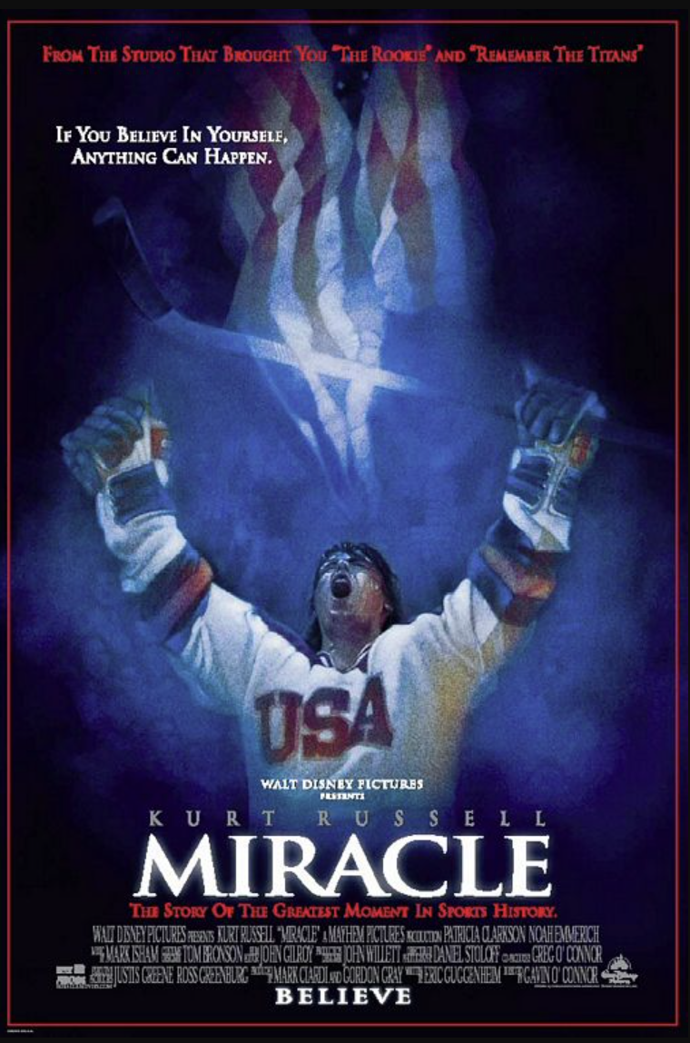
We have loved John Rowe since, well, forever. He has the incredible talent befitting a man with his impressive CV. He’s a movie artist with several high profile images including the poster for Miracle, and a screen-used brochure for John Hammond and his company InGen’s Jurassic Park. He’s an illustrator who learned from some greats like the legendary Saul Bass and created murals featured at Disney World, and is a fine artist who finds the layered meaning in whatever he paints. He’s also gentle, deep soul who infuses those qualities in his work, and takes every project to heart, be it a corporate commission, Disney fine art, or the portraits he creates of people he finds compelling.
In the span of time we’ve known John, we’ve become friends, and seen him create some beautiful Disney interpretive art, as well as lean into his fine art portraiture. He’s won some of the major illustration and fine art awards, while always maintaining his realistic yet emotionally evocative style. We’re thrilled to be able to offer the John Rowe Disney Fine Art Archive Editions Collection, all from John’s personal collection of Artist’s Proofs. In honor of the release of this collection, we interviewed the artist about his career, aesthetic, and where he gets the great ideas on which his most popular Disney images are based.
Leslie Combemale: What were the early indications when you were a kid that you wanted to work as an artist?
John Rowe: I used to draw every single day of my life. Even when my friends would come over and want to play, I would have to say, “Well, let me finish my drawing, and then I’ll go play football.” I just always loved drawing. When I was in elementary school, I wouldn’t fill out the papers they kept passing out to me, asking questions about dinosaurs or plants or whatever it was we were studying. Instead, I would draw a picture of them. So I would draw that dinosaur, or shark, or plant, I’d draw them perfectly with every fin and every element exactly. And then instead of turning in the work that the teacher had been passing out, which I thought was very boring, I would walk by her desk, and I would nonchalantly flip my drawing on her desk, because I wanted her to know that I was keeping up.
You were like an illustrator and training! Did you get good grades?
No! I was failing. And I was going to fail second grade. Then we went to a meeting with the teacher and my mom, and it wasn’t until then I figured out those papers are what they care about in school. I thought, “That is so weird.”
So you’ve always gone your own way, which is so important for an artist.
You have to kind of have your own agenda and your own vision of what you want to do, and then how you want to live your life.
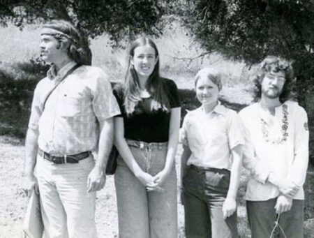
John Rowe, on the right, with fellow artists at Art Center
How did you wind up at one of the most prestigious art schools in the world, Art Center?
I was going to become a history teacher, because I tested really high in history. But when I got up to Cal State, I couldn’t go through with it. So I told them I wanted to be an art major, and they told me I had to have a professor in the art building sign off, so I went to the building, and it was five stories tall, but there were no professors there because the semester hasn’t started. So I’m wandering around, and I run into Al Fiore, and he says, “I’ll sign this for you If you take my class.” I said, “Well, I can’t take your class, it’s an upper division class, and I’m just starting.” He said, “Just take my class.” So I take his class, and he also teaches at Art Center. He’s also a designer designing the new interior for the L 1011 airplane and the cockpit for some new Boeing airplanes. I turned on my first project and he says, “If you graduate, after four years here, they will never teach you to be better than you are. Let me help you get into a real art school.” And then he helped me get into Art Center.
Explain who Al Fiori is, explain the importance of him as an artist.
He was a designer, and he taught at Cal State, LA. He was the head of the design department there, and he also taught at Art Center. He mentored so many people.I hooked up again with him years and years later, just about 15 years ago. He said he got asked to take a sabbatical from Cal State LA because he was cherry picking all of their very best students out of the school art and sending them to Art Center. He said, “I had just been offered a job at NBC to do some design work for them, and as part of the job, they gave me a Ferrari. So I parked my Ferrari out at the loading dock, and I was interviewing with the dean of the school, who told him to take the sabbatical, and to reconsider not pinching students, and he could come back later. They said they’d pay for my year off. And I said i’m out of here,Just then the guy from the loading dock came in and said, ‘Hey, somebody’s Ferrari is blocking the loading docks. Anyone know who’s that is?’ And I said ‘That’s mine. Gotta go!'” He said that was the best exit he ever made in his life.
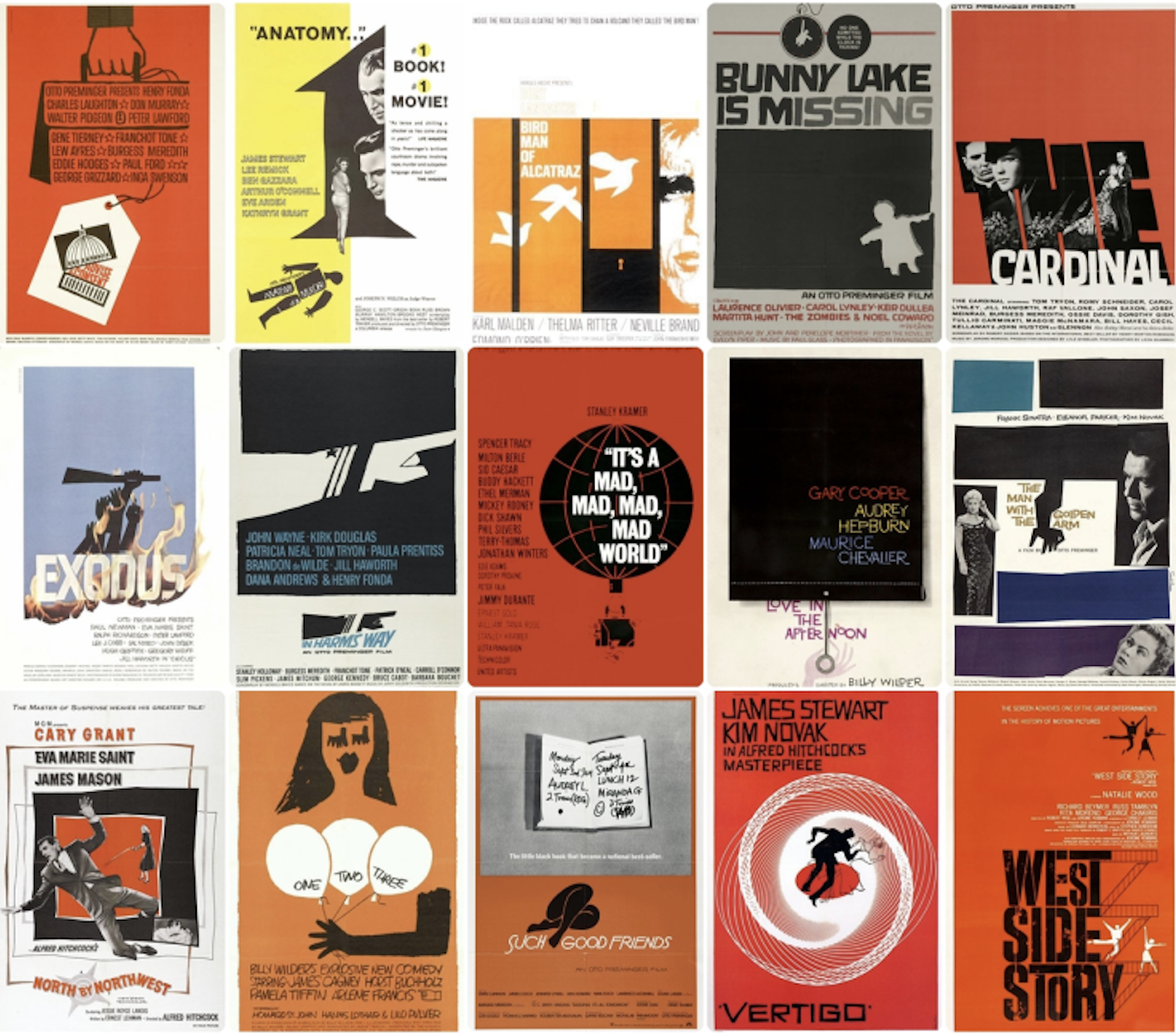
Movie posters by legendary cinematic artist Saul Bass
That’s a great lesson that it’s possible to be an artist and make money at the same time. You worked with one of the greatest illustrators in film history, Saul Bass. Can you talk about that experience and what it taught you?
I learned a great deal from him. He was incredibly meticulous. Everything had to be perfect. I had worked for months on the color for the Japan Energies logo, and he had done hundreds of drawings, and I was just painting color. I had two 8 x 8 inch pieces of art that I had made, and each one had to be identical. So the Japanese CEO would come in with his entourage, there’s about 15 people in the studio. And Saul and everyone is there, and they have my art, and they’re dropping a jeweler’s loop on it, and going over every every part of both pieces. They found a difference between the two. And they’re freaking out. “One piece has to go to Japan, and one has to be here. We need to be able to print worldwide from these two things.” They were busy on the phone trying to get a first class ticket to fly my art, because the CEO of Japan Energy was leaving in a few minutes, and it had to be fixed. My art couldn’t go by FedEx or any other way, ithad to be hand-carried to Japan.So I hear them on the phone, and they’re asking if I can fix it in the few minutes before the CEO leaves. Yes! Yes, I can fix it!” And I’m in my mind, I’m thinking that first class ticket is the same price and the fee they’re paying me!.
The movie poster for Miracle by John Rowe
He didn’t deal directly with you, right?
Normally, no. One thing about Saul is,I did 30 projects for him. I would go in with the team of designers.I would be sitting there, and he never talked to me directly. He always told the designers all the notes and fixes needing to be done. I was just the hired help. Then one day, I had messengered a little oil painting over there, and he was sitting there, again with the designers there too, ripping my newest assignment to shreds, saying how pedestrian it was, and how it looked like what some shlock illustrator would do, then he looked directly at me. It was the first time he had ever spoken to me, and he said, “Nice painting yesterday.” He ripped the one I was there for to shreds, but the one from the day before he liked enough to compliment me.
That’s when you know they mean it!
When Saul did pass away. all Hollywood was going there because he had done so many film projects and so many things, and Walter Matthau was speaking at the eulogy and stuff like that. And Nancy, his project manager, called me up personally and said, “Hey John, I know Saul would have liked it if you were there, so your name will be at the door. Just come. It would be good.”
You’ve worked on some pretty high profile projects some folks don’t even know about. You’re full of stories!
I have a story about the day I didn’t meet Steven Spielberg. I was working for a designer friend of mine, and I was painting these gates, and I was up all night doing it. I have a story about the day I didn’t meet Steven Spielberg. I was working for a designer friend of mine, and I was painting these gates, and I was up all night doing it. I mean, literally, I got the assignment and I had to stay up all night. So I came in with no sleep to the Universal to a place I didn’t know, because I don’t follow movies, called Amblin Entertainment. I delivered this thing, and the guy at the desk says, “This is great. It’s wonderful. This is really cool. Steven will love this. Steven will think this is really nice. I can go back and show Steven, do you want to meet Steven?” I’m like, “No, man. Just show him the work. I’m so tired.” He goesand comes back and says, “Steven loves this. Steven wants another one tomorrow.”I go back home, and I tell my wife, “This guy I work for is just obsessed with his boss. He must have said the name Steven 100 times.” and she asks, “Where were you? Do you have a card?” I pulled out a card and I gave it to her and it said “Jurassic Park”.She said, “Do you know what the biggest movie next year is going to be? Jurassic Park.” I did a brochure for him for that, and it was used in the movie.
So in terms of projects that you’ve done that had a huge impact on your forward movement as an illustrator, what are a few? I know creating the covers for the reprinted Marguerite Henry books Misty of Chincoteague, that was a big deal.
I think those books were really important. Also one of the high points of my career was when I got a commission to do 12 stamps for the United Nations. Once you get a commission from them, they let you do anything you want. They don’t give you any direction, they just trust. Then once I delivered them I was able to go to New York and speak at Madison Square Garden and signed my autograph to hundreds of people’s first edition stamps. I was able to take my daughter, who was 17 years old at the time, and she got to see her dad do something cool.
John Rowe’s illustrations for the UN stamp release
You’ve also done a lot of images for Disney, some of which people see every day.
There’s a big mural in Animal Kingdom Park at the entrance. It’s 80 x 20 feet tall. When I did that mural, the director called me in, and she had a beautiful little drawing she’d made of all these animals. She said, “I hired two artists and both did a terrible job. We didn’t go forward with them. I’d like to do the same with with you. I’m gonna blow this up to eight feet and then you can paint on top of that.” I looked at it and it was a nice drawing but not the kind I’d need to do a photorealistic painting, so I told her “I’d love to do that, but I can’t work on paper, so I’ll transfer it to canvas myself and then I’ll do a sample of that.” Then I corrected all the things that needed to be fixed and perfected and did the sample and she loved it. You can see those murals today at Disney World.
Mural by John Rowe at Disney World’s Animal Kingdom
You’ve done some really beautiful images in your partnership with Disney fine art. What was the inspiration for kind of that aesthetic?
The stories that Disney tells, I think they touch us. We’re influenced by them because they really relate to real life. When I painted a Disney story, that’s what inspired me. I had one that’s really personal to me, The Little Mermaid piece called “Fathoms Deep”, and when I painted that, Ariel is dreaming about a better life like a real person would, and just below her I had the good fish, and deep below I had the monstrous fish.
The Little Mermaid “Fathoms Below” by John Rowe
I painted them looking very realistic, but very evil. And I met a young woman who was 20-something who had that image tattooed on her leg. She came to me and she said, “This is my life. I grew up in gang violence, my parents were murdered when I was young, and I was raised around some bad people. And I’m that little girl wishing on the star, and wishing for a better life. And below are represented all of the gang violence and all of the things that I came through and I got out of in my life. That really made me understand how these stories, although they’re animated cartoons, have a real life story, a resonance within them that’s deeper than that. So I wanted to paint realistic figures, realistic people, and realistic scenes, because I think our emotional experience of these animated films is not the experience of a cartoon, our emotional experience is experience of how real people live life.
Belle’s Search
Fallen Snow
Ariel’s Reflection
The Arrival of Prince Ali
The Depth of Love and Space
The Black Pearl
That desire to connect, to speak to real life experience, extends to your other fine art.
I do feel the same way about fine art. I don’t want to just do a nice, pleasant painting, I want to do something that speaks to something deeper about the model I’m painting. Almost all the models I use are people that I meet, and then I photograph them and talk to them, and find out something about them. That way, the painting can have some relation to the kinds of experiences they’ve had in their lives, but also that the viewer can relate to and find inspiring in some way.
You can see all of his Disney work on our website HERE. You can see his fine art on his website HERE.
Welcome to ArtInsights 2.0: A Hybrid Online & In-person Model! What, pray-tell, ArtInsights 2.0 look like?
That’s what I’m here to lay down.
First, for those of you who might want to know why we decided to close our brick and mortar gallery, here’s an article about it published in The Reston Letter,
Essentially, we were paying too much to Reston Town Center center for clients. Nearly all were finding me via word of mouth, online information, the ArtInsights blog, and searches for specific art. It has been wonderful to have a place to hang our hat for the last 30 years where collectors could visit us, but…truthfully, we can always find a way to connect in real life, but more than depending on being in a fixed location, we are far more about supporting small business and individual artists, and doing all we can to celebrate the art of illustration, animation, and film art in the 21st century.
For us, that meant redefining what an art gallery is, especially for us at ArtInsights, where everything is based in the expertise and integrity of its proprietor.
About our focus and the art:
SO. Going forward, we are going to continue to release blogs that talk about the history of film and animation, about the cartoons and movies we love, and featuring interviews with animators and film artists and experts that illuminate and fans will enjoy! You can find all our blogs HERE.
We are also always actively working to find art and artists that we can partner with for exclusives. As many of you know, we are the sole representative for the estate of movie artist John Alvin, (you can see his work on the fan webs we created for him HERE)
We are always looking for other opportunities to bring the best art by artists who actually work in the film industry to collectors. For us, it’s all about making sure everyone feels supported: we want the artist, collectors, and our gallery to feel happy with their partnerships and interactions. In our partnerships, the artists get paid the highest percentage from sales – the collectors get art they want at a great price – and the gallery succeeds. EVERYBODY WINS!
About how we interact with clients:
First, let’s talk about new or potential collectors. You know you love movies and/or animation, but where do you start? I love talking to folks about how to proceed. We can set up a time via phone, zoom or in person to talk about what you love, how to collect, what to collect, how much it might be, what to avoid, what might be best, and what ArtInsights can find for you. That service is free, because we believe we can take care of your tastes and needs as a collector, at least in part. (Unless your jam is anime. We love anime, but we don’t specialize in that.) You can email us at artinsights@gmail.com to set up a meeting.
Ever since the start of the pandemic, because we discovered we had a number of high-risk clients, we have beendelivering art, showing new images via zoom, and meeting people in their own safe spaces, whether that be their own homes or a local coffee shop. We found it took away the pressure sometimes inherent to an “art gallery”space, making building and creating collections a more joyful experience. I was bringing them or offering special pieces, and who doesn’t love to feel special in that way? Whether via phone, zoom, email or in person, their reaction was almost always an immediately “yay!” or “nope!”. It makes it so much easier to build the perfect collection!
ArtInsights also has a newsletter we send out every few weeks, always with a link to the latest blog, and often with new releases. This gives collectors a chance to see some of the newest offerings being released, or reminds them to just click on “studio art”, which shows a lot of the most recent studio releases and gallery acquisitions.
Of course there are lots of cels and images I get that never make it to the newsletter, especially images that are hard to find or rare. With that in mind, one way we like to work for our clients is through wish lists. If you’re looking for art from specific movies or featuring specific characters, let us know, and we’ll add it to our search. I’ve been doing this over 34 years, and I never forget my clients’ fondest wishes. It’s important to let me know what’s at the top, because that might move you to the top of the priority list if it’s a unique character or scene! You can email me at artinsights@gmail.com about that.
Ok, we’ve found you a great piece. Now what? Well, we can ship it to you unframed if you have a framer you trust. Or we can find a great framer near you. Or we can take care of the framing through our new collaboration with Broadway Gallery.
We started working with Caren and Barry Broadway when we were looking for folks who deliver oversized art and hang large framed images over 5 by 5 feet. They’d taken over for their mom, Sue Broadway, who started the gallery in 1978. This gave us a feeling of connection, because Michael had started his framing company in 1979, so there was some symmetry there.
I always seek out female-owned businesses to support, so it was great to find one we could partner with going forward. Caren, ably assisted by Lydia, have been a great match for me in terms of meeting my clients at the frame shop, finding what suits their art, and pricing the project quickly. They have lots of frames from a variety of framing companies, and can turn around jobs for ArtInsights in 4 weeks time.
I’ve worked with a number of my clients there, now, and have been very pleased with the results. I’m sure you all will be, too! If you have art you’re purchasing from ArtInsights, or have art you’d like to have framed but would like the ArtInsights eye in terms of design, I can either meet local collectors at Broadway Gallery, or I can design options and email them to clients for approval.
If clients are meeting me at Broadway, they generally accept 1/2 downpayment, and the other half upon completion, which you can pay directly to them. If I’m creating a framing design via email for my clients,ArtInsightscan charge you or it can be paid directly to the frame shop. It’s all about whatever is most convenient for you!
About having ArtInsights design your in-home gallery or rehang your collection:
We are happy to come to your home and redesign or assist in hanging your walls as your collection grows. While we do deliver art purchased by collectors who live nearby, free of charge, our art gallery design services are done for a fee. We can discuss ahead of time what makes sense, but usually it’s $250 an hour, including travel time (I hang art very quickly, though!)
Who doesn’t love a Top Ten Halloween Cartoons list? Something about classic scary cartoons stirs up nostalgia more than the average every day animation. Is there something about being scared at the same time as entertained that we hold on to from childhood?
Every year at ArtInsights, October has offered the opportunity to play all the best classic Halloween cartoons over and over, since they’re a gallery favorite. This year seemed like the perfect opportunity to list the best creepy cartoons ever made. None of these are too scary for most kids, and perfect for playing on a family night at home.
Our experience in the gallery, however, is adults are far more likely to sit and watch them over and over than their kids are. Of course, no one needs an excuse to play The Nightmare Before Christmas one more time, a movie we have the soundtrack to in three languages … (English, French, and German). It is, however, an opportunity to educate our friends about it’s greatness, as well as the greatness of other creepy classics. And with that in mind, here is my list of the top 10 Halloween cartoons of all time:
No. 10 — The Legend of Sleepy Hollow (1949):
Packaged as part of the post-war Disney featurette The Adventures of Ichabod and Mr. Toad, Legend has a terrifying and great scene of Ichabod being chased by the headless horseman, not to mention narration by Bing Crosby and a great song. It is loyal to the original story by Washington Irving, which means it leaves some doubt as to the survival of Ichabod at the end. Enjoy the music and one of the best villains in Disney history, who “achieves his aim” with the least amount of airtime.
No. 9 — Lonesome Ghosts (1937):
Four green phantoms invite Mickey, Donald, and Goofy who are “Ghost Exterminators” over to their haunted house to drive them crazy—a gorgeous piece of vintage animation, with classic characters we all love. Note the detail in the backgrounds. Goofy’s quote “I ain’t afraid a’ no ghosts!” was used in some movie later.
No. 8 — Broom-stick Bunny (1956):
The first cartoon to use June Foray’s voice for Witch Hazel in a Warner Brothers cartoon, and it is widely considered the best of the WB cartoons featuring the character. The backgrounds are highly stylized in the tradition of the best of the Chuck Jones directed cartoons, and critics gave high praise to the witty dialogue written by Tedd Pierce.
No. 7 — Hyde and Go Tweet (1960):
This Friz Freleng directed cartoon is arguably the best featuring characters Sylvester and Tweety. It brings knuckle-dragging into your dreams at night! Tweety accidentally drinks a formula that makes him a huge yellow monster with bulging eyes and he terrorizes Sylvester—as he still terrorizes Tweety lovers whenever they watched the cartoon. Notice how “monster Tweety” breathes. Hilarious!
No. 6 — The Skeleton Dance (1929):
Black and white Silly Symphonies cartoon with skeletons rattling their bones joyously. It’s like the perfect Halloween Busby Berkeley cartoon. Creepy! A very early Disney cartoon before many experiments lead to advancements in animation, and yet still plays as one of the most beautiful cartoons ever made.
No. 5 — Water Water Every Hare (1952):
Bugs as a beautician, fixing the tennis-shoe wearing monster Gossamer’s hair—who doesn’t remember that classic cartoon moment? “Monsters are such interesting people!” And the big-headed evil scientist as he floats in an ether induced haze, while edited from more recent versions of the cartoon, is a classic example of “anything goes” in classic Looney Tunes!
No. 4 — Trick or Treat (1952):
Another result of legendary Donald Duck cartoon director Jack Hanna, but this one is many a Disney aficionado’s favorite. It introduced Witch Hazel, who was voiced by famed voice artist June Foray (who we mentioned in No. 8, Broom-stick Bunny). With Huey Dewey and Louie’s costumes and the stylized backgrounds, it showed just how vibrantly colorful a Disney short can be.
No. 3 — Night on Bald Mountain (1940):
Horror fans will point to Fantasia as their favorite movie not because of the Sorcerer’s Apprentice, but because of the dark and emotionally intense segment with the demon Chernabog, and at one point, bare breasted redheaded harpies! …and in a Disney cartoon! Leave it to Disney animation genius Bill Tytla!
No. 2 — It’s the Great Pumpkin, Charlie Brown (1966):
Some will argue for this Peanuts classic, and the third special, to be No. 1. Linus as the eternally hopeful optimist does inspire fierce loyalty in fans, and rightly so. It also makes subtle reference to open-mindedness and tolerance towards less traditional beliefs. Linus waits with the sign “Welcome Great Pumpkin” for him to appear in the pumpkin patch on Halloween. We have all the usual delightful suspects to enjoy, and Linus’s philosophizing to deepen our and our children’s thinking.
No. 1 — The Nightmare Before Christmas (1993):
Back when it was released, this was a sad little bomb, but it was MY sad little bomb and I have the original underwear, tie and watch to prove it. It has traveled in time and become a colossal cult classic, helping to keep teengoth store Hot Topic in business. The songs, the love story, the diverse cast of lovable secondary characters, the amazing world created in the mind of Tim Burton, and directed by Henry Selick, all come together into a Halloween masterpiece.
*This blog is reposted from my site Cinema Siren, written in 2011- I’m happy to say these ten are still my top ten!
To see some images based on these great cartoons and other Halloween frights, you can go to our
As I recently mentioned (in my latest blog, about the museum show “Ink Tributes” by Marlon West) I’m going to include blog posts about new films, animation and film art news, and other subjects that are not about art in ArtInsights. I’m hoping these (fascinating!) posts will have you coming back when you ARE looking for art. In the meantime, let me tell you about the new film The Peasants, by the filmmaking wife and husband duo DK and Hugh Welchman, who brought the Oscar-nominated film Loving Vincent.
Here’s the trailer for the movie, so you get a sense of what it looks like, and why it’s a big deal:
Before I get into all of this, I want to tell you why you want to read the whole article:
FIRST: the story of this production includes these filmmakers literally saving artists..they were working on The Peasants in the recently opened studio in Kyiv, Ukraine, when Russia invaded and started an unprovoked war. DK, Hugh and all the folks at BreakThru (the production company making The Peasants) had to get the artists out of the country, and they did. You can read all about their rescue in The Guardian newspaper HERE.
SECOND: as with Loving Vincent, art from The Peasants is available for purchase, and DK and Hugh gave me a discount code for readers of this blog, in case they want to buy any of the oil paintings created for the movie. The art is going fast, especially the art priced at $250 and $500 — although so far they’ve been adding more art every few days… (and yeah, we’re talking about oil paintings that are around 20 x 26 inches, so that’s quite a deal for production art from such a gorgeous and inventive film)…you can see all the art for sale HERE.
You can read my 5-star review of The Peasants on the Alliance of Women Film Journalists site HERE.
Now. On with the blog:
Loving Vincent featured an animation technique in which live action is filmed, then oil paintings are created based on that footage. It was a way of celebrating the art and live of Vincent Van Gogh, and was appropriately lauded for its laborious yet gorgeous style. I interviewed them about the movie for the AWFJ, and you can read it HERE.
A more technical explanation, taken from their press notes:
“The over 100 painting animators who worked on the film did so on specially designed PAWS units (Painting Animation Work Stations), which Breakthru developed for Loving Vincent, in four studios in Poland, Serbia, Lithuania, and Ukraine. The experienced film crew shot live action footage, then footage from the live-action shoot becomes the reference footage for the painting animators. They then use this reference footage and paint over this with reference to the style (brushstrokes, colors, level of detail) set by the design paintings to paint the first frame of their shot on canvas, sized 67cm by 49cm. They then animate the shot by painting the subsequent keyframe, matching the brushstrokes, color, and impasto of their previous frame, for all parts of the shot that are moving. At the end, they are left with a painting of the last frame of the shot. Each frame is recorded with a Canon 6D digital stills camera at 6k resolution.
The keyframes created by the oil painting animators are then sent to the in-betweening process, which takes the style and brushstrokes of the original oil paintings and adds some digital brushstrokes to come up with the inbetweened frames. The amount of oil painting done per shot varied from every frame to every 4 frames at 12 frames per second.”
Yeah, that’s pretty technical. Suffice to say, Film is shot, then artists make paintings of that footage. Here’s a video of the making of the movie:
Just when you think animation can’t be any more technically complicated and time-consuming….
Most of the artists hired as painters for the film were women, and 30% of them were working in Ukraine, so not only did the pandemic cause problems for the production, so too did the war. Once Kyiv was secured, they re-opened their studio there, but bombing was so constant, they lost electricity. Hugh Welchman started a crowdfunding campaign to raise money for a generator, so the artists would be safe and warm during the frigid Ukrainian winter.
As I mentioned, I interviewed DK and Hugh about The Peasants talking to them from their home in Poland. Here’s an excerpt of the interview:
=======
There’s a new animated feature from writer/director wife and husband team Dorota Kobiela (DK) and Hugh Welchman known for the Oscar-nominated film Loving Vincent, called The Peasants. It’s based on a novel of the same name by Polish 1924 Nobel laureate Wladyslaw Reymont, a thousand-page tome so well-known in Poland that it’s taught in schools, and considered one of the classics of world literature.
The novel’s story is meant to deliver a complete and evocative look at the customs, behaviors, culture, and daily life of people in Lipce, a small Polish village, and unfolds over the four seasons. Although the original book follows multiple characters, including Boryna, the village’s richest farmer, his son Antak, Antak’s wife Hanka, and young, beautiful dreamer Jagna, The Peasants centers on Jagna. She is an optimistic artist, and quite a beauty, and all the men of the village want her, including Boryna. Against her wishes, Jagna’s mother makes a deal for a marriage to the old farmer. Jagna is guileless, and chooses her own lovers and interests, which include the married Antak. This causes judgment and hatred from the religious women of the village. This feature film shows the devolution of Jagna’s life resulting from her determination for independence and autonomy.
Created in the same style as Loving Vincent, The Peasants was filmed in a technique in which live action is shot, and then used as reference and interpreted through oil paintings, each created by hand at four studios in Poland, Serbia, Lithuania, and Ukraine. Those oil paintings then are shot and become the images seen as the finished film. Women made up 75 to 80% of the artists working on the film.
Not only did the pandemic prove a challenge for the production, but so too did the war in Ukraine. Female artists in the Kyiv studio in Ukraine (most men were not allowed to leave the country) were evacuated to the safety of the Polish studio. The Kyiv studio was reopened after the fighting in Kyiv eased, but bombing plunged the space into darkness, so the producers started a Kickstarter campaign to buy a generator.
The film, in keeping with the novel, is often very serious and sometimes emotionally oppressive, but every frame is nothing short of gorgeous, and really demonstrates the level of artistry animation can reach as an art form. It takes the work DK and Hugh Welchman did on Loving Vincent and expands upon it, showing the possibilities of their technique through this worthy interpretation of a classic novel.
Leslie Combemale of AWFJ spoke to filmmakers DK and Hugh Welchman about their latest project in this exclusive interview:
Leslie Combemale: Can you talk about how the visual language of The Peasants reflects the artistic style of the Young Poland period? I know Wladyslaw Reymont was part of the literature of the time. You use symbolism in the paintings, like, for example, the use of red with Jagna, and that’s part of the movement. Can you talk about that, what other aspects of the Young Poland period are represented, and in what way?
Jozef Chelmonski’s “Indian Summer” and production art for The Peasants
Dorota Kobieka (DK): Yes, we definitely reference aspects of that movement, using it as inspiration, more often than quoting the paintings, although we do have particular pieces that we quote. Mostly it is in elements like the composition and colors. There are a number we do use, like the painting Indian Summer, where Jagna is lying on the grass playing with the bit of fluff in the air, which is by Jozef Chelmonski, one of the main painters of that period. There’s another, with flying storks, when the farmhand and the boy are in the fields looking at the storks, that’s called Bociany, or Storks, also by Chelmonski.
Hugh Welchman: We have 42 direct quotes in the film, and actually 15 of them are Chelmonski, so he became our main guiding light, although we took inspiration from around 30 different Polish painters, and also more broadly across European realism. For example, we have a direct quote from the French painter Jean-Francois Millet. We wanted to draw on that whole movement. The Young Poland painters were particularly appropriate, because they were presenting this view of Polish culture trying to keep Polish identity and national spirit alive during the partitions, and the period that Poland had been wiped off the map by the three empires. They’re showing Polish life and Polish culture, and were presenting a positive image as well as trying to show how life was really like. That seems really appropriate for Reymont, because he presents his characters, warts and all, with their failings, but at the same time, he has a very affectionate view towards his characters. Even though they can be awful sometimes, you still love them, feel for them, and can understand them, even if they sometimes do some terrible things. Also, his descriptions are so beautiful, very often it’s magical realism rather than straight realism, because of his poetic descriptions, and his bucolic portrayal of nature and the peasant world. The Young Poland movement and the realist movement seemed to be the best ways to bring his prose alive.
LC: The transitions into each of the four seasons are a particular opportunity for stylization. DK you were part of the editing team, which was an important aspect of those transitions, but what were the discussions around that with production designer Elwira Pluta and director of animation Piotr Dominiak? Were each of the four sections of the film, in each seasons, separated stylistically?
DK: That was very big part of the development process, there’s a divisions of the story by the seasons, because that’s how it is in the book. It’s actually divided, originally, into four books, each book for a different season. We thought them really good for representing a certain mood and part of the film, so we tried to design around them. Mainly the colors represent the seasons, and we tried to find the mood of each season that is represented in the story.
HW: It was a big part of it actually, from when we wrote the script, because in the Reymond novel, the transition to a new season, he has these long descriptions at the beginning of each novel, so it was an opportunity for us to be visually quite flashy. We wrote these very long camera moves at the script stage. For example, when we went from autumn to winter, we always wanted to have a continuous pullback to represent the change of the season. Then with spring to summer, we wanted to have the 360 degree camera move. I think those transitions were always going to be set pieces for us, which reflected the fact that they’re set pieces in the book. One of the things that attracted us about making this into an oil painting animation is if you take three pages of his description of the winter storms coming in, we can do that in one twenty second shot.
LC: It also offered you the opportunity to advance from the style of Loving Vincent, and show many other ways in which you can utilize the techniques you use.
DK: It was absolutely more liberating to be able to do more camera movement and more challenging animation.
HW: We didn’t want to do Loving Vincent 2. A lot of people were asking what artist we would be doing next, and it was really important for us that we found something that would show that oil painting animation can be more than that, so that we can show the many possibilities of the technique. DK was very clear not to repeat the restrictions that we had with Loving Vincent. Part of the concept was was bringing portraits to life, so it was a talking heads concept. She wanted us to do something that was much more free, and have dynamic camera movement. The story of the ever-changing seasons and landscape, and the very volatile, dramatic story of the characters lended itself to this dynamic approach. In the novel, you have these amazing celebrations, and we saw that as a great opportunity, and you can see that in the dances, the battle scenes, and the wedding.
LC: The Peasants feels like a mixture, in terms of paintings, of portraiture, landscapes, and paintings of people in nature, like the one we discussed of Jean-Francois Millet. Was that intentional, and how did you determine the composition of the shots?
DK: Yes. exactly. In the book itself, Reymont uses different styles, which is very interesting. It’s very unusual for one novel to mix so many styles. He uses realism, Impressionism, and symbolism, depending on who is speaking, because sometimes he uses inner monologue of a character, and sometimes it’s the external narrator, who is very objective. Sometimes it’s the village itself telling the story. So it’s very interesting, and we thought it would be great to find the way to represent that in the painting styles.
HW: DK and Piotr put together an enormous file referencing nearly 400 paintings, and so while we only directly reference 45 paintings, there were over 300 elements of paintings that went into the film, like the clouds from a Ferdynand Ruszczyc painting, or the trees from another painting, so we not only had landscapes and these peasant portrait paintings, but we also had elements from lots of other paintings as well, like skies and sunsets.
DK: It was also something that we discussed a lot with our cinematographer, who was very sensitive to the painting style and he also didn’t want to shoot this like a movie. He was always thinking, “How would a painter sitting at an easel paint that?” We wanted to be true to that.
You can read the entire interview by going to AWFJ.org HERE.
====
As a lovely gesture to me, knowing I own an art gallery, Hugh and DK offered my clients a discount on art when they buy it on The Peasants website. ArtInsights doesn’t make any money on this, and that’s 100% fine with us! The money goes to maintaining their studios, including the one in Ukraine, supporting their artists, and helping them in both promoting The Peasants and allowing them to move forward with their next project!
The discount code is artinsights_peasants_10. You can use it only once, and for a maximum of 2 paintings. (Paintings are between 250 and 2000 Euros) Be advised that shipping to the US is $300 via DHL. The paintings that feature Janga (the story’s protagonist) go very fast, but they seem to be adding paintings every few days. I do know it’s the studio manager doing the adding, and they’re pretty focused on getting US distribution for the film and promoting it wherever and whenever they can, so they’ll show up when they show up!
I’m aware that many or most of you will want to see the movie before you buy any art! That’s fine! Hopefully it will be playing at a theater near you soon enough. In the meantime, let’s just celebrate the creativity, compassion, inventiveness, and badassery that it took and takes for these folks to keep moving animation forward as they are doing!
It’s not all about ArtInsights, sometimes it’s about someone really cool doing something inspiring…It isn’t often that my work with ArtInsights and my work amplifying movie artists below the line collide, but here we are! As I move into my the new phase of ArtInsights online, I want to cover some artists and their work that goes beyond the work our site carries, because animators and film artists do so much more than the work they create in their careers in animation. It seems perfect, given my own passion for activism, that the first “Artist Insights” is Disney artist Marlon West.
Photo courtesy of Miya Norfleet, St. Louis Public Radio
Disney special effects artist Marlon West’s collection of comic book illustration-styled portraits are being featured in an exhibit called Ink Tributes. Formerly shown at the Museum of Social Justice, they are now at the Saint. Louis University Museum of Art, at an exhibit that opened on August 25th, and will run through December 30th, 2023.
The series is a collection of portraits of victims of police brutality and racial discrimination, as well as heroes and icons of Black excellence. Speaking about the images upon the opening in St. Louis, West explained, “For many of us Black nerds, Marvel’s characters are particularly relatable. They are often hated and hunted by the powers that be. They are aliens, or born different, or having to deal with harsh cards dealt to them. They are feared, despised, shunned, and misunderstood. There isn’t a more American form of portraiture than black ‘inks’ over white, to honor those that faced this nation’s fear and loathing of the Black body.”
Gloria Richardson Dandridge by Marlon West, part of “Ink Tributes”
A St. Louis native, West is known as an award-winning animator, Head of Effects, and Special Effects Supervisor at Walt Disney Feature Animation Studios. Some of his most recent credits include Encanto, Frozen and Frozen II, and Moana. With a career that has spanned over 25 years, he also worked on classics like The Lion King, Pocahontas, Hercules, Mulan, Meet the Robinsons, and The Princess and the Frog. You can watch Marlon talk about his career on this official interview with Disney Plus:
I became “friends” with Marlon on Facebook after I interviewed him about Frozen II for The Credits, which was shortly before the pandemic.
(You can read the interview I did with Marlon HERE.)
Marlon West’s Ink Tribute to John Lewis, which can be seen at the St Louis University Museum of Art through December 30th, 2023.
By the time the pandemic was in full swing, Marlon was already posting his drawings on social media, and I noticed them right away. Some of my favorites were of John Lewis, who I met at San Diego Comic-Con when he was doing a panel before mine. I got seriously tongue-tied, because Representative Lewis was a major hero of mine. He was called “the conscience of the Congress”, and was famous for what he called “good trouble”. If you don’t know about John Lewis, you can learn about him in this documentary:
Many of the Ink Tributes are of victims of police brutality, some during the pandemic, like George Floyd, Bryanna Taylor and Ahmaud Arbury, which sparked the historic Black Lives Matter movement, others are of lives lost throughout recent American history, like Emmett Till. Till’s portrait is a positive representation of the young man before he was brutalized, bringing humanity to an American citizen who could have made an important difference in society. West created over 40 images of important figures in the Black Lives Matter movement, including allies like Ruth Bader Ginsburg and Kamala Harris.
These Ink Tributes put a face to the names we’ve heard, and go beyond “saying their names”, creating an indelible image of people taken before their time.
Marlon also spearheaded a black and white photo of Black animation professionals at Disney, “A Great Day in Animation”, as inspired by “A Great Day in Harlem”, a photograph of 57 jazz musicians taken in 1957 by Art Kane. “A Great Day in Animation” was taken by Randy Shropshire, with Jeff Vespa as production lead. Marlon envisioned the photograph to feature Disney Legend and all around wonderful guy Floyd Norman in the center of the picture, surrounded by Black Disney professionals.
Photo credit: Randy Shropshire/Nickelodeon Animation/Paramount Animation
You can read more about it on the great website Good Black News, HERE as well as on Variety HERE, where there’s a video of the day they took the photograph, and includes Marlon talking about his inspiration to get these animation professionals together for it.
You can watch Floyd talk about his experience in animation on one of the San Diego Comic-Con panels I have moderated for ArtInsights and ASIFA Hollywood, and on which I have had the honor to celebrate him:
To read about each tribute in Marlon West’s Ink Tributes, you can go to the Museum of Social Justice page about the exhibit, which includes images and short biographies about each person illustrated HERE.
You can visit the Ink Tributes exhibit at the Saint Louis University Museum of Art anytime between now and December 30th. The museum is free of charge, and open between 11am and 4pm Wednesday and Sunday.
As part of our Peanuts art special event, “Halloween in August” featuring the new limited edition The Great Pumpkin, award-winning animation director and artist Larry Leichliter added layout drawings to original vintage cels that needed context.
Here’s one example:
He is also creating original drawings based on two images from It’s The Great Pumpkin, Charlie Brown for folks who buy art during our event, which includes the new limited edition, The Great Pumpkin.
The new limited edition “The Great Pumpkin”, based on the work of Ed Levitt from 1966.
The limited is based on the cover by Ed Levitt for a storybook created in conjunction with the release of It’s The Great Pumpkin, Charlie Brown. (You can read more about Ed on our blog about him HERE.
We at ArtInsights went through the whole movie in order to pick one great image that would inspire him and he could use, but we sent him about a dozen screen caps, and it was so hard for him to choose, he wound up choosing two, both of which are wonderful….
Larry captures Snoopy and the agony of defeat! “You’ll pay for this, Red Baron!”
Nothing quite captures eternal optimism like Sally and Linus in the pumpkin patch, waiting for The Great Pumpkin!
These images are then the basis for original drawings created for collectors who buy art during our show, given as a special gift. (Only one per household, and only until September 2nd. We don’t want to take advantage of his kindness or have him doing this forever!)
We caught up with Larry and talked to him about his experience as an artistic kid in LA, his memories of Halloween and It’s the Great Pumpkin, Charlie Brown specifically, and what inspired him most during his years working with Bill Melendez and company, and animating at Bill Melendez Studios, where the Peanuts cartoons were made.
Did you see animated features as a kid?
Larry Leichliter: I think I remember seeing Bambi or Pinocchio at the movie theater. I always liked to draw as a kid, and the Disney films in particular inspired me to draw. I remember I also used to draw the characters from Lady and the Tramp a lot. Copying characters from those cartoons represented my early attempts at outlines, but it wasn’t until much later, though, that I actually learned how to draw. In school, whether it’s life drawing or cartoons, you understand you’re drawing volumes and forms first, to get proportions, and then you do the details.
Did you learn squash and stretch from classes or from watching cartoons?
It’s one of the first things you learn, and I don’t even remember where I first heard the terms and learn the concept, but I do remember as a kid, making flip books. The first kind of flip book that I made was, you take a pencil, and you roll up a piece of paper on the pencil, then you could make a drawing on the piece of paper underneath, and pull the pencil down and unroll the paper that you had rolled up on the pencil, and make another drawing, and you can run the pencil up and down, and paper would curl up on the pencil, and you could make those two drawings animate. That was my first foray into animation.
You’ve always had a love of Peanuts, and you even have proof from your own career…
I do! This is the lunchbox that I took to work every day, no matter where I worked, whether it was a Disney or Warner Brothers or any other studio, but a friend of my wife’s gave this to her, it was her son’s, and he gave it to her because he knew that I worked on Peanuts cartoons, and from that point on, in fact, even while I was working at Melendez Studios, I would take my lunch to work in that lunchbox every day, so people got to know me is the Peanuts guy.
Larry’s very much used Peanuts lunchbox
How much do you refer to Schultz’s drawings, and how much to the earlier Melendez cartoons, in terms of creating Snoopy and other Peanuts characters on-model? firstly, when you were working on the cartoons, and secondly, for the layouts that you do now, as part of the limited editions?
Schultz is always my first reference, because I can’t say enough about his sense of design, and how ideal these characters are, in terms of their design. They’re simple, and yet very expressive, and in some ways, easy to draw, but in other ways, you have to pay attention, so I do refer to his drawings frequently. There was a fellow who worked for Bill in the early days, his name was Frank Smith, and he did the original model sheets for the studio. I use the copy I have of his model sheets all the time. They sit on my desk.
You have that for every character? I’d love to have that, as would every collector, I’m sure!
Yeah, they have all poses of the different characters. I have the first model sheet I received when I started working there back in 1970, and it’s something I’ve kept the entire time, because it’s such a great model sheet. The drawings look so much like Schultz’s drawings. They’re just really well-drawn, and that was Frank Smith. The other thing I do, when I get a cel or drawing that needs a flesh-out out background or a layout,I’ll go and look at the film, and then I’ll look at the original artwork produced by the studio to try and recreate what it actually looked like in the film, using the original art as reference, as well as whatever other information I can gather from research. That’s how I put layouts or the look of limited editions together.
Can you name any mentors that were helpful when you worked for Bill Melendez?
First and foremost, I’d say Al Pabian. He was a wonderful guy. I started at the studio as an assistant animator, and Al was the lead assistant animator, so sharing an office with him was a real opportunity for me, because he gave me a lot of the introductory information that I needed to get a handle on how to draw the characters and what to look out for and stuff like that. Beyond that, I’d have to say Don Lusk, although he only worked at the studio a few years. He had the office right next to mine. We were actually situated in houses. There were three houses on Larchmont Boulevard. Al Pabian and I had a bedroom in the back with a window that looked out on the backyard, which was paved, and we use for a parking lot. I remember, there were two bathrooms, maybe three or four bedrooms, and a kitchen.
A story meeting at Melendez Studios
Don Lusk had his office to himself in another bedroom, right next to ours, and I could go in and chat with him every once in a while. One of the things he told me when we were talking about animation was that he liked, when he started a scene, he would think about how to motivate the character, and what was going to get the thing moving. He said, “I like to throw the character off balance, and then see what he does.” When I look at his scenes, there’s a lot of movement in them, because the character is always off balance and trying to regain his balance in some way. It may not be really slapstick, although many times it was, sometimes it was just emotional, but the movement, the characters being out of balance, was always part of what he would do. That turned out to be essential, and an interesting introduction to me for how to begin animating.
When you create a layout behind a production cel to give it context, how do you go about that without being too distracting? I’m thinking of the scene with Snoopy in the supermarket, during the Joe Cool sequence in There’s No Time for Love, Charlie Brown.
An original production cel of Snoopy from There’s No Time for Love, Charlie Brown, with a hand-prepared layout by Larry Leichliter
Like you say, you don’t want the background or other elements in the background to be so interesting that they distract you from the main character, or what the action is in in the scene. The great thing about the design of the show, and again, this goes back to Schultz and how he inspired all of the artists that work on the show, is that the style of drawing throughout the specials is usually very clean and simple, sometimes even stylized. A circle will not be a true circle, it’ll be this kind of oval. A box will not be a straight square box, it’ll be somewhat off. So that scene that you’re talking about in the grocery store, there were all these grocery carts and there’s a lot of cross-hatching going on, but there is a way to do it where you get the pattern, and it’s fairly detailed, but it’s not overly distracting.
What do you remember, yourself, about the Halloween special?
When the Christmas special came out, I was in high school already, and we looked forward to it with great anticipation. My brother and sister and I all sat down in front of the television and watched it.When the Halloween special came out, I didn’t know about it ahead of time, so I went to school the next day, and everybody was talking about it, and all the great scenes with Snoopy fighting the Red Baron, and the trick or treating, and I was like Charlie Brown, like I got a rock. I had missed it. So I never missed it after that, the next year and every year following, because, you know, we were all big fans of the Peanuts books. I still have several of them from back then that I keep on my office shelf.
Did you love horror movies and watch them? If so, what was the first one?
Oh definitely. It’s hard to remember which one I saw first, but I remember seeing and loving The Blob, with Steve McQueen, and The Night of the Living Dead, which is a great movie and still a favorite, but that was later in the 60s.
I love that horror movies offer an opportunity for the writer and director to speak to subjects with societal importance and can make social commentary, which is true for both The Night of the Living Dead and Invasion of the Body Snatchers, but also so many others, but that’s also true in the case for Schulz’s Peanuts comic strips. They have that in common.
Yeah, that’s one of the best things about both. I grew up in Los Angeles, and a lot of those old B movies were made at various locations in LA, but one of the most popular was Griffith Park. And you’re mentioning Invasion of the Body Snatchers. There was a set of caves up in the hills in in Griffith Park, that you could just walk up a slight hill and come to. It was big and went all the way through this small hill, and opened up into sort of a natural amphitheater. It was it was an interesting place to play, which I did a lot, and that cave is in Invasion of the Body Snatchers.
You actually have a connection to It’s The Great Pumpkin, Charlie Brown as an artist.
Yes! One of the first chances that I had to work on Snoopy as the flying ace and so many other Peanuts characters at Halloween was this book of It’s Great Pumpkin, Charlie Brown from the 70s. I drew most of the drawings in it based on the film. Doing these images really took me back to the many times I watched the cartoon.
Bill Melendez wanted Larry to know that, even though the cover says the book was by Charles Schulz, he knew Larry drew most of the images!
What came up?
Well, I was reminded of one of my favorite moments, which is when Sally says, “”Are you sure it’s legal? I wouldn’t want to get accused of taking part in a rumble.” Sally has so many great lines in that cartoon.
Things like this didn’t occur to me until later, watching the show, but there’s this conversation between Sally and Linus in the pumpkin patch that I’m in love with, because the animator who worked on it and the kids who did the voices, they were just so in sync with each other. The acting by the kid who played Sally, and the simple, subtle gestures with her head and with her looks to the side fit so well with the attitude in the dialogue. I asked Bill one day, “Who animated that scene?”, and he said it was Ruth Kissane, who was, I think, the only female animator at the studio in those days, and it’s just wonderful.
Great Pumpkin! This list represents some very heavy hitting animators!!
My favorite line was “If anyone had told me I’d be waiting in a pumpkin patch on Halloween night I’d have said they were crazy.”
What do you tell kids or people going into animation in terms of advice?
I never did well in interviews. Somebody would recommend me for a job, so they’d call me in, I’d go in, and have an interview, and I wouldn’t get the job because I was so bad in interviews. But the fact that somebody I worked with thought enough of my work and of me to recommend me made all the difference. It opened up a lot of opportunities for me. So what I tell people when I’m teaching classes is to be sure and make friends. Get to know the people that you’re working with. I don’t think people really need to be advised of that, because for most folks it’s something that just comes naturally, but artists can be reserved. If you’re shy, like I am, and tend to keep to yourself, try to break out of that. Try to get to know people. That’s what’s really going to help you along.
You can read more about the new limited edition “The Great Pumpkin”, or buy it (and, for a limited time, get an original drawing by Larry Leichliter!) by clicking on the image below:
To finish off our blog and interview, here’s a video of Larry showing us all how to draw Snoopy doing his happy dance:
Not many people know just how impressive and historic the career of Ed Levitt was. He not only worked on some of the most beloved classic Disney animated features, he also had a huge impact on the design, look, and story of a diverse collection of cartoons released in the 50s and 60s. He was considered by his peers to be one of the best layout, background, and storyboard artists in the history of animation. He started at Disney at the age of 21 during the making of Snow White, doing rotoscope tracings. Disney quickly moved him to working on backgrounds, which he did for Pinocchio, Fantasia, and Bambi.
Ed Levitt is actually quite in step with what’s happening right now in that he was very pro-union, and picketed during the 1941 strike. He did return to Disney to work on the propaganda film Victory Through Air Power, which had a huge impact on turning the tide of World War II. You can read about just how important that film was on this Walt Disney Family Museum blog post. Shortly thereafter, Levitt enlisted in the Marines, creating training films as part of the Marine Corps Photographic Section, in Quantico, Virginia. His liberal politics drove him to make several anti-war films considered very much ahead of their time, including “Where Will You Hide”, a 1948 short about the risk and perils of nuclear war. Jim Bacchus was one of the narrators, and it was only his second film.!
Ed Levitt during World War II
You know that famous Peacock logo used by NBC? Levitt chose the colors for the technicolor version when the studio switched from black and white in 1956.
The first color Peacock logo, circa 1956
Levitt went on to work in animation in both advertising and pop culture, including mid-century styled cartoons like Crusader Rabbit and Gerald Mac Boing Boing, which had a story by Dr Seuss, and during which he worked under none other than Bill Melendez. He also worked with Melendez at Playhouse Pictures, creating commercial spots for Ford. Then in 1964 Melendez opened his own studio, and immediately hired Levitt to join him there.
As for his part in the Peanuts cartoons many of us know and love, Levitt worked on 12 Charlie Brown tv specials, starting with A Charlie Brown Christmas in 1965. Beyond having created some of the best backgrounds for that great classic (like the famously stylized and hyper-colorized Christmas tree lot), one of his greatest claims to fame was that he alone predicted the cartoon would become a classic in the future, and be played every single year.
When everyone else thought they had a flop on their hands, Levitt said, “Don’t be silly. This film will be shown for a hundred years!”
He also coined the term “graphic blandishment”, which was what Melendez used to allow credits for the various artists and animators who worked on the Peanuts cartoons.
As we all know now, A Charlie Brown Christmas became a huge classic, even winning a Primetime Emmy Award for Outstanding Children’s Programming. It also won a Peabody Award!
Ed Levitt with the Emmy for A Charlie Brown Christmas
It was during the long stint working with Melendez Studios that Levitt created the cover for the storybook version of It’s The Great Pumpkin, Charlie Brown. He really captured Snoopy’s joy, and the fun of the Halloween special:
This illustration is another example of Levitt’s wonderful sense of design and skill creating layouts.
Levitt was very involved in the support and recognition of workers in the animation business. He was a 2-time president of the Screen Cartoonist Guild and an active member of the Academy of Motion Picture Arts and Sciences.
During the 60s, he worked on 12 of the Peanuts TV specials that have become classics, but also contributed to many other TV shows, as well as movies like It’s A Mad Mad Mad Mad World (on which he worked with famed titles designer Saul Bass) and The Incredible Mr. Limpet.
Meanwhile, in the mid-60s, Levitt bought a ranch in Lake Hughes, and commuted an hour to work at Melendez Studios, growing fruit and raising cattle in his spare time. He ultimately retired from the film business in 1973, and committed himself to ranching full-time. He lived a long, happy life and died at the age of 96.
Levitt at his orchard’s “pick your own fruit” stand after retiring.
We at ArtInsights sold the original art of Ed Levitt’s cover art for the 1967 It’s The Great Pumpkin Charlie Brown book. This image not only captures Snoopy at his most joyful, it’s also a testament to Ed Levitt’s lasting impact on the history of animation.
This is the best piece ever! Halloween + Snoopy doing a happy dance + Peanuts kids in the pumpkin patch = perfection! Now it’s a new limited edition giclee on canvas. Click on the image for more information or to buy!
Hi! Leslie, co-owner of ArtInsights here, making a big announcement…
That’s right, after 30 years in brick and mortar, we’re moving online-ArtInsights is going virtual-we’re SO excited about it, and hope you are, too! We’ve loved being in person and face to face all this time with our framing clients, and some of our art clients, but we’ve discovered with some creative marketing, commitment to communication, and great service, a combination of art consulting for folks in the area, phone consults, and email interactions can prove very successful, and we couldn’t be more thrilled. Let us tell you all about it…
When? October 31st is our last day at Reston Town Center. September 20th is the last day to bring in framing.
Why?
From the very beginning, the focus for ArtInsights was to reach out across the world and find clients for both limited editions and the unique, one-of-a-kind animation and film art we have been committed to promoting. We always wanted to have art that was created by the actual animation and film artists working in the field, and that sets us apart from any other gallery in the world. The focus on interviews and articles on film and animation helped people find us. Of course, we chose Reston Town Center for ArtInsights because it was so close to Dulles International Airport, and indeed we have had people fly in from around the world in the course of our being there. Being in Reston Town Center was a delight, especially at Christmas-time, when the center was decked out in decorations.
We had lots of fun at our events and with the many artists who came through for appearances. Still, in terms of retail, we never depended on folks physically coming into the gallery.
When, without asking any of the retailers, the owners of the center decided to charge for parking, the people who wandered into the gallery dropped to a trickle, even on weekends. We were (rightly) really mad about it, but we were prepared! Between the special releases and exclusive art we represented, people still found us online, and once we started a phone dialogue, they learned to trust our integrity and our expertise in the field. Over time, our business became about building relationships via phone and email. A huge percentage of our clientele became people we’ve never met, but know well through a mutual trust and built history.
Once the pandemic hit, of course, we rarely saw anyone in the gallery. BUT, since everyone was completely freaked out, I searched for a way to help. What could I do for people? I decided to start writing more on our blog. Sometimes it was just about art we had, and explaining it, other times it was about the art business or featured an interview with artists we love and work with…they were struggling, too! Word spread, and more people found us through our blogs and special virtual events, and our business, well, it kinda exploded.
Here’s the video of our event with Larry Leichliter, Emmy-winning animation artist and director, talking Peanuts specials and his many cartoons:
Anyone who has interacted with us longterm will tell you, what you hear/see/read is what you get with us. We are very transparent about our business, the art, and our own personal philosophies. I think that’s why the blog worked so well to bring in new clients. I’ve had a lot of experience with animation and film (over 30 years at this point..), and I know more than I realize…and I was thrilled to discover that comes through!
Look. We know how incredibly lucky we are that the recent events had a positive impact on our business instead of putting us out of business. I’m sure it’s in part because we sell art that makes people happy, and happiness is sometimes in short supply these days…anyway, we feel very, very grateful.
So… here are some of the details of our move online:
As I mentioned, for framing clients, the last day Michael will be taking in framing is September 20th. If you have been framing with Michael for lo these many years, this is your last chance to take advantage of his handiwork. He’d love to see you and work on your treasured images, but has been framing since 1979, and wants to move on to his next big adventure!
STOP BY OR MAKE AN APPOINTMENT SOON! You can email us at artinsights@gmail.com, or call us at 703-478-0778.
Our last day in the gallery is October 31st. Halloween is fitting, because it’s our favorite holiday. Between now and then, we’ll be slowly moving art out and shifting to our home office. (See my main office and support staff below)
To be clear, ArtInsights is going virtual, but WE ARE AND WILL REMAIN OPEN FOR BUSINESS! (just via phone, email, and special appointment, instead of at the gallery!)
We’ll still be offering the art we love to our clients, whether they’ve been working with us for 30 years or calling/emailing us for the first time. We are still committed to vintage animation art, Disney interpretive art, the art of John Alvin, Alex Ross comic illustrations, and the wonderful art of the Charlie Brown and Peanuts specials…and who knows? We might add other special collections in the future!
As a last event, and to show how we’ll be doing things in the future, we have a virtual show starting on Friday, August 18th, and fittingly, we’ll be premiering a new Halloween limited edition featuring an image from It’s The Great Pumpkin, Charlie Brown. (with thanks to the Peanuts people, for giving us the opportunity, and allowing us to celebrate Halloween in August!)
In part, we chose Peanuts for our show because, while his first appearance in the strip was October 4th, Snoopy’s birthday is celebrated on August 10th, which is the day in 1968 when Snoopy had a surprise birthday party in the comic strip:
We’ll be premiering the new image (which, by way of a hint, features Snoopy!) via email on August 17th, so if you’re not yet on our newsletter list, click here to SIGN UP TODAY! (it’s that annoying pop-up that happens when you come onto our site) The art will be available for purchase either by pre-order via email on the 17th, or you can buy it online at 12:01 am EST on the 18th!
Look for a new blog with a special interview with Larry Leichliter and a profile on animation artist Ed Levitt on next Thursday, August 17th!
There will also be some very rare and wonderful one of a kind images from Snoopy Come Home–here’s a preview of what will be available:
Michael and I can’t wait to take a real vacation (we’ve never been able to leave for more than a week at a time in over 30 years) and go to brunch (I’ve gone to brunch 5 times in 30 years. No kidding…) We do hope you’ll continue to support us and connect with us as we move into this new phase of our business.
We’ve loved working with you…and remember:
For those of you in the area or coming for a visit, we’re happy to schedule a meeting for art consulting, to see new art, or for art delivery!
Please come visit us in the gallery soon to wish us well. We’d love to see you!
Today, we’re going to talk about Boba and Jango Fett, and a piece created by John Alvin called Like Father Like Son. I love The Mandalorian. I love Padro Pascal, I mean, who doesn’t? In fact, Grogu has become my second favorite Star Wars character after Yoda. All that being said, as bounty hunters go, my heart will always belong to Boba Fett, the OG bounty hunter. As even Star Wars series mastermind John Favreau will tell you, without Boba Fett, the Mandalorians and Mandalore would not exist.
I’m sure if John Alvin were still here today, he’d love Mando and Grogu, too, but as it was, he was one of the first diehard fans of Boba Fett all the back in the late 70s.
WHAT’S UP WITH BOBA?
Boba has been in the news a lot lately. There’s been a lot of conjecture recently about whether they’ll be a second season of The Book of Boba Fett, and it’s looking more and more, based on recent information, that we won’t be seeing a season two. The Mandalorian, however, is trundling along into another season, and a feature film spearheaded by producer/director Dave Filoni is now in the works.The film will, in his own words, “focus on the New Republic, and “close out” the interconnected stories that are told in series including The Mandalorian, The Book of Boba Fett, Ahsoka, and other Disney+ shows.” It’s being called the “Mandoverse”, and a number of folks are imagining the various powerful characters working together as a sort of version of Star Wars Avengers. Still, let’s be honest. As far as bounty hunters are concerned, (and to paraphrase a famous Disney quote), It all started with Boba Fett.
If you’re not someone who can win every Star Wars trivia contest, you may be wondering how the Mandalorian and Boba Fett, and Boba Fett and Jango Fett are connected.
BOBA AND JANGO HISTORY
There’s a huge difference between Mando and Boba. Mando (or Din Djarin) is adopted by the Mandalorians as a foundling, and grows up learning the way of the Mandalore. Both are bounty hunters, but Boba Fett isn’t a Mandalorian.
Jango Fett IS a Mandalorian. Like Din Djarin, Jango is raised as a foundling, and in the ways of the Mandalore, After fighting in the Mandalorian Civil Wars, Jango becomes the best and most renowned bounty hunters in the galaxy. Subsequently, Sith Lord Darth Tyranus hires Jango to be the template for millions of clones, secretly bred on the lonely aquatic planet of Kamino in the outer rim. His body, face, and all his DNA are used to build an army of clone troopers. As payment, Jango is given a clone, whom he calls Boba, to raise as his son.
Jango was a bad dude. He took part in a plot to assassinate Senator Padmé Amidala, and conspired with Count Dooku to decimate the Jedi Order. He was beheaded in the First Battle of Geonosis.
Boba Fett, who is the first bounty hunter represented in the Star Wars canon, not only has all the talents and skills of his father and genetic donor, but uses an altered version of Jango’s Mandalorian armor. Driven largely by a need for revenge against his father’s death, he works both with the gangster Jabba, and the Sith Lord Darth Vader. While trying to prevent Han Solo’s rescue by Luke Skywalker, he falls into the Great Pit of Carkoon, and into the jaws of the man-eating sarlaac. BUT WAIT! He survives and escapedsthe sarlaac and joins forces with a Tusken tribe, where he finds a stronger sense of honor and integrity, building his own moral code. He becomes the ruler of the territories of Mos Espa, and gains the respect of its citizens by protecting them in repeated attacks by violent outside forces.
Maybe you’d like to see an official timeline for Boba’s life and career. LucasFilm is only too happy to oblige, and you can read it here:
or perhaps an official video might be better at breaking down Boba’s history. You can see that HERE, or below:
Boba Fett, and by extension all the Mandalorians, are, in part, based on what was dubbed in the spaghetti westerns of Sergio Leone as “the man with no name”. George Lucas was very strongly influenced by Leone’s films, as indicated by this quote. “There were quite a few films made about bounty hunters in the Old West. That’s where that came from. He is also very much like the man-with-no-name from the Sergio Leone Westerns.”
Boba Fett figures far more prominently in terms of inspiration for the original trilogy than you might imagine. In Lucas’s early draft of the Star Wars: A New Hope, Boba Fett was the prototype for Darth Vader. Vader started out as an intergalactic bounty hunter. When Darth evolved into a sort of dark knight, Boba Fett became the bounty hunter.
So: how did a character that has very little screen time in the original Star Wars trilogy become so popular? Toys. Two years before Empire Strikes Back was released, Kenner created a series of action figures, and Boba Fett was one of the hardest to obtain, making that toy highly prized by Star Wars fans.
For fans of what is NOT arguable the best Star Wars movie, here is a video of behind the scenes from The Empire Strikes Back:
“IT’S ALL ABOUT BOBA” (John Alvin)
That brings us to John Alvin, and his love of Boba Fett and Star Wars (and the piece Like Father Like Son), because Andrea Alvin remembers that toy.
I spoke to her about her memory of John and his interest in and fascination with Boba Fett, which he had from the beginning. She explains, “Whenever you bought one of the toys, there was the chance of a special prize, and that prize was a Boba Fett action figure. It was before he was a big deal, after the first movie. He had gotten enough attention from fans that they used him as a premium, and he was very hard to get. You’d have to buy a bunch of the toys over and over just trying to get him. Of course, John got multiples of it.”
John was also a huge fan of the Sergio Leone movies, so it was no surprise to her at the time that he was attracted to the character. “He was always a fan boy for Boba. He and his friends would talk about plot points, and where they thought George would take him in the next movies. They’d all parse out what his connection to the rest of the characters might be, who he might be related to, how he might figure in future plots, and if they’d ever get to know his backstory. With all the many characters, heroes and villains, Luke Skywalker’s journey towards being a Jedi, Leia’s stint as a scantily clad slave, it was still all about. Boba. He was always the one they’d talk about.”
BOBA, “LIKE FATHER LIKE SON”, and the inspiration for FORCE OF INFLUENCE Series:
Out of his fascination with who is related to whom and the timeline of it all, John Alvin created a series called “Force of Influence”. Many of the originals from that series were purchased by George Lucas himself, because he too used the connections between characters as a lynchpin for the whole saga.
One of the first pieces John worked on in the series was “Like Father Like Son”, with Boba and Jango Fett together in one image. Andrea remembers him working on the original. “The piece was really big, at least 20 x 30. He watched the movies the whole time he was painting it. We must have seen the original Star Wars trilogy hundreds of times. It was in constant rotation. It got to the point where he could literally speak the whole movie while painting. Much as I loved them too, I knew what seemed like overkill to me was inspiration to him. It’s why he wanted to gHet the “heavy light” and the emotional truth of the visual image exactly right.”
She goes on to talk about the color story of Like Father Like Son. “The color is very much in his aesthetic, that turquoise blue and orange. Jango is the father figure, so he’s standing behind, and there’s this fiery light between Jango and Boba. It has this great composition with the fire swooping up from left to right and right to left is this lens flare and smoke. John was a master at leading the viewer’s eye. It’s great visual storytelling and a very dynamic piece.”
In going through the archives a few weeks ago, Andrea found a small number of hand-signed limited editions created from this original, which is owned by George Lucas. For a limited time while they last, the John Alvin art estate is offering these limited editions to Star Wars fans. Click on the image of Like Father Like Son or HERE to buy this iconic image of two classic Star Wars characters.
I’ve not written any blogs on price alerts before, but this seemed Charlie Brown and Snoopy art by Dean Spille, and Peanuts art signed by producer Lee Mendelson, who passed away in 2019, seemed a good time to start!
These Peanuts art pieces are all based on Dean Spille storyboard color keys, so they are based on Peanuts production art from the history of Snoopy and Charlie Brown TV specials and features.
The Sopwith folks are loathe to increase prices. They’d rather just sell the pieces out and call it a day, but as many of you know, the pandemic put a wrench in prices all up and down retail and wholesale. We’ve been reeling from the price increases in the wholesale for custom framing and moulding supplies. There are mouldings that cost more wholesale than we had them listed for retail! Sopwith has had that same trouble with printing supplies and wholesale printing. They can’t continue selling any of their pieces at the current prices, so AS OF MONDAY, MAY 22nd, (YES, 3 days from now!!) all the art will have a price increase between $100 and $300.
The Lee Mendelson-signed art “Triple Play” is on alert, as there are only 10 more available, so we bought as many as we were allowed, but will sell them very quickly, since we’re selling them at $750 until 11:59 Sunday night.
On Monday, the price will increase to $1000. Click below or HERE to find out more.
The rest of the Dean Spille Peanuts limited editions will also have a price increase on Monday. None of these pieces are signed by Dean (who lived in France for 40 years, and died March 8th, 2021), but this is a rare opportunity to own a limited edition image based on production art by the artist!
For people who love all things Peanuts, and love Snoopy, Charlie Brown and friends, these are a wonderful addition to a Peanuts art or Peanuts collectibles collection. There’s so much history behind these images! You can read all about Dean Spille HERE, and you can watch Lee Mendelson in his interview with Leslie (co-owner of ArtInsights and rabid Peanuts fan) below:
For those who love Pink Panther, and for those who just love a good origin story, do I have an animation yarn for you! Perfect to file under “the incredibly true life of a longtime animation art gallery owner”, I’m going to share how I wound up with a box of original production cels and drawings of the storied and beloved character. Then, of course, I’ll talk about the magic of Friz Freleng, from his 4-time Oscar-winning work at Warner Bros, to his popular Pink Panther shorts through DePatie-Freleng Studios, to the freaky DePatie-Freleng connection to the 60s tv show I Dream of Jeannie, and 1977’s Star Wars: A New Hope.
When I got out of college in 1988, I was desperate to get away from the affectations of drama majors (I was in the fine arts program), and looked for a job in sales, something I’d done since I was 15. One of many jobs I applied to was as the gallery director for a gallery that had been around since 1979, but was switching to all animation. It would be one of the first 5 animation galleries in the world. (I knew of Gallery Lainzburg, Circle Galleries, and Seaside, but assume there was one more I didn’t know about!)
I got hired. At the time, my partner and hubby Michael Barry was running the frame shop in that space, and I knew I’d be longterm friends with him when I met him, but the owner was a total sexist creep. I figured I could handle him, which turned out to be the case, but he taught me that everyone should work ONE TIME for a total creep, so they know what to avoid in the future!
I set out to learn absolutely everything I could about animation and animation art. I wanted to know the history, the people who were important to the industry and cartoons I loved, and of course, where to find art to sell, since at this point it was absolutely not something the world saw as “real art”. So I started reading…thank GODDESS for Jerry Beck and Leonard Maltin’s book “Of Mice and Magic”, from 1987, and Jerry Beck’s “Looney Tunes and Merry Melodies” published in 1989, when there were so few books about animation, and the subsequent masterpiece by Frank Thomas and Ollie Johnston, “The Illusion of Life”, which is a must-have for animation fans.
I also started calling around, trying to track down some of these animators. You wouldn’t believe some of the artists I got to speak to, and even become friends with, before they passed away. This was early days in the shift to “animation superstar” folks like Eric Goldberg and Andreas Deja, and much as some folks knew who Chuck Jones was, he wasn’t the household name he has become since then. People like Friz Freleng, Jay Ward, Frank Thomas and Ollie Johnston, and John Hench were not well-known at all outside the industry, so once I tracked them down, they were happy to talk to me.
I traveled a lot to the west coast back then, and went to visit and talk to these animators a lot. At the time, Jay Ward and some of the animators who had worked on his shows had a trailer on Sunset Boulevard across from the Chateau Marmont called The Dudley Do-Right Emporium, where they’d sell scene cels and merchandise featuring Rocky and Bullwinkle, and I think he might have already had cancer, but I got to talk to him a lot before he passed away in late 1989.
Here’s a great little PBS doc Of Moose and Men: The Rocky and Bullwinkle Story:
Around that time, I also started talking to Friz Freleng. The first time I called him on the phone, he was a bit wary, but we did get to talking about WB cartoons, since my dad and I had watched all the ones he’d worked on and loved them, so I knew them really well. Four of his cartoons from his era at Warner Bros won Oscars, Tweety Pie (1947), Speedy Gonzales (1955), Birds Anonymous (1957) and Knighty Knight Bugs (1958), and he was the only animator who created a Bugs cartoon that won an Oscar, which is nuts. Chuck Jones’s What’s Opera Doc? didn’t even get nominated! He also won an Oscar as producer and director under his own name for his first Pink Panther short, 1964’s The Pink Phink. I knew all of this, and knew the cartoons, so that was what got us talking, plus he was an accomplished musician and music fan, so we had that to chat about…in the process, I learned so much about animation history, and about his part in it. This was also the first time I recognized that animation directors tended to downplay their importance to art history.
Anyway, before one of the times we met in 1989, I asked if he had any art he’d be willing to sell. He brought out a big box of cels and drawings. (I think he had a lot of them). I asked if I could buy it, and we made a deal. There were some cels and lots of drawings, all, he said, from The Pink Panther Show. I can’t confirm that, but I do know I bought them from him in 1989. I’m sure I should have asked him for art from the early days of Pink Panther, or from Warner Brothers cartoons, and maybe I did. I don’t remember. I just remember being beside myself that the artist and director himself would sell me art from what was one of my favorites growing up, and something my dad and I watched all the time.
Through the years, I’ve sold the art here and there, though haven’t ever put it on the website. The cels are far gone, (though of course my dad has a production cel and drawing, hand-chosen way back then) but there are still a few drawings available from this treasure trove. So now I’m putting them on the website. I hope some of you who are fans like me buy them, because they aren’t expensive, and have a great story!
*Bear in mind, there are shadows of stickers on the lower corner of most of the backs of these drawings (originally written by Friz or someone in his employ, I’m not sure which!)
There are drawings from a variety of cartoons, including Pink Elephant (1975), Pink Pro (1976), Sprinkle Me Pink (1978) and the Olympinks (1980). Thanks for my friend and fellow animation enthusiast and expert Todd Federman for ID’ing the drawings and finding the moments they appear in each film. What a wonderful collab!
Here’s one cartoon represented in the collection, The Pink Pro. We have a drawing that’s a held pose from the short!
Here’s the cartoon featurette released in conjunction with the 1980 olympics (the one with the “mirawhere our hockey team won!)
—
Now, about Friz himself, his career, and his work at DePatie Freleng:
Friz started animating in high school, and applied to a newspaper contest in Kansas City, Missouri and and won, and Hugh Harman won 2nd or 3rd prize. He answered an ad for an office boy at United Film Ad Service, where Walt Disney had started, and Harman was already working. When Walt Disney left UFAS and moved to California, he took a bunch of guys with him from that company, including Ub Iwerks, Hugh Harman, and Rudolf Ising. In 1927, Freleng joined them. He went on to work for Harman and Ising, who were creating a studio. After working with them for a while, he continued on to Warner Bros, when Schlesinger was at the helm, moving up the ranks to the top quickly. There, he created Porky Pig, directing the character’s premiere in 1935’s I Haven’t Got a Hat. He also created Yosemite Sam in 1945.
Freleng directed three shorts based on Robert Louis Stevenson’s 1886 novella Strange Case of Dr. Jekyll and Mr. Hyde, including Dr. Jerkyl’s Hide (1954), the Bugs short, Hyde and Hare (1955), and Hyde and Go Tweet, my favorite Tweety and Sylvester short, in 1960.
Here’s a little clip from that wonderful cartoon:
As you can see, Freleng was a master of comic timing, and as talented in that aspect of his craft as Chuck Jones, but with a different style. Freleng, in fact, hired Chuck in the late 1930s.
When Warner closed in 1963, Freleng created a new company with his former boss at WB, producer David H. DePatie. Their most enduring and successful cartoon property was Pink Panther. Right at the beginning of their partnership, DePatie-Freleng was commissioned to create the opening credits to The Pink Panther feature film in 1963. Freleng created Pink in partnership with layout artist and director Hawley Pratt.
I love how clearly you can see that the character is hand-inked. That pink outline fairly jumps off the screen!
Henry Mancini, who wrote the theme song, was nominated for an Academy Award for his score. Through the success of those opening credits, the film’s distributor United Artists commissioned Freleng to create a short cartoon featuring the character. The Pink Phink, in 1964, went on to win an Oscar for best animated short. Ultimately, that led to an NBC anthology series called The Pink Panther Show in 1969, which ran for 11 years.
While DePatie-Freleng was in business, they also created the opening title sequence for I Dream of Jeannie, and contributed special effects to A New Hope in 1977. If you’ve ever wondered how those lightsabers emit their blue or red “blades”, now you know!
Here’s the iconic opening sequence of I Dream of Jeannie. I was shocked to see cels from this sequence recently went for over $20,000 at auction!
It’s not like you need to see this again (and..spoiler alert if you haven’t seen the movie!) here are the animated lightsabers in action:
Friz passed away at 89 in 1995. I’m so glad I got to ask him so many questions when I had the chance!
We’re adding Pink Panther drawings we have from my time with Friz as quickly as possible, and you can see them all HERE, or contact us to see if we have any others that we might not have put on the site yet. Most are $95 or even less, so they’re going fast!
Here’s a great little doc about Pink Panther:
and if you want to see Friz talk about his career, here’s an interview with the man himself:
Disney Fine Art has just released a lovely new series by Canadian artist Denyse Klette called “The Stardust Collection”, and it felt worth a blog to me. I just added Denise’s work to the site, and I think it’s going to be very popular, especially to people who love stargazing!
Denyse has always wanted to be an artist, and loved art and drawing from a young age. In fact, she remembers copying images out of a Disney “How to Draw” book at the age of 4. By 16, she had her first piece published, a comic strip, in two local Canadian papers.
Early Comic Strip by Denyse Klette
As a young wife and mother in Toronto, she began studying with a mentor, and they subsequently started a mural company together. Working steadily with that mentor was one of the most influential experiences in terms of developing her talent and learning color theory, something that would be important in her work as a Disney artist. For over 26 years, a 12 foot tall and 30 foot long mural created by her in 1993 could be seen on top of the Broadway Bridge in the city of Saskatoon. Two of the children represented in the mural are inspired by her daughters. That mural was instrumental in getting her commissions to do portraits, many of which are of high profile corporate and political subjects.
Broadway Mural in Saskatoon by Denyse Klette
Denyse went on to create the art for the Belly Button Buddies series, which ended up including two award-winning books, a cd, and a live show, which became a popular tv show!
“Belly Button Buddies”
She has also done quite a bit of commissioned work, including a hotel and casino that features 39 of her originals and over 450 giclees in their rooms and public spaces. She has created many images that have been licensed and sold into the mainstream. In fact, you may have used one of the adult coloring books or puzzles she created through a licensing deal with Macmillan Publishing.
A major turning point in Denyse’s outlook on life and perspective on art happened during her mom’s treatment for cancer and the building of her new home. There was an accident in which Denyse severed her left thumb (Don’t panic, fans! She uses her right hand to paint!). This instilled a daily reminder not to take life and joy for granted, and to choose joyful subjects when creating art.
Of course the idea of choosing joy leads perfectly to her work with Disney Fine Art. A sculpture she created caught the attention of a gallerist in Florida, who put it on display at the Fine Art Expo at Disney World. Visiting the exhibit inspired her to create her first Disney painting, which she submitted to Disney Fine Art. Only a short time later, she was signing a contract to create official Disney art.
Denyse Klette signing her Disney Fine Art contract
See how her choices brought her full circle from that 4 year old artist, and her first Disney “How to Draw” book to becoming one of the few artists selected as official Disney artists?
Denyse Klette and “Minnie’s Milky Way” from the Stardust Collection
“Follow your bliss. If you do follow your bliss, you put yourself on a kind of track that has been there all the while waiting for you, and the life you ought to be living is the one you are living. When you can see that, you begin to meet people who are in the field of your bliss, and they open the doors to you. I say, follow your bliss and don’t be afraid, and doors will open where you didn’t know they were going to be. If you follow your bliss, doors will open for you that wouldn’t have opened for anyone else.”
Denyse Klette shows following your bliss can be a way to your best life. Nowhere is this better exampled than the new Stardust Collection, and you can see all the images by clicking HERE.
I asked Denyse to answer 5 questions about herself & the new series.
5 QUESTIONS WITH DENYSE KLETTE
What inspired the Stardust collection for you and what do you hope collections will be most moved by seeing the work?
I’m one of the official brand creators for Swarovski crystals so when I’m working on originals I use the crystals and embed them into the pieces.
Disney Fine Art came up with the beautiful stardust finish for the reproductions that gives them the magical sparkling touch. They are so so pretty in person! Can you ever have enough sparkles???? I hope that collectors will see my love for the characters and the little story I’m trying to tell in each piece.
“Infinite Possibilities” has multiple layers of meaning, because it sort of speaks to space travel as well as the imagination. Can you talk about that image?
I LOVE this one too! Even though this is a relatively simple design it made me think of several things.
1. There are moments with some friendships where no words ever need to be spoken…its the moment of time that you remember together.
2. The old question of what adventure is out there?
3. I love the peacefulness of this scene too. Just the two of them and the stars. You can practically hear the silence.
4. To me it is a reminder to stop and just take in the beauty of the world we live in.
“Infinite Possibilities” by Denyse Klette
Good Friends are Like Stars celebrates friendship but also captures the sweetness of the 100 Acre Woods characters. What was the inspiration for this piece?
We are fortunate to live out in the country, so we as a family have sat and just watched the sky. It’s amazing how you never get tired of shooting stars or the magic of the northern lights dancing for us. Even though it is beautiful if you are by yourself, there is something about sharing the magic with friends or family. The stars always remind me that we are so small, and to be thankful for the small things. After all Pooh said “Sometimes the smallest things take the most room in your heart”
“Good Friends are like Stars” by Denyse Klette
What inspires you the most about creating art for Disney and how does it feed you artistically?
I think it’s the freedom that they have given me to create with my style and flare. I love experimenting with new mediums and techniques to make each one unique which definitely feeds me artistically!
The amazing collections of Disney characters and stories is so huge that I am constantly coming up with new ideas! My biggest complaint is I don’t have enough hours in the days! 😁
How does it feel to be the first Canadian official Disney Fine Artist?
I don’t think there are words for how exciting it was to sign with them. 🎉 It truly is a pinnacle in my art career. Like millions of other people, I grew up loving Disney so I try to remind myself every time I walk into my studio how incredibly fortunate and magical it is to create art for them.
See all the Stardust Collection images on our official Denyse Klette artist page, HERE.
This Valentine’s Day, ArtInsights is doing cupid’s work, and watched lots of sweet, poignant, and sometimes heartbreaking cartoon shorts in the hopes of bringing you a worthy list for the holiday. I got weepy so you don’t have to, or at least not as often! I wanted to find 10 great cartoons from a variety of studios that would represent love in many of its most positive and joyful forms. As long as I can remember, my parents have sent me a Valentine. In fact, I just got one from them. Valentine’s Day is just another opportunity to tell the many people (and creatures!) you love them. See our list below, set in chronological order of release, for an animated celebration of love you can share with your valentine, be they your parent, pet, partner, or paramour.
THE UGLY DUCKLING 1939
Though there was an earlier incarnation of this Hans Christian Andersen story brought to the screen by Disney in 1931, the better version was released in 1939, released on April 7th, as a Silly Symphonies short. It won the Best Animated Short Subject Oscar. It was the last of the Silly Symphony series, ending it on a high note. Several of the most famous and beloved animators in Disney history worked on the film, including Milt Kahl and Eric Larson, and featured the voice of Donald Duck, Clarence Nash, doing duck sounds. As love-related cartoon shorts go, this story is a timeless one that brings to life the experience of feeling lost and finding your clan, and the love that surrounds you when you do.
MR DUCK STEPS OUT 1940
Of all the entries on this list, Mr. Duck Steps Out, which features Donald Duck, Daisy, and his nephews Huey, Dewey, and Louis, is the most specific to Valentine’s. Donald comes to call with a heart-shaped box of chocolates for his sweetie. This is a joyful short with dancing, romance, and fun, but also speaks to the patience and understanding sometimes needed in blended families. Here Daisy is presented as Donald’s permanent love interest for the first time. The story for Mr. Duck was created in part by Carl Barks and Jack Hannah, and animators on this short include Les Clark and Dick Lundy. Find art of Donald Duck HERE.
JOHNNY FEDORA AND ALICE BLUEBONNET 1946
This, for full disclosure, is one of my very favorite pieces of animation every released. Released as part of Disney’s animated anthology Make Mine Music, the whole story is told through song, sung by The Andrew Sisters. It was directed by Jack Kinney, who also helmed many of the best “How To” Goofy shorts. It’s about two hats who fall in love while on display next to each other in a department store, only to be separated when Alice is bought. Much struggle and many challenges later, there’s a very sweet happy ending. It’s about commitment, y’all.
FEED THE KITTY 1952
This is one of two shorts featuring a pup and kitty that love each other I’ve included in the list. Why? Well, for one thing, this cartoon has been rated as one of the top 50 best in history. Directed by Chuck Jones, Feed the Kitty, the first short featuring bulldog Marc Anthony and kitten Pussyfoot, is a masterclass in comedic timing, and character design. The great voice artist Mel Blanc, though uncredited, can be heard as a pained, clawed Marc Anthony. It’s the relationship between the dog and kitten that holds the whole thing together and makes it so memorable. It’s a reminder that (as in the case of Pussyfoot kneading Marc Anthony’s back and possibly drawing blood in the process) a little pain is part of a life of love, but it’s all worth it. Find art of Marc and Pussyfoot HERE.
THE DOT AND THE LINE: A ROMANCE IN LOWER MATHEMATICS 1965
Again, directed by Chuck Jones, but co-directed by artist Maurice Noble, and winner of an Academy Award, this short was released by MGM. It tells the story of a dot and line, and their romance, which goes through a number of challenges before all is said and done. Weird and wonderful, it’s an esoteric and visually fascinating cartoon, perfect for the more nonconformist animation fans.
PAPERMAN 2012
Our only black and white entry, this computer animated short was directed by John Kahrs, who also supplies the voice of the male lead. Produced by Disney, it was the first short cartoon to win an Oscar since 1970. It takes place in the 40s, and is a story of missed and second chances, love at first site, destiny, and Cupid-help from an unexpected source. The whole thing is very romantic, with the lead character George inspired by George Bailey, the lead character in another memorable romance of sorts, It’s a Wonderful Life. Find art of Paperman on the website HERE.
KITBULL 2019
Traditionally animated, Kimball is directed by female animator Rosanna Sullivan, and produced by Pixar. It became a sensation after being released on YouTube and racking up 93 BILLION views, and ultimately got nominated for an Oscar. It’s the story of a teeny homeless kitten who befriends a pit bull, and it’s just really a portrayal of pure, unconditional love in action. It’ll make you feel all your feelings and remind you of whatever favorite creature you’ve got now or had in your life that made your life fuller and more beautiful. The short was part of Pixar’s SparkShorts program, which offered opportunities to unknown voices in animation. Sullivan was inspired by the hand-drawn animation she saw as a child, and wanted to create animation that couldn’t be replicated inside a computer. Her work and commitment to 2D led to a wonderful, poignant film that will become one of your favorites, especially if you’re an animal lover.
HAIR LOVE 2019
I dare you to get through this one with dry eyes. Directed by Matthew Cherry and another Oscar winner, Hair Love centers on seven-year-old Zuri, who is trying, unsuccessfully, to do her own hair with hair tutorials. Enter her dad, Stephen, who commits to figuring out how to tame Zuri’s gorgeous hair into her desired do. The end, (and I reveal this for folks who don’t need this kind of surprise), shows Zuri and Stephen bringing Zuri’s mom home from the hospital, where she’s been getting chemotherapy. It’s actually a happy ending, and what can I say? Love is in every frame of this cartoon.
(Matthew Cherry: https://youtu.be/IAGHJRSsc6A)
OUT 2020
Another potential tearjerker, written and directed by Steven Hunter, this is the 7th in the Pixar SparkShorts program. It is both Disney and Pixar’s first short to feature a gay lead character. It’s a bit convoluted, but very sweet, and celebrates familial and romantic love in ways not seen before onscreen. Love is love, and Valentine’s Day is for everyone!
US AGAIN 2021
3D computer animated short Us Again is a Disney release, written and directed by Zach Parrish. The film, which shows an older married couple reinvigorate both their bodies and souls through dance was inspired by his own grandparents and a viral video of married choreographers Keone and Mari Madrid dancing as an elderly couple. Female composer created the soundtrack before the animation was created to give the Madrids, who created the choreography for the short, music to work with. You can see this cartoon on Disney+, and watching it, at the very least, will remind you of a few things: you’re never too old to dance or be in love, love can help keep us young, and “thinking young” helps keep love partnerships healthy and vibrant.
As a reminder, the gallery has lots of great pieces of art that celebrate love in animation. You can find a nice collection specific to romance HERE. May you all have a happy Valentine’s Day, and may you always remember you are loved.
At ArtInsights, we have as many fans of Beauty and the Beast as we do for The Little Mermaid, and that’s saying something. Since we’re heading into Valentine’s season, the season of love, as it were, I thought I’d talk about the history, art, and fun facts about the tale as old as time.
IT’S A WINNER:
Disney’s 1991 new classic Beauty and the Beast is not only beloved by fans all over the world, it also represents a number of important firsts. The film was the first fully animated feature ever to be nominated for a Best Picture Academy Award, and is a stunning example of what historians call the Disney Renaissance.
The film lost the Best Picture Oscar to, umm, SILENCE OF THE LAMBS, a film that had the distinction of being one of only two film in history (along with It Happened One Night in 1935) in which Best Actor, Best Actress, Best Director and Best Picture all went to the same film, so at least Beauty and the Beast lost to a worthy adversary. Composers Alan Menken and Howard Ashman DID win, though. Alan Menken won for Best Original Score, and he and Ashman were nominated for a Best Music Oscar for their songs “Belle” and “Be Our Guest”, and won the award with the unforgettable tune sung by Angela Lansbury, “Beauty and the Beast”.
ODD ORIGINS:
The tale has a fascinating if slightly bizarre and complicated origin story. The very first known version of Beauty and Beast is the very adult and very strange Greek tale written in the 2nd century AD called Psyche and Cupid, but there have been many permutations throughout the world over the centuries.
The germs of the tale seen in Disney’s feature come from a tale written by female French novelist Gabrielle-Suzanne Barbot, who included it in a collection called “La Jeune Américaine et les Contes Marins” (The Young American and Tales of the Sea), published in 1740. The Belle et la Bete segment is believed to be, in part, inspired by the life of Petrus Gonsalvus and his lovely wife, Catherine. Petrus Gonsalvus was born in 1537 with hypertrichosis, also known as Werewolf Syndrome, in which copious amounts of hair grow on all surfaces of a person’s skin. He began his life as an enslaved person, and at just 10 years old, he was given as a gift to the King of France. Gonsalvus lived in Henri II’s court for over 40 years, during which he was given the education of a nobleman, learning everything from Latin and poetry to military tactics. It was at court that he met his wife Catherine. They had 4 daughters and a son, several of whom shared their dad’s disorder, and were painted many many times by artists of the day. A few years after Barbot’s version was released, Jeanne-Marie Leprince de Beaumont condensed her story and turned it into largely what we recognize as the basis for both Jean Cocteau’s 1947 live-action romantic fantasy film, and Disney’s 1991 animated feature.
You can actually see the direct inspiration Gonsalvus provides for the Beast in Cocteau’s 1946 gem La Belle et la Bête. If you haven’t seen this version of the story, it’s a French film classic that critic Roger Ebert called “one of the most magical of all films”. Here’s a trailer where you can see the Beast’s design:
The Disney version was developed as far back as the 1930s, when Disney was looking for other stories to adapt into a feature. It was shelved back then, but in the late 80s, they brought the idea back and started working on a non-musical version of the story—another first, though, was the film hiring a screenwriter, rather than the film being developed via storyboards. Linda Woolverton wrote a draft and then worked with the story artists. They then shifted and retooled the story, hiring first-time feature directors Kirk Wise and Gary Trousdale, and Alan Menken and Howard Ashman to write songs and make it a musical, and Wise, Trousdale, Menken, Ashman, Woolverton, and producer Don Hahn collaborated to make what we all see onscreen.
Here is an interview with Kirk and Gary about their careers:
GREAT PERFORMERS
Angela Lansbury was, as you all know, the voice of Mrs. Potts, and to be honest, that was one of the main reasons I was excited to see the movie when it was the theaters for the first time.
Here she is, singing it live in concert 2001, and though she’s not in her voice’s prime, it’s pretty impressive at 76.
This amazing performer had an EGOT before it was cool, meaning she has been nominated for an Emmy, Grammy, Oscar, and Tony. For her first film Gaslight in 1944 she was nominated for a Best Supporting Actress Oscar, then again for The Picture of Dorian Gray in 1945, and The Manchurian Candidate in 1962 (losing, if you must know, to Patty Duke’s performance in The Miracle Worker. Fair enough..) They gave her a lifetime achievement award, which I always think is sort of too little too late. Her work on Broadway was even more impressive. She recieved 7 Tony nominations, winning 5, including for Mame in 1966 (OMG i wish i’d seen that!!) Gypsy in 1975, and Sweeney Todd in 1979. Here she is performing as Mrs. Lovett showing just how fantastic she was and what stage presence she had:
As Jessica Fletcher in Murder, She Wrote she was nominated for an Emmy nominated 12 times in a row but never won. Philistines! Anyway, I enjoyed the rabbit hole I went down looking at videos of Angela Lansbury performances, and you might, too. There’s a treasure trove out there of her work.
Meanwhile, talking about great Broadway performers, you might only know Jerry Orbach, the voice of Lumière, as Lenny Briscoe on Law and Order. He was actually on tv way back in the 60s, starred on Broadway, even winning a Tony Award in 1969, and for all you Gen X’ers out there, of course played Baby’s dad in Dirty Dancing. Nik Ranieri, who also worked on Meeko in Pocahontas, Roger in Roger Rabbit, and Hades in Hercules, was the supervising animator for Lumière.
Broadway performer Paige O’Hara was chosen out of over 500 hopefuls to play Belle. What I think is really cool about Paige is she has loved art and painting even longer than she loved singing and acting. Inspired by her architect dad, she started drawing and painting as a child. She even sold her art to help support herself when she first got to New York as a starving actor! O’Hara was added to the Disney roster when a Disney art scout saw an original painting of Belle she brought to one of her signings. You can see all her Disney art HERE.
The poster for Beauty and the Beast was created by none other than famed campaign artist John Alvin. He had worked on only one other Disney movie at that point, though he went on to create posters for Aladdin and The Lion King, and the term “Alvin-izing” would be coined by a Disney executive about his magical imagery. It was the first time that a Disney movie campaign had 2 key posters, one geared for children and another, John’s poster, for adults.
The Adult Campaign poster for Beauty and the Beast by John Alvin
We have one limited edition from the extremely sold out limited edition based on the alternate finish which was very nearly used as the key art for the adult movie poster. The piece, which is an Artists Proof from the Alvin family, isn’t on the site, but you can contact us via email if interested!
Bittersweet Embrace by John Alvin
In terms of art used in the making of the film, there are no production cels from Beauty and the Beast. Though it was drawn in 2D, the drawings were scanned into a computer and colorized in there, so no cels were used. They did have an auction, as they did with a number of films from the Disney Renaissance, at Sotheby’s, where they sold original drawings with cels created by the ink and paint department especially for the auction. There were also hand-drawn limited editions from the movie created for the collector market. When I was touring the ink and paint department once back in the 90s, the ink and paint artists were working on the Beauty and the Beast limited edition set of two. I met a woman who had been working there since the 50s and had worked on Sleeping Beauty. I bought the cels she was inking that day, and those limited editions belong to a very happy fan of both movies! I currently don’t have any cel art created from Beauty and the Beast for sale at the gallery, but we do have lots of interpretive pieces created by official Disney artists.
As Valentine’s Day approaches, it’s lovely to know there continues to be interest and love for Beauty and the Beast. That’s in no small part because of the Broadway Beauty and the Beast musical stage play, which is yet another first, the first of many subsequent Disney Broadway productions. A number of famous stars of stage and screen have performed in the show, including Debbie Gibson, Andrea McArdle, and Toni Braxton as Belle. Then of course in 2017, the live-action adaptation was released directed by Bill Condon, starring Emma Watson, Dan Stevens, and tons of other great performers, Ok, let’s be honest, though…we came for Emma and stayed for 6-time Tony Award-winner Audra McDonald, who stole a movie that also starred Josh Gad, Luke Evans, and Emma Thompson. Here are cast members talking about their experience:
Director Condon has had a number of successful releases, including Chicago, Dreamgirls, and Breaking Dawns part 1 and 2 of Twilight. He’s always coming up with the next big thing, and I’m sure he’s going to announce whatever that is soon!
The most recent permutation of Disney’s B&B was Beauty and the Beast: A 30th Celebration, which just aired in December of 2022, and starred H.E.R. , Josh Groban, Shania Twain, and David Alan Grier. You can get a tiny taste of what that was like here:
Feeling romantic yet? Hopefully this blog has taught you a thing or two or allowed you to see something new or unexpected in Beauty and the Beast. Meanwhile, if you’re interested in interpretive Disney artists’ takes on the original feature, GO HERE, but here are a few examples of available art:
Belle of the Ball by William SilversTrue Love’s Tale by Tim RogersonSpring Dance by Rodel Gonzalez
Since this is the first blog of the new year, I wanted to ring in 2023 with something interesting and fun, and really tried to think what connected with starting over, new beginnings, turning over a new leaf and all that. I don’t believe in New Year’s resolutions, although I respect them in other folks. My new year, since I’m pagan, is the Winter Solstice. Still, there’s something magical about the turning of the clocks, and the fact that it happens all over the world. So. Let’s say we are ALL in need of a shift, and that we could use some inspiration by way of accountability.
Enter Jiminy Cricket, Pinocchio’s official conscience.
THE HISTORY OF JIMINY:
Jiminy Cricket was first introduced as Grillo Parlante in italian novelist Carlo Collodi’s book The Adventures of Pinocchio: Story of a Puppet in 1883. The character appears in the book four times, and in every instance he represents common sense and Pinocchio’s own conscience, although the Italian Jiminy Grillo Parlente, is actually killed by Pinocchio, only to come back as a ghost, and then be resurrected. (!)
For Disney’s 1940 animated feature Pinocchio, Jiminy is given a much bigger role as Pinocchio’s companion, and his official conscience as appointed by the Blue Fairy.
Beyond being anthropomorphized, Jiminy’s design differs significantly from real crickets. Real crickets have very long antennae and have six legs, while Jiminy has four. He was designed to look like a gentleman from the late 19th century, with a top hat and spats. His name is based in what might be defined as the G-rated oath used instead of Jesus Christ, “Jiminy Christmas!”, which dates back to at least 1803!
Jiminy Cricket was designed by character animator and member of the collective known as Disney’s Nine Old Men, Ward Kimball. In addition to Jiminy, Kimball was known for his work on Mickey Mouse, some of the most beloved characters in Alice in Wonderland, including the Cheshire Cat, the Mad Hatter, and Tweedledee and Tweedledum, plus Gus and Jaq and Lucifer the Cat in Cinderella. He was a supervising or directing animator on Fantasia, Dumbo, Fun and Fancy Free, and The Reluctant Dragon, Alice in Wonderland, and Cinderella, and won an Oscar for his work on Toot, Whistle, Plunk, and Boom in 1954, and the 1969 Disney education film It’s Tough to be a Bird.
For those geeky enough to get excited about seeing Ward Kimball on Groucho Marx’s What’s My Line, (like me!) here you go:
THE VOICE OF JIMINY:
As to Jiminy’s voice, the original artist for Jiminy in Pinocchio was Cliff Edwards, who was nicknamed Ukulele Ike. He was one of the most popular singers of the 1920s, and had a song that reached number one on the hit parade, “Singin’ in the Rain”, a song which he introduced. Yes, THAT Singin’ in the Rain:
He was actually one of the first singers to show scat singing on film, as exampled here with Buster Keaton in 1930’s Doughboys.
Edwards contributed Jiminy’s voice for both Pinocchio and Fun and Fancy Free, and sang one of the most popular and enduring songs in the Disney cannon, “When you Wish Upon a Star”, which is now largely considered the studio’s signature song. It was deemed culturally significant and added to the National Recording Registry of the Library of Congress in 2009, and the American Film Institute named it as #7 in the top 100 songs in the history of film.
Edwards had died in poverty in 1971, and when the folks at Disney Studios found out, they paid for his tombstone. They subsequently made Cliff Edwards a Disney Legend, an honored bestowed on him in 2000.
In more recent films, other voice artists were commissioned, including Joseph Gordon-Levitt for the 2022 live-action adaptation of Pinocchio. In Guillermo del Toro’s Pinocchio, it was Ewan McGregor who did the honors, although in that film, the character is referred to Sebastian.
INCARNATIONS OF JIMINY CRICKET
There are a number of times in which Jiminy has appeared onscreen, which is important for animation art collectors who collect original production cels to bear in mind, because the value of art representing the character varies widely depending on which incarnation you are potentially adding to your collection.
First, Disney’s Jiminy appeared in Pinocchio. Here he is, doing the opening narration of the film after singing his most famous song:
Subsequent to that, he appeared in 1947’s Fun and Fancy Free.
He was represented in Disney TV specials, and the various incarnations of WaltDisney’s Wide World of Color or The Mickey Mouse Club, where he taught kids to spell ENCYCLOPEDIA! Here’s a great example of how Jiminy looks in the cartoons of the 1950s. Note the very thick ink line that outlines his figure:
He also appears in 1983’s Mickey’s Christmas Carol as the Ghost of Christmas Past. Here is a trailer for the cartoon from 1983.
More recently, Jiminy has appeared in the Kingdom Hearts video game, bringing him and his wonderful spirit to the youngest of generations.
IDENTIFYING JIMINY CELS:
All versions of Jiminy look different both onscreen and as art. Cels from Pinocchio and Fun and Fancy Free are mostly on nitrate cellulose, and are hand-inked. The eras are close enough together that you have to watch the cartoon to track down your cel, and that’s something I always recommend, no matter what era the cel you have or are considering for purchase. Cels from Pinocchio and Fun and Fancy Free will be presented as Courvoisier setups, with mats and backgrounds that are either wood veneer or simple hand-prepared backgrounds from the Courvoisier studios.
Of course, videos from The Mickey Mouse Club era are way harder to track down, and sometimes even impossible to find. MMC Jiminy cels will be presented as Disneyland Mat setups, and that means they’ll be cut down, will have small mats, litho backgrounds, and seals on the back. Disneyland Mat setups are almost always stuck to their backgrounds, and often are shown on backgrounds that don’t belong to the shows from which the cels are derived.
Cels of Jiminy from Mickey’s Christmas Carol are definitely problematic, in that most of the cels sold by Disney from that cartoon are laminated, cels of Jiminy included. Laminated cels from the Disney art program are mostly going to deteriorate in a way that makes them look shriveled and bubbly, and restoration doesn’t fix them. It’s a sad fact, but a true one.
Ultimately, if you love Jiminy and can save up for a cel from his most famous film and Disney debut Pinocchio, that would be best, but if you’re looking for the character without spending as much, a Disneyland mat setup would be a lot less money…and of course, you can get interpretive images created by Disney artists right here on this website. (you’ll see interpretive images of him below)
JIMINY’S LEGACY:
Jiminy remains a beacon for doing good and feeling compassion, as well as letting your conscience be you guide. That expression can’t help but bring images of Pinocchio’s conscience to mind. As Disney characters go, Jiminy is one of the most positive and uplifting. He was the embodiment of “if you can dream it, you can be it” and all that stuff made popular recently by books like “The Secret”. He’s everyone’s cheerleader. When all else fails to pull you out of a funk, try Jiminy singing “When You Wish Upon a Star”. At the very least, it will help.
A big part of Jiminy’s lasting legacy is the classic song, which has been covered repeatedly by a lot of big stars. The latest is Cynthia Erivo, who sang the song as part her role as the Blue Fairy in the recently released live action Pinocchio.
You can find all the Jiminy art available on our site HERE, or contact us if you’re looking for original production cels of the character, but for now, enjoy a few of the interpretive Disney pieces created of Jiminy and his friends in Pinocchio:
“Waterlogged” Jiminy Cricket embellished giclee by Jim Salvati
The Wishing Star Embellished Giclee by Rodel Gonzalez
Blue Castle Pinocchio and Jiminy Embellished Giclee by Harrison and Peter Ellenshaw
The holiday season is upon us, once again! It’s time to watch some Christmas cartoon shorts to get us all in the mood. There’s much trouble in the world, of course, but this year it seems we can actually spend time together and celebrate love and light, whatever that might mean in terms of belief, be it Christian, Muslim, Jewish, Pagan, Wiccan, Buddhist, or whatever else helps you make sense of why we’re all here. We bring in the new year with those we love most, whether they’re relatives or found family.
To put everyone in that joyful place, we at ArtInsights thought we’d offer some suggestions of a few of the sweetest Christmas cartoon shorts, some of which will be familiar, others of which may be entirely new to you. You don’t have to be Christian to love Christmas and Christmas cartoons, whatever they say. Yule, Santa, and all the beauty of the holiday can be enjoyed by anyone. It’s all story, after all! So here are 10 Christmas cartoon shorts from a variety of animation studios and productions for you, as we offer season’s greetings!
Mickey’s Orphans 1931
This early black and white Mickey short features the famed mouse along with his beloved Minnie Mouse and faithful pup Pluto. It takes place during Christmas time, features the voice of Walt Disney, and is Mickey’s 36th short. It’s a remake of a 1927 Oswald cartoon Empty Socks, which was only recently found in a library in Norway in December of 2014! (That cartoon is still not available to the public, or it would be on this list!)
The stage is set at the beginning of the short, with Minnie playing Silent Night, and Pluto sleeping by the fire. When someone leaves a basket on their doorstep, Pluto brings it in, and the household discovers it’s filled with orphaned kittens. Though Mickey and Minnie are determined to make the kitties feel at home, the babies go about destroying to place. This storyline will resonate with anyone who has a cat, especially a kitten who has toyed with carefully appointed holiday decorations!
Santa’s Workshop 1932
Also an early Disney short, Santa’s Workshop is part of the Silly Symphonies. It centers on Santa’s preparations for the night before Christmas, aided by his trusty elves. It also features Walt’s voice work, this time as an elf. It’s directed by Wilfred Jackson, who went on the direct Snow White in 1937, and Cinderella, Alice in Wonderland, and Peter Pan in 1950, 1951, and 1953, and won the Winsor McCay Award in 1983. Notable about this cartoon is it features prominently in the Scandinavian version of the Disney compilation featurette From All of Us to All of You, played every year just before the holiday. It is part of, in effect, the Scandinavian version of A Charlie Brown Christmas. It is a short of its time, and as such has a few racial stereotypes that have been since scrubbed from the cartoon.
The Night Before Christmas 1933
The sequel to Santa’s Workshop, The Night Before Christmas is also directed by Wilfred Jackson, and it’s one of the more joyful Christmas cartoon shorts ever released. As you might imagine, it’s based on Clement C Moore’s famous poem from 1823, originally released anonymously as Account of a Visit from St. Nicholas”. Moore’s work had an enormous impact on the perceptions and traditions of the holiday, and Walt Disney created this short to lean into those traditions. In it, St. Nick delivers toys to sleeping children, whereupon they come alive, dance, and have fun.
Alias St Nick 1935
This short was produced by Harman-Ising Productions and released by MGM as one of the Happy Harmonies cartoon series. It features a tough, skeptical baby mouse named Little Cheeser who makes clear his doubts of the existence of Santa Claus as Mrs. Mouse is reading A Visit from St. Nicholas to her whole brood. A cat overhears the mice and dresses like Santa to trick Mrs. Mouse and make a meal of her and her babies, but Little Cheeser thwarts his plans. Little Cheeser goes on to have a cartoon named after him, released in 1936.
The Pups’ Christmas 1936
Also released by MGM as a Happy Harmonies short is the very sweet cartoon in which two puppies experience Christmas for the first time. They get up to a lot of mischief in a script co-written by Bill Hanna of Hanna Barbera fame. The stars are the “two little pups”, who were introduced earlier the same year in, you guessed it, “Two Little Pups”.
Christmas Comes but Once a Year 1936
Here’s a cartoon short from Fleischer Studios as part of its Color Classics series. I absolutely love this cartoon. It features the character from Betty Boop Professor Grampy in his only appearance without Betty. Grampy discovers that kids in an orphanage have gotten worn out and broken old toys on Christmas, and sneaks into the kitchen of the orphanage to assemble new toys from household appliances, furniture, and other kitchen paraphernalia. Then, dressed as Santa, he changes Christmas for all the orphans.
Frosty the Snowman 1950
In 1950, just after the first release of this Christmas classic tune, the UPA (United Productions of America) Studio created a 3 minute cartoon short in the style of their most famous cartoon, Gerald McBoing-Boing. It was directed by Robert Cannon, known for his work at Warner Bros. famed Termite Terrace, and won the prestigious Winsor McCay Award in 1976. Filmed in black and white, Frosty premiered on Chicago tv station WGN-TV on December 24th and 25th, 1955, and has been playing every year since.
The Star of Bethlehem 1956
As much as most folks think Snow White is the first full length animated feature, Reiniger beat him by 11 years when she created The Adventures of Prince Achmed in 1926. She is known for using delicate silhouettes in creating her animation. This 1956 film retells the story of the nativity through her unique and artistic lens. You can read more about it HERE. (https://www.bfi.org.uk/features/lotte-reiniger-star-bethlehem) ..and here’s a great short film with Lotte that shows her process and art.
Christmas Cracker 1963
This Oscar-nomationed short is a mix of live action and animation, with segments directed by animation legend Norman McLaren (oscar-winning Scottish Canadian), Jeff Hale (famed for creating animation inserts for Sesame Street and founding the SF animation studio Imagination Inc), Gerald Potterton (best known for directing Heavy Metal and sequences in Yellow Submarine) and Grant Munro (Canadian animator known as a pioneer and animator of paper cut-outs). There are three segments: Jingle Bells, which uses cut-out animation, Tin Toys, which uses stop-motion animation, and Christmas Tree Decoration, (my favorite) which features a man working to find the very best and most inspiring topper for his tree.
Une Vieille Boîte (An Old Box) 1975
This is a charming and slightly more minimalist animated short by Dutch animator Paul Driessen. Released by the National Film Board of Canada, it tells the story of an unsheltered man who discovers a box that turns out to be magical and full of Christmas spirit. Driessen’s animated films have won more than 50 prizes all over the world, and he also won a lifetime achievement award at both the Zagreb and Ottawa animation film festivals. He is famed professor and two of his students have won Oscars for their work.
I hope you enjoy these shorts and they get you into the Christmas spirit! If you’re looking for art that can bring spirit to your wall, check out our HOLIDAY GIFT GUIDE or consider a few of these gallery favorites:
“Winter Lights” by Rodel Gonzalez
“Ice is Nice” by Dean Spille
“A Snowy Christmas Carol” by Michelle St. Lauren
“We’re Simply Meant to Be” by Jim Salvati
“Letting Go” by Amy Mebberson
“The Warmth from WIthin” by Rodel
You can see lots more snowy imagery that celebrates the coming of winter HERE, but for Star Wars fans, this evokes love, warmth (brought to you by the guts of a Ton ton) and found family:
“The Cold of Hoth” by John Alvin
One last suggestion, just to get you ready for all the sweets, the candies, cookies, and pies of the holidays, with this limited edition by movie poster artist and former animator Andrea Alvin:
This holiday season, many of us are less fearful of getting together with family and friends, even if we still might have to be cautious. That’s great news! It’s certainly been a tough few years, and now it’s time to celebrate the ones we love who are here and healthy, and raise a toast of gratitude.
Still, shopping online sure makes gifting a lot easier, especially for those of us that have folks that are really hard to shop for! Of course we’d love to see you at the gallery, especially for our 30th anniversary celebration on December 11th between 2-5pm in Reston Town Center, but for our distant friends and clients, we’ve put together the 2022 holiday gift guide with a few suggestions to take the struggle and down-the-rabbit-hole searches out of your holiday equation.
Animation and film art is a great gift for just about everyone, as long as they love movies or cartoons, and who doesn’t? It’s a gift you know is special and unique enough that they haven’t bought it for themselves. It’s also highly unlikely they’ll get it from a less inventive, creative giver. The nostalgia of film and animation art creates a feeling of warm memories and happy times. So let’s get to it. Let’s find the perfect art!
Holiday Gift Guide for the Marvel or DC fan in your life:
Marvelocity Marvel limited edition signed lithograph on paper by Alex Ross
Wakanda Forever limited edition giclee on canvas by Alex Ross
Batman 80th Anniversary Tribute limited edition unsigned lithograph by Alex Ross
Framed original production cel of Batman
To see all the Alex Ross Marvel and DC art, click HERE. To see all the superhero one-of-a-kind original production art click HERE.
For the magical dreamer in your life:
Sold out Let it Go Frozen limited edition giclee on paper by Amy Mebberson
The Little Mermaid sold out signed limited edition giclee on canvas by John Alvin
The above limited edition by John Alvin of Ariel from The Little Mermaid comes from his estate and his hand-signed. The edition has been sold out for years, and we have only one for sale for $1950. It is gallery wrapped and ready to frame or hang on your wall. Contact the gallery at artinsights@gmail.com to buy.
Music of the Night Phantom of the Opera limited edition giclee on paper by Alan Bodner
The above image is by Disney and Warner Brothers art director Alan Bodner, who also loves all things musical. You can see all his art HERE.
Holiday gift guide for your most esoteric traditionalist:
Original graphite of the raven and skull from Snow White by Toby BluthForest Cathedral Fantasia limited edition lithograph
The above is a great image from the sold out Fantasia limited edition collection. You can see others, as well as all the art available from Fantasia, by going HERE.
Ben and Me original production concept graphite
The above beautifully framed image is an original concept graphite from Ben and Me. You can see more original concept art HERE, and original production drawings HERE, although we have more, so contact us for even more images.
Holiday gift guide for the Peanuts lover in your life:
There are some great sold out limited editions, original drawings, and original production cels available right now on our website. Find them all on the Peanuts page by clicking on the below image, or HERE.
SEE ALL THE GREAT PEANUTS PIECES ON OUR WEBSITE!
We have several new key set-ups on the site, and are getting (and selling) new art every day. Check it out!
For the sci-fi and fantasy lover in your life:
Like Father Like Son Jango and Boba Fett limited edition giclee on paper by John Alvin
Terminator 2 original mixed media by John Alvin
Set of signed Predator and Alien limited edition giclees on presentation board by John Alvin
These three images are all by John Alvin, and all are signed by the artist. To see everything available by one of the most successful movie campaign artists in film history, go HERE.
Great finds for your feminist friends or family member:
Woman Up Big Hero 6 limited edition lithograph on paper
There’s so little approved and official art from Big Hero 6. The above image is a great representation of the film as a whole, but also stands beautifully as an ode to girlpower!
Her Father’s Daughter Brave limited edition chiarograph on paper by Heather Edwards
Meow Cat Woman limited edition giclee on paper by Alex Ross
That’s right. Catwoman is the ultimate cat lady, and we love her like that. FYI cat ladies can be really into cats, love their independence, AND be super hot. #CatLadiesAreHot
Anna’s Journey Frozen concept art limited edition giclee on canvas
But of course, you know feminists are comfortable in their own skin and love what they love, so CLICK HERE TO SEE EVERYTHING we have for sale in descending order of addition to our stock.
Gifts for swinger and cool cats:
Dr. No James Bond limited edition giclee on paper by Alan Bodner We have #1 of the edition framed and looking SOOOO midcentury mod in the gallery. Ask us about it!
Cro-magnon Crooners The Flintstones original mixed media by Willie Ito
Rat Pack limited edition giclee on paper by Alan Bodner We ALSO have #1 of the edition framed and looking SOOOO midcentury mod in the gallery. Ask us about it!
What’s that you say? You want to bring romance to the holidays? We’ve got you covered.
Holiday gift guide for most romantic gifts:
A Paris Sunset Mickey and Minnie limited edition giclee on canvas by James Coleman
So This is Love limited edition giclee on canvas by Harrison Ellenshaw
Bella Notte Walt Disney Classics Collection limited edition sculptures
Triple Play Peanuts limited edition giclee on paper by Dean Spille
Swedish Chef limited edition giclee on canvas by Tim Rogerson
Summer Escape limited edition giclee on canvas by James Coleman
Fore hand painted crystal limited edition art glass by Mike Kupka
Mona Lilo limited edition giclee on canvas by Tim Rogerson
Lastly, even though I’ve become a cat lover, I grew up with dogs and my sister just adopted a new furbaby (welcome, Hershey!) so my final suggestion is…
Holiday gift guide for the dog lovers in your life:
So Many Dogs limited edition giclee on canvas by Tim Rogerson
Scooby and Shaggy original production cel from Zombie Island
Dog on Duty Snoopy limited edition from It’s the Great Pumpkin, Charlie Brown!
The Warmth from Within limited edition giclee on canvas by Rodel Gonzalez
Original production cel of Pongo from 101 Dalmatians
Tickling the Ivory limited edition on canvas by Tom Matousek
Also remember we have hundreds of pieces in stock and ready for shipping, and are happy to make suggestions if you’re looking for that extra special gift or trying to match your budget with the best image for your loved one. You can see our curated collection of images ready to ship HERE.
It’s been our pleasure to work with you, frame for you, and find friendship with you for the last 30 years!
In the latest Disney Fine Art release, there is a wonderful collection premiered by Heather Edwards, and it’s all VILLAINS! Heather has been creating beautiful fantasy art from the beginning of her career, and became an official Disney artist over a decade ago. Her originals are snapped up before they’re even released, or are done as commissions. Every piece she creates is full of symbolism, often has hidden images, and, of course, hidden Mickeys! I’ll be writing a separate blog specifically speaking to each of her pieces and the symbols, images, and Easter eggs she includes, but first, collectors should get to know her as a person and as an artist, and see her new collection!
I spoke to Heather about her life in art, her inspiration, and her new collection, The Heather Edwards Graphite Collection, which is full of tasty, flamboyant “baddie” characters that don’t get nearly enough attention. Perfect for October and the coming of Halloween!
Leslie of ArtInsights: How did you get your start with Disney?
Heather Edwards: Well, this is a bit of a longish story. First thing’s first, while I loved watching Disney animated films growing up, I never dreamt of being a Disney artist. I was more interested in painting animals and horses and such. It wasn’t until I had been convinced to take my adventure into fantastical art that I stumbled, if you will, into the Disney realm. About ten years into my professional art show career, a gentleman crossed paths with me at my booth at SDCC and asked, rather simply, if I had ever created any Disney related artwork or had been interested in it. I told him, “no.” He then proceeded to ask if I would now be interested in doing so. I told him that I probably was not. (Again, I hadn’t ever dreamt of being a Disney artist and didn’t think it would be something I would be interested in–primarily for the fact that I was envisioning doing the animated versions of the characters. I was focused on employing classical realism in my artwork and those two styles are vastly divergent). The gentleman then proceeded to procure his business card to hand to me, on which it read that he was a marketing rep with Disney and he told me that if I was ever interested that I should give him a call. Lol, if I have a super power, it is the uncanny ability to put my foot in my mouth. Anyway, I took the card and he walked away. As it happens, a very good friend of mine who had watched all of this go down encouraged me to send some sketches to the Disney rep–but only in a style that was entirely my own, which was to bring the characters to life in a way that brought both reality and classical merit. So I did. There was much back and forth over the course of 18 months where things didn’t seem to go anywhere, and then, poof, the emails went silent. I didn’t know what to do. My good friend again advised “just do”. So I painted up Cinderella’s New Day (Cinderella), Elegant Warrior (Mulan), and Her Father’s Daughter (Merida).
Happily, everybody loved them and images of them went viral online after being hung (exactly two years after my first encounter with the Disney rep) at SDCC the year that I finished them. A month later we were hanging the same originals (plus I See the Light – Rapunzel) at the D23 Expo.
I See the Light Rapunzel limited edition by Heather Edwards
That’s where the paintings caught the eye of the folks at Disney Fine Art. A contract was the next step. And the rest is history.
Who are some of your role models as an artist and as a person?
I’m not sure I would say that any artist is particularly a “role model”—albeit I thoroughly admire their work and creativity and that inspires me. As for a role model as a person, I can unequivocally say that a very fine friend of mine by the name of Connie Lane is a star in my mind. She is the epitome of kindness, grace, strength and integrity—everything I am striving to become. Not to mention she was personally an Ambassador to Walt Disney while he was alive. Yeah, then there’s that. 🙂
Who are some of your favorite creators right now that inspire you?
My favorite creators right now are still probably the ones I’ve had for a very long time. I love the styling and sensitivity of the PreRaphaelites of the late 19th century. I also love the vast number of Renaissance artists that were their roots. That being said, however, I am daily delving into modern creative sources in order to find new ways to express my ideas. There has been no one singular artist or one singular style that has grabbed me, per se; I let an image strike me in the moment. I then ask myself why I stopped to look closer at it and if it is something that resonates, I let it “stay.”
I understand that your experiences being raised in and loving nature has had a huge impact on your work as an artist. Can you talk about that a bit?
Absolutely! There are many things my parents taught me growing up, but when it comes to art (and life, I guess!) one of the most impactful things I learned was to be observant and to find beauty in everything. Living a rather sheltered childhood meant that this was focused on my surroundings—and I preferred the out-of-doors. Unlike several of my siblings, during summers off of school, I would wake up as the sun rose to watch the effects the changing light had on and through the blades of grass in the lawn. I would examine the rust on the old metal porch chairs and sleep outside on stormy nights to study the ever-morphing clouds, inhale the moisture in the air and feel the reverberation of thunder. These are just the tiny number of things that I still enjoy doing, and all of it—visual, tactile, audial, etc—has an effect on the way in which I create.
Please give us an idea of a day in your life as a painter, what your process or your daily regimen is as an artist?
No two days are the same for me, honestly. But usually, it’s wake up, feed the cats and dog, take the dog for a walk, put the house in order, pick some weeds, smell some roses… yup, I still take time to observe the sunlight coming through the variegated purple leaves of my canna lilies, et al… make sure that everyone at home has what they need to succeed for the day, and then I head to my studio. You’d think that I would sit right down and get to painting when I get there, but no. There are emails to answer and bills to pay, orders to fulfill and a fire to light under my chair so I get motivated to get to work. When that finally has a chance to happen, I drop into my “zone” and nothing can stop me from painting until all the energy for it has left me for the day. Some days that’s 12 hours. Some days that’s one hour. For me, though, I cannot “surface” paint. I truly have to be in a creative “zone” in order to be successful. This requires a level of mental gymnastics to purge my brain of everything else so that I can focus fully on what’s in front of me. A meditation of sorts. Depending on the day, this can take a while or it can happen almost immediately. But once I’m where I need to be, it is very easy to let the creative juices flow.
How does music play a role in your creative experience? (or does it?) what kinds of songs do you play while painting or what most inspires your muse?
Music (or the lack thereof) is extremely important to my creative experience. I find that with certain creative endeavors, only a certain type of music will do. Music definitely sets a mood and it lends strength to the stories that are being told in my artwork. Generally, I go for instrumentals as I find that lyrics have a tendency to draw me away from my task at hand, and these can range from dramatic classical symphonies to drop-into-the-background game soundtracks. But sometimes, it actually brings more success when I have the opposite, such as alternative rock, jazz, or international music. Other times, if I have anything playing (let alone any noise at all), I am so distracted that I cannot accomplish anything I am trying to do. During those times, I literally meditate the entire time I am painting.
You are a mom with a big family. How do you balance your family with your artistry and how do those experiences feed each other?
Being a mom with a big family has been both a challenge and a blessing. Being able to work a flexible schedule—and up until recently, working from home—definitely helped. But it also made it hard, lol. Trying to paint while you’ve got a pair of identical toddlers crawling and climbing into trouble at any given moment keeps you on your toes (and away from painting)! Traveling for art shows used to be difficult, especially when there were little ones to tote around with me or leave behind with sitters. Now that the kids are grown (the youngest twins are now 16), things run a bit more smoothly. Both my art/career and family have had direct influences on each other, though. Some of my kids have latched onto that creativity and are running with it, and have even made notable money at it. And there is no question that my kids/family have influenced my work—as simply as some of my children being models for me, to full paintings being inspired by experiences I have had individually with them and that we have had as a whole family.
Where did the “DOG and DRAGON” name come from and what is it in reference to?
Before I married my husband now, we both owned and operated separate creative businesses. When we came together, we decided that we wanted something that was “ours”. One night at a Chinese restaurant while waiting for our food to arrive, we chatted over the Chinese zodiacs that they always put on the table as a place setting for diners. We discovered that he was a “dog” and I was a “dragon”. It kind of rolled off the tongue and we thought it sounded cool, so it stuck.
Who is your favorite Disney character? Why?
My favorite Disney character has always been Mulan.
The Elegant Warrior Mulan Chiarograph by Heather Edwards
The initial response I get from most people why that might be is usually for the fact that she’s strong and bold and doesn’t need a prince to save her. Absolutely, I agree, one hundred percent. However, it goes far deeper than that for me. Mulan truly resonated with me because I felt very intimately a version of her predicament. I felt like I didn’t fit in anywhere. I was confused at who and what I should be and my role in family, community and society. I felt I understood my purpose, but didn’t at the same time. Like her, I have felt, and sometimes still do feel, conflicted about a future that is unknown. Yet, from Mulan I took courage and decided to fight against my fears and the expectations of negative influences around me and make my dreams happen instead—and I always will.
In your non-Disney fantasy art, you use a lot of symbolism. There are symbols in your Disney art, too? Can you give us a few examples?
Hahaha, I can’t seem to help myself when it comes to symbolism in my artwork, whether my Disney or independent work. A couple of examples? In Sewn in His Shadow, (Peter Pan and Wendy) there are symbols of Wendy’s journey and purpose in this painting.
Sewn to His Shadow by Heather Edwards
I like to capture transitional moments and here Wendy is contemplating “growing up”, becoming a young woman, and in a way, leaving behind being a child. Amongst all the other visual indications of this, the symbol of it is found in the design of the rug beneath the two figures—of blossoming flowers from buds. In the painting Dig a Little Deeper, (Tiana, from The Princess and the Frog) the symbolism of the dreams of the characters of the film and how they conflict and/or coincide are found in the beignets, Tiana’s father’s copper pot and the background Art Nouveau design work of lily pads. There is, of course, much more to the explanation of that symbolism, but that’s it in a nutshell.
Did the pandemic have an impact on your creativity or your artistic perspective?
The pandemic, in and of itself (whether that be Covid-19 or the shutdown), did not have an impact on either my creativity or my artistic perspective, or furthermore, on the business aspect of creating (although it did shift). I just kept on painting and creating and doing the things I always did—only with a mask on, lol. Although, when I think back on it, in 2019 I had begun to tire of attending so many art shows and had thought to cut several, if not most, from my schedule. But when there weren’t any shows to attend for the next year and a half, I discovered how much I missed connecting with people! On the flip side, some of the unexpected aftermath of the pandemic (which I will refrain from enumerating here), did however have a lasting impact on my art, both in content and in the way I produce.
Let’s talk about your new releases of villains. First, what inspired you to create the series?
To be absolutely honest, what inspired these pieces was a bit of pressure from Disney Fine Art, ha! My new paintings, especially the Disney ones, sell almost immediately after they are completed. Because of that, whenever I end up at Disney shows (like Festival of the Arts in Orlando or D23 in Anaheim) I rarely have something by way of originals to offer to people. I’ve done nine of the Villains in the Graphite Series so far (six are released) and the first three were done for a gallery show. The following six were done a few months later for Festival of the Arts. All of them were done while either in a hotel or on an airplane under the stress of finishing them in time for those shows.
Can you go through and talk about each of these images: What did you seek to capture in each of the characters?
In hopes of not offending any of my audience who adore the Villains, but being entirely honest at the same time, I will state the following. I have never been a fan of putting the Villains as central figures of any of my paintings. The reasons are several, but the main thing is that, while I enjoy watching their characters in film and understand the subtle nuances of any multifaceted character, whether “good” or “bad”, I do not wish to immortalize any such character or glorify their villainy in paint. Perhaps that may seem a little harsh, but it is the way I feel and I always try to go with my gut. In creating the drawings of the Villains for the Graphite Series, instead of “bringing them into this world” as I try to do with my other character paintings, what I sought to capture in each of the characters was their “essence”—to give them life and reality, but stay accurate to their Disney design. With this approach, I believe that I am staying true to my core feelings on the subject and yet can fill a niche that folks have been wanting me to fill for a long time.
What were the challenges or ease of creating them?
I suppose the biggest challenge for creating them was doing them justice while at the same time refraining from overemphasizing their negative aspects. The easy part was the actual work. I spent years and years as a pencil artist, so returning to graphite was like “going home”. I love drawing.
What do you love about each of them?
Life’s Full of Tough Choices (Ursula):
I love Ursula’s tentacles! Of course, I love doing anything wildlife related, so this was pure joy.
A Most Gratifying Day (Maleficent):
I think my favorite thing about this image of Maleficent and Diablo is capturing their contemptuous expressions. Kind of a challenge with a bird.
Everybody’s Got a Weakness (Hades):
Hades’ contemplative frustration combined with the posing, wrinkles and even bloodshot eyes got me on this one. Even Villains struggle.
Friends on the other Side (Facilier):
I really liked the lighting on this one.
I’m Afraid I’ll Have to Destroy You (Mim):
Unlike most of the Villains, I don’t actually think of Madam Mim as a Villain. She’s more mischievous than anything and I think that’s why I like her so much. And she’s funny. And terribly underrepresented.
Let the Games Begin (Queen of Hearts):
With this one, it was fun to take a very simple character design (compared to many of the other Villains) and make her alive and full of complexity.
You can see all Disney art by Heather Edwards HERE.
The Story behind Tim Rogerson’s New Art: “Bros in Business” and “Making Movie Magic”.
Tim Rogerson’s Making Movie Magic
I asked Tim Rogerson to give us a little insight into the new pieces just released that made a huge splash at D23 this year, Bros in Business, featuring Oswald and Mickey, and Making Movie Magic, starring Mickey and Minnie, Goofy, Donald, and Pluto. Below, in his own words, are his inspirations and ideas behind them:
– The very first D23 Expo in 2009 was the event that changed my life and career. I had the honor of being the official artist and painted, “In Company of Legends”, which the original sits in the Disney archives. It’s still surreal to me that I have a piece of Disney history in my portfolio. Every D23 Expo since, I always try to up my game and paint something better and more special. This recent D23 Expo 2022 was no different. I wanted to paint something that celebrates the 100 years of the Disney Studios.
Tim Rogerson
Bros in Business by Tim Rogerson
– First up was “Bros in Business” inspired by an old photograph of brothers Walt and Roy Disney standing out front of their new studio on Kingswell Avenue in Los Angeles. The studio was called, “Disney Bros Studio” and was the very beginning of the Disney company. I love staring at this photo and imagining if these guys had any idea of what that little studio would become. I knew right away, I had to paint Mickey as Walt and Oswald as Roy which took some convincing during the approval process we go through at Disney Fine Art. I’m thrilled everything worked out and I was able to bring this painting to life.
Tim Rogerson, 2022
Walt and Roy as they embark on their new business!
– Next was “Making Movie Magic” which I wanted to show the studio in action. The first production at Disney Bros Studio was the film, “Alice’s Day at Sea.” The poster from that film is iconic with Alice riding a jumping fish and I thought it would be amazing to show the Fab Five creating that moment 100 years ago. What I love most about this painting is the whimsy of it all as it captures that good ‘ol Hollywood backlot studio feel.
Tim Rogerson, 2022
Inspiration for Minnie’s partner in Making Movie Magic
ArtInsights has some strange and wonderful connections to the art of Sleeping Beauty, and further, to the artists who were integral to making the Disney classic. This blog will talk about that, and also offer a few great images of Sleeping Beauty art for Disney collectors!
First, take a look at the original trailer from 1959:
In July of 2022, we went to San Diego Comic-Con, producing and moderating a panel with some wonderful animation professionals, two of whom worked on Disney’s Sleeping Beauty. Both made a significant contribution to the art of Sleeping Beauty. Jane Baer, who was a special guest of the convention, and was awarded the Ink Pot Award for her contributions to the animation industry, and Floyd Norman, “Disney Legend”, Winsor McCay and Ink Pot Award winner, went to the Art Center in Pasadena together in the 50s. They then wound up at Disney Studios at the same time, working on Sleeping Beauty with some of the most storied, famous artists ever to work at Disney.
Here for the first time, we publish the video of our panel “Legends Talk Animation”, where Jane and Floyd dish about the goings-on during the production.
Leslie Combemale of ArtInsights moderates the panel with Sleeping Beauty artists Jane Baer and Floyd Norman, with insights from animation historian and author Jerry Beck!
This panel doesn’t just talk about Sleeping Beauty, it goes into the many other projects that became Disney, Hanna Barbera, and Filmation classics, on which Jane Baer and Floyd Norman had a major impact!
That’s not the only connection we at ArtInsights have with Sleeping Beauty. In 1999, we were fortunate enough to welcome Mary Costa, the voice of Briar Rose, to ArtInsights for an event. People say you should never meet your heroes, lest they fall short. I can’t say I was particularly a fan of hers, or felt one way or the other about her before I met her, but I was a fan of the film. It’s truly beautiful, and represents all the best of Disney animation, in invention and story, and has traveled through time really well, keeping a magical quality that has never faded. Once I met Mary, though, and spent time with her, I learned she was one of the most luminous, positive, joyful, and, I’ll even say, “magical” people, that I’ve ever met.
a promotional photo of Mary Costa from around the time of Sleeping Beauty. She already had a reputation as an opera singer when she was hired as the voice of Aurora/Briar Rose in 1952.
As someone who was raised Christian and had a bad taste in my mouth from my own experiences, Mary Costa showed me there are open-hearted Christians out there, who truly walk the path of what they believe Jesus did, showing kindness, openheartedness, compassion, and love. While it didn’t bring me back into the fold, she was revelatory. There ARE a lot of “followers of Christ” out there, and she is definitely one of them!
Leslie, Mary Costa, and Michael at the art of Sleeping Beauty event at ArtInsights in 1999.
Here was my experience with her, and it is very personal: Our event was planned for Saturday, June 19th, 1999. She was arriving on June 18th. My sister Jane had been killed on December 17th of 1998, and the family had planned to bury her ashes on her birthday, which was June 18th. I called Mary a few days before she was arriving, to let her know why I wouldn’t be picking her up from the airport. Instead of being disappointed or put off, or just getting off the phone, she immediately asked me if it would be helpful for her to come to the event. She said she wanted to be present for our family. She said this as someone who had never met me. I was touched, and taken aback, but thanked her, and told her we’d just see her on the day of the event. We met a few hours before it started. She wanted to say a prayer beforehand, and asked that we all hold hands. I was cynical, and thought, “oh boy…” but she brought my sister Jane up, asked that she be there in spirit, and asked what other religions were represented in the circle. She called upon all the other belief systems, INCLUDING WICCAN(!) and then prayed that we all be blessed, and asked for a positive experience. When my family came, she stopped whatever else she was doing, and spoke to them about my sister. She told my dad she was honored he had come, and meant it. I think they even shed a few tears together, and this was when the gallery was full of people. For Mary, it was all about connection, first and foremost.
Just last night I went down a YouTube rabbit hole of interviews with Mary, and noticed again how well she listened and focused on those around her. It has been her gift a long time!
Mary Costa being fawned over by a true Sleeping Beauty fan, UK chat show host Paul O’Grady.
A Mary Costa signature from our event. It’s the handwriting of a princess!
Once the event was over, we went to dinner together. It was just Mary and me. She had been married to a famous producer in the 50s and 60s, and talked about spending weekends with the rat pack. She shared great stories about Frank, Sammy, and Dean. She also shared, in whispered tones, she had a huge crush on Van Johnson for years. Then we went to see Disney’s Tarzan on the opening night. One of the main characters’ names was Jane, and the character looked like my sister, which we both thought was wonderful. She had lots of opinions about the voice acting and story, and it was all fascinating! What a trip it was to watch a Disney feature with one of the classic voices in Disney animation!
Perhaps some of you have met someone you think of as an “angel on earth”. I’d never really thought of that expression before meeting Mary Costa, and honestly I’ve never met anyone else who I think fits that description, but Mary Costa definitely does. Now when you think of Briar Rose, you can imagine that character being voiced by a truly wonderful person.
My other connection to the art of Sleeping Beauty was more accidental. I was traveling with movie poster artist Steve Chorney to his home outside of Santa Barbara, a place I’d never been. We drove together in his convertible, headed to the place he’d kept some of his classic original movie poster art. When we got there and drove into the driveway, I noticed a huge, gorgeous tree at the house across the street. I remarked to Steve that it looked like one of the trees in Sleeping Beauty. He told me that Sleeping Beauty concept and background artist Eyvind Earle had lived there, and that was where he had been inspired for the trees he drew in his work for Sleeping Beauty. That tree had been his inspiration!
You can see more about Eyvind Earle and his art in this wonderful, classic Disney film, which shows four Disney artists painting a tree. There’s a lot of art of Sleeping Beauty in this film…You should DEFINITELY watch this!:
I should have asked what tree it was, and taken a picture. I did neither. I was too overwhelmed! There, before my eyes, was the tree that we all know from Disney’s classic film! I guess it was one time when my Disney geekiness took over.
How much do you know about the art of Sleeping Beauty, or about the film itself? I’ve talked about it before in an ArtInsights blog from 2015 HERE.
Sleeping Beauty is based on a European fairy tale, the earliest version of which was in the 1300s. The more famous version of it, by Charles Perrault (who also penned Cinderella) was released late in the 1600s as La Belle au Boite Dormant. The Brothers Grimm also offered a version in the 1800s called Little Briar Rose. Of course there have been many versions told since then, including the famous ballet by Tchaikovsky in 1890, which was Disney’s favorite ballet, and one of his favorite pieces of classical music.
The 1959 Disney film was directed by Les Clark, Eric Larson, and Wolfgang Reitherman. The voices, in addition to Mary Costa’s starring role as Briar Rose, were supplied by a number of Disney favorites. Maleficent was voiced by Eleanor Audley, who also voiced Lady Tremaine in Cinderella. Flora, Fauna, and Merryweather were voiced, respectively, by Verna Felton (who also played Briar Rose’s mother, Queen Leah, the fairy godmother in Cinderella, and the Queen of Hearts in Alice in Wonderland), famed radio actress Barbara Jo Ellen, and Barbara Luddy (who played Lady in Lady and the Tramp and Kanga in Winnie the Pooh).
The art of Sleeping Beauty is unique in Disney history, in that it was a time of great experimentation, and also the last film that was completely hand-inked, so there was a level of meticulousness and specificity that is unparalleled. The hand-inking in Sleeping Beauty was more intricate and complicated than any of Disney film before or since. The drawings of the characters, especially Briar Rose herself (whether by herself or with other characters) were so intricate, the animators sometimes only completed one a day. That’s how much work these characters required! It definitely shows in the art left behind from the film.
Enjoy this great short film about the making of Sleeping Beauty:
Once Upon a Dream: The Making of Sleeping Beauty
Here are some new original pieces of the art of Sleeping Beauty available now at ArtInsights:
Original production cel of Briar Rose from Sleeping Beauty
An original production cel of Flora, Fauna, and Merryweather from Disney’s Sleeping Beauty
An original concept drawing of Maleficent from Sleeping Beauty
Fauna production cel from Sleeping Beauty
An original production drawing of Briar Rose and Philip from Sleeping BeautyProduction art of an imprisoned Prince Phillip, and the 3 Fairies, Flora, Fauna, and Merryweather Briar RoseThe Mock Prince
You can see all the original art of Sleeping Beauty available for a limited time on the ArtInsights gallery website as well as the limited editions currently available, by going to the art of Sleeping Beauty page HERE.
I’ve talked a lot about Snoopy Come Home here on this blog, especially HERE. If you read my blog regularly, you know it’s one of my favorite cartoons. It has a lot going for it, and is unique a lot of ways, in terms of Peanuts animated history. For one thing, it’s one of only 4 Peanuts cartoons that don’t mention Charlie Brown in the title. It’s also the only Peanuts animated feature with music composed by Disney Legends Robert and Richard Sherman, known as the Sherman Brothers. It’s also the debut of Woodstock, a Peanuts fan favorite, and Snoopy’s best fine feathered friend!
The main story of this feature is based on a series of cartoon strips created by Charles Schulz for publication in August of 1968.
2022 is the 50th anniversary of Snoopy Come Home. I’d say it feels like only yesterday, but a lot has happened in the last few years, and quite frankly, I think it might have aged ALL of us and wrecked our sense of time. This charming Peanuts feature film does feel like comfort. It feels like a celebration. It’s a plot as old as time: Boy gets dog. Boy loses dog. (To Lila, who is sick and needs comfort. Snoopy is a good dog!) Boy missed dog. Dog misses boy. Dog and bird-bestie return to boy. Time for a celebration!
A gorgeous Snoopy Come Home key setup on an original Dean Spille background I sold last month
In fact, Snoopy Come Home premiered in August of 1972, so I figured it was the perfect time to talk about this wonderful film. The Peanuts folks have been releasing Snoopy Come Home art all year, exceptional art (as you see right above) and some incredibly cute scenes. Now I’ve watched this cartoon many many times, so I know exactly where each image is from in the movie. It’s almost like the way I know Sleeping Beauty or 101 Dalmatians or any number of other Disney cartoons. I grew up with them, I’ve sold a lot of cels from them, and I love them completely. To be honest, I love Snoopy Come Home a lot more than some Disney movies. (now I guess is the time some of you will sign off. If you don’t get how awesome Snoopy is, go off and try to live your best life without him!)
In the last week, I’ve gotten some great new images I’ve really excited about from some of my favorite scenes from the cartoon, which brought me joy given 3 out of 5 of the pieces arrived exactly on the day of the 50th anniversary!
First, though, here are a just a few of the other originals and limited editions from Snoopy Come Home I sold this year:
As many of you know who collect or love Snoopy and Peanuts, I specialize in and am a huge fan of cels of Snoopy and Woodstock. Finding good images of the two of them together brings me a simple joy I can’t describe. Well, below are the ones I’ve jumped on, and am now offering here for the first time (click on the images to learn more or buy)! :
You might not know the scene with Snoopy crying and Woodstock consoling him, or Snoopy offering a smooch to Lucy. That’s the beauty of the internet. Enjoy:
There’s nothing quite like seeing the exact moment where the cel was used in animation. It’s so exciting for collectors, and even casual fans who just enjoy seeing the production art and how it was used! This film has been watched by millions over the years, and has been played in countries all over the world. Snoopy is understood in all languages, and that’s one of his best qualities. He’s Joe Cool, Charlie’s Best Friend, and Woodstock’s pal in ways people relate to everywhere across the globe.
I’m thrilled I’ve been able to mark what I think is a special movie on its anniversary by finding great images for my clients and seeing each of them in person. If you love Snoopy Come Home or are curious about it and want to see it, it’s available for rent right now, or of course you can buy it and have it to watch whenever you want! (we at ArtInsights are very much believers in physical media!)
Charles Schultz gave us all such a gift when he created Peanuts. Bill Melendez and the wonderful artists who worked with him at his studio added to that gift by creating animated features and specials we can watch on our own or with loved ones. Let’s celebrate that however we can!
The new Willow live action original series has a premiere date of November 30th on Disney+, which is not as far away as it seems, and fans of the classic 1988 feature film are starting to get excited. That premiere date was announced at the Star Wars Celebration in May, along with a teaser trailer:
WIllow Teaser trailer released in May of 2022 at Star Wars Celebration
As many already know, this new series will be picking up some 20 years after the events of the movie, and introduces a number of new characters. Obviously Willow Ufgood (Warwick Davis, reprising his role from the film) and the new cast will get up to some magical adventures.
Here is a “Meet the Cast” video, released in November of 2021:
You may not recognize these folks, but allow me to jog your memory of where you’ve seen some of them. Starring in the Willow cast are Rosabell Laurenti Sellers (Tyene Sand in Game of Thrones), Erin Kellyman (of The Green Knight and The Falcon and the Winter Soldier), Tony Revolori (known as Flash in Spiderman: Homecoming and Zero in The Grand Budapest Hotel). Actors you may not know but are likely to become household names include actor/writer/directors Amar Chadha-Patel and Dempsey Bryk and Ruby Cruz, last seen in Mare of Easttown.
The official synopsis from the Disney+ page reads:
“An epic period fantasy series with a modern sensibility set in an enchanted land of breathtaking beauty, “Willow” features a diverse international cast with Jonathan Kasdan, Ron Howard, Wendy Mericle, Kathleen Kennedy, and Michelle Rejwan serving as executive producers. The story began with an aspiring magician from a Nelwyn village and an infant girl destined to unite the realms, who together helped destroy an evil queen and banish the forces of darkness. Now, in a magical world where brownies, sorcerers, trolls, and other mystical creatures flourish, the adventure continues, as an unlikely group of heroes set off on a dangerous quest to places far beyond their home, where they must face their inner demons and come together to save their world.”
(Disney+)
Here you can see Warwick talking about Willow 2022:
Originally, John M. Chu would have helmed the pilot episode, but after both he and his replacement Jonathan Entwistle exited the project due to scheduling conflicts, director Stephen Woolfenden (Outlander) stepped in for the first two episodes. Four of the eight episodes are directed by female filmmakers, two by writer/director Philippa Lowthorpe (The Crown, Call the Midwife), and two by writer/director Debs Paterson (A Discovery of Witches, Harlots).
One of the most exciting aspects of the show to me and to the Alvin family, is the fact that they are using John Alvin’s logo treatment from the original feature film, which he hand-designed, to promote the film and as its title:
Willow title, using the original design created by John Alvin for 1988’s Willow
On the left is John Alvin’s Willow advance poster, and the second and third are posters used around the world at the film’s release.
He designed it pretty early on in the work for the 1988 Willow poster:
This is an early design from the Alvin estate of work by John Alvin on the Willow poster.
The three above images are comps for the Willow advance poster. John has already designed the typography and is using it as an integral part of the design.
The original Willow film was released in 1988, and though it wasn’t an immediate triumph at the box office, it became a huge cult classic, leading to the creation of a board game and a number of computer games.
John Alvin was brought in quite early in the 1988 production, and in those days, John, who was already storied for creating the E.T., Blade Runner, and Cocoon posters, had a lot of interaction with both Ron Howard and producer George Lucas. The Alvin key art for the Cocoon movie, which was also directed by Ron Howard, who was set to direct Willow, is a perfect example of that “Alvin-izing”, that drew fans to films with ‘the promise of a great experience’.
John Alvin’s Cocoon movie poster
Here is another example of John’s typography, which he was integrating into his marketing design in a complex image including all the main characters.
Concept work for the Willow marketing campaign
Below are several images based in iconic archetype imagery, one that used that emotional and dramatic shadowing, and the other that included more of the kitchen sink style that showed the lead characters more distinctly.
Concepts for an iconic archetypal design for John Alvin’s Willow one-sheet
Here are some good examples of comps for the “kitchen sink” poster that included all the lead characters featured in the film. Of course the title treatments are in evidence in all the images. Creative kitchen sink designs were used beautifully by Bob Peak and Richard Amsel, two other greats of film history.
Some gorgeous ideas moving towards the finished image of the one-sheet by John Alvin for Willow
Although Val Kilmer made a cameo appearance in Top Gun: Maverick, there has been no indication that he’ll do the same for the Willow series, something Warwick Davis has mentioned he hoped would happen.
Here for fans of the Val Kilmer-starring original, and for those who have no idea why Willow is such an enduring cult classic, is the official trailer for the 1988 Ron Howard film:
John Alvin’s logo treatment and image of his teaser poster is featured here!
We celebrate John Alvin every day. When you watch the new series, think of his contribution to the beloved classic, and to the whole of film history.
*The estate of John Alvin is currently not accepting offers for purchase of single images from his Willow art collection. For more information about the work and art of John Alvin, contact Artinsights.
So far Alan Bodner has had a career that inspire aspiring artists, and should capture the imagination of animation and film fan, and it looks like he’s just getting started. The Emmy and Annie-award winning art director, illustrator, and fine artist has worked on many favorites from the recent past, and was even the art director of the beloved cult classic animated feature The Iron Giant.
Bodner grew up in the Pacific Northwest, in Portland, to a family that was forever inspiring to him. His aunt was a dancer who had worked in Martha Graham, and his dad had a toy business. His childhood was full of toys, and games, dance and music, and it stuck with him. Though he planned on studying to be a dentist, fate and his own talent had other plans. He wound up studying, instead, at the Art Center in Pasadena, then almost immediately got a job in the animation industry.
He began his career by working at Filmation Studios in the late 70s, surrounded by some of the best artists in the business, and was eager learn from them. He was also an immense talent, and started being recognized as such. One of those taking notice was Brad Bird, who was looking for an art director for his 1999 project The Iron Giant.
He has since worked at nearly every studio, as a background artist, in visual development, and as an art director. He was at Filmation in the early 80s, where he created backgrounds for She Ra, Flash Gordon and Blackstar, to name just a few. He was spent part of his career at Warner Brothers, where he worked with some of the greatest artists in animation history, and was a background artist on shorts like Daffy Duck’s Quackbusters, Invasion of the Bunny Snatchers, and Box Office Bunny. At Disney, he art directed for beloved fan favorites like Kim Possible and Phineas and Ferb, and won a Daytime Emmy for Tangled: The Series. He is currently art directing on Mickey Mouse Funhouse.
All through his career, he has set aside time to work on his personal art, which is inspired by his childhood, the nostalgia of bygone days, and the mid-century modern style of the 50s and 60s. We are thrilled to add original art to the limited editions recently announced and highlighted at the gallery.
We spoke to Alan about his life, career, and art. What were his inspirations? Who helped and inspired him along the way? What excites him as an artist? Learn all this and so much more in this exclusive interview!
ArtInsights: Tell us about your childhood and how it informed your work and aesthetic as an artist.
AB: I have to admit my childhood was extraordinary on so many levels. Number one, my father was a very creative person, and he was in the toy business with his brother, and they had a couple other partners, they had a toy distribution business up in the Northwest. They were distributors who serviced several states. There was this huge toy showroom, that was really the backdrop of my childhood. I would see all the new toys that came out, and I would get to see showcases for the different people who come in from different stores look at these things. There’d be demonstrations of the toys.
Alan’s dad demonstrates the new Twister from Milton Bradley at Norther Specialty Sales, Portland Oregon circa 1966.
It was so overblown with color and design, but I feel like that just hit a chord with me from the beginning.
Here’s a commercial for Ideal’s Mr. Machine, which was a major influence on Alan’s imagination.
I just loved all that fantasy. Plus my dad also had a little connection to the celebrities of the local television station in Portland. Some of these guys had their own kids shows but we knew them because they were bringing commercials from the toy company to the television station. Of course, I didn’t really know a lot that was going on, but I had some pretty great moments. I had a birthday party as a little kid where I came through my kitchen and there was this guy by the name of Dr. Zoom, who had his own TV show. He was sitting there having breakfast with my dad and mom. Fantasy was brought into my life at a very early stage.
On the other side of my family, my grandfather was a women’s coat and suit manufacturer. There were tailors in my family from past generations and I just think that the artistry, from clothing to physical art, it seemed like it was a natural progression for me. I remember as a little boy going to my grandfather’s manufacturing company. He was at the tail end of that business, where a lot of it was like ghosts of the past. There was all these tables and sewing machines but there was nobody using them. It was really like I built in my active imagination all this stuff happening. So for me, I imagined in this showroom all these fashion shows with the coats and suits. My brother and I would pretending we were having fashion shows on full stage.
Did you actually see any fashion shows there?
Unfortunately, I never got to see those, but I saw them via my mother, because she was very fashionable, and there was, continuously, around fashion from the get-go. It didn’t affect my cousins or my brother, but for some reason it hit me and I just loved that stuff from the very onset, so I’m really thankful that happened.
What other influences did you have as a child?
As a kid I took dance lessons and singing lessons. I love my great aunt, which was my grandfather’s sister, in her early days, was a dancer with Martha Graham. She was one of her first students, and they had a lifelong friendship. I saw beautiful photographs of Martha Graham, and my aunt was like my Auntie Mame. She would take me to plays, and had us playing instruments in the house, and we’d be marching around, I mean, she was really great. I’m thankful that I had people like that, who also inspired me to be creative. I had another aunt who sang. My father, at one point, was the president of the Portland Opera Association, and for that year, and I was really a little boy when this was taking place, I remember being taken to the Portland Opera, and seeing that stuff on stage. It was just so incredible to me all that color and design in the costumes and sets. I think in the back in my mind I was just destined to do something with that stuff.
So you went into the arts immediately?
The funny part about my story is that I didn’t think I was going to be going into the arts. I really thought I was heading toward being a dentist, which is what I was studying all the way up to my first year of college. I wanted to be a dentist, because my uncle was a dentist and he was a fabulous person. I thought this until one day I was taking this class at University of Oregon. It was really an art class for my own enjoyment, and the instructor came over to me one day, he says, “What is your plan with your art?” And I’m like, “Nothing. It’s just fun.” He just said, “No. You need to be in a professional arts school. You’ve got to do something with it.” It was just like a lightbulb went on. I had been doing art all along, not really thinking seriously, “this is my path.” My passion took hold, and that fire just lit, and from that point out, I knew I had to find a way to do it.
Your personal work lands right at the intersections of nostalgia and art. The beauty of production and illustration art and the artists who create it, I think, is that with illustration, graphic, and so-called “commercial art”, the artist has to stick to strict guidelines and still create something with their own aesthetic and style, which is much harder than just being inspired and drawing whatever you like. I think that’s just so cool and very undervalued, although it’s changing.
You put it into really good words. That really resonates with me because I’ve had this conversation with other artists that I know who are fine artists and there was always this layer from their side of like “well, you’re doing commercial art. My work is fine art. But I still feel like my stuff is in the realm of real art. I mean, I like the fact that it’s commercial art. I love working at art from that perspective. But at the same time, I feel it’s just as just as good or just as valuable. I’m interested in making something ecstatically pleasing and beautiful at same time as it performs its function, whatever that is.
When an artist is creating something in which they have a brief to follow while at the same time making it aesthetically pleasing and recognizable as their work, I think that’s challenging. So I find that so impressive and exciting.
I love the collaboration that takes place with other artists, especially in animation. I really appreciate what other people do and what they bring to it, and finding my place in there is really wonderful. I learned so much about design and color from animation. There are so many great artists in the history of animation and to bring me into that industry as an apprentice and learn from some of the greats. It has had such an impact on me.
Talk about that! Where did you apprentice?
Well, my first job in animation was that Filmation Studio. It was a really great time because it was the late 1970s, and a lot of older animators and artists in the animation field were retiring and all of a sudden, they started to realize “We don’t really have a young core here, and we’re haven’t really been pushing this.” They really knew that they had to make a choice, and they started to have these apprentices. I started to call around to the animation studios, because I loved animation. I was so influenced by the commercials when I’d sit there watching these cartoons every Saturday. I thought, “Where’s that?” Because in art school, they never pushed animation. Their noses were very much up in the air about animation and never I brought it up in school because, like, “that stuff is not art”. And I was like, “Well, yeah, it is. It’s really beautiful stuff.” So I went into Filmation and showed my portfolio and the man who saw me was in their layout and character design. He looked at my stuff and he said, “You probably could do drawing here, but you have a color sense that’s nice. I’m going to take you down to the background department.” I had no idea with that, but I walked into the background department and was introduced to Erv Kaplan and on his wall were just these unbelievably beautiful paintings, these little tiny, beautiful paintings and scenes from all these shows that I had loved as a kid. too. And he says, “I like your work.” About a week later he hired me. I’m grateful to this day that he did that, because I learned so much. So so much more than art school, I went to a really good school, there’s no question about it. I was finally able to understand what it was that I was supposed to be doing. When I got this job, the artists in the department would really become mentors to me. There were so many amazing talents. These people were Disney artists, Hanna Barbera artists, and they were all in this room. Everybody had been in major studios, and to have these people literally take the tools out of my hand and say, “You need to do this when you’re painting.” There were so many things they helped me understand, and I was working hard but it was so much fun.
What were some of the projects that were really fun at Filmation?
On the Fat Albert series, there was this little section in there called the Brown Hornets, which had a design-y style that the kids in the show would watch on television, I remember. I loved that stuff, and I really started to gravitate toward the more stylized looking cartoons.I really got some amazing education there.
What were the steps that got you from Filmation to becoming the art director of The Iron Giant?
I was at Filmation, they went through a big strike about four years into my working there, and at that point it didn’t look like animation was doing all that well, so I went to New York and was working at ABC news there as a news graphic artist for four years. I made a connection before I left to go to New York with Dick Thomas, who was doing some art for a toy company, and I got to do some art for him. It turned out that Dick Thomas was this great background artist, and he was also working at Warner Brothers. And, and he had been with Warner Brothers, Disney and Hanna Barbera. He was really a seasoned talent, and we had a nice rapport. While I was in New York, I would periodically keep in touch with him just see how he was doing, as he was getting older. About four years down the line, I decided to come back to Los Angeles, and I connected with him and he said he wanted to hire me. That was the beginning of my 15 years stint at Warner Brothers, which absolutely is one of the highlights in my career, with some of the most incredible artists, who at that time were still alive.
At that point, yeah! Unbelievable. Geniuses, really.
That was a tremendous learning experience. It’s like I went from first grade through high school at Warner’s. It was absolutely wonderful. I learned so much about designing color, I got such a gift on that one. I was in Warner Classics, which was a very small boutique department. There were really only 30 or 40 of us at the most. We were doing shorts, art for the stores, and we did commercials, and it was a beautiful time period. I worked with so many great talents and was so honored to be part of that. Mel Blanc, Friz Freleng, and Chuck Jones were all working there then. These guys were really part of that those crews that did the most classic cartoons for Warner Brothers. I was so touched that Mel Blanc gave me a credit in his autobiography, he actually talked about me as one of “the new kids”. I went to Mel Blanc’s birthday party on the lot. I just thought, “Man, I really don’t know how it gets any better than this.” To be in the room with people like Kirk Douglas, who were his buddies, it was crazy.
That’s so funny, because I started selling animation in 1988 and just got to meet and get to know so many great artists before they passed. We were both so lucky, and I think we knew it even then.
I could not agree more. Just to be around Maurice Noble, I would show him my stuff. I was such a huge fan, and to have him there, when I was trying to sort of maintain the feeling of what he had been doing in the 50s and in his work on those cartoons. I’m very influenced by it, and I don’t have any problems saying that.
Check the gorgeous trippy backgrounds of What’s Opera Doc by genius visdev and background artist Maurice Noble
I see in your work influence from Maurice Noble, and that spectacular intersection of shape, form, and color. He was just in a class all by himself. When you see your work now, where do you see Maurice Nobl
In my shape language. I can really get things very abstract. I love working abstract, just to loosen me up. And I have lots abstract pieces that I just are all about interesting shapes against each other in different color combinations.
(see below for original 3D art by Alan Bodner, inspired by his love of abstract shapes and color designs)
And I think that’s something that Maurice nobles was a master of. It wasn’t so much that the perspective was right. I don’t really care about the perspective being right. It’s more about what shapes look good against each another? It’s a balance of shapes. I try to create art with shapes that flow into each other and show movement. I think that was a very big thing, even in What’s Opera Doc, the backgrounds and the shapes of those columns. The last thing he was thinking about was making sure that the perspective was correct. He was just trying to make sure everything was kind of weighted properly and it’s believable perspective, but it doesn’t have to be accurate. I love that because it’s so freeing. .I can just say, “This is what it is”, and the viewer believes it.
After saying that, I can your influence and your inspiration from Noble in your art direction for so many shows!
With so many creators you couldn’t get away with anything like that, because they were so interested in proper perspective. But who cares about that?
It’s a cartoon!
Exactly! That’s why I like stylized cartoons! Because it’s fantasy. That was not quite the case in Iron Giant. I had been doing all this Warner Brothers stuff, and going home and working on my own art, which I started to do about that time, and I was starting to do abstracts, I went in to talk to Brad Bird, and it was a friend of mine, Harry Saben, who recommended me. We had done all this stuff together at Warner’s. He went to art school with Brad, and Brad saw him told him he was looking for an art director and asked for recommendations. Harry was gracious enough to bring up my name.
(Below are some wonderful images created by Harry Saben and Alan Bodner together for the WB stores)
I really did not want to leave Warner Classics. I was enjoying myself. I really didn’t have any desire to go, because I was enjoying it so much. But I went and I saw Brad, and I saw the stuff on the walls, the development was so cool, the whole idea of a giant robot, and it was a feature. I’d never worked on a feature, and quite honestly, I was just beginning to be an art director. I had only done like a couple of things where I was being given the title of art director. I was really a background artist, and I loved being a background artist. When I went and I talked to Brad, he said, “Well, I really do need an art director. I like your work, but what I really like is your color and your abstracts.” I was showing him my own personal work. It wasn’t really my backgrounds from Warner Brothers that interested him, it was my fantasy stuff. Then he called me back and said he wanted to hire me. He wasn’t sure what exact position but he wanted me on the film. I knew that I really didn’t know what an art director fully did. I started to do what I thought were color scripts.
I’d go through the film and take out different moments and put together a little color script of these major moments. I was still painting. The computer was coming in, but it hadn’t hit me yet. I was trying to learn how to use the computer, but I was still painting traditionally, and there wasn’t a lot of time for me to be doing these little colored rendering, because my job included me going around to the background department and layout department, and talking with the heads of those departments, and then meeting with all of these artists, and I had never had to deal with 15 artists in each department.
That must have been a lot!
My day would generally be I would walk around to each department and see what everybody was doing. I would come back, and I would meet again with Brad, and he would look at it, and I would be with him. I really trailed him for a couple of years. It was like college education again. I’m learning from him. I’m hearing everything he’s saying. He’s making references to live action films. Now I’m watching live action films. I’m actually going through live action film, and copying scenes that look very dramatic. He was telling me “Don’t look at animation stuff. Look at live action stuff.” I started to do that, and I found it very fascinating, and I started to really go through it. I would keep on building, go back to my room and build that color script. I really wish that I had more experience on the computer back then. Now, I use computer every day and I love it. I remember at moments, I was excited and thrilled and at the same time scared half to death because I had to deal with all these artists. I’m very diplomatic. I don’t ride people. As a director, I just really want them to do the best they can and take ownership of what they’re doing and at the same time have fun doing it.
How has that changed over the years since now you’ve been an art director for many years.
If I love any aspect of the show I’m working on that I will take a lot of ownership of, it is in color scripts and color comps. I still like doing that, and I feel like, you know, I can keep a consistent and interesting look to the show. I don’t spell those things out to the Nth degree that I’ve painted the whole thing, I just give a very simple color direction. I’ve often felt that the simpler I can make this, the better it’s going to be for them, because then they have a lot they can bring. I don’t stifle creativity. I’m looking at the whole story.
That worked really fabulously on Tangled, because those stories, those are like little features. We were doing a feature for every episode. I could put in the color script in the characters and the backgrounds very simply, and get a whole point across. I’d have the director and the producer in my office every week looking at these color scripts, and we’d go through it, and once that was hammered out, then I’d hand that over to other stylists, and to the background painters. It worked out beautifully. It was consistent.
And you’re working on Mickey’s Funhouse now.
On Mickey’s Funhouse. It’s not so much about color scripts, as it is, the environments. I get really involved in, “What’s that environment looking like?” I want to make sure that it looks different from the other one, and I want to try out different colors. I don’t have to make blue skies, I’m not interested in that.
Bodner uses a fantastical array of color and shape for Mickey Mouse Funhouse
What other colors will make this thing interesting and fun and playful? I’m very involved with that, and I hand that stuff off to the background artists, and the color stylists, and layout department. It’s a joy to play to all the strengths of everyone working on the show.
Looking back on some of the shows and movies you’ve worked on, what is a great example that represents your aesthetic as an artist and something that examples the influence you’ve had?
If I was to think of a show that really resonated with my own styling, it would probably be Kim Possible, because I started just to tell myself how little can I get away with on this background and still feel like there’s lots of dimension to it, and how little I can put into these backgrounds texturally and still feel like it’s full and gutsy. That was really challenging and really fun, because, there’s a lot of depth designed to those things, and I got to work with some amazing talents on that show.
I’m going to shift a little bit to the art that that you’re doing now and have been doing for quite some time, your personal work.
I started doing these musical things, when I was at Filmation. I put them in a box and I let them go. But then as the years went by I started asking a question to a lot of people who were retiring, and getting older. “What are you going to do when you retire? What’s your plan? Are you going to do your own art?” They’d say, “Yeah, I got plans to do my own stuff. I don’t have the time to do it now.” And I watched this unfold. A lot of them didn’t. They’d say they’d be working for 45 years and they didn’t want to do art anymore. And something went off on me again, I just said, “You know what? I am not going to do that. I’m going to start doing my art now, and maybe I’m only working on it a couple of nights a week, but I’m going to do it now.” I started asking myself what I really loved and what I wanted to do for myself. What do I really enjoy?I just decided to take themes that I’ve always loved. I wrote a list. I love dance, music, movies, tv shows, commercials from when I was a kid.
(for his personal work, Bodner started with colorful images of women in music and dance images..)
Who doesn’t love Cole Porter? “Night and Day” by Alan Bodner: The original and limited edition are both available.
To see all art available by Alan Bodner, go to his ArtInsights artist page HERE.
And I said, “Okay, so now you’re going to do 10 pieces of each one.” At least I set a goal. And I work a lot, but I committed a long time ago to keep at this list of what I’m passionate about and what brings me joy. I keep adding to the work as I go.
I absolutely love the cereal boxes and kid commercial stuff you’ve done. It’s everybody’s childhood!
Trix are for Kids!Lucky Charms by Alan Bodner
Enjoy these cereal-inspired pieces by Alan Bodner!
I love those things. They’re really great designs. I want to do my homage to that stuff. I love my version of fan boy stuff. I’m not really a superhero kind of artist, but I thought maybe if I take the shows that I liked as a kid, I’ll find my voice in those things. Some of them became like a comic book page. I thought it was kind of fun, because It’s not just one piece, but it’s like I’m telling a little story. I love doing these things. I also love doing these dimensional pieces. They are just a joy to do.
I can tell you’re a fan of the Addams Family and the Wild Wild West and other shows that have this intense cult fandom. You get these little nuances in the art that show you loved to watch each episode. It’s clear you’re a fan.
All those shows are so incredible. I could watch them forever.
Thunderball by Alan BodnerAlan and his original from ThunderballLost in Space by Alan BodnerAlan and his original for Lost in SpaceI Dream of Jeannie by Alan BodnerAlan and his I Dream of Jeannie OriginalDark Shadows by Alan BodnerWild Wild West by Alan Bodner
You have a list of shows you still want to do, right?
Oh yeah! Twilight Zone, Outer Limits, Star Trek, Man From Uncle, Bewitched, Gilligan’s Island, Brady Bunch, Pee Wee’s Playhouse and Charlie’s Angels. But there are so many great shows. I love so many and I remember them from my childhood and from reruns and they are just so fantastic.
There are also musicians and musicals that have inspired you.
Oh yes. I love music from all eras. Sometimes I wonder how I have so many different kinds of music and styles existing in my head at once!
On the Town by Alan BodnerPhantom of the Opera by Alan BodnerRat Pack original artThe Rat Pack by Alan BodnerThe Fab Four by Alan BodnerDavid Bowie by Alan BodnerElton John by Alan BodnerPrince by Alan BodnerTina Turner by Alan BodnerLady Gaga and Tony Bennett by Alan BodnerGaga and Bennett original by Alan Bodner
You said you wanted to mention one particular artist who was a great talent and a close friend.
Yes. Someone who was a great influence on me and is really one of those unsung heroes is Nyla Clayton. I met Nyla at Filmation. She was in the back of the studio airbrushing cels. And you’d never even know that this woman was Nyla of Beverly Hills in her day, which is an interior design house. She did these lavish, elaborate parties, and she was a larger-than-life figure, who was angry with life at the point when I met her, but we became friends. It turned out that she worked on Alice in Wonderland and the Enchanted Tiki Room, and snd she was in Imagineering at Disney for many years. She and Walt Disney kind of went head to head. She was a very strong person, and Walt didn’t like that, but she was very influential for quite some time. She was really good friends with Alice Davis. I inherited some things from Nyla, she gave to me. She was an assistant to Mary Blair for many years, and so I have a Mary Blair in my office here that was Nyla’s, and I have these little tiny totem poles that Nyla made that were the prototypes for the Enchanted Tiki Room. It’s hard to find pictures of her, but she was something else. When she came to Los Angeles, as a teenage girl, she went to live at this home that was like a hotel for aspiring actresses, and became really good friends with Katharine Hepburn and Joan Crawford. And I have a letter from Katharine Hepburn to Nyla. She was lifelong friends with these people. By the time I met her she was pretty embittered, but I was very, very happy to get to know her. I was in an art show at Filmation many years ago, and she came up and said she wanted to know who did that painting. It was a figure I did and some dance, and I was just starting to do these things. We became friends and I would you know visit her and talk to her. I know that she was a feiry fighter but she was very sweet to me. I always feel like there’s some thread of her work that comes out of in mine. She did these dimensional pieces that would have blown your mind, and now they don’t exist. Her family didn’t save this stuff. She had a lot to do with the Electric Light Parade in Disneyland. She was very influential. The only person who could really tell you in depth about her would be Alice Davis. It’s so sad that women like Nila from the history of Disney are unsung heroes.
Inspired by Nila Clayton’s work as a Disney Imagineer and her work on the Tiki Room, Alan Bodner created an original totem of Universal Monsters, and incorporated costume jewels from Nila’s estate into the art as a tribute to his friend.
You have to fit creating your personal work in between working full time at Disney, right? You’re art director for Mickey Mouse Funhouse.
Yeah, I’m art directing that, and we’re in our second season. It’s been a joyous show. And I was so excited because some of the influences that I was really hoping that we could look at and get influenced by were from the Mouseketeers, and the Mickey Mouse Club, and I put a wall together of pictures from Mickey Mouse Club and the sets that Annette Funicello and the Mouseketeers danced in front of. They were fun and so cool looking and I thought this is kind of what the world has got to feel like a reflection of for Mickey Mouse. This is his world. Let’s bring him back with his roots here. Of course his roots are also my childhood. We did that, and we looked at that and went to Disneyland and looked at buildings in Toon Town and the Alice in Wonderland ride, and said, “We’ve got to get influenced by this stuff again, and not try to make this show look like every CG show that’s on, so it really is kind of nice that the studio got behind that, and liked the fact that it was an homage to the history of Disney.
We are thrilled to be able to offer the art of Alan Bodner, and premiere his original art inspired by the nostalgia of his youth, and you can see them all HERE!
Time sure goes by fast for Disney fans. It’s the 20th anniversary of Lilo & Stitch! It seems like only yesterday Disney put out their 42nd feature film, introducing the world to the blue alien “Experiment 626” and the concept of Ohana. Stitch, as Experiment 626’s human friend Lilo Pelekai calls him after adopting him as a dog, has been genetically engineered to cause chaos. (Isn’t that what lots of puppies do, though?) Through the sweet story centered on found family as well as some pretty frenetic action, Stitch ultimately chooses to stay with Lilo and her sister, making the narrative a beautiful nod to larger groups, or wider nets of loving friends and blood relations. Lilo and Stitch was met with positive reviews by critics, and enthusiasm from Disney fans, and was nominated for Best Animated Feature at the 2003 Oscars. It had the misfortune to be up against one of Hayao Miyazaki’s best, Spirited Away, which walked away with the award.
The film was directed by Chris Sanders and Dean DeBlois, which is 8 years before DeBlois brought us the first in the wonderful How to Train Your Dragon series as both screenwriter and director. He went on to direct HTTYD 2 and 3, both of which are glorious, and in their way also celebrate found family. I interviewed Dean about HTTYD2:
Lilo and Stitch was developed by Michael Eisner, inspired by 1941’s Dumbo, which was famously less expensive than the studio’s first 2 films. The original story was based on a children’s book pitch that Sanders had in the mid-80s, featuring the character of Stitch. It was decided early on to center the action in Hawaii, the look and feel of which went on to color the entire film. DeBlois had co-written Mulan with Sanders, so he invited him on to co-write and direct Lilo and Stitch.
It was on a research trip to Kauai that DeBlois and Sanders learned about Ohana. DeBlois said the tour guide seemed to know someone everywhere they went. That guide went on to explain the idea of family that extends way beyond blood, encompassing close friends and neighbors who support and love each other unconditionally, as is the case in many parts of the Hawaiian islands. The voices of Nani, Lilo’s beleaguered and responsible big sister, and David Kawena, Lilo’s boyfriend, are played by Tia Carrera and Jason Scott Lee, actors who both grew up in Hawaii.
Sanders supplied the voice for Stitch, who was animated under the supervision of Alex Kupershmidt. Kupershmidt also had a hand in the design and animation of Khan and General Li in Mulan, and the Hyenas in The Lion King. He also worked on technical animation for Zootopia, Moana, and Raya and the LastDragon.
It was the great animator Andreas Deja who was the supervising animator for Lilo, which, he once told me, was quite a departure for him. He’s often more connected to villainous or dramatic characters like Scar, Jafar, and Gaston, but he also lended his expertise as supervising animator of Roger Rabbit. Lilo was by far the calmest, sweetest character he’d ever worked on.
Here is an interview I did with Andreas:
The backgrounds in Lilo and Stitch were done in watercolor, a technique that hadn’t been used in decades, but one that created a look that was both detailed and drenched in color, perfect for evoking the sharp light and richness of color specific to Hawaii. It was also another a throwback to 1941′ Dumbo, which used watercolor for its backgrounds. You can see the specificity and richness in this limited edition based on an original background created by Lilo and Stitch background and concept artist William Silvers:
“Lilo’s House” is based on the original background created in the making of Lilo and Stitch by William Silvers.
I spoke to Silvers about the deleted scenes he worked on that were cut from the original film. Originally in the 3rd act Stitch flew a Boing 747 jet through Honolulu, but after the September 11th attacks, the filmmakers decided to change that scene to have Stitch fly a spaceship through the mountains of Kauai. These changes postponed the release of the film by 7 months. You can read about Bill Silvers, his career, and his experience HERE. We carry limited editions from Lilo and Stitch by Bill Silvers, and you can find them all HERE.
Bedtime Story by Bill SIlversStitch Storytime by Bill SilversHanging With Scrump by Bill Silvers
A Lilo and Stitch live action film in the works, with Chris Sanders reportedly lending his voice to Stitch once again.
There are some wonderful images available by Disney Fine Artists available to all you Lilo & Stitch art fans. The art of Lilo & Stitch really blends the beauty and color of Hawaii with the strong character design for which Disney artists are celebrated. You can find all our Lilo and Stitch art HERE.
Mona Lilo by Tim RogersonHula Stitch by Manny HernandezIsland Lullaby by Bill SilversSunset Salsa by Stephen FishwickLilo and Stitch Share a Sunset by Rodel Gonzalez
If you’re a huge fan of Lilo and Stitch, you’ll love watching this interview celebrating the 20th anniversary featuring Dean DeBlois and Chris Sanders:
If I said I had a favorite movie poster and then touched my two index fingers, you’d know which poster I meant. The mark of a great movie poster is one that, when the movie is mentioned, it’s the poster image it conjures, not a scene from the movie. E.T. the Extra-Terrestrial is the ultimate example of that, and my friend, movie campaign artist extraordinaire John Alvin, is responsible for that glorious image. Saturday, June 11th marks the 40th anniversary of the release of E.T., so now is the perfect time to celebrate and go deeper into the making of John Alvin E.T key art., which represents one of the most iconic movie posters of all time.
John Alvin created hundreds of movie posters, many of them instantly recognizable. They include lots of classics from the 70s, 80s, and 90s, including Blazing Saddles, Young Frankenstein, Blade Runner, Gremlins, Willow, Dark Man, The Goonies, Cocoon, The Lion King, Aladdin, Beauty and the Beast, Arachnophobia, and so many more. His career was cut short when he passed away in 2008 unexpectedly. Though there was much of the creative spark left in him, he still left a wonderful body of work behind, and had a long, storied career.
He got into the film business shortly after graduating from the famed Art Center in Pasadena. He had created some images for plays with advertising professional Anthony Goldschmidt. Anthony was working on the advertising campaign for Mel Brooks, and his movie Blazing Saddles. As Andrea Alvin, John’s wife and partner in Alvin and Associates, and author of the book The Art of John Alvin explains, “He and Anthony had worked together on posters for some plays, and Anthony came to John and said, ‘Mel Brooks is doing a movie, and I’m doing the titles for it. He hates everything that Warner Brothers is doing. Would you want to do a painting on spec where we’ll be partners and send it in and see if Mel Brooks likes it?’ They did that and Brooks loved it. That’s how John got started in movies.”
Andrea says that from the day Blazing Saddles was released, John never had another slow day as an artist. Word had gotten around about his work, and Brooks had become a fan. John worked as freelancer with Goldschmidt, who used him as his go-to artist through Intralink Film Graphic Design, which Goldschmidt started in 1979. “He can do anything”, he said, according to Intralink’s senior art director Judith Kahn. “He became Intralink’s de factor resource for executing the appropriate imagery wherever an illustration was needed. Whether the drill was functional, for example a deft hand needed for rendering a quick pencil sketch to convey the idea to a client, often for trailer graphics or a main title sequence, contexts for which John is little known, or fully collaborative, the ace artiste called upon to execute a key art image whose concept we’d pitched and secured approval on, John’s versatility proved second-to-none.”
Never is that more in evidence than the art John created for Steven Spielberg’s E.T. He started working very early on, way before it was shot, when it was called “A Boy’s Life”. Andrea recalls several title permutations. First it was called A Boy’s Life, then E.T. and Me, and then finally E.T. the Extra-Terrestrial.
One of the cues in the wonderful score by John Williams is called E.T and Me:
One of the original names for the film E.T. exists as a cue by John Williams. Have a listen and enjoy the nostalgia!
He was asked to do a lot of preliminary stuff, like the designs and images for the trades to promote and get buzz going inside the industry for Spielberg’s new film. One item was a big foldout trade ad. Andrea still has one of them in her collection, and she is allowing me to show it here:
The back side of the E.T. trade brochure, created very early in the campaign.
On the front of this trade brochure, the three images are all hand-painted by John Alvin.
John did a lot of work designing and tailoring a logo for the titles. Andrea explains the way he created the writing for the back of the trade brochure. “What they used at the beginning, which was done before the film was shot, they were doing a lot of logo exploration. John did a lot of hand-lettering, although this was designed from a typeface. Nothing exists exactly like this. He did the mask, and painted the sky inside the letters and the big swash on the R that goes to the end. That’s all hand done. For the brochure, it’s basically an artistic modification, whereas the lettering on the finished poster was created by John, and unique to him.” As she reminded me, there were no computer programs for graphics back in 1982, so the type was set, and any modifications were done by hand.
A rough title design created by John Alvin for E.T.This title design is very close to the one used early in the campaign for the industry brochure.
The idea of The Creation of Adam as a basis for the image was decided early on for the key art. That being said, what would the hand look like? The poster itself did not have to go through that many permutations before Spielberg and his team were happy with it, but John initially found it a challenge because he had not seen what the alien looked like and had no basis for design. Not wanting to reveal E.T’s true form, the filmmakers offered John a rubber hand to work from. It was, as I remember from John laughingly talking to me about it, “impossible”.
E.T. and his designer, Oscar-winning artist and special effects wizard Carlo Rambaldi
What they gave him was this flaccid, flat, dead or fake-looking greenish piece of rubber, and there was no way he could get the magic of this charming, soon-to-be beloved alien right with a piece of rubber. Ultimately they persuaded the E.T. team to get John a blueprint of Elliott’s hand, drawn by creator Carlo Rambaldi, and John used that as reference in creating the poster. I asked Andrea if she still had the drawing. “I wish! They took it back as soon as John was finished with it.”
With Rambaldi’s blueprint for E.T.’s hand, John was able to create that mysterious drama we all know and love. Remember, at the time, it was the only clue about what the alien would look like! As is always the case in the process of making a finished painting to use as key art, John created a number of images for approval before being able to proceed. At this point, he had really leaned into his signature style, using what is now known as “heavy light”, but what would the composition of the image be? Whose hand could he use as a model for Elliott? They had sent some photographs of kids’ hands, but nothing seemed quite right, so John took his pictures of his own daughter Farah’s hand in all the positions that might work for his image. It’s Farah’s hand in all the below graphite concept art, and, ultimately, the famous finished poster.
In addition to needing an accurate model for the alien and Elliott, John needed to get the titles exactly right. He wound up creating it himself. Here’s what he used to make E and T on the poster, which Andrea still has in her collection:
Andrea Alvin holds up the E.T. logo, the title letters John created and used to make the E.T. movie poster.
Says Andrea, “The reason he made this was so he could spray through it, and have it kind of blurry on the edges, so it was soft. If he had cut a mask for it, it would have been very hard-edged. In keeping with the poster that all that this “heavy light” he made this mask, which is on the back of a 14 x 16 tracing pad, and he cut it out and sprayed through it. You can see the paint that’s still on it from when he did it. They wanted, on the finished poster, something that looked a little more hand-made, so it’s not like a typeset logo.” She goes on to explain why John chose to create this particular kind of design, which has become iconic and recognized all over the world, for the letters. “They wanted something that had a more casual feel about it. The movie is about kids, really, and this is more of a hand-lettered look. By the time the movie was getting ready to release, they knew it was about kids and more visceral.”
John Alvin’s original art used to create the E.T. the Extra-Terrestrial movie poster
The key art was painted in a very large format, and the process was, well, what would now be called old fashioned. Andrea relates, “It was a big piece of art. It was like 30 x 40, okay, or 40 x 60, because they had to do it large, so that when they took a transparency of it, it had all the details. Now you can take a picture of a small thing at a high resolution, but they couldn’t do that then, so they had to do a big, big painting. I was was in the room with him when he was doing it. I mean, we didn’t to wear masks. We’d end up blowing our nose blue for a couple of days from all this overspray!”
So. What was his process? John Alvin was famously vague about how he worked, although he mentored many younger illustrators coming up in the industry. He didn’t want to take the magic away from the finished product by dissecting the way his key art was made. Still, Andrea can answer that question. “In the case of the E.T. art, it followed the way John’s process would be generally. If there were a lot of details, like on the alien hand E.T, which has a lot of texture, he would do that with a paintbrush, in acrylic paint. He masked that off, and then he painted the sky with the airbrush. He came back in and did airbrush work over the top of the painting, and then he put in details on top of that with Prismacolor pencil.” That’s why it’s so common to see “mixed media” in the description of an illustration original!
John Alvin’s poster, which won the Best Poster Art Saturn Award in 1982, was used for releases all around the world, and then for nearly all the merchandise.
French John Alvin E.T. artGerman John Alvin E.T. artSpanish John Alvin E.T. art
Did John Alvin know it would be such a huge hit, shattering box office records that took years to break? According to Andrea, “Until the movie was released, we didn’t know that it was that big a hit. Then, as it became released, they took his finished art and put it on everything. I happened to go to the Los Angeles Gift Show that year, for whatever reason, and it was, I mean, from keychains, to bath towels, to sheets, it was on everything. So you can still find a lot of the merchandise with his image on it.”
John’s E.T. poster graced the original packaging for all the toys released from the film.
One of the most remarkable stories connected to E.T. and the Alvins is that, by sheer coincidence, they wound up moving to the neighborhood where some of the film was shot in the Porter Ranch area of the Valley. They bought the house, moved in, and then discovered it was where the Halloween and chase scenes were filmed!
John always believed he was creating, as he called it, “the promise of a great experience”. In the case of 1982’s E.T., not only was it an enchanting feel-good film, it also had John Alvin’s magical touch, which, without even revealing the characters or plot lines, or, as is the case now, using a photograph that promoted one lead actor, had an enormous impact on turning movie lovers into E.T. audience members. It was Spielberg that made good on the promise of a great experience. The snowball effect that led to E.T. holding the record for the highest grossing movies for years started even before the first move trailer. It started with a poster. It started with John Alvin. On the 40th anniversary of the release of E.T., let’s thank John, wherever he is.
You can celebrate the 40th anniversary by seeing E.T. the Extra-Terrestrialin theaters in IMAX this August! It will play exclusively on IMAX starting August 12th.
For more fun and fascinating info on the making of E.T., check out this documentary:
If you’re in the mood for some serious fan service, as well as a healthy dose of advertising, there’s a 2019 E.T. sequel of sorts in the form of a 4 -minute holiday ad starring Henry Thomas called “A Holiday Reunion”:
When I started doing research for this blog, I had no idea the wealth of fun and info Pixar has created for its fans. Sooo much cool stuff! It was a joy to discover. Hang tight and you’ll be able to discover it, too, through this blog!
For many years, we didn’t have access to the fine art of Pixar. For sure, there were a few stunning pieces out there. They were created by folks in visual development who actually worked on the concepts for Pixar movies. There was work by Daniel Arriaga from Up and Brave, and a wonderful piece called “The Pixar Storyline” that they created a deluxe edition of in only 10 images that I loved, especially knowing it was made by someone who had worked on these films!
“The Pixar Storyline” such as it was when Danny created this great image of movies made by Pixar. Limited edition of 10!
Then there’s the work of Lorelay Bové, who started at Disney in visual development during Princess and the Frog and then worked her way up to assistant production designer on Encanto. This image from Ratatouille is based on her own visual development for the film:
Bové’s The Flavor of Paris, a limited edition giclee on paper, is one of the only official art images from Ratatouille.
2007’s Ratatouille, the 8th film produced by Pixar was not only loved by critics, but won over 50 awards, including winning an Oscar for best animated feature, but it was also nominated for best screenplay, music, sound mixing and sound editing Oscars. It was developed by writer/director Jan Pinkava starting in 2000, but was picked up by Brad Bird when Pinkava left Pixar in 2005. Bird and other creatives on the film went to Paris for inspiration, and visited some of the top restaurants in the city. Michael Warch, the sets and layouts department manager, had been a culinary academy trained professional chef before working at Pixar, and helped consult with animators about making the computer generated food look appealing and artistic. The final dish of ratatouille served in the film was created in real life by a famous chef, Thomas Keller, who had allowed Brad Lewis, the producer of the film, to intern in the kitchen of his restaurant. On the less savory and delicious side of the food spectrum, compost piles the rats ate, depicted in the film, were based on photographed images taken by the art department of 15 different kinds of produce in the process of rotting.
Patton Oswalt was hired by Brad Bird to voice the lead character after he heard him doing a comedy routine about food. Bird created a test by using the audio from the routine and putting it together with footage of Remy. Here’s a recording of the (NOT SAFE FOR WORK and FULL OF CURSING) routine to show just how inspired Bird is in his casting:
Here’s Patton talking about the experience of voicing the character. By the way, Patton Oswalt grew up literally 5 miles from ArtInsights, in Sterling, Virginia. In fact, one of my friends remembers him from his brief stint as a wedding DJ. His parents used to come into the gallery from time to time, and they were lovely.
Remember I mentioned how much great stuff has been created by Pixar for the fans? Well here is the first one, from their “Pixar by the Numbers” series:
Now back to the art of Pixar…recently, Disney Fine Art started releasing more images celebrating Pixar films created by their artists, including Tim Rogerson, Stephen Fishwick, Michelle St. Laurent, and Tom Matousek. You can see all the Pixar art available on our gallery page for Pixar, HERE. Of all the recent releases, I particularly love Rogerson’s Incredibles to the Rescue, even though it doesn’t Edna Mode, my favorite character from the movie.
Incredibles to the Rescue limited edition by Tim Rogerson
I loved the film so much, especially the Grammy-nominated music by Michael Giacchino. It was his first Pixar score. He went on to get nominated for an Oscar with Ratatouille, and then won for his work on Up. Director Brad Bird was looking for something specific, basically the future as imagined in the 1960s. If you think his score sounds like a James Bond movie, that’s no accident. The first trailer used John Barry’s music from On His Majesty’s Secret Service.
When Brad Bird’s pitch for The Incredibles was accepted by Pixar, he brought many of the artists and creatives from his work on the failed but wonderful The Iron Giant. The Incredibles two Oscars, one for sound editing and the other as best animated feature that year. It also won a whopping 10 Annie Awards, including one that went to Brad Bird for his voice work as Edna Mode! Originally, Bird had hoped Lily Tomlin would voice the character, but she told him she couldn’t possibly do a better job that he was doing.
There’s a great article on the making of on the Disney site, talking about the first in a series of the videos called “Pixar Scenes Explained” on this storied Pixar YouTube page, which is where all that fun I mentioned can be had. It features Director of Photography Patrick Lin and Lead Layout Artist Robert Anderson talking about the film’s finale. You can read all about it HERE.
And that brings us to another super cool and very informational video created by Pixar I want to include in this blog, one that explains rigging specific to The Incredibles. You’ve been wondering what the heck that is for a while, right? Well, digital rigs are ‘the virtual bones, joints, and muscles that allow models to move’. A rigger starts with a 3D model of a character, and figures out how that particular character should move and then creates hundreds of points on that subject where motion can be controlled and manipulated.
I have pretty much loved all the Pixar movies, but Up and Monsters Inc. are two movies I’ll watch whenever they’re on, (even with the sad first minutes of Up). The image below just reminds you of how many great characters were developed for Monsters Inc. I couldn’t pick a favorite (although Randall is right up there).
“The Scariest Little Monster” limited edition giclee on canvas by Tim Rogerson
The first time I saw it, Monsters Inc. just seemed so inventive and original, and even after many viewings, it still does. Here’s a video that explains the importance of story, and how stories get revised to ultimately craft the finished product we love.
Of course Randy Newman won an Oscar for his song “If I Didn’t Have You”, but he was also nominated for his score. He won his only other Oscar for the song “We Belong Together” from Toy Story 3. It’s pretty crazy that will all the great scores he’s written, he’s only won for songs! I mean, have you HEARD the score to The Natural? Also, Monsters Inc. was nominated for the Best Animated Feature Oscar that year, but lost to Shrek. That didn’t age well. How often do you watch Shrek vs Monsters Inc.?
For no reason other than I just love it, here’s a video Pixar made as part of their “Pixar Remix” series, relating to Monsters Inc.:
If you’re as big a fan as I am of the movie, you’ll want to go to the Pixar page for Monsters Inc. to see all sorts of other quirky, inspired, artistic making-of information HERE.
Here’s another from their “Pixar Remix” that I love, and I bet you will, too!
Here’s a beautiful image from Disney Fine Art that I think captures the love between Wall E and Eva, and it does so in such an artistic and edgy way, it really compliments the movie and makes a great addition to the art of Pixar. I wish they had more art from this film!
Wall E’s Wish limited edition giclee on canvas by Tom Matousek
Up is like the most heartwarming movie that could possibly exist for deeply cynical, grumpy people. Who better to capture that aesthetic than Ed Asner, who many of you know I have loved for years, met once, and and wrote about when he passed. In writing the character he plays Carl Fredricksen, writer/director Pete Docter said Asner’s award-winning portrayal of Lou Grant was essential to getting the right balance of kindly older man and unlikeable curmudgeon. Bob Peterson, (who appears in the above video “Story is King”) voiced Doug, and wrote the line “I have just met you, and I love you.” based on what a kid told him when he was a camp counsellor in the 1980s. Here’s another of those “Pixar Scenes Explained” videos, this one of Doug!
Tim Rogerson created an image similar to his Incredibles piece for Up, and I love how he captured the ingratiating and joyful expression that pretty much lives on Doug’s furry face. It really says, “I have just met you, and I love you”:
Journey to Paradise Falls limited edition on canvas by Tim Rogerson
Pete Docter’s inspiration for Carl was, in part, working with Disney Legends Frank Thomas, Ollie Johnston and Joe Grant. Grant gave advice on building the story of Up before he passed away in 2005. Docter said, though, that it was Ellie, Carl’s intrepid, optimistic wife that was closer to Grant’s personality. Speaking of Ellie and Carl, here’s a really cool video from the “Pixar by the Numbers” series about Pixar couples:
The newest release of the art of Pixar is my favorite, created by concept artist and surfer extraordinaire, Jim Salvati, inspired by Soul.
The Soul of Music by Jim Salvati is one of the rare images of a Black character created as a Disney Fine Art limited edition.
I interviewed Soul Art Director Daniel Lopez Muñoz for the Motion Picture Association’s The Credits about working on the film and specifically about the character of Joe, and how he and the animators specifically studied the hands of Black jazz musicians as they played piano to figure out how to draw Joe’s hands when he’s playing. Jon Batiste, who shared an Oscar with Trent Reznor and Atticus Ross for their combined work on the score, was instrumental in capturing the essence of Joe Gardner as a jazz pianist. The animators examined video footage of Batiste’s hands to see how they his fingers moved on the keys. Batiste is on fire right now, having just won 5 Grammy Awards in 2022! If you don’t know his work outside Soul, I heartily recommend you check it all out on his website HERE.
Lastly, there are two other favorite videos I found while researching Pixar which are part of their “Studio Stories” series. One is about the fact that they actually have a Battle of the Bands on the Pixar campus:
The other is about the costume contest they have every Halloween in which they seem to completely lose their minds:
I only touched on a few films here, obviously. I love Toy Story, too, where it all began! There are Pixar art images from most of their films, and I just didn’t have the time to write about every one of them. We at ArtInsights created a page specific to Pixar art, though, showing all currently available images, and you can see them HERE.
Now that you know how much great content Pixar has out there for fans, have you gone to their YouTube page and subscribed? Because this kind of fan service should be rewarded! If you’ve watched others you loved, let me know in the comments.
If, like me, you’re a diehard fan of all things Peanuts and Charlie Brown animated specials, you’ve seen the 1974’s Emmy-nominated It’s the Easter Beagle, Charlie Brown!. When my friends at Bill Melendez Studios found some great art from the special, I thought it might be time to not only feature the art but talk about the history of the cartoon. The image of Snoopy bounding through the grass doing the happy dance and offering painted eggs to all the children of the neighborhood and frolicking with bunnies runs in my head on repeat this time of year.
Of course the origins of Easter are based in the pre-Judeo-Christian pagan worship of the Anglo-Saxon Goddess Oestre. As part of a festival dedicated to the renewal we see at Springtime, eggs, which represented the dawn of Spring, were buried and eaten. As with many other traditions adapted by Christian missionaries, Oestre was celebrated as a way of encouraging conversion. In this case, eggs were symbolic of the renewal through Christ’s resurrection, and new life given through the forgiveness of original sin.
Many pagans and Christians mark the holiday with Easter traditions like egg hunts, fancy hats and dress, and family gatherings for a feast. In Catholicism, that feast means the first time many can eat and drink what they gave up for Lent, which originally included eggs, because dairy products weren’t eaten during Lent. Many give up wine and chocolate (or alcohol and sweets, if you prefer), and Easter is the first time they can indulge in these delights! In the US and Europe, that’s partly why there’s so much chocolate that has made its way into Easter celebrations.
Painted eggs have been traced back over 2500 years, when the ancient Persians painted them for Nowruz, the Persian New Year. In the 12th century, England’s King Edward I gave over 450 eggs painted with gold leaf to his relatives during the Spring season. In 17th century Germany, gifts to children and Easter egg hunts became popular. Queen Victoria popularized the tradition by having egg hunts and filling artificial eggs with candy for the children. The US got into the spirit by having its first Easter egg roll in 1878, during the presidency of Rutherford B Hayes. Interestingly, though the Easter egg roll was meant to be secular, some imbued it with the symbolism of the rock being rolled away from Jesus’ tomb, allowing followers to see he had been resurrected.
Cut to Peanuts and Charles Schulz. As is clear from A Charlie Brown Christmas, Schulz was Christian. His faith and spirituality had a big impact on his work from the beginning. As examined in Stephen J Lind’s book “A Charlie Brown Religion: Exploring the Spiritual Life and Work of Charles M. Schulz”, more than 560 of his Peanuts strip contain a spiritual, theological, or religious reference, with 40 that directly mentioned prayer. His first animated special in 1965 explored ‘the true meaning of Christmas’, with Linus famously quoting from the bible, a rarity for a primetime cartoon special. One of the beauties of the Peanuts strip and of its creator is he believed there were many paths to the sacred, including many outside the Christian faith. He also valued joy and kindness, and showed it through is characters and stories, especially those involving Snoopy and Charlie Brown. So it makes sense that in 1968, he introduced another of Snoopy’s alter egos, The Easter Beagle.
His first appearance in the strip was April 14th, 1968, but it wasn’t until April 11th, 1971 that he was called The Easter Beagle:
The strips that made up the story of the Easter Beagle is what they used to construct the 1974 cartoon, which was the 12th Peanuts animated tv special, and the 4th to commemorate a holiday. It was first broadcast on April 9th, 1974.
If you know the special, you know there’s a scene where Snoopy dances, holding the paws with a circle of bunnies. Those bunnies are based on the Snoopy’s favorite (fictional) storybook series, “The Bunny Wunnies”, written by Miss Helen Sweetstory. They were first introduced on July 26th, 1970.
Here he is in the special. No, I haven’t seen any cels of these sweeties in about 20 years, but that doesn’t stop me from loving it onscreen and continuing my search for them!
Notice in the above scene, when he approaches the Bunny Wunnies, he happily shouts, “Hey!” It is one of the only times Snoopy ever speaks in a cartoon.
One of the most joyful sequences in all of animation, here’s Snoopy delivering painted eggs as the Easter Beagle. The music that accompanies him is not by part of the score Vince Guaraldi created for the special. It is the Allegretto from Beethoven’s 7th Symphony in A Major.
We got a small and very wonderful selection of original production cels from It’s the Easter Beagle Charlie Brown to sell from the Bill Melendez Studio. You can find some of them in the above clip! If you love It’s the Easter Beagle Charlie Brown, seek out these images before they sell. You can find them all now on our site for a limited time, at a special Easter price, HERE.
All of this is to say, this time of year is a time of celebration. I’m writing this blog during the Pink Full Moon, which for pagans is a big deal, and also a time of renewal and new life. For Muslims, Ramadan has been going on since April 1st, and will continue through to May. Whether you are pagan, Christian, Jewish, Muslim, a secular humanist, or atheist that just loves Snoopy dancing with bunnies, may you find joy in your weekend safely, and perhaps even with the aid of Snoopy as the Easter Beagle in this timeless Peanuts classic cartoon.
You can watch It’s the Easter Beagle Charlie Brown on Apple TV. While you’re there, check out the new Peanuts special, just released on April 15th, created in commemoration of Earth Month and in time for Earth Day. The cartoon features a charming new song by Ben Folds, part of which you can hear Sally singing in the trailer:
I can’t believe after more than 30 years selling Disney art, this is the first time the art Disney’s Haunted Mansion has become available. It inspired me to write about my favorite Disney attraction.
In the many times I’ve gone to Disney World and Disneyland for work or for fun, the Haunted Mansion has always been a highlight, and I’d even say one of the main reasons we’ve gone to the parks. There was one visit in which Disney Studios had closed the park for us to wander around unimpeded, and we went through the mansion repeatedly at near midnight with only friends surrounding us. Those experiences only enhanced what is a magical experience even after waiting hours to ride it, and I should know. I’ve done that, too. That made me curious. What was the process the famous artistic and engineering geniuses at Disney Imagineering that resulted in a ride that has withstood the test of over 50 years and multiple generations? What secrets does it hold?
The Haunted Mansions for both Disneyland and Disney World were built at the same time, in 1969. By then, they already knew they’d be opening Disney World, so they made two of every element of the attraction.
The idea for it came before Disneyland, way back when Walt was going to create his park across from Disney Studios. The first illustration that included some version of the attraction was drawn by Disney artist Harper Goff, then Disney assigned Imagineer, director, and animator extraordinaire Ken Anderson to create a story, which he did, based on a dilapidated antebellum manor styled after those in and around New Orleans, which he studied copiously in the process of his designs. His house had swarms of bats, boarded up doors and windows, overgrown with weeds. Walt rejected it, thinking a run-down house inside his park sent the wrong message. Instead, he suggested as inspiration the Winchester Mystery House in San Jose, and Anderson took that and ran with it, writing stories about former residents turned evil ghosts. Two imagineers known as integral to the design and engineering of the attraction, Rolly Crump and Yale Gracey took his stories and brought them to life for the park. The Haunted Mansion was expected to open in 1963, and construction started in 1962, with the exterior finished by 1963.
It was largely inspired and modeled after a Victorian Era manor called the Shipley-Lydecker House in Baltimore Maryland.
This is a great video about the evolution of the interior and exterior of the Haunted Mansion!
Famed animator and background artist Marc Davis and Claude Coats partnered in the feel of the ride’s interior, with Coats contributing the scarier elements and Davis bringing a comedic and less spooky quality. Plans for an opening stalled first because of the New York World’s Fair, then because of Walt’s death in 1966. After Walt passed, there were a few major changes to the ride. They scrapped an idea for a “Museum of the Weird, which would include a restaurant like the Blue Bayou at the Pirates of the Caribbean. What was once going to be a walk-through attraction became one with what became the famous “Doom Buggies”.
The Haunted Mansion at finally Disneyland premiered opened with a press event at midnight on August 12th, with an opening for the public later that morning. It was an immediate success. Within a week of opening, Disneyland celebrated its highest single-day attendance.
One thing that makes the attraction special is the wonderful Ghost Host. Foolish mortals are welcomed to the mansion by a disembodied voice, originally supplied by one of the most famous voices in animation, Paul Frees. Even legendary voice artist Mel Blanc called Frees “The Man of a Thousand Voices”. Not only did Frees have a long and storied career with Disney, he also provided voices for Rocky and Bullwinkle’s Boris Badenov, was featured in nearly every Rankin Bass stop-motion cartoon, he was also the voice of Mr. Granite in The Flintstones, and played both John Lennon and George Harrison in a Beatles cartoon. The Ghost Host is also known as Master Grace, named in tribute to Yale Gracey.
Here is a vid with some early outtakes of his recordings as the Ghost Host:
As to the features of the attraction itself, there’s so much to love. A friend of mine bought the original stretching portraits from the Haunted Mansion a few years ago when Disney was foolish enough to get rid of them and that made me curious about their origin. There are four portraits, including a balding man, an old woman, a brown-haired man, and, my favorite, a tightrope walker. In an early script for the Haunted Mansion, the balding man was an ambassador named Alexander Nitrokoff. The old woman stretches to show her late husband’s bust. The brown-haired man is identified in the comics created in 2005, he and the two men sitting on each others’ shoulders are gamblers called Hobbs, Big Hobbs, and Skinny Hobbs. The tightrope walker has many alias, with Disney cast members calling her Lillian Gracey and the comics dubbing her Daisy de la Cruz. They say she’s a witch who turns men into crocodiles. I LIKE IT! Madame Leota might be the most popular character inside the mansion. She is a psychic medium originally voiced by Eleanor Audley, who voiced both Cinderella’s Lady Tremaine and Maleficent in Sleeping Beauty. Her face is based on imagineer Leota Toombs.
You can see the inspiration for Madame in this picture of Leota Tooms, one of the rare but highly influential female imagineers working inside Disney in the 60s.
Of course one of the best moments on the ride is the ballroom dancers, usually called the Waltzing Dead by fans. There are a total of 12 dancers, 6 women and 6 men, that dance as couples. In the Ghost Gallery, which is a notebook written by cast members at the Magic Kingdom’s Haunted Mansion in which they created biographies for all the attractions’ characters, the ballroom dancers are meant to be souls of folks who attended a party at Gracey Manor, only to be cursed by Madame Leota for neglecting her.
Lastly and perhaps most memorable, the ride features the groundskeeper, his mangy pup, and the hitchhiking ghosts. The groundskeeper is sometimes referred to as The Caretaker, and there’s some question as to whether the shovel he holds is for his grounds work or for a second career grave robbing. In the comics, he is identified as Horace Fusslebottom.
The hitchhiking ghosts have become a thing of their own legend. They are referred to as Gus (The Prisoner), Ezra (The Skeleton) and Phineas (The Traveler), but those names are believed to have been invented by cast members and subsequently spread by visitors to the attraction. The Ghost Gallery imagines them as three cellmates at the Salem Asylum for the Criminally Insane.
It was a thrill when I was surprised a few days ago with what felt like, after so many years without any art, an avalanche of interpretive images of The Haunted Mansion was released by Disney Fine Art.
“The Travelers” Disney Haunted Mansion art by Trevor Carlton
“Haunted Mansion” limited edition by Rodel Gonzalez. Note it includes some favorite characters from the attraction and captures the design of the mansion itself!
“A Haunting Moon Rises” Haunted Mansion art by Rodel Gonzalez shows Mickey, Minnie, Donald, Pluto and Goofy wandering its grounds. Can Pluto read the gravestones?
For folks who like their Haunted Mansion with a splash of Tim Burton, here’s “Welcome to the Haunted Mansion” by Michael Provenza.
In “A Message From Beyond” Haunted Mansion art by Mike Humphries, the artist celebrates Madame Leota and her mystical powers.
Click on any image above to find out more about the art, or you can see all the Haunted Mansion images by going to our Haunted Mansion art page HERE.
I’ll leave you with a wonderful clip from a 1970 Wonderful World of Disney episode in which Kurt Russell guides us through the Haunted Mansion at Disney: