Andrea Alvin comes by her strong sense of nostalgia honestly. Born in 1947, she grew up in 50s Fresno, California, which she says was ‘always a little backward, always a little late in everything. If you wanted hip and new, you had to go to LA.” There was a candy store around the corner from her grammar school, and they sold sweets through the fence to Andrea and her friends. Six years younger than her only sibling, her brother Mel, she often spent her time alone, drawing in her room. Her mother was, as Andrea puts it, “a major force”, who owned a bustling beauty salon, so Andrea always believed women could do whatever they aspired to. She remembers her mom was almost always on a diet, but every once in a while would give her and Mel $20, a LOT in those days, to go buy candy at the store, and the three would sit together, eating candy and watching movie musicals all day. If there’s a better recipe for imprinting nostalgia than Jujubes and Judy Garland, I can’t imagine what it would be.
In high school, Andrea was popular-adjacent. Her two best friends Donna and Suzy were the most popular girls in school. She graduated early. She always knew art would be her career, so in 1966 she applied to Art Center in Pasadena.
At the time, women made up only a fraction of the student body, and all potential students were encouraged to go to a junior college first. Also there were lots of soldiers coming back from Vietnam just starting school. That put the average age of students in their 20s. Still, barely 18, she and her pal Carol applied and were accepted. Her parents were very supportive of her artistic aspirations, but they did expect her to make a living at it, so she focused on advertising art and illustration. When Andrea graduated in 1969, she had already gotten a job working as an animation designer and animator at Film Fair, quickly followed by a stint at Spungbuggy Works. In both places she created commercials for products like Tootsie Roll and Chicken of the Sea. She also did work for the newly created Children’s Television Network, which would go on to create Sesame Street.
All the while, she was honing her photo-realistic painting style, which she had discovered through her interaction with famed artist photo-realist Robert Cottingham.
In 1970, she was introduced to John Alvin by a friend. Explains Andrea, “Wendy had too many boyfriends, so she brought John over to my house thinking we’d hit it off. It was like, ‘Here! Take him!’”, Andrea laughs. When asked whether they clicked, she responds, “It was instantaneous.” They were married in 1971.
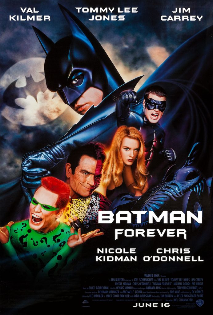
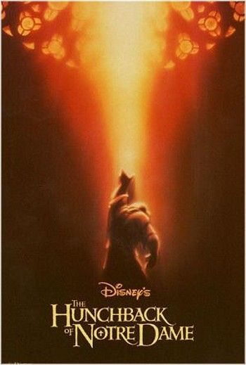
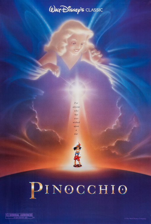
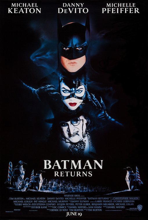
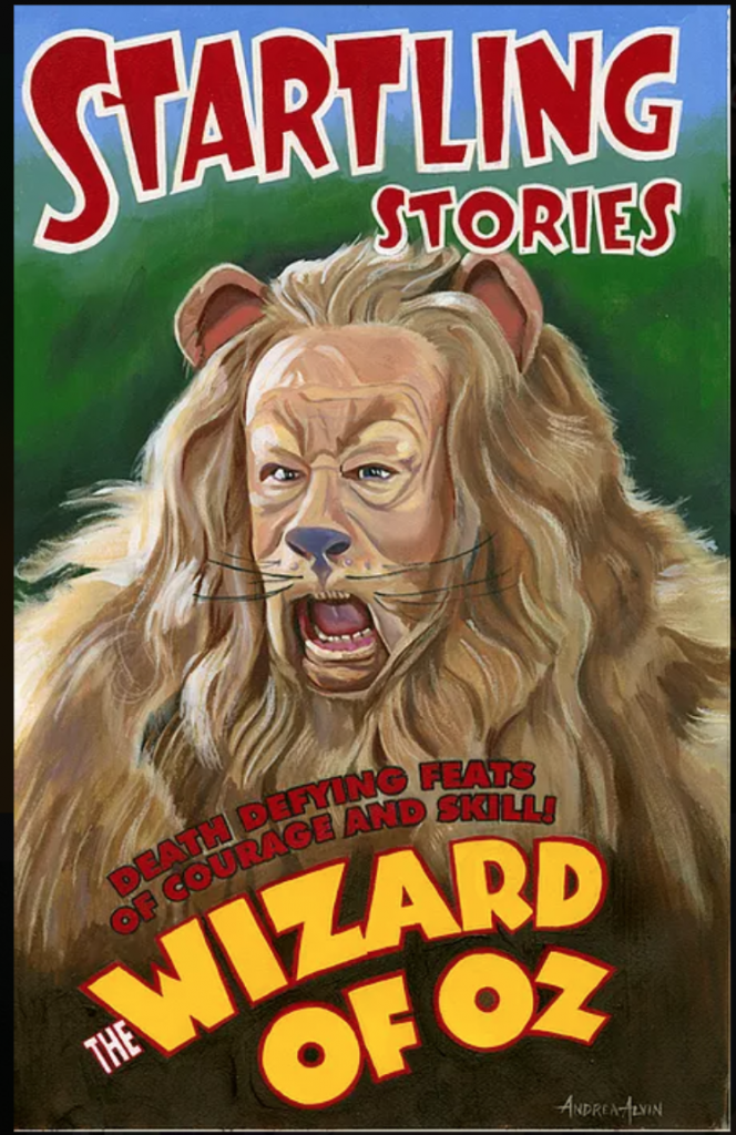
From the very beginning of John’s career as an iconic movie poster illustrator, Andrea worked and partnered with him. Her influence and perspective is in evidence in a number of famous posters. She contributed substantially to the creation for ad campaigns like Batman Returns, Batman Forever at Warner Brothers, and Pinocchio and The Hunchback of Notre Dame at Disney. She has won awards for her illustration and design work in film, and was an equal partner in the company Alvin and Associates, which she started with John.
When John passed away unexpectedly at 59 in 2008, Andrea had more than just emotional pieces to pick up, she found her voice as an artist had changed. While she’d been exercising her photo-realistic talent all along, she wanted to reflect on and integrate how loss had impacted her. As it turns out, even now, nostalgia continues to be a comfort and a subject that speaks to her, as it always has been. But, she explains, her art has definitely evolved.
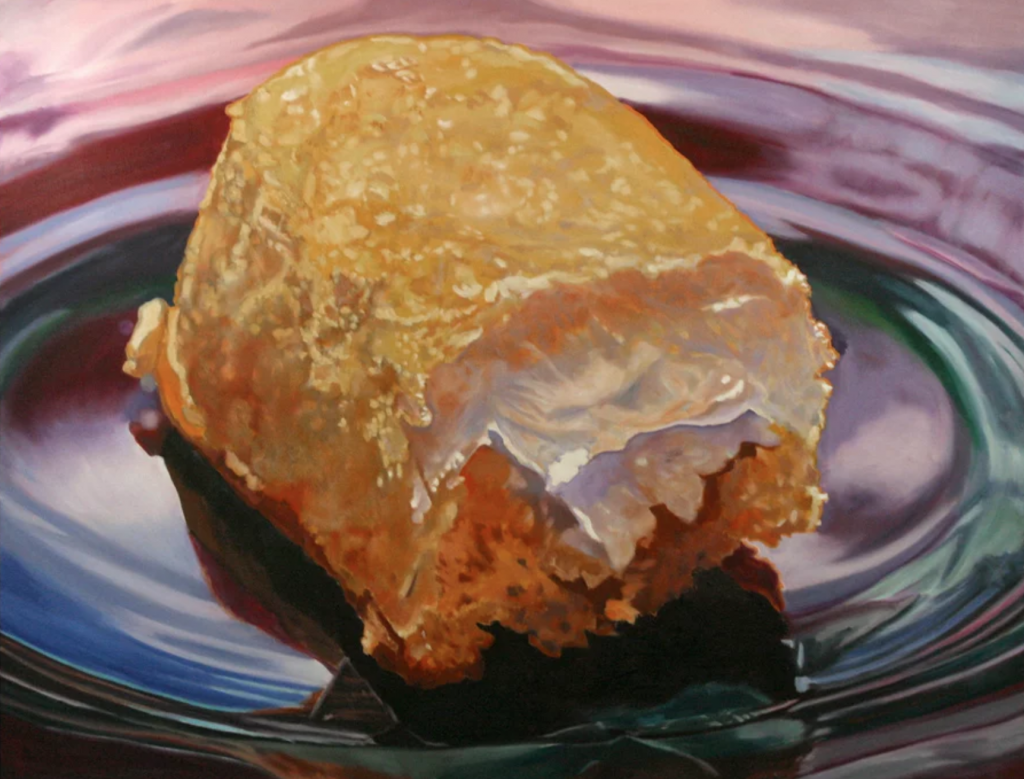
“As far as nostalgic images, I had started painting a lot of these subjects before he died. It took me a long time to process what I wanted to say, and how to say it in my art, and in the last 4 or 5 years, somehow I’ve come to this more detailed type of painting I’ve been doing, that started with the candy canes and the gumballs. I pulled back from my subject matter. I had one big subject. Now I’ve pulled back, and you get more subject, but also more detail. I don’t know what that says or how that happened, but I have a wider view. I’m not rushing through to complete anything. I have the solitude to sit and look at my work and the detail has come from that. With my more recent work, there’s an atmosphere. There’s a mood.”
Andrea has created official images for Warner Brothers and Disney, engaging her appreciation of animation and film while incorporating her unique style, and she has also created art that speaks to her love of all things nostalgic. Her fans and collectors are grateful. Whether it’s candy, toys, or cartoon characters, Andrea Alvin gives joyful moments from our childhoods back to us in ways only she can.
I spoke to Andrea Alvin about her career and asked her about her newest work in this exclusive interview:
LC: What does the word ‘art’ mean to you and what about being an artist fulfills you as a person?
Andrea Alvin: That’s a big question. Art takes many forms, for example my daughter is an artist, she sings and performs. Art brings beauty and social consciousness into the world. It makes us think, it evokes an emotional response. Being an artist is who I am. I have always wanted to be an artist. It influences how I view the world, both literally and figuratively.
LC: What in your childhood drew you to becoming an artist? How did your inner artist express itself when you were a kid?
Andrea Alvin: I was a very shy child and was happy to spend time alone drawing and coloring and living in my imaginative world. Both my parents and my brother were extroverts and I was not going to try to compete for attention. My brother is six years older than me, so a good portion of my childhood was like being an only child, spending time alone or with adults. Art was my company and my escape.
LC: You went to Art Center. What was the experience of that as a female artist? Were you clear on what style and modality you wanted to work in? How did it form you or help you hone your skill?
Andrea Alvin: When I went to Art Center College of Design in Los Angeles, I was one of about ten women in a school of five hundred. I never thought about being a female artist until I saw how much of a minority we were. I think it just made me work harder. Also, I wanted to major in Advertising Design, but I was told that girls only majored in Packaging Design or Fashion Illustration. I started as a fashion illustration major, but I couldn’t draw in that style. I was really bad at it! So, I switched to Ad Design and also took as many painting classes as I could along the way. My parents were set on me having a career, that paid actual money, when I graduated. Art Center was very demanding and accepted only a high level of skill and craftsmanship from every aspect of its curriculum. I have been able to use those skills over the years in the various journeys throughout my career.
LC: You were half of “Alvin and Associates”, which was focused on film advertising design. Your partner and husband John created some really iconic posters. Can you talk about what role you played in creating imagery?
Andrea Alvin: This is where my Ad Design major at Art Center came in handy. When John began getting illustration jobs for movie posters, I was the unknown person in the background helping with concepts, copy lines and critiques. One of my more famous “ghost” contributions is on the Blazing Saddles poster. I came up with the idea to put the Hebrew lettering on Mel Brooks’s Indian head band that says, “Kosher for Passover.” A painting did not leave the studio without my second set of eyes helping to determine that it was ready to release.
When John and I formed Alvin & Associates, we didn’t have any second thoughts about whether we could do it. We were great partners. I was strong in design and concepts and I knew what John could do with an image. We had an unspoken shorthand. A great example is the re-release poster for Disney’s Pinocchio. The image is of the Good Fairy looking down on the little puppet and touching him with her magic wand. I created the layout, chose the specific models and knew John would create the magic that turns him into a boy. I created the concepts and designs for “Batman Returns” and “Batman Forever.” Those posters were a design challenge because all of the movie stars’ likeness contracts. I knew John could make the various images into a cohesive image. I won a Key Art Award for best design of a poster for Batman Forever.
I was the one who moved us into using the computer and Photoshop very early. I saw a demo and knew this was the future. I’d say we were on the bleeding edge of its use in creating movie posters.
LC: Describe your artistic aesthetic, where it comes from (in terms of inspiration—artists you loved, movements that inspired your own work) and what kinds of images draw you to paint them?
Andrea Alvin: Over time my work has become a melding of Impressionism with Photorealism. The brushwork is evident and in some cases fairly loose, but it resolves photographically from a short distance. They look extremely tight in a photograph, but in reality they are not. My objective is, that it definitely looks like a painting and the viewer is aware of the artist’s presence.
As I mentioned earlier, I went to a design school and studied advertising. Andy Warhol and other Pop artists inspired my subject matter. They opened the door to using subjects from popular and commercial culture. In reality, no subject was off limits. In the 80’s, Photorealism became a movement and I really connected with it. Artists like Ralph Goins, Wayne Thiebaud, and Audrey Flack were painting photo-real still lifes of every day subjects with superb mastery. Chuck Close influenced me with the way he filled the canvas with his subjects. John Singer Sargent’s brushwork is inspirational. I still look to the work of those artists.
LC: What is it about nostalgia that makes you want to capture it on canvas?
Andrea Alvin: I started painting subjects that had a nostalgic aspect because I wanted to paint things that were very “American.” To me, the toys and snacks that I grew up with seemed to define my generation and those beyond. We are a consumer society. These are subjects that everyone can relate to. I found that if I used light and atmosphere in my work, it evoked a warm feeling in the viewer. I also find it humorous to elevate these subjects in a grandiose manner. Having a four foot square painting of Oreo Cookies hanging my living room makes me smile.
LC: Could you tell us a bit about some of your most recent pieces?
Andrea Alvin:
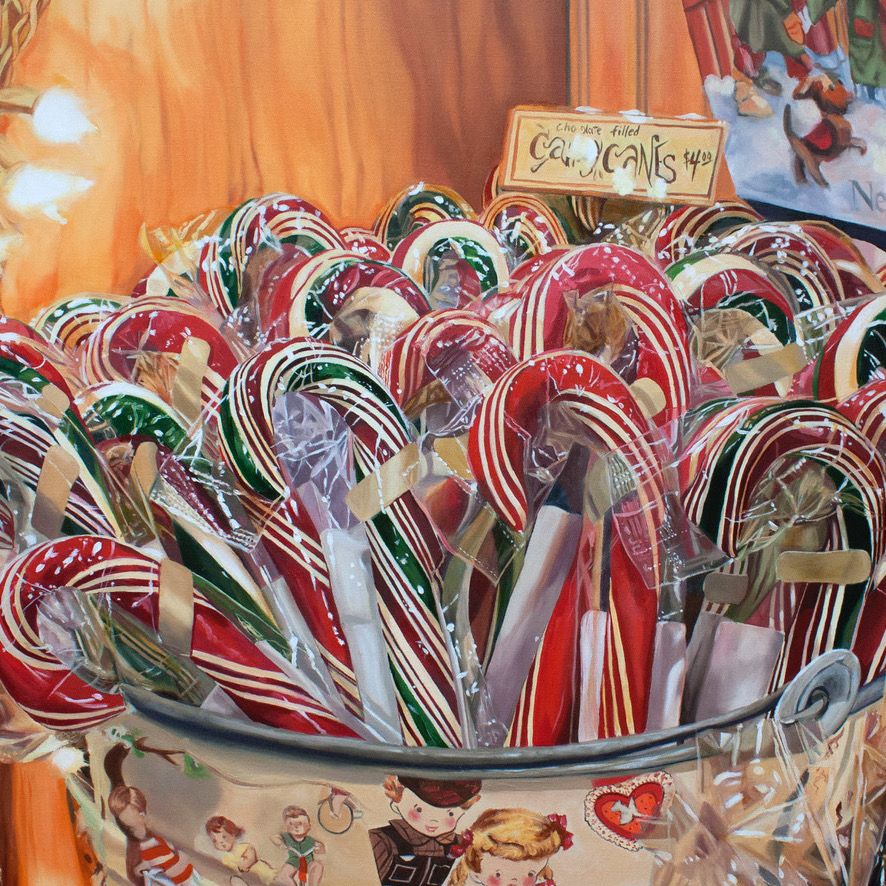
“Samuel’s Candy Canes”
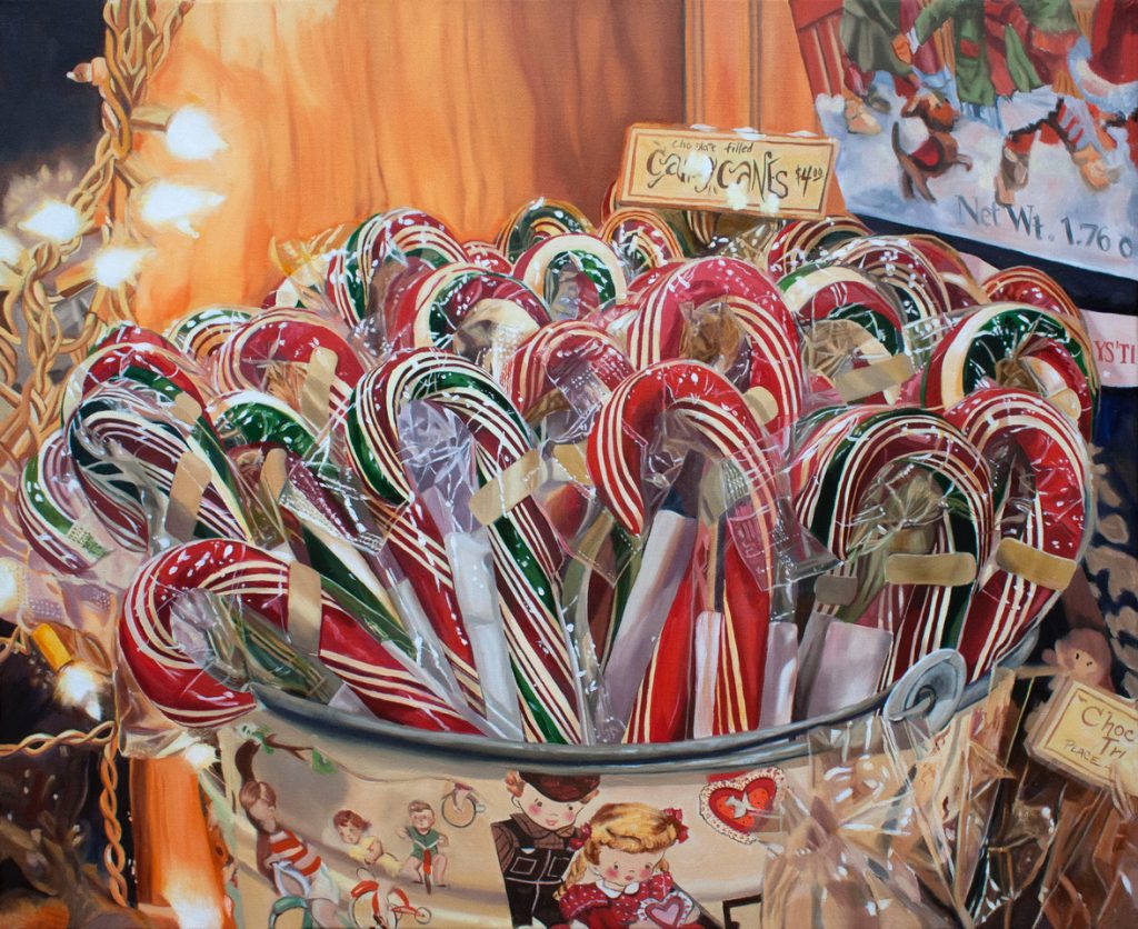
Each year, Rhinebeck, the town I live in, has a winter celebration called Sinterklaas. It is a combination of a Norman Rockwell Christmas and Mardi Gras. The whole town participates and it brings in people from all over. One year I brought my camera and was shooting pictures throughout the day. I wandered into Samuels Sweet Shop, the town’s only candy store, and it was appropriately decorated for the event. I saw the candy canes in the vintage bucket draped with festive lights, and it really spoke to me. Whenever I look at it I think of SInterklaas and the feeling of the winter holidays. It’s cold outside, but here I am in a warm cozy spot and I’m going to enjoy something sweet. I hope it makes the viewer feel that way as well.
“Got a Penny?”
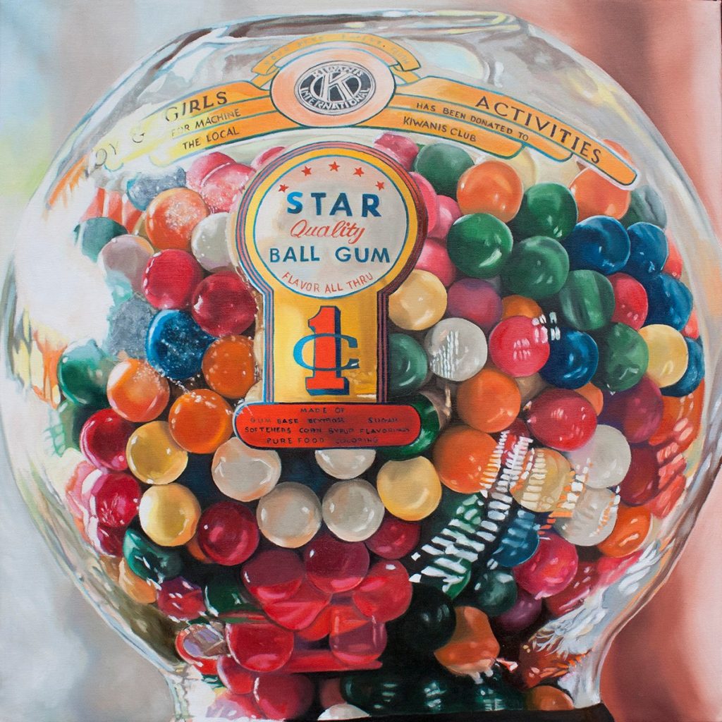
Generally I only paint from my own photographs, but once in a while, someone has a photo that inspires me. This one, of the gum ball machine was taken by a friend that I went to high school with, Jerry Lane. He’s a professional news cameraman, so it was of excellent quality. Thank you Jerry!
It reminded me of going to the store with my mother. These machines were strategically placed outside the door, so you couldn’t miss it, whether you were coming or going. “Please Mom, have you got a penny? I really need that gum.” We always knew if a mother gave in to the annoying begging, because the gum would turn our mouth and teeth a bright red or green or blue for hours.
“Putting Out the Fires”

I grew up in Fresno, California. It is a place of scorching hot summers with temperatures in the triple digits for days on end. Squirt guns were great fun and a way to stay cool. I was really taken with the shapes, colors and transparencies of these toys. When I completed the painting and was looking for a title, the Marjorie Stoneman Douglas high school shootings took place. It put a different spin on the subject. Was there a way to portray the subject of guns, even though they are whimsical toys. was not negative? Thus, the title, Putting Out the Fires. Sadly those fires are still burning and the shootings continue.
LC: You’re working now on a piece with ice cream sundaes called “In the Good Old Summertime”. Why did you pick that subject and what is it saying?
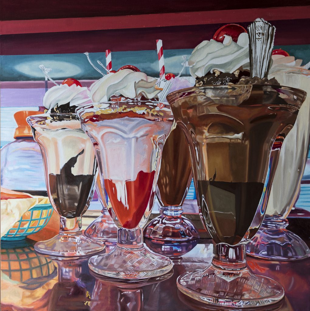
Andrea Alvin: My friend in Los Angeles, Lynda Fenneman, took this picture. There is a motel and coffee shop in the San Fernando Valley that has been restored to its original mid century grandeur and is used as a movie set. I connected with this photo because of the iconic nature of the ice cream sundaes and their setting. I’ve cropped in on it to make them even more heroic. Nearly every town had a movie theater and a restaurant with a soda fountain. In my town, we had Carnation. My older brother and his high school friends would hang out there. They called it “The Flower.” “Meet me at The Flower” was a Saturday night invitation. For my grammar school friends and me, it was the lure of the cone shaped glass, chocolate sauce and whipped cream that beckoned to us. It’s those shared memories and the fun of painting those reflections and surfaces that drew me to this subject.
LC: We did a project on candy hearts. What about that was fun or engaged you as an artist?
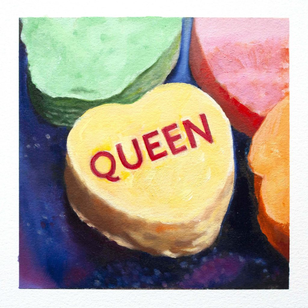
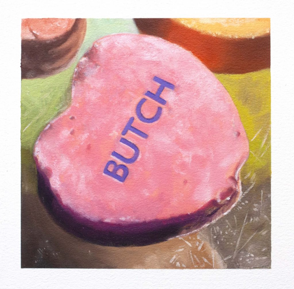
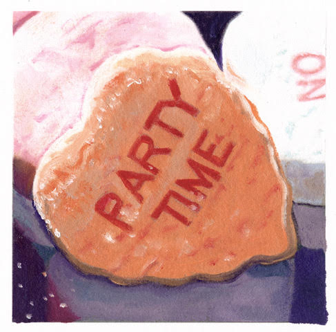
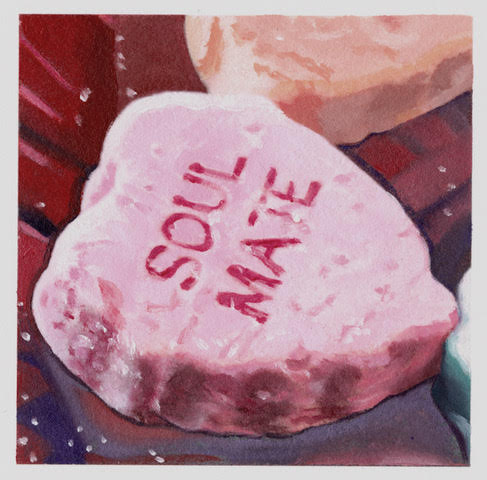
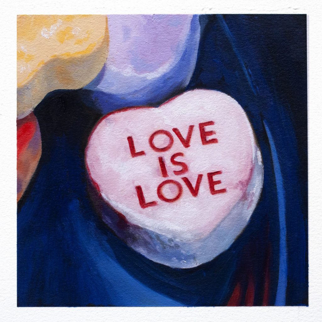
Andrea Alvin: The candy message hearts are so iconic. They are a perennial Valentine candy. We had fun changing up the messages to be more inclusive to today’s culture. From the traditional Soul Mate and Party Time, we added Love is Love, Queen, and Butch. The colors are sweet and fun and they are really like chunks of chalk, so painting them was a bit of a challenge. We donated a portion of the sales to the Trevor Project, so it felt good to give to a worthy cause.
LC: How has the pandemic effected you as an artist and how has it been integrated into your work?
Andrea Alvin: When I knew we were on lockdown, I thought, “this should be a very creative time.” Unfortunately, I had a very hard time concentrating on art work. It took me a while to get back into painting regularly. I think that my subject matter is a perfect distraction from the bad news and depression that so many people felt. It always makes me feel better.
LC: What one bit of advice would you give to artists who want to be successful?
Andrea Alvin: First, hone your skills. Go to art school or study and practice to be as good as you can be at your chosen art form. Do it for the love of the process and not for the money. Success is not about sales or how much money you can make, it’s about being good at what you do and constantly growing and creating. It takes a lot of drive and a self recognition that “you can do it” no matter what obstacles come your way.
LC: If you have to pick one quote that expresses how you approach life, what would it be and why?
Andrea Alvin: From the artist Chuck Close – “Inspiration is for amateurs. The rest of us just show up and get to work.”
YOU CAN SEE AND BUY ALL OF ANDREA ALVIN’S ART BY CLICKING HERE.