

Below you’ll find Cinema Siren’s Top 10 Movie Posters of 2015, AS WELL AS added opinions and thoughts from Andrea Alvin and Bill McCloskey–both who were involved in the making of some of the best movie posters in recent film history!
Go here to go to the youtube vid.
The past is the past. As someone who celebrates traditional illustration in movie posters, it’s hard to say. It’s not that there are any nods or actual illustrations being used to promote new films, or that there won’t be a resurgence, but the era that genius artists like John Alvin and Richard Amsel made their own is gone forever. And there are reasons for that. Not only are many of the greats lost to us, having passed away, but more importantly, the world of film promotion has changed so significantly. When the artists who brought us posters like the one for E.T. and RAIDERS OF THE LOST ARK created their memorable images, the closest thing they had to a social network was word of mouth. An advance poster, as John Alvin would say, created “the promise of a great experience”. It had to. We as movie fans couldn’t click to see a trailer, or see a youtube featurette, or read about the coming attractions on the hundreds of film blogs vying for fans’ attentions. Just today, Benedict Cumberbatch’s Doctor Strange rose to the top of trending topics on Facebook.
So posters, and movie campaigns as a whole, have had to embrace and use the times. As a result, these top posters reflect the new way in which art directors, brand managers, and studios are leveraging fandoms around the world and the power of social media in their campaigns. Some of these images attempt to harken back to the golden age of movie posters, and some still attempt to grab and hold at least a fraction of the attention of curious film lovers with just one image. Good for them. As the representative of the estate of film artist John Alvin, I applaud them. It is through that experience, my knowledge as a film critic, a movie lover, and as an expert in film art, I offer my top movie posters of the year.
In the interest of you not just taking my word for it, I have also enlisted Bill McClosky, former art director at Intralink Film Graphic Design and Andrea Alvin, John Alvin’s wife and partner in Alvin and Associates, to add their comments and insights.
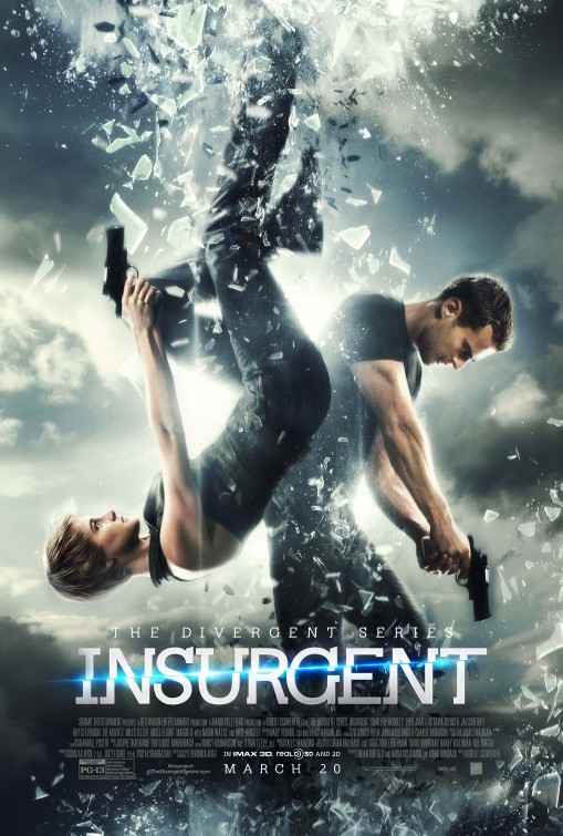
10. INSURGENT:
Since a blending of photoshop and photography creates the palette for most film posters these days, the best find ways to connect with the audience in a visceral way—and make potential viewers both curious and excited. This visual riff on a playing card shows an equal power between the masculine and the feminine in the film, while suggesting the action is both off kilter and off the charts. This poster reminds fans of the Divergent series while motivating potential viewers to check out the franchise.
Andrea Alvin: I like the formality and elegance of this design and its allusion to the ying and yang symbol. It’s an image of the two characters in a world that is coming apart. Its visually appealing and conceptually tells a story.
Bill McCloskey: I agree with both Leslie and Andrea on this one, in addition I think this does something very unique to movie posters – it changed orientation. One of the most frustrating things, as well as a benefit, as a designer of movie campaigns is the size and orientation of the poster is consistently one shape and one proportion, this campaign switches the focus to the top and the bottom of the frame, in addition to the symmetry of the opposing figures.
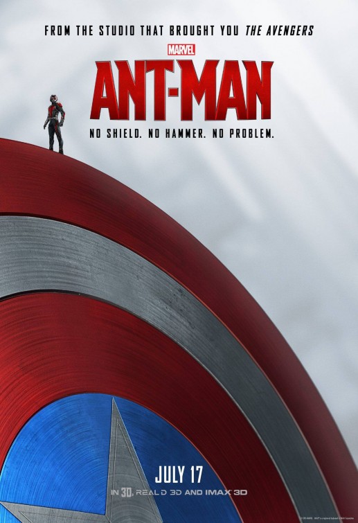
9: ANT-MAN
This campaign offers great tag-lines (“Heroes Don’t Get Any Bigger”, “No Shield. No Armor. No Problem.”) and uses the leverage of Marvel power to promote a movie that had gotten quite a bit of negative press. Their designs made huge strides in rebranding the film. The advance is fun and cheeky, but the series that thumbs its nose at the big boys who have brought in so much money for Marvel while reminding us the character is part of the Marvel team was genius, and positioned the film as funnier than its predecessors. Fans got what they expected at the multiplex.
Andrea Alvin: I love the copy line. Its strong and funny. This is a great image. It tells us that this little guy will stand up to the big and powerful and hold his own. Its a strong graphic and an image we can remember and it brands the film.
Bill McCloskey: This has one of the best composition elements going for it…Contrast in size. This also benefits from being able to utilize two other fantastic franchises, Captain America and Iron Man, but they were used so tastefully and with minimal exploitation, they serve the image rather than dominate it.
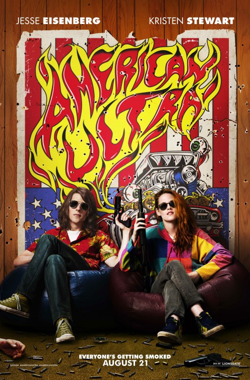
8: AMERICAN ULTRA
Is it the 70s? Does it matter? The campaign for American Ultra had to draw the stoner contingent as well as those who love Jesse Eisenberg and Kristen Stewart’s other work. This poster says, “Pot!, Guns!, America!”. The film had to do the rest.
Bill McCloskey: Teaser posters tend to be able to exploit the size and position of certain elements. I love the title treatment as that was the element I mostly designed during my career. There will be a problem utilizing this in the final campaign because it will require putting on the most disgusting element of the movie poster…the billing block, as that size is always determined by the physical size of the logo’s lettering.
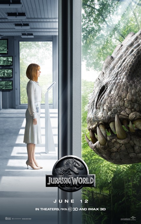
7: JURASSIC WORLD
With the original logo still intact, this poster for Jurassic World reminds its audience dinosaurs, and the humans they want to eat, are front and center in the story. Juxtaposed images of a white computer room and controlling businesswoman and a dino surrounded by foliage, pit technology against nature. Those who are fans of the franchise know nature always wins. This image suggests Jurassic World may show that to audiences in a new and exciting way.
Andrea Alvin: This is a strong composition. Dividing the poster into two equal images makes the viewer very conscious of the two competing worlds in the film. I feel like the dino side is still a bit pristine, and could benefit from a more visceral and menacing shot of the beast. For me, it lacks the tension that I believe the designers were trying to allude to.
Bill McCloskey: I agree Andrea, the success here is in the composition of the opposing elements, I would also like to see a bit more “grit” to the dinosaur’s environment.
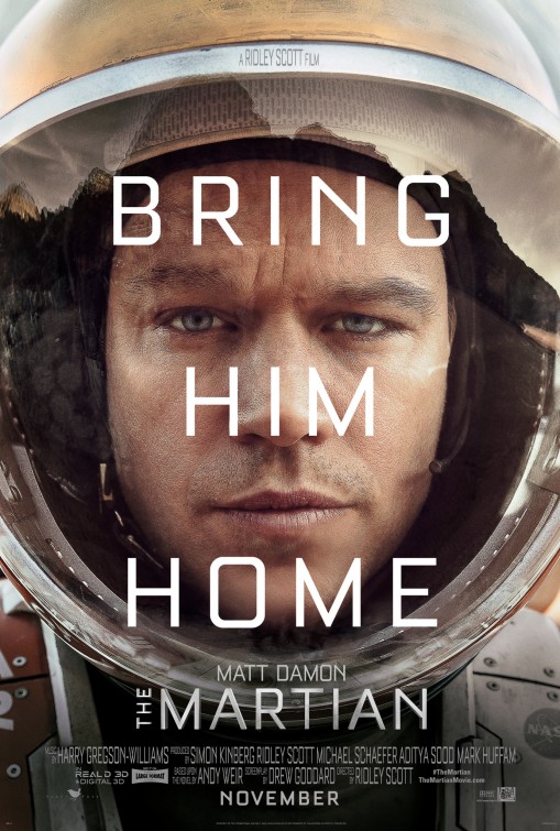
6: THE MARTIAN
Whether with traditional illustration or photo images, sometimes using the star power of the film lead is the best way to insure box office success. No one wants to see Matt Damon trapped forever on Mars. This simple, dramatic image, coupled with a clever collection of astronaut videos meant to go viral, meant far more fans attended the first weekend of release, thereby leveraging word of mouth for this great film’s ultimate success.
Andrea Alvin: This poster has the feeling of a high quality “Missing person” poster. I like its call to action. It’s a good way to present a poster using the star power of Matt Damon. I might have tried a subtle reflection of the Martian landscape to show his desolation.
Bill McCloskey: I love this poster and this one breaks the mold a bit with its big, superimposed, simple copyline. Usually we try and create a nice clear space in the composition for the placement of the copyline, here it runs right over our star’s face, but the line breaks perfectly between his gaze and his mouth. Having worked with Ridley Scott before he also likes to bury the credits, see if you can find his above title credit.
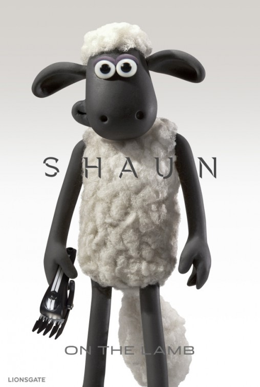
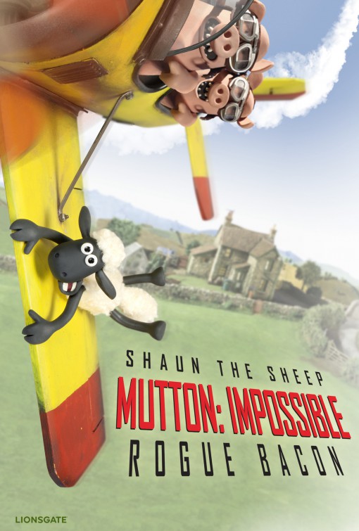
5: SHAUN THE SHEEP
Promotion for the Shaun the Sheep movie had to get both longtime fans of the show and potential viewers onboard for their release to make some bleating money. These riffs on other blockbusters were a clever way to reinforce love from the fans and pique the curiosity of animation aficionados they wished to add to their flock. From Spectre, and Mission: Impossible to the Fantastic Four and Ant-Man, this campaign shamelessly leveraged other designs, and to great effect!
Andrea Alvin: I love both of these posters. They have treated the animated characters with all the seriousness of an action movie and that makes it funny. This is a campaign aimed at savvy adults. I want to see it.
Bill McCloskey: I agree with both Andrea and Leslie, to bring animation into the mainstream you have to engage the adult audience and both of these posters do it cleverly.
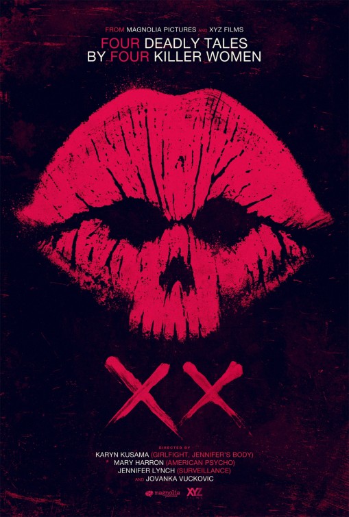
4: XX
With all the fuss about women in film and the dearth thereof, here is a film with women directors helming four unique stories. The poster, like the subject of this anthology, is killer! If a graphic poster is used, it’s essential it reads from far away and causes curiosity in the viewer. The best posters advance knowledge of films that might otherwise stay unknown. This dramatic image does the trick and deserves a big smooch!
Andrea Alvin: This is a really effective poster. It looks like the european campaigns done in the 70’s or 80’s – very artistic. At first viewing, I know its about women and that its scary. It works.
Bill McCloskey: It’s always tough to make a graphic image have a double read and this one is very clever on how it accomplishes meshing both of the images. You also can’t get more striking than red on black.
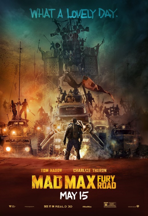
3: MAD MAX: FURY ROAD
No one in the public saw this movie as the colossus it became, until the posters started hinting at spectacle beyond our imagining. That’s what a great movie campaign does. One of the best aspect of this collection of images is they are created by a diversity of agencies, but still maintain a consistent look. The tagline “What a Lovely Day” will live on, as will the memory of this particularly poster, which captures the “High Noon” vibe of one man facing an impossible undertaking. Gratefully, he has Imperator Furiosa to help!
Andrea Alvin: This is a very successful poster. It is difficult to create a poster for a movie that is so full of details and images, without it becoming “ beef stew.” That is a term we used to use when the art was full of details and had no focal point. It is something we see a lot of today in poster design. This poster solves this particular problem beautifully. The formal composition, with nearly everything stacked in a line down the middle of the page emphasises the concept of one man against the world. The “world,” represented as a beheamoth mass of men and machines emerging from a noxious mix of fire and smoke, is portrayed as one huge form with the many details contained within it. Our hero, sihlouetted with his back to us shows his potential strength of character. The story and conflict are all here in this image… and it looks good too.
Bill McCloskey: Leslie has hit the nail on the head. The word of mouth that started coming out about this movie established how truly amazing the imagery in this film was going to be. Also evoking our main character’s stand against the masses is always a “go to” theme. As Andrea also mentioned it’s hard to create an “atmospheric” look with out creating a mish mash up of elements. The forced depth of field is what really helps pull that off.
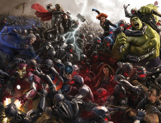
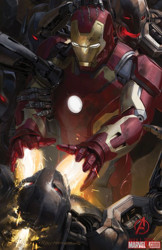
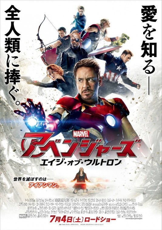

2: AVENGERS AGE OF ULTRON
How do you keep the head of visual development and his team happy at Marvel? Or any artist, for that matter? You let them sign their work (note the signature). The special release poster was a wonderful way to excite Avengers fans at SDCC 2014, and in fact was 8 images pieced together, all of which were their own advance posters. All of which were signed by the artists. The creators involved were the head of visual development for Marvel, Ryan Meinerding, and 2 of his concept art cohorts, Andy Park and Charlie Wen. The Eclipse agency added to the momentum by creating both an illustration mimic, and design that reads from far away and close up, like a Where’s Shield version of Where’s Waldo. Marvel has always respected diverse designs and ideas for promotion, and it shows in their ever-increasing fandom.
Bill McCloskey: Well you can’t forget the fan boys and girls. So limited edition posters are perfect. Comic-Con is known for its giveaways and I’m sure this was a hit. I would have tried to collect them all.
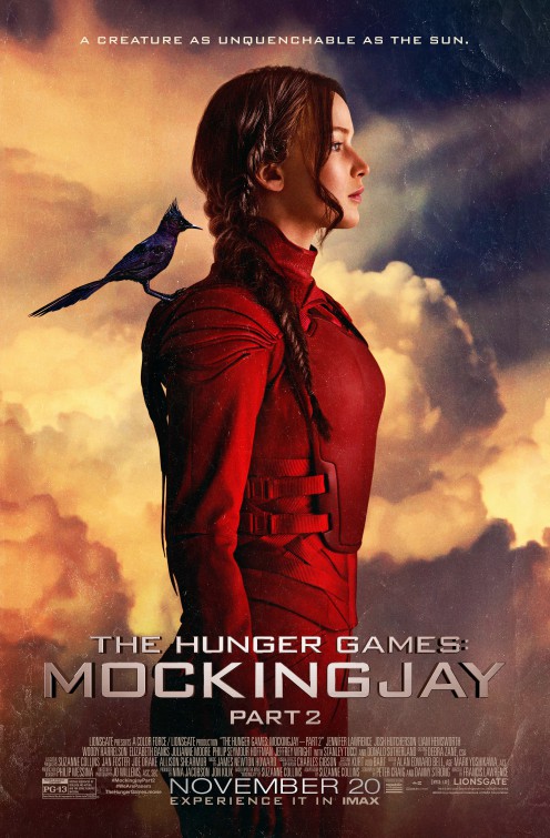

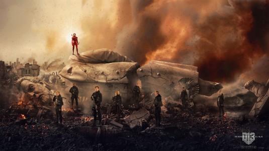
1: HUNGER GAMES
The secret of success for the Hunger Games Mockingjay part 2 campaign is in part the art photography of Tim Pale. He is both the chief brand officer and international marketing president at Lionsgate and a talented photographer. Pale has taking photographs of all the major players in the Hunger Games franchise from the beginning, and pursuaded Lionsgate to use the images in the campaigns’ propaganda-based designs. The result is a collection of gorgeous, compelling images that went viral and reaffirmed the value of artistic presentation in movie posters. The campaign for the last Hunger Games film got even halfhearted fans back into the theaters. It may also influence the look of future movie art. A campaign can be successful, inventive, artistic, and visually diverse.
Andrea Alvin: The single figure against the clouds is a very successful poster in my opinion. The propoganda posters were a natural fit for this movie because of the political nature of the subject. The heroic photos are gorgeous and the top poster has the feel of a Maxfield Parrish painting as well.
Bill McCloskey: Over the years, studios have begun to rely on pre-marketing images. In my olden days, the 80s, we sometimes had to beg, borrow and steal for decent photography for John Alvin to illustrate from, but these days it appears special photographic shoots before principal photography is done allows for design firms to create teaser posters that can start to define the product to the public. Sometimes these images won’t tie into the main campaign at the end, but they will still succeed at keeping the word of mouth going.
Andrea: The art of the movie poster is not dead, its just different. There are fewer examples of thoughtful, concept driven and good looking posters, but I don’t think that is the fault of the artists and designers, rather a short sighted view on the part of the studios. The purpose of the poster to brand a movie is the same as it has always been, although it is not being utilized. One great poster can be the movie’s calling card in the theatre or when choosing a movie to watch on a streaming service. Most are lost in a muddle of images that are unforgettable. Thank you Leslie, Cinema Siren, for pointing out some very nice examples of what is being done today in movie marketing.
Bill: Thanks for giving me the opportunity to comment on some of the current standouts in one sheet design. Would I love to see more graphic images and illustrations come back into the marketplace? Who said they’re gone? The hyper real photocomposition on “Star Wars – The Force Awakens” blends the two so well, it’s hard not to look at that campaign as the type of illustrations we used to see from the greats: Alvin, Amsel and Peak!
Thanks to both Andrea and Bill for offering their thoughts, and congratulations to all the agencies and artists who created the chosen images and campaigns. Here’s hoping there will be some traditionally illustrated posters on the list in 2016, and that the best images continue to inspire and excite those of us who love movies to keep finding our new favorite films!